Festland – Agency Library

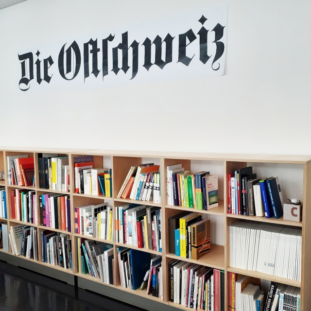
I’ve yet to write up my time spent with the corporate advertisement agency Festland in ST. Gallen. I wanted to share something that delighted me when I was working there. Festland has a large library of books and I took some time out to browse through them. The majority were in German, but some were of other languages.

There were also many recent magazine subscriptions that the agency shelved in the waiting area and corridor. I’m sure they’re primarily there for the clients to browse through as I didn’t see any staff making use of them.

festlandlibrary00
Festland’s book resource

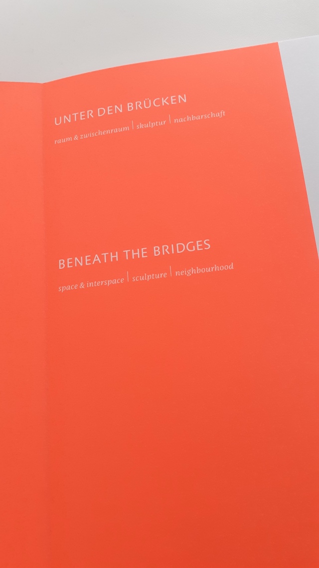
Many design books consisted primarily of images (just the way I like it) and so I could enjoy heavy tombs full of photography. One such book that stood out was Unter den Brüken (‘Beneath the bridges’) and had many beautiful pictures of notable bridges about Switzerland and the areas underneath and around them.

underbridgesbook
Unter den Brüken is a rectangle… a brick-like book…

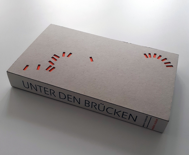
The physical traits of Unter den Brüken are beautiful. It’s an art object, for sure. My phone photos don’t do it justice. The thick, cardboard cover features numerous rectangles cut out – in a seemingly random placement – teasing us with the vibrant title page underneath.

beneaththebridges_insidepage
The title page is a beautiful safety-orange

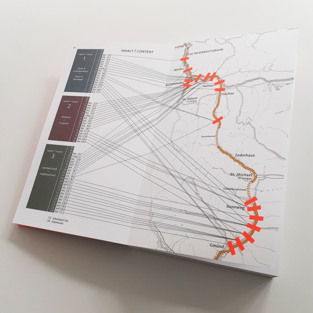
Turn past the title page and see there’s a map with the country’s bridges marked out by orange rectangles. Now the reasoning behind the haphazard-looking cover pattern reveals itself!

underbridges01
Map with bridged marked out

Once opened, the rectangle-shaped book forms a neat square, and the pictures inside are square, too.

underbridgesinside01
Page 124 of Unter den Brüken

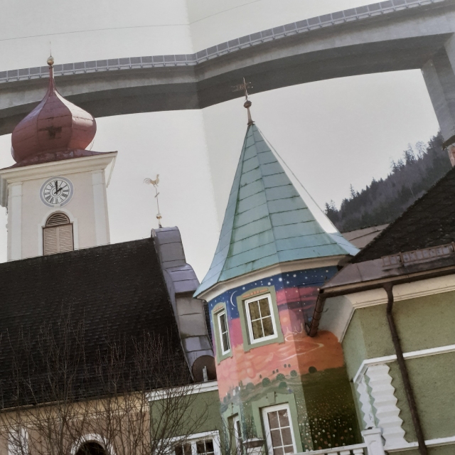
Each page showed either a photo of one of the bridges’ unique structure and characteristics, or the surrounding area the bridge cut through. Some locations has several photos taken at different times of the year, to show how the change of the seasons effects the area.

transutopiacover
Transutopia

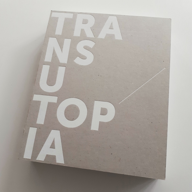
There were some fine art books, such as Transutopia. The library art books were in German (of course) but the works covered were world-wide; some classic, some contemporary. You’ll know many classic works catalogued even if you can’t read these books (and hey… they’re full of drawings and pantings… art is a universal language if there ever was one).

idontknwothisone
Inside the art book, Transutopia

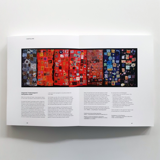
Transutopia is a catalogue of modern artworks. Like almost all books I encountered in Switzerland, the editorial layout was organised by strict rules, immediately obvious to anyone used to reading books with a more clumsy layout. The text is organised to aid memory (the line you left off on) and is much more pleasing to the eye with the rhythm it flows in. No justified text here. I’d like to discuss Swiss typography rules in a later post, using printed media I picked up while away.

helveticabookcover
Helvetica Homage to a Typeface

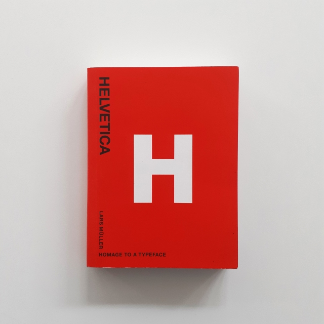
There was a tiny (tiny!) book full of photos of Helvetica in use about the world; on signposts, on posters, on decals etc. It was nice to flick through during a lunch break.

helvetica inside
Inside Helvetica Homage to a Typeface

I’m sure I took more photos of the library books than I’ve got to show, but I must’ve misplaced them! Oh well. I was gifted the book TYPE FOR TYPE Custom Type Solutions for Identity Design by the agency as a leaving present, so when I share, I’ll have to take many photos of it! …It’s an art object.

office style guide
Bilingual book, Office style Guide Das Arbeitsbuch (‘Office style Guide The Workbook’)

There were good books that had wandered out of the library bookcase.

About the studio there was a guide to office layouts, Office style Guide Das Arbeitsbuch. It’s a workbook with cardboard templates and stencils to cut out, draw, and model studio plans with. The books is bilingual, so just flip it upside down and turn it over to read it in English. It’s also insightful into the types of studio a person might want to build.

officestyle huide inside
An explanation of office layouts and any corresponding productivity change

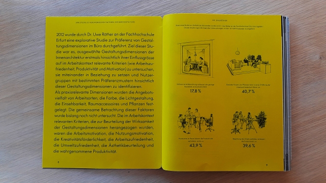
The book’s divided into sections each covering ‘different feeling’ studio types (such as industrial-themed studio) which include the materials that are best suited to an aesthetic. It’s well-known that the work environment effects the mood and thus the productivity of those inside it. The book gets quite analytical with MATH! With FACTS! FIGURES!

Truth be told, I’d not given that much thought to the process of creating the ideal layout for a creative studio. (I don’t own an agency, so I don’t need to, really.) I realise, if you have a large space, you may dedicate serape rooms to different functions, such as a room just for staff who need solitude or for absolute privacy with a client. There may be a part of the studio for relaxing and reading. Festland had such areas and rooms. But Festland was large – two stories – compared to other creative studios I have visited that were just single-rooms.

If there’s anything I’m expecting from other agencies from now on, it’s a decent library of creative books!

Easter – Läderach Goods

It’s a Sunday – a chill day – it also happens to be Easter. So I thought to share a relaxed post of some pictures and thoughts of some Easter-marketed Swiss chocolate (and their packaging). I picked up these items while in Switzerland.

At the end of my last full day in Switzerland last March, I visited ST. Gallen’s Läderach chocolate shop to pick up some of their fabled goods. Among the most well-known chocolate brands in Switzerland, Läderach has been around since 1962. Of course with the Easter-themed goodies on sale, I couldn’t not pick them up to share with family once I got home.

alltheladerach
Läderach chocolate that I brought back from Switzerland.

Not pictured: the rest of the Swiss chocolate I brought over with me.

I felt that I had to pick up some chocolate eggs and a little hare. I did buy a nice pre-packaged selection of FrischSchoggi – that’s ‘fresh chocolate’ in English. Läderach’s FrischSchoggi are displayed as large slabs that can be broken up upon request of a customer and are priced according to weight.

Anyway, let’s look at the two Easter-related items that I bought. It’s an opportunity to critique at types of packaging design that I have not yet looked at.

eggsboxladerach
Plastic and cardboard egg box packaging

It’s not strange to come across real hen and duck eggs stored in plastic boxes, but the type I’m most used to seeing are the cardboard variant. Here, the point to using plastic is that the consumer can see these hand-painted chocolates inside of the packaging. It’s not the most environmentally conscious choice of material, but it can be recycled.

For those wondering, the flavours of chocolate eggs inside are strawberry, milk, and orange!

laderacheggsgold
Raised foil text on the egg box’s cardboard wrap

The wrap around cardboard label is predominantly beige with cocoa-coloured silhouettes of springtime grass, flowers, and… flecks of pollen!? The matte finish on the wrap around  features the brand’s logo in raised gold foil text. It’s mature and understated, and to me, it speaks ‘luxury’. Definitely this is a treat for the adult market.

backofladerachegges
The necessary info is stickerd onto the back

All of the ingredients and storage instructions of Läderach confectionary are in German. On the back of the chocolate egg box, the weight, storage, expiry date, and ingredients are found on a white sticker with black text which is slapped onto the underside of cardboard wrap. Note that the sticker acts to further secure the cardboard wrap, along with two smaller, round stickers.

Thinking about the product from an ethical perspective, the use of plastic isn’t great, but overall, the materials used to make this egg box can be recycled, and that’s good. As stated before, the plastic material chosen allows for the potential customer to see the product while keeping the chocolate both safe and clean. After all, the nature of this consumable can’t be compared to say, a fruit, which doesn’t need packaging at all.

cleochocolate
Raspberry flavour mini Cleo

These small, stylised chocolate hares are so cute that I had to pick one up for myself! The mould is elegant and sleek, but the painted eye adds a cute (and maybe a somewhat perturbed) look. Cleo came in many flavours. The mini Cleo that I picked up is raspberry, but the option of milk and dark chocolate were there.

These little chocolate hares stand up inside a plastic bag, with a cardboard backing for support. There’s a sticker atop each bag adorned with the store logo. From the front, the strip of cardboard support has a simple grass field illustration and the product name at the top. At the base of the cardboard backing is the ‘Chocolatier Suisse’, printed in gold, in the same font that adorns base of many of their year-round packaging.

Speaking of the standard packaging, the Läderach branding uses almost exclusively white, gold, and black. (Can’t really go wrong with those colours.)

backofcleo
Reverse side to the mini Cleo chocolate

The back of the Cleo product shows the legally required product information which is stickerd onto the back of the plastic bag, made visible by the white of the cardboard strip. The sticker label states the weight, storage, expiry date, and ingredients of the treat.

The overall presentation of the product is unfussy by design. The packaging used can be recycled, but it is less so than a traditional cardboard package that Easter confectionary is often sold in. I don’t believe that I have seen moulded chocolates presented individualy like this in any other shop, so to me, the packaging is somewhat of a novelty!

In the future, I’ll keep in mind Läderach’s packaging design in comparison to our equivalent domestic products aimed at the same audience. The pervasive usage of white and gold is light and friendly, yet chic. Läderach definitely has it’s own identity, even if it’s a relatively young company in the grand scheme of chocolatiers!

WKL200 – Reflection (01)

In January, the company Siemens approached graphic design students for logo work. Presumably because the belief that students face less creative constraints due to their freelance status. (But boundaries are set by briefs, regardless!) The brief presented was a challenge for me, with highs and lows.

As with all clients that approach you, it’s important to understand where they are coming from. I needed to do a lot of reading up on the company, as I knew next to nothing about the history of Siemens or the specific line of work that the logos were requested for; their off shore wind farms.

diagram_hohe-see-and-albatros-wind-farms-at-a-glance
Diagram showing Hohe See and Albatros’ planned number of turbines

I did end up researching what the daily routine of an engineer is, what environment they are working in, the clothes they wear, and the equipment they use etc. But the brief strained the importance of the place the work was at. The brief also made it clear that the The logos were not for the farms themselves, but rather the people who work on the farms. The workers were keen to wear emblems that reflected themselves as a ‘team’.

The specific farms that required logos were Hohe See and Albatros and Horn Sea TwoThe most important of the key desirables was to create a symbol that represented the men at work and their ‘team spirit’. The workers were very interested in emblems such as the ones created by Bands FC (Football league and Album cover crossovers). This element of the brief was not received too well by a number of students (for being restrictive from the get-go) and many approached the brief in other directions initially.

mb_mitmedialab_12
MIT Media Lab directory that used symbols for departments

I even approached the brief by attempting to create logos that shared visual elements (shapes or pattern) to keep some consistent identity across the two teams. The decision to explore this was made concrete after looking at logo work by Pentagram for MIT Media Lab. This approach was not well understood by the client, and I understood that they disliked it.

hhhornseaa
Logos made using arcs that can be read as waves or wind

When I presented pencil scamps to the client, it was very much a case of straying too far from the client’s wishes, and my scamps were not meeting the goals. I had in mind a more conservative and corporate logos – ones that work great in monochrome, and on any scale –  ones that could be easily replicated on clothing, letter heads, stationary etc.

HOHE SEEE
Hohe See and Albatros logos that use the same arcing shapes

Versatility of the logo was something that actually wan’t a necessity. It wasn’t stated in the brief that the logo would be for anything more than ‘personal use’. But it also wasn’t stated that the workers would be the only ones to sport the logo either. I had drafted and crafted a number of logos thinking they’d have to adhere to the general rules of logo design.

very practice logo
Vectors I made to explore Hornsea Two colour options

I experimented a lot with the pen tool and manipulating the lines ever so slightly to get very smooth curves in some of the logo concepts. I was really happy with the vague images of the logos above –  I thought that because the viewer could interpret the lines as they wanted the logo could represent what they want. Is it the wind, is it turbulent waves? It’s what you make it.

The abstract angle is the wrong road to travel for this particular client tough. They were less enthusiastic with examples from students that were a less direct answer to the brief. What was demand was something ‘simple’, something ‘obvious’.  And I can admit that it was deflating. It took a lot of potential avenues out (experimentation, and fun). But it just means I had to attack the problem from another angle. I did find it difficult to get exited over the sports logo direction, and don’t feel that my best strengths are able show through.

colour early albatros foot bal like
Early vector of a more football-like emblem

I returned to looking at the issue of providing the client with a crest-like logo. I drew many new scamps focussing on the albatross and the wind turbines. The sort of logo work I ended up vectorising became more of an illustration. (It also wound up looking a lot like a pre-existing Football emblem, I later realised.) Arriving at this conclusion, I feel that the brief really wanted a illustration from the start; not a logo.

I was given pointers by a tutor to help ‘modernise’ the feel of my first digital attempt of a ‘sports-inspired logo’. Varying the line width of the rings and removing the lines around the type gives the image a more contemporary look. It was desirable to remove the lines from the bird itself. I added a SOV vessel and wind turbines into the sea.

revised_seimens_final
Revised colour ‘Hohe See and Albatros’ logo

The logo as above does not function (or read) well in monochrome, however. This is because this logo was not initially conceptualised as a black-on-white mark, and is relying on a lot of colours and lines to communicate to the viewer. Without colour, it suffers a lot. (Believe me.)

I had wanted to work on this logo more and refine it with the aforementioned details before presenting digital logos to the client, but I was occupied overseas and busy with a work placement before I realised the time to pitch had arrived, and I hadn’t the program to do so. Since I wasn’t present for the presentation of student works, I do not know the outcome of the project. I would have liked to have heard some feedback on the vectors of my scamps that were dismissed beforehand, and the opinion of the emblem-like logo that was made closer to the client’s wishes.

Looking back on this project, I feel proud of the progress I have made recently using Adobe Illustrator, and how fast I can move when I need to. I feel happy with my more abstract symbolic designs even if they are not going to be utilised –  they were genuinely enjoyable to craft.

Keeping On Top – Schedule

Right now, a lot of student’s work schedules are out of whack, by no fault of their own. It’s an uncertain time, but to prevent ourselves from feeling overwhelmed by our backlog of jobs and stretches of unallocated time, we can organise them and power through.

I made use of timetables before I left for an overseas work placement in February and my daily schedule was rearranged. I quickly found a new routine to follow while away – and it was much easier as I had much, much less free time to allocate to activities. Here’s a timetable that I made at the beginning of the year in January:

TIMETABLE_CLASS_PLAN
Timetable from tail-end of January 2020

I found it useful to break days up into morning, afternoons and evening. Not every hour of the day needs to have a task in it! It’s important to take breaks! If you’re unable to leave home for a walk, and lack a garden, step exercises and other inside activities are great to give your mind a break from writing, researching, and making.

I’d recommend organising your tasks by making a bullet-point list of objectives, deciding which are the priority (taking deadlines in mind) and then fit them into a weekly schedule. Some jobs are done daily, some takes given are due in a weeks time, but other tasks have several weeks to carry out. Fit them in order of importance, across the coming weeks worth of timetables and chip away at them. You’ll feel better having your objectives down on paper than all jumbled in your headspace.

Kunstmuseum Basel – Obersteg Collection

While in Switzerland, I visited Kunstmuseum Basel to view the Meisterwerke der Sammlung Im Obersteg (‘Masterpices in the Obersteg Collection’showcasing four floors of work, but featuring art by Picasso, Chagall, and Jawlensky. I’m going to share a few of the pictures that I took.

I found getting to Basel and the museum itself relatively painless (my specific journey took a few hours). It has to be said that the bus and train system across Switzerland is easy-to-use even if it’s your first visit. Basel is also chock-full of art galleries… so I was surprised to hear one of them is just simply called… ‘Kusnstmuseum’.

kunstmuseum admission
Inside Kunstmuseum Basel’s New Building

The Meisterwerke der Sammlung Im Obersteg exhbition was held in the Kunstmuseum’s New Building. At the time of visiting (early March) the gallery spaces were quite quiet and no group tours were permitted.

The following photographs show only a very, very small few of the works on show. (Of course, I’m biased to which pieces I like, too!)

Jawlensky self portrait
Self-Portrait (1911) Alexej Von Jawlensky

Jawlensky’s use of colour is so vibrant and confident! I’d never seen his work in person before and I am so glad that I got to see some in Basel.

stormy landscape
Stormy Landscape (1915) Alexej Von Jawlensky
Jawlensky wall
Wall of Jawlensky’s work

landscape with church
Landscape With Church (1909) Wassily Kandinksy
Kneeling nude on yellow ground
Kneeling Nude on Yellow Ground (1913) Cuno Amiet

I took a lot of photographs of the paintings that were shown without glass. (Because my phone camera isn’t really made for talking shots with glare and reflected light!) Seeing many oil paintings in person again was great. The vibrant colour palettes and strong figures were inspiriting.

20200307_141506
Portrait of the Model Giulia Leonardi (1910) Ferdinand Hodler
leon bonhomme 4
Works by Léon Bonhomme
effigy of a fruitbearing rock
Effigy of a Fruitbearing Rock (1958) Jean Dubuffet

The varied figures and mediums used was a highlight for me. Yes, there were also many oil paintings, but even then, each artist uses them in their own way cultivated through their unique exploration of the medium.


chagall empty
A quiet room with Chagall’s work on display
me and the village
Me and the Village (1911) Marc Chagall

Baboon and her young
Baboon and her Young (1951) Pablo Picasso

I really like the strong shapes and contrasting textures that the baboon is composed of. Her face very much looks like the Citroën 2CV, don’t you think?

reclining nude
Reclining Nude (1934) Pablo Picasso

The exhibition housed a pair of Picasso’s harlequins (which were a big feature). I can’t say that they’re easy to photograph and I didn’t get good photographs of them, but I was very happy to see them in person! (I made sure to buy a notebook with one of the pantings printed on the cover.)


The ground floor had on show a few rooms of modern artworks.

carl andre
Cedar Piece (1959/1964) Carl Andre

In the gallery space above, you can see Cedar Piece by Carl Andre in the foreground, and clockwise, from the left: the florescent light Untitled (1969) by Dan Flavin, the aluminium sculpture Untitled (1970) by Donald Judd, and the painting Untitled (1968) by Blinky Palermo.

I also visited the Kunstmuseum’s Old Building and saw 4 floors of art there. If I share any photographs of the artwork, I’ll make a separate blog entry.


kunst stuff
Some items I bought from the gift shop

Looking back, I’m really happy that I made my way out to Basel to see the museum, even if I was on my own. (It may have been more exiting to see and share with someone else, but there are always future gallery exhibitions to go to.)

I bought myself a notebook with one of Picasso’s harlequins, and a couple of postcards. I have already sent the postcard of Sam Gilliam’s work (Rondo) to a friend who the work reminded me of.

Until I can visit galleries again in the future, I have the memories of visiting Kunstmuseum Basel, and feel that now is a good time to create for the sake of creating. When last did you put aside time to make something that shows how you feel…?

Hatton Gallery – Art & Science

I visited the Hatton Gallery within Newcastle University’s campus for their Illuminating the Self exhibition during February. There were three gallery spaces open to the public, and I wish to share some of the contents from two of the rooms in this blog post.

The Illuminating the Self exhibition showcases artworks in response to the University’s current research and progress in understanding the causes of epilepsy and the treatment of it.

Andrew_carnie_work01
A detail from an installation by Andrew Carnie

Susan Aldworth’s installation Out of the Blue (and artist book) explores “…the human perspective of living with epilepsy and the potential impact of technological interventions within the brain.” Aldworth’s piece is within a small room, and somewhat interactive.

light_up_shirt1
Shirt with embroidery

Aldworth’s installation includes Victorian undergarments that have been embodied by community sewing groups and students from the Royal College of Needlework, using ultraviolet threads. The clothes are hung from the ceiling amongst strobe lights.

out of the blue 01
The artist book cover is embodied much like the installation garments.
out of the blue 02
This book is one of 15 copies

Inside the artist book are photographs of models wearing the embodied Victorian garments and the testimonies of individuals living with epilepsy.

light_up_shirt2
The installation

The suspended clothes were blocked off by a barrier. The lights flickered on and off in groups seemingly at random – maybe there was a pattern to it. I spend a good 20 minutes in the room, looking through the artist book and noticing the light pattern change.


There was a small room with work by Marianne Wilde concerning gene and embryonic research during the 1990s. I only appreciated the screen prints of MRI videos in this room, but the works were entirely difficult to photograph, and I can’t do them justice with my phone photography. There were glass and mixed media sculptures, videos and objects left from a performance piece.


The largest gallery space was a dark room filled with installations by Andrew Carnie; full of art in response to the perspective of living with epilepsy, it is a complimentary show of work to Susan Aldworth’s piece.

blue_matter
Still of the video projection Blue Matter

The largest artwork was a screen-projection of drawings and computer animation called Blue Matter. Large sheets of thin, black material ran the length of the long room and were used to display the images. The simple-looking pattern and outline images were layered and changed gradually, always forming different compositions.

Balloons triggered by sound
Balloons

There were two eyeball-like balloons that expanded, lit up, and collapsed in response to those walking about the space. I don’t recall how long I spent in this room, but it was long enough to notice the balloons inflate and collapse a number of times. The space was quiet when I was visiting (at midday).

hatton spin 01
Electric light and fan installation piece

In the corner of this dark room was a small electronic piece made of fans and lights. I took short videos of it. I really liked the momentum and pace the art was set to display text and spin its lights.

There was a LOT going on in Carnie’s exhibition space; but again it is difficult to photograph the type of artwork on show. There were many strange constructs as part of the installation. If it were possible, I’d recommend for those interested in the subject matter and works to go and see this for yourselves, with your own eyes.

As to be expected of contemporary artwork, the response to current topics and scientific research was enlightening and engaging to see. I feel my understanding of epilepsy, those who live with it, and the way it is treated today is stronger, too.

Creative Freedom – FREITAG Animations

I thought to write a quick post on some short films made for a Swiss bag, accessory, and clothing company, FREITAG. These animations function as engaging and sharable video advertisement even though they are not marketed as a conventional commercials.

TRUCKIN screen shot
Screen shot of FREITAG video TRUCKIN’ from the ‘TARP BLANCHE’ series

The company FREITAG and its products were born from graphic designers Markus and Daniel Freitag, who in 1993 were in search of waterproof and durable bags to safely transport their creative work in. They found the right materials within the streets of Zurich –  truck tarpaulins, discarded bicycle inner tubes and car seat belts. Their items have taken off in popularity across the globe. Today, with the consumer being ever-more conscious of their purchases, the durability of FREITAG bags and the option to trade in bags one has tired of in exchange for a different or new one puts these items ahead of other long-lasting bag options.

The following three videos are from the 2017 ‘TARP BLANCHE’ series, in which the creatives involved had full authority to tell a story about FREITAG as they envisioned. The narratives get pretty wild.

Big Buddy Blue, by Team Tumult:

THE PICKING, by Burcu & Geoffrey:

TRUCKIN’, by Neil Stubbings:

There are other videos in the series, that can be found on FREITAG’s YouTube Channel. Along with many other interesting promotional videos.

I particularly like the aesthetic of TRUCKIN’, which borrows its purposely monochrome palate and silliness from the hand drawn animations of the 1920s. As with the other short films within the series, this animation explores the creation of the first FREITAG bags with a very unique and warm narrative that keeps the viewer’s attention from start to finish.

Have you watched and shared any company ‘promotional videos’ that act as advertisement for a product or service lately? Did they hit that ‘shareable sweet-spot’ many genuine adverts have aimed for?


Zine Pickup – Psychopomp

On the way home from campus the other week, I picked up a small illustration zine from one of the city’s comic book shops – Psychopomp. It’s a risograph-printed zine with artist interpretations of psychopomps (spirits, deities and so on who guide souls to an afterworld) from different cultures from around the globe.

Psychopomp is illustrated and bound (saddle stitch) by Tom Kindley and is 10 pages long. The copy I picked up is no. 16 out of 50 editions.

psychopomp cover
Cover of Psychopomp

The zine is a two colour risograph publication – blue ink and red ink. It’s not without tone, however. Both layers are toned to give much depth in the illustrations. The red ink’s shading is fair and the deepest blue is used for outlines. It is difficult for me to capture on camera the exact tones of the printing ink. I’ll share a few pictures from inside the zine below.

phychopomp anubis
Detail from Anubis illustration
psychopomp centre fold
Centrefold of Mercury and a Valkyrie

The boarders of each page illustration are unique. The artwork throughout is quite detailed and fun to look at. I was aware of psychopomps, but unaware how just many different guides exited.

psychopomp aztec3
Page with Xolotl illustration
psychopomp haitan vovou
Depiction of Baron Samedi

I am glad to find small press like these locally. Looking at them, I can see how they’re assembled – though it helps to have knowledge of risogrpah printing!

I’ve still yet to find the time to make personal illustrations of my own while studying, but I know I could also make artist books once I am in a more comfortable position with time and money to experiment. I will have alumni access to a risograph printer after graduating from studies and I want to make use of it. I’m not thinking about sales or profit so much as I am looking forward to exploration and self-expression at this point in time. But who knows what the future will hold!

Creative Industries – Staff Exhibition 2020

On the 31st of January 2020, I visited the preview night of the creative industry staff artworks exhibition, held within Newcastle College’s Mandela Building. The exhibition runs until the 21st of February this year. The opportunity to visit during opening night brings with it the usual perks; conversation, atmosphere, and drinks.

t print 01
Print (detail) by Hania Klepackia

Within exhibition were photography, digital photomontages, prints, collage, sculpture, watercolour paintings, acrylic paintings, oil paintings, mixed-media, video,  pottery, found objects, and more.

The exhibitions space is relatively small, but it was used most practically; there wasn’t any wasted space.

Here are a very small number of photos that I took of artworks on display. Not every piece had a name, but all of the works were credited.


kerl b 01
Wire bird sculptures by karl Mercer
t sculpture
Close up of karl Mercer’s sculptures. These are 1:1 to the bird they’re modelled after.

I’ve had conversations with friends in the past about sculpture. Some who create sculpture believe that the medium used to create pieces should be embraced; that is, the materials should not be obscured and be readily obvious to the viewer. I have not yet formed a view on that particular argument myself. No deception is involved in the presentation of these birds.


Laura Sedgwick Photo 01
Photography by Laura Sedgwick
t photos 01
Photography by Graham Stouph

Getting to talk to some of artists was an opportunity that felt good to take advantage of. When asked, staff shared the thoughts or reasons behind creating pieces, the inspirations, or the mediums used with me. Overall, it was a very casual opening night.

I don’t believe that every staff member exhibiting happened to be present at the opening show. None of my tutors were exhibiting work, and I only talked to a few of the staff to ask about their pieces – admittedly, the staff members I already knew.


sb resin 03
Stories by Steve Baxter (driftwood cast in resin)
sb resin 01
These pieces were created with found driftwood cast in opaque resin, displayed over a lightbox.

Most of the artwork on display was for purchase. There was no price tags, but the artists were happy enough to talk to those interested about pricing.


Since most everything I’ve made recently has been digital –  for the sake of replication, mostly –  it was nice to see work that there are only single copies of. It’s harder to share these works because of their solitary existence, but of course, as with any gallery viewing, it feels as if I am privileged to see them in person. And that’s not to say that digital artwork – sometimes freely circulated on the internet – is not as valuable, but it certainly is refreshing.

As it’s been a while since I have visited any of the art galleries in the city of Newcastle, I wish to see their current exhibitions. Maybe some of my peers will show an interest in seeing them together, if I invite them.

Creative Agency – SHA

In mid December 2019, local advertisement agency SHA visited our Graphic Communication department to ask students their invaluable input on their development of a current advertising campaign for 2020 student recruitment to Newcastle College.

Originally named StarkHartleyAtkinson, after its founders, SHA refers to itself as a “boutique marketing communications agency”. The agency welcomes graduate students and has recruited graduates over the past 5 years. Be aware, SHA’s policy to those employees who leave for ‘greener pastures’ is that they may never return. If may seem harsh, but they’re keeping their workplace clear of poor working-relationships and emotional baggage.

SHA IMG 01
Still from a video for an academic research video by SHA, commissioned by Newcastle University

Part of SHA’s visit was dedicated to sharing information about themselves. It was explained in detail how their process ‘Brainwave’ works. SHA’s development of a campaign starts with understanding the emotional barriers to a service or product, and the emotional stimuli that can be used to address the barriers. On their website, Brainwave is mentioned:

We believe that real emotional insights allow for the creation of Intelligent Ideas that Get Results, so we dedicate ourselves to identifying the emotional barriers that contribute to our clients’ commercial problems. This approach helps the agency to identify the emotional stimuli through our planning process called Brainwave, ultimately delivering the Intelligent Idea that can overcome the problems a brand faces and deliver a very real positive commercial result.

SHA is always keenly aware of the competitors of the particular service or product they are providing advertisement for. SHA has turned away clients with ambition and goals that did not reflect SHA’s. SHA would rather keep a reputation for solid advertisement that performed well than bend to the wishes of a client who’s ideals and vision would lead to a campaign’s failure and the frustration of wasted time, effort, and money.


As for the ‘2020 student recruitment campaign’, I wasn’t the target audience – school leavers were the audience – so I can’t say that I was the most useful member of the focus group. I don’t find the same elements of campus life exiting as younger students do. I’m not into the social element of friendships and clubs as deeply as I am focused on the acquiring of skills and knowledge to build a portfolio. (I always figured one makes friends along the way, and I have less time to socialise in student societies than many fellow students, unfortunately.)

Even though I’m not part of a student society, I enjoy the company of like-minded peers in the studio and I think the advertisements that showed photographs of real students working together and enjoying their education to be the most sincere and appealing personally. Students closer to the target audience found the colourful stock images of students having fun off campus the most preferable. I honestly think the social element to be worthwhile – you’ll find in further and higher education that you’ll make good friends with those who are like-minded.

Within the poster advertisements some of them focused on the aspect of being the next big name in the culinary world or part of an art movement. I didn’t give it much thought at the time – and maybe high school leavers want to the the ‘next big something’ – but I think about that angle and I’m nonplussed. Less weary and battered students must find the notion thrilling.

Really, the preferred advertisements among the focus group were wholly subjective. Different angles appeal to different individuals, and I felt that I could only give input on the layout, typography, and colour choices, given my position as a not-target!

N.B. If a local agency happens to approach your campus and states just how readily they take on design graduates, it’s not something to be overlooked!