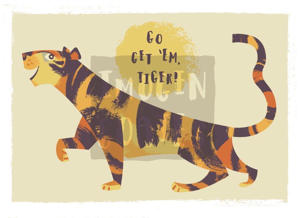
I’ve been test printing work at home to see how my digital illustrations look in full-colour. I made a new tiger illustration, which just so happens to be the Lunar New Year animal of 2022.
As I want to experiment with digital painting, this may be the last vectored illustration I make for some time unless I invest in the programs for it. I’m exited to learn digital painting, however. I’ll have more freedom in regards to texture and line.
Some of my work has been saved as pdfs for future printing as postcards or greeting cards; I’m very happy with these motivational tiger! I also made a birthday tiger graphic (with alternate text).
I still have a lot to learn in regards to typography, but it’s fun to experiment with different typefaces, and learn as I go. I suppose when I make future greeting cards, I’ll be revising my understanding.
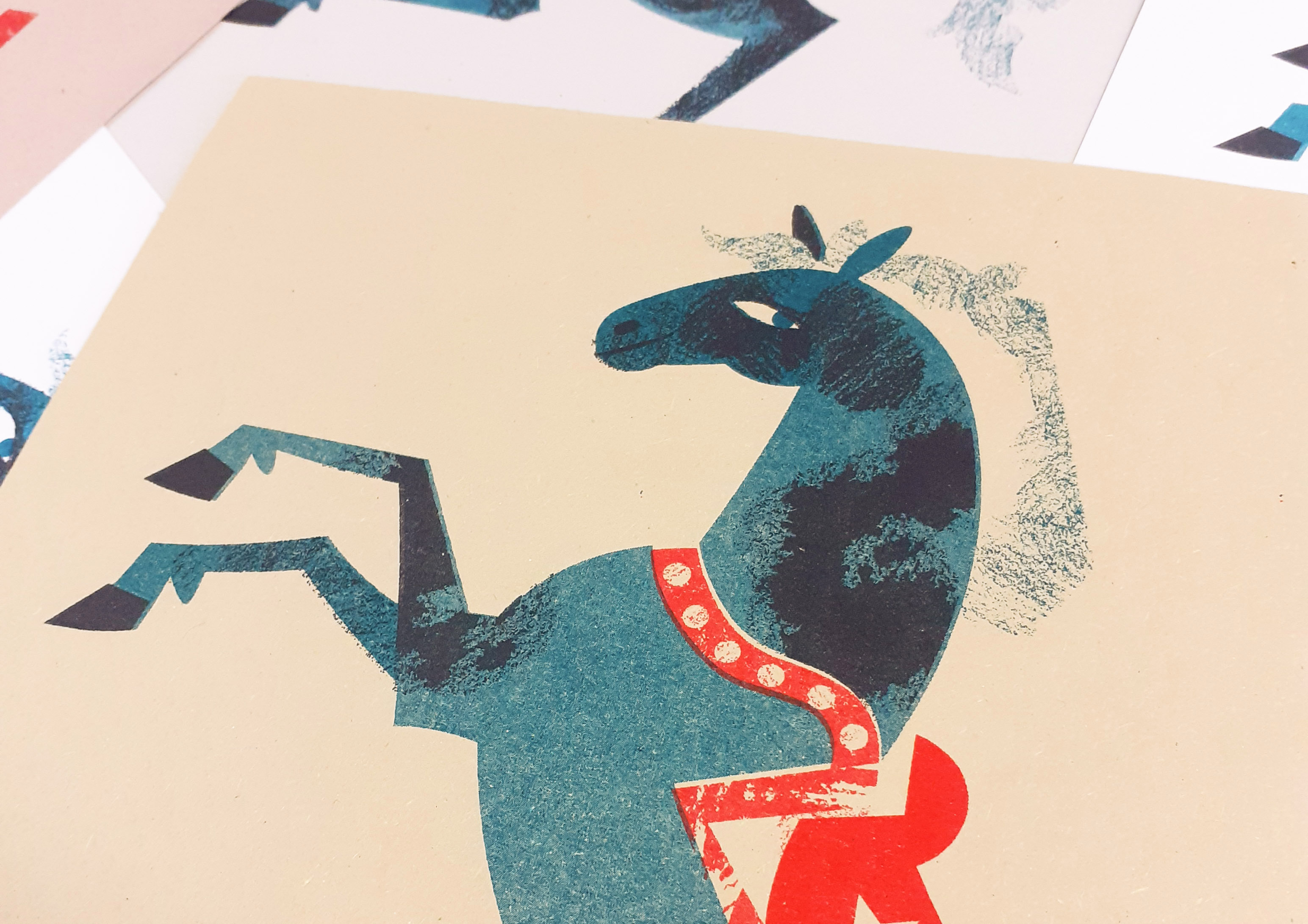
I tore into an old Illustrator file and took it apart to experiment more in Risograph printing before winter break. I chose to revisit the circus horse that I vectored much earlier in the year. Separating the layers and simplifying the image was a little bit of a pain, since I made the original image with no intent to print it as a Risograph. But the outcome is something that I’m very happy with!
Riso circus horse!!
I had planned for the illustration to use four inks, and I would have liked them to have been black, teal, red, and yellow. The yellow ink would have been used for detail on the blanket and to add texture to the background. However, I wasn’t happy with the results, so I cut that colour out all together. I think the three colours used here work together well.
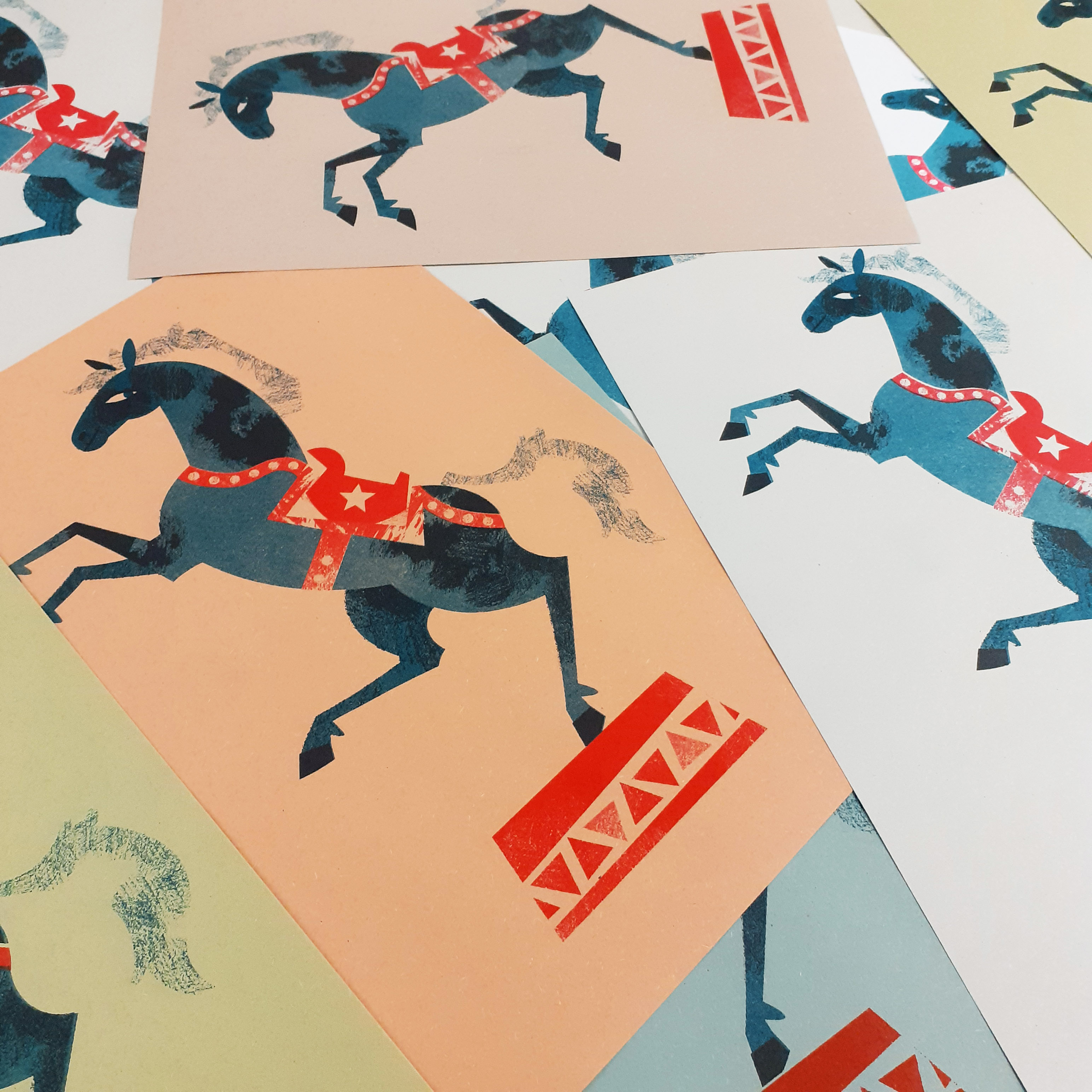
The majority of the horses are printed on different coloured sugar paper. Some are printed on white card. I would like to look into printing the illustration on card of different colours in the future. I might even be able to include the fourth colour if I can tweak the original image enough, but I don’t consider it a necessity for the image to work anymore.
Horses on different coloured papers
Thinking about it, I would like to try printing grey horses, with dappled fur either using black or teal for the detail. Really, there’s nothing stopping me from printing fluro pink horses other than my own sensibilities.
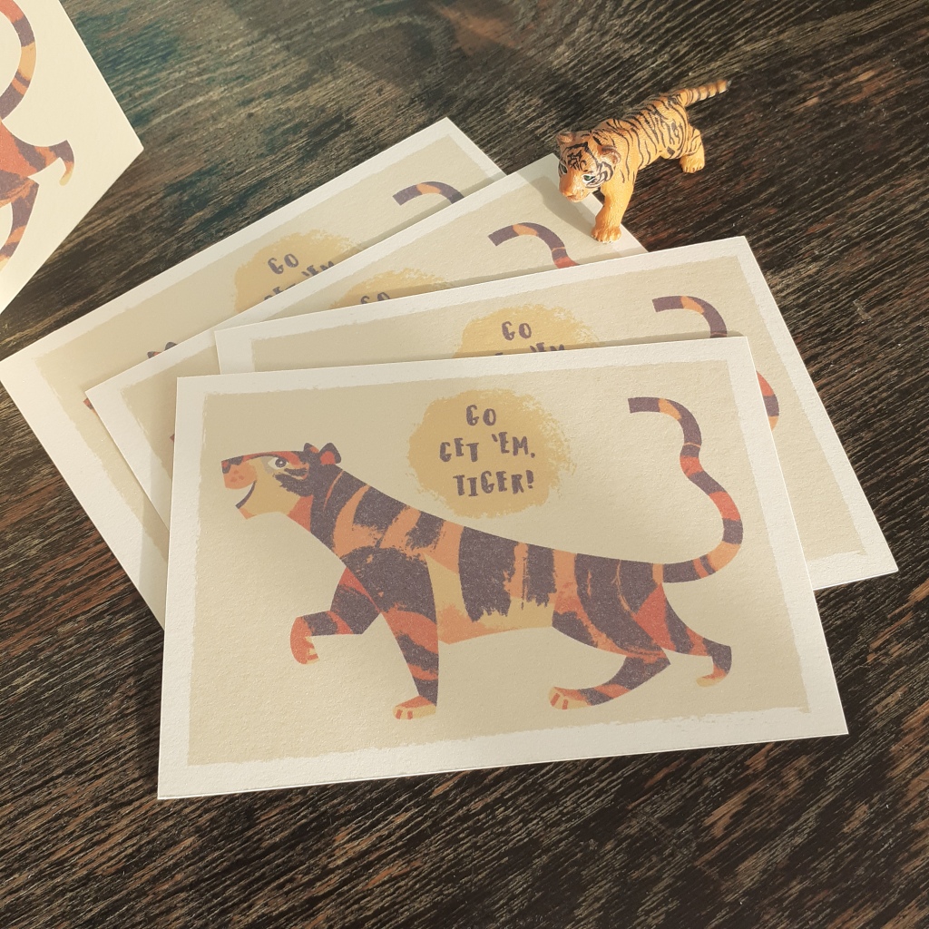
I tidied up the tiger assets I already had for a mini print
After cleaning up the tiger illustration I had practiced Riso prating with, I made the graphic into an A5 mini print and then printed the same image onto card to make B5 greeting cards. It’s just experimentation, but I’ve learned a lot thus far. I’d like to make some illustrations from scratch with the intent of printing them this way – it’ll streamline the whole process.
A little update to the personal stationery project I’d started quite some time ago. I’ve had access to print some trial sticker sheets and gave Risograph printing another go after a long absence. It was exiting! Next time I share some printed works I’ll go further in-depth with each method used. I didn’t record every step of either of the printing processes, but I’ve made a note to do so for the next round.
Risograph Printing
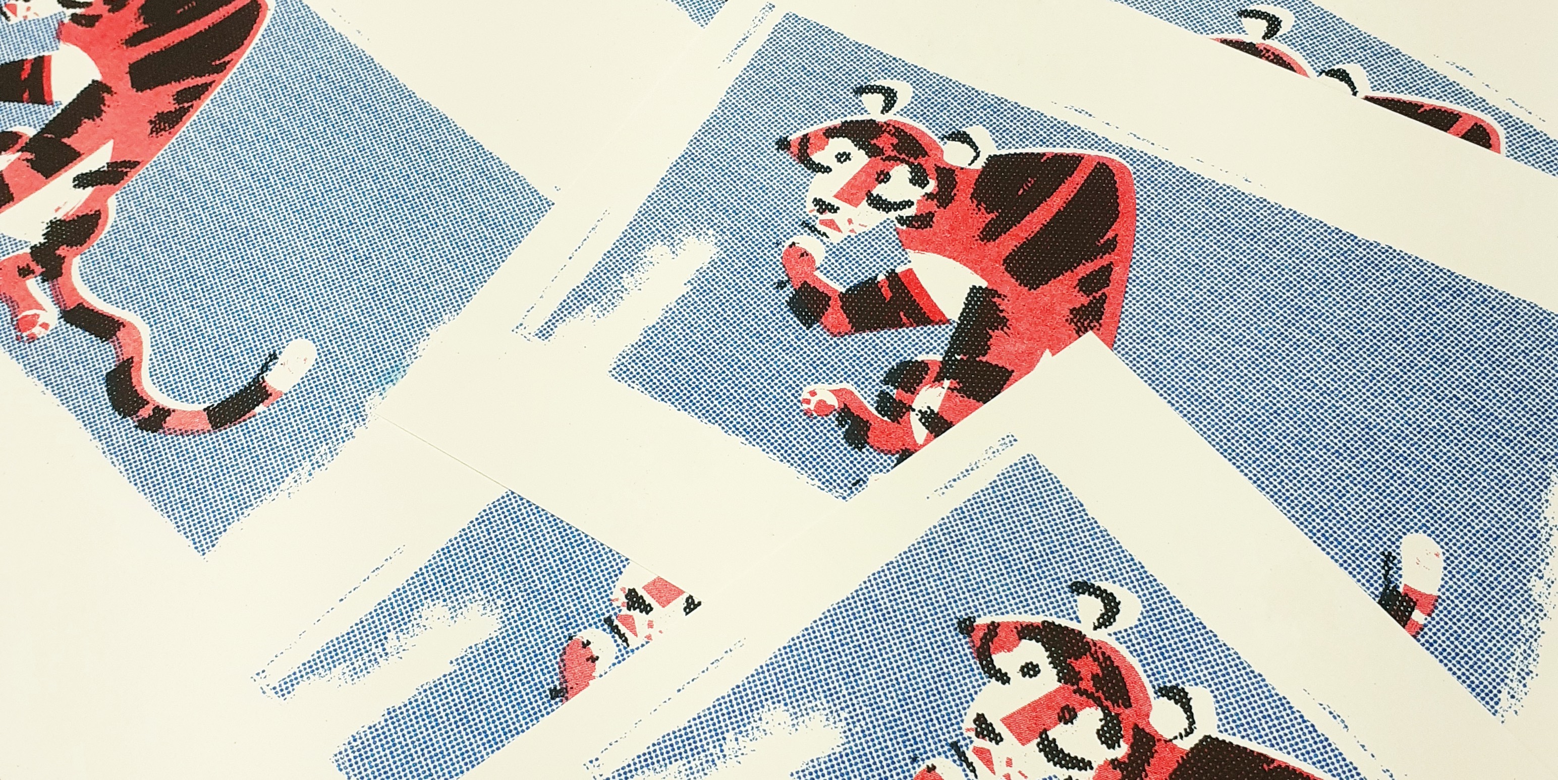
It had been… a veeeery long time since I had made anything with a Risograph printer. I’ve posted some Riso work here before. But I need to get back to grips with the machine. I printed some simple note cards using only 3 inks; red, blue, and black. So including the card or paper colour, the card’s design uses 4 colours – never mind that black isn’t really a colour.
Risograph print note cards
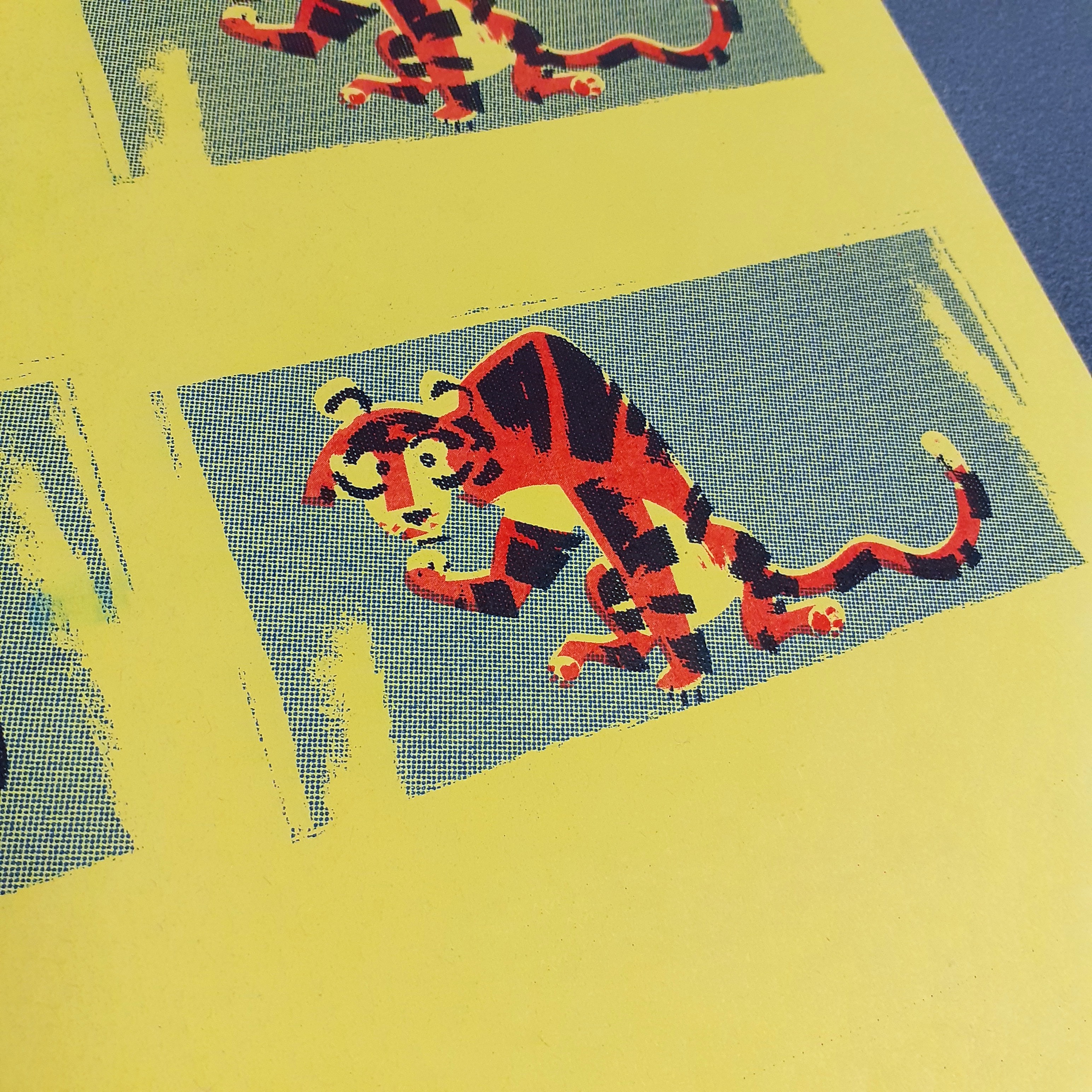
Even though I made these rather impulsively, with assets already on-hand, I found separating the layers of the tiger graphic simple enough. Though the graphic was not designed with the intent of Riso printing, the elements of the illustration were grouped sensibly which streamlined the whole process.
Here’s also where I want to say that the mid-century design sensibilities of some of the illustrations I’ve made recently really lend themselves to this printing aesthetic.
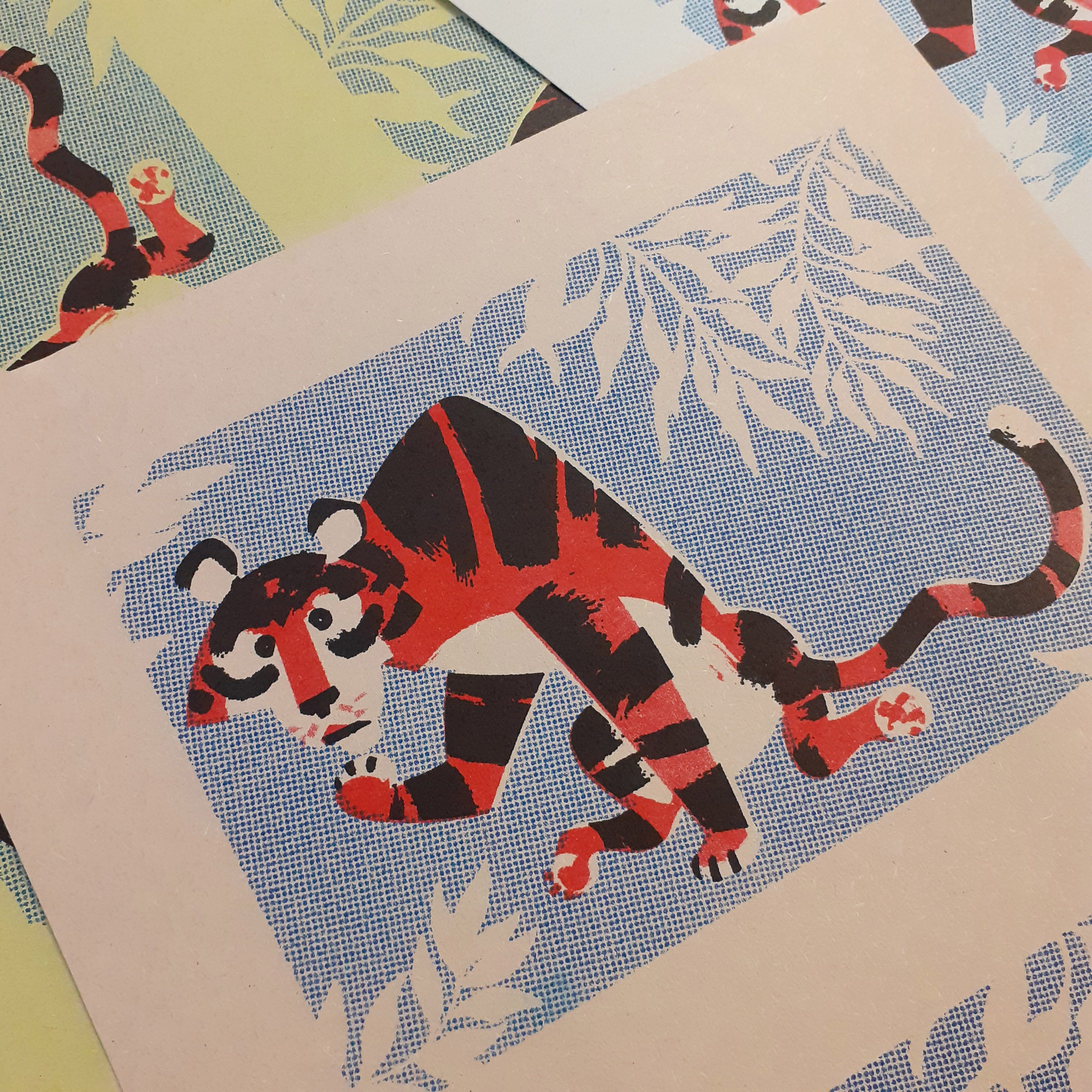
Risograph tigers
I think the tiger turned out very cute and suites these bold colours. I ensured to knockout the tiger’s body entirely on the blue layer, or else I’d end up with purple as the two inks overlap. I used half-tones on the blue layer and black layer as too much solid colour can result in track marks (ink streaks resembling an automobile’s tyre tracks).
Sticker Printing
There are a few different sticker paper qualities that I can use; glossy, matt, and transparent. I intend to try out all three different types of paper, and get a better idea of what qualities suit the different visual styles of sticker designs.
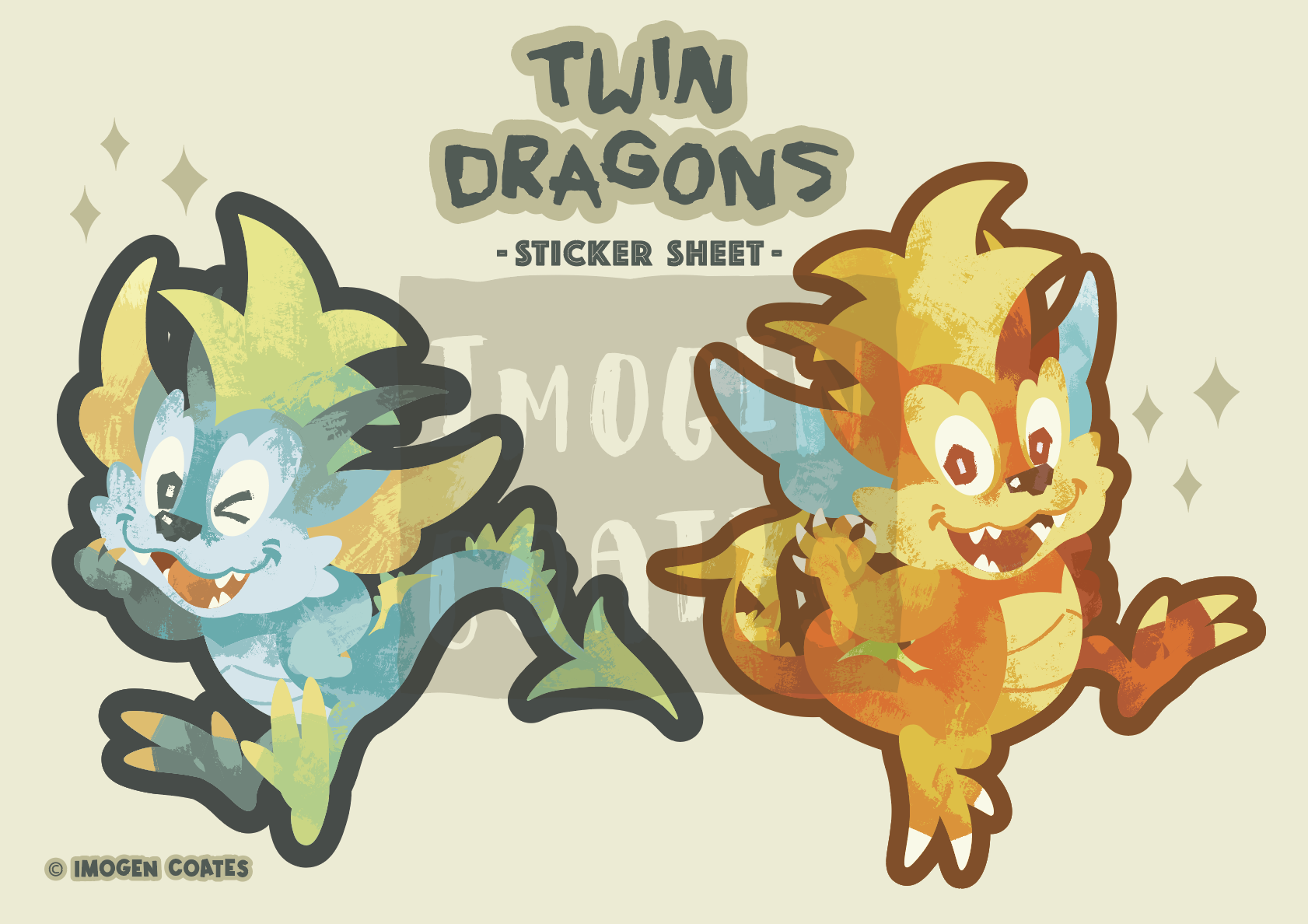
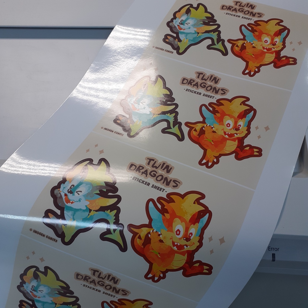
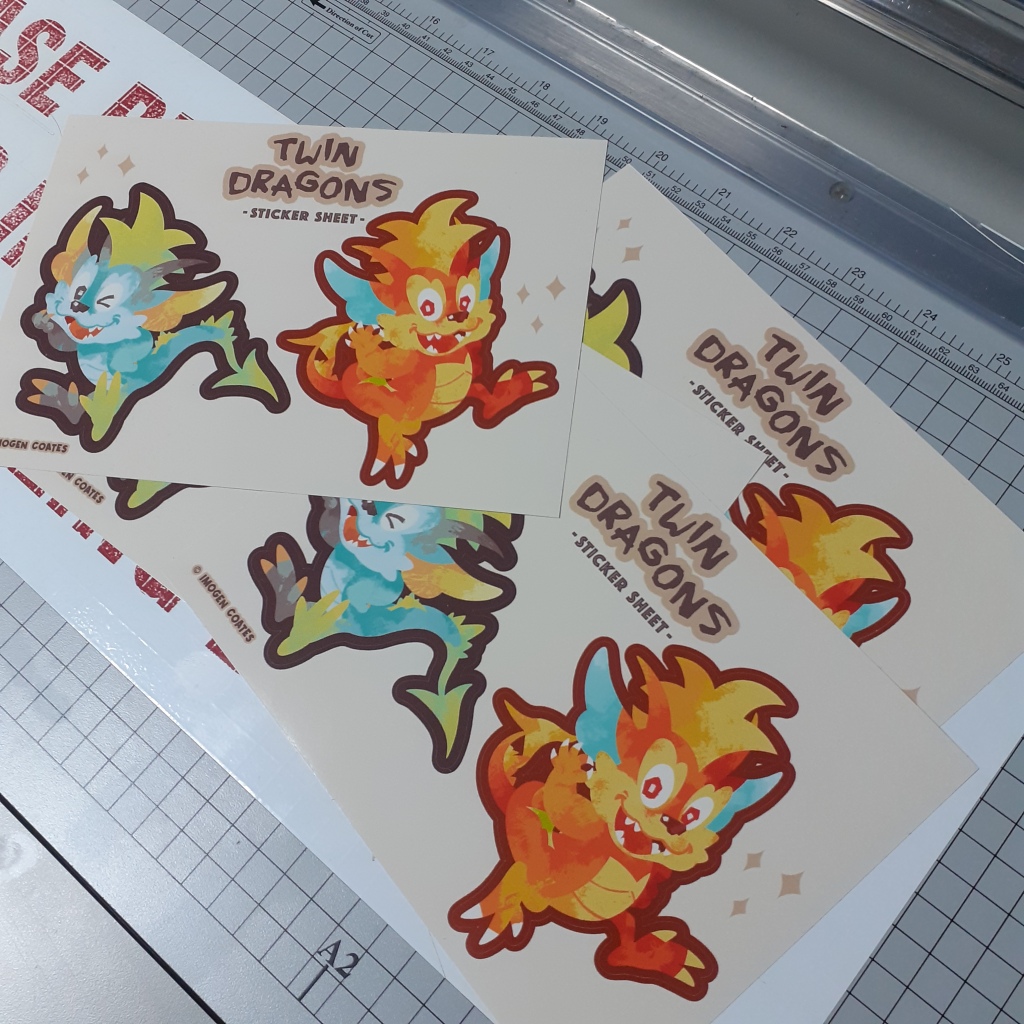
B5 sticker sheet featuring two large dragons
Below are some dragon sticker sheets; before and after being separated and trimmed with the guillotine. They’re printed on white, glossy paper.
There were a couple of tiny cutting errors on this sheet. But it’s a trial run, so I’m able to sort out any mishaps (big or small) after seeing these printed physically.
Though I didn’t take photographs of the process of arranging the assets for print, next time I’ll take screenshots to show the steps taken to print these. I’ll be printing on different types of sticker paper, so when I share them, I’ll mention the quality and characteristics in-depth as I compare them.
Well, that’s it until next time! I’m learning a lot as I go, but it feels good to have some physical copies of digital pieces to hold at last! There will always be some sort of discrepancy in colour when printing digital pieces as printers can’t always reproduce colours accurately. (Some colours just aren’t ‘printer-safe’.) I look forward to more printing and experimentation with Riso!