Since any significant travel has been restricted for months, I’ve tired to satiate the desire for exploration by traversing the local woodland and such. It’s a solitary activity, and thus I’ve much time to think to myself. I thought about how much overseas traveling there is to look forward to in the future once such movement is safe.
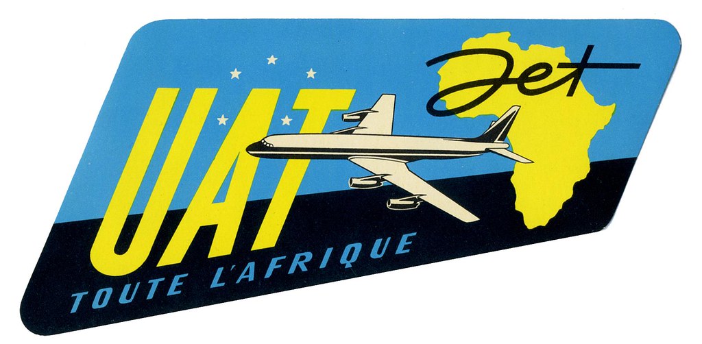
When I looked through my last passport, I found very few ink stamps on the pages despite how much I had traveled with it. A lot of the documentation of our travel these days is digital. Long gone is the era of travel ephemera such as luggage labels; the kind that airlines and hotels used to slap on vacationer’s suitcases. Never have I seen luggage labels in person. But exposure to them in vintage cartoons and film leaves me with a romantic impression of them. (And perhaps, a romantic impression of travelling itself.)
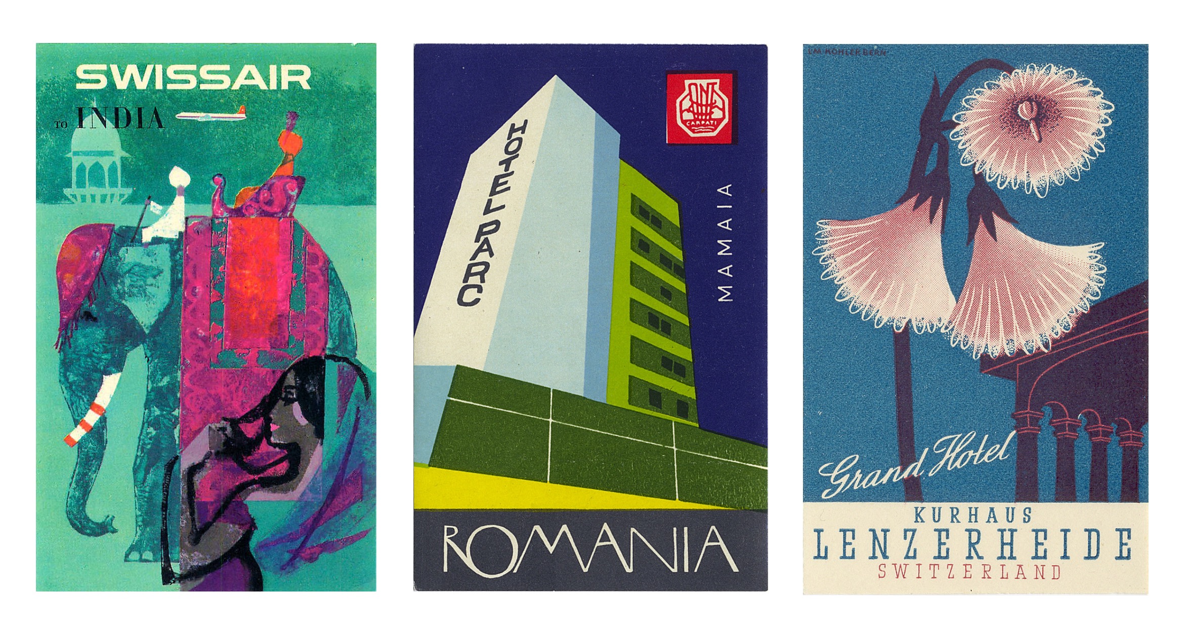
In searching for these specific paper ephemera, I ran across the flikr account of Tom Schifanella, Art of the Luggage Label. All of the images I have shared here are sourced from Tom Schifanella’s account, and so I encourage you to browse through the albums if any of these designs pique your interest.
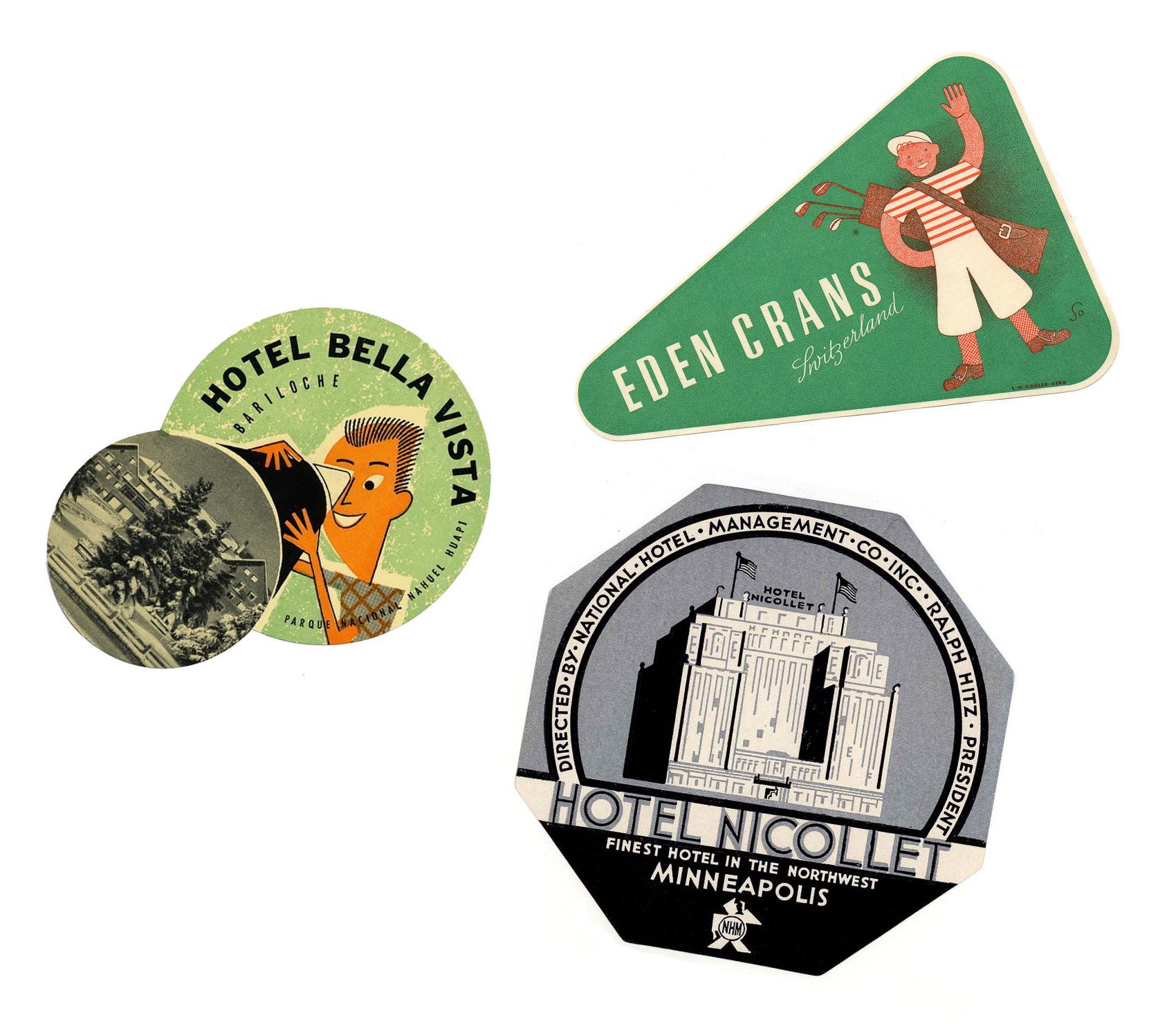
I want to share a few labels that stood out to me for one reason or another, even labels that I don’t feel affinity for – because it’s still possible to appreciate and understand the thought and concept of the designs.
Location-Centric Illustration
The following couple of labels are minimalist depictions of Italian holiday destinations surrounded by water. I like these designs for their limited use of colour; while the design for Hotel Capri uses three colours in total, the Grand Hotel in Lake Como uses four. The bold, sans-serif typeface helps the text read on the small scale that these images would be printed.
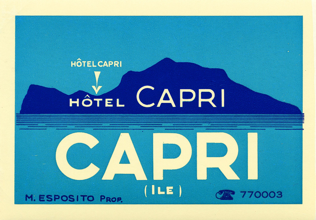
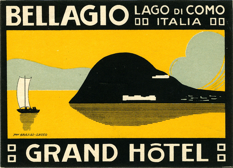
Despite my attraction to these illustrations for their deceptively simple designs, the corporate illustrations of luggage labels are not all subject to strict restrictions of colour or texture.
Typography-Focused Design
These French hotel luggage labels are almost excessively ornate. While the highly-detailed graphic direction doesn’t appeal to me personally, these designs communicate clearly feelings of grandeur and wealth.
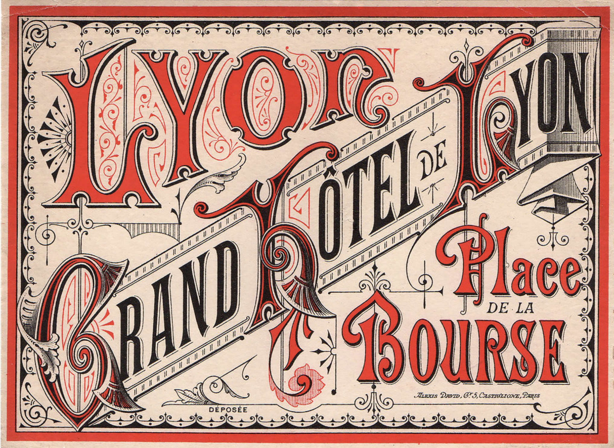
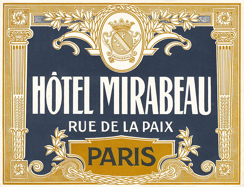
These decadent visuals aren’t ubiquitous today as this visual direction isn’t always practical or very suited for many modern services and goods, thus the old-school draftsmanship skills used to create these are not so freely taught or learned to students of design today.
Swiss Style
These circular labels are all happen to be advertisements for hotels in Switzerland. They’re all functioning on a limited colour palette, too.
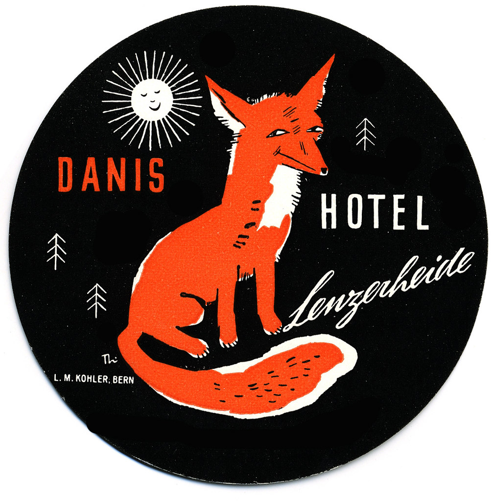
This illustration brings up feelings of outdoor activities and exploration in the mountains. The stylisation is nostalgic to European children’s books from childhood.
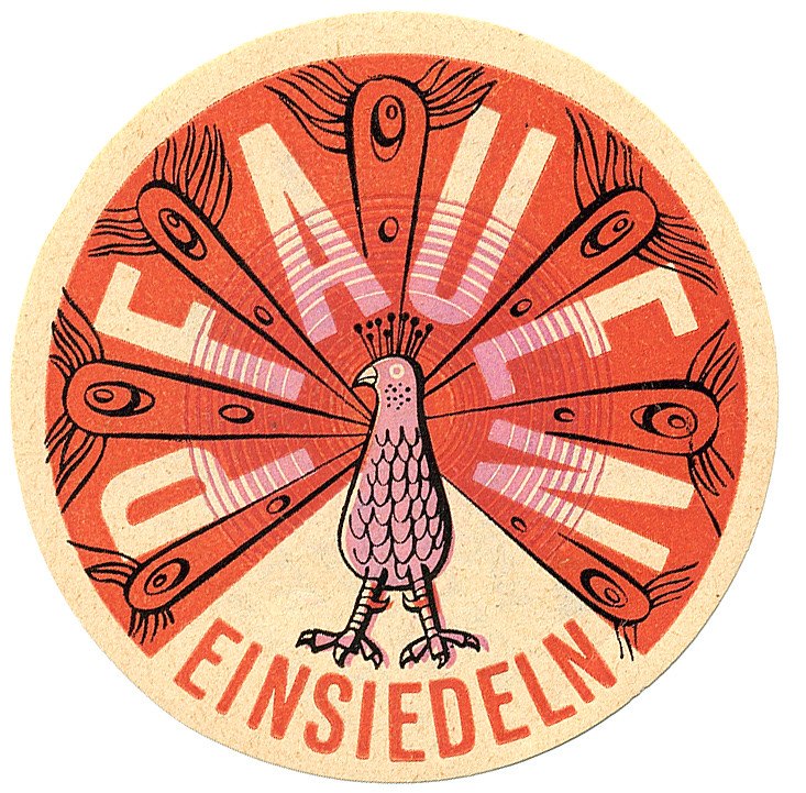
‘Pfauen’ here means peacock, and peacocks bring to mind elegance and beauty. This design takes advantage of the circle shape with a clean, considered illustration. The registration of the pink ink looks to be off, but it also lends this piece more character.
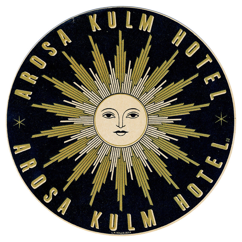
While this graphic doesn’t immediately communicate to me traditional ‘hotel’, I can feel a connection to mountainside spas where one can enjoy the closeness of nature. I can’t help but think of The Sun tarot card when looking at this…? The design does interest me, and makes me wonder what the hotel attached to this sticker was like.
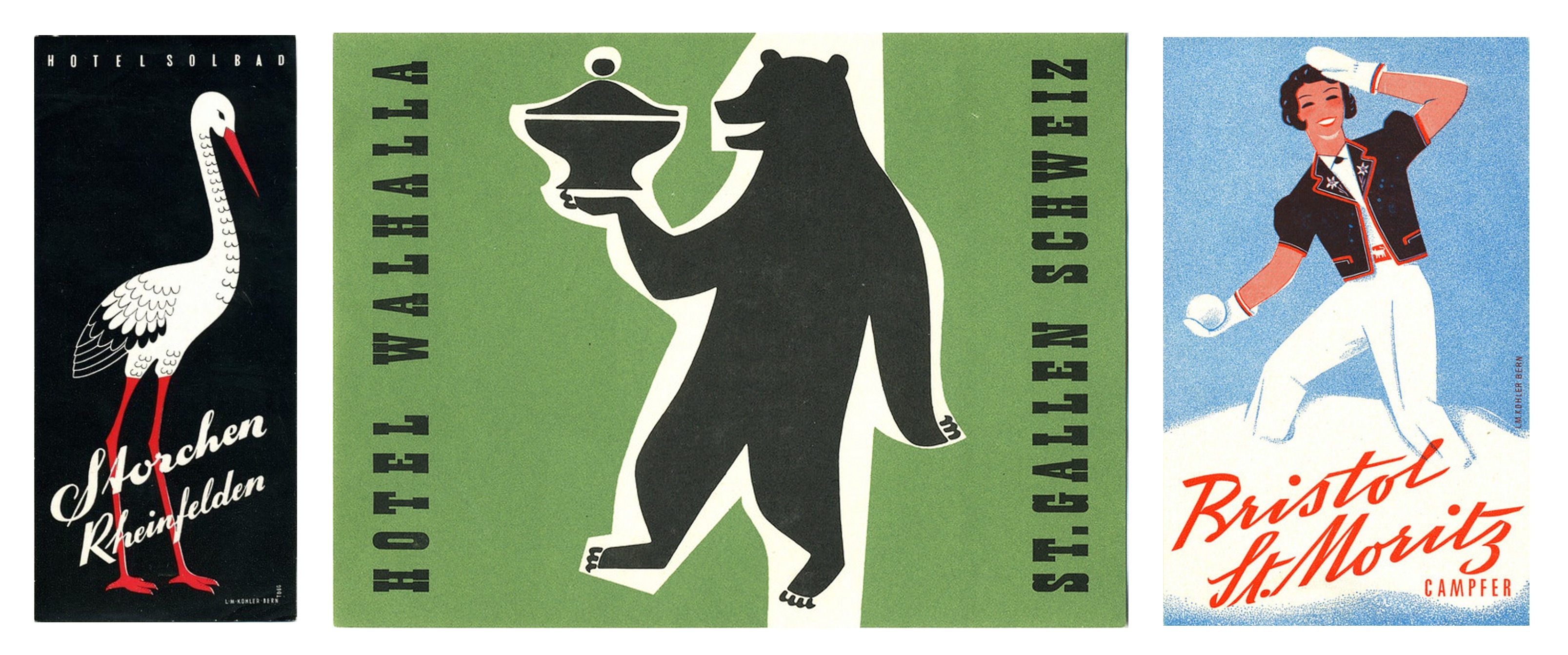
There is so much variety in these miniature illustrations, it’s a little overwhelming tying to take them all in at once – they’re in competition with each other, after all!
A number of these label illustrations are a shock as I would not have even contemplated some of the colour combinations employed, and yet I enjoy them. Other designers have made considerate use of black and I also consider that bold and brave – I’m always wary of how absolute and black is and its power to overwhelm an image. So, in reflection, I realise I can be more adventurous when illustrating in the future.
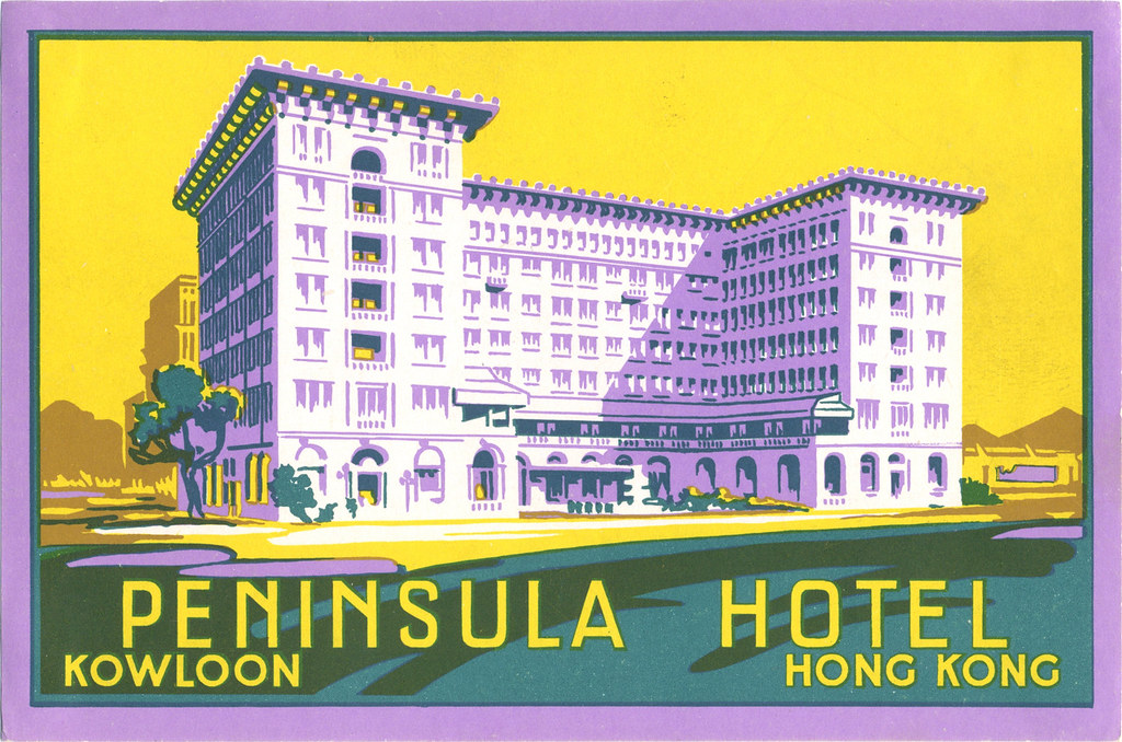
While it was an impulsive action to seek out these luggage labels, it was rewarding. I found a whole world of corporate design I knew next to nothing about. There’s definitely a lot to pull from if you’re looking to find inspiration from past eras. But in imitating past design it’s important to think about why you want your work to be informed by older works, and if it really does communicate what you want.
Think about why these illustrations have been saved and are still appreciated now – many able to outlive the services they promoted. A lot of thought and heart went into these labels to ensure their impressions stuck!
