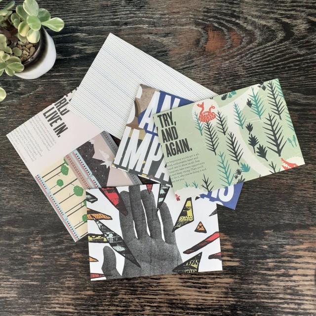
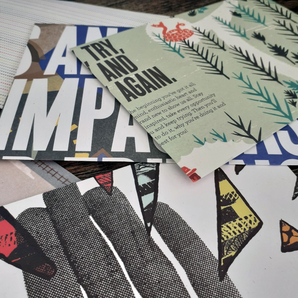
Once again I turn to some outdated printed media to craft some envelopes. They’re for personal use, so I doesn’t matter what the end result looks like. They fair fine enough in the post. I used a copy of YCN Student Annual 2010/2011. As the name implies, it’s a book full of graphic design work by students.
These aren’t a standard size envelope, but they fit A5 paper folded in half. And that’s good enough for my personal correspondence needs.
Using these makes snail mail quite a lot more fun and personable than it already is.
I hope to share some more of the specific art and design books that reside on my bookshelf in the near future. I’m reading a few essays that are not directly related to design, but I may find myself sharing such media here, too. Sometimes it’s good to read outside of your interests and you may find yourself some nugget of wisdom that’d otherwise go overlooked.
A little update to the personal stationery project I’d started quite some time ago. I’ve had access to print some trial sticker sheets and gave Risograph printing another go after a long absence. It was exiting! Next time I share some printed works I’ll go further in-depth with each method used. I didn’t record every step of either of the printing processes, but I’ve made a note to do so for the next round.
Risograph Printing
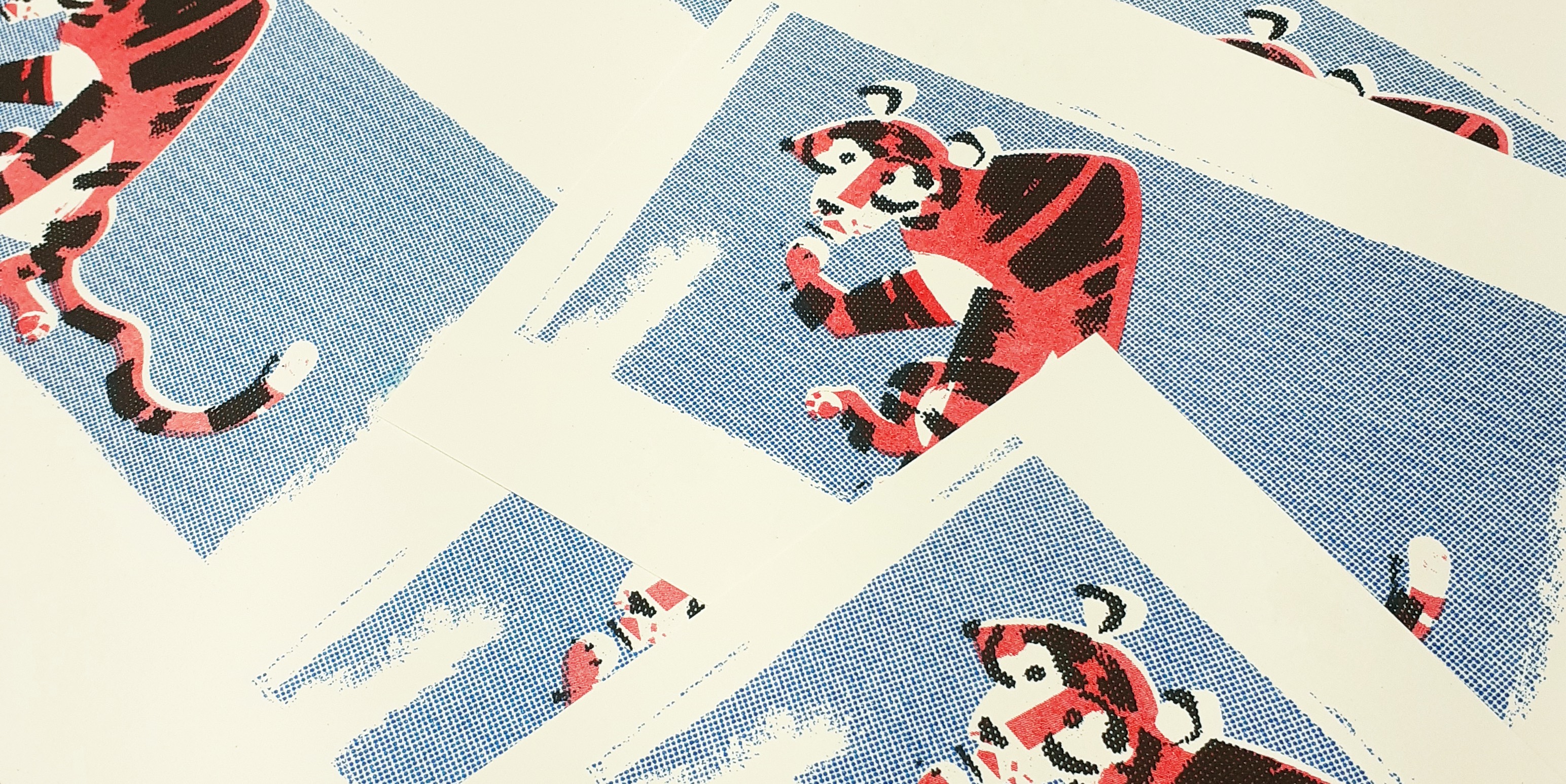
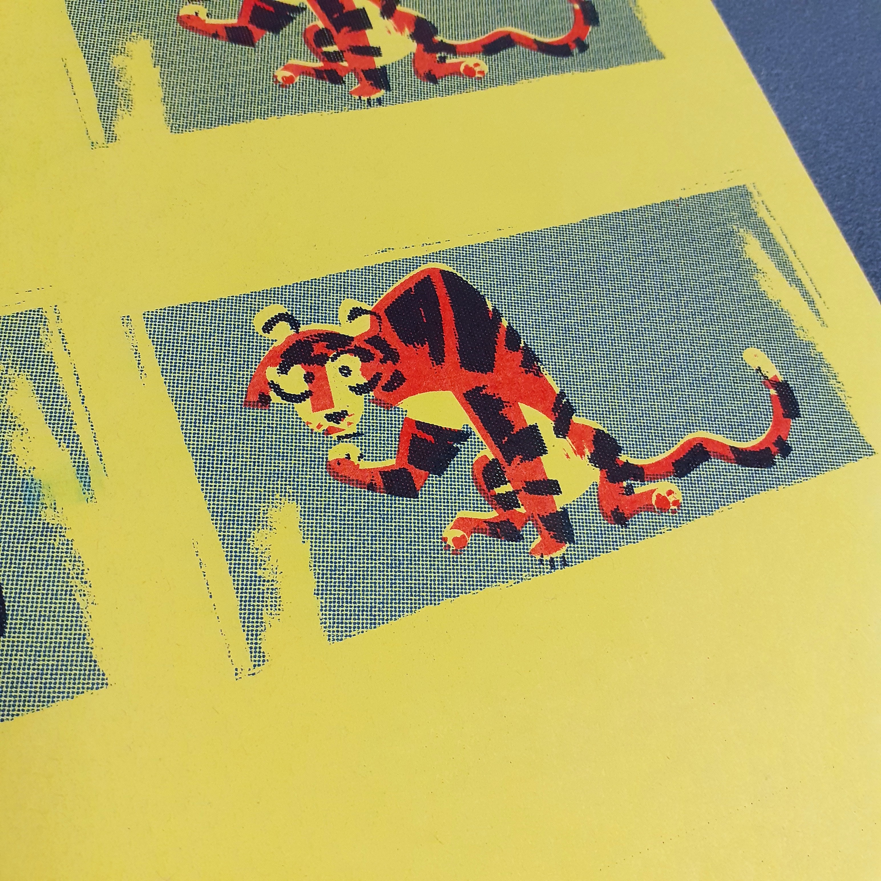
It had been… a veeeery long time since I had made anything with a Risograph printer. I’ve posted some Riso work here before. But I need to get back to grips with the machine. I printed some simple note cards using only 3 inks; red, blue, and black. So including the card or paper colour, the card’s design uses 4 colours – never mind that black isn’t really a colour.
Risograph print note cards
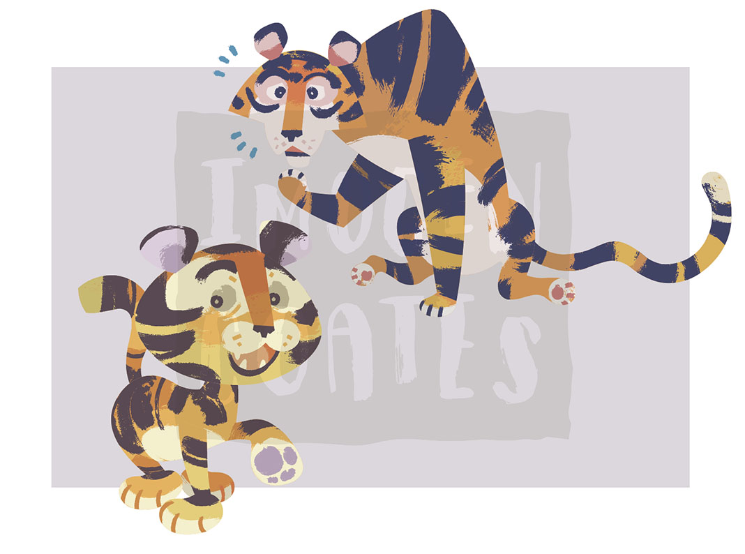
Even though I made these rather impulsively, with assets already on-hand, I found separating the layers of the tiger graphic simple enough. Though the graphic was not designed with the intent of Riso printing, the elements of the illustration were grouped sensibly which streamlined the whole process.
Here’s also where I want to say that the mid-century design sensibilities of some of the illustrations I’ve made recently really lend themselves to this printing aesthetic.
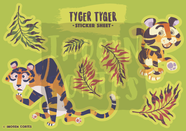
Risograph tigers
I think the tiger turned out very cute and suites these bold colours. I ensured to knockout the tiger’s body entirely on the blue layer, or else I’d end up with purple as the two inks overlap. I used half-tones on the blue layer and black layer as too much solid colour can result in track marks (ink streaks resembling an automobile’s tyre tracks).
Sticker Printing
There are a few different sticker paper qualities that I can use; glossy, matt, and transparent. I intend to try out all three different types of paper, and get a better idea of what qualities suit the different visual styles of sticker designs.
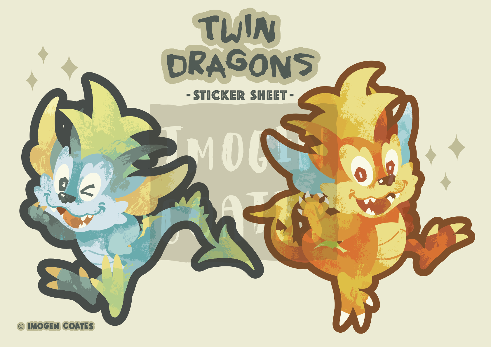
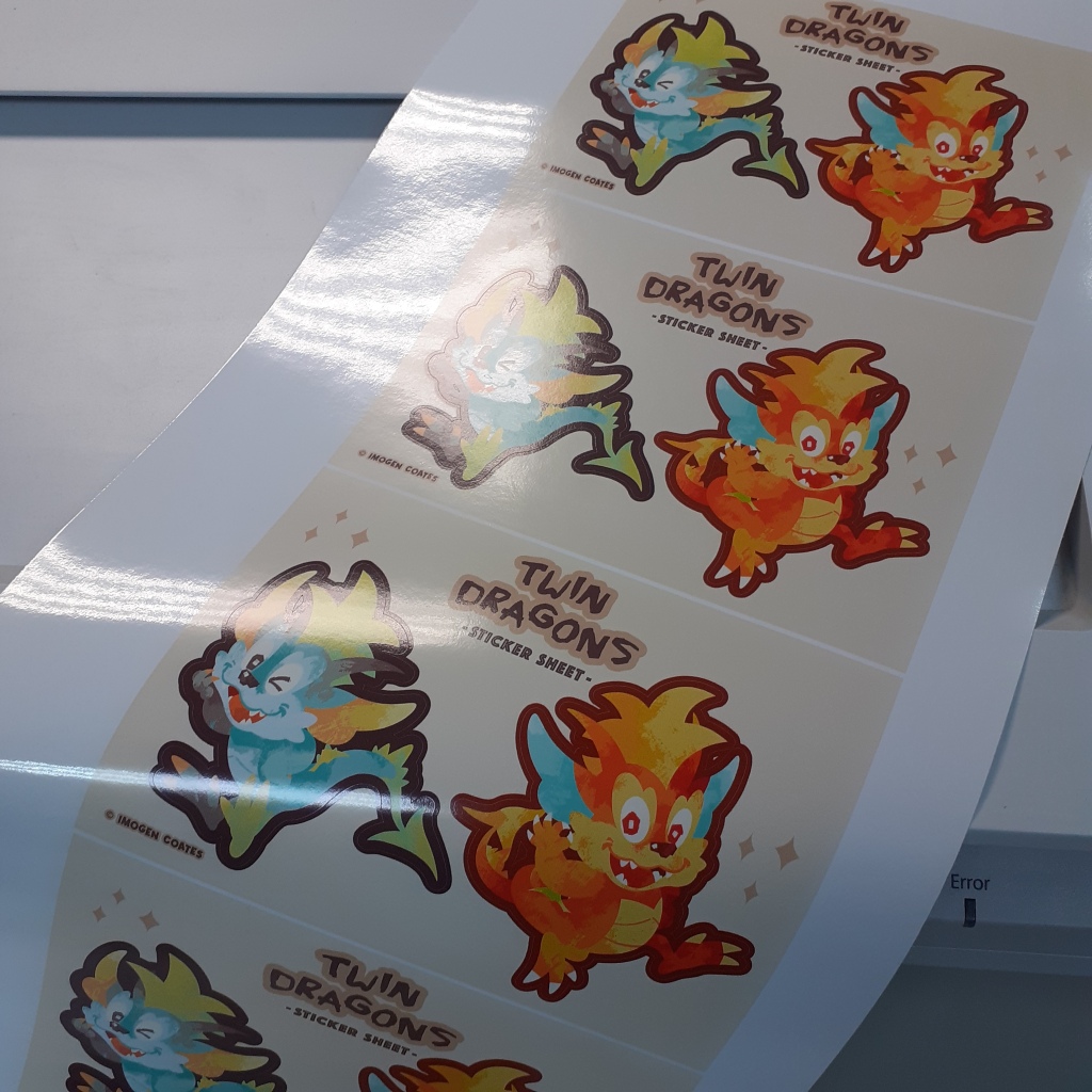
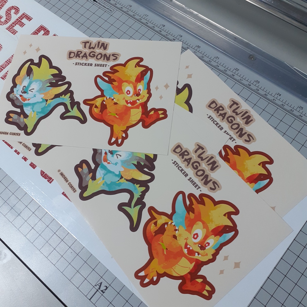
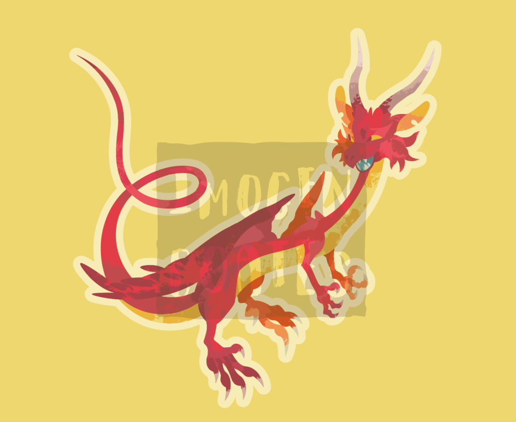
B5 sticker sheet featuring two large dragons
Below are some dragon sticker sheets; before and after being separated and trimmed with the guillotine. They’re printed on white, glossy paper.
There were a couple of tiny cutting errors on this sheet. But it’s a trial run, so I’m able to sort out any mishaps (big or small) after seeing these printed physically.
Though I didn’t take photographs of the process of arranging the assets for print, next time I’ll take screenshots to show the steps taken to print these. I’ll be printing on different types of sticker paper, so when I share them, I’ll mention the quality and characteristics in-depth as I compare them.
Well, that’s it until next time! I’m learning a lot as I go, but it feels good to have some physical copies of digital pieces to hold at last! There will always be some sort of discrepancy in colour when printing digital pieces as printers can’t always reproduce colours accurately. (Some colours just aren’t ‘printer-safe’.) I look forward to more printing and experimentation with Riso!
There are a couple of personal projects that I’ve been slowly chipping away at. It’s difficult to move any faster than I am when most critique is from a small number friends who want to give any, and I’ve been away from academic pressure. I’ve feel like I’ve had a difficult time structuring myself. I don’t have access to all of the tools needed to reach the end of projects, so nothing I’ve done really has a ‘completed’ feeling. I’m going to log some project progress here so that I can better see how much farther I have to go.
Assets from last year that I’ll put to use on stationery
I’ve wanted to make stationery for some time now, I’d like to finalise some of the letter paper designs that I had worked on. I do need more specific critique on those works though. I thought making sticker sheets would be a fun (smaller, and more straight-forward) project.
You may think stickers superfluous, but they can brighten up diaries, notebooks, and workspaces in general. I’d argue that their surface value of being “nice to look at” is good enough.
I have a few assets from digital illustration experimentation in that I’d very much like to put to use, such as these pair of tigers. The current plan for a tiger sticker sheet is simply both of the tigers, with a small selection of leaves. The colours are bold and cheerful.
There are two dragon graphics I made with the intent of printing them as large stickers, rather than part of a sheet of stickers. Personally, I’d like to have some big stickers to place on sketchbooks and such, and I know others would, too.
I don’t want to squander space when printing, so I’d like to add some smaller stickers to avoid such waste. I’d like to add relevant objects such as coins, pearls, or jewel encrusted daggers or staffs – anything that you’d find in a dragon’s hord. But It also depends how competent I am at designing them!
I know the compact design of the first dragon graphic is much less fussy than the second. I anticipate the red dragon may be a little more difficult to peel and stick place. I don’t have any plans to adjust the design however. I’d like to see how practical it is once printed.
To help remedy some creative blocks I mentioned, I do want to support students though the alumni scheme I was offered, and I feel it will help build up confidence weakened though lack of any real meaningful academic discussion and exercises. I’m more than happy to share skills and methods of creativity with students. I hope that I can visit the school campus safely, and even have the access to tools I don’t have. Maybe even make use of the facilities from departments outside of graphic design (such as the textile department). I’ll be printing stickers the first change I get. I look forward to recording the results of trial sticker printing on my blog!
At the tail end of last year I had the idea of making downloadable stationery. I wanted to refine some of my skills in Adobe programs and learn some new ones. I had the idea of making weekly planners and letter paper sets – the latter being something not everyone uses nowadays. Still being on a mid-century illustration high, the designs I worked on have that feel about them. I’m sharing a some of them here.
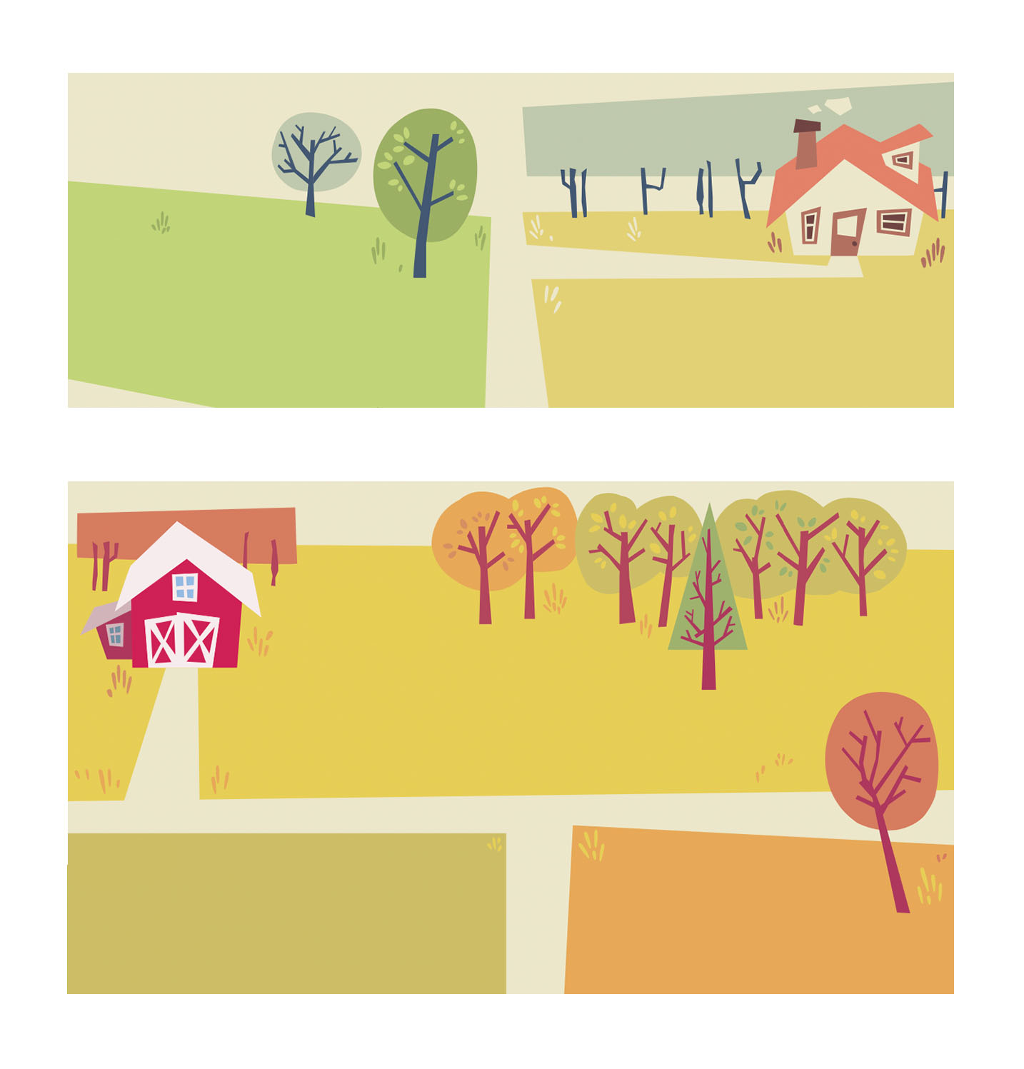
Organisation is key to getting tasks done, so I wanted to make practical stationery to aid those who want to get organised, and benefit from writing tasks down physically. The compositions of the weekly planners are simple enough. I chose to divide a page into seven blocks – for seven days of the week – focusing on a countryside illustration. I made two sheets.
Details from two separate weekly planner illustrations
I think the weekly planner illustrations turned out very friendly. If I remove the text, they look like background assets ready to be part of a fuller, livelier illustration. I enjoyed filling them out with just enough details for interest, but balancing the empty spaces for the use of writing.
I think the composition of letter paper is much more straightforward. I made a lot of pages that were detailed around the corners or edges of the page, while leaving the centre free of distractions.
I don’t think I’ll be using the above template as a writing paper as the stylisation isn’t as playful as the other ideas I had for compositions and subject matter. The target audience for such a niche item is more likely wanting to use designs that are much more stylised and fun. But it’s worth keeping in mind if I want to revisit the composition itself.
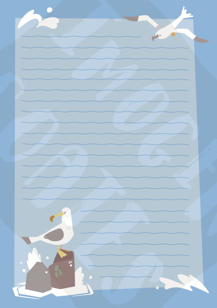
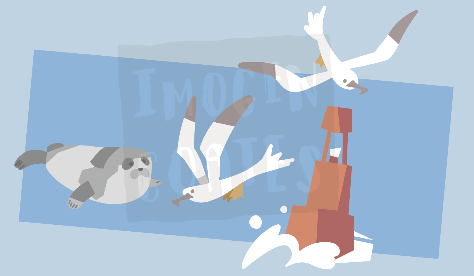
One set of letter paper I wanted to make was nautical – anything to do with ocean life or perhaps boats – so I made a few pages to go together as a set. I think having the nautical paper lined works well to reinforce the ocean waves feeling, but I can of course remove them. I do want to give the option to users to choose unlined paper to write upon.
In making a lot of similar assets for themed writing paper sets I have the choice to recycle some of the assets towards sticker sheets etc.
Ocean friend illustration assets
There are aspects of the digital stationary project that aren’t finished at all – I have some designs that need to be touched up, or pieces that I’m unhappy with. I have yet to decide on where to host or sell PDFs of the stationary. I really enjoyed making these even though I did find it trying at times. I’d say I learned a lot. While writing this up, I realised that I can even make colouring in and activity sheets if I think I can contribute something that isn’t already being provided by other services.
If for some reason I can’t move forward with the idea of downloadable stationary, I can add the designs I made to my portfolio for now. This year, I want to make a lot of things for personal growth and portfolio needs!
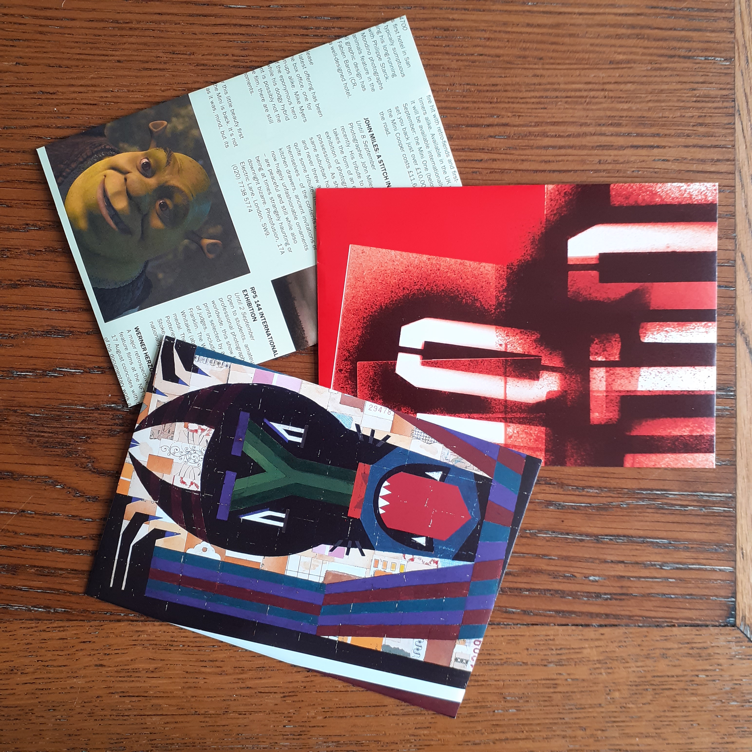
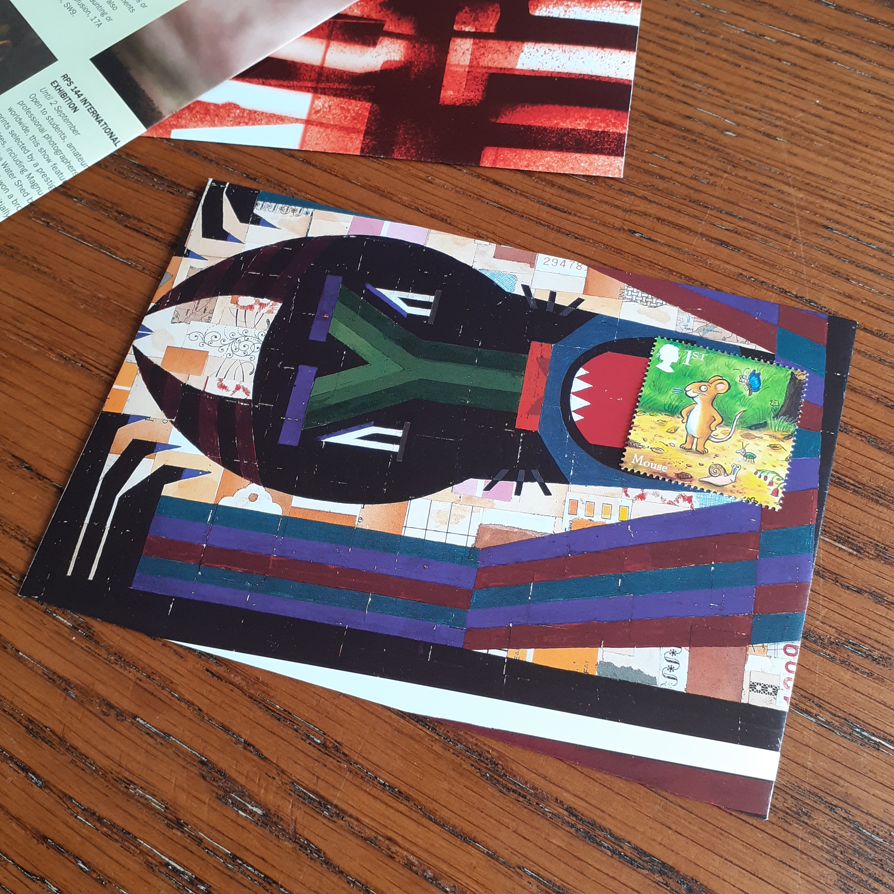
Alongside the desired phone calls or video chats to keep up distance relationships, I’ve found myself both sending and receiving more postcards or letters to keep in contact with loved ones. A few weeks ago I ran out of envelopes to send letters to friends and family, so I decided to up-cycle some paper from around the house to make envelopes. I used an old copy of Creative Review – a commercial creativity and graphic design magazine.
The insides of Creative Review are varied. The magazine covers the current visual trends, notable student graduate work, interviews from designers or creative directors, art exhibitions, the news on the latest popular media (films, video games, etc.).
These C5 envelopes made from a 2001 issue of Creative Review
I was familiar enough with basic envelope nets to bash out some C5 envelopes in a short time. I used a popular culture review page, an art exhibition review, and a printing service advertisement to make radically different envelopes.
As I have already cut up my 2001 copy of Creative Review, here are a few images of the magazine’s insides of another issue (taken from their website). These are page spreads of of a 2018 issue, showing the magazine’s variation of editorial design.
The Place issue: October/ November 2018
The Place issue: October/ November 2018
The Place issue: October/ November 2018
A single page of Creative Review is large enough to make a single C5 envelope, with room to arrange the placement of the net. Part of the fun is figuring what imagery or text would look most exiting on the envelope. Even the advertisements can hold some interesting photos and design!
LICK, LICK
This envelope is my favourite of the three shown here. The placement of the stamp looks as though the ‘design’ is interacting with it. It sparks ideas for illustrated envelopes.
I’ve mentioned my affinity for stationery design (particularly illustration) in the past, and that at some point I’d like to try my hand at designing some letter writing sets. There’s definitely something to be gained from experimenting with the materials (and imagery) that make up mundane objects to generate new excitement in them. I received a positive response to these envelopes when I sent them out to others in the post!
Writing to good friends and close family is something that I enjoy. I always have a reserve of stationery for when the need to write a letter arises. I enjoy discovering uniquely designed (illustrated) stationery, and I hope that those who receive my letters enjoy receiving them as much.
Let’s look at a few stationery items that I hand on-hand, and why I felt the need to invest in them!
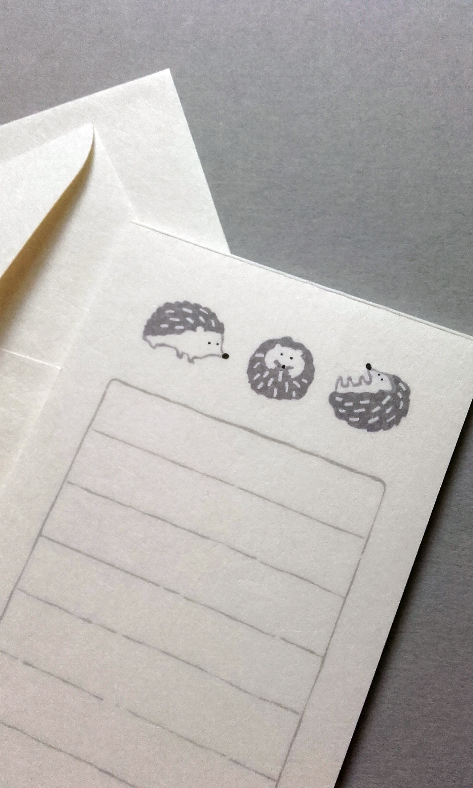
FURUKAWA SHIKO mini stationery, featuring a hedgehog motif.
The attraction to this tiny set of washi letter paper and envelopes, for me, was thee-fold; the hedgehog illustration, the material, and the diminutive size. The envelopes are 120×80mm. Not sure if they’re too small to send in the mail…!! I’ve used them to hand out notes in person.
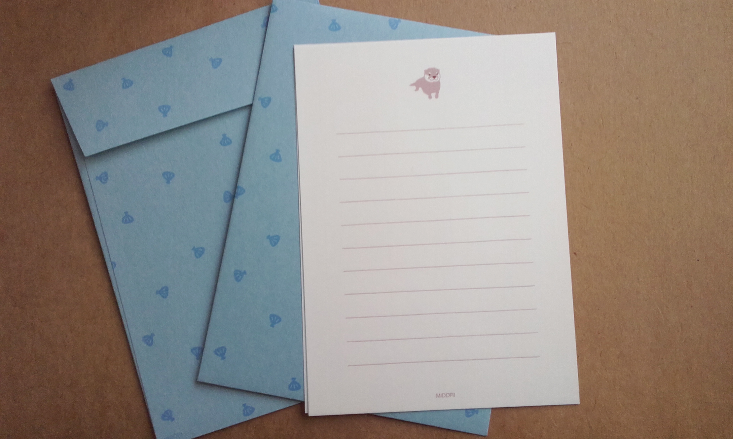
A petite letter set; good for brief letters. This letter set is made of sturdy, shell-patten envelopes (15×11cm) and washi letter paper (14×10cm) with a cute otter caricature at the top of each page. Fuzzy otter stickers are included to seal the envelopes. The simplicity and economic design is what persuaded me to buy these… alongside the cute otters.
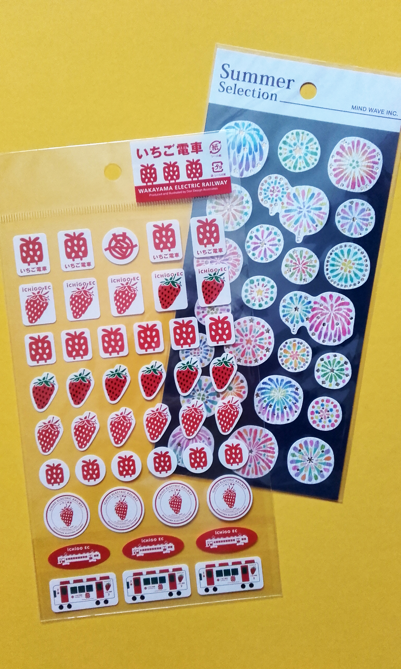
A set of iCHiGO EC stickers, and MIND WAVE Summer Selection (firework) stickers.
Everyone loves stickers, right? Both kids and big kids can enjoy them! Stickers are handy to have on-hand decorate envelopes or plain writing paper.
The Wakayama Electric Railway stickers are exclusive to the iCHiGO EC line – a strawberry-theemed, red and white train boarded with natural wood and wooden furniture. I like how minimal the use of colour is in these strawberry train stickers; most of the stickers are simply red on white. Along with two other themed trains on the Kishigawa Line, iCHiGO EC is a tourist attraction.
Firework (花火, Hanabi) stickers by MIND WAVE. I really like the stylisation of these fireworks. The material is a craft paper, with gold foil finish in places. The characters used to write ‘firework’ are ‘flower’ and ‘fire’ respectively, and you can see in these illustrations that the fireworks do look like flowers.
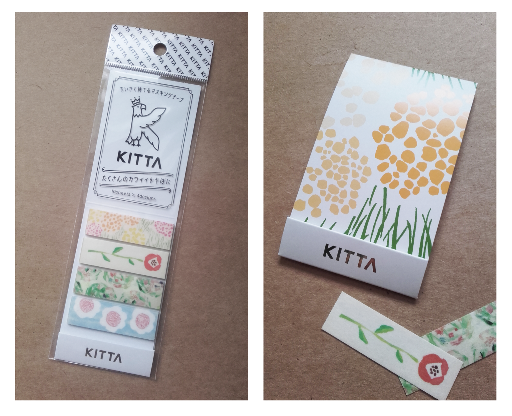
Portable washi tape stickers produced by KITTA.
All of the designs of these stickers are drawn analogue. All of the designs are made on paper with different pencils, markers, paints and such, and then scanned to make washi stickers, which lends the imagery a warm feeling.
The package design itself is neat. The stickers are tear-away strips stuck to a small sheet of card that folds in on itself. The card ‘wallet’ can be tucked away into a pencil case or planner, or wherever else is convenient.
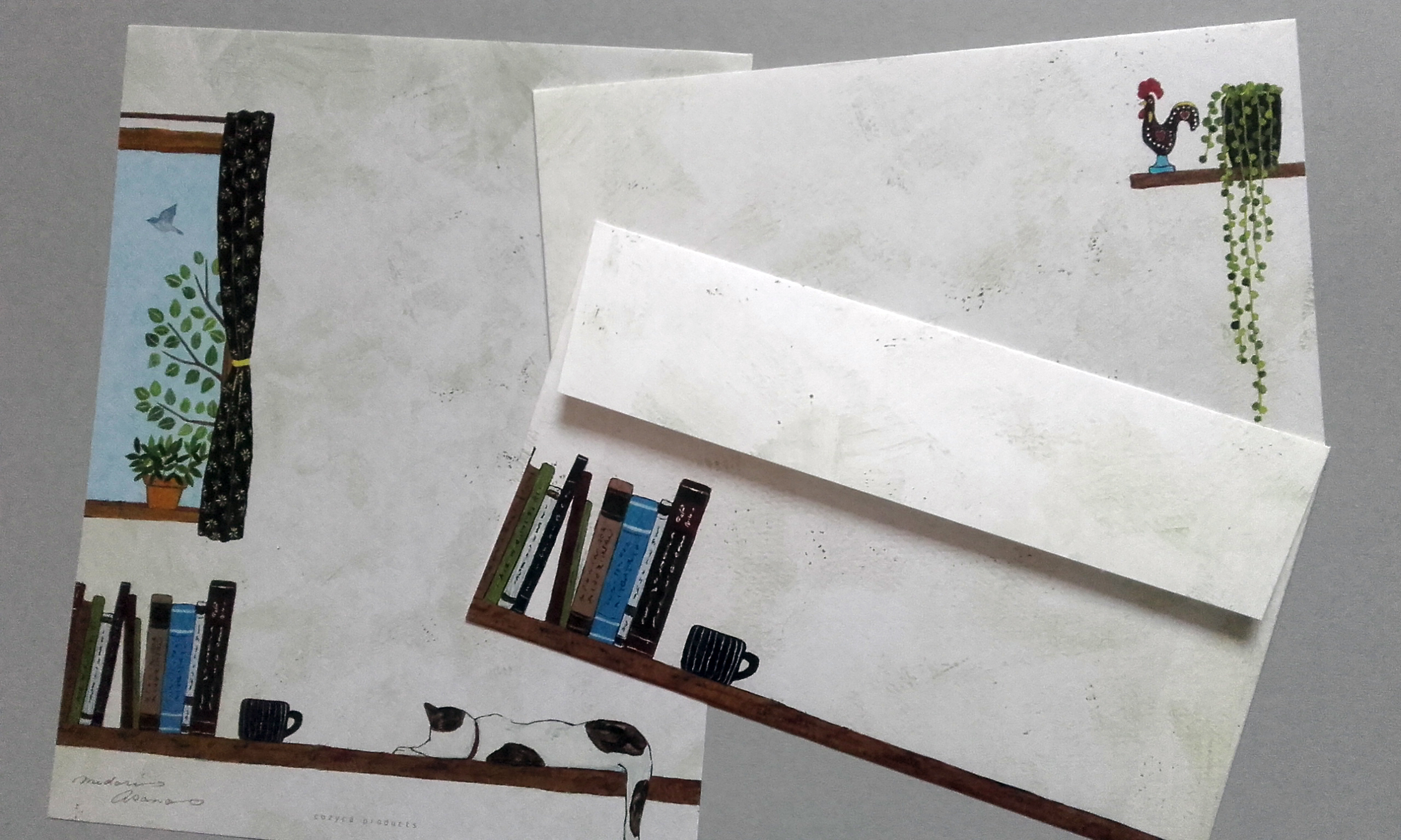
Cozyca Products My Room letter writing set, illustrated by Midori Asano.
I’ve used a number of Cozyca Products’ letter writing sets in the past. The envelopes and paper has always been washi, so they have a translucent element and delicate feel. Coupled with the types of illustrations chosen, the sets always feel mature, sophisticated, and even ‘cozy’.
Cozyca Products have made goods in collaboration with a number of well-established Japanese illustrators. Maybe I should look into writing about them in a future post? There’s certainly a varied range of visual directions.
Have the illustrations – visuals in general – of a product ever persuaded you to invest in it? Or perhaps the convenience or design itself won you over?