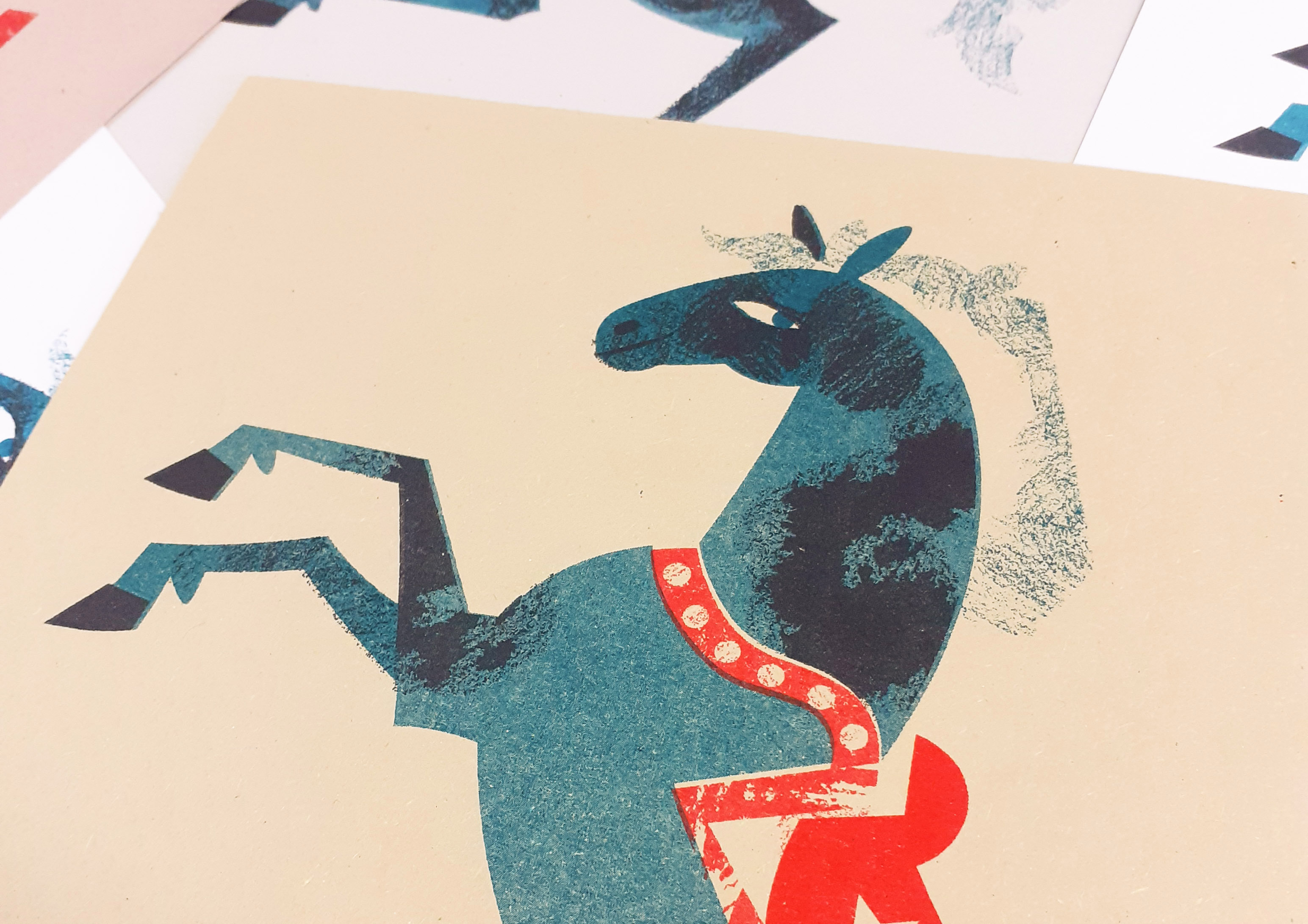
I tore into an old Illustrator file and took it apart to experiment more in Risograph printing before winter break. I chose to revisit the circus horse that I vectored much earlier in the year. Separating the layers and simplifying the image was a little bit of a pain, since I made the original image with no intent to print it as a Risograph. But the outcome is something that I’m very happy with!
Riso circus horse!!
I had planned for the illustration to use four inks, and I would have liked them to have been black, teal, red, and yellow. The yellow ink would have been used for detail on the blanket and to add texture to the background. However, I wasn’t happy with the results, so I cut that colour out all together. I think the three colours used here work together well.
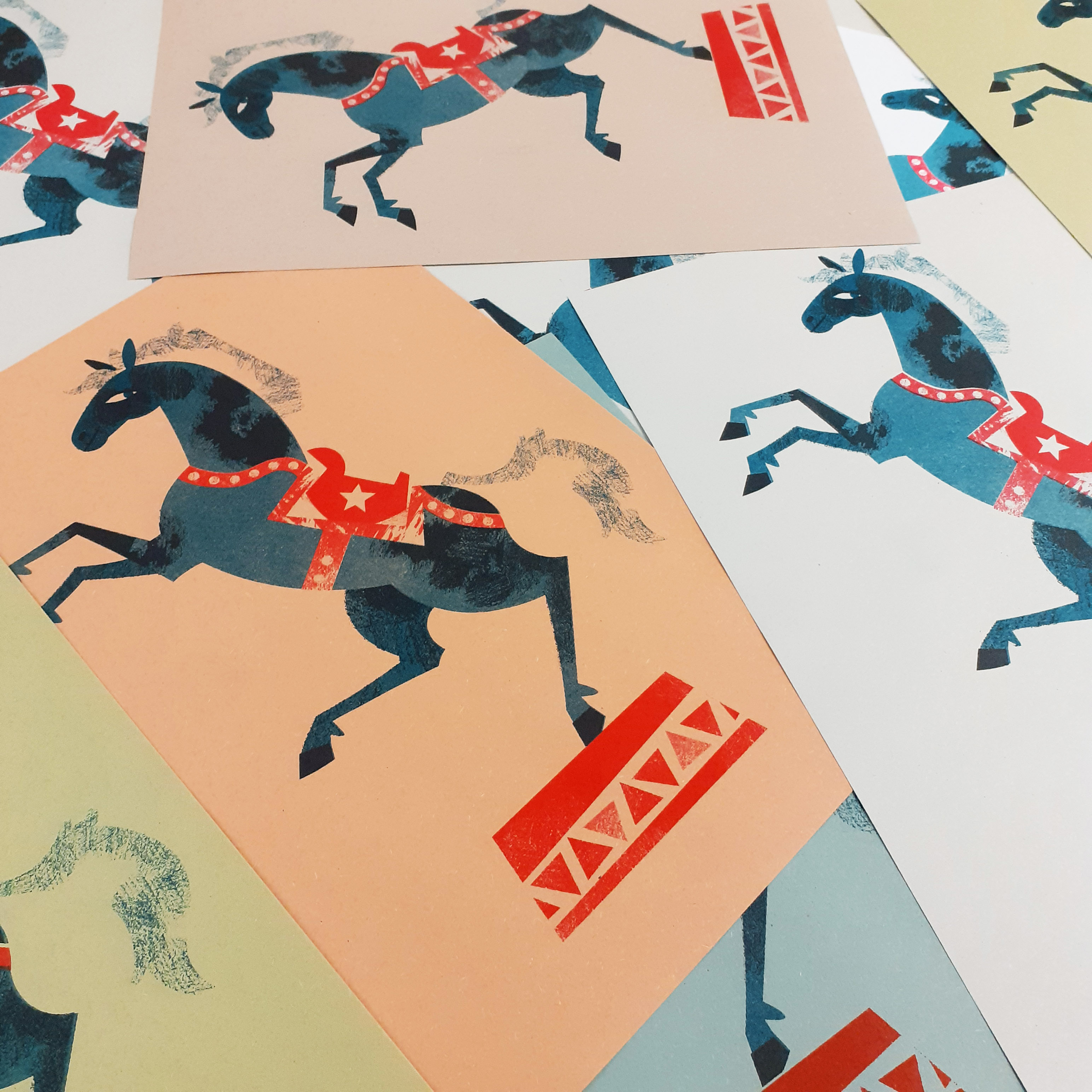
The majority of the horses are printed on different coloured sugar paper. Some are printed on white card. I would like to look into printing the illustration on card of different colours in the future. I might even be able to include the fourth colour if I can tweak the original image enough, but I don’t consider it a necessity for the image to work anymore.
Horses on different coloured papers
Thinking about it, I would like to try printing grey horses, with dappled fur either using black or teal for the detail. Really, there’s nothing stopping me from printing fluro pink horses other than my own sensibilities.
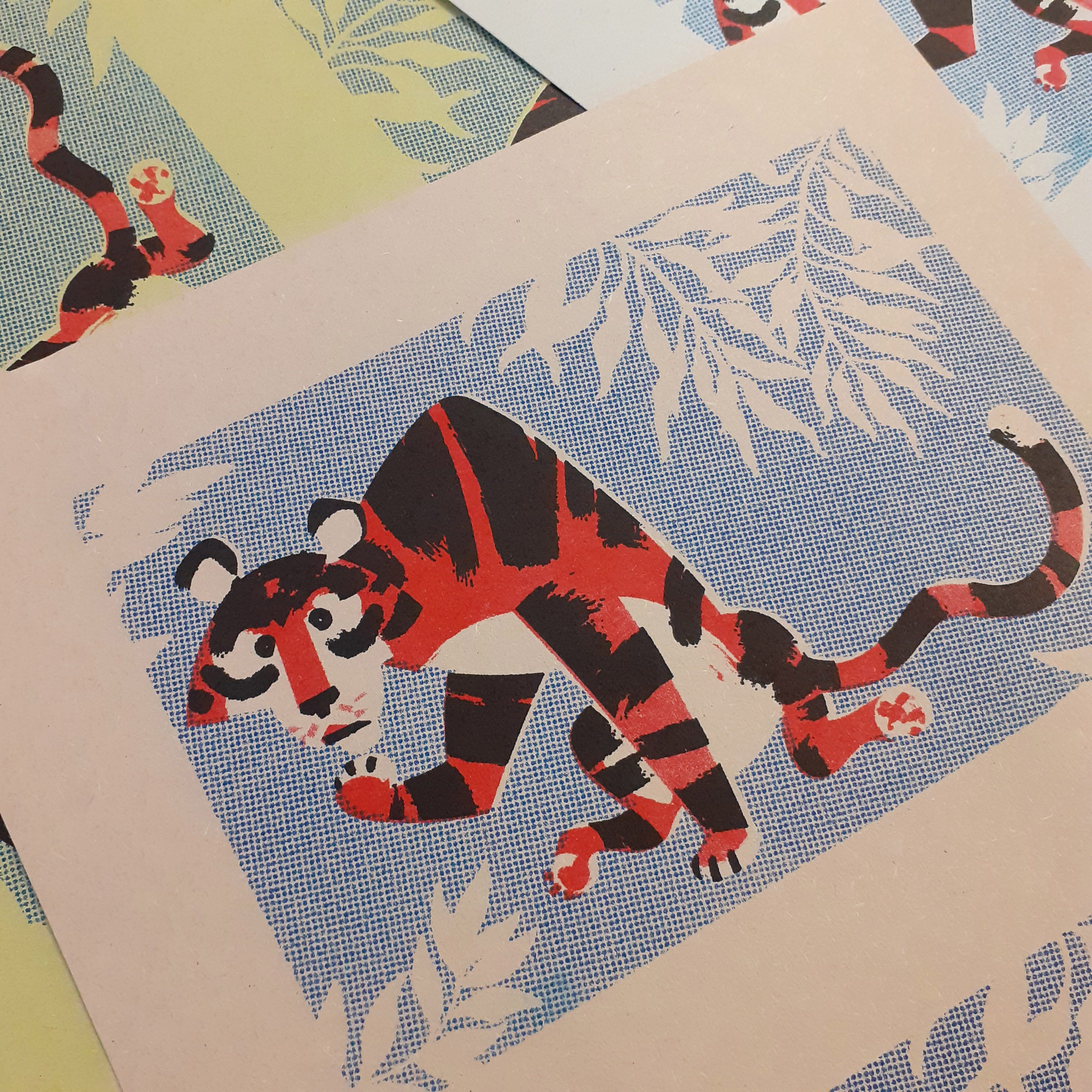
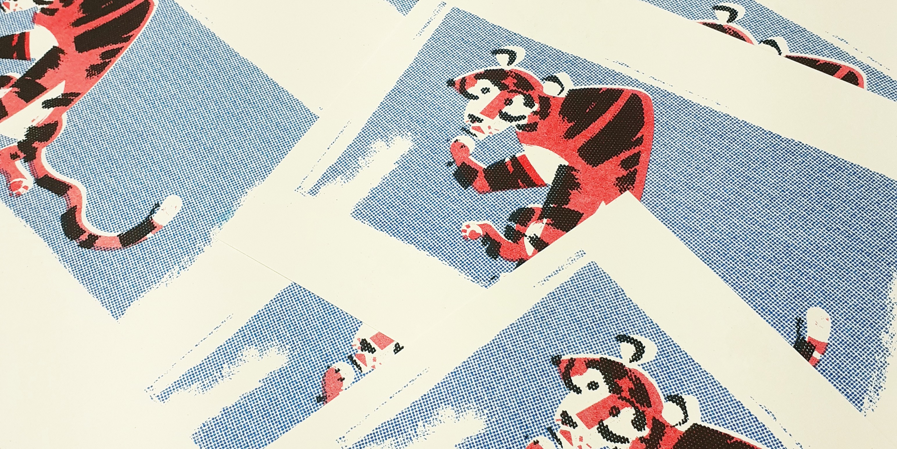
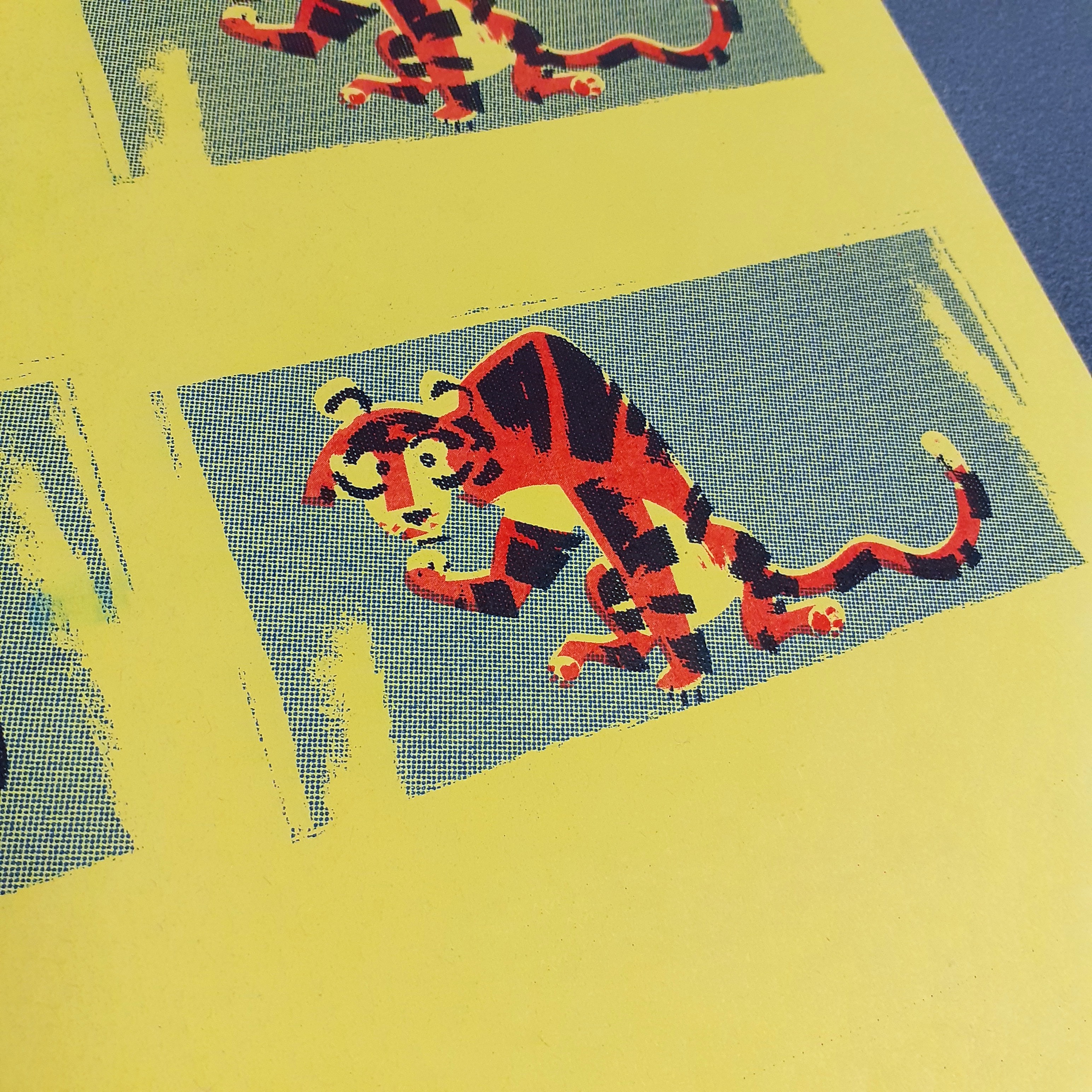
I tidied up the tiger assets I already had for a mini print
After cleaning up the tiger illustration I had practiced Riso prating with, I made the graphic into an A5 mini print and then printed the same image onto card to make B5 greeting cards. It’s just experimentation, but I’ve learned a lot thus far. I’d like to make some illustrations from scratch with the intent of printing them this way – it’ll streamline the whole process.
A little update to the personal stationery project I’d started quite some time ago. I’ve had access to print some trial sticker sheets and gave Risograph printing another go after a long absence. It was exiting! Next time I share some printed works I’ll go further in-depth with each method used. I didn’t record every step of either of the printing processes, but I’ve made a note to do so for the next round.
Risograph Printing
It had been… a veeeery long time since I had made anything with a Risograph printer. I’ve posted some Riso work here before. But I need to get back to grips with the machine. I printed some simple note cards using only 3 inks; red, blue, and black. So including the card or paper colour, the card’s design uses 4 colours – never mind that black isn’t really a colour.
Risograph print note cards
Even though I made these rather impulsively, with assets already on-hand, I found separating the layers of the tiger graphic simple enough. Though the graphic was not designed with the intent of Riso printing, the elements of the illustration were grouped sensibly which streamlined the whole process.
Here’s also where I want to say that the mid-century design sensibilities of some of the illustrations I’ve made recently really lend themselves to this printing aesthetic.
Risograph tigers
I think the tiger turned out very cute and suites these bold colours. I ensured to knockout the tiger’s body entirely on the blue layer, or else I’d end up with purple as the two inks overlap. I used half-tones on the blue layer and black layer as too much solid colour can result in track marks (ink streaks resembling an automobile’s tyre tracks).
Sticker Printing
There are a few different sticker paper qualities that I can use; glossy, matt, and transparent. I intend to try out all three different types of paper, and get a better idea of what qualities suit the different visual styles of sticker designs.
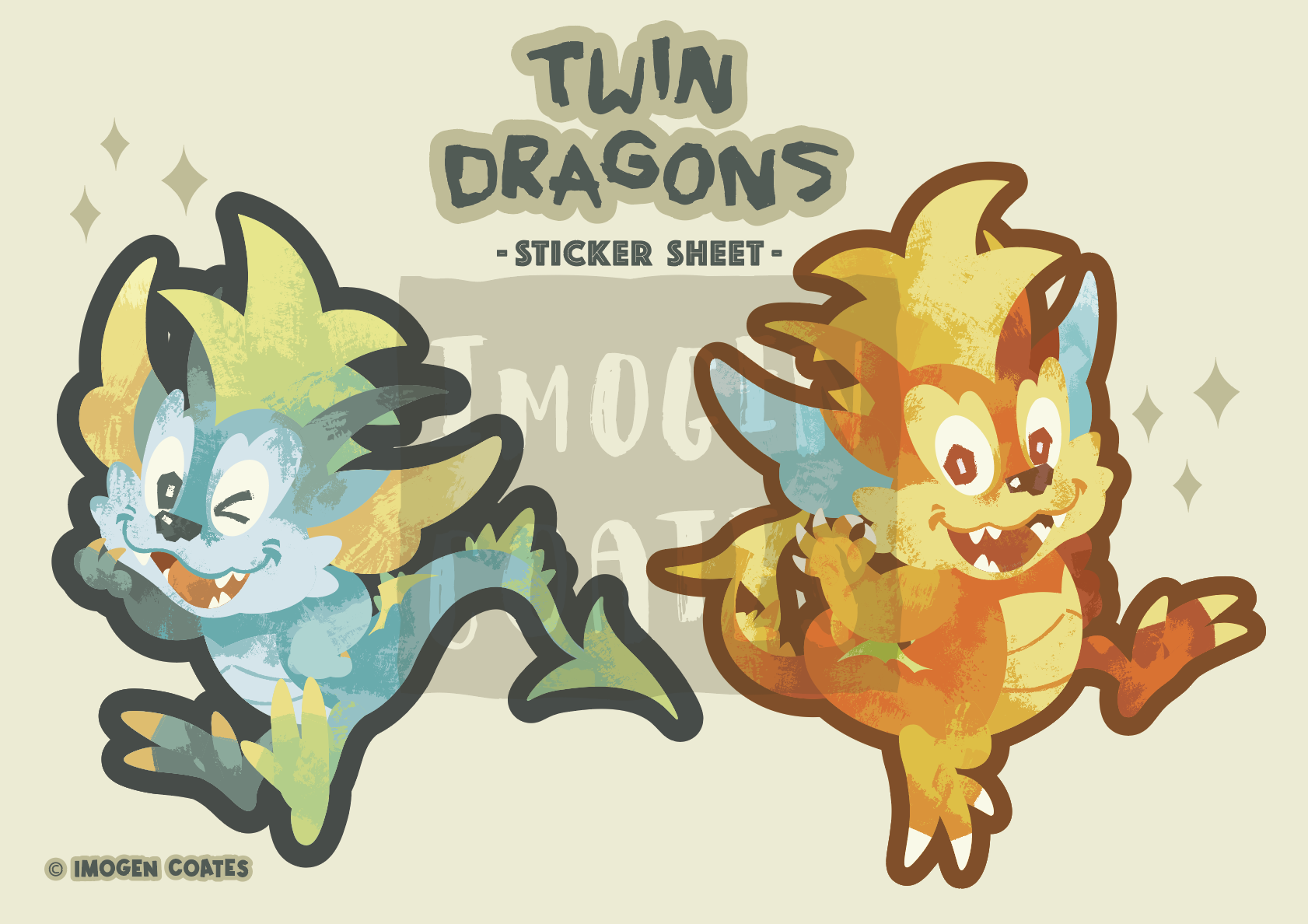
B5 sticker sheet featuring two large dragons
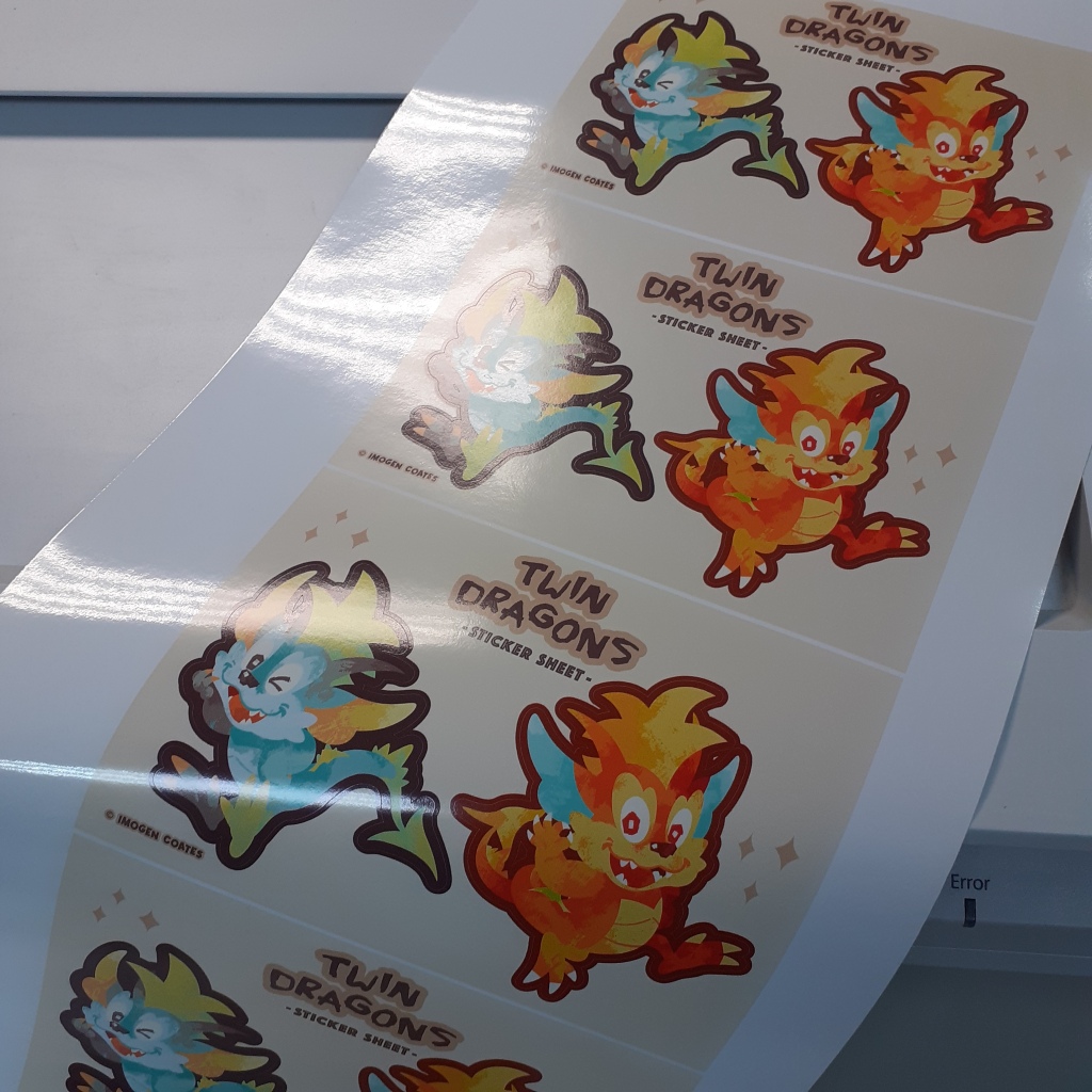
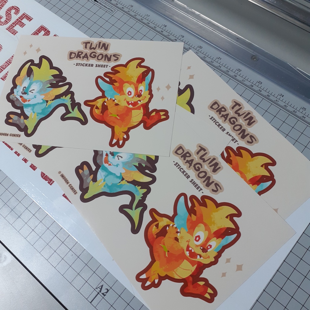
Below are some dragon sticker sheets; before and after being separated and trimmed with the guillotine. They’re printed on white, glossy paper.
There were a couple of tiny cutting errors on this sheet. But it’s a trial run, so I’m able to sort out any mishaps (big or small) after seeing these printed physically.
Though I didn’t take photographs of the process of arranging the assets for print, next time I’ll take screenshots to show the steps taken to print these. I’ll be printing on different types of sticker paper, so when I share them, I’ll mention the quality and characteristics in-depth as I compare them.
Well, that’s it until next time! I’m learning a lot as I go, but it feels good to have some physical copies of digital pieces to hold at last! There will always be some sort of discrepancy in colour when printing digital pieces as printers can’t always reproduce colours accurately. (Some colours just aren’t ‘printer-safe’.) I look forward to more printing and experimentation with Riso!
I have written about the odd zine that I happened to pick up in the past, and very recently, in fact! I’ve decided to share a number of zines that I have on-hand in one post to show off the variety than can be found. This is not as in-depth a look as an entry would be looking at a single piece, but be prepared to eyeball a lot of images. This entry is picture-heavy!!
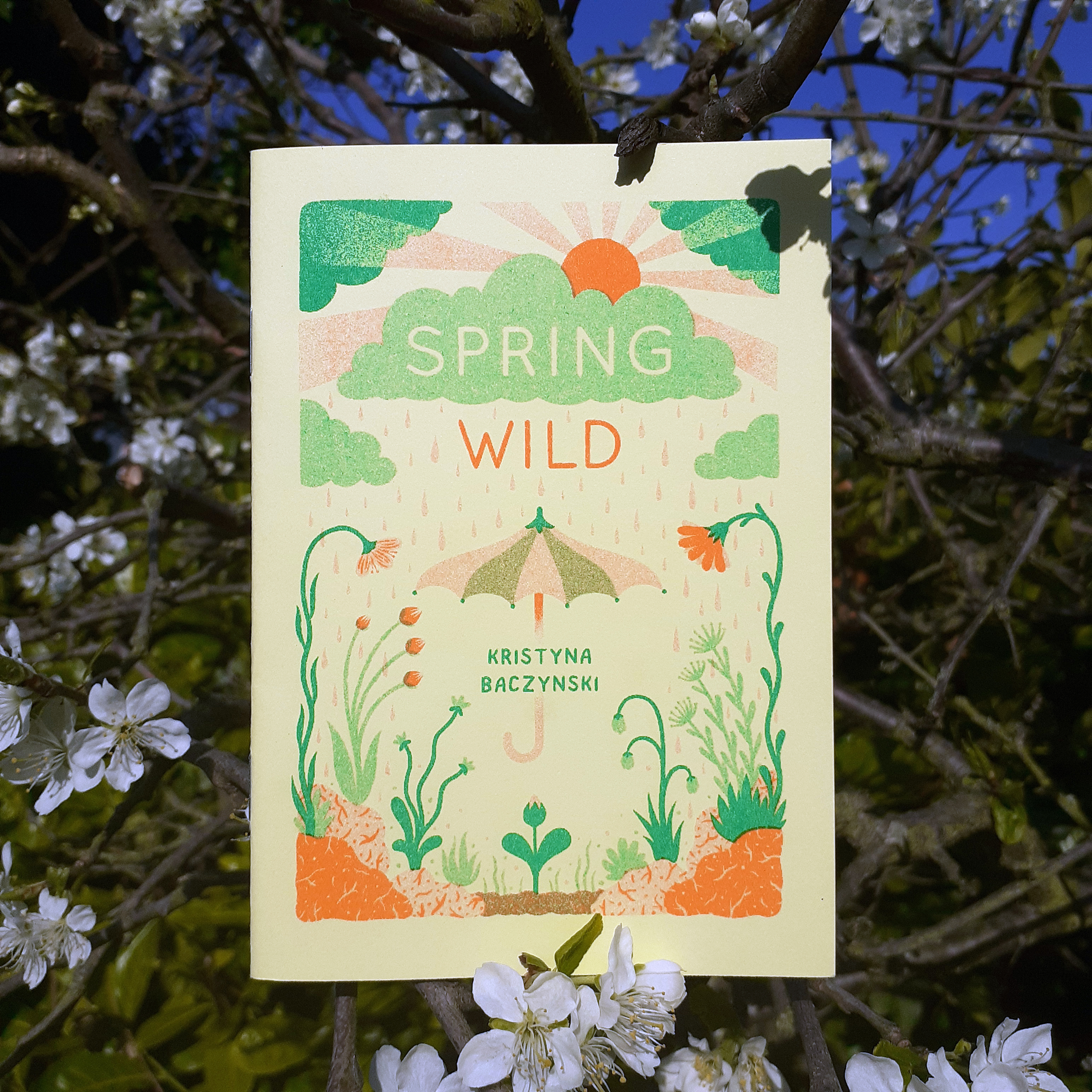
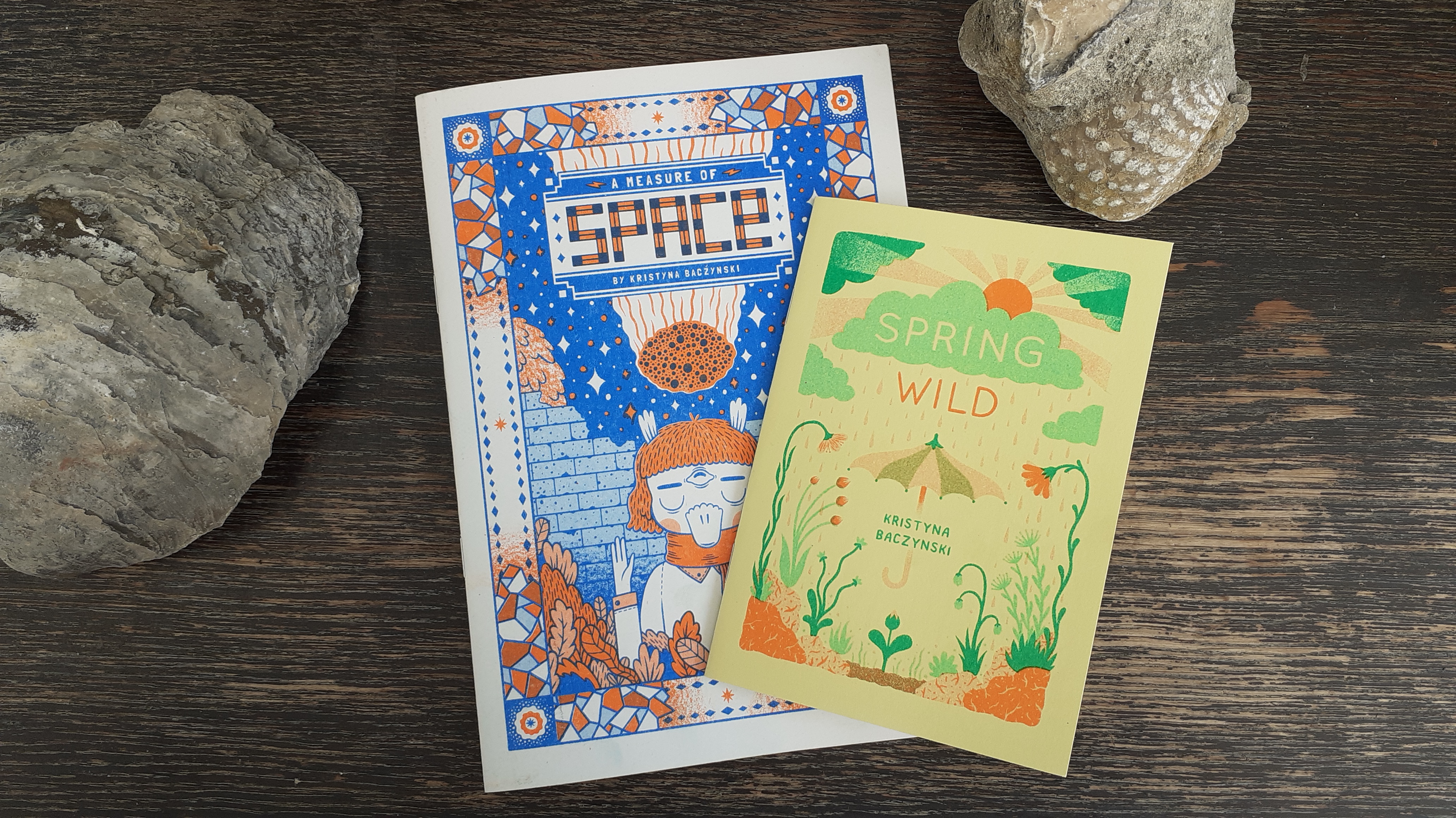
Firstly, I want to show a couple of zines by Kristyna Baczynski, Spring Wild, and A Measure of Space. Both are risograph-printed, with vibrant covers and monochrome insides. They’re very easy on the eye.
Risograph-prizted zine, Spring wild by Kristyna Baczynski
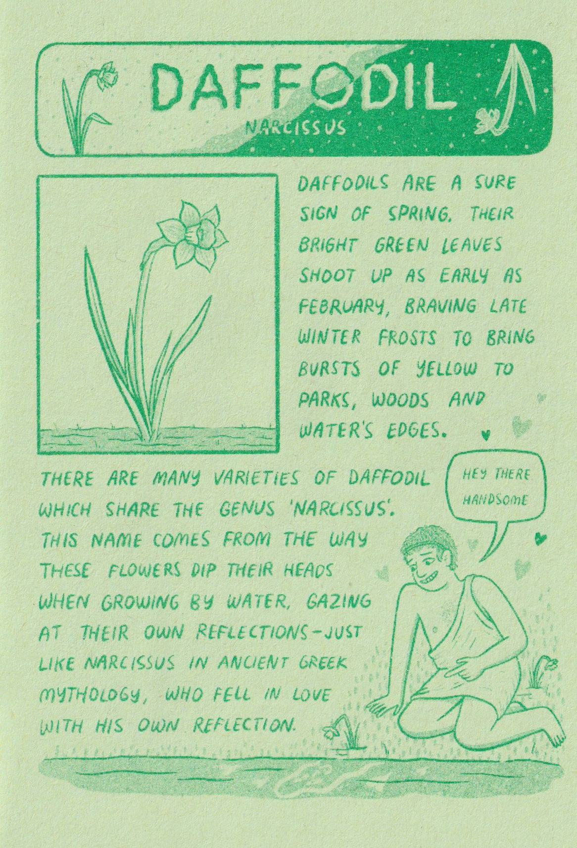
The cover of the zine Spring Wild is two tone. The inside is a dark green ink on light green paper. It’s not possible to go outside and enjoy the wildlife beyond back gardens as I write this, but this small zine is a little catalogue of spring-time plants native to European countries. The body copy is in printed handwriting. It’s full of charming illustrations and wit.
Spring Wild’s page on the Daffodil
Ordinarily, I’d avoid scanning books with their spine at risk of damage, but a thin zine is much less likely to be harmed by scanning its pages, so I feel at ease sharing some clean pictures of some of the publications’ contents here.
Copies of A Measure of Space and Spring Wild, by Kristyna Baczynski
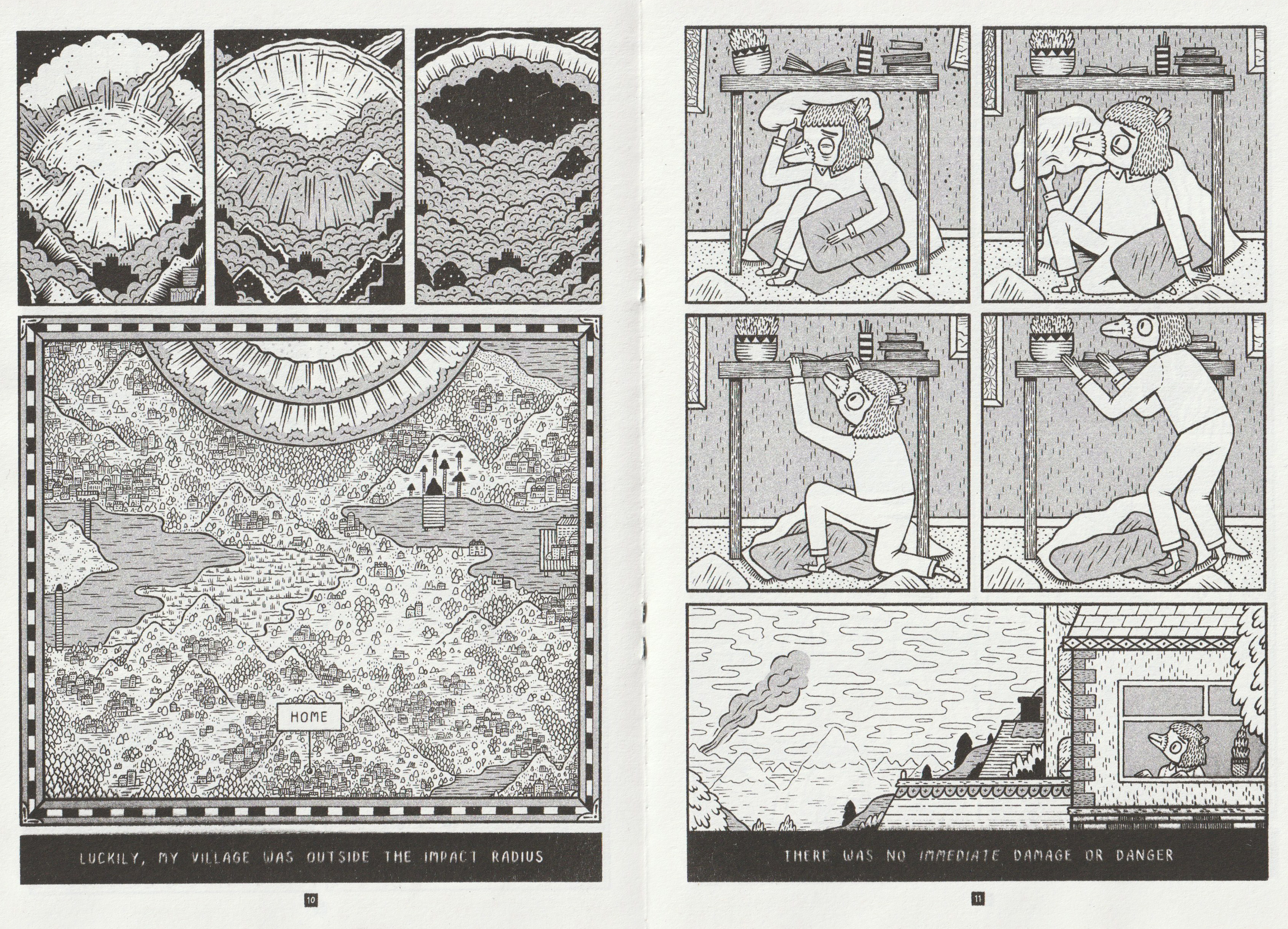
Many zines you’ll see out in the wild (on any (comic) book store shelves) are printed in monochrome, which is to keep costs down as they’re not often made with the intention of making a big profit. (More likely, the zines will be worth more second-hand if the creator’s work is coveted.) Most of the zines I have in possession are of a single colour.
Pages 10 and 11 of A Measure of Space
Working in black and white, A Measure of Space has plenty of visual clarity that may come across as cluttered if it were coloured haphazardly. I actually like pouring over some of the more jam-packed comic panels to make out little details.
Both of Baczynski zines are bound saddle stitch (with staples) and so are most of the zines I own. Finding ones tied together with other materials is a welcome surprise.
It feels quite special to find a zine with a cover that’s a different colour paper or card from the rest of the internal pages. I haven’t many zines that are printed on coloured paper as of writing.
Above is a page from How To… Make A Zine, a photocopied mini zine made from a single sheet of white A4 printing paper. This tiny publication is all about… (you guessed it) …how to make zines!
Because there are no hard and fast rules to the medium, I’ve acquired zines of all different sizes, contents, and materials. Some zines are even made from a single sheet of A4 and folded into 8-pages (including the front cover and back cover).
Pages from ICEBERG by Hayley Wells
The scan above shows pages from a tiny zine, made from only one piece of off-white printing paper. Hayley Wells’s ICEBERG consists of full-page collage illustrations and small pieces of text formed from what look to be old-school rubber or metal alphabet stamps. For a monochrome zine, it stands out among other’s I’ve seen due to it’s unique visual presentation.
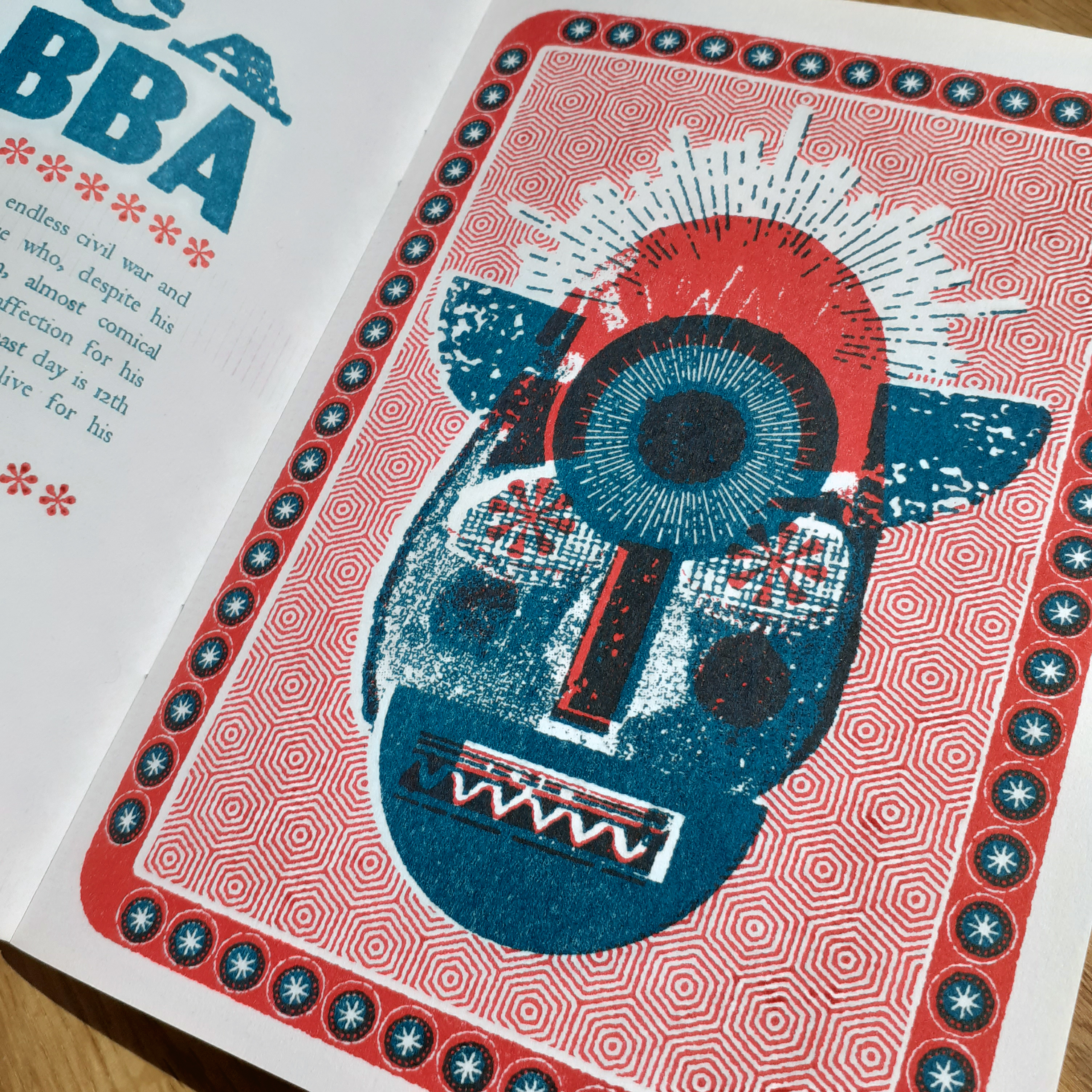
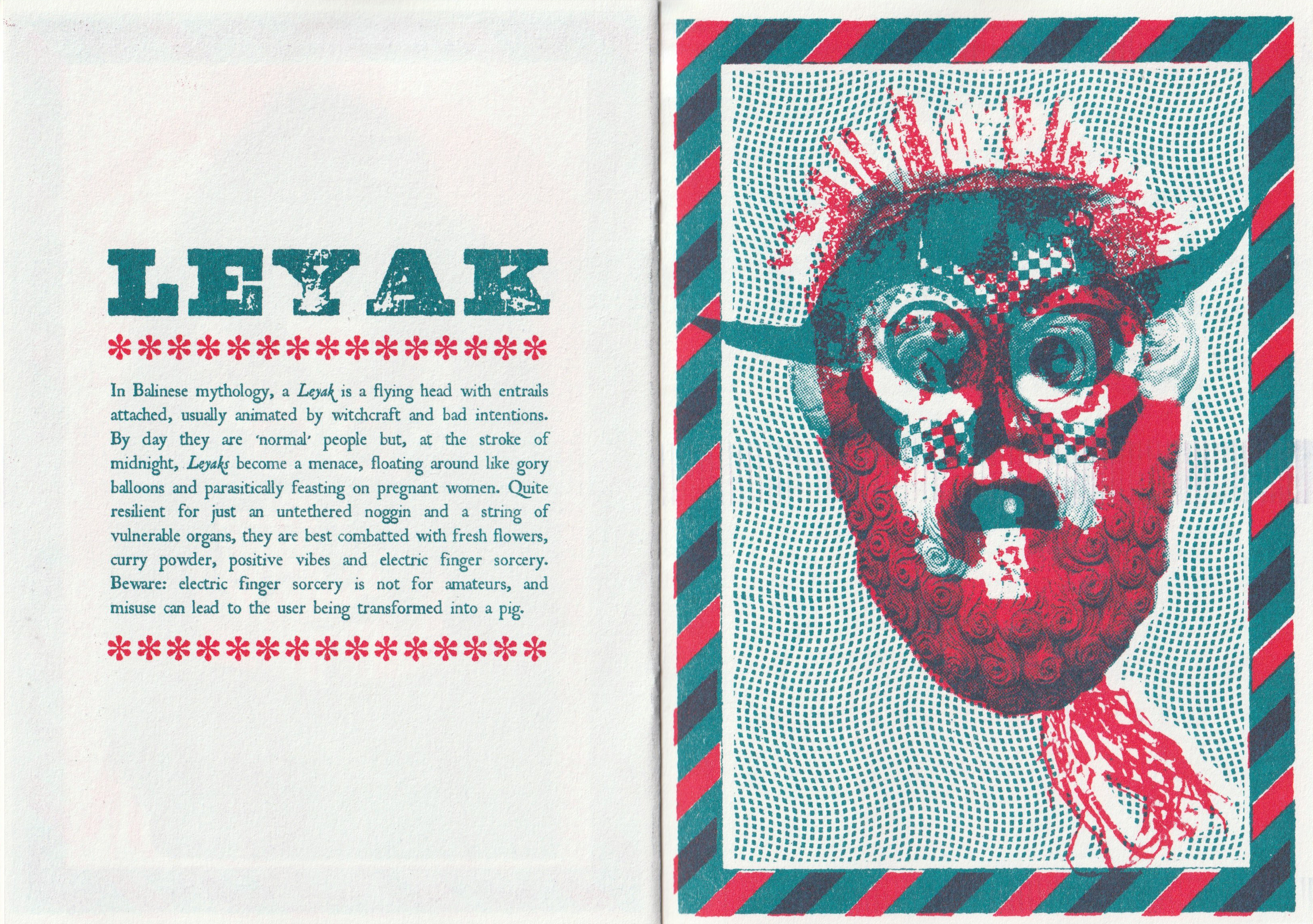
Lesser Seen Folk Demons is a beautiful risograph-printed zine using two colours. It’s a modern bestiary of spooks and creeps and we may find around the world if we’re lucky. It’s 24 pages long. Each demon gets a description, and an full-page illustration made from collage. Part of the allure of this sort of publication to me is stems from media from childhood that focused on bestiaries and lore of fictional monsters.
Illustration of Unca Grabba in Lesser Seen Folk Demons
It feels much like a slender book; there’s a forward by Dr. Mathew Cheeseman of the university of Derby… there’s an ISBN in the back of the zine, along with the printing credits (year of publication, and edition etc.).
Page spread on the Leyak
The text in this book uses just two fonts; one for headers and one for body copy. The tone of voice is very tongue-and-cheek. A page on The Deadly Diddlio reads:
THE DEADLY DIDDLIO
The inhabitants of Pyefleet-In-Water, eastern England live in fear of The Deadly Diddlio, a malevolent wind-borne spirit who is purported to visit their small island once a year to bring discord, broken windows and sexual mayhem. Dating back to the twelfth century, this somewhat unpleasant avatar can only be combated by interpretive dance, and lots of it. He’s a pain in the arse, basically, and bloody ugly to boot.
Actually, this book’s concept is not too unlike thoughts I’ve had about crafting illustrative bestiary-like zines, albeit with a vastly different tone of voice and art direction. Seeing this out there proves that there are people that genuinely enjoy such specific content. (I guess I should step on it already and draft such a bestiary of my own subject choices, huh.)
You can be sure that there will be more small press works that I’ll want to share on my blog in future entries. There’s also plenty other content that I want too share here. Look forward to it all!
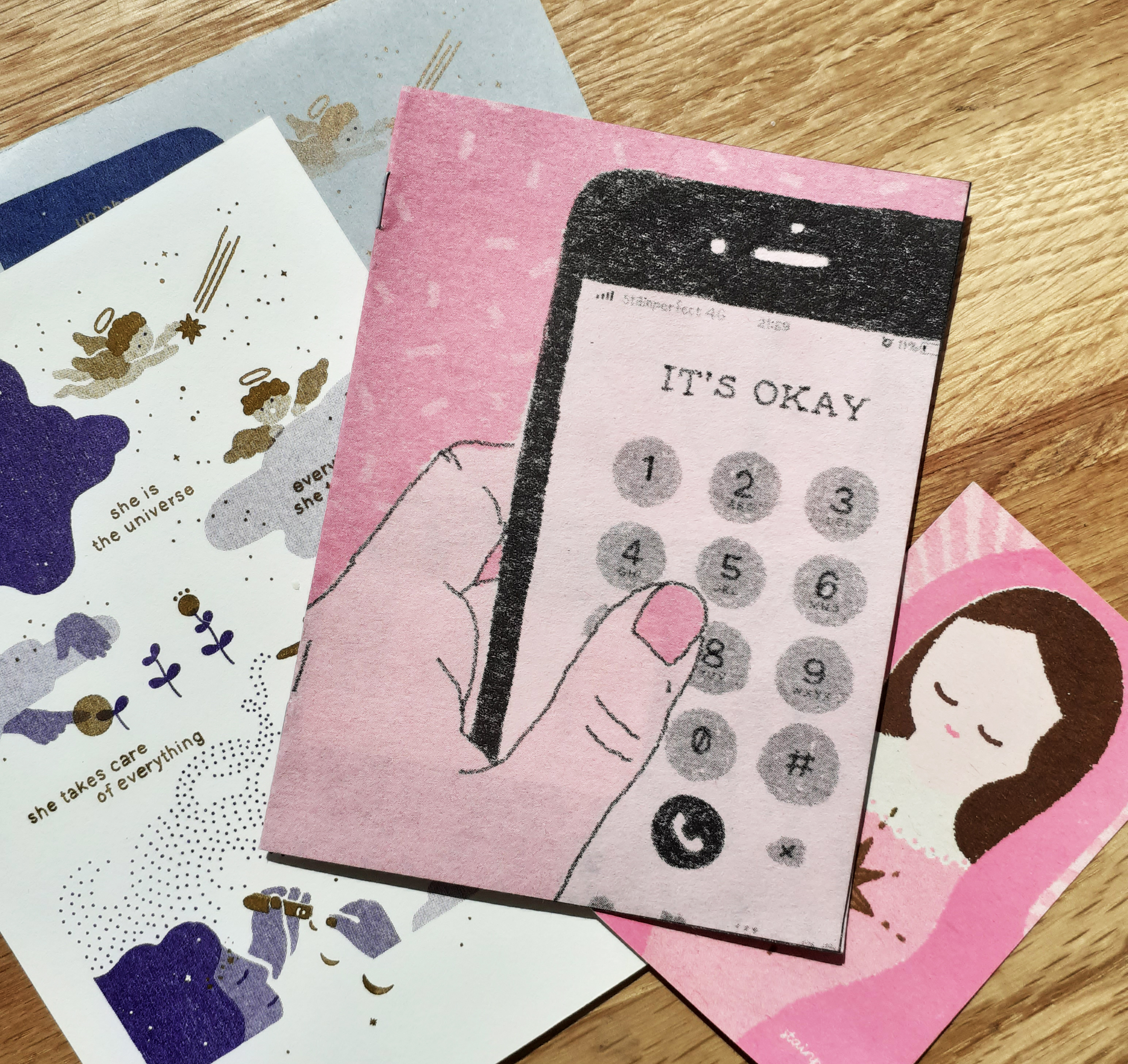
Every now and again, I like to pick up some printed media for new reading material. Small print works are the most accessible to me right now, so I’ll share some pictures and thoughts on a very small – but very strong – zine I bought made by a Japanese creator, Stainperfect.
I have shared on my blog other zines that I’ve picked up in the past by different creators. So be sure to check the ‘zine‘ tag if you’re interested!
IT’S OKAY by Stainperfect
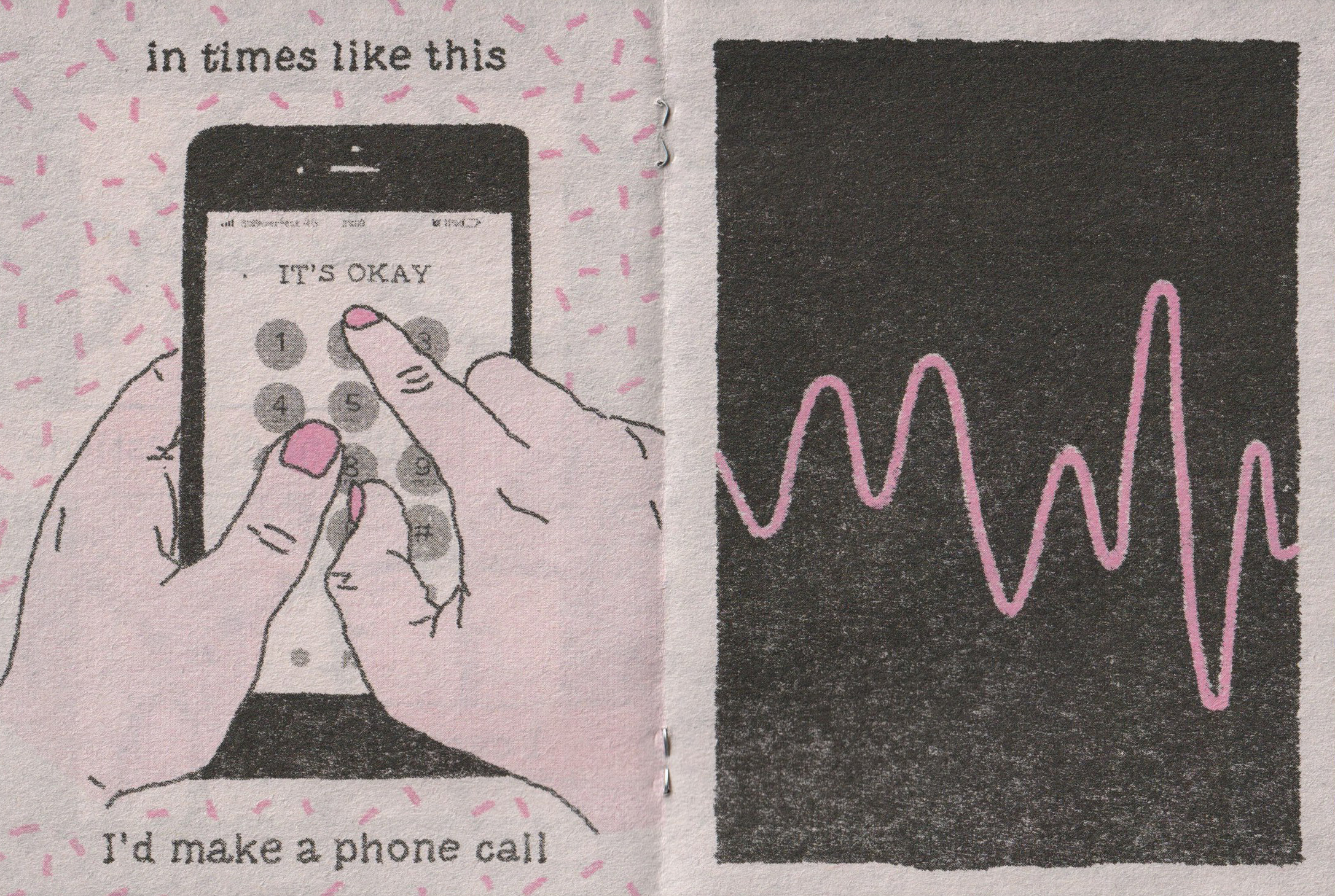
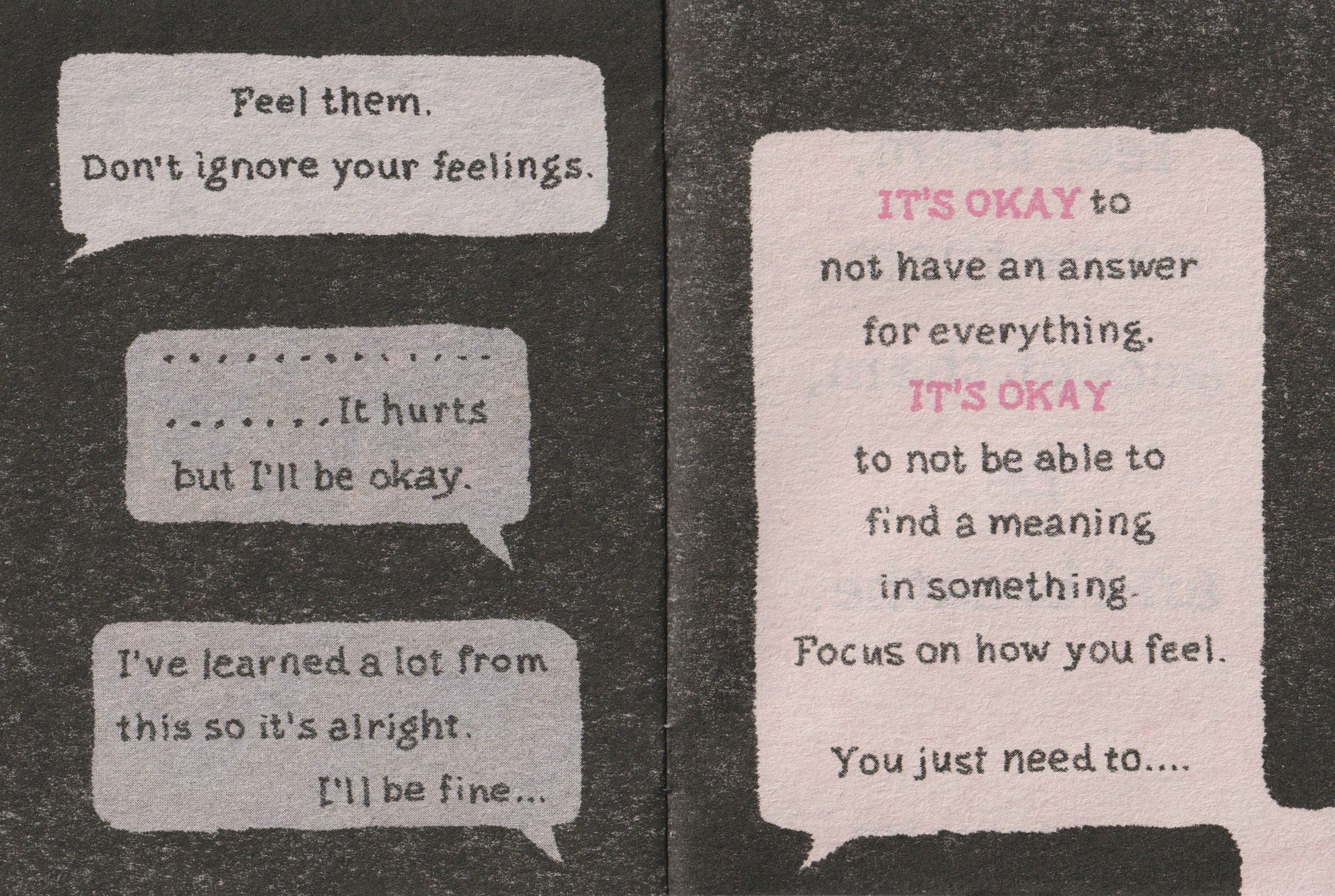
The zine IT’S OKAY is about C6 in size. Including front and back covers, the zine is 8 pages; the narrative is 7 pages long. It’s pink and black risograph ink on thin, newsprint-like pink paper. (The large-areas covered in black riso ink means the black may rub off easily!)
There are no faces or names in the comic. I feel that this choice was made so that the reader may identify with the story all the stronger, on perhaps, a personal-level.
Page 3 and page 4
Page 5 and page 6
It reads to me that the author made a big realisation when talking to their friend over the phone, and the lesson can be taken to heart by the reader.
Like all art forms, this story can be interpreted differently depending on the person reading it, or how they even wish to view it. For me, the story is about accepting your feelings – all of them – and recognising them for what they are. Feelings can’t be simply categorised into ‘good’ or ‘bad’, they just are. It’s OK to feel all sorts of different things… to react a certain way to a situation or event.
In my own time, I’ll be picking apart more zines in detail; the paper qualities, page counts, and contents etc. as I really want to get down to making some myself. Maybe even making use of risograph facilities at some point. So you can be sure that they’ll be a few more blog entries on whatever zines I find posted here!
Next time you pick up a new piece media to read, think about why it appeals to you. Did you chose it because of the colours the object is made of, or the lack of colours used? Maybe the content’s message? Or the imagery either inside or conjured up by the text…? Maybe the types of materials used in making it just stood out to you!
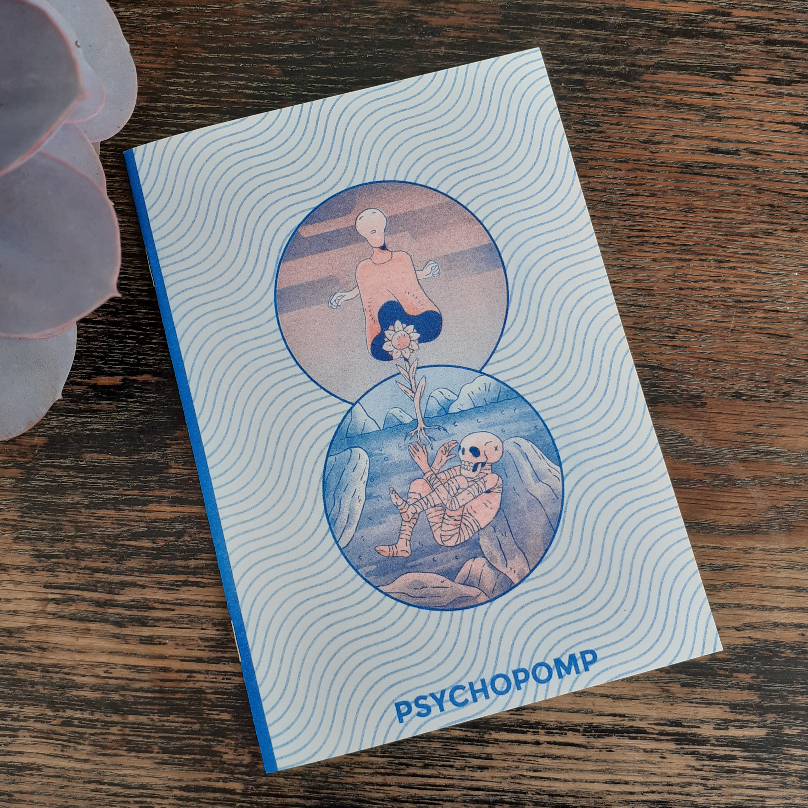
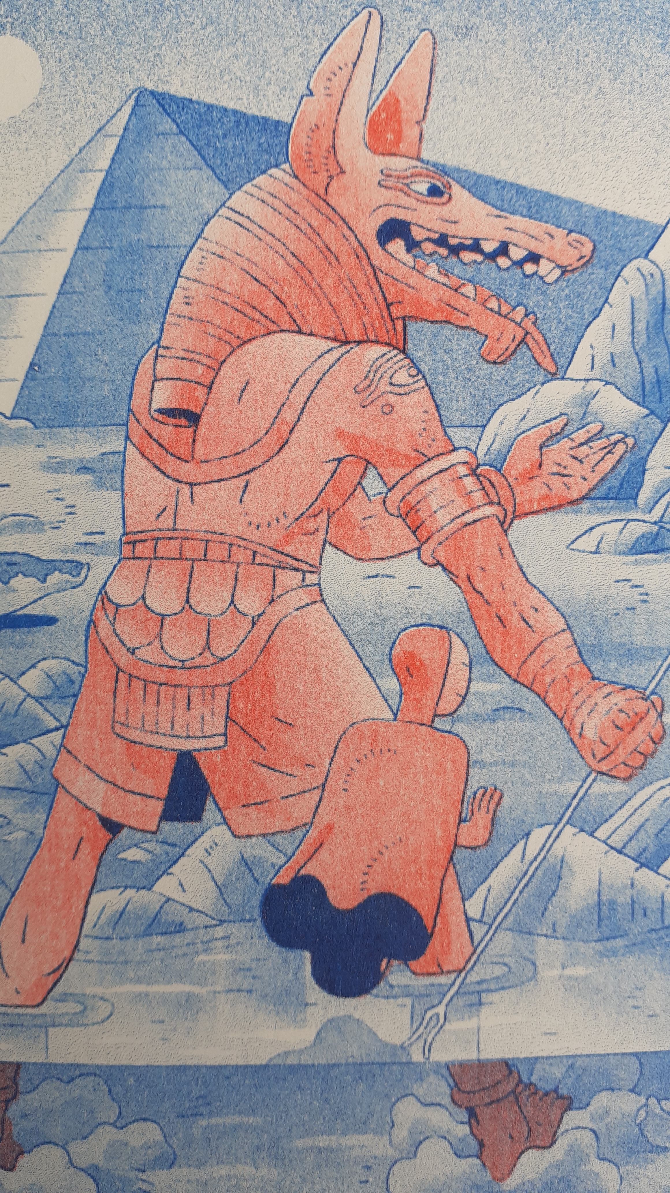
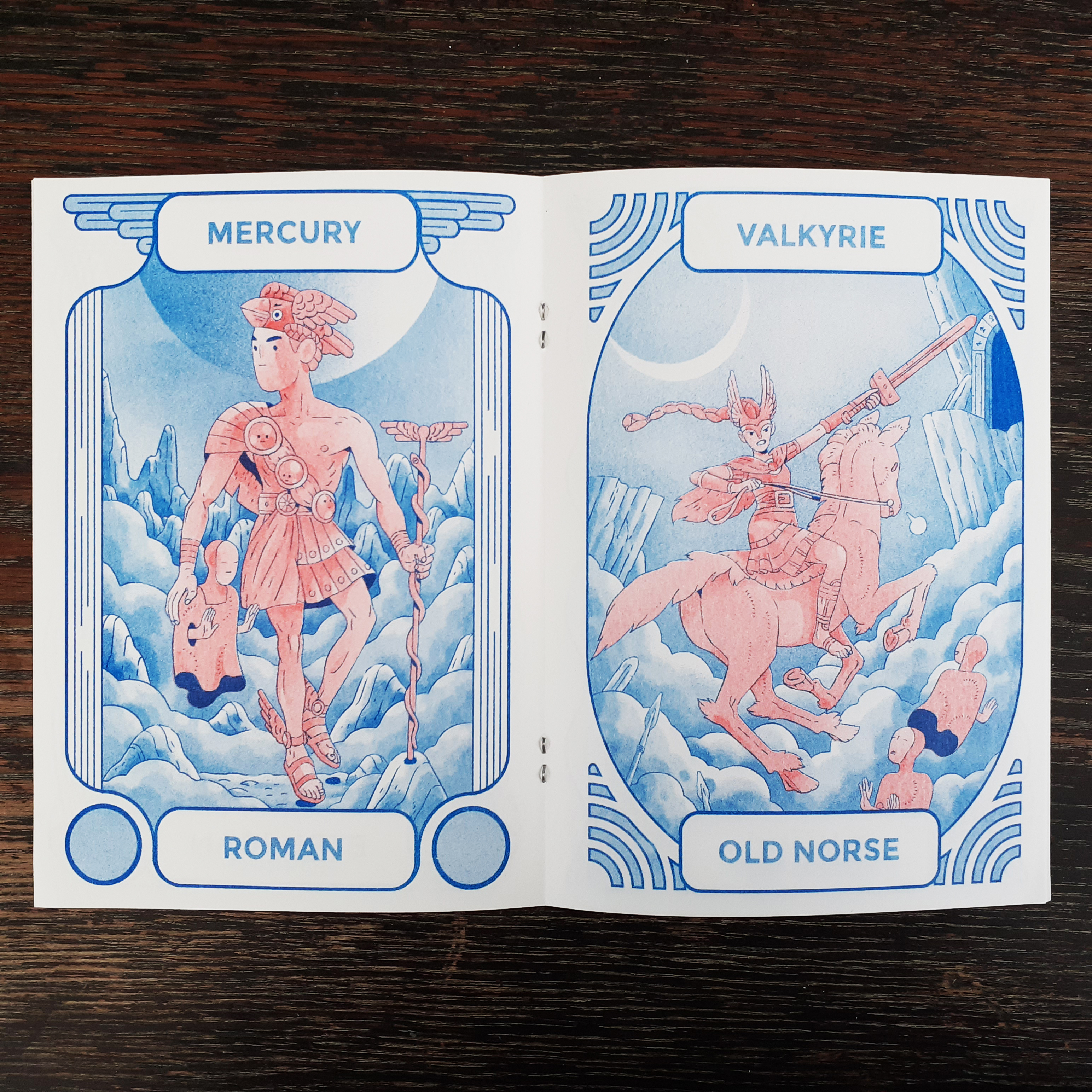
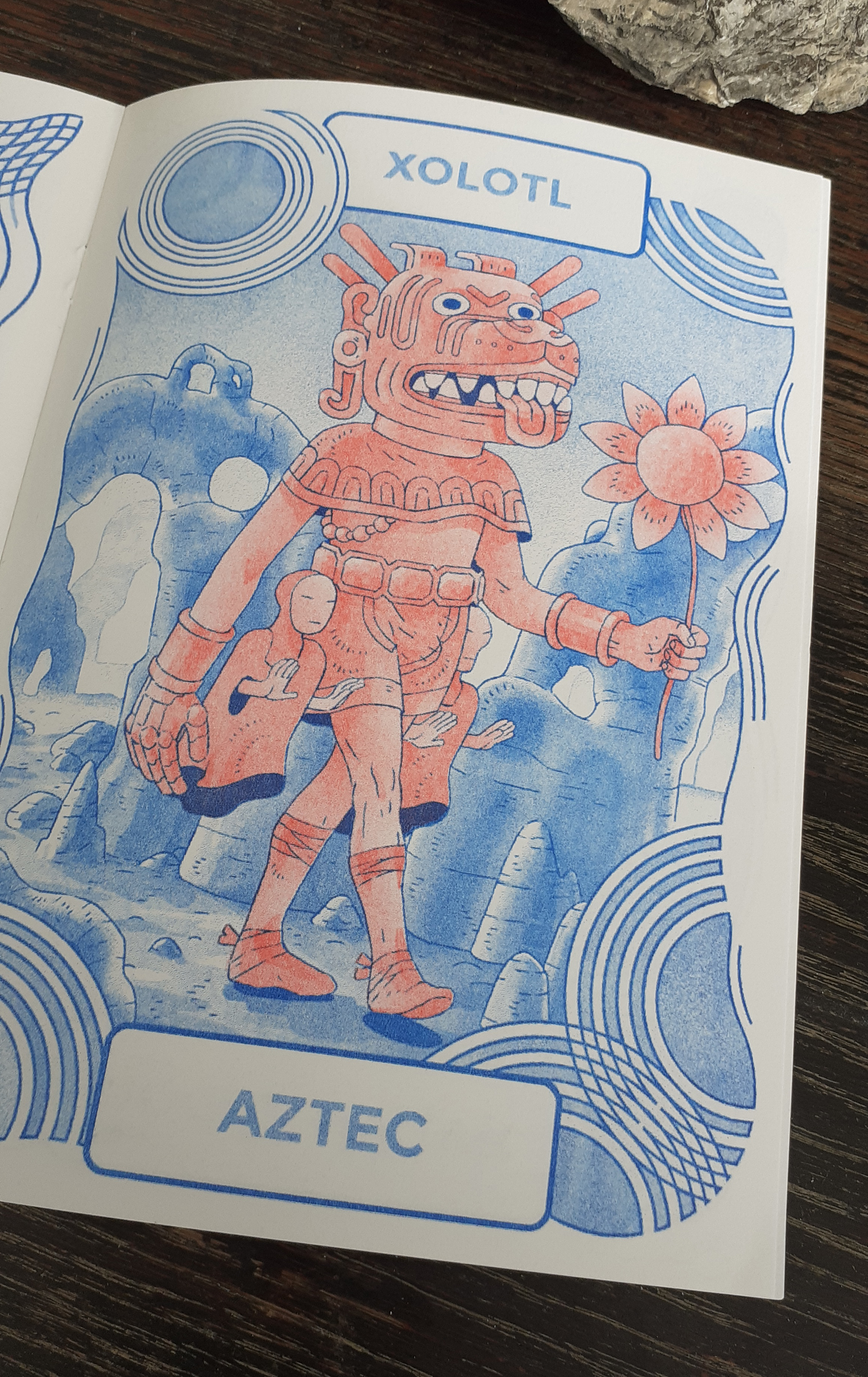
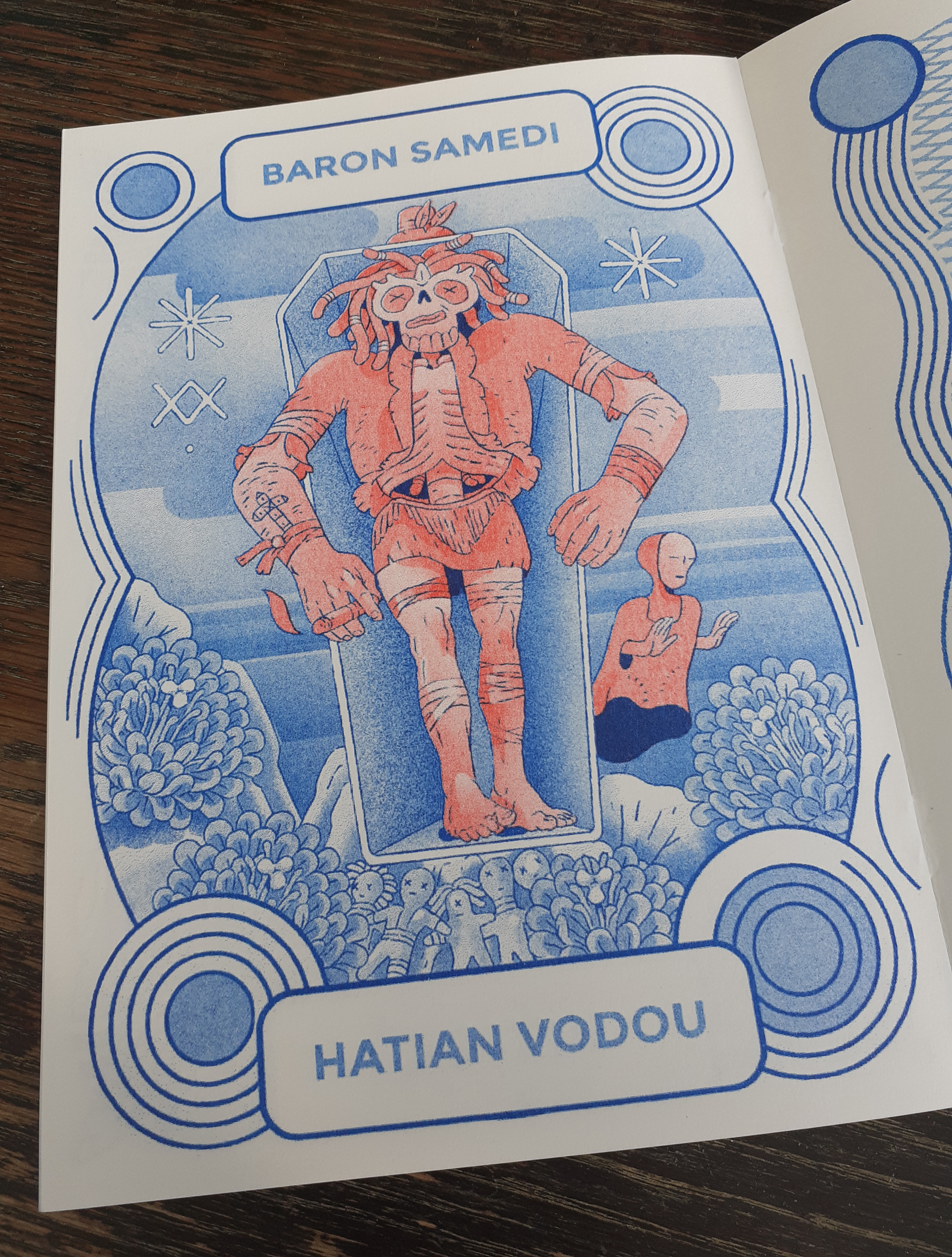
On the way home from campus the other week, I picked up a small illustration zine from one of the city’s comic book shops – Psychopomp. It’s a risograph-printed zine with artist interpretations of psychopomps (spirits, deities and so on who guide souls to an afterworld) from different cultures from around the globe.
Psychopomp is illustrated and bound (saddle stitch) by Tom Kindley and is 10 pages long. The copy I picked up is no. 16 out of 50 editions.
Cover of Psychopomp
The zine is a two colour risograph publication – blue ink and red ink. It’s not without tone, however. Both layers are toned to give much depth in the illustrations. The red ink’s shading is fair and the deepest blue is used for outlines. It is difficult for me to capture on camera the exact tones of the printing ink. I’ll share a few pictures from inside the zine below.
The boarders of each page illustration are unique. The artwork throughout is quite detailed and fun to look at. I was aware of psychopomps, but unaware how just many different guides exited.
I am glad to find small press like these locally. Looking at them, I can see how they’re assembled – though it helps to have knowledge of risogrpah printing!
I’ve still yet to find the time to make personal illustrations of my own while studying, but I know I could also make artist books once I am in a more comfortable position with time and money to experiment. I will have alumni access to a risograph printer after graduating from studies and I want to make use of it. I’m not thinking about sales or profit so much as I am looking forward to exploration and self-expression at this point in time. But who knows what the future will hold!
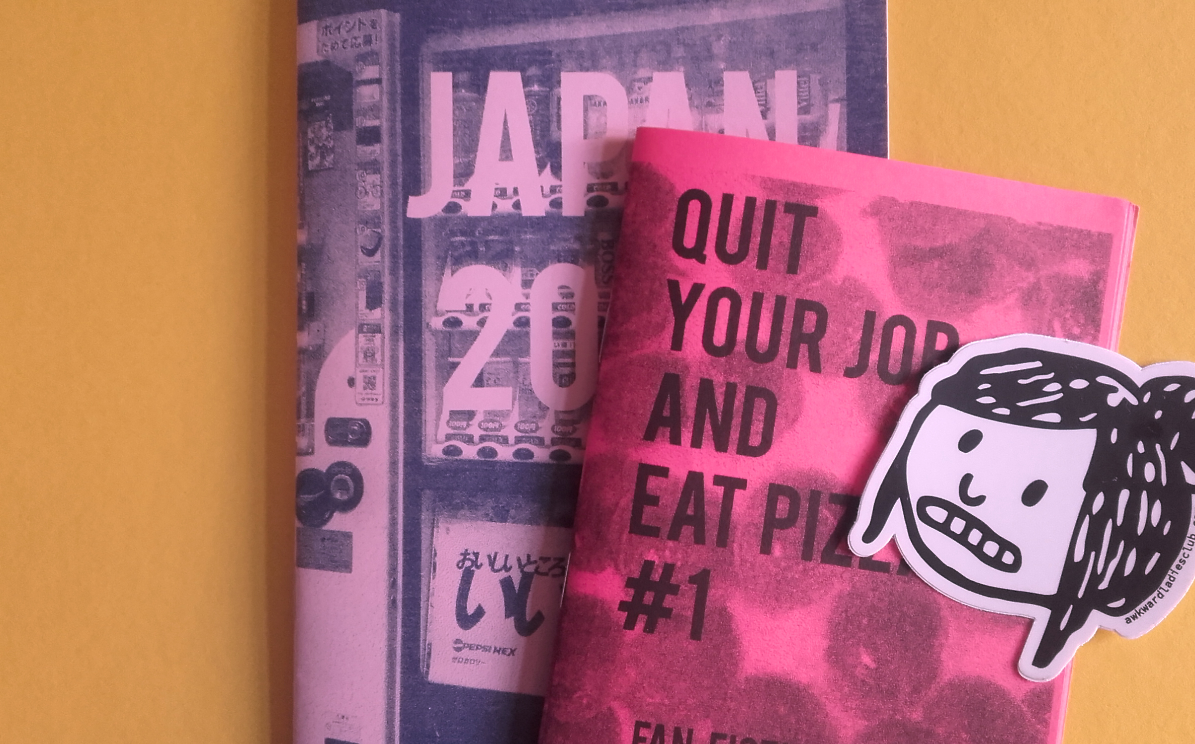
Picked up a couple of zines to go towards self-publication research. One is a text-heavy personal zine (often shortened to ‘perzine’) and the other is a collection of photographs. I won’t be keeping either of them; I don’t have the space, but we’ll take a quick look at ’em here and now.
Neither zine is a standard print size, and both use different printing methods!
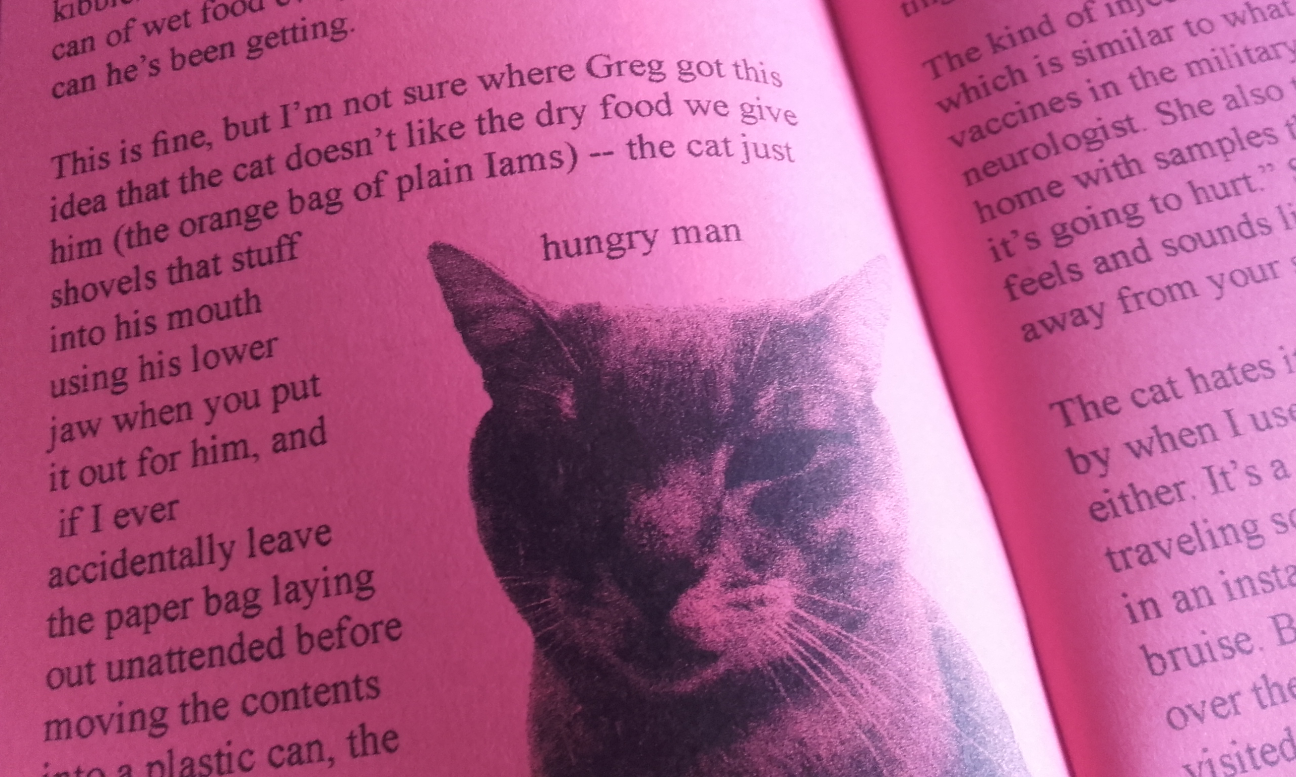
Quit your job and eat pizza #1 Fan Fiction Piracy is printed on playful, hot pink paper and has a silkscreened cover, and photocopied interior. Bound by staples; ‘saddle stitch’ binding. It’s really, very tiny in my hands, but it’s 24 pages long.
The opening segment of Quit your job and eat pizza #1 covers the authors leave from work due to their health, the medication they take, and how they administer it. We’re even treated to diagrams of a samavel injector and the graphic representation of the drug sumatriptan. (I learned something science-y, something… medical!)
It’s called a perzine for a reason!
There’s a section titled sci-fi zine piracy in the 1990s. Before the internet became commonly accessible, before fans of movies, television shows, and cartoons had any shared online spaces to show their fan creations (usually prose or illustration) many dedicated fans made zines covering their favourite media and circulated them in conventions. Today, a lot of fans’ secondary content is shared freely on the internet. What I didn’t expect, was to read that folks pirated the rarer zines back then by photocopying an original copy and selling the bootlegs! To combat cheap, illicit copies, some authors produced zines on a particular coloured paper, or stamped the original run for authenticity.
It’s easy to understand why some zines would be coveted; regardless of the genre, if the content was desirable, but the print run was low in number, the second-hand price would be driven up.
Hungry … man … Hungry-Man …
There’s a whole section dedicated to rotten cat teeth, and one focusing on community college print-making. A real variety here.
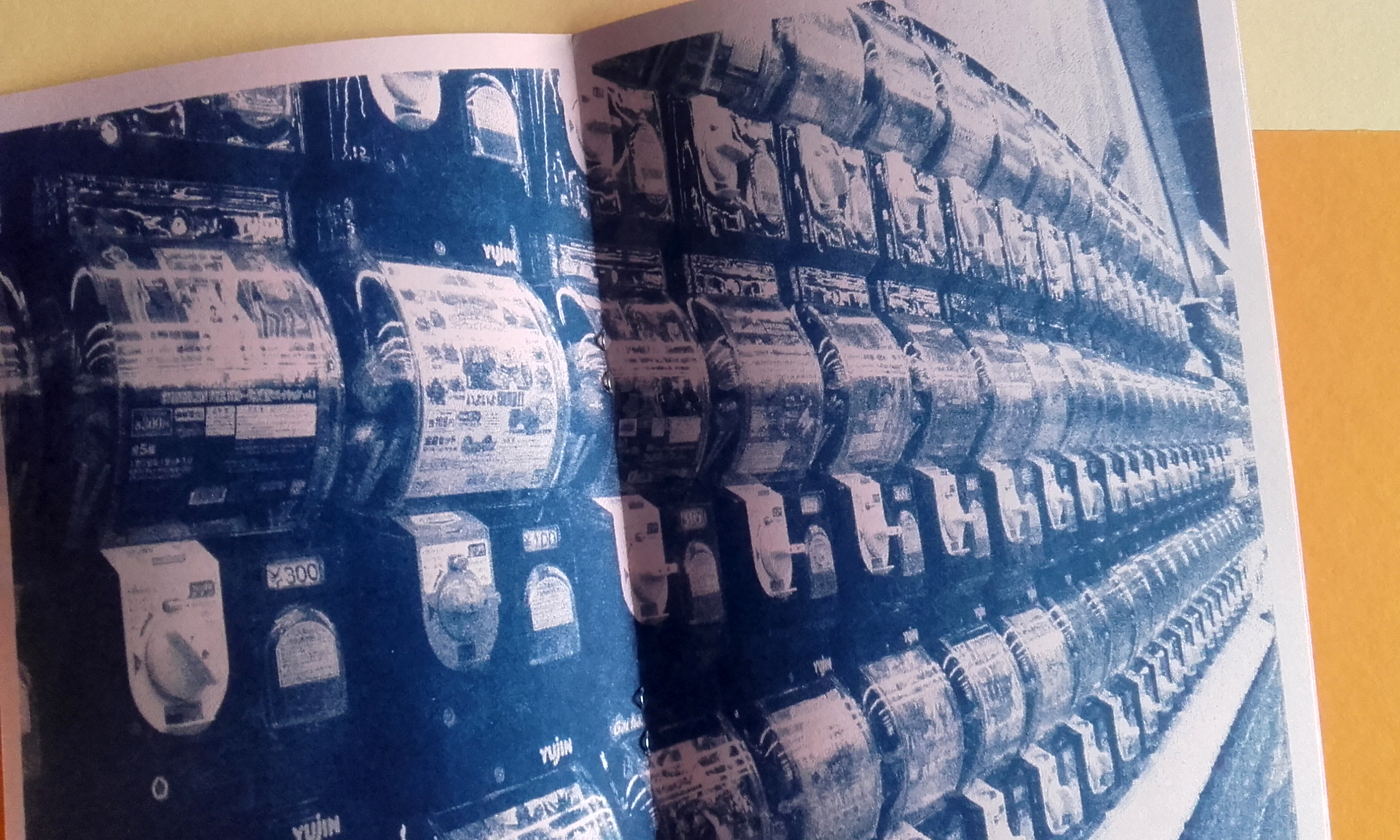
JAPAN 2009 is risograph printed in federal blue ink on pink paper. It’s saddle stitch. The size is 5.5″ x 8.5″ and it’s 22 pages long. It’s a collection of photos from a trip to Kobe and Tokyo; all without commentary. It’s interesting to see foreign images without context, though I recognised some landmarks and objects.
The photographs are split between the country’s aforementioned prefectures Kobe and Tokyo, which you could see as ‘chapters’. Despite the name, this photograph collection was first printed in 2014, and the copy seen here is from 2019. This is where small-press collecting can get confusing; there’s no way to tell which printing (edition) the copy I have is other than the point of purchase.
Some photographs take up the entirety of the page. The centrefold shows an image of numerous gachapon machines. Gacha machines take coins, and in return, give up plastic balls with surprise plastic clutter inside (i.e. super-small ‘toys’). The name of the machine comes from the Japanese onomatopoeia for the metal crank turning – ‘gasha’ (ガシャ) – and the sound the plastic ball makes as it drops – ‘pon’ (ポン).
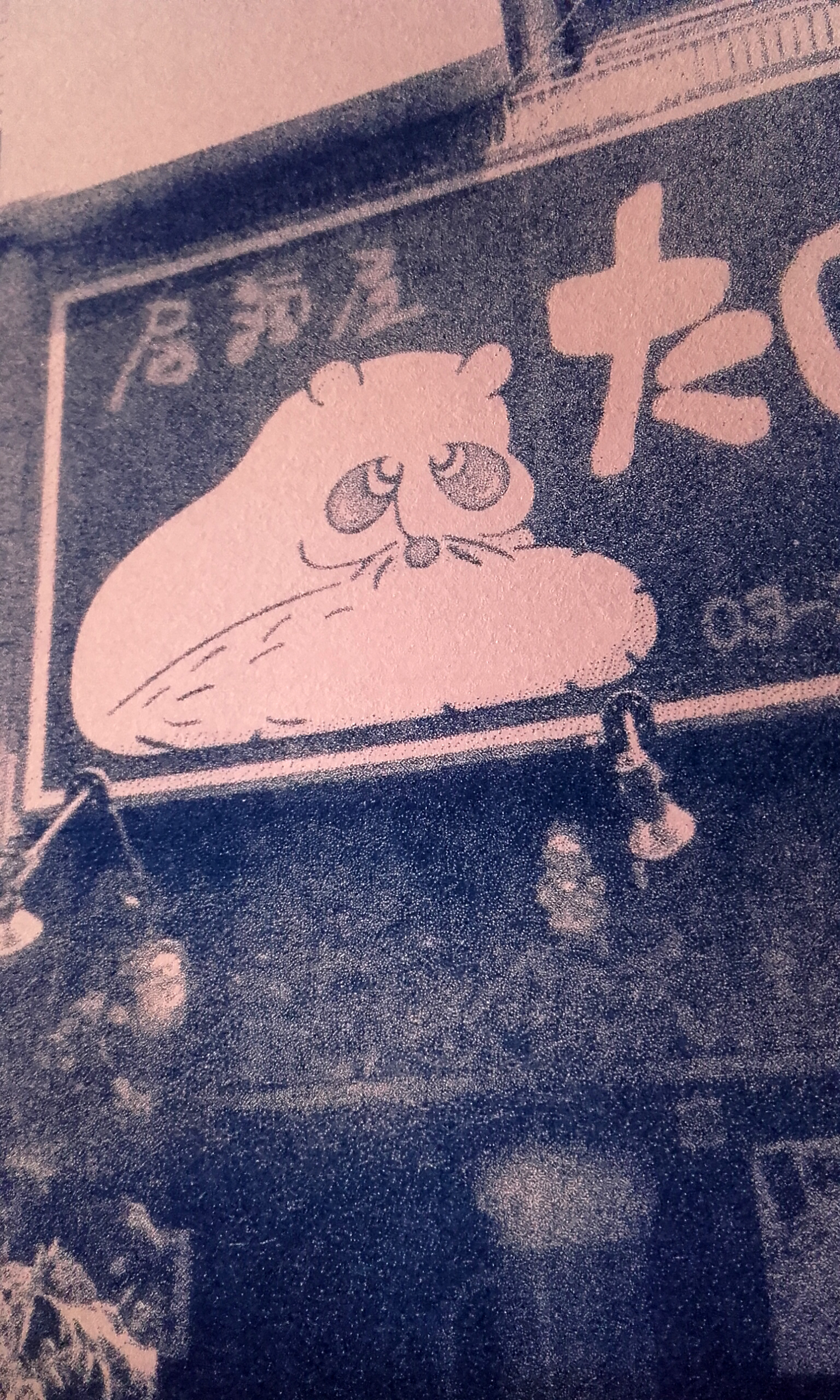
Detail from a shopfront. A curled-up tanuki?
Shopfront with what I’m assuming to be a stylised tanuki (racoon dog). Difficult to tell without seeing any of those telltale balls on display!
JAPAN 2009 is a neat concept. To group photographs from a trip that may otherwise get little exposure and bind them without context, leaves more room for a reader’s personal interpretation. Sort of lends some mystique to the collection of images? Equally, a sort of predominately visual travel-diary may make for a fun project to work on in the future.
Looking into the state of physical print in the 21st century for contextual studies, I have looked into the specific self-publication of zines.
Self-publishing printed media is a culture itself. The culture of fanzines has been around since the 1930s. Besides fanzines, news zines and personal zines are staple genres. Truthfully, there is no hard rule on what content a zine should hold.
People may think of use of photocopiers when they think ‘zine’ and saddle stitch binding (using a stapler) but the use of the Risograph machine is popular today too, along with other forms of binding.
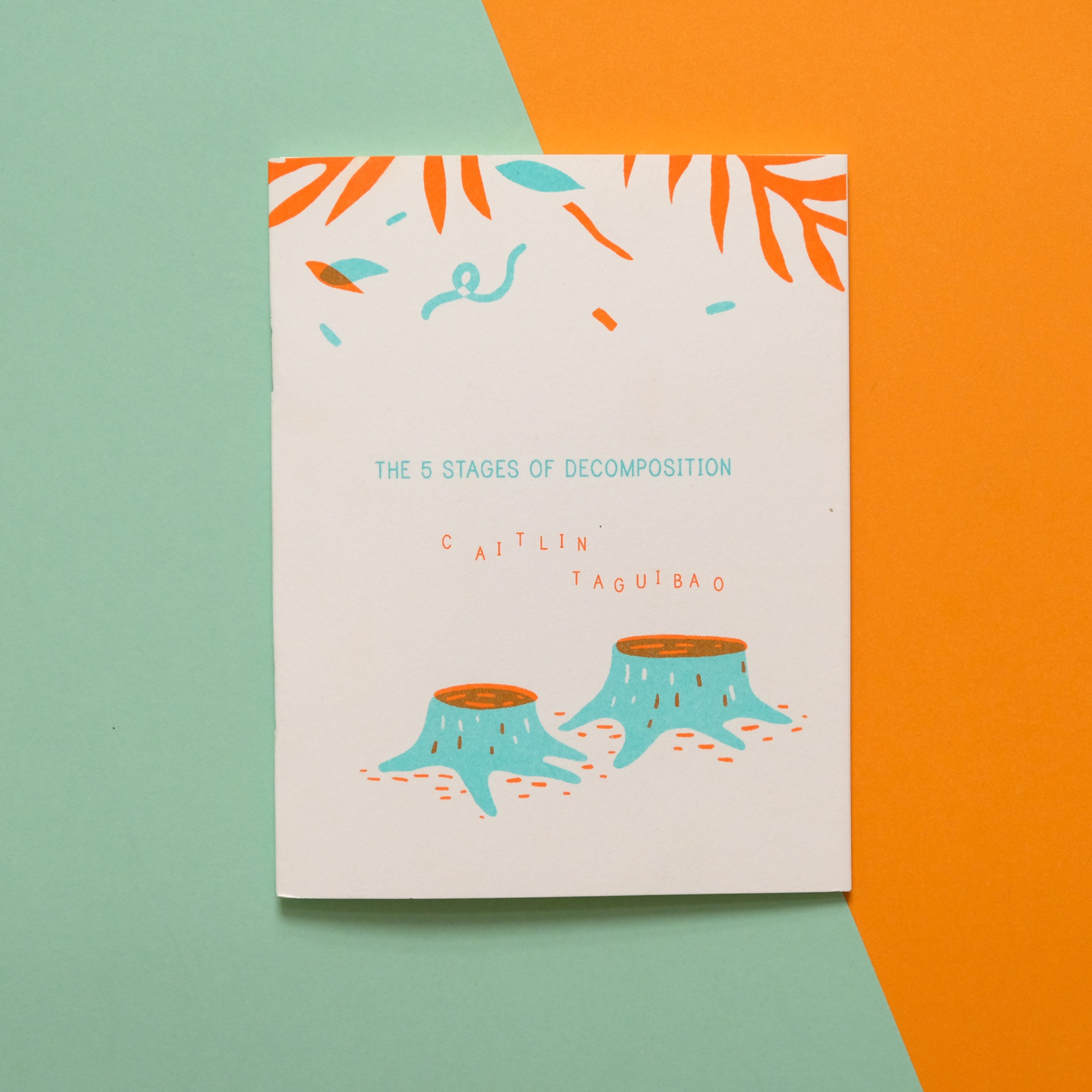
Risograph printed zine for sale at Zine Day Osaka by artist Caitlin Taguibao.
The boundary of what can be considered a zine seems to be played with continuously by self-published creatives. I’ve seen almost inappropriately sized miniature zines (with tiny text) and unwieldily, long leporello zines.
The desire to share out thoughts and feelings about anything and everything though text, photos, and drawings is universal. Art; self-expression is being human.
There are many established self-publication festivals around the world, from Canada’s Canzine Vancouver, Scotland’s Glasgow Zine fest, to Belgium’s Cultures Maison. Some events are multi-day and bring in large, international crowds such as Japan’s Tokyo Book Fair, but smaller celebrations such as Japan’s Zine Day Osaka takes place over a couple of days and have their own dedicated producers and following ensuring a continuation of zine culture.
Some zine festivals stick to one subject matter or concern, such as New York’s NYC Feminist Fanzine. Some festivals provide a safe-space for expression or for minorities to gather and connect.
There are so many festivals around the globe celebrating self-publishing; zines, artist books and so on, that I can’t track them all down or list them here.
I have two zines from America to share at a later date. Both risograph; one a personal zine with a mixture of contents, and the other a zine of photographs. There’s something special about holding a limited-press book in-hand, isn’t there?
After experimenting with risograph printing, I found that I’d like to make more personal Illustrations using the technology. I figured it would be worth looking at, or picking up small books made using a riso printer more often.
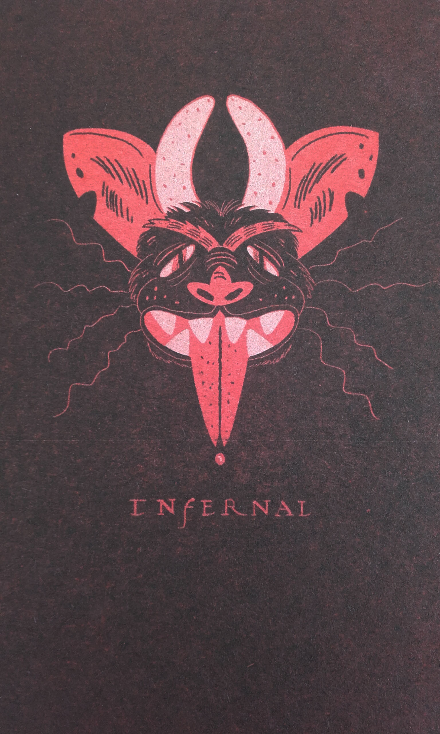
I picked up a risograph printed zine from one of the comic book stores in town. I don’t buy on impulse, and I like to browse the self-published books for the illustration and text, but INFERNAL caught my eye, I decided to pick it up. I want to share a few pictures of the artwork here.
The zine’s cover.
It is, of course, a zine full of demons (it’s “a zine about hell”). It’s a collaboration between two artists, Eli Spencer and Sophie Robin. The publication is a non-standard size, I’d say close to A5, and it was made thanks to the Edinburgh-based social enterprise print studio Out of the Blueprint.
It is difficult to capture the vivid colours of riso ink with a phone camera (or digital camera) and my photos don’t quite do the book justice.
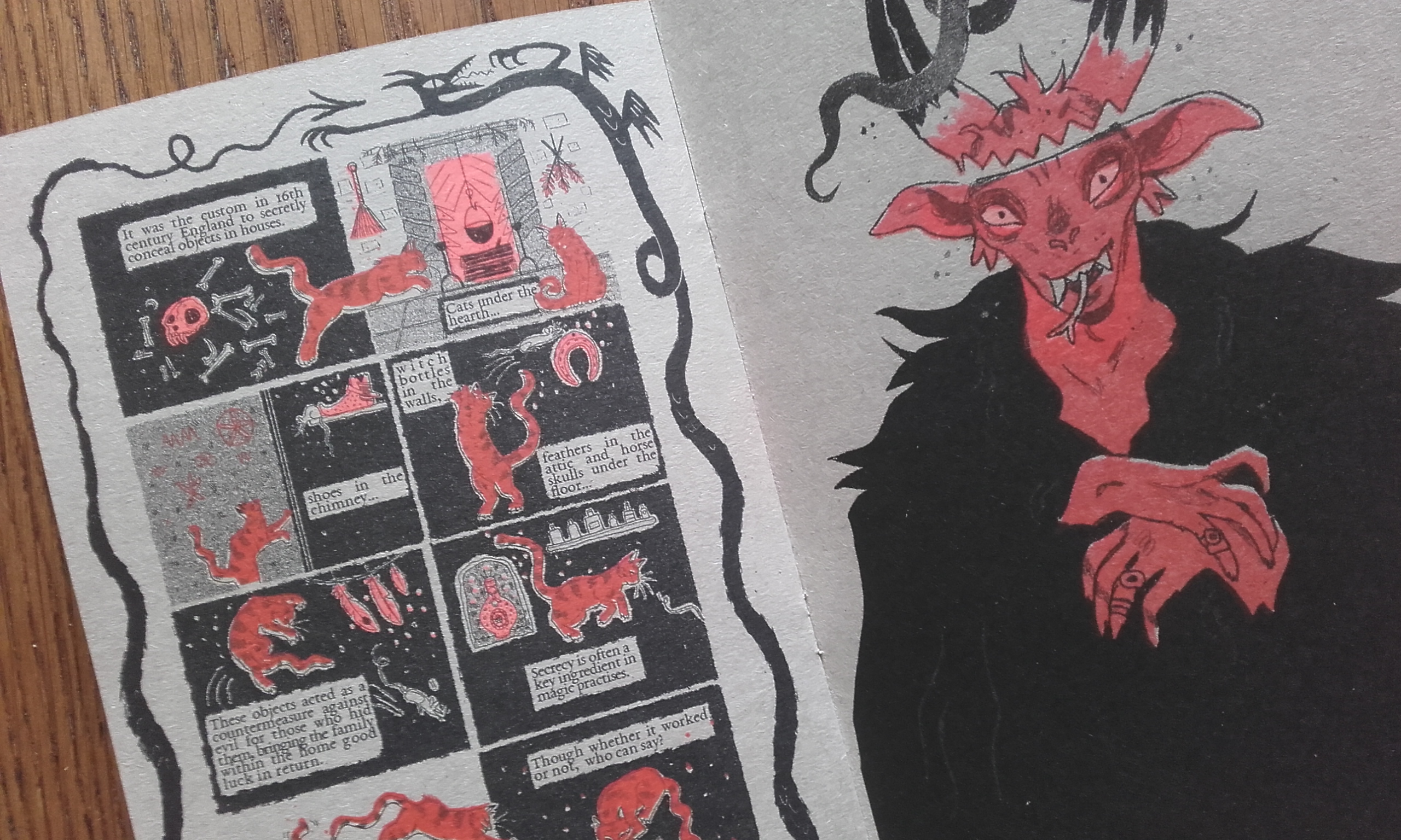
Inside the zine – comics and illustration.
Not all zines are made using a risograph printer, of course. One can use a regular photocopier, or any kind of printer. But the reason I picked this book up was because it was riso printed; the pages are all grey sugar paper, using fluro orange, red, and black ink.
seeing small self-publications like this gives me the hope that I can also print books if I wish to. I can’t see myself printing an artist book or zine in the near future – between the upcoming academic year and work – but it is something that I can work towards if I find the time to paint and draw. An artist’s book can just be a collection of work reprinted and bound!
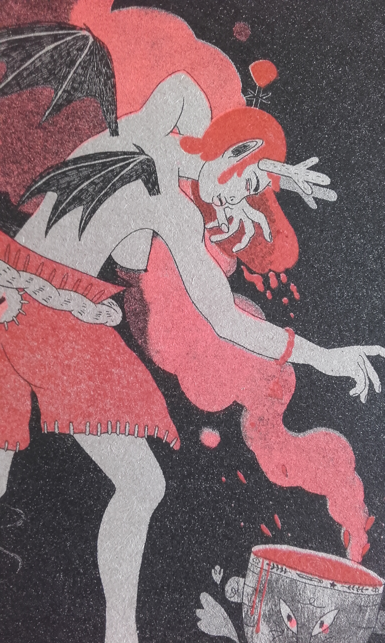
Detail of an eastern demon illustration.
Each artist’s work complemented each others’ and that makes flicking through the illustrations engaging. The colours of the inks of course reinforce the association of hell and red, ruddy brown, and black tones.
You can see that some pages’ registration is a little off (or, I assume it to be) but that’s one of the charms of this printing method, and each zine is an unique artwork in its own right.
I recognised some of the demons in this book (some exclusive to literature or folklore than religion) but none of the demons are indexed and I wanted to know more about some of them.
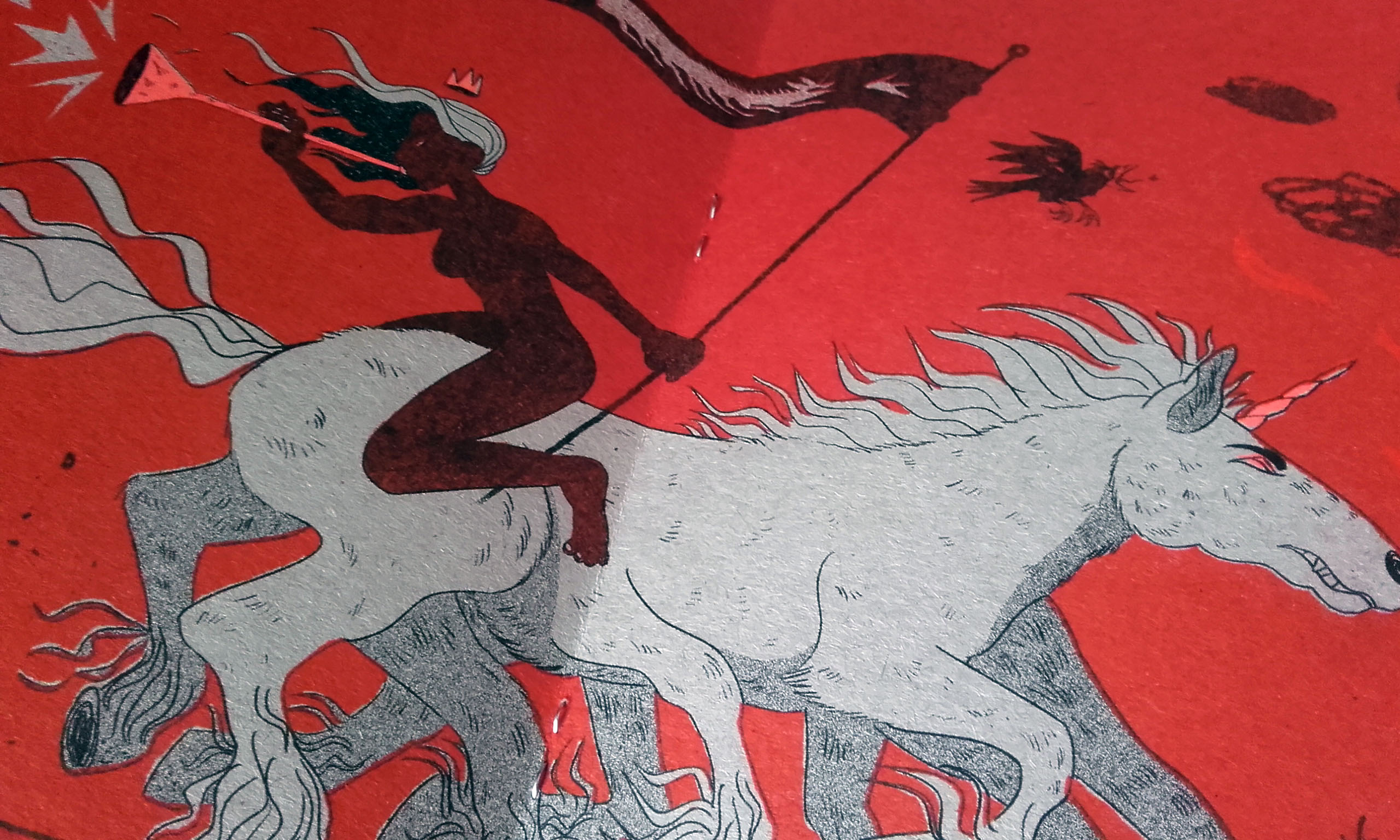
The centrefold illustration.
Even though the printing risograph zines is technical and uniform, the internal contents of the zines doesn’t have to be. The insides will be as varied as the people who make them!
If your local comic book shop has a section dedicated to self-published works it’s worth checking out to see books with content that otherwise wouldn’t get printed; either because they cover subjects and issues big publishers shy away from, or the content might not interest a large enough audience to validate the cost of mass-printing. Regardless, you’re not likely to find artist books or zines in a chain bookstore!
Although I have already written in detail about the poster brief, sticker making, and risograph prints that I made elsewhere on this blog, I want to write up my thoughts on the Practice Enrichment module as a whole now that I have been given feedback.
I’d admitted previously that I had difficulty with the risograph session – getting a composition together – but in the end I sourced my images from magazines and made a pleasing enough image.
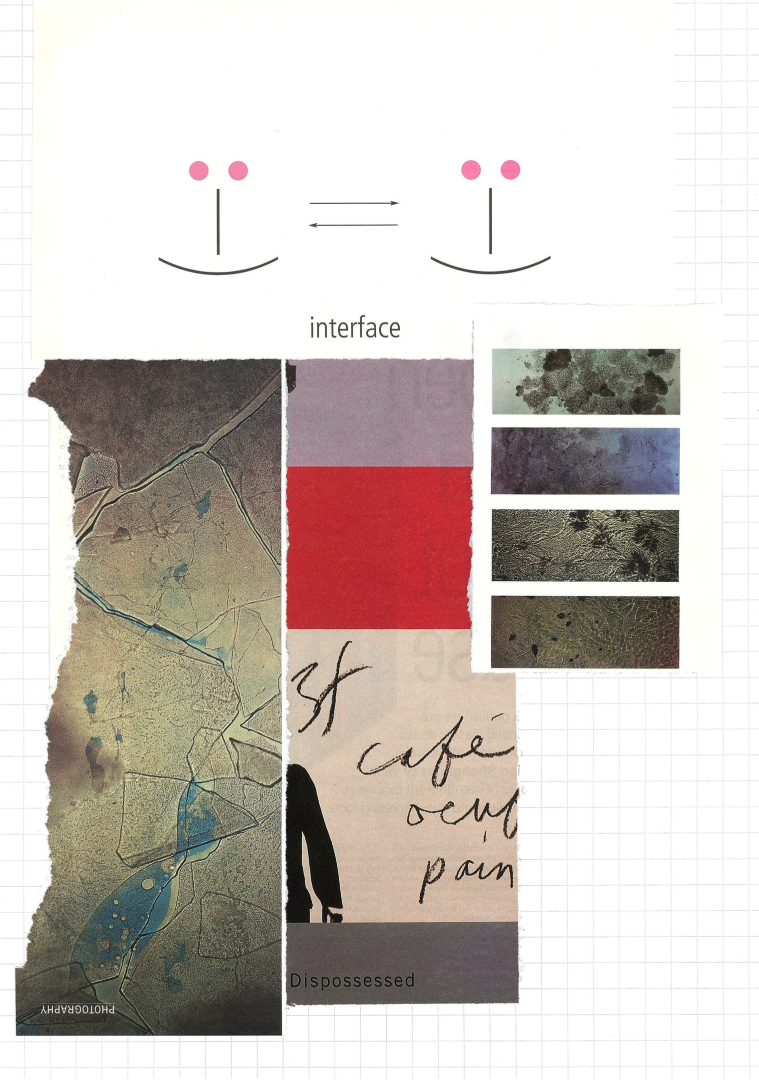
Colour photocopy of the collage that became the teal layer.
Only 7 final images out of the run of 10 were of a good, consistent quality. But I think that’s a good number and I’m eager to try my hand again at risograph printing. With enough trial and error, I imagine that I could create some very pleasing work.
End result.
I think I need guidance to go though the method of creating decals again. The workshop was s quick; but through practice, the task should become easier. Creating a crisp and solid graphic that performs as you want is the hardest part; printing it is a technical process.
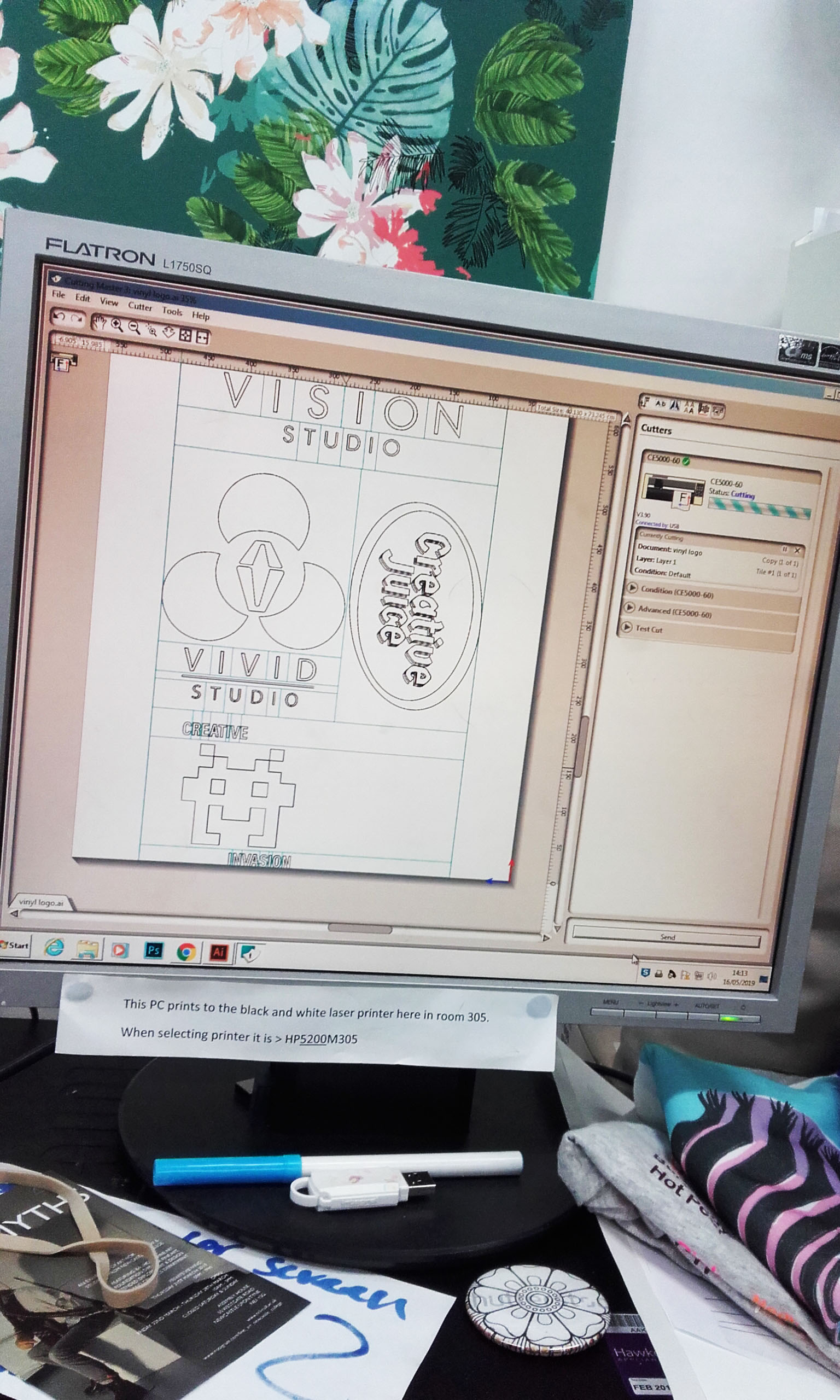
Four designs (including mine) are fit onto a strip of vinyl in Cutmaster 3.
The vinyl graphic needs to be in monotone; although a finished multiple colour vinyl is possible, if the work is made of different, individually printed layers. My Creative Juice logo was simply black. The work has got to be a vector in order to work with the Cutmaster 3 program, which sends the data to the vinyl cutting machine.
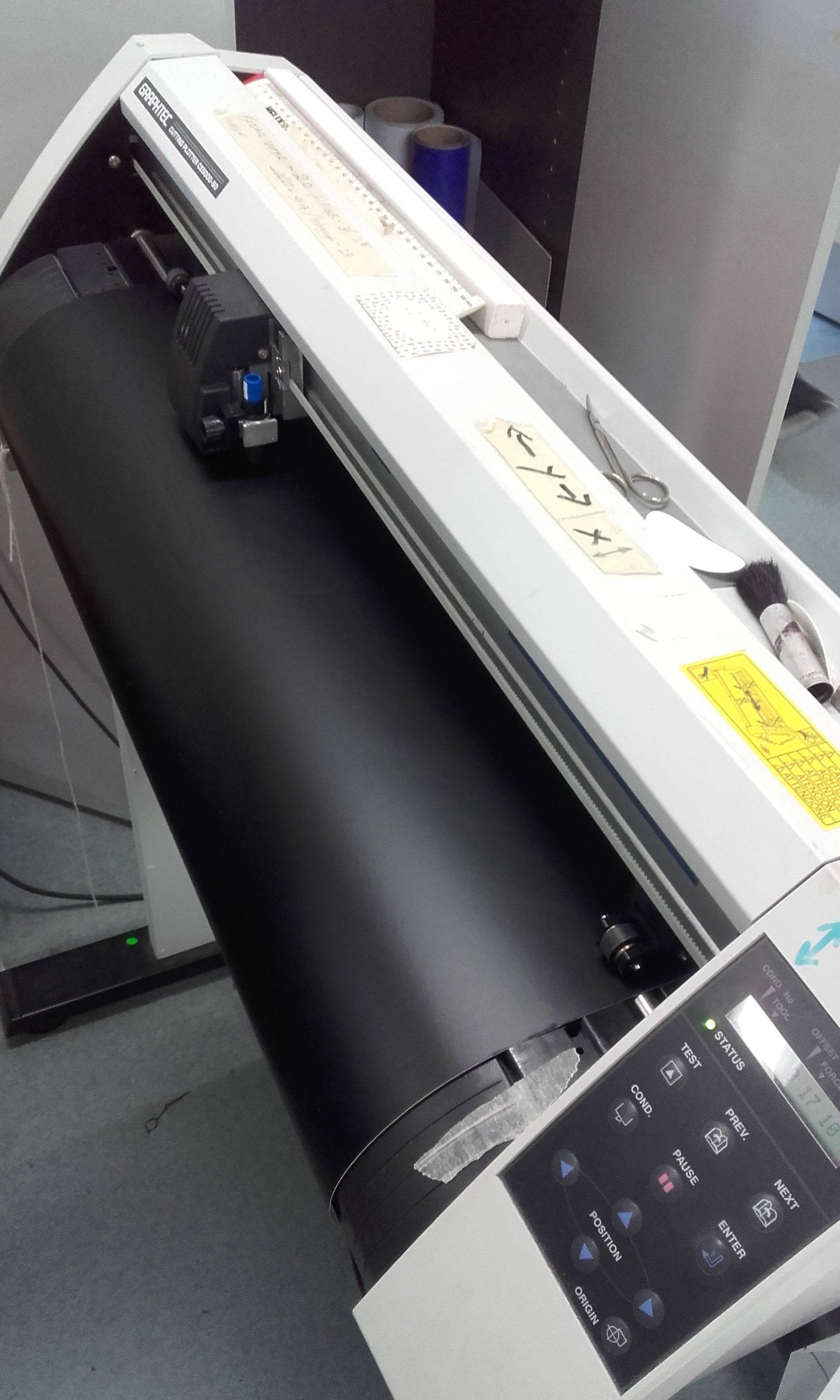
This machine cuts decal.
Sticker-making felt a lot simpler a process. As long as the graphic is sharp enough to print as the desired dimensions, it doesn’t need to be a vector. I used programs and technology exclusive to the creative industries’ department. The most important specific to remember is the cut-contours’ line with of 0.25.
Detail of a sheet of stickers.
With the feedback that I have received, I am happy with the results. I am encouraged to push on and keep up the momentum and drive to better myself, to continue learning at my own pace to become a solid graphic designer.
Reflecting on this past academic year, I have achieved a lot, learned much more than I had thought I would (or could), and I intend to keep it up. And there’s so much more to learn when I return in the autumn.
Another 1-day brief delivered by our tutors. Students were asked to create a two-colour (A3) Risograph printed poster. Blank Poster’s word prompts would define the content, and we could later submit our work to the website (for exposure) if we wished to do so.
The process of Risograph printing is a technical ordeal. Risograph printing is an environmentally friendly, unique printing method which uses a special Japanese printer. It could be compared to the largely obsolete technology of a Mimeograph; ink is pushed though a stencil.
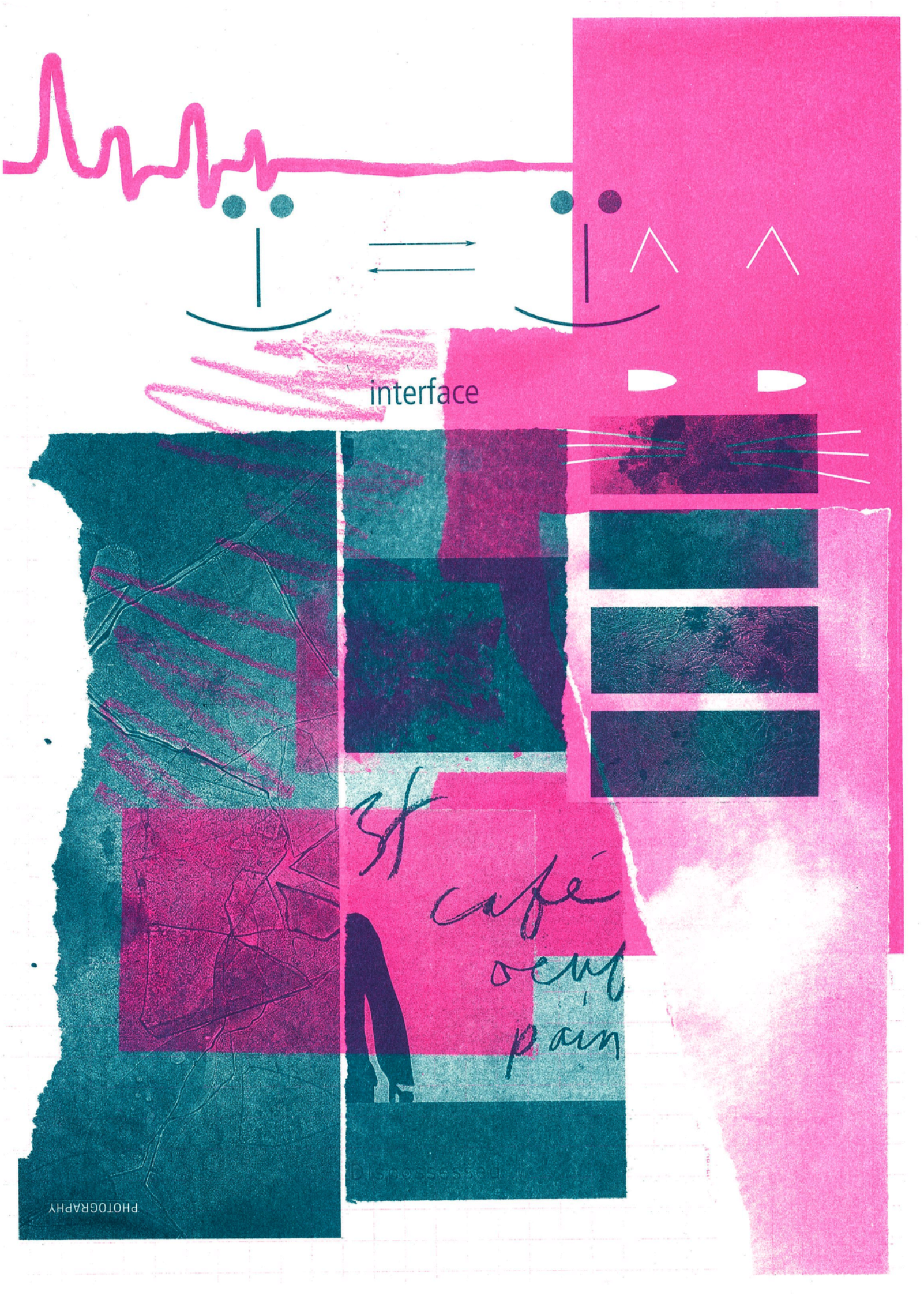
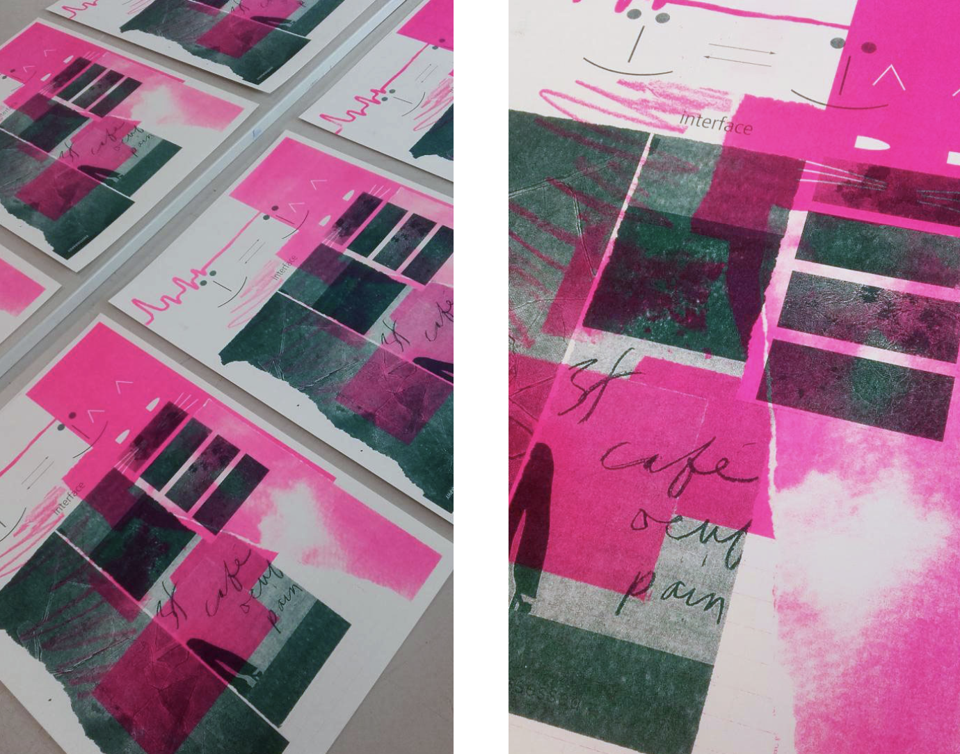
The finished Riso print.
A Riso printer uses soy based inks and masters (which are essentially stencils) to produce a unique set of prints. A master is copied from whatever’s placed under the printer’s glass.
While only a single coloured image can be printed at one time, more colours can be layered onto dried prints (overprinting), and will produce new colours from overlapping ink. As can be seen in the image above, I overprinted and ended up with nice, muddied pinks. It’s actually very difficult to capture the brightness of the fluorescent pink in a digitised image!!
If I wanted to avoid creating new colours, I would have had to ensure that no patches from either layer overlapped; the knockout technique.
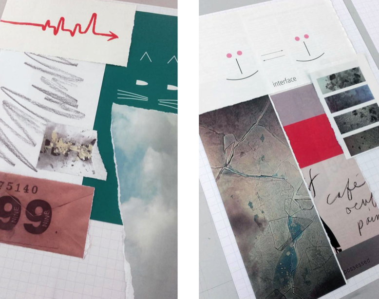
Collages used to make my Risograph print
I was unsure of making a digital illustration, and thought to pursue an analogue composition. I had great trouble with this brief.
Though I struggled with the drive to create a composition, in the end, I did make an analogue piece of art. I scoured the magazines that we had in the studio for source material to make two collages.
My inspiration or influence here? … fine textures and close-up photography. Interaction; intimacy. Although I much prefer an artwork to speak for itself, and like the viewer to interpret the piece however they wish to.
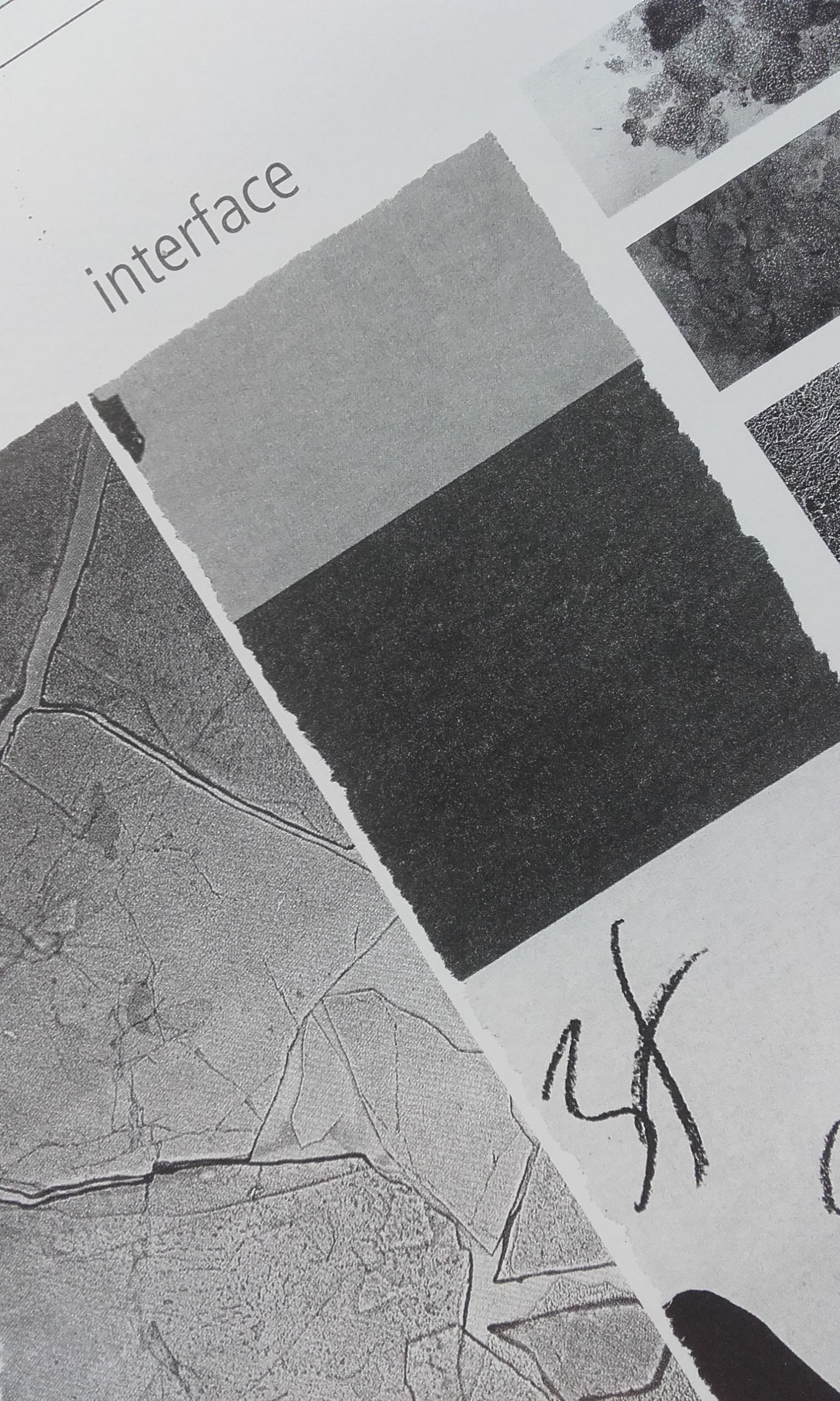
Detail of a black and white photocopy. This is the teal layer.
I really liked that the fine textures within the images I had used were emphasised in the photocopies. The machine’s glass was a little dirty and left extra marks on my collages, but in this case, I think they add to the overall aesthetic.
I really appreciate that the Risograph print has similar visual feel to a conventional silkscreen print – each print is unique – though the process is quicker, cheaper, and results in less mess.
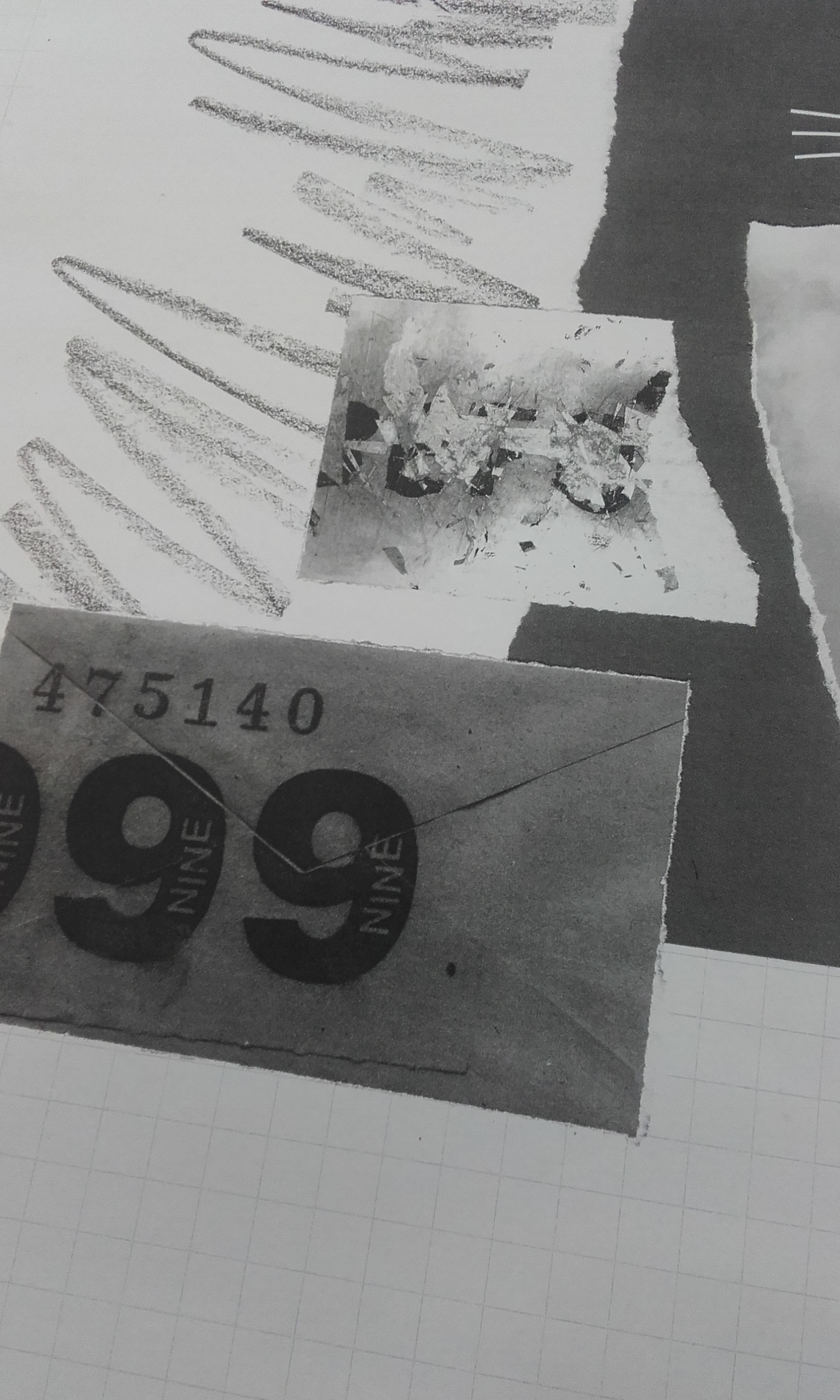
Another detail. This time of the pink layer.
One of the most exiting elements of Risograph printing is that you’re essentially “working blind” and the final outcome might not match your expectation exactly. The finished work could be an unexpected result. It could be better than your expectation!
Not all of the details from the photocopy carried over to the colour prints. I lost some cool detail in my collages, along with most of the background paper’s grid. It’s good to spot these happenings now, and remember them in the future.
A run of prints laid out to dry.
You can see from the above image (left) that each print is unique in how the ink is pushed through the master and how it takes to the paper. My work did not suffer any print marks (uneven printings of heavily-inked areas) or marring from the machine’s “pick off needle” which can leave scratches (needle marks) it does have some light track marks (yes, marks not dissimilar to the marks of an automobile’s tyre tracks) at the top of the page on the pink layer.
Upon reflection, I very much enjoyed the exercise and I am pleased with the outcome. I want to take advantage of the Risograph printer we have in the design department. I want to make personal illustrations and experiment with digital image making in my spare time, too. If I ever get very well acquainted with the Risograph printer, I feel that I can make ace analogue illustrations with a bite I can’t otherwise produce traditionally.