Albert Camus – “Create Dangerously”

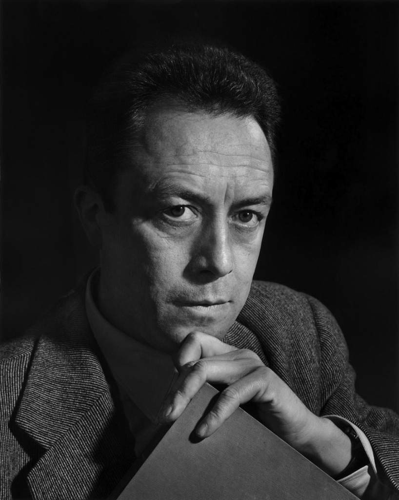
Recently, I read a translation of a well-known speech by the French-Algerian writer and philosopher Albert Camus. The speech I read was Create Dangerously, which was delivered in 1957 at the university of Uppsala in Sweden, and it concerns art and its relationship to its audience, and the power of art; “To create today means to create dangerously. Every publication is an act, and that act makes us vulnerable to the passions of a century that forgives nothing.”

The speech Camus gave is as relevant to the creatives of our time as it was to the creatives of the period it was given in. Perhaps it is of more significance today? I wanted to share a couple of extracts from the speech.

“Of what if art could speak, indeed? If it adapts itself to what the majority of of out society wants, art will be a meaningless recreation. If it blindly rejects that society, if the artist makes up his mind to take refuge in his dream, art will express nothing but a negation. In this way we shall have the production of entertainers or of formal grammarians, and in both cases this leads to an art cut off from living reality.”

Throughout his speech, Camus asks the artist to take responsibility for their creations. To be mindful of what you create, and what you are reacting to. Artists can speak for those who can not, after all.


In the past, I had been thinking about the lack of government funding that goes towards creative public endeavours, or the preservation of art (in all forms). But the suppression of art isn’t solely external. Camus explains to us:

“It is not enough to say that art is threatened by the state. If that were true, the problem would be simple: the artist fights for capitulates. The problem is more complex, more serious too, as soon as it becomes apparent that the battle is wages within the artist himself. The hatred of art, of which our society provides such fine examples, is so effective today only because it is kept alive by artists themselves. The doubt felt by artists who preceded us concerned their own talent. The doubt felt by artists of today concerns the necessity of their art, hence their very existence.”

I’m not going to let myself get dragged down by thoughts of “is this work purposeful?” anymore. I’ll create because that’s what I know, and I want to use art as a form of communication. I want to use art as a connection to others.


Now, I don’t see eye-to-eye with everything Camus presents us here. Camus views “art for art’s sake” (”l’art pour l’art”) as frivolity, and warns us against the superficiality of it all. That is, if you take the mindset ‘to the extreme’. The notion that if one creates art divorced from moral, political, utilitarian, and didactic function, that it doesn’t serve a purpose in society. I wonder if it is truly possible to divorce creations from the aforementioned functions. (For example, you can study a painting someone made ‘for experimental purpose’ and learn from it.) Tying art to function – or the lack of obvious practicilaity of my work – is what causes me great stress, after all. I think I’m fine if I create for the sake of it; I can not remove myself from the world so I need not worry about divorcing my creativity from humanity. I’ll try not to get caught up in frivolity.


If you want to read through the speech yourself, you may do so here, in a PDF format. I hope that this speech is of use to anyone who studies art or creates themselves. You may find some thoughts that aid you, or may even challenge your beliefs on the act of creation.

Design Reference Books – “Modern Heraldry VOL. 1”

Long time no blog, huh?? I thought to share some books on my shelf that others may find of interest for design reference and inspiration. The book I picked out today is Modern Heraldry VOL. 1 Seals Stamps Crests & Shields (2015) published by Counter Print. This blog entry isn’t an endorsement of the publisher, rather it’s my desire to point others to useful printed references in place of using the internet for the majority of gathering material to spark projects and the imagination.

I won’t be ‘reviewing’ the book here; I don’t feel the need to. All I can say is it feels good to have on the bookshelf. You never know when such a thing will come in handy. (Even for rendering fictitious logo designs for movie or stage prop design, or environment/background illustration.)

The book is akin to a visual dictionary. The language of design in dense, and this books sorts the best of the best modern symbolic logo designs into easily referenced sections of shields, seals, crests, flags & ribbons, and laurels. It’s a very pleasant book to page through.

The blurb states: “Modern Heraldry is a comprehensive and profusely illustrated guide to more than 350 trademarks, based in heraldic symbology, from all over the world.” Indeed, the book is an eye-opener to overseas logo design that otherwise would go unnoticed to me. It’s always a treat to see how other countries navigate design ‘trends’, and what design rules their work adheres to. The world is far more connected now than the previous century, so it’s reassuring to see vastly different takes on say, a café logo from different countries. (Of course the intended market audience and the quality of the product or service sold effects the image and logo even within the same country.)

I hope you can enjoy the few images that I’ve shared here. At some point, I’ll show some of the second volume of Modern Heraldry. I’ve a small number of other books by the same publisher, but I do own some interesting and equally specific graphic design books that I would like to share here. A previous graphic design book I covered on my blog would be Logos from Japan. It’s a fascinating insight into foreign logo and symbol design.

Modern Logo & Symbol Design – Logos from Japan

A good friend gifted me a new logo design book titled Logos from Japan. The book is published by Counter Print. It’s a continuation of the survey of design made to curate the graphic design book From Japan, but focusing only on the country’s logo design. I want to share some of the book on my blog.

It’s a paperback book of 160 pages, in full-colour, and has a short foreword on the selection of designs within.

The book is has grouped the logos by theme such as ‘Architecture’, ‘Natural’, and ‘Latin’. Each logo is labeled by name, with the information of the agency that created it, and the year it was made. There’s plenty of room allocated to each logo – many have a page or two of their own – and there’s photography of some of the designs at work on signage or print.

animal welfare
Animal environment and welfare foundation logo
apparel logo design
Clothing store logo featured on signage and paper bags

There’s an interesting passage in the book’s foreword that highlights globalisation’s relationship with design and craftsmanship – homogenisation – and that Japanese design has thus far evaded strict international ‘rules’ popularised by Swiss design:

In 1996 the German graphic designer Olaf Lue wrote that German design no longer had any national attributes. Observing that some might favour this development, Lue also acknowledge that some might regret it. It was true that, throughout the latter half of the twentieth century, the spread of information and the effect if globalisation showed its impact on the world of design, as in many other areas. An ‘International’ or ‘Swiss’ style was prevalent in the West, characterised by cleanliness, readability and objectivity. However Japanese design remained largely recognisable, mixing extremely traditional elements of Japanese Art history and the highly modern influence of Western design.

inside book
Human figure-based logos
Toyama
Toyama prefecture’s logo

And this book really is a wonderful showcase of design that feels almost unreal in contrast to what I see of most UK, American, or European product and service logo branding. I see a lot more playfulness in Japanese logo design. Of course the playfulness is kept to appropriate services and products such as bike shops, T.V. stations, video game studios, patisseries, and so on, though I am used to seeing the these services represented through more serious, elegant, or corporate images.

The logos featured within this book are all from within the past couple of decades. As the forward explains the mentality behind modern Japanese logo design is to create something that captures the interest of the public eye in the moment:

Arguably, this could be seen as a less ‘long lasting approach’, and some of the logos will be seen as ‘of their time’ when looked upon from years to come. However today, when most identities are viewed on screen, there isn’t a permanence of print that companies are more inclined to quickly throw out their previous logo design in favour of a new one. As such, the style of Japanese logo design is constantly changing and a long lifespan for a logo is no longer expected to such a great intent.

I haven’t been taught to think about logo design as quite so ephemeral, and it’s an interesting view to read about. The transient nature of contemporary Japanese logo design is understandable when put into perspective of modern services and consumerism.

This book is very fun to flick through for the unique blend of tastes Japanese design has acquired. The number of colours used on some logo designs, and the colour combinations across these logos is a very interesting insight to design that does not follow international rules.

I’m very happy to add this book to my small collection of graphic design books. I really look forward to the day that I am able to visit libraries again to check out any recent publications for graphic design reference, too. The internet is handy to have at my fingertips, but sometimes I find holding and pouring over a book a better experience. Carefully curated publications like this shows why print is still around!

Sanzo Wada – “Haishoku Soukan”

I picked up a new book as I want to add to the small pool of design reference books I have. The book is called A dictionary of Color Combinations, and is published by SEIGENSHA. The small amount of text within the book is primarily written in the Japanese language, but the practical nature of the book means it is accessible to those who can not read the Japanese text.

a_dictionary_of_color_combinantions_front01
A dictionary of Color Combinations

a_dictionary_of_color_combinantions_front02
The book itself is a lovely object

The contents of the book are sourced from the work of Sanzo Wada (和田 三造). Sanzo Wada created 6-volumes of colour studies (Haishoku Soukan) between 1933 to 1934 (in the pre-war Shōwa era). Sanzo Wada studied western style painting at the Tokyo School of Fine Arts and later worked as an instructor at the school. This book’s dust jacket states that he was a working artist of many disciplines; while he was a costume designer for theatre and movies, he was best-known for his woodblock artworks.

a_dictionary_of_color_combinantions_index
Contents page

Color_combinations_01
Details on the source materials

The book sports a thin brown paper dust jacket, and is rather small being A6 (so you could say it’s a ‘pocket-sized’ reference book). It’s very dense, and there are more than 300 thin, but glossy pages. Over 200 of the pages are dedicated to colour combinations (348 unique combinations in all). There is a section for colour pairings, and then three and four colour combinations. Each colour is given its Japanese name first, and then an English name.

a_dictionary_of_color_combinantions_2colors
Pairs of colors

a_dictionary_of_color_combinantions_3colors
Groups of three cololours

Even though the contents are from back in the 1930s, it’s clear that Sanzo Wada was progressive in colour theory studies, and the colours grouped together here will work to suit contemporary western sensibilities. I can imagine looking to this book when stuck on illustrative projects with mature audiences and certain demographics in mind. The books gives the CMYK (the cyan, magenta, yellow, and key/black) code of each colour towards the back. (The CMYK colour range is used for any design intended for print.) This is very friendly feature for those working digitally.

color-combinations05
Colours and their codes

a_dictionary_of_color_combinantions_swatches01
Using the cut-out swatches provided, it’s possible to arrange new combinations

At the tail-end of the book are plenty of colour swatches in which one can cut out and make one’s own colour combinations. (I personally can’t bring myself to cut such a book up… but the practicality is a nice thought.)

a_dictionary_of_color_combinantions_back01
The back of the book

The insides and usefulness of a design book is more important than its image, but this book happens to look and feel nice. (It’s actually a difficult book to photograph given how tight the binding is, but I hope the pictures I took showcase the contents and overall look well enough.)

If this looks like a useful book to you – for use in interior design, fashion, graphic design – then it’s good to know that the book has been in continuous print since 2010 and is not difficult to come by.