I have received my results for the Academic Study Skills module, and I am very pleased. The module is essential for students to demonstrate their ability in researching and referencing material. The research topic being “predicted creative industry trends”. For me, this exercise was natural. I like to search out new information, and then I love to share it; it’s just a little more formal to collect findings and then write a report on a subject than to engage in a casual conversation with a peer or friend.
A glitch-themed mood board that I made. It includes editorial, website, and poster design.
I’m glad that my research and writing was of a “professional standard”; though it was a little out of my comfort zone to research and write about creative industry trends. I need to get into the habit of looking at present visual styles and the predicted aesthetic directions of the future. I was once told that fashion goes through cycles, and that’s not incorrect. It’s just a matter of keeping on top of how quickly styles fall out of favour. I’m unsure in my ability to predict trends, and personally, I’d rather design work that doesn’t adhere to a certain trend. (I may be shooting myself in the foot.)
Considering my solid grade, there was not much commentary (or any critique) from my tutor. I am to continue with implementing the skills that I have demonstrated within this module into my other modules; it will support my theoretical understanding.
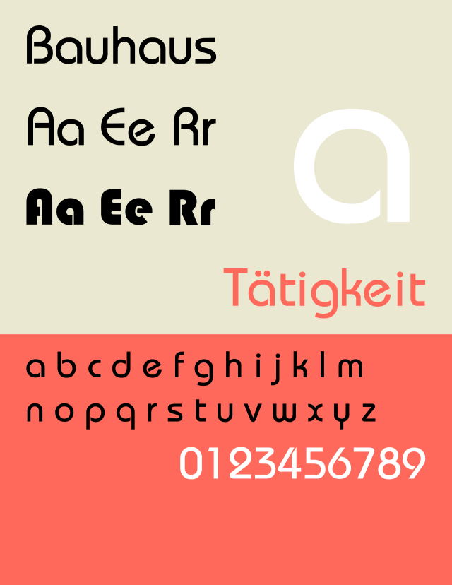
100 years on, and the teachings of the Bauhaus school of art are still examples of a solid design process. That is to say, that today’s graphic designers owe a lot to the teachings and theories of Bauhaus; it was the most important influence on graphic design in the twentieth century, with its presence felt throughout contemporary typography, architecture, website layout, furniture design, and art theory.
The Bauhaus school was founded in the year 1919 in Weimar, Germany, by architect Walter Gropius. Bauhaus essentially means “house of building”. The school existed in three German cities; in weimar from 1919-1025, in Dessau from 1925-1932 and in Berlin from 1932-1933, with a combination of tree different directors; Walter Gropius, Hannes Mayer and Ludwig Mies van der Rohe.
It was a school that strived to combine beauty with usefulness through architecture, sculpture, painting, crafts, and engineering. Under Bauhaus’ teachings, weavers, painters, architects, and so on were all understood to be of equal importance.
Much like the Arts and Crafts movement of Britain, Bauhaus’ teachings were in part, a reaction to soulless mass-production. Though unlike the Arts and Crafts movement, Bauhaus supported the idea that both mass-production and the individual artistic spirit were compatible. Another key difference is Bauhaus’ focus on practicality; for art to survive in a turbulent society, art had to show its functionality and purpose.
In future posts, I’d like to examine specific artists from the school of Bauhaus, and how their works still influences design to this day. As Bauhaus is such a broad topic, this entry focusses only on the Bauhaus typeface and some popular usage that it sees.
Bauhaus typefaces
Student of Bauhaus and later teacher, Herbert Bayer, built the experimental Universal typeface in 1925, and while never truly finished, it lay the groundwork for the Bauhaus typeface Blippo, designed in 1969 by Joe Taylor.
For the Bauhaus typefaces, serifs (often seen as, or used as reading aids) have been left out in favour of a more definite, crisp finish; meanings it’s a sans-serif font. The font Blippo and the variant, Bauhaus 93 (first used in Microsoft Office in 1993) see ever-popular usage on brands looking to be easy-going and friendly.
The logo for Nintendo’s range of collectable, interactive figures.
Nintendo has used Bauhaus 93 for their amiibo logo. They also used Blippo back in 1985 in the title screen of the Nintendo Entertainment System’s Super Mario Bros. and its sequel. Nintendo generally pushes their accessibility, their wholesome content, and the fun and excitement of learning and exploring, so appropriating the font to communicate “playfulness” is no surprise.
The Playmobil logo from 1980-1990. Playmobil continues to use a modified Bauhaus font logo.
Playmobil uses the Bauhaus font to look both approachable and fun, yet the typeface also holds a sturdy and durable quality to it, mirroring the endurance of a product that is designed for everyday play and wear.
In media, the 1981 British stop-motion television program Postman Pat uses Blippo in the logo and end credits, while Bauhaus 93 is used extensively in the American, flash-animated surreal comedy web series Homestar Runner.
There are other well-known uses of the Bauhaus fonts, though they’re either used for children’s entertainment, or family-oriented products or services. I think there is much opportunity for Blippo and Bauhaus 93 to be applied to services and products aimed at other target markets, especially when paired with complimentary fonts. The bauhaus typeface family is most suitable (that is, highly legible) for use on print media such as posters and book covers.
There are numerous channels for adverting to reach us; digital, print, radio, video, and so on, and sub-categories to some channels. Though some services and products have better been able to reach their target market through the unconventional means of guerrilla marketing.
The concept has been around since 1984, and generally, guerrilla marketing runs on smaller budgets, yet bigger imagination in order to capture an audience. The key differentiation from conventional advertisement is that the guerrilla marketing is not traditional, it is not a television commercial, or a radio advert; and if it does involve traditional mediums such as posters, they’ll be gimmicky or interactive.
Guerrilla marketing comes in many forms, even in the most innocuous of acts acts such as handing out free goods. Tissue-pac marketing puts the advert directly, into a potential consumer’s hands, and the service or product is more likely to be remembered with continued exposure though use.
Another guerrilla tactic is ambush marketing; it steals the thunder from other advertiser’s efforts. When companies hand out free items to spectators or competitors in a sporting event, but they aren’t a sponsor of the event, they’re either taking advantage of the mass of people in one place, or the sports teams and their presence in the publics’ mind.
“Nothing stops us.”
I want to share an example of guerrilla marketing used by the UK branch of DHL, the logistics company. The agency Ogilvy created a marketing strategy focused on the company’s tenacity in delivering what’s asked of them.
Ogilvy covered DHL vans in distinct road obstructions; traffic cones, construction barriers, even dirt, foliage and tape, to create caricatures of a determined driver’s ride. Seeing any of these vans, the viewer is expected to have a strong reaction. The exact feelings brought up from the sight of the vans are inconsequential, because a strong enough reaction leads to telling others about DHL’s advert regardless, and in turn raises awareness of their service.
“24 Hours Online Tracking.”
China’s DHL branch also commissioned Ogilvy (Beijing), to help promote awareness of their online tracking service. A large silhouette of a computer cursor was installed onto a fleet of DHL’s runner vans that shuttle about Beijing’s central business district. The drivers also sported a cut out of the cursor on their backs when delivering parcels in person.
In this case, the humour breaks though language barriers by being purely visual. While the simplest of visual puns may be understood and appreciated across language barriers (and maybe even cultural differences) most advertisements are tailored to a particular market, and are not needed to work outside the intended market.
Have you ever been ambushed by guerrilla marketing? Does an unusual tactic spring to mind when thinking of a favourite advert? …you may have even been part of a campaign without knowing!
Print media is the form of advertisement that I have the most affinity for; I like looking at pictures. I respect that an idea can be delivered solely with text, with a static image, or a combination of both, and yet speak as loud as a radio or video.
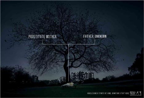
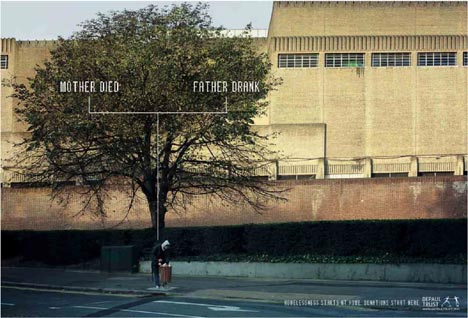
Because all of the advertisements that I have posted thus far are made to sell something, I now want to look at advertisement that takes the form of a campaign. Campaigns can be used to educate and raise awareness of an important issue, not just promote sales of a service or product. Here, we’ll look at a homeless awareness campaign created for DePaul trust.
Bench: “Prostitute Mother. Father Unknown.”
A charity who works with with young homeless and vulnerable people across the UK, DePaul Trust commissioned the agency Publics London to create print advertisements in 2006. “The Root that causes Homelessness” campaign challenges viewers to think carefully about the origins of homelessness. Rather than simply asking potential donors to give money, this campaign helps people to understand why donations should be given, by educating them.
Bag Lady: “Alcoholic Mother. Sexually Abusive Father.”
In these print advertisements, the viewers are given all of the information needed by the visual aid of the “family trees”, while the unfriendly typeface coupled with the honest text asks to be taken seriously.
Dog: “Violent Father. Violent Mother.”
As DePaul explained the needs of the commission, ”For this campaign to have an effect, we wanted viewers to feel the isolation, loneliness and despair of the homeless person in each shot. Location, the type of tree and the light were critical to capturing these emotions. The creative idea required us to shoot wide to capture the entire tree, which indeed makes the person small in the frame. But we found that seeing homeless people in the harshness of their surroundings was more powerful than seeing them up close.”
Bin: “Mother Died. Father Drank”
The photography was by Ernst Fischer. The original intent, was to photograph actual homeless people, but due to UK laws, the people in the photos became models at the last minute.
There are countless campaigns that intend to do good by educating audiences, and I think it is important to consider such advertisements before writing off the advertisement industry as something wholly related to business and profit.
In advertising, a proposition is to promise something; to offer a benefit. With so many companies competing with their own brands of what are essentially the same items, each brand needs a proposition if it hopes to capture an audience. The Unique Selling Proposition or USP was developed by Rosser Reeves, who was a pioneer of television advertising during the 1950s. His words, “Buy this product and you will get this specific benefit.” describe this marketing concept. Reeves understood that consumers were given too much information in advertisements and streamlined the delivery for them, and in the process, increased the sales of products he produced advertisements for. Naturally, as consumers evolved, and learned to better scrutinise marketing tactics and products themselves, different categories of propositions came into use as marketing tools.
A Single Minded Proposition or SMP is the one thing – the most important thing – that the audience needs to know. While this 1950s commercial for Anacin (produced by Rosser Reeves) lists its benefits compared to its competitors, it hammers home the SMP by the end of the video; that it’s “fast“ pain relief. I admire the short animations in this advert that attempt to visualise the pain of a headache.
Today, Emotional Selling proposition or ESP has essentially replaced USP. A person’s buying behaviour is more closely linked to their brain’s limbic system (which process feelings such as hunger, thirst, response to pain, and levels of pleasure etc.) than their brain’s neocortex (which is in charge of spatial reasoning, and conscious thought etc.). Identifying a product or service’s emotional selling point is now just as important as knowing the unique selling point. Although modern advertisement relies on the theory of ESP, before it was named and capitalised on, the concept was recognised early by the businessman and Revlon cosmetics founder Charles Revson, who knew that he was not simply selling products, but was marketing “hope” (or rather, the feeling of hope) to the consumer.
We previously looked at the advertisement agency Mother; now let’s look at a “banned” advert that they produced; Iceland‘s “no palm oil Christmas” television advert. It did not comply with the Broadcast Committee of Advertising Practice (BCAP) code that Clearcast requires an advertisement to do, in order to be approved for airing on television.
The advertisement is not “holiday-themed”; it’s Iceland’s statement of intent to remove palm oil from their own products. It highlights the impact of palm oil on the environment, and was deemed “too political” (due to it’s roots as a Greenpeace video).
In spite of – or rather, because of – the television ban, it quickly gained awareness and support over social media (Facebook) and by word of mouth. The controversy surrounding the ban was covered in several newspapers, such as Metro, The Guardian and The Independent, further promoting Iceland’s stance on palm oil, and the store’s image itself. Clearcast became an easy mark for negative thoughts on the whole ordeal.
Iceland’s official video even flaunts the word “Banned” in the title.
But, surely, Iceland knew – before submitting the commercial – that it would not pass Clearcast’s standards? Why then, use a retooled Greenpeace campaign video, knowing it would be deemed unfit to air? Because Iceland’s executives also knew it couldn’t be outright forbidden from public sight, and they knew that it would thrive online. It certainly propelled Iceland into the minds of the public unlike ever before. Iceland’s public image and stance on palm oil became a heated discourse thanks to this piece of media. It was a carefully calculated move.
Still, it should be noted that advertisements do have the power and potential to change the target’s mindsets and behaviour. They don’t simply have to market something, but can be used as campaigns. Iceland’s bold, environmentally-conscious move here puts them ahead of their competitors in the minds of many who realise that their everyday consumerist choices do have an impact, and also wish to take environmental conservation and sustainability seriously.
It’s time to look at the state of todays’ advertising industry. This is new territory to me. Across the next few entries, I’m going to look at different creative agencies; regional, national, and international, in order to better understand the function and importance of these agencies.
Advertising itself encompasses many channels (a system used to communicate or distribute information) such as radio, posters, television, online banners, online video, and so on. Some channels (videos) are more intrusive than others (bus stand posters).
So, what exactly are creative (or advertisement) agencies? A creative agency is a business dedicated solely to the planning, creating, and handling of advertisements of a client’s property. If you’ve something you want to sell but don’t specialise in marketing, then an advertisement agency is where you’ll want to take your service or product. An agency may be external and operate independent of the client, but an agency can also be an internal department of a company!
A regional advertisement agency that I want to mention is Mother. Originally founded in 1996, it is the UK’s largest independent advertising agency. The agency’s philosophy is “To make great work, have fun and make a living. Always in that order.”
Of Mother’s large portfolio, I’ve been most exposed to their PG Tips television commercials, utilising the characters Al and Monkey (who were previously used to promote the discontinued television company, ITV Digital). The commercials are typical of British humour. Mother knows their target audience, and embraces it. Yes, a number of these ads run with typical British dead-pan humour, light teasing, or satire.
Their PG Tips advertisements appeal to different social classes as they embrace the every-day (or just the mundane) that unite the nation, with narratives such as returning home from grocery shopping, or visiting a relative, to which everyone then enjoys a well-deserved cup of tea. There’s always a silly tilt to the narrative, and typical banter that resonates with the target market. (Target market meaning the consumer of a product or service.)
Now, as funny as I may find Mother’s PG Tips’ adverts, I do wonder how overseas viewers see them. Especially because the humour is tailored to the UK market; I expect the humour to fall flat to those outside of it.