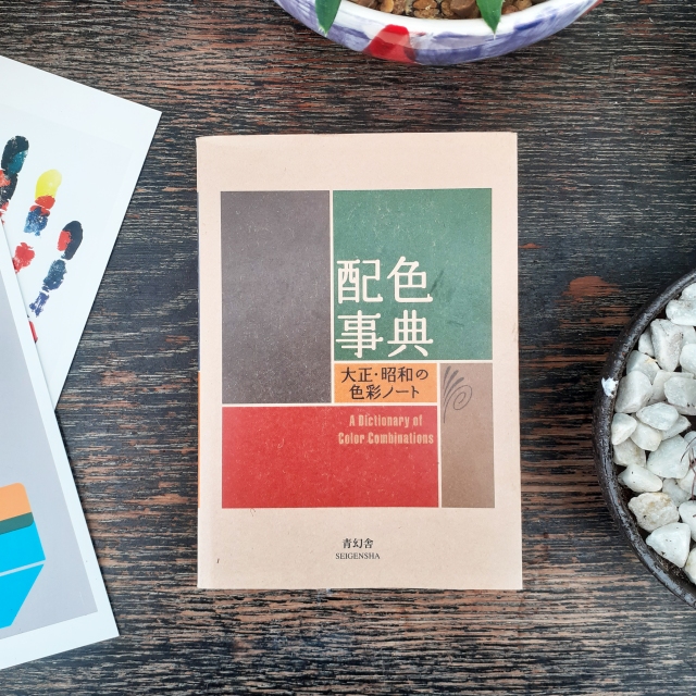
I picked up a new book as I want to add to the small pool of design reference books I have. The book is called A dictionary of Color Combinations, and is published by SEIGENSHA. The small amount of text within the book is primarily written in the Japanese language, but the practical nature of the book means it is accessible to those who can not read the Japanese text.
A dictionary of Color CombinationsThe book itself is a lovely object
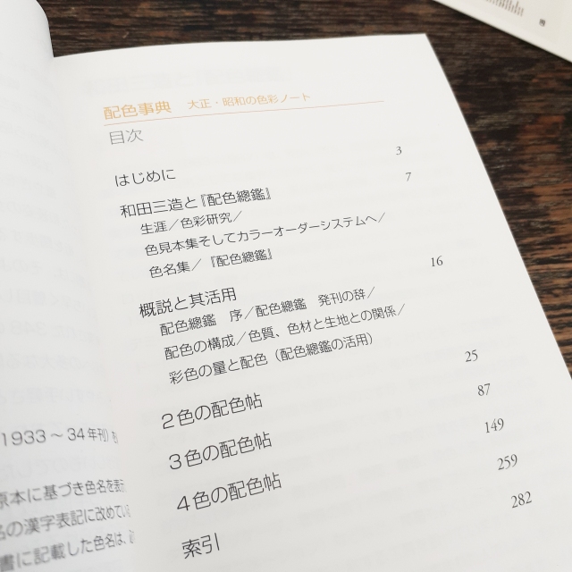
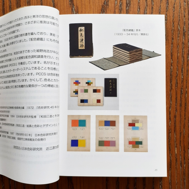
The contents of the book are sourced from the work of Sanzo Wada (和田 三造). Sanzo Wada created 6-volumes of colour studies (Haishoku Soukan) between 1933 to 1934 (in the pre-war Shōwa era). Sanzo Wada studied western style painting at the Tokyo School of Fine Arts and later worked as an instructor at the school. This book’s dust jacket states that he was a working artist of many disciplines; while he was a costume designer for theatre and movies, he was best-known for his woodblock artworks.
Contents pageDetails on the source materials
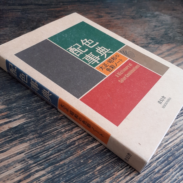
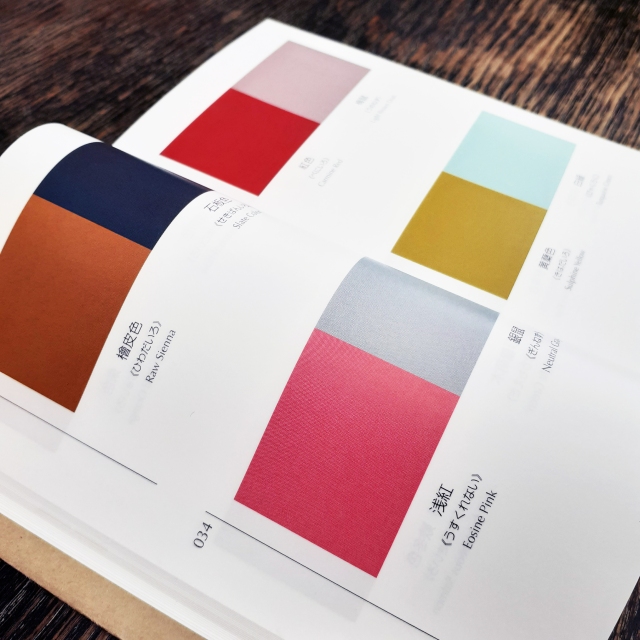
The book sports a thin brown paper dust jacket, and is rather small being A6 (so you could say it’s a ‘pocket-sized’ reference book). It’s very dense, and there are more than 300 thin, but glossy pages. Over 200 of the pages are dedicated to colour combinations (348 unique combinations in all). There is a section for colour pairings, and then three and four colour combinations. Each colour is given its Japanese name first, and then an English name.
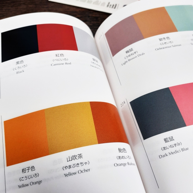
Pairs of colorsGroups of three cololours
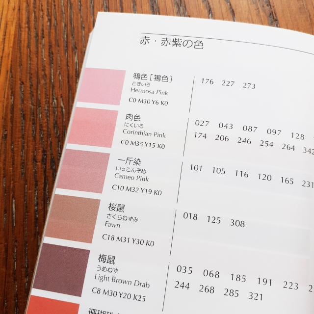
Even though the contents are from back in the 1930s, it’s clear that Sanzo Wada was progressive in colour theory studies, and the colours grouped together here will work to suit contemporary western sensibilities. I can imagine looking to this book when stuck on illustrative projects with mature audiences and certain demographics in mind. The books gives the CMYK (the cyan, magenta, yellow, and key/black) code of each colour towards the back. (The CMYK colour range is used for any design intended for print.) This is very friendly feature for those working digitally.
Colours and their codesUsing the cut-out swatches provided, it’s possible to arrange new combinations
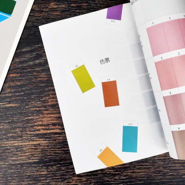
At the tail-end of the book are plenty of colour swatches in which one can cut out and make one’s own colour combinations. (I personally can’t bring myself to cut such a book up… but the practicality is a nice thought.)
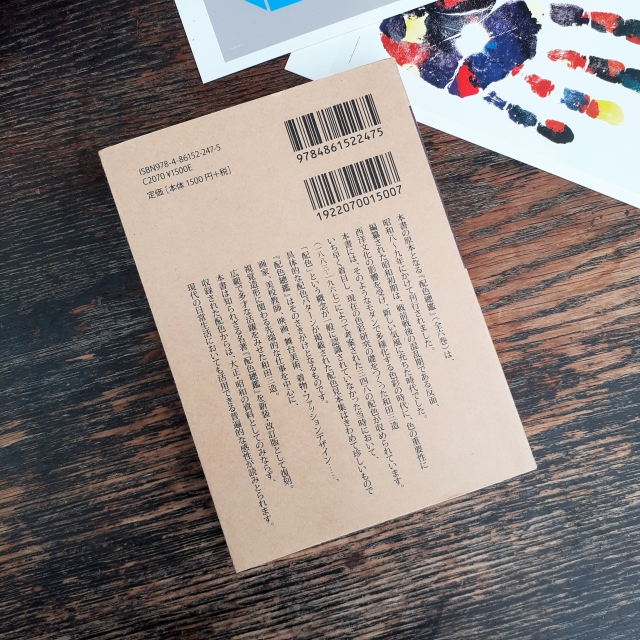
The back of the book
The insides and usefulness of a design book is more important than its image, but this book happens to look and feel nice. (It’s actually a difficult book to photograph given how tight the binding is, but I hope the pictures I took showcase the contents and overall look well enough.)
If this looks like a useful book to you – for use in interior design, fashion, graphic design – then it’s good to know that the book has been in continuous print since 2010 and is not difficult to come by.
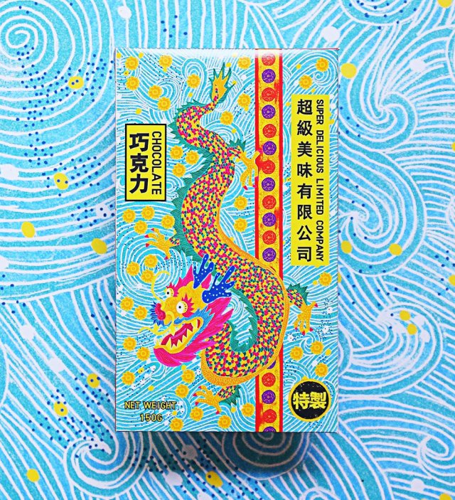
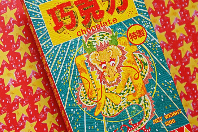
After finishing much research for a current project, I came across a striking food product that is unlike any other chocolate product I’ve seen before. I’ve not included it in sketchbook research because I found it so late, but I also feel that it would be best too here on my blog.
The Super Delicious Limited Company chocolate bar packaging is designed and illustrated by by Zilin Yee, an independent graphic designer, while the copywriter for the project was Herbie Phoon. Zilin Yee used the programs Adobe Photoshop and Adobe Illustrator to craft the very tactile-looking packages, informed by the physical qualities of Joss paper.
A product “based on the idea of the joss paper culture“
The traditional, bamboo-made Joss paper is burned during ancestral worship ceremonies. Joss paper includes variants known as ghost or spirit money, which are highly colourful ‘afterlife bank notes’, burned at funerals. The packaging designs capture the brightness and patterns of the ghost bank notes.
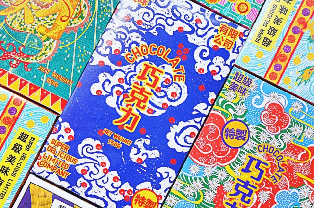
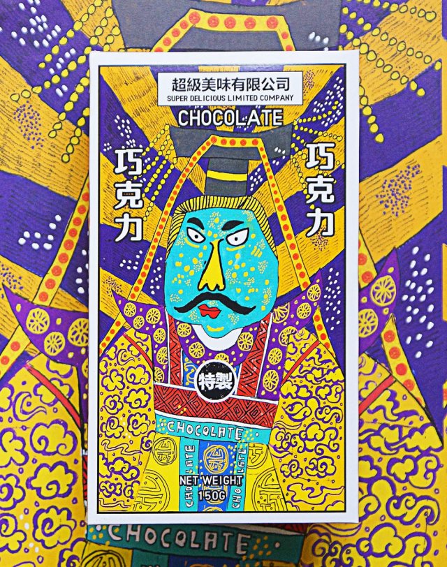
Many different packagesThis package illustration is strongly reminiscent of ghost money, featuring an emperor
The chocolate bar’s packaging all feature very whimsical and playful illustrations. The line of packages are of course, tied together by their visual theme, and typography. The brand logo, product name, and weight are positioned in different places on each package, which is unusual as the same placement would unify a product feasting differently designed packaging.
The colours and patterns are enough to make me want to buy this
If I were to see this sort of product package design in the west, it would undeniably have strong shelf presence going for it, even among other ‘designer’ or ‘premium’ chocolate bars with outrageous packaging design, Super Delicious Limited Company chocolate wears its inspiration on its sleeve (…or box).
The design inspiration has no immediate relation to chocolate (or the origin of the cocoa bean) but it stands out due to the unique route the designer chose to take. Sometimes a product doesn’t have to ‘fit in’ with the status quo to be desired. More-so than other chocolate bars, the visuals of these packages are the real draw to the item, and that’s worth thinking about in future packaging projects.
Lately, I find myself tangled up in unhelpful thoughts about the future. Sometimes, an almost overwhelming feeling of dread and apprehension if I’ve been thinking too hard. When I was facing personal problems, and self-doubt in relation to work and careers in the past, I reached for a book by Adrian Shaughnessy; How to be a graphic designer without losing your soul. It helped reaffirm my choice to study graphic design and my goal to enter the creative industry with a better understanding of integrity.
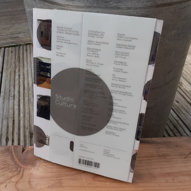
Again, I have been facing some self-doubt and uncertainty, and felt the need to retreat into the library for some advice. One of the books I pulled out and decided to check out also happened to be edited by Adrian Shaughnessy.
The book I picked up is named Studio Culture. It shares an understanding of many different founders of graphic design studios and those who are work within them.
Library copy of Studio Culture
Here is the book’s blurb:
Studio Culture provides a unique glimpse into the inner workings of 28 leading graphic design studios. In a series of penetrating interviews, the secret life of the studio is revealed, and the mechanics of building and maintaining a vibrant studio culture are laid bare with disarming frankness.
Even flicking through the book casually in the library before checking it out, I really felt the sincerity, and was surprised how direct the interviewees were. It felt like the image I had of design studios were now incongruent with the reality of these studios, so I had to borrow the book.
You see, I am both exited and nervous for a short work placement in a graphic design agency that I will be attending abroad in the near future. I don’t feel that the studios on campus are an accurate reflection of real-wold work ethos or camaraderie of a modern studio (sorry!) and I feel the need to better acquaint myself with what to expect in a healthy studio.
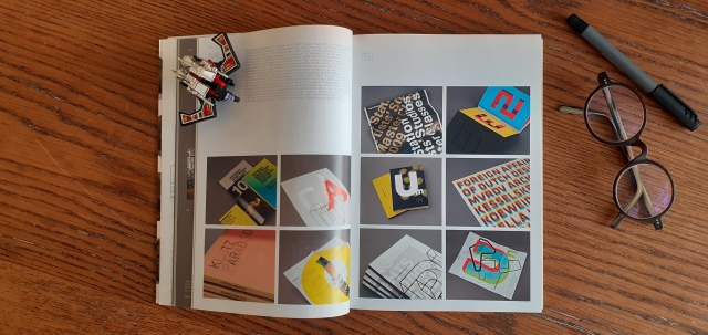
Inside Studio Culture. These pages showcase work by Atelier David Smith.
As stated in the blurb, the book shares with the reader insight to 28 different studios across the globe. Each studio is given a chapter to itself in which contains an interview; each interview is either conducted in-person, over the phone, or through e-mail.
The presentation of the written information is easy to digest. We’re given the studio’s names, the year they’re founded, the number of personnel at work, the location of the studio, and their web domain (at the time of printing). Each studio is given a short bio, and there’s some photography of the interior (and sometimes and exterior) of the studios, which is much appreciated, although most of these images are printed very small. Each studio shares work from past projects as a spread of images.
Here’s an excerpt of a conversation held between Shaugnessay and Urs Lehni of Switzerland-based studio Lehni-Trüb:
Were you inspired by any studios?
That’s a difficult question to answer. We could respond by dropping a bunch of names of designers and studios, but I think we were much more interested in certain attitudes and forms of practice. As examples we could name a certain approach in recent book design from the Netherlands; conceptual art of the late 1960s; or some playful manifestations of design in Italy during the 1970s: although there are just commonplaces for many designers…
What I like about your work is its lack of showiness – the absence of graphic effects and tricks. This makes it hard to detect your stylistic influences. In what way do the three influences you mention above inspire your work?
We doubt big ideas and concepts. As soon as something becomes too slick, we try to saw one leg off to unbalance it again. We like ambivalence more than clarity. Maybe this results from a lack of security and the lack of a serious attitude, or maybe it is simply questioning the recurring demand to always be inventive and unique. Deception, appropriation and imitation are helpful strategies to find our way out of this, in equal measure good and bad.
All of the interviews (regardless of the information channel) feel genuine and feel valuable.
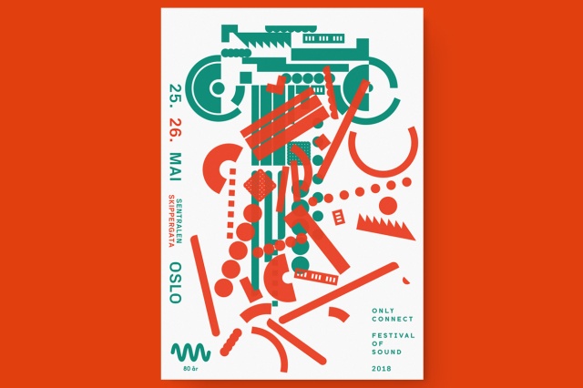
The book lead me to look up a number of foreign studios. Here is a graphic by Non-Format for the 2018 Only Connect Festival of Sound organised bynyMusikk.
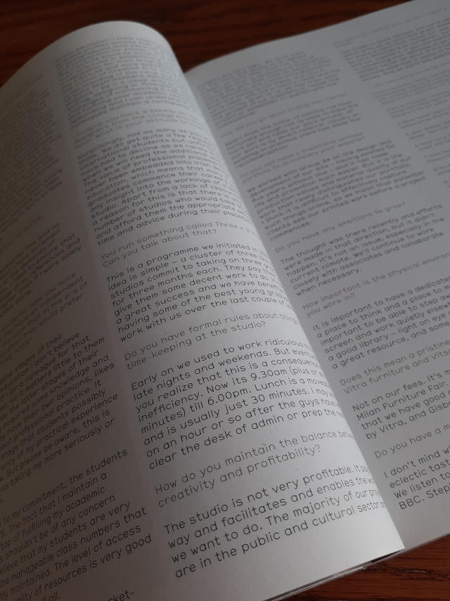
Early in the book, Shaugnessay makes a point about our workplace needing to be considered in order for us to do our best work. There’s a lot of focus on the psychological hygiene of a studio.
The types of people in the workspace are considered and Shaugnessay shares personal mistakes in employing certain folk:
When I first started hiring designers, I made some terrible mistakes by employing designers purely on the strength of their work. I hired people who had impressive portfolios but whose human characteristics were sometimes less impressive. These were talented people who needed a lot of maintenance; in other words, they were people who needed to be told what to do.
Shaugnessay believes that modern studios are non-hierarchical and democratic, and as such, ‘telling people what to do’ doesn’t fit. His view being that the competent design studios will work on the notion that ‘the boss is dead’; the contemporary studio is a place of equality. But he also mentions the existence of studios running on an autocratic model. Because of course there would be.
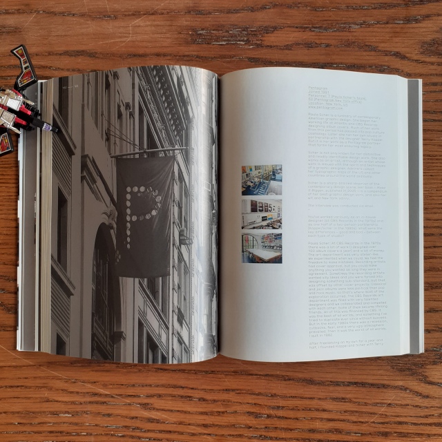
Chapter containing an interview with New York-based Pentagram
…it is mentioned that the ‘virtual studio’ already exists. There are studios who are based in different locations such as Non-Format and Universal Everything, and carry out tasks without hinderance through modern communications technology.
With all the advancements of digital platforms to craft work, I am glad to hear that the hand-made is respected. Shaugnessay explains:
An area for making things with our hands is often considered unnecessary in todays all-digital studios. This is a mistake. Design suffers when it loses contact with it’s made-by–hand artisan roots. No matter how small the studio, we should try to find space for an area where things can be made, cut, distressed, painted and built. An area for photography is equally useful.
We’re also informed that in the studio everyone should be respected. This includes cleaners. Such a statement seems to be ‘obvious’ – a basic understanding of respect for different tasks different people carry out – but if you’ve ever worked in a place where there has been a clear hierarchy of ‘most valued to least valued persons’ with clear inequality of respect and appreciation, then you’ll know that it has the potential to damage interpersonal relationships and cripple work ethic.
Lots of tiny, tiny print
In regards to the physical characteristics and design of the book, I liked the lightweight, matte paper used. But my eyes did not appreciate the tiny type and I would have liked for some of the images to have been larger (I wanted to better appreciate the interiors and exteriors of the studio photographs). Of course, the book would have been much thicker if it were given a larger size font; it’s already quite dense at over 300 pages.
This book was first printed back in 2009, but I feel that the contents are still relevant as of writing. I’d recommend this book to all students studying graphic design who are preparing to enter the creative industry. It will aid in getting a better grip on the structures of modern studios, and what to expect when working in them.
Visiting the campus library for hands-on research on print – on magazines – I borrowed a couple of the journals that interested me due to the contents, the materials used, and editorial layouts, and I will share photos of those journals, too.
(Just bear In mind that the old phone I’m using to take pictures… is on its way out.)
The following photographs are of the December 2019 edition of British Journal of Photography, titled Cool + Noteworthy.
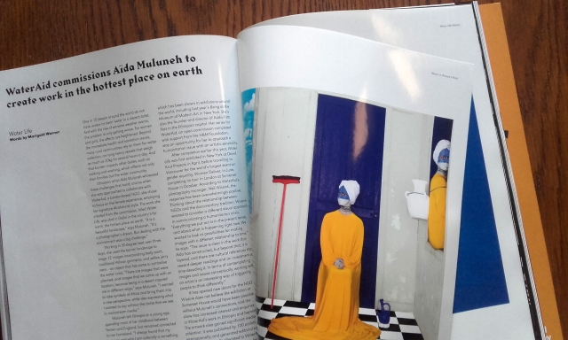
Article on Aïda Mulneh’s commissioned artworkThe gloss on the pages gives the journal a ‘premium feel’
The heavy, glossy paper used in the centre of the British Journal of Photography adds value to the object; I can tilt the book and enjoy the light’s changing reflection, I can run my fingers over the soft surface, I can listen to the sounds the glassy pages make as I turn them.
Matter and Moonvoyage from artist Paul Cupido’s book ÉphémèreLarge photograph from a fashion articleArticle on cartography
The articles are all laid out in grids with the text aligned left. The general layout is restrained, or reserved.
The following photographs are taken of Aesthetica’s June/July 2019 edition.
Piece from Of Rainbows and other Monuments, Clemens Ascher
The two-page image spreads are numerous in Aesthetica, and I’m trying to imagine how they’d display on-screen. There’d be a lack of fold in the centre of the page, of course, and I feel that the small loss of image in the centre of the page in print is a characteristic specific to print that would be somewhat missed in a digital format.
Pages showing artwork from Flowers in December, 2016 by Sanja MaruśićMore artwork by Sanja Maruśić, from Flowers in December, 2016
Looking at pages with such large images makes holding the physical book so rewarding. I am reminded that the copyright of an image is different than copyright of text. Many copyrighted images can not be printed freely without consent.
Article on photography and its power to incite change
There are no excessively glossy pages in this Aesthetica issue; but the pages are a decent thickness. This magazine is much denser than British Journal of Photography, being 162 pages long, than the Journal’s 98 pages.
The dimension and weight of the physical magazine is something that a digital edition can’t recreate. All sorts of material read on the same hand-held device will feel the same size and weight. A reader is removed somewhat from an on-screen book as there is less touching involved.
Next, I want to research some magazines that are exclusively published online and see how they show off their strengths (and weaknesses) through specific characteristics that are bound to the screen. It’s only just to look at the counterpart to print and give credit when due.
For contextual studies research on print, I took myself to the library to see what magazine subscriptions are currently available to borrow. There was such variety; fashion, photography, history, art, engineering, dance, politics… too many subjects to name, actually.
I picked up many magazines and looked through them, trying to gauge their credit and purpose. Here are some of the magazines of interest. I took note of the materials used and the editorial layouts.
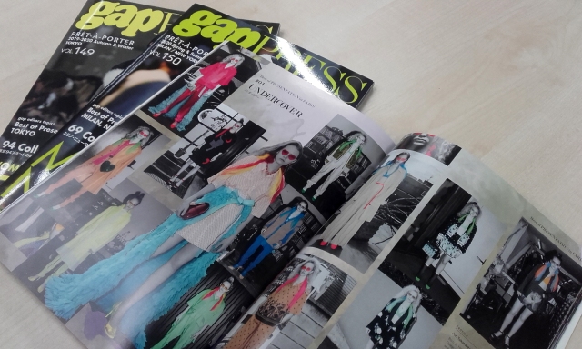
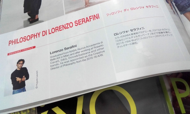
The magazine gap PRESS – ‘gap’ standing for ‘groupe avant-premiere’ – covers international runway fashion shows and presentations within the fashion industry. On the magazines website, access to digital archives are available for customers who have bought physical copies.
Bilingual contents of gap PRESS
The contents of gap PRESS are all bilingual; in English and Japanese. Real people have gone though with the task of translating the contents, and will have been met with thorough scrutiny before publication. A machine translation we may use online doesn’t compare to a human translation.
ELLE Decoration magazines
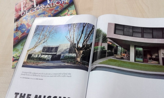
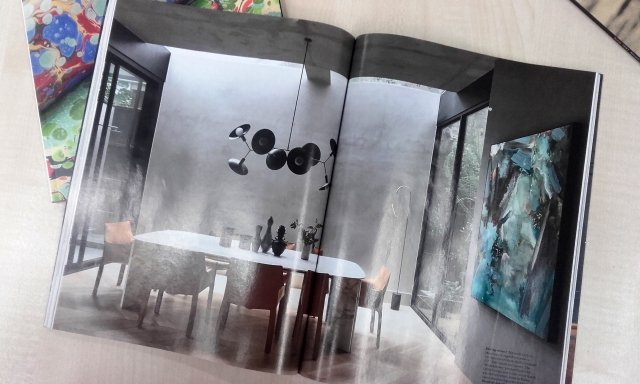
I picked up a copy of ELLE Decoration from the racks because a copy had marbled wallpaper featured on the mate cover, and it caught my eye instantly. The size of the magazine – standard – was big and bright enough to pull me over with an enticing cover alone.
Two-page spread of interior design in ELLE Decoration
The inside of ELLE Decoration is full of photography and large speeds of interiors that have been skilfully paired with fonts and a considered amount of text on each page. The layout has room to breathe.
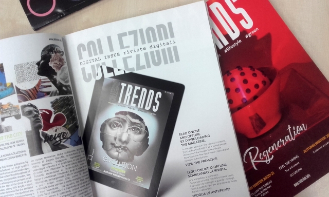
Collezioni Trends Magazine is published three to four times a year. Collezioni Magazine is a compressive guide to textiles, printed after thorough research, it includes information from international trade shows and exhibitions. The paper was regular weight for a magazine; felt that it could tear easily.
Digital preview of a copy of Collezioni Trends Magazine
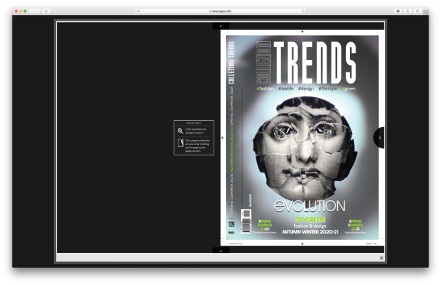
Collezioni Trends Magazine is available as a digital preview. I flicked through it online – of course the pages are but a small selection, and out of sequence – the point of the free sample is to expose enough contents to entice newcomer subscribers.
The experience of looking though the sample of the magazine online wasn’t really impactful on my safari browser however. There’s a emulated page-turn animation as I ‘flick through’, but there’s a lack of actual articles to read – here I’m greeted with images only. (Beggars can’t be choosers…)
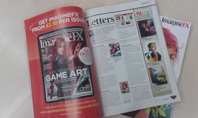
ImagineFX advertising the sales of its digital magazine
I saw other magazines which promoted the sales of digital editions. I feel that the push of the digital copy sales is simply that; to sell more copies, than to phase out the print editions.
Many of the cheaper magazines had glossy covers, but the usual thiner, duller, recycled paper inside. When the inside of a magazine had some thicker cardboard pull-out of glossy spread inside, it was a surprise and felt like an incentive to buy.
After thinking about the magazines strengths and drawbacks, here are some unbiased pros and cons that I feel the physical magazine possesses:
PROS
Portability of the magazine – possible to take it about freely
Possessing a physical copy instills a strong sense of ownership
Physical characteristics such as paper quality (weight and material) are part of the user’s experience of the item
CONS
Takes up physical space
Depending on the content, the item may be a waste of resources
The printed information within may quickly become outdated or redundant
Of course I could look at the printed magazine and compare it to online counterparts. For example, digital media can often be stored on several devices, and thus essentially be ‘several copies’, but when you buy a physical magazine once, it’s just the one copy. Still, a hardcopy has the benefit of being internet and electricity-free; you can read a magazine without internet access, and it won’t run out of battery, unlike a device.
Seeing all of these magazines in print, I am not convinced that print is dead! There is still high demand for so many magazines of varying subjects and differing demographics, as seen by the racks in the library!
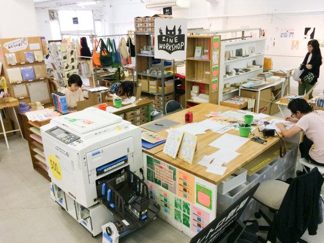
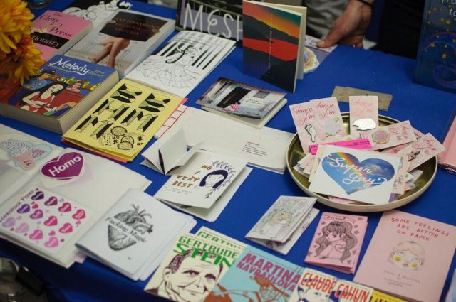
Looking into the state of physical print in the 21st century for contextual studies, I have looked into the specific self-publication of zines.
Self-publishing printed media is a culture itself. The culture of fanzines has been around since the 1930s. Besides fanzines, news zines and personal zines are staple genres. Truthfully, there is no hard rule on what content a zine should hold.
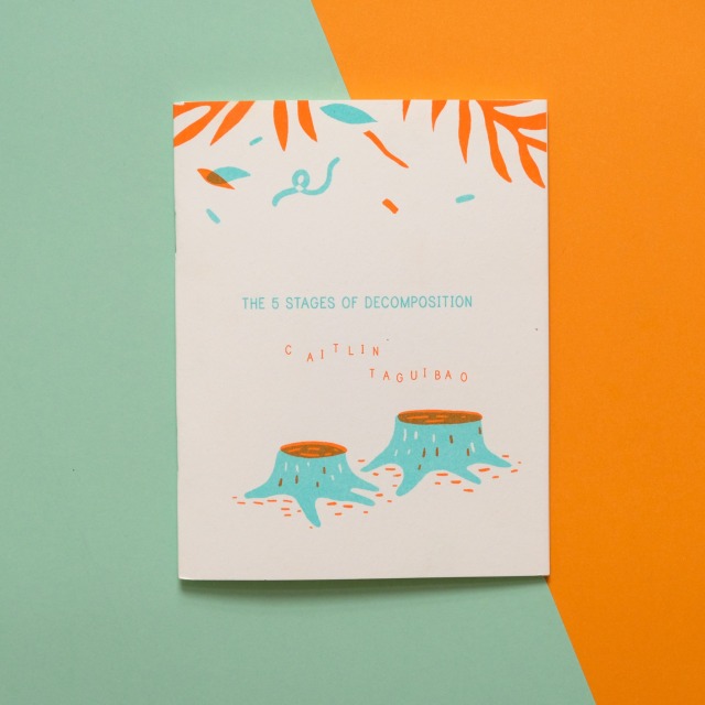
People may think of use of photocopiers when they think ‘zine’ and saddle stitch binding (using a stapler) but the use of the Risograph machine is popular today too, along with other forms of binding.
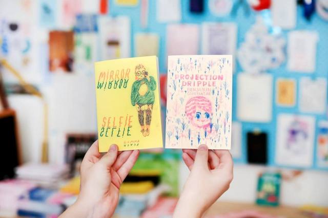
Risograph printed zine for sale at Zine Day Osaka by artist Caitlin Taguibao.
The boundary of what can be considered a zine seems to be played with continuously by self-published creatives. I’ve seen almost inappropriately sized miniature zines (with tiny text) and unwieldily, long leporello zines.
The desire to share out thoughts and feelings about anything and everything though text, photos, and drawings is universal. Art; self-expression is being human.
There are many established self-publication festivals around the world, from Canada’s Canzine Vancouver, Scotland’s Glasgow Zine fest, to Belgium’s Cultures Maison. Some events are multi-day and bring in large, international crowds such as Japan’s Tokyo Book Fair, but smaller celebrations such as Japan’s Zine Day Osaka takes place over a couple of days and have their own dedicated producers and following ensuring a continuation of zine culture.
Some zine festivals stick to one subject matter or concern, such as New York’s NYC Feminist Fanzine. Some festivals provide a safe-space for expression or for minorities to gather and connect.
There are so many festivals around the globe celebrating self-publishing; zines, artist books and so on, that I can’t track them all down or list them here.
I have two zines from America to share at a later date. Both risograph; one a personal zine with a mixture of contents, and the other a zine of photographs. There’s something special about holding a limited-press book in-hand, isn’t there?
Regarding the contextual studies essay module, students were presented with eight pre-constructed questions to choose from if the wish to do so. I had wanted to pic a unique topic for myself to sink into. The most important outcome of the module is to make a prediction within design. (The prediction don’t have to come true, I guess. But it should be backed up with facts!)
I had considered looking at ‘toy engineering’. These days, there are a lot of health and safety standards put in place to keep the products’ target safe from accidental injury or even death. The needs of the consumer change, and the product evolves to keep up. But, perhaps the topic is too niche…? My knowledge of toy engineering is more-or-less specific to one brand.
‘Sustainability in toy packaging’ is another topic that I could make predictions of. I had difficulty finding much (any) academic information cataloguing the materials used in toy packaging design – either vintage or contemporary. Sustainability in toy packaging may be itself a strange topic to want to look at, as toys themselves are not generally considered sustainable. The materials used in production aren’t always considered for their longevity. (Much to any toy collector’s dismay…)
The eighth pre-constructed question was the only topic that really connected with me: “Creators and publishers of printed zines and magazines are dealing with the growing possibility of their medium being rendered obsolete by the expansion of online media. Is print media dying out?”
So. I need to stop stalling, and find some sources to work with! I’ll pursue this question until I find some guidance for looking into other options. It’s good practice to dive into a podcast on the topic of print media’s future, and see what reliable information I can pull out.
I listened to the podcast below, Episode 96: Wither theMagazine, by Jessica Helfand and Michael Beirut, who “…discuss the changing of the guard at New York magazine… and the fate of online publications such as Rookie and Design Sponge, which are both winding down.”
My notes on The Observatory podcast, Episode 96: Whither the Magazine
@ 06:29
Beirut “It’s interesting just to think about what’s the future of hand-held magazine, in the age of mobile, tablets, digital, whatever. Because the point of entry is just so different.”
Beirut talks about the reader’s interaction with the online magazine – one may be on social media (eg. twitter) looking at fashion trends and find themselves directed to a magazine though a tweet. The reader may not stay on the magazine article itself for long, or they may look at other articles on the same website.
Beirut is suggesting that tweets direct the reader to cherry-picked content.
On print magazines, Beirut comments that they have a “beautiful tension between expectations and surprise.”
^ Of course, this ‘tension’ subjective to the consumer! It is a truth that the suspense of ‘turning the page’ is a characteristic of print media.
@ 8:25
Helfand “…many magazines have online counterparts.”
^ It’s a statement, but it is unbiased and truthful.
@ 9:26
Helfand shares a story of when she was the art director for the Sunday Magazine at the Philadelphia Enquirer. When Helfand found someone sitting in front of her on an Amtrak train reading her magazine… she watched observantly… “What he did is, was he started at the back, he looked at the crossword puzzle, he pulled it out, he went to the food page, he looked at that and then he threw it on the ground and went to the business section.” Helfand laughs, and recalls that she started to cry. Then shares with us how humbling the experience was, stating, “You just don’t really ever know how people consume the things that you design.”
Beirut then suggests that the information’s delivery could have been inefficient…
@ 10:45
Beirut “…there’s just so much romance associated with putting out a magazine…”
^ A very subjective statement.
Michael Beirut subscribes to a great number of magazines including The New Yorker, The Atlantic, Vanity Fair, and so on, so it’s not surprising to hear such a strong opinion on print magazine from Beirut.
@ 17:03
Beirut “…the death of the magazine has been announced loudly, over, and over, and over again; we’re in a golden age of magazine and publication design.”
Helfand “Right; print isn’t dead.”
Beirut “Yeah, print’s not dead. And new magazines spring up all the time.”
This string of conversation shows that both are very firm believers that the magazine isn’t dead; print isn’t dead.
Taking everything I’ve just heard in consideration, I feel as if there will be a lot of strong opinions on the topic of “print media dying out”… I’d expect to dig up polarising opinions. Printed media is something that I feel strongly about, too, in a positive light. Though I am well aware of the number of benefits to online platforms as alternatives to printed-format books, newspapers, and magazines. There’s always – at the very least – two sides to an argument.
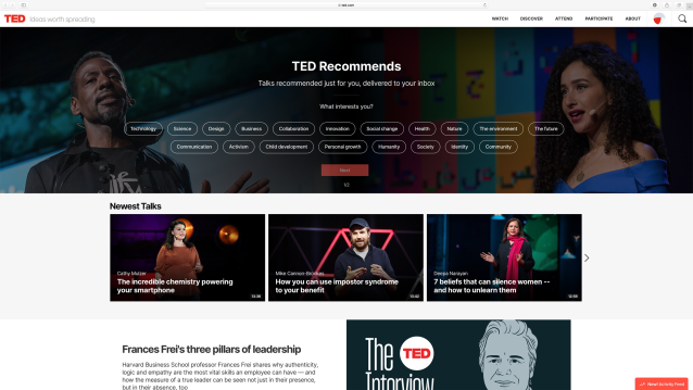
In the past, I’ve casually watched some TED Talks over at YouTube. But for the current Contextual Studies module, having a TED account should make research far less frustrating, and perhaps, even fun!
Home page of TED
I’m going to personalise my account and let the site know what interests me, to garner a tailored feed of information. This is an advantage over my YouTube account, which is cluttered with other interests.
Thinking about the module – though I’m unsure of the topic I’ll choose just yet – I decided to punch ‘communication’ into the search box as communication is very important to me. I am genuinely invested in keeping in contact with others – especially through writing letters. I’m wary of miscommunication, whether the communication be in person, by written letter, over the phone, and so on, despite the expectation and inevitability of misunderstandings.
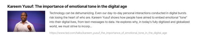
This search results stood out to me
This search results stuck me of interest because I often worry about my ‘tone of voice’ over text and e-mail particularly – and both of these forms of communication are needed to keep up both personal and professional contacts.
Details about the speaker in the above video
The site’s videos each have detailed written information on the talk’s topic and the speaker. Many videos on the site have an audio transcription, and that makes quoting the speakers much faster and easier.
Of course my fellow peers are encouraged to use this website as a resource, but I would also encourage anyone who is interested in broadening their knowledge in their fields of interest. There’ll even be something for you!
As an introductory to a new module (Contextual Studies) I watched Margaret Gould Stewart’s TED Talk concerning Designing for Scale, How giant websites design for you (and a billions others, too). I’ve noted some of the key information presented.
Concerning the difficulties of designing for scale, Stewart stated:
“It’s hard in part because it requires a combination of two things: audacity and humility. Audacity to believe that the thing that you’re making is something that the whole world needs, and humility to understand that as a designer, it’s not about you or your portfolio; it’s about the people you’re designing for, and how your work just might helming them live better lives.”
The big take away from this TED Talk, for me, was to take in mind technological limitations of users. When designing a website that is intended for use for people across the globe, such as Facebook, it has to look good on the oldest possible desktop computer monitor or most basic of smart phones. All elements have to look good and perform well – from the icons to the chosen typeface.
This statement that concerns the user stuck out:
“Designing for low-end cell phones is not glamorous design work, but if you want to design for the whole world, you have to design for where people are, and not where you are.”
Prioritising the user is the right mentality.
I can’t ignore that Stewart, being an employee of Facebook, isn’t going to deliver a talk that is not biased towards the company’s work mentality and ethics. Bias is something to keep in mind when watching, listening to, or reading any media, when it comes to citing such media later on!
I look forward to sharing research and relevant findings on my blog, once I have gotten an idea of what topic I should pursue.
Adobe’s 99U is a “creative career resource” for professionals. It’s an online catalogue full of articles – of a very broad range of subject matters – covering anything from ethics, sources of inspiration, and merchandising, to business conferences, and criticism. The articles are written by designers, engineers, marketers, artists, and even company owners.
I work a job outside of my interests to pay for my education. At work, there’s never a moment I’m stood still, I’ve no time to talk to other staff, and I’m oblivious to the wold outside of the small building I’m in. I’m a hard worker, and I’m liked, but I don’t want to depend on this job as a sole income. …how does all that tie in to 99U?
Turns out, the 2018 article “Taking a Day Job Doesn’t Have to Crush Your Soul” (written by James Cartwright) has been a very comforting read! It’s a piece with the insight of four freelance illustrators. Within the article, Grace Helmer, Jesse Fillingham, Thomas Slater, and Bobby Breiðholt share their work experiences with readers; they discuss just how they tackle the balancing act of “going freelance” yet remaining financially stable in such a competitive field.
As someone who’s genuinely interested in illustration, and hopes to put their illustrative skills to use more often, this article was very insightful. Reading that it can be expected to take 10 years to establish oneself (in the field of illustration) helps inform my expectations. I recommend this article to others concerned about balancing work and life, and to anyone who fears that the prospect of going freelance may be too difficult.
2018 illustration for Cold Cube 04, by Jesse Fillingham
The four illustrators share with readers glimpses into their lives, and show that it is possible to work as one pleases – in the field that one wants – while keeping one’s head above water. Juggling multiple jobs keeps one’s brain active, and allows for a breather between different responsibilities. A day job may be the primary time spent socialising with every-day people, in person.
The social aspect of his day job keeps it interesting for Slater, who spends the rest of his time working from home with his housemate, illustrator Kyle Platts. Even though he refers to it as a “low-skilled job” that can feel like a compromise. “But it’s a happy compromise,” he says.
RED ALERT! by Thomas Slater
The write-up doesn’t gloss over the shortcomings of working freelance yet keeping a day job for support or security. There is a shared agreement among the illustrators that holding onto a day job is a double-edged sword for the artist.
There are drawbacks to dividing the week between two jobs, of course. Slater believes the comfort of regular income has caused him to rest on his laurels and not push himself hard enough to take on more clients; Fillingham has turned down work because his day job encroaches on deadlines; and Helmer admits the work can sometimes be less than stimulating. But for the most part, the pros outweigh the cons.
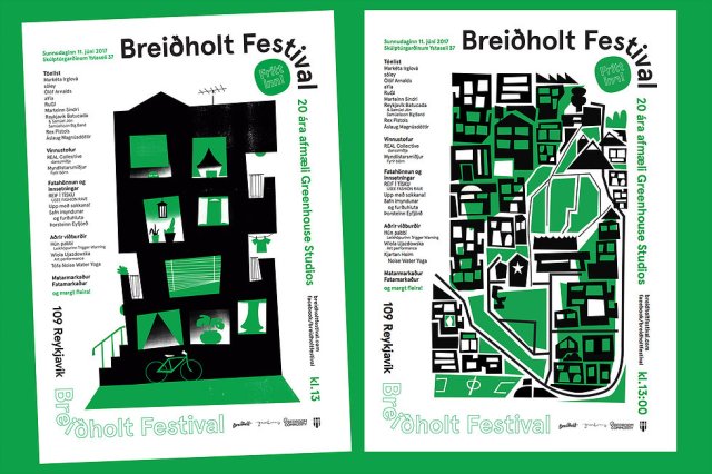
Music and arts festival advertisement material for the Breiðholt festival, by Bobby Breiðholt
While I did learn early on not to compare myself to others, because I know that each person faces different trials throughout their life, I still often wonder how other people navigate the world (if they get to make the work that they wish to and yet pay the bills). I’ve worked jobs I’ve disliked or found boring in the past, so it’s good to be reminded by others – freelancers who have found success – have also gone through similar routes, and made similar choices. Patience is the greatest virtue.