On the commute from home to campus, and then back again, I’ve had time to read. I had missed reading regularly! The cover of the novella I’m presently reading (a UK Penguin edition (and translation) of Bohumil Hrabal’s Closely Watched Trains) is composed of a photomontage. I’ve been thinking about what I’ll read next, and how many books will catch my eye for their cover.
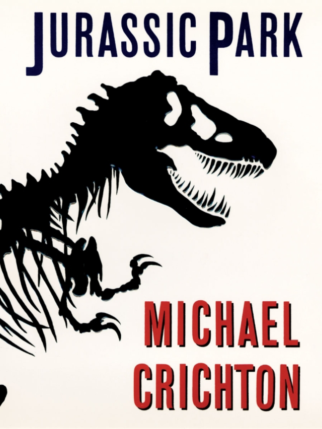
Chip Kidd created the iconic Tyrannosaurus rex skeleton silhouette for the 1990 science fiction novel Jurassic Park – the same dinosaur’s silhouette was used to create the park’s logo used Steven Spielberg’s film adaption. The inspiration for the skeleton silhouette came from a visit to a New York museum, and a non-fiction dinosaur book purchased while there.
Chip Kidd’s cover for Michael Crichton’s 1990 novel, Jurassic Park
I have never looked for in-depth information on graphic designers who work with publishers and authors in the past. It’s something worth looking into. With a quick search however, I did find an insightful video published by Random House; with commentary by their own book cover designers.
In this short video, The Art of Cover Design, a small number of Random House book cover designers’ insights; Robbin Schiff, Chip Kidd, Christopher Brand, and Peter Mendelsund tell us about making book covers they feel will have the most impact and most importantly, “last”.
“You never really want to call out a character in full, because a very important part of reading is being able to imagine the characters yourself.” – Peter Mendelsund, The Art of Cover Design
In referring to his cover jacket for The Girl with the Dragon Tattoo, Mendelsund remarks “Can you get away with a day glow cover, on a book like this?” and it’s taking such risks that arguably make the first edition book cover stand out.
Peter Mendelsund has created many designs for books whose authors are no longer around to discuss choices with. I imagine it is both freeing and daunting – if one doesn’t limit one’s own routes and alternatives to the endless possibilities of a design.
I’ve been thinking to myself, it would be nice to create some art for the covers of books that I am fond of. Or maybe books that I have been newly introduced to… It would be worth fiddling with my schedule to find time to create some book cover artworks, even rough drafts, and share them online.
Are there books that you feel you’d like to design a cover for…?
I love to read, and I also love to imagine how I might design a book’s cover once done reading it. So, what about those creatives out there who actually design the covers for the books we read?
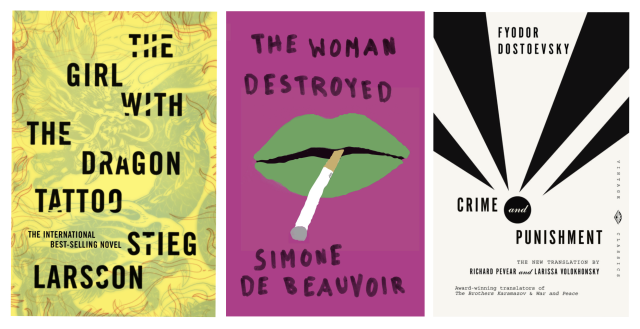
Do these look familiar? These covers are Peter Mendelsund’s work!
I hope to look at numerous graphic designers who have worked with book publishers, and I will start with Peter Mendelsund. You will have seen Mendelsund’s work wether you’re aware of it or not. He has crafted covers for many writers of a range of genre, and with a wide range of target demographic to boot, but all of the authors’ works that I have seen he has created covers for, are all either the break-out writers of contemporary fiction we see in the charts, or the long-dead, wold-famous writers who’s works we’re generally encouraged to read throughout our lives. More or less, Mendelsund rebrands the already popular books.
We can say that Mendelsund doesn’t always need to imbue his covers with the power to sell the books – they can sell themselves, regardless. But does he still give it his all to market the books though their covers? Let’s take a look at a small handful to get a feel.
Franz Kafka’s “The Trial”
Stripped down, “The Trial” is a tale of a man who is arrested and prosecuted for crimes that are neither revealed to the protagonist nor the reader. You can interpret the work as a critique on bureaucracy and civil rights, if you want. I like this cover because the complementary colours (red and blue) really make the irises pop. The rows of eyes give off an uneasy feeling – great, because Kafka’s works are full of unease for the protagonist as well as the devoted reader. Unsurprisingly, all of the books Mendelsund created for this line include the eye motif. I think it’s clever, and I think it works.
Osamu Tezuka’s “Black Jack”, vol. 3
I feel that Tezuka deserves an entry on his own, or maybe when discussing sequential art. In any case, this famous comic artist has made a plethora of works both kids and adults can enjoy. “Blackjack” is a medical drama aimed at young adults. Note that Tezuka himself had studied medicine in order to become a medical doctor himself before changing careers; this gives his art a very authentic feeling, even if the fantastic medical procedures covered would not be feasible at all in real life. Mendelsund made a series of covers for Vertical’s western release of Black Jack. I feel that the main point of interest is in the centre of each cover. The jackets are of bright, flat colours, and the diamonds cut into the centre of each book’s cover reveal underneath a heavily-detailed, monochrome drawing of Tezuka’s, sometimes being a medical illustration. I like that tactile reinforcement of the books’ surgical element.
Fyodor Dostoevsky’s “Notes from a Dead House”
This book is a semi-autobiographical take on Dostoevsky’s experiences as a prisoner in one of Siberia’s labour camps. The protagonist, a nobleman turned convict, is sentenced to ten years labour for the murder of his wife. The bones are a visual cue for death but with their vertical positioning, double as jail bars, and the bleak colouring denote the tone of the book. This cover says what it needs.
Let’s look at a couple of books with visual puns! The covers really speak for themselves.
Gaku Yakumaru’s “A Cop’s Eyes”
Yakumaru presents us with a series of short stories about a police detective. The reader is treated to the views of criminals to create an image of the protagonist. If you gave but only a passing glance to the cover, you may mistake the handcuffs for eyeglasses; that is the strength of the visual pun. I do like that the majority of the text here is in a gentle, soft script, leading to an emphasis of the book’s title with its bold, sans serif font.
Steven Amsterdam’s “Things We Didn’t See Coming”
“Things We Didn’t See Coming” is a post-apocalyptic novel full of disaster beyond the narrator’s control. Mendelsund plays with alignment to obscure our vision, strengthening the title’s message. The text is still legible, but we must surrender more of our time to the cover, and look just a little closer, in order to read it, lest we don’t see it. I don’t often look at book covers that are all text and think they’re great, but I can really appreciate the amount of consideration that must have gone into this cover design. To sell the story with text alone shows confidence.
I think with even the few book covers looked at, it’s obvious that Mendelsund does indeed want to show the onlooker and potential reader what the book contains and feels like. I think these are sincere covers showing Mendelsund’s understanding and appreciation on these author’s works. They display a designer’s versatility. At a glance these designs might seem ‘simple’, but they’re witty and aren’t dragged down by any unnecessary information.
If you made it to the end, thank you for reading! Do you think Peter Mendelsund’s book covers work? How do you feel about them? Love ’em? Hate ’em? Total indifference?
If you spotted any omissions, let me know! I’m writing to push myself to improve my written analysis of design.