2ND Year Final Project – “Hindsight is 2020”

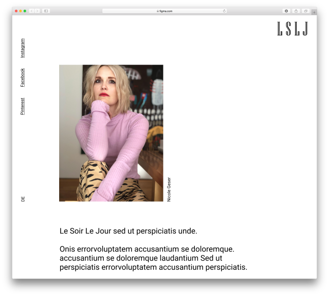
The last project of the academic year is one of freedom. I’ve already discussed a little about the year’s Final Practice here. Basically, the Final Practice gives students free reign over the design they want to peruse. It could be an article, an app, a series of posters, a product, whatever you want. It’s an opportunity to work on something one’s really passionate about!

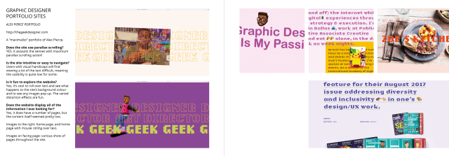
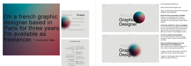
On the side to the personal project is the incentive to build a portfolio of the past works made during study. This could be website-built, printed, or PDF-based. I’d rather cover the portfolio task in it’s own post, but every student juggled working on organising a portfolio alongside their Final Practice and other modules. The portfolio assembly was a scary (yes, ‘scary’) task in the back of my mind as I worked on my personal brief.

idea geneation
Personal project musings

We had a lot of leeway, and so I discovered there are projects that may be worthwhile pursuing in the future. I hadn’t thought about making apps prior to brainstorming project ideas.

teaproposal01
Final Project proposal page 1
teaproposal02
Final Project proposal page 2

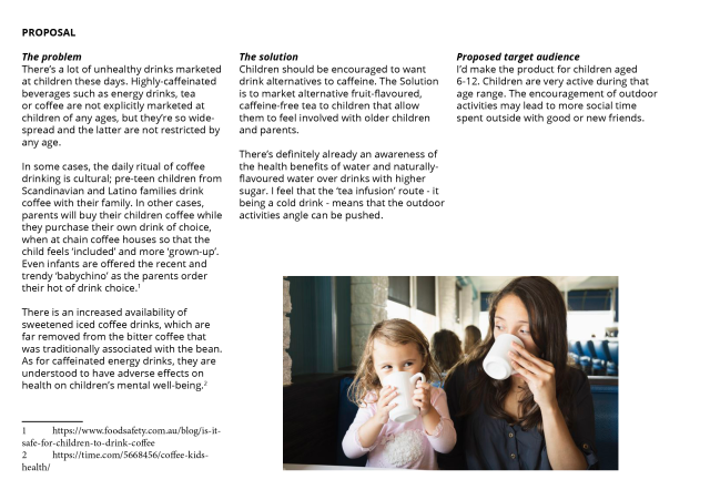
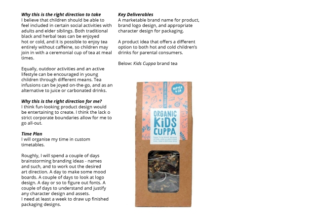
I wrote a proposal for a product that could be health or lifestyle-oriented. I wanted to market fruit tea specifically for children.

I find that writing a proposal for a project is easiest when it’s broken up onto sections. I hope the format makes reading it easier to digest for a stranger – and that was the sort of feedback I got in sharing it with peers when I asked for critique. Definitely, there’s always room for improvement when writing these sort of things. It has to be seen as a document you’d present to someone investing in your ideas.

timetable01
A page showing distribution of my time

I think I could have organised my time better. I made timetables to follow through with. But I found myself burned out at times. When I got frustrated with aspects of the project, I knew I should take a step back, but knowing that I would ‘fall behind’ my schedule would make me feel even more frustrated or stressed. It’s actually fine to edit my plans as I go, as long as I have the end-goal in sight and am aware of how much time is really left.

illust_direction_example
Looking at traditional illustration on packaging

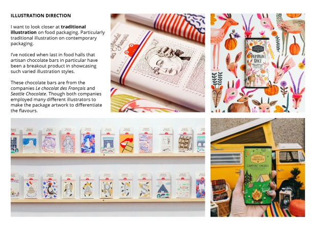
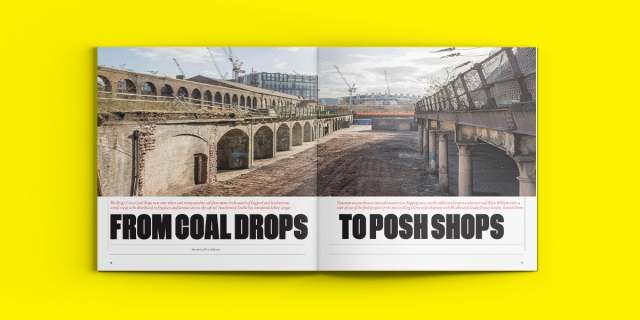
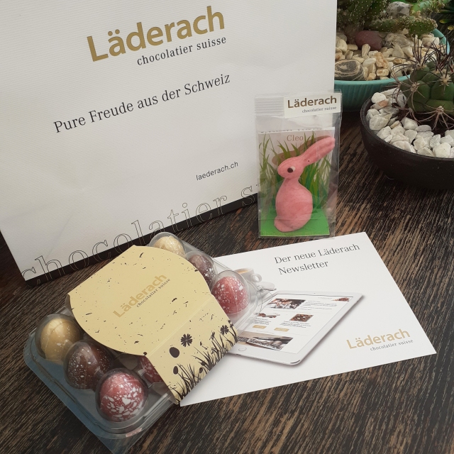
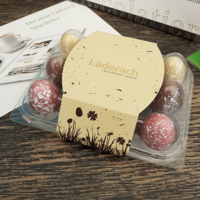
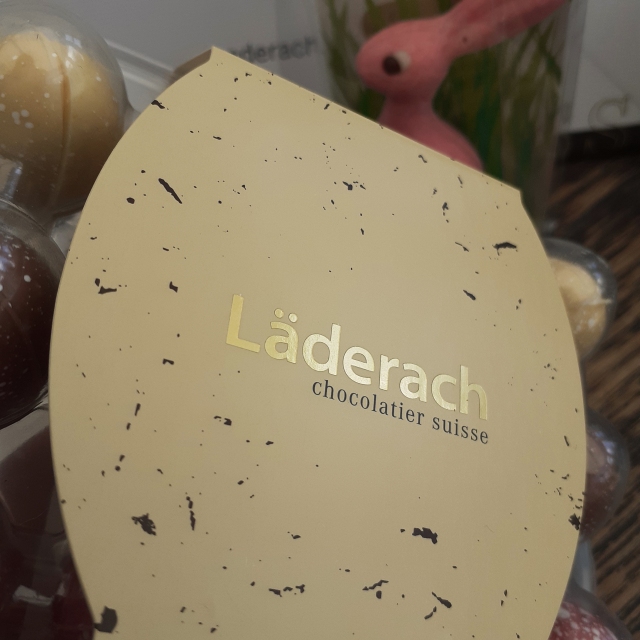
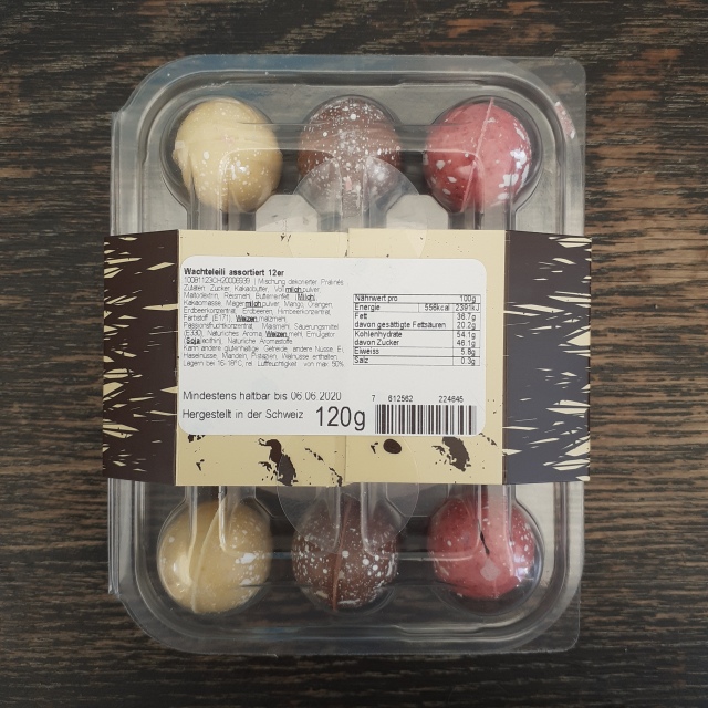
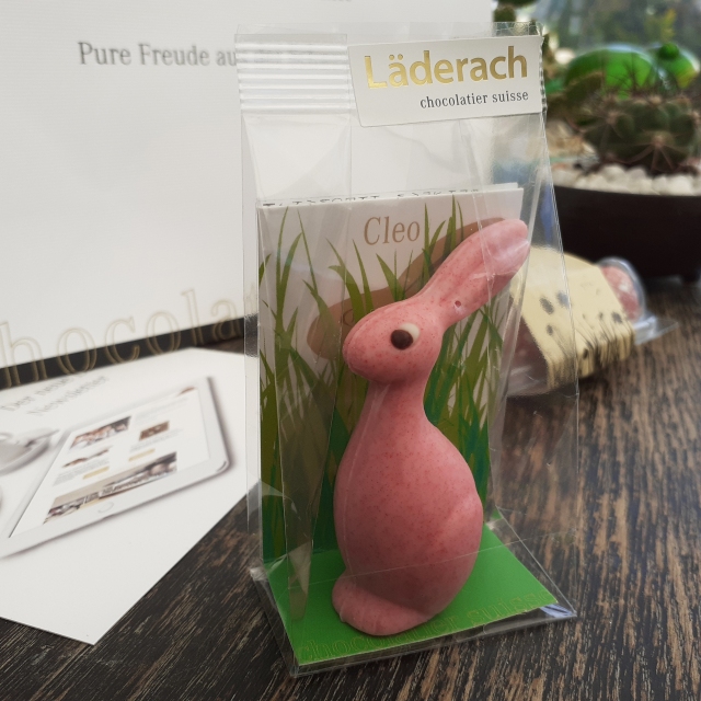
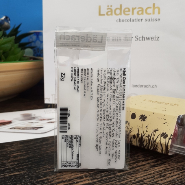
I enjoyed looking at a packaging design again. It was not possible to take my time in stores to hold and feel a bunch of different packaging, and so I had to rely on what I could find searching online. That’s OK as I’m not unfamiliar with the importance of physical qualities of packaging.

chocolat-france
I guess I couldn’t have gone to France to window shop anyway. (Image from Kiss My Chef.)

The amount of elements involved in the project were overwhelming at times. I had to take into consideration brand names, product names, packaging nets, illustrative assets and so on. Like other students, I was working on this project alongside other modules so I had to balance this one with other modules and portfolio development. (I had more-or-less finished most other modules, though they weren’t tidied up.) I really felt a sort of mental wipeout over the amount of different tasks. (Thankfully nothing like a full-blown burnout.)

some_plant_assets
Very early digital illustration assets

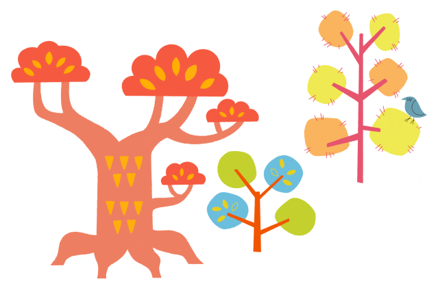
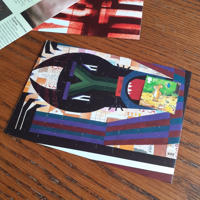
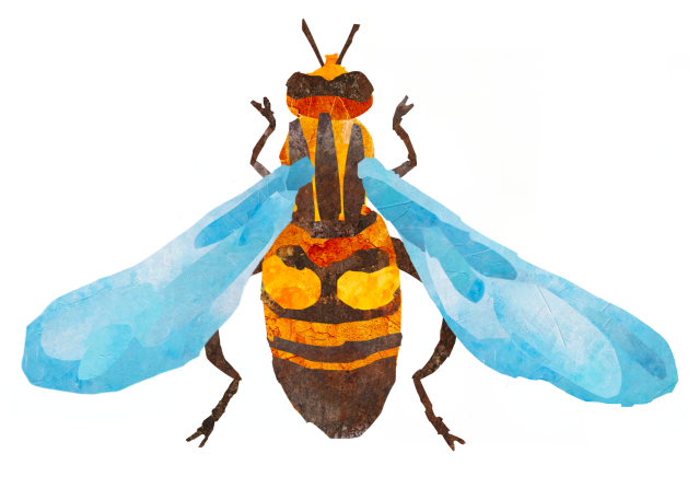
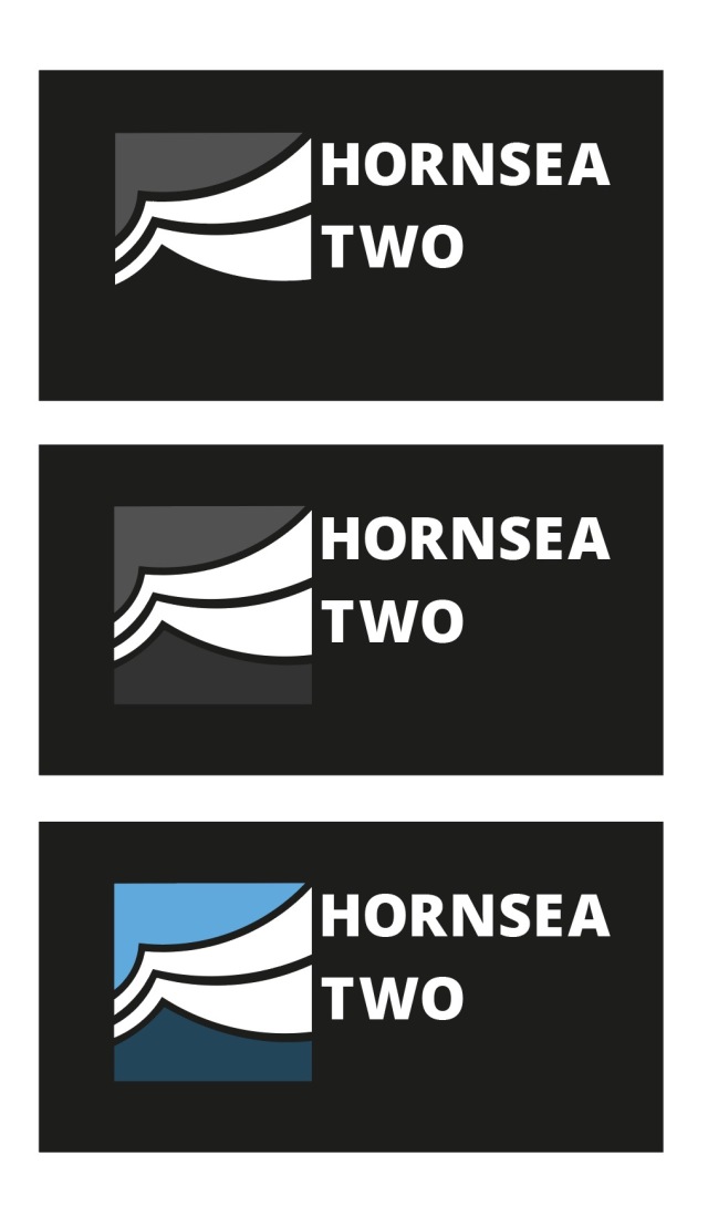
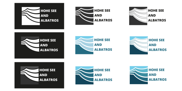
I thought that making the assets for the project would be straight-forward, but it’s not as simple as I had thought. Looking at traditionally illustrated packaging, I wanted to do the same. In the end, I turned to digital artworking methods. In the past, I had made the mistake of not putting together my assets from the previous packaging module to-scale, which made printing awkward to say the least. Somehow, the need to work to-scale still catches me off guard. I also really wanted to make different tea flavour packaging to help reinforce that the product I proposed could exist in real life. It means a larger workload, but theoretically, I could make one set of package illustration assets, and tweak them twice over if I wanted to make 3 products.

net_example_study
I made studies of different types of packaging nets

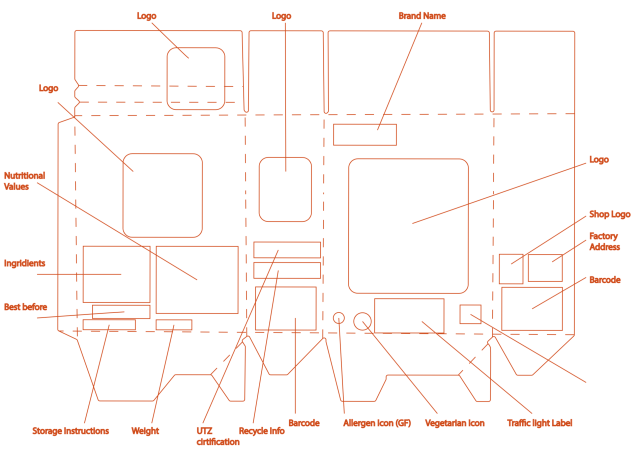
Making nets is no problem in the end; I’ve looked at enough to understand the importance of practicality over flashy, unconventionally-shaped nets. I’m also conscious of wasting resources. (Even for a hypothetical product!)

As of writing, I took a break from looking at or thinking about Final Practice so to come back to it with a fresher, clearer mind and eyes. I’ll be sharing the finished assets and box designs. I hope to have some more positivity to share about the project overall, and share the deeper process of portfolio building.

WKL200 – Reflection (02)

All students are asked to take part in seeking out freelance and open design briefs over the academic year in the Work Based Learning module. The module helps to reinforce the understanding of working with others, and taking advantage of the chance to find and complete projects that appeal to us. I hope that in writing this, it will help me put aside any negative feelings about the past few months, and see the opportunities I took advantage of, and any enjoyment I got out of them.

I’m going to split up my thoughts of the module quite simply as ‘hardships’ and ‘enjoyment’, finishing off with my thoughts on the module overall. Of course, my feelings are more complicated than that, though I want to keep this post from being too lengthy. Anyway, the amount of trials this year definitely feel enough to warrant their own section.

HARDSHIPS

The end of 2019 and the beginning of 2020 were rocky, and fraught with problems, so it’s not difficult to understand the past academic year has been undercut by many issues that diminished the quality of learning and education.

HSA 06
Early logo scamps for the Siemens‘ open brief

I’d mentioned it in an older, specific post, but one of the open briefs in which graphic design students across all year groups tacked was for the company Siemens. I found understanding the brief difficult! It was a ‘logo design’ project, but the logos were desired to be illustrative, and the visual language of sports teams that was desired, was not associated with the workforce. I felt glad to have created anything looking like a half-functional logo by the end. Work churned out by fellow students was very competent, but ultimately, no student work was chosen. A staff member at the wind farms instead created their own logo for use. Who made it? I don’t know. (But…. it’s… not good.) It’s very saddening to have wasted a lot of passion and time and effort.

Scan 23
Specifications for a display board to show a recruitment campaign poster

Because of the effects of the Covid-19 virus on world-wide economy and all types of business, some of the briefs that students worked on would be put on hold, and perhaps they will never be seen to the end. The briefs that I worked on while in Switzerland with Festland were for a website build for a French-styled boutique called Le Soir Le Jour, and the other was an entire apprenticeship recruitment campaign for the energy-providing company EW BUCHS. I made illustrated assets and mockups for freebee merchandise, mockups and idea germination for a social media campaign, storyboards for filming video, and rough illustrations for the poster and flier design. It’s a shame that the work put into the advertisement campaign and website building have no end results to speak of.

I also fell into trouble shortly after returning home amid the Covid-19 pandemic, finding my license to important computer programs and run out. The programs I needed are not cheap to rent, and I had to be careful about what I was spending my money on, given that the pandemic meant that I didn’t have any workplace to go to. I later found access to the programs through the course, but by that time, the deadline of one of the projects I had already past. In fact, I have not heard back to understand the end result of the logo redesign.

ENJOYMENT

Some of the projects that I took part in to contribute to the Work Based Learning module did see completion. I was lucky to work on short projects that were fun, while also helping me sharpen my digital skills.

The chance to work overseas was a great opportunity. I can’t say it was without stress but it was an experience I’ll cherish. I think I made friends and hope to keep a connection with the agency I worked at. Given the circumstances, I sent out a postcard to the company, and some other items in the post to one of the staff because tactile mail at this time is something to be appreciated, however old school it is.

Even if a number of briefs that I worked on were not seen through to the end – for whatever reasons – the better understanding of different design jobs and the requirements needed I came away with it worth the time spent.

END THOUGHTS

Recently, I had a video tutorial with a tutor – actually, I’ve had a bunch of those lately since conventional lessons are non-existent at present – and we talked about the expected outcomes of a designer’s projects. Not all projects are seen through to the end. Not every brief is made by a client with a solid understanding of design. Most ideas won’t even be developed past rough ideas because only so much resources can be spent on the ‘right ideas’. So it’s not ‘bad’ to see many thoughtful solutions to problems left unrealised. It’s just… how it is.

As stated, the time spent on the unfulfilled briefs was not an entire waste of time or effort. I still widened my skillset and I gained a better understanding of some tools. That a number of briefs I took on did not make it to the very end is unfortunate, but I can accept it. I’m going to look forward to future projects that allow me to craft something great!

Up-cycle Design – C5 Envelopes

Alongside the desired phone calls or video chats to keep up distance relationships, I’ve found myself both sending and receiving more postcards or letters to keep in contact with loved ones. A few weeks ago I ran out of envelopes to send letters to friends and family, so I decided to up-cycle some paper from around the house to make envelopes. I used an old copy of Creative Review – a commercial creativity and graphic design magazine.

The insides of Creative Review are varied. The magazine covers the current visual trends, notable student graduate work, interviews from designers or creative directors, art exhibitions, the news on the latest popular media (films, video games, etc.).

THIS ONE
These C5 envelopes made from a 2001 issue of Creative Review

I was familiar enough with basic envelope nets to bash out some C5 envelopes in a short time. I used a popular culture review page, an art exhibition review, and a printing service advertisement to make radically different envelopes.

As I have already cut up my 2001 copy of Creative Review, here are a few images of the magazine’s insides of another issue (taken from their website). These are page spreads of of a 2018 issue, showing the magazine’s variation of editorial design.

CR_spreads_OCT18_p54-55
The Place issue: October/ November 2018
CR_spreads_OCT18_p78-79
The Place issue: October/ November 2018
CR_spreads_OCT18_p148-149
The Place issue: October/ November 2018

A single page of Creative Review is large enough to make a single C5 envelope, with room to arrange the placement of the net. Part of the fun is figuring what imagery or text would look most exiting on the envelope. Even the advertisements can hold some interesting photos and design!

EAT_MOUSE
LICK, LICK

This envelope is my favourite of the three shown here. The placement of the stamp looks as though the ‘design’ is interacting with it. It sparks ideas for illustrated envelopes.

I’ve mentioned my affinity for stationery design (particularly illustration) in the past, and that at some point I’d like to try my hand at designing some letter writing sets. There’s definitely something to be gained from experimenting with the materials (and imagery) that make up mundane objects to generate new excitement in them. I received a positive response to these envelopes when I sent them out to others in the post!

Unrealised Goals – Finish them in summer 2020

The summer is fast approaching. The academic year is reaching it’s end. Sure, student timetables are out of whack now, but it’s important to keep going. I need to set myself goals over the summer months to keep my creativity and interest in design up. I’m looking back at a project not long since handed in, and I know that I want to revise elements of it already.


I handed in my responsive project – a live brief outcome from the UN and the World Health Organisation. I will admit that I swayed the brief to suit my own emotional and mental-wellbeing, from ‘raising awareness of Covid-19 to prevent the spread’ to ‘coping with the pandemic through activities’. The thing is, I had to write a proposal, so I found justification in the angle I ‘tackled’ the brief. In modifying the brief, I could focus more on subjects that would help me cope, while being – theoretically – more productive.

Essentially, to address the problem of Covid-19, I chose to design for a child audience, and ‘market’ an activity that would be cultivating inside-grown plants from mail-order seed packets. The real drive for the project being to give kids more structure and short-term goals at home when schools were closed. I wanted to include two mini zines (8 pages each) with information and facts on the types of plants that can be grown from the seeds, and garden insects that are beneficial to outdoor plant growth.

I explored a couple of different illustration routes to see what could suit seed packet design and little booklets, but it was a lot to take on in such a short space of time. I only got as far as making mockups of the basic layout for a proposed packet design, and one zine. I made many illustrations, but I don’t think they’ll go to waste. This project included my first tries at creating digital collage.

new_hoverfly
Hover fly digital ‘paper’ collage

Although it’s far more time-consuming than I had thought – I still felt a lot of gratification upon finishing any insect collages. I am very happy with how some of them turned out.

I wish I had shared more of my development work as I was working on the responsive project. I shared a little over some Microsoft Teams DMs and Discord, and got some interesting insights into other’s thoughts on paper collage. I realised the variety of the  papers I could use – the ‘paper’ being digital – were bigger than I thought. Newsprint and even photographs can be utilised for different textures and to suggest different patterns.

paper_cutouts_beetle
Ground beetle digital collage

I’d like to make more bug collages over the summer, and fill a whole printed, colour booklet. I want to finish the black and white zine full of line garden insect drawings I started for my responsive brief, too. I’d want to make the hand-drawn illustration version downloadable, printable, so that folding it and colouring it is an activity on top of learning bug facts.

There’s a lot go milage in my proposal as it’s not explicitly Covid-19 specific, it can exist outside of the initial brief timeframe, which lends the ideas longevity. That’s why it’d be worth returning to the project in my own time.


One of the last modules of the academic year is a ‘personal project’. Again, I have full reign over how I want to approach design. It can be anything. ANYTHING! Naturally, I generated a number of ideas that I can’t possibly address within the soon-approaching deadline. Some ideas probably aren’t worth looking at closer than I already have. But the ideas that I can’t address in the meantime are worth looking at in the future. I can set myself goals to achieve some of these projects.

idea geneation
I thought a lot about different routes to take a ‘personal’ project

Some routes I was interested in were stationary sets – letter-writing sets… sticker design – health and wellbeing product packaging, spotters guides, and the good old bestiary. Here are a few notes I took in my sketchbook while musing over spotters guides and bestiaries:

spottersguide01
SPOTTERS GUIDE??
spottersguideexample01
I even thought about phone applications in relation to spotters guides
beasteriesexample
Etchings and ink illustrations of grotesques by Arent van Bolten, made between 1604 and 1616

Books full of creatures from folk tales, or video game monster indexes have always interested me. There’s definitely fun to be had in illustrating (and writing for) such things. So I can see myself making images for some variation of a bestiary myself.

Whatever routes I can venture down, it’s all an excuse to make illustration that I can put my heart into. Digital or analogue; I don’t think it matters much which I use, but the medium would probably change in relation to the illustration style I most want to dive into.

… But I chose what I had thought to be the quickest and most useful route to myself, thinking about the near-future. I’ll be looking at packaging design. I’ve worked on some before. I’ll put to the test the knowledge I’ve learned in the past!


Planning out projects during the summer months and staying up-to-date in wold design news is vital as to not lose the heart I need to find work in the creative industry. It’s also important to keep up my blog; write about any design I find of interest, show any development of interest, and so on. The next logical step… is to finish all of the modules I have already! But then… then I can work out a schedule for the summer. And meet unrealised goals.

Web Design Application – Figma

During my time spent at the corporate advertisement agency Festland, I worked with fellow staff to revitalise a client’s personal business website, Le Soir Le Jour. I tried to work towards the new website look in the conventional method of >contents required >site map planning >wireframe >site build. I still worked towards building a website using that development format. But I was quickly introduced to the website design application, Figma, which changed the way I worked towards the goal.

I’ve written a little on the free app Figma in my digital sketchbook for my tutors to read though, and I both mentioned and linked the application’s website on the class’s Microsoft Teams group, but writing about it here gives it more exposure. I won’t delve much into the development of the LSLJ website here as I’ve already recorded it in a sketchbook, but I’m using pictures of it’s development to show how I worked in Figma as visual aid.

LSLJHOME
Original LSLJ home page
aboutpagelslj
Original LSLJ about page of Nicole

Le Soir le Jour was originally text-heavy on several of its pages, so the end-goal was decided to be ‘clean and minimal’. It also had many pages that would need their images and text updated every season. We found a way to lesson the work for the site owner.

I should mention, while I worked on a site map plan of the website, and the interactive desktop prototype, the front-end developers would have handled the coding.

Basic overview of Figma

Firstly, you can work on several website pages at once on a ‘canvas’. You chose the dimensions of the pages, and you can always changes them later. Every page can be given a name. Every asset you place will named by default, too – a default name such as ‘shape1’ is designated to the first shape drawn on a file, or an image that’s been imported and hosted on Figma’s cloud will be called by its filename at first. Text is placed in boxes, and each text box… can also be named. It’s good to name everything you place you you can locate and edit the right assets with ease. Several items can be modified in a group if they’re all highlighted at once.

overview_of_oldwireframe
Very early digital wireframe of LSLJ I made in Figma

As you would expect, there are shortcuts that are used on familiar design programs that apply here; to zoom you can hold ‘⌘ + spacebar’ while clicking a mouse to zoom, as in Adobe programs. If you click the ‘?‘ in the bottom right of the canvas, you’ll have access to the list of keyboard shortcuts such as ‘⌃ + G’ to see the canvas’ grid.

It’s possible to use any fonts that are already present in the app (such as the standard web-safe fonts everyone will have on their computer, to the Google Fonts). Or you can add new ones by downloading them.

nicole_revised_page
Example of a revised LSLJ about page of Nicole in Figma

Oh yeah, I should mention, this might look like a wireframe. But it’s not. It’s just… very minimal.

I was asked to edit the placeholder body copy to the standards of printed media… while it’s possible to arrange text however you wish on a Figma document, it seemed pointless in the end as a responsive website would react to the size of the window and move the text about freely.

The two biggest features I would consider that made using Figma a great tool would be the collaboration and prototyping. Figma is wholly cloud-based, so that means anyone with a browser could view and leave a comment on a design, given they have the working URL to a project. Only four were directly involved in this project’s visual design; the client, the two staff who worked on the design, and the senior designer who oversaw the project (up until it’s unforeseen postponement).

revised_overview
Example of the website’s pages in Figma, using placeholder images from the client

Prototyping in Figma is incredibly intuitive, and therefore it’s quick to prototype a design, but it also has limitations. The prototyping of a website is as simple as linking a pice of text or an image to another page; you select the element you want to become a hyperlink, and then drag a line from that element to the desired page. The limitation is that you can only link an element to the top of another page. You can’t link an image on one page to, say, half-way down another page’s contents, or to the bottom of the page you’re currently browsing. So from this you can guess that it means you can’t make a navigation bar any more complex than one that links to the top of internal pages. I also couldn’t make sticky navigation bars.

Here, it’s worth mentioning the website prototype isn’t responsive and won’t adjust to the size of the window viewing it. (Making a responsive website wasn’t a goal of the agency as the website I built in Figma would be adapted on ‘Squarespace’ by coders at a later date and thus become responsive.)

lslj top og page
Figma website prototype of the LSLJ website, browser-view

Collaborating in Figma is easy. Anyone logged onto the account in which a file was created in can make edits to the file as they have access to the URL. This means you can share a file with an entire team and others can try out the prototype and suggest adjustments in comments, or even edit it themselves (surely, they’ll ask you first). Those not logged on to the account in which a file was made in can still view the prototype in action and see how they feel about navigating it. This means a client can be shared the URL of a project and navigate a prototype in their own time.

Sometimes, new programs take some getting used to, but I found learning the app’s interface quick and intuitive. It really fit my needs and it was great that I could forward a link to co-workers to oversee progress, and share with them my prototype to ask how they found navigating it.

I wonder if my tutors would think to utilise the Figma application in the future during any web design modules. To my fellow students who are looking to to make quick website mock-ups and interactive prototypes within a free resource, I’d recommend you give Figma a try. It’s easy to pick up, and it’s collaborative. Yes, it has limitations, but for what it is, it’s good. It can make solid website plans that a front-end website coder can take over from.

NCI508 Feedback – “Success is born out of struggle”

After receiving my feedback for the Digital Skills Application module (which included understanding parallax website design and coding skills) I’m actually really pleased with my feedback. I’m proud of myself! Perhaps… this module result is my highest mark this academic year…? It wasn’t an easy module for me to get to grips with. I definitely struggled with the coding aspect at times. Looks like the fight was worth it!

The goal of the module was to code a website to represent our Graphic Communication course. Some visual assets (and an optional brand guideline) were handed to us. ‘Goodloop’ is the studio name and there are pre-existing graphics and colours tied to it.

good loop logo
Goodloop logo by peer Micky Wier

Looking back on the Digital Skills Application module, it definitely had emotional ups and downs. There were times where I was exited to learn more about contemporary website design and exploring so many interactive websites was a treat. I pushed myself to uncover new knowledge. I can’t lie; did find teaching myself coding difficult. I wish I had found the website W3Schools earlier into the module. Though, I do believe that I’ve retained enough coding knowledge, that if I were to work together with a front-end developer to make a website, it’d be easy sailing.

Screen Shot 2020-04-21 at 11.59.11
Sketchbook pages on WHOAMAMMA

I was proud of my research page layouts and I got much better acquainted with Adobe InDesign. Therefore, I want to share images of my research sketchbook. The sketchbook does look odd when printed and bound as I had to print it single-sided, while I made the margin larger on the ‘inside’ of the pages for the purpose of binding it double-sided, leaving room for the spine. It means the margin is uneven on the hard copy, and text on every other page is rather close to the spine but there’s nothing that can be done about that.

Screen Shot 2020-04-21 at 11.58.47
Research on NEA MEDIA
Screen Shot 2020-04-21 at 11.59.03
Pages on UNIBROW ARTS FESTIVAL and OLYMPP

My layout of the research made it easy for my tutor understand the vital elements of the websites I’d looked into. I covered the aesthetics of the sites, functionality, and key design elements.

It was mentioned that I could have improved my research by delving into the pros and cons of the website designs. I should have used more professional language and terminology to enhance my analogy and critical thinking. Yeah!

Screen Shot 2020-04-21 at 11.59.14
Page on graphic a designer’s portfolio; ALEX PIERCE PORTFOLIO
Screen Shot 2020-04-21 at 11.59.36
Another graphic designer’s portfolio; ELYSE NIEZGODA PORTFOLIO

These last two pages you see above were of creative’s portfolios I found online. I recorded and submitted a video analysis for each of them for my tutor to sit through. In recording videos, I learned a lot about how to present my thoughts and myself clearly to the listener. The feedback I received for my videos was very positive!

basic skeelton cponcwpt 02 copy
A really early, really basic layout plan for the top of a page

After looking at so many websites, I made various rough plans of how the website may be laid out.

student profile eaarly drasft
Example of what a ‘student profile’ section of the course website could look like

I did enjoy generating ideas of how elements of the site may be laid out. I thought the course website – being a creative course – should involve some individuality of those teaching and studying. I’d have liked a profile section to make use of student-submitted profile pictures, bios, and signatures. Very visual and playful.

Ah. I appreciate my tutor feeling that my sketches and plans were ‘charming’!

Knowing that I didn’t have to be able to write code that that accurately reflected my plans, suggested layouts or aesthetics meant that drafting plans was more relaxed and less restrictive. I know enough code that I know what is and is not ultimately doable.

webcode
Working in Adobe Dreamweaver

Adobe Dreamweaver is a friendly program to code in, it does close lines of code for you automatically, which depending on where you stand, is either a boon or a curse. If you want to develop the good habit of closing your tags, then the fact Dreamweaver does it for you isn’t as helpful. The program also offers suggestions of code while writing, which is nice if you’re a beginner.

It’s an easy program to get to grips with, and there’s no reason why one shouldn’t use it if one happens to own a copy. I will admit that I believed my coding ability to be weak while working on this module. I was quite stressed and upset at points, thinking “Why can’t I do this faster??” or “I don’t understand this part of the code at all!” but learning code takes time – much like learning anything. I should have been more patient with myself.

carousel coding
Part of the CSS I used to edit the carousel HTML code

As for talking through my website code in a video capture, I found it much more easy-going than delivering in-person as I could always re-take a video if I really happened to mess up. Delivering my thoughts, I found it good to split my desktop screen in half; show my website code on one side, and the website in-browser on the other.

split screen video
Quicktime recording

Here’s what my desktop looked like as I presented my own code and website via video. Dreamweaver on the left, safari tab on the right.

websitetop
Top of the page I coded

The website I coded doesn’t visually represent the website I had drafted; though I experimented with elements of code that I proposed I’d use in exploring possible site development.

I managed to talk through the shortcomings in my video analysis of my coding and website presentation; visibility problems; usability issues etc. and it felt good that I could articulate these over video – showing that I felt something was less than I had wanted and that I would aim to fix it.

stufent profiles
Student profile layout

Showing my desired design choices through my sketchbook drawings, my lecturer understood clearly the type of aesthetics I would have liked to implement if I had a higher skillset in coding. The suggestions I made for the website’s feel could easily be given to a front-end developer as visual examples they could work towards.

studentworkcarousel
Example of a manual carousel of student design

My footer could have been better presented if it was… rich. There could also have been a better segregation at the bottom of the page; that the footer was indeed its own thing. I also deleted the code for the sticky navigation bar at some point and it’s less comofrtable for the user to search for sections on such a long page sans a sticky or floating navigation option.

My tutor was happy enough with my video delivery, rational justifications of my code, and method of thinking. It was suggested that video could “…be be a method you might want to consider in the future,” weather it be to present development of a work as a time-lapse, or “…if you use a different technique in illustrator or photoshop or indesign…” …even a cap of what I’m doing and why I’m doing it may be a better way to communicate my thoughts. And I do find it hard at times to explain my methods through text. Visuals can really help communicate an action or design choice. I agree that video is a good method to look into in order to deliver my thoughts and working process.

How do I feel about the module overall? Hmn! Relieved that I learned something. Happy that I can communicate my methods clearly. As I said, it was difficult, but it is rewarding to come out on top!

Easter – Läderach Goods

It’s a Sunday – a chill day – it also happens to be Easter. So I thought to share a relaxed post of some pictures and thoughts of some Easter-marketed Swiss chocolate (and their packaging). I picked up these items while in Switzerland.

At the end of my last full day in Switzerland last March, I visited ST. Gallen’s Läderach chocolate shop to pick up some of their fabled goods. Among the most well-known chocolate brands in Switzerland, Läderach has been around since 1962. Of course with the Easter-themed goodies on sale, I couldn’t not pick them up to share with family once I got home.

alltheladerach
Läderach chocolate that I brought back from Switzerland.

Not pictured: the rest of the Swiss chocolate I brought over with me.

I felt that I had to pick up some chocolate eggs and a little hare. I did buy a nice pre-packaged selection of FrischSchoggi – that’s ‘fresh chocolate’ in English. Läderach’s FrischSchoggi are displayed as large slabs that can be broken up upon request of a customer and are priced according to weight.

Anyway, let’s look at the two Easter-related items that I bought. It’s an opportunity to critique at types of packaging design that I have not yet looked at.

eggsboxladerach
Plastic and cardboard egg box packaging

It’s not strange to come across real hen and duck eggs stored in plastic boxes, but the type I’m most used to seeing are the cardboard variant. Here, the point to using plastic is that the consumer can see these hand-painted chocolates inside of the packaging. It’s not the most environmentally conscious choice of material, but it can be recycled.

For those wondering, the flavours of chocolate eggs inside are strawberry, milk, and orange!

laderacheggsgold
Raised foil text on the egg box’s cardboard wrap

The wrap around cardboard label is predominantly beige with cocoa-coloured silhouettes of springtime grass, flowers, and… flecks of pollen!? The matte finish on the wrap around  features the brand’s logo in raised gold foil text. It’s mature and understated, and to me, it speaks ‘luxury’. Definitely this is a treat for the adult market.

backofladerachegges
The necessary info is stickerd onto the back

All of the ingredients and storage instructions of Läderach confectionary are in German. On the back of the chocolate egg box, the weight, storage, expiry date, and ingredients are found on a white sticker with black text which is slapped onto the underside of cardboard wrap. Note that the sticker acts to further secure the cardboard wrap, along with two smaller, round stickers.

Thinking about the product from an ethical perspective, the use of plastic isn’t great, but overall, the materials used to make this egg box can be recycled, and that’s good. As stated before, the plastic material chosen allows for the potential customer to see the product while keeping the chocolate both safe and clean. After all, the nature of this consumable can’t be compared to say, a fruit, which doesn’t need packaging at all.

cleochocolate
Raspberry flavour mini Cleo

These small, stylised chocolate hares are so cute that I had to pick one up for myself! The mould is elegant and sleek, but the painted eye adds a cute (and maybe a somewhat perturbed) look. Cleo came in many flavours. The mini Cleo that I picked up is raspberry, but the option of milk and dark chocolate were there.

These little chocolate hares stand up inside a plastic bag, with a cardboard backing for support. There’s a sticker atop each bag adorned with the store logo. From the front, the strip of cardboard support has a simple grass field illustration and the product name at the top. At the base of the cardboard backing is the ‘Chocolatier Suisse’, printed in gold, in the same font that adorns base of many of their year-round packaging.

Speaking of the standard packaging, the Läderach branding uses almost exclusively white, gold, and black. (Can’t really go wrong with those colours.)

backofcleo
Reverse side to the mini Cleo chocolate

The back of the Cleo product shows the legally required product information which is stickerd onto the back of the plastic bag, made visible by the white of the cardboard strip. The sticker label states the weight, storage, expiry date, and ingredients of the treat.

The overall presentation of the product is unfussy by design. The packaging used can be recycled, but it is less so than a traditional cardboard package that Easter confectionary is often sold in. I don’t believe that I have seen moulded chocolates presented individualy like this in any other shop, so to me, the packaging is somewhat of a novelty!

In the future, I’ll keep in mind Läderach’s packaging design in comparison to our equivalent domestic products aimed at the same audience. The pervasive usage of white and gold is light and friendly, yet chic. Läderach definitely has it’s own identity, even if it’s a relatively young company in the grand scheme of chocolatiers!

WKL200 – Reflection (01)

In January, the company Siemens approached graphic design students for logo work. Presumably because the belief that students face less creative constraints due to their freelance status. (But boundaries are set by briefs, regardless!) The brief presented was a challenge for me, with highs and lows.

As with all clients that approach you, it’s important to understand where they are coming from. I needed to do a lot of reading up on the company, as I knew next to nothing about the history of Siemens or the specific line of work that the logos were requested for; their off shore wind farms.

diagram_hohe-see-and-albatros-wind-farms-at-a-glance
Diagram showing Hohe See and Albatros’ planned number of turbines

I did end up researching what the daily routine of an engineer is, what environment they are working in, the clothes they wear, and the equipment they use etc. But the brief strained the importance of the place the work was at. The brief also made it clear that the The logos were not for the farms themselves, but rather the people who work on the farms. The workers were keen to wear emblems that reflected themselves as a ‘team’.

The specific farms that required logos were Hohe See and Albatros and Horn Sea TwoThe most important of the key desirables was to create a symbol that represented the men at work and their ‘team spirit’. The workers were very interested in emblems such as the ones created by Bands FC (Football league and Album cover crossovers). This element of the brief was not received too well by a number of students (for being restrictive from the get-go) and many approached the brief in other directions initially.

mb_mitmedialab_12
MIT Media Lab directory that used symbols for departments

I even approached the brief by attempting to create logos that shared visual elements (shapes or pattern) to keep some consistent identity across the two teams. The decision to explore this was made concrete after looking at logo work by Pentagram for MIT Media Lab. This approach was not well understood by the client, and I understood that they disliked it.

hhhornseaa
Logos made using arcs that can be read as waves or wind

When I presented pencil scamps to the client, it was very much a case of straying too far from the client’s wishes, and my scamps were not meeting the goals. I had in mind a more conservative and corporate logos – ones that work great in monochrome, and on any scale –  ones that could be easily replicated on clothing, letter heads, stationary etc.

HOHE SEEE
Hohe See and Albatros logos that use the same arcing shapes

Versatility of the logo was something that actually wan’t a necessity. It wasn’t stated in the brief that the logo would be for anything more than ‘personal use’. But it also wasn’t stated that the workers would be the only ones to sport the logo either. I had drafted and crafted a number of logos thinking they’d have to adhere to the general rules of logo design.

very practice logo
Vectors I made to explore Hornsea Two colour options

I experimented a lot with the pen tool and manipulating the lines ever so slightly to get very smooth curves in some of the logo concepts. I was really happy with the vague images of the logos above –  I thought that because the viewer could interpret the lines as they wanted the logo could represent what they want. Is it the wind, is it turbulent waves? It’s what you make it.

The abstract angle is the wrong road to travel for this particular client tough. They were less enthusiastic with examples from students that were a less direct answer to the brief. What was demand was something ‘simple’, something ‘obvious’.  And I can admit that it was deflating. It took a lot of potential avenues out (experimentation, and fun). But it just means I had to attack the problem from another angle. I did find it difficult to get exited over the sports logo direction, and don’t feel that my best strengths are able show through.

colour early albatros foot bal like
Early vector of a more football-like emblem

I returned to looking at the issue of providing the client with a crest-like logo. I drew many new scamps focussing on the albatross and the wind turbines. The sort of logo work I ended up vectorising became more of an illustration. (It also wound up looking a lot like a pre-existing Football emblem, I later realised.) Arriving at this conclusion, I feel that the brief really wanted a illustration from the start; not a logo.

I was given pointers by a tutor to help ‘modernise’ the feel of my first digital attempt of a ‘sports-inspired logo’. Varying the line width of the rings and removing the lines around the type gives the image a more contemporary look. It was desirable to remove the lines from the bird itself. I added a SOV vessel and wind turbines into the sea.

revised_seimens_final
Revised colour ‘Hohe See and Albatros’ logo

The logo as above does not function (or read) well in monochrome, however. This is because this logo was not initially conceptualised as a black-on-white mark, and is relying on a lot of colours and lines to communicate to the viewer. Without colour, it suffers a lot. (Believe me.)

I had wanted to work on this logo more and refine it with the aforementioned details before presenting digital logos to the client, but I was occupied overseas and busy with a work placement before I realised the time to pitch had arrived, and I hadn’t the program to do so. Since I wasn’t present for the presentation of student works, I do not know the outcome of the project. I would have liked to have heard some feedback on the vectors of my scamps that were dismissed beforehand, and the opinion of the emblem-like logo that was made closer to the client’s wishes.

Looking back on this project, I feel proud of the progress I have made recently using Adobe Illustrator, and how fast I can move when I need to. I feel happy with my more abstract symbolic designs even if they are not going to be utilised –  they were genuinely enjoyable to craft.

Keeping On Top – Schedule

Right now, a lot of student’s work schedules are out of whack, by no fault of their own. It’s an uncertain time, but to prevent ourselves from feeling overwhelmed by our backlog of jobs and stretches of unallocated time, we can organise them and power through.

I made use of timetables before I left for an overseas work placement in February and my daily schedule was rearranged. I quickly found a new routine to follow while away – and it was much easier as I had much, much less free time to allocate to activities. Here’s a timetable that I made at the beginning of the year in January:

TIMETABLE_CLASS_PLAN
Timetable from tail-end of January 2020

I found it useful to break days up into morning, afternoons and evening. Not every hour of the day needs to have a task in it! It’s important to take breaks! If you’re unable to leave home for a walk, and lack a garden, step exercises and other inside activities are great to give your mind a break from writing, researching, and making.

I’d recommend organising your tasks by making a bullet-point list of objectives, deciding which are the priority (taking deadlines in mind) and then fit them into a weekly schedule. Some jobs are done daily, some takes given are due in a weeks time, but other tasks have several weeks to carry out. Fit them in order of importance, across the coming weeks worth of timetables and chip away at them. You’ll feel better having your objectives down on paper than all jumbled in your headspace.

Creative Agency – SHA

In mid December 2019, local advertisement agency SHA visited our Graphic Communication department to ask students their invaluable input on their development of a current advertising campaign for 2020 student recruitment to Newcastle College.

Originally named StarkHartleyAtkinson, after its founders, SHA refers to itself as a “boutique marketing communications agency”. The agency welcomes graduate students and has recruited graduates over the past 5 years. Be aware, SHA’s policy to those employees who leave for ‘greener pastures’ is that they may never return. If may seem harsh, but they’re keeping their workplace clear of poor working-relationships and emotional baggage.

SHA IMG 01
Still from a video for an academic research video by SHA, commissioned by Newcastle University

Part of SHA’s visit was dedicated to sharing information about themselves. It was explained in detail how their process ‘Brainwave’ works. SHA’s development of a campaign starts with understanding the emotional barriers to a service or product, and the emotional stimuli that can be used to address the barriers. On their website, Brainwave is mentioned:

We believe that real emotional insights allow for the creation of Intelligent Ideas that Get Results, so we dedicate ourselves to identifying the emotional barriers that contribute to our clients’ commercial problems. This approach helps the agency to identify the emotional stimuli through our planning process called Brainwave, ultimately delivering the Intelligent Idea that can overcome the problems a brand faces and deliver a very real positive commercial result.

SHA is always keenly aware of the competitors of the particular service or product they are providing advertisement for. SHA has turned away clients with ambition and goals that did not reflect SHA’s. SHA would rather keep a reputation for solid advertisement that performed well than bend to the wishes of a client who’s ideals and vision would lead to a campaign’s failure and the frustration of wasted time, effort, and money.


As for the ‘2020 student recruitment campaign’, I wasn’t the target audience – school leavers were the audience – so I can’t say that I was the most useful member of the focus group. I don’t find the same elements of campus life exiting as younger students do. I’m not into the social element of friendships and clubs as deeply as I am focused on the acquiring of skills and knowledge to build a portfolio. (I always figured one makes friends along the way, and I have less time to socialise in student societies than many fellow students, unfortunately.)

Even though I’m not part of a student society, I enjoy the company of like-minded peers in the studio and I think the advertisements that showed photographs of real students working together and enjoying their education to be the most sincere and appealing personally. Students closer to the target audience found the colourful stock images of students having fun off campus the most preferable. I honestly think the social element to be worthwhile – you’ll find in further and higher education that you’ll make good friends with those who are like-minded.

Within the poster advertisements some of them focused on the aspect of being the next big name in the culinary world or part of an art movement. I didn’t give it much thought at the time – and maybe high school leavers want to the the ‘next big something’ – but I think about that angle and I’m nonplussed. Less weary and battered students must find the notion thrilling.

Really, the preferred advertisements among the focus group were wholly subjective. Different angles appeal to different individuals, and I felt that I could only give input on the layout, typography, and colour choices, given my position as a not-target!

N.B. If a local agency happens to approach your campus and states just how readily they take on design graduates, it’s not something to be overlooked!