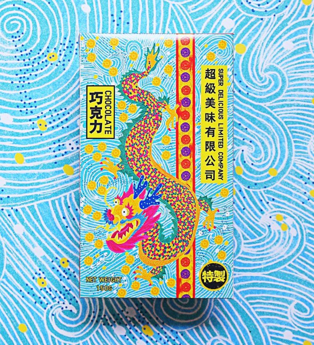
After finishing much research for a current project, I came across a striking food product that is unlike any other chocolate product I’ve seen before. I’ve not included it in sketchbook research because I found it so late, but I also feel that it would be best too here on my blog.
The Super Delicious Limited Company chocolate bar packaging is designed and illustrated by by Zilin Yee, an independent graphic designer, while the copywriter for the project was Herbie Phoon. Zilin Yee used the programs Adobe Photoshop and Adobe Illustrator to craft the very tactile-looking packages, informed by the physical qualities of Joss paper.
A product “based on the idea of the joss paper culture“
The traditional, bamboo-made Joss paper is burned during ancestral worship ceremonies. Joss paper includes variants known as ghost or spirit money, which are highly colourful ‘afterlife bank notes’, burned at funerals. The packaging designs capture the brightness and patterns of the ghost bank notes.
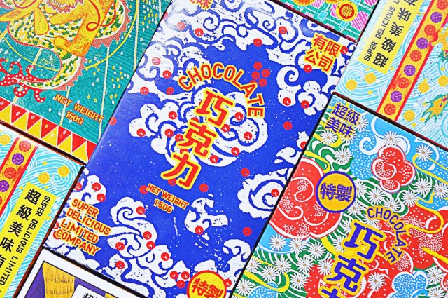
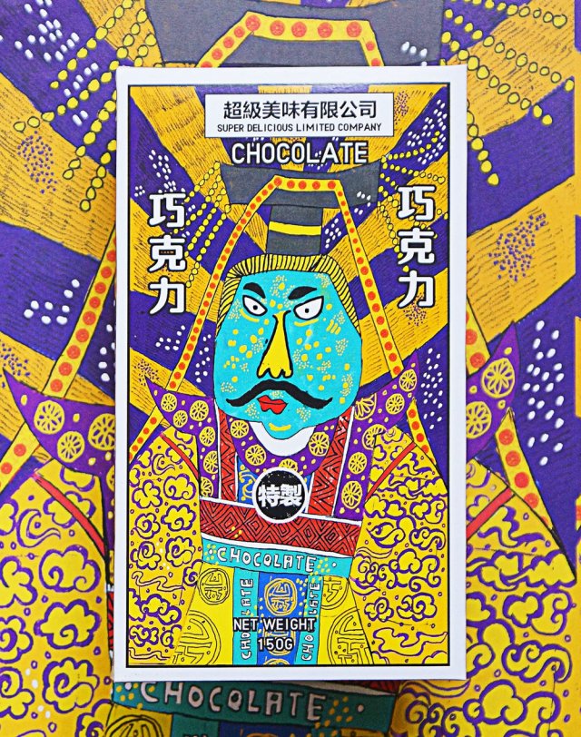
Many different packagesThis package illustration is strongly reminiscent of ghost money, featuring an emperor
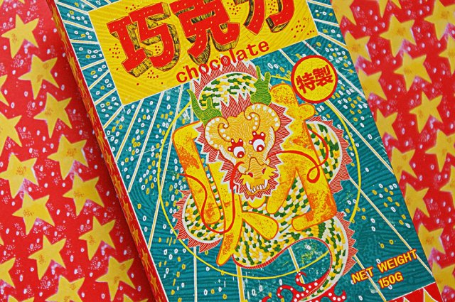
The chocolate bar’s packaging all feature very whimsical and playful illustrations. The line of packages are of course, tied together by their visual theme, and typography. The brand logo, product name, and weight are positioned in different places on each package, which is unusual as the same placement would unify a product feasting differently designed packaging.
The colours and patterns are enough to make me want to buy this
If I were to see this sort of product package design in the west, it would undeniably have strong shelf presence going for it, even among other ‘designer’ or ‘premium’ chocolate bars with outrageous packaging design, Super Delicious Limited Company chocolate wears its inspiration on its sleeve (…or box).
The design inspiration has no immediate relation to chocolate (or the origin of the cocoa bean) but it stands out due to the unique route the designer chose to take. Sometimes a product doesn’t have to ‘fit in’ with the status quo to be desired. More-so than other chocolate bars, the visuals of these packages are the real draw to the item, and that’s worth thinking about in future packaging projects.
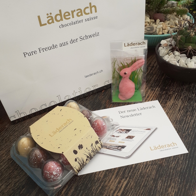
It’s a Sunday – a chill day – it also happens to be Easter. So I thought to share a relaxed post of some pictures and thoughts of some Easter-marketed Swiss chocolate (and their packaging). I picked up these items while in Switzerland.
At the end of my last full day in Switzerland last March, I visited ST. Gallen’s Läderach chocolate shop to pick up some of their fabled goods. Among the most well-known chocolate brands in Switzerland, Läderach has been around since 1962. Of course with the Easter-themed goodies on sale, I couldn’t not pick them up to share with family once I got home.
Läderach chocolate that I brought back from Switzerland.
Not pictured: the rest of the Swiss chocolate I brought over with me.
I felt that I had to pick up some chocolate eggs and a little hare. I did buy a nice pre-packaged selection of FrischSchoggi – that’s ‘fresh chocolate’ in English. Läderach’s FrischSchoggi are displayed as large slabs that can be broken up upon request of a customer and are priced according to weight.
Anyway, let’s look at the two Easter-related items that I bought. It’s an opportunity to critique at types of packaging design that I have not yet looked at.
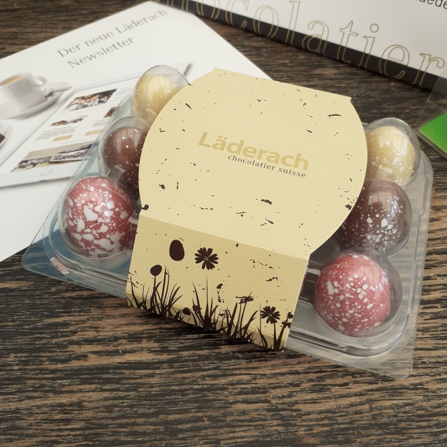
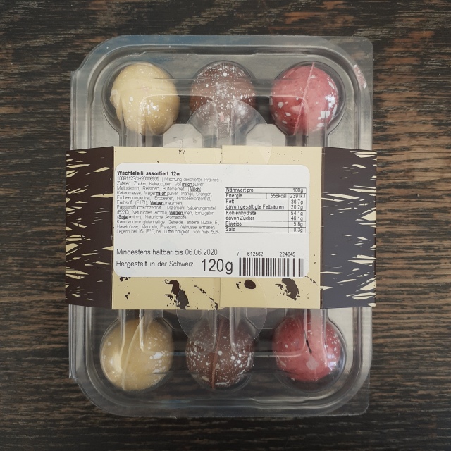
Plastic and cardboard egg box packaging
It’s not strange to come across real hen and duck eggs stored in plastic boxes, but the type I’m most used to seeing are the cardboard variant. Here, the point to using plastic is that the consumer can see these hand-painted chocolates inside of the packaging. It’s not the most environmentally conscious choice of material, but it can be recycled.
For those wondering, the flavours of chocolate eggs inside are strawberry, milk, and orange!
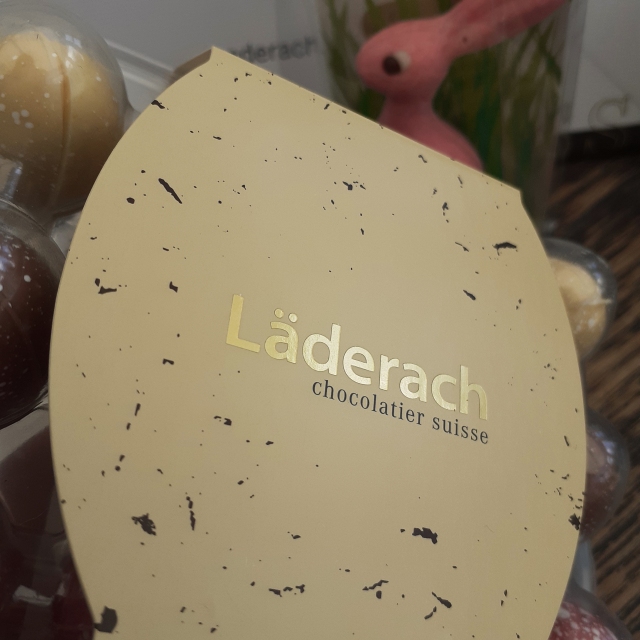
Raised foil text on the egg box’s cardboard wrap
The wrap around cardboard label is predominantly beige with cocoa-coloured silhouettes of springtime grass, flowers, and… flecks of pollen!? The matte finish on the wrap around features the brand’s logo in raised gold foil text. It’s mature and understated, and to me, it speaks ‘luxury’. Definitely this is a treat for the adult market.
The necessary info is stickerd onto the back
All of the ingredients and storage instructions of Läderach confectionary are in German. On the back of the chocolate egg box, the weight, storage, expiry date, and ingredients are found on a white sticker with black text which is slapped onto the underside of cardboard wrap. Note that the sticker acts to further secure the cardboard wrap, along with two smaller, round stickers.
Thinking about the product from an ethical perspective, the use of plastic isn’t great, but overall, the materials used to make this egg box can be recycled, and that’s good. As stated before, the plastic material chosen allows for the potential customer to see the product while keeping the chocolate both safe and clean. After all, the nature of this consumable can’t be compared to say, a fruit, which doesn’t need packaging at all.
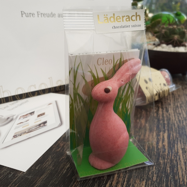
Raspberry flavour mini Cleo
These small, stylised chocolate hares are so cute that I had to pick one up for myself! The mould is elegant and sleek, but the painted eye adds a cute (and maybe a somewhat perturbed) look. Cleo came in many flavours. The mini Cleo that I picked up is raspberry, but the option of milk and dark chocolate were there.
These little chocolate hares stand up inside a plastic bag, with a cardboard backing for support. There’s a sticker atop each bag adorned with the store logo. From the front, the strip of cardboard support has a simple grass field illustration and the product name at the top. At the base of the cardboard backing is the ‘Chocolatier Suisse’, printed in gold, in the same font that adorns base of many of their year-round packaging.
Speaking of the standard packaging, the Läderach branding uses almost exclusively white, gold, and black. (Can’t really go wrong with those colours.)
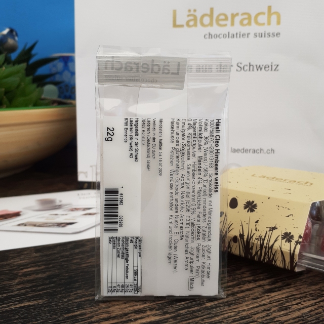
Reverse side to the mini Cleo chocolate
The back of the Cleo product shows the legally required product information which is stickerd onto the back of the plastic bag, made visible by the white of the cardboard strip. The sticker label states the weight, storage, expiry date, and ingredients of the treat.
The overall presentation of the product is unfussy by design. The packaging used can be recycled, but it is less so than a traditional cardboard package that Easter confectionary is often sold in. I don’t believe that I have seen moulded chocolates presented individualy like this in any other shop, so to me, the packaging is somewhat of a novelty!
In the future, I’ll keep in mind Läderach’s packaging design in comparison to our equivalent domestic products aimed at the same audience. The pervasive usage of white and gold is light and friendly, yet chic. Läderach definitely has it’s own identity, even if it’s a relatively young company in the grand scheme of chocolatiers!
I have been working on a module focused on food packaging, and it was narrowed down to creating food product packaging for children. After much primary and secondary research, I scanned and digitally traced a number of packaging nets belonging to various foods to understand the how the nets behave and fold. But it’s good to look at all sorts of packaging, including non-food items, to get a firm understanding of a package’s function… including hierarchy.
As expected, 99Designs has a great number of works to browse through if one needs some visual stimulant; a solid resource.
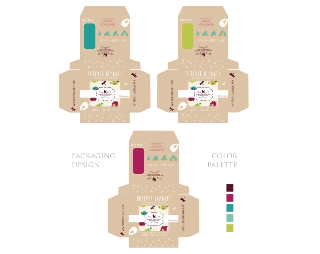
Package design nets for baby blankets
These baby blanket packaging designs by Naturalcom lay out the nets so they’re easy to read, scrutinise, and understand. These nets above are a wrap-around cardboard design.
Alternative visual designs for the same nets
More of the same style of packaging, but with slightly different imagery and thus a slight change to the feel. I don’t know if I’ll make as many different feeling packages given the limited time I have and that I still work rather slowly on Adobe Illustrator.
A different type of nets for the same product
I also need to have this high-standard of design and layout; including a breakdown of the colour pallets and font families used. I’m getting closer to where I want to be on this module.
I’m well aware that I need to work on my confidence in my designs and decision making greatly. I should take opportunity to do so within this module and own it. I can make this project fun.