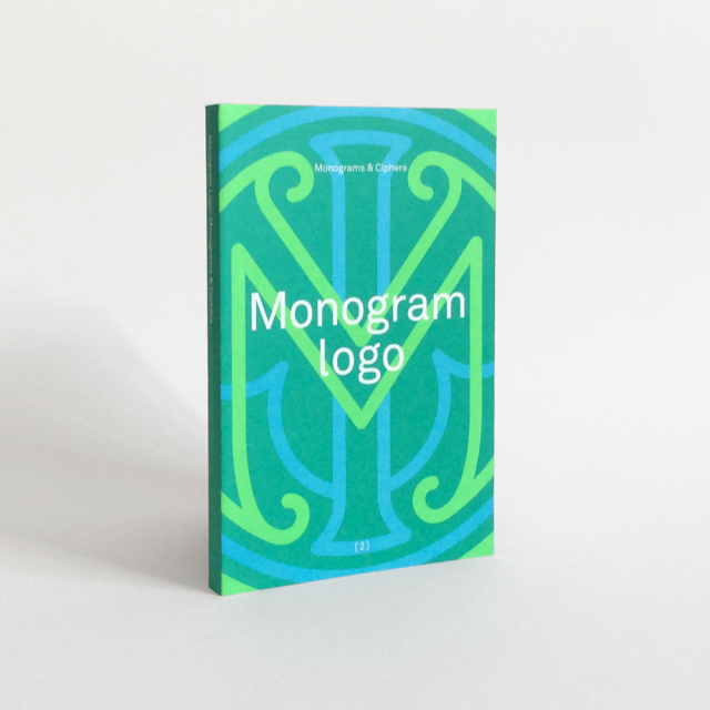
Borrowing a book titled Monogram Logo (published by Counter-Print) from the studio out of vague interest, I’m finding myself appreciating the art behind crafting solid monograms. Whether the designs are fun and playful, or elegant and assured of itself, there is a lot of good design packed into this physically small book.
Monogram Logo by Counter-print, 2014
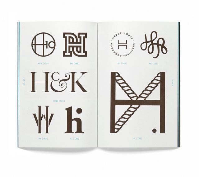
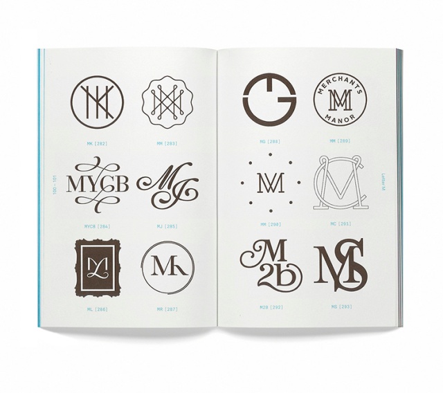
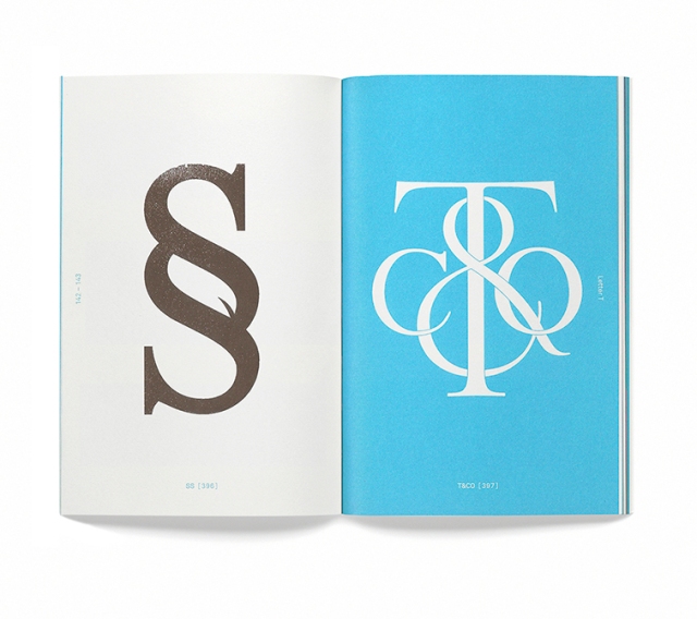
Since the book I have ahold of isn’t my copy, I won’t scan pages from the book, I’ve found a few images of the contents here.
Page spread from the “H” section of the book.
There are only so many letters in the English alphabet; so there are people, services, companies and so on, who will inevitably share the same set of initials! This book groups monographs by the leading letter of the insignia. There is a section for almost every letter in the alphabet.
Collection of “M”-centred monograms.
The number of monograms on each page differs and they are speed out in an easily-digestible manner – all numbered and tased with the letters used to construct each monogram. Each “chapter” – for lack of better word – lists the graphic’s origin, purpose, the designer and year it was created.
End of “S” and start of “T”.
The book itself is a beautiful object. No doubt about it. But it’s also a resource of inspiration and knowledge.
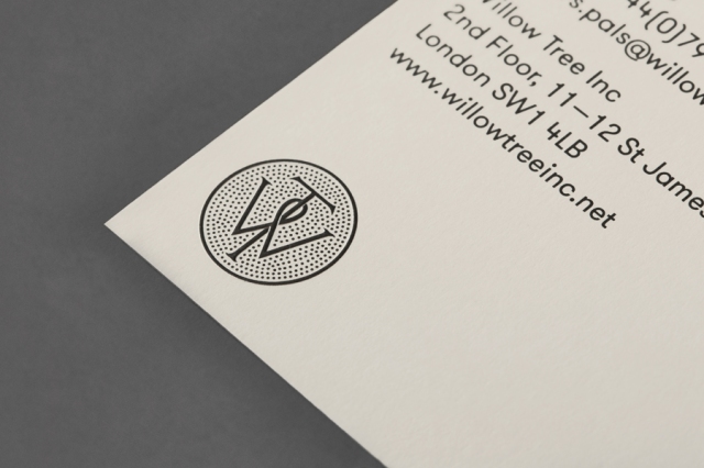
BP&O mockup of the Willow Tree logo, designed by Bunch.
The above mockup for the Willow Tree logo from the renowned agency BP&O shows the standard of monogram and cipher icons chosen for the book.
Searching for the logos seen in the book online, I can find some of them in use, out in the wild.
Myself, I’ve the initials “I”, “N”, and “C”. Of course it spells out the abbreviation of “incorporated”, but it’s also a homophone for “ink”. I’d like to make some rough drawings of my initials to see if I can’t also create a type-based icon or monogram to use myself (even as a stamp).
Do you have a favourite logo made of type that forms a monogram? Does it capture the spirit of the product or service that it’s trying to convey?
I’m not one to feel comfortable staying put for too long. The desire to travel and explore is strong; there’s only so such time I have to do so, after all. In the spirit of travel, let’s take a look at a small number of airline logos, and see how well they embody their companies ideals and character. There is beauty to be found in the logo designs of even the most corporate of identities!
The logo of Deutsche Lufthansa, by Professor Otto Firle, 1918
An encircled, angular crane with outstreched wings serves as Lufthansa’s logo mark. Originally, this logo was created for the defunct airline Deutsche Luft-Reederei, and subsequently bought by Lufthansa. The emblem possesses a distinctly retro but timeless feel, while the crane itself holds positive associations such as luck and longevity. The crane’s stylisaiton invokes immediacy, while the colour yellow also strikes faster than other colours; that is, we’ll register this before the other, different-coloured logos in a line-up of aeroplane tails.
KLM’s logo has gone though some drastic modifications since the company’s founding in 1919, though the regal crown remains essential – and so it should. The crown itself being made out of four clean circles, a cross, and rectangle is deceptively simple, yet immediately recognisable when removed from the logo type. The particular shade of blue has become an integral component of the companies identity, so much that they’ve capitalised on it’s patrons’ association of blue with their “Flying Blue” scheme (which is essentially air miles).
Qantas Airways uses the red kangaroo as their logo; the silhouette taken from the Australian one penny coin. Here, the straight lines of the triangle convey strength, professionalism and efficiency, while the kangaroo’s tail tapers off with a sense of elegance. The sleek and organic kangaroo also offsets the otherwise potential harshness of the triangle.
Undoubtedly, avians are a popular subject for airline logos; TACA Airlines uses a heavily-stylised eagle as their logo mark. To me, it almost didn’t register as a bird. It’s very elegant, and I wonder if the same effect could have been achieved using fewer lines. While I like the sweeping motion of the eagle, I feel it the bird lacks the urgency (and thus the impression of “speed”) that other, similar logos possess.
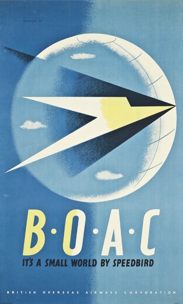
The now defunct British Overseas Airways Corporation (BOAC) used a greatly-stylised and angular bird in flight, known as the Speedbird, designed by the artist Theyre Lee-Elliott. The unwavering, direct lines that make up the Speedbird invoke efficiency, swiftness, and dedication. The slender logo mark is complimented by the thick sans-serif logo type.
Now, as my course approaches a new module, I need to turn my attention to the advertising industry. It would also be good to devote a whole post to travel posters in the future. Here, I want to share just one poster advertisement by the artist and graphic designer Tom Eckersley, for BOAC, as it features their logo, front and centre. The contrast of the sphere and the triangle-shaped bird creates tension and is the viewer’s focal point. I enjoy the minimal colour palette.
BOAC poster by Tom Eckersley, 1947
Are there any airline logos that you have an affinity for? And if so, do you feel that they communicate clearly their company’s identity and any values? I personally feel that the vintage logos here imbue the feeling of safety and a sense of reliability in this fast-paced and unpredictable world we live in, by simply standing firm though decades of change.
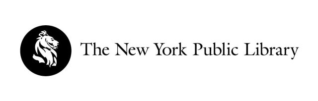
Have you ever been exposed to a design and wondered just how the piece arrived at the conclusion that it did? The ideation process reveals the evolution of a piece, be it a logo, a website, a tool, and so on. The ideation process covers all initial ideas and any problem solving needed to reach a sound and resolved piece. Let’s look at the redesigned logo of The New York Public Library, by graphic designer Mark Blaustein.
New York Public Library’s logo, Mark Blaustein, 2009
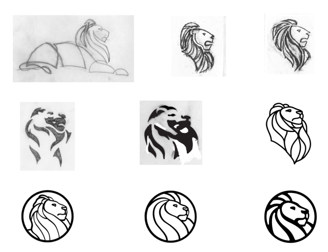
The image below shows the progress of distilling key elements in an initial sketch to create a solid icon. Mark Blaustein has recognised the economy of line and skilfully played it up to a logical conclusion.
Marc Blaustein’s ideation process of creating a new logo for The New York Public Library, 2009
Of course, the (sometimes arduous) process of logo ideation is a lot messier than clean picture shown above. As creatives, we’ll find ourselves swamped with ideas. If we have the time, we should pursue each road that appears before us, though not every road leads to a conclusion we would like. Basically, if you don’t try something out, you’ll never know if it works. And if something doesn’t work out, then you will have still learned from it.
More of Marc Blaustein’s ideation process for The New York Public Library’s logo, 2009
Above are another set of ideation sketches by Mark Blaustein, investigating stain-glass aesthetics. (There were also organic motif routes such as leaves and fire that were explored.) Refined logos from this particular route would have been interesting to see! I do feel that some stain-glass elements went into the look of the final design.
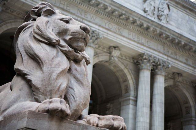
The library lion, Patience.
The original logo for The New York Public library was also a lion. Part of the library’s image are the stone lion statues, Patience, who watches the south side of the Library’s steps, and Fortitude, who guards the north of the building. It’s only fitting that the beast we call “the King of the jungle” must be symbolic of enlightenment; a monarch needs knowledge to rule justly, and fairly. The lion is strong, the lion is powerful because he has knowledge on his side.
The previous logo of The New York Public Library.
Above, we have the library’s previous logo; with the icon or mark to the left, and the logo type (the name of the business, company, studio etc.) to the right.
The old logo looks fine upon first viewing, doesn’t it? It has a vintage charm about it, too. But there are problems that come with such a detailed approach to logo design; it loses detail and becomes difficult to read once it is shrunk down. Where as the new design is suitable to print as part of a letter header, or fitting as a stamp or badge.
I did find a number of knee-jerk reactions to the new logo when it was first shown to the public; claims of it being “too corporate“. But such statements come down to general misunderstanding of how a logo must work. It must not simply look good, it also has so function as a memorable symbol, and in this case, encompassing all that the library stands for. The new logo is appropriate for branding material goods such as tote bags, can badges, and jewellery, which only reinforce the library lions’ popularity further, thus keeping the library in the minds of the public.
After looking at the both logos, do you feel that the previous design was suited to it’s job, and worked just fine? Or do you feel that Mark Blaustein’s design better reflects the library and works just as well (or perhaps even better)? For all the goals that it achieves, I prefer Mark Blaustein’s design.
I’m tying up loose ends of a project, and it requires tidying up my scamps. I want to reproduce them digitally. Now, I’m not used to Adobe Illustrator just yet, so I’ve a lot to learn about reproducing and rendering my drawings on a computer. I hope I can post variations of my designs once I’m done!
For the project, I’m working with an animal motif because the animal is central to the message. There are a plethora of brands, companies, charities, and digital programs etc. that utilise the charm of an animal in their logo. So let’s look at some logos with a wild side!
Penguin Publishing and Puffin Books – 2003 renditions by Pentagram
Though the designs have been revised a number of times, Penguin Publishing’s monochrome icon has been around since 1935! The penguin is a sharp-dressed and smart-looking bird. Puffin Books’ logo for their children’s imprint, is the much smaller, and mischievous bird.
WWF – logo designed in 1961 by Sir Peter Scott
WWF’s logo is perhaps one of the most recognisable animal logos in the world. It’s true expression is ambiguous – it doesn’t have a defined pair eyes, and because of this, we can project feelings onto the bear. It could be happy, sad, scared etc. If you look closely, don’t the three visible legs form a “W”…?
Pola Honora – logo designed in 1999 by Likovni Studio
The uroboros is symbolic of renewal, rebirth, and cycles. Here, the snake is used to promote water purification for a Croation company. The simplified shape of the mouth helps form an arrow, reinforcing a sense of motion, not unlike the the universal recycle symbol. Circles are also a friendly shape that are easily remembered.
Fjällräven – logo designed in 1974
Fjällräven aim to inspire others to take an interest in the outdoors, to respect the world’s animals, nature, and other people. The mountain fox is wise and resililiant, possessing ideal traits of an outdoor adventurer, but at the same time, the fox isn’t without the cute features of other small, furry mammals. The logo is stylised so the consumer of the goods can interpret the logo however they like, and use it to define a part of their identity.
Oceano de Lisboa – designed in 1996 by Chermayeff & Geismar
The ripples on the surface of a body of water double as a school of fish. Lisbon oceanarium is a massively popular tourist attraction for visitors from around the world, and this stylish logo shows the aquarium’s competence from the get-go. The logo can be printed in colour, but more importantly, it works just as well in monochrome – which is how it’ll be seen when printed in a letterhead in business correspondence.
California Conservation Corp – logo designed in 1878 by Vanderbyl Design
An adult bear is wrapped around a cub in a defensive manner, the adult is prepared to protect its young, and the child is safe and content. Protection is what CCC is all about; its mission is to guard land and wildlife from flood, fire and other disasters.
Pochin – logo created in 2001 by Funnel Creative
We acknowledge elephants as one of the most strong yet gentle creatures on the planet, and artist interpretations usually play up their literal strength, as seen here in Pochin’s logo for their business in property development. Because we recognise the elephant as sensitive and caring, we may assume the companies’ industrious workers are too.
Alright! We’ve looked at but a tiny handful of logos utilising the raw power of different animals. There are so many more that I’m sure you’re aware of, and maybe even fans of! So, do you have a favourite animal-centric logo? If so, is the animal vital to the message, or simply there for decoration?
Take that last point in mind if you’re to design a logo; if an animal’s symbolism can strengthen a message, then great! …But if it’s just there for looks, it may cause viewer confusion, and muddy your message!