Poster Design – Miron Lykyanov

I want to take a moment to share some of the works from the book I picked up when in Glasgow. While I did mention the book’s contents previously, I did not share much. Here, I’ll share some vintage pictures of USSR poster design from Phaidon’s publication, Designed in the USSR 1950 – 1989. I don’t plan a deep dive into a critique of the artworks shown here, but I want to share some smart imagery. Though there’s a plethora of beautiful designs contained in the book, Miron Lykyanov’s works caught my eye. So, let’s look at some of his posters.

example 6
Movie posters for “Chernaya Chaika”, “Molodo-Zeleno”,  and “Ya, Babushka, Iliko I Illarion”, designed by Miron Lykyanov, between 1962 and 1963

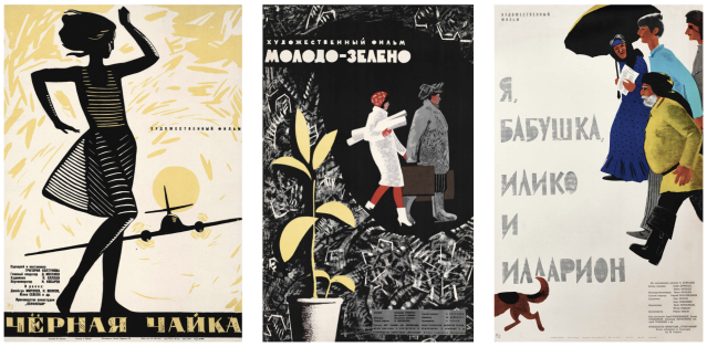
While Designed in the USSR 1950 – 1989 has a great section on movie posters, some of the stand-out designs are by Miron Lykyanov. I admire that’s he’s not shy of using black. I have personal associations with black as representative of absoluteness and irrevocability –  it’s strong and certain of itself, showing unwavering commitment to any composition.

4961
Movie poster for “Vremya Otdykha S Subboty Do Ponedelnika”, (Leisure Time from Saturday to Monday) 1959, by Miron Lykyanov

This poster is great because the figures are dispersed with the essential text, so the viewer becomes involved with the flow of the illustration as they read it. I like the careful management of negative space and the typography.

cr-8-10-42-1-a-24
Social awareness poster “Through Worlds and Centuries”, 1969 by  Miron Lykyanov and Vasily Ostrovski

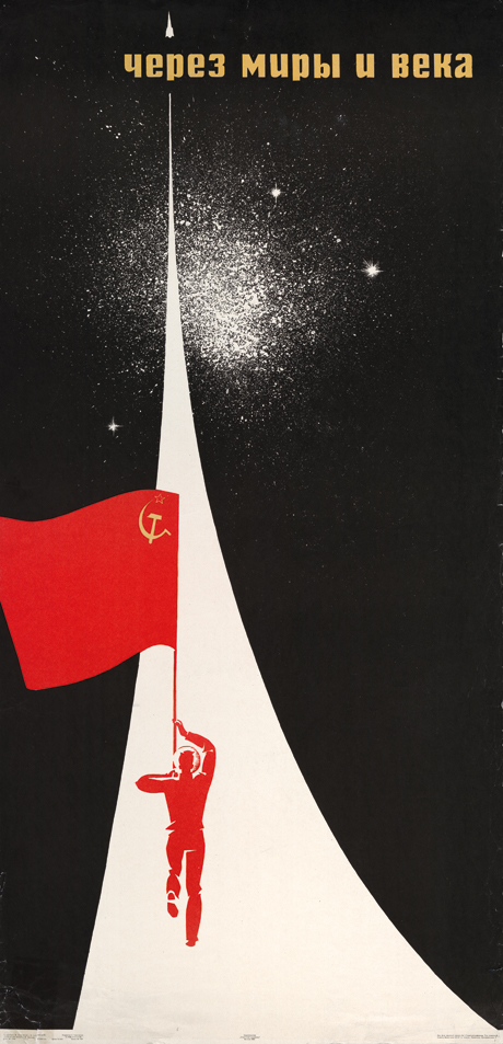
This poster pays homage to Konstantin Tsiolkovsky, Russian and Soviet rocket scientist, who claimed “the road to the stars is open”. The deep black space has an infinite feel, but here the unknown is not scary, rather the pursuit of new ground is exciting. A very persuasive piece, “I have unlimited potential” is the message it sends to viewers.

example 7
Social awareness poster “Young People, Go to the Textile Industry!”, 1970s by Miron Lykyanov

This social awareness poster is out to provoke discussion, thinking, and response. The threads create the illusion of a warm sun – and the suggestion that a bright future lies ahead for all those with the drive to become involved in the textile industry.

In a future post, it would be nice to spend more time specifically on the general design of social awareness posters, and the power that pictures alone have to break though language barriers and cultural differences to send out messages to anyone, anywhere, in almost any language.

Graphic Design Festival Scotland 2018 – Entry 01

Earlier this week, I was in Glasgow to attend an international poster exhibition, and a risograph printing and bookmaking workshop held by Graphic Design Festival Scotland, within The Lighthouse. I took many photographs of the poster gallery, and later picked up the show’s poster catalogue (as well as a book on USSR design from 1950 to 1989). In a future post, I’d like to go over a few of the high-ranking poster entries that exhibited this year’s international poster exhibition. There was a real mix of design to enjoy! I don’t plan on critiquing the posters, rather, I’d like to show the ones I liked, and share why I liked them, or why exactly they work as posters.

134786_large
“Antwerp Art 2018”, an international poster competition entry for this year’s GDFS by Vrints-Kolsteren, 2018

As for the book I brought back, Designed in the USSR 1950 – 1989 is full of wonderful design choices, and covers everything from matchboxes to automobiles. There’s even a section dedicated to sweet wrappers! Besides the fantastic colour palettes, there are so many unique typefaces to discover, too. Below is one of many posters from within the book; this one advertising a movie concerning high school students who form a secret society for the offended and weak.


133-Drug-Moi-Kol-ka
“My friend Kolka!” movie poster by Miron Lykyanov, 1961

Since I took so many photographs during the trip, (of the posters, the workshop, Mackintosh tea rooms, the botanical garden etc.) they’ll take some sorting through. The process of risograph printing is relatively new to me, so it will do me good to write about the process.

Screen Shot 2018-10-26 at 12.01.11
“Funny Zoo” chocolate wrappers, 1950s – 1970s

Reading week begins after the weekend, so by then I’ll have time to write up on the poster exhibition, the workshop, and maybe share more pictures of the USSR design book that I’ve picked up too. I also saw plenty of other nice collections of books when in town, and made note of the publishers or jacket designers.

Here’s hoping that my (phone camera’s) photos are up to scratch! There’s a lot to write about, and it’ll be much more fun to share with pictures!


Catch you later! And if you should spot any mistakes here, do let me know!