Vintage Illustration – Luggage Labels

Since any significant travel has been restricted for months, I’ve tired to satiate the desire for exploration by traversing the local woodland and such. It’s a solitary activity, and thus I’ve much time to think to myself. I thought about how much overseas traveling there is to look forward to in the future once such movement is safe.

airline label
Luggage labels like this were crafted to advertise airline and hotel services in the 20th centuary

When I looked through my last passport, I found very few ink stamps on the pages despite how much I had traveled with it. A lot of the documentation of our travel these days is digital. Long gone is the era of travel ephemera such as luggage labels; the kind that airlines and hotels used to slap on vacationer’s suitcases. Never have I seen luggage labels in person. But exposure to them in vintage cartoons and film leaves me with a romantic impression of them. (And perhaps, a romantic impression of travelling itself.)


various luggage stickers
Vintage airline and hotel luggage labels

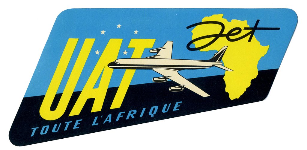
In searching for these specific paper ephemera, I ran across the flikr account of Tom Schifanella, Art of the Luggage Label. All of the images I have shared here are sourced from Tom Schifanella’s account, and so I encourage you to browse through the albums if any of these designs pique your interest.

even more various luggage stickers
Different shapes that baggage labels take on

I want to share a few labels that stood out to me for one reason or another, even labels that I don’t feel affinity for – because it’s still possible to appreciate and understand the thought and concept of the designs.


Location-Centric Illustration

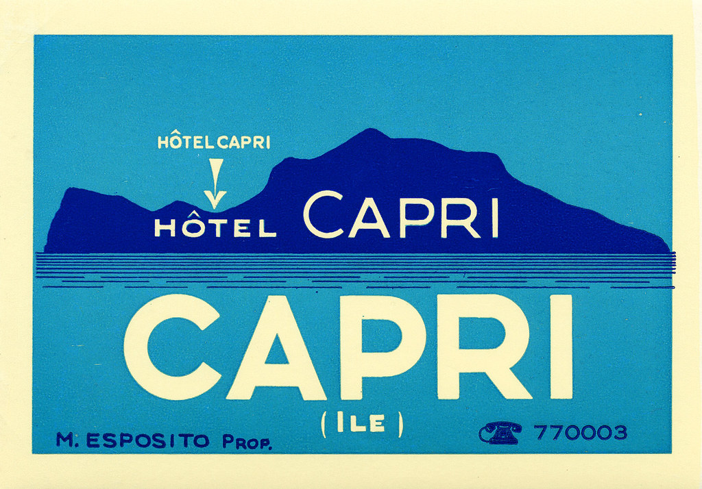
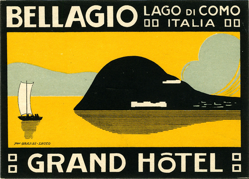
The following couple of labels are minimalist depictions of Italian holiday destinations surrounded by water. I like these designs for their limited use of colour; while the design for Hotel Capri uses three colours in total, the Grand Hotel in Lake Como uses four. The bold, sans-serif typeface helps the text read on the small scale that these images would be printed.

Hôtel Capri sticker
A baggage label illustrating the island of Capri, Italy
Grand Hôtel Bellagio sticker
Label for a hotel situated in Bellagio, Italy

Despite my attraction to these illustrations for their deceptively simple designs, the corporate illustrations of luggage labels are not all subject to strict restrictions of colour or texture.


Typography-Focused Design

These French hotel luggage labels are almost excessively ornate. While the highly-detailed graphic direction doesn’t appeal to me personally, these designs communicate clearly feelings of grandeur and wealth.

Lyon hotel sticker
The label for Grand Hôtel de Lyon
Lyon hotel sticker
Hôtel Mirabeau labek

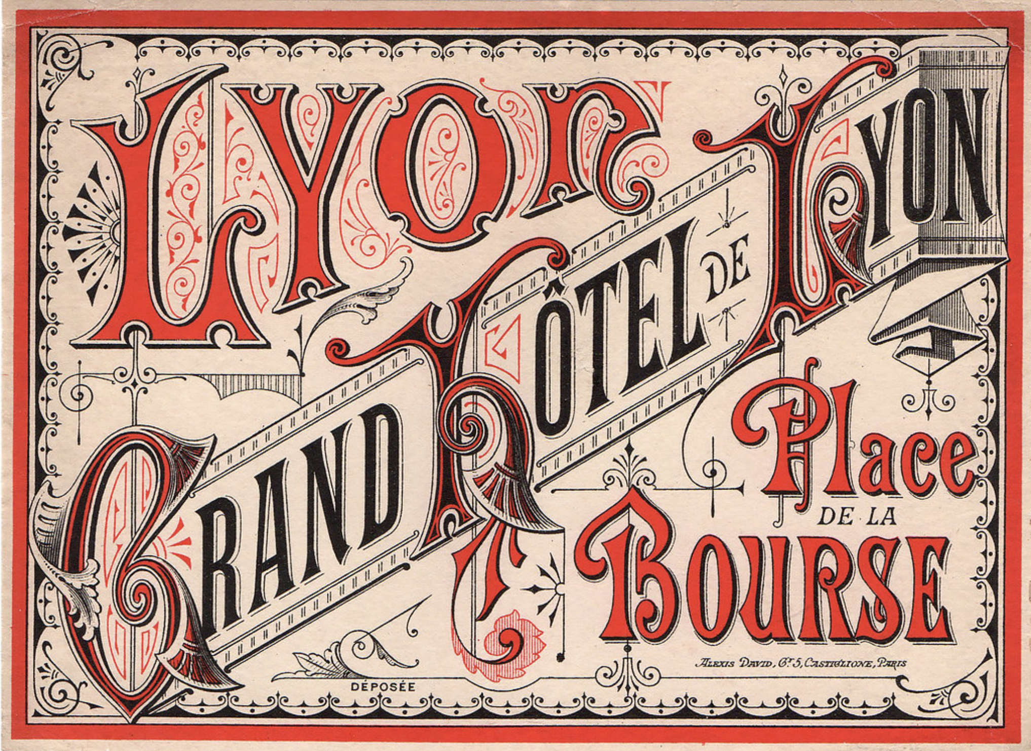
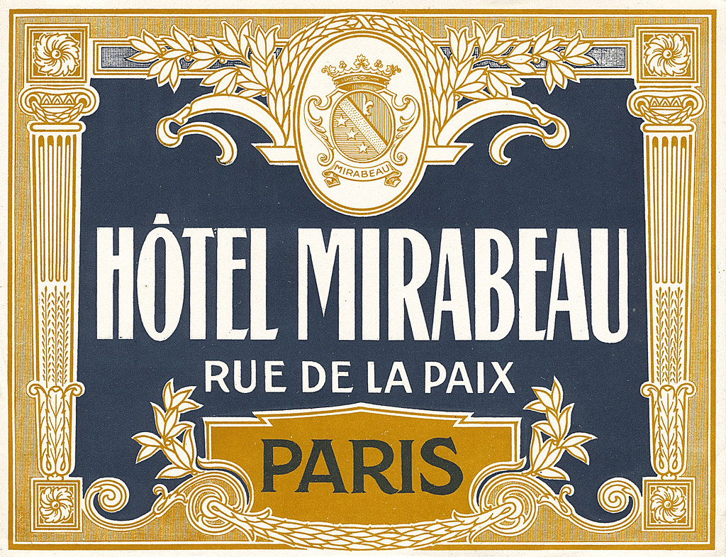
These decadent visuals aren’t ubiquitous today as this visual direction isn’t always practical or very suited for many modern services and goods, thus the old-school draftsmanship skills used to create these are not so freely taught or learned to students of design today.
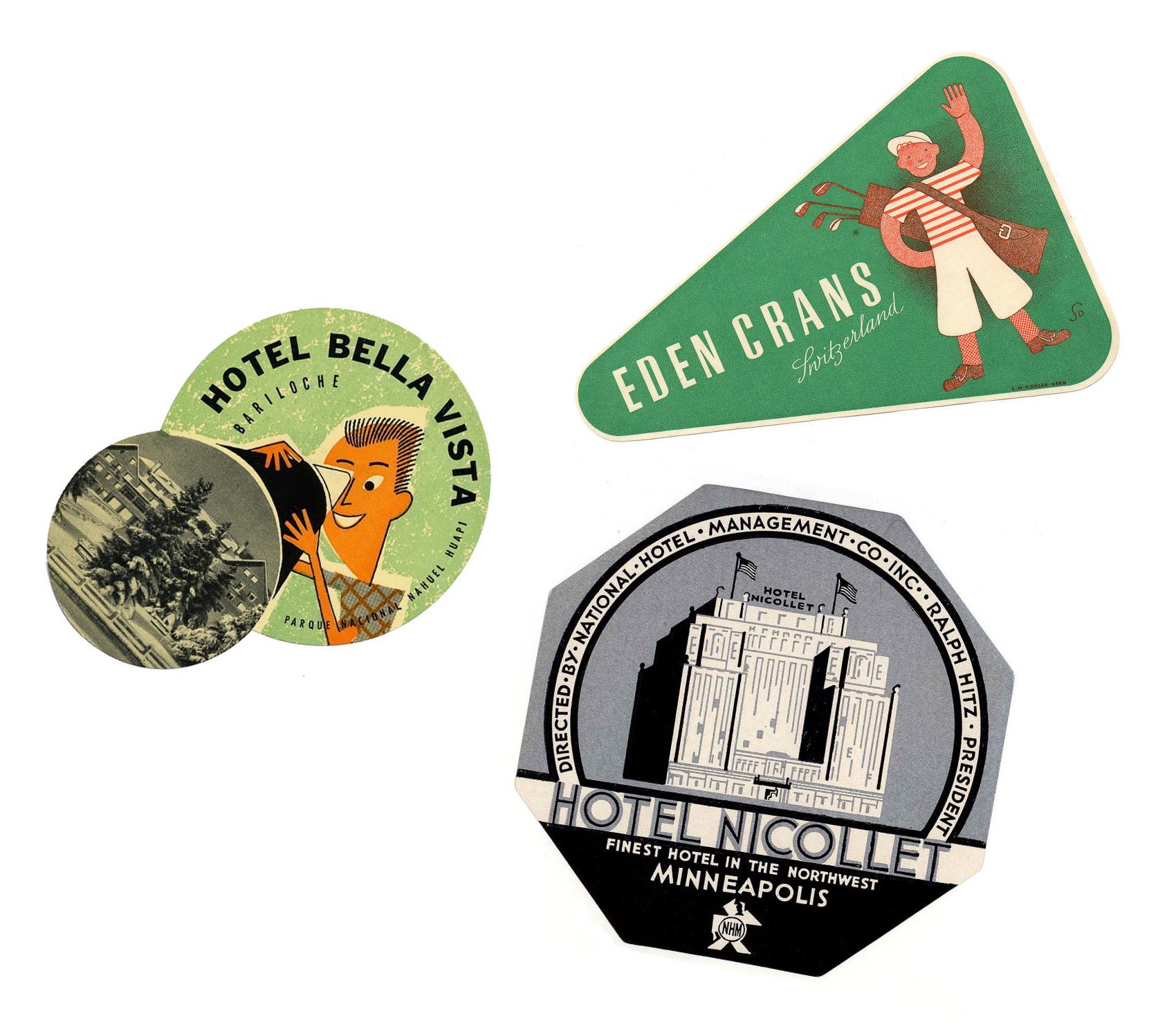

Swiss Style

These circular labels are all happen to be advertisements for hotels in Switzerland. They’re all functioning on a limited colour palette, too.

anotherswiss hotel sticker
Fox Label from a Hotel in Lenzerheide, Switzerland

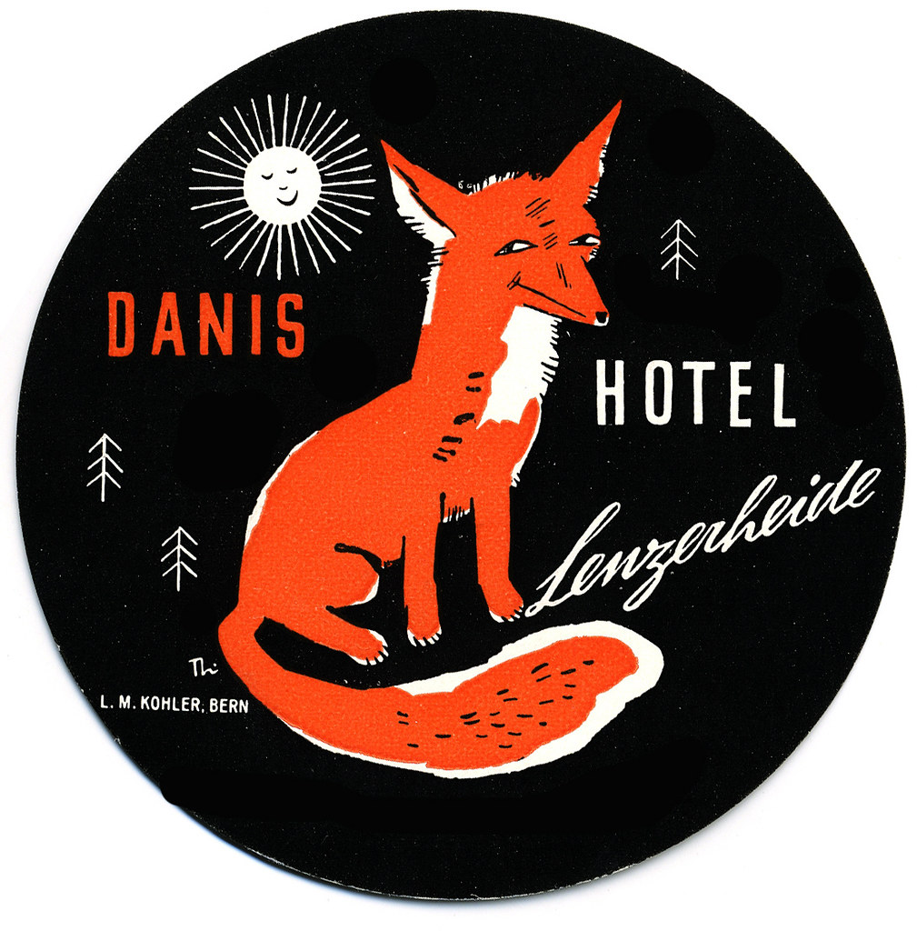
This illustration brings up feelings of outdoor activities and exploration in the mountains. The stylisation is nostalgic to European children’s books from childhood.

swiss hotel
A peacock promoting a hotel located in Einsiedln, Switzerland

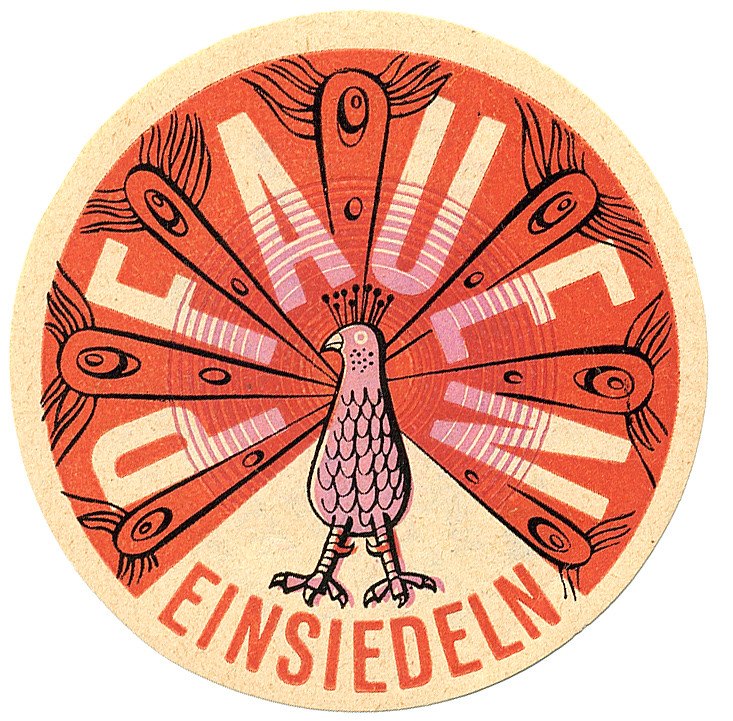
‘Pfauen’ here means peacock, and peacocks bring to mind elegance and beauty. This design takes advantage of the circle shape with a clean, considered illustration. The registration of the pink ink looks to be off, but it also lends this piece more character.

sun hotel sticker
Sun label from a hotel in Arosa, Switzerland

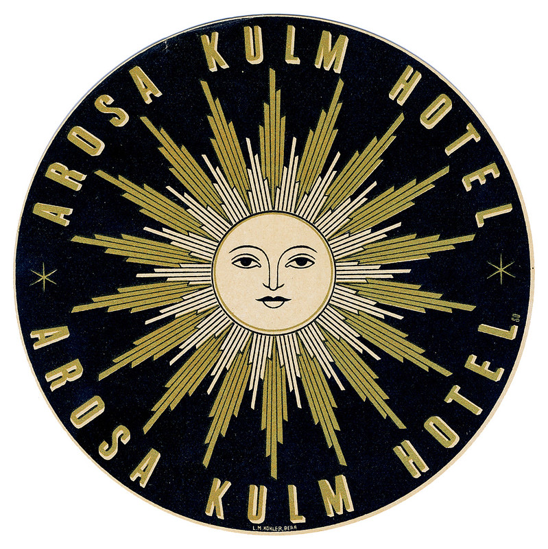
While this graphic doesn’t immediately communicate to me traditional ‘hotel’, I can feel a connection to mountainside spas where one can enjoy the closeness of nature. I can’t help but think of The Sun tarot card when looking at this…? The design does interest me, and makes me wonder what the hotel attached to this sticker was like.


Swiss style labels
More examples of mid-century Swiss Style

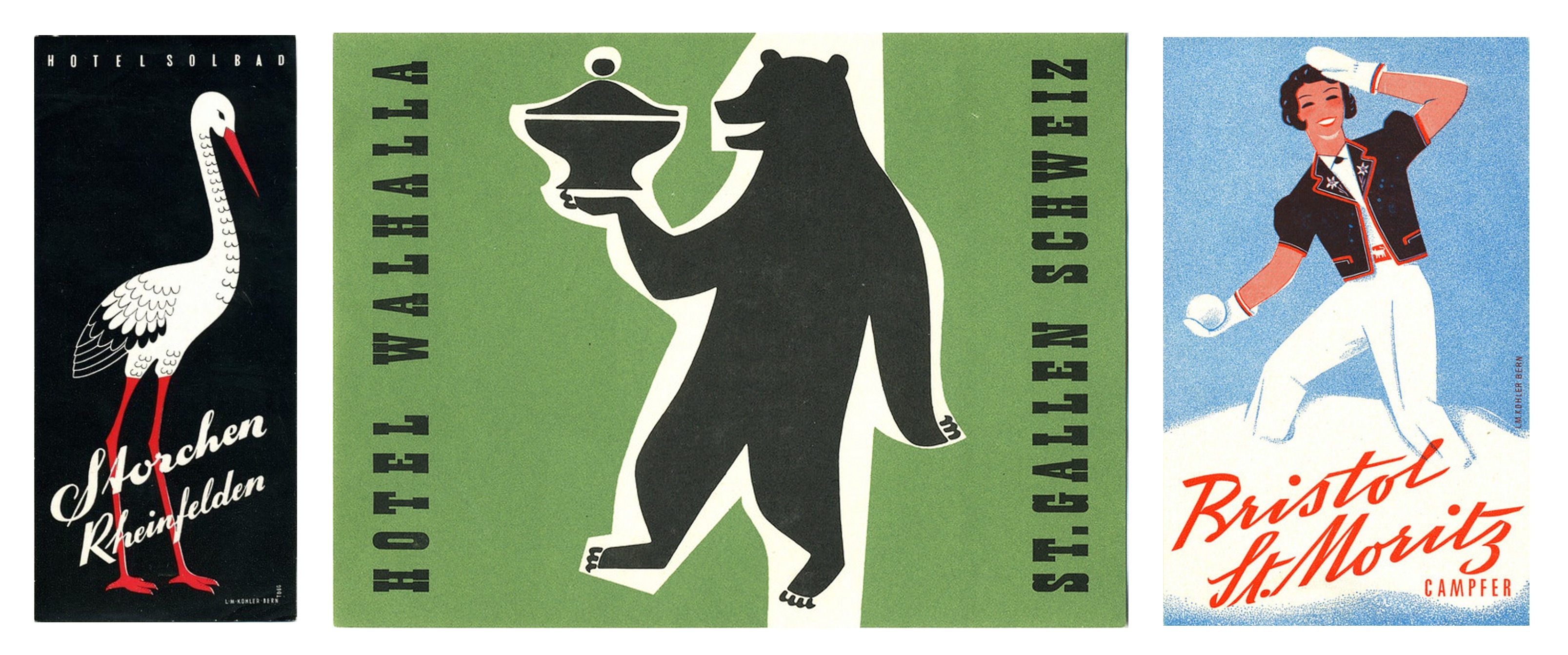
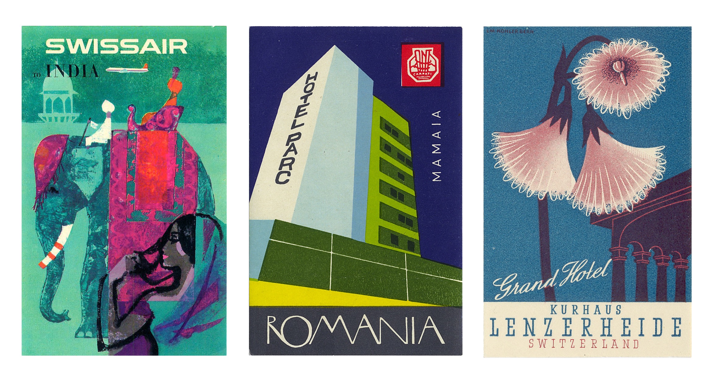
There is so much variety in these miniature illustrations, it’s a little overwhelming tying to take them all in at once – they’re in competition with each other, after all!

A number of these label illustrations are a shock as I would not have even contemplated some of the colour combinations employed, and yet I enjoy them. Other designers have made considerate use of black and I also consider that bold and brave – I’m always wary of how absolute and black is and its power to overwhelm an image. So, in reflection, I realise I can be more adventurous when illustrating in the future.

Hong Kong hotel
Still standing, just modified

While it was an impulsive action to seek out these luggage labels, it was rewarding. I found a whole world of corporate design I knew next to nothing about. There’s definitely a lot to pull from if you’re looking to find inspiration from past eras. But in imitating past design it’s important to think about why you want your work to be informed by older works, and if it really does communicate what you want.

Think about why these illustrations have been saved and are still appreciated now – many able to outlive the services they promoted. A lot of thought and heart went into these labels to ensure their impressions stuck!

Creative Freedom – FREITAG Animations

I thought to write a quick post on some short films made for a Swiss bag, accessory, and clothing company, FREITAG. These animations function as engaging and sharable video advertisement even though they are not marketed as a conventional commercials.

TRUCKIN screen shot
Screen shot of FREITAG video TRUCKIN’ from the ‘TARP BLANCHE’ series

The company FREITAG and its products were born from graphic designers Markus and Daniel Freitag, who in 1993 were in search of waterproof and durable bags to safely transport their creative work in. They found the right materials within the streets of Zurich –  truck tarpaulins, discarded bicycle inner tubes and car seat belts. Their items have taken off in popularity across the globe. Today, with the consumer being ever-more conscious of their purchases, the durability of FREITAG bags and the option to trade in bags one has tired of in exchange for a different or new one puts these items ahead of other long-lasting bag options.

The following three videos are from the 2017 ‘TARP BLANCHE’ series, in which the creatives involved had full authority to tell a story about FREITAG as they envisioned. The narratives get pretty wild.

Big Buddy Blue, by Team Tumult:

THE PICKING, by Burcu & Geoffrey:

TRUCKIN’, by Neil Stubbings:

There are other videos in the series, that can be found on FREITAG’s YouTube Channel. Along with many other interesting promotional videos.

I particularly like the aesthetic of TRUCKIN’, which borrows its purposely monochrome palate and silliness from the hand drawn animations of the 1920s. As with the other short films within the series, this animation explores the creation of the first FREITAG bags with a very unique and warm narrative that keeps the viewer’s attention from start to finish.

Have you watched and shared any company ‘promotional videos’ that act as advertisement for a product or service lately? Did they hit that ‘shareable sweet-spot’ many genuine adverts have aimed for?


Creative Agency – SHA

In mid December 2019, local advertisement agency SHA visited our Graphic Communication department to ask students their invaluable input on their development of a current advertising campaign for 2020 student recruitment to Newcastle College.

Originally named StarkHartleyAtkinson, after its founders, SHA refers to itself as a “boutique marketing communications agency”. The agency welcomes graduate students and has recruited graduates over the past 5 years. Be aware, SHA’s policy to those employees who leave for ‘greener pastures’ is that they may never return. If may seem harsh, but they’re keeping their workplace clear of poor working-relationships and emotional baggage.

SHA IMG 01
Still from a video for an academic research video by SHA, commissioned by Newcastle University

Part of SHA’s visit was dedicated to sharing information about themselves. It was explained in detail how their process ‘Brainwave’ works. SHA’s development of a campaign starts with understanding the emotional barriers to a service or product, and the emotional stimuli that can be used to address the barriers. On their website, Brainwave is mentioned:

We believe that real emotional insights allow for the creation of Intelligent Ideas that Get Results, so we dedicate ourselves to identifying the emotional barriers that contribute to our clients’ commercial problems. This approach helps the agency to identify the emotional stimuli through our planning process called Brainwave, ultimately delivering the Intelligent Idea that can overcome the problems a brand faces and deliver a very real positive commercial result.

SHA is always keenly aware of the competitors of the particular service or product they are providing advertisement for. SHA has turned away clients with ambition and goals that did not reflect SHA’s. SHA would rather keep a reputation for solid advertisement that performed well than bend to the wishes of a client who’s ideals and vision would lead to a campaign’s failure and the frustration of wasted time, effort, and money.


As for the ‘2020 student recruitment campaign’, I wasn’t the target audience – school leavers were the audience – so I can’t say that I was the most useful member of the focus group. I don’t find the same elements of campus life exiting as younger students do. I’m not into the social element of friendships and clubs as deeply as I am focused on the acquiring of skills and knowledge to build a portfolio. (I always figured one makes friends along the way, and I have less time to socialise in student societies than many fellow students, unfortunately.)

Even though I’m not part of a student society, I enjoy the company of like-minded peers in the studio and I think the advertisements that showed photographs of real students working together and enjoying their education to be the most sincere and appealing personally. Students closer to the target audience found the colourful stock images of students having fun off campus the most preferable. I honestly think the social element to be worthwhile – you’ll find in further and higher education that you’ll make good friends with those who are like-minded.

Within the poster advertisements some of them focused on the aspect of being the next big name in the culinary world or part of an art movement. I didn’t give it much thought at the time – and maybe high school leavers want to the the ‘next big something’ – but I think about that angle and I’m nonplussed. Less weary and battered students must find the notion thrilling.

Really, the preferred advertisements among the focus group were wholly subjective. Different angles appeal to different individuals, and I felt that I could only give input on the layout, typography, and colour choices, given my position as a not-target!

N.B. If a local agency happens to approach your campus and states just how readily they take on design graduates, it’s not something to be overlooked!

Online resources – Brand New

A number of entries have been dedicated to covering logo design, but I’ve yet to address logo redesign and rebranding; so, let’s look at a website that does just that!

The website Brand New (a division of UnderConsideration) is an ever-updating catalogue of design, showcasing the world’s corporate and brand identities – with comment. It’s a great resource (and archive) to view reimagined logos, the rebranding of corporate companies, consumer products, services, non-profit organisations, and so on.

dunkin logos
Dunkin’  …old logo to the left, new logo to the right

The articles are accompanied by the thoughts of one of the founders (and opinions of many others follow in the comment section). This is good –  to see both established and young working designer’s opinions on design. But visitors’ opinions are welcome too, in voting polls.

I recommend looking at some recently redesigned identities – though the comment sections alone are often worth it – they cover an in-depth look at reimagined logos,  applications of the brand, and advertising campaigns.

Poster Design – Herbert Bayer

Originally a student of the German school of Bauhaus, studying from 1921 to 1923, Herbert Bayer later taught at the school during the years 1925 to 1928. He became the head of the printing and advertising department, as appointed by the school’s founder, Walter Gropius. A skilful typographer, he taught the school’s first classes on typography.

Soon after Bayer’s work was included in a Nazi Entartete Kunst (literally “Degenerate Art”) exhibition during 1937, Bayer left Germany for the safety of America. Many other students and teachers of Bauhaus fled their homes for overseas countries as the Third Reich’s ridged control over artistic expression threatened not only their livelihood but their lives, too.

ugly duckling
Ugly Duckling of the Office, 1939

I want to share some of Bayer’s poster designs he created for the Container Corporation of America. The advertisements Bayer produced for the company cover themes such as integration and responsibility. The careful use of space, limited use of colour, and placement of text gives these posters an enduring modernity.

WEAKNESS TO STRENGTH
Weakness into Strength, 1941

This series of posters’ original images are made of mixed media. Most using gouache, pen and ink, and pencil on paperboard; some incorporate collage. And while majority of Bayer’s posters are monochrome – both practical and cost effective – some sport limited colour, such as the Fire Steals awareness poster which makes use of the colour red to reinforce the danger through colour association.

Fire Steals
Fire Steals, 1942

Unsurprisingly, the later posters that Bayer produced for the Container Corporation of America intend to invoke the conscious conservation of materials in hard times of war; they’re not just advertisements, they’re social awareness posters. And they’re effective because they clearly communicate ways in which the viewer has the potential to make an impact.

WHALLOP
Paperboard Packs a Mighty Wallop!, 1942

Regardless of the content of these posters, I feel that their designs are fresh and clean-looking, even by today’s standards. The school of Bauhaus taught the idea that both mass-production and the individual artistic spirit were compatible, and indeed, these corporate, mass-produced posers still hold artistic merit. The flow of text and image is almost melodic.

Advertisement – Ethics

For peace of mind, I’ve decided it necessary to pin down my moral standpoint on advertising.

As the module requirements for “Advertising Design Processes & Development” was delivered, I felt dread wash over me, as I knew nothing about advertisement from business or academic perspectives. Looking back, that was OK, and that was good. Most pre-conceived notions I had were flimsy at best, and were easily altered, strengthened, or discarded though research. I’m in education to learn after all, so what does it matter if I had no prior knowledge of a topic if I have the eagerness to learn?

Researching agencies and marketing techniques, I found the majority of advertisements are made to sell products and services. There are a lot of advertisements out there to promote things that I disagree with; wether it be the promotion of a corporation I understand utilises unethical practices, or an entire industry that personally I feel is unscrupulous, such as gambling. There are methods of advertisement that I dislike the practice of; in spite of the fact that some of those practises work very effectively.

I became apprehensive over the idea that I could create advertisements for what I interpret as unsavoury products and services. I was left feeling disconcerted at the realisation that I could promote unsustainable, unethical products, or bad practices. Though it’s important to remember that morality isn’t clear-cut; it’s unhealthy for an adult to hold a black-and-white worldview, and I admit that sometimes my worldview does become too ridged.

In reality, any advertisement is forbidden to lie. So legal dishonesty is ruled out. Yet manipulating emotions to sell a service or product is standard. Though looking at it from a different, positive angle, advertisements can have a beneficial effect on a person’s behaviour; such as an awareness campaign on energy consumption that may change the target audience to be more conscious of the amount of electricity that they use, and in turn become less wasteful.

PAPYSUS FAUX EXAM PAPAER PRINT AD
A PAPYRUS print ad for the prevention of young suicide, by the agency TBWA/Manchester

Bearing in mind that there are countless campaigns that intend to do good by educating audiences, in attempt to change their actions for the benefit of themselves or others, there are also campaigns that attempt to reach out to those who are in need of help themselves; such as victims of domestic abuse, or suicidal youths who need someone to talk to. Good causes.

I’m also a consumer. In moderation, I like to spend my hard-earned cash on items that bring me joy. As a child I was exposed to very toyetic media, and yet upon the realisation that such media exists only to sell toys (as extended and glorified toy commercials) I rarely feel negativity towards such media.

I acknowledge and understand that, despite what I may feel, I need to be prepared for the chance that I may be asked to work on commercials that I have little to no interest in, or the service or product itself is something that greatly disagree on. To continue, I have to put aside feelings when they impede on my progress and learning. Still, it doesn’t mean that I won’t have the opportunity to create work for good causes.

Guerrilla Marketing – Ogilvy

There are numerous channels for adverting to reach us; digital, print, radio, video, and so on, and sub-categories to some channels. Though some services and products have better been able to reach their target market through the unconventional means of guerrilla marketing.

The concept has been around since 1984, and generally, guerrilla marketing runs on smaller budgets, yet bigger imagination in order to capture an audience. The key differentiation from conventional advertisement is that the guerrilla marketing is not traditional, it is not a television commercial, or a radio advert; and if it does involve traditional mediums such as posters, they’ll be gimmicky or interactive.

Guerrilla marketing comes in many forms, even in the most innocuous of acts acts such as handing out free goods. Tissue-pac marketing puts the advert directly, into a potential consumer’s hands, and the service or product is more likely to be remembered with continued exposure though use.

Another guerrilla tactic is ambush marketing; it steals the thunder from other advertiser’s efforts. When companies hand out free items to spectators or competitors in a sporting event, but they aren’t a sponsor of the event, they’re either taking advantage of the mass of people in one place, or the sports teams and their presence in the publics’ mind.

SAMSUNG DIGITAL CAMERA
“Nothing stops us.”

I want to share an example of guerrilla marketing used by the UK branch of DHL, the logistics company. The agency Ogilvy created a marketing strategy focused on the company’s tenacity in delivering what’s asked of them.

Ogilvy covered DHL vans in distinct road obstructions; traffic cones, construction barriers, even dirt, foliage and tape, to create caricatures of a determined driver’s ride. Seeing any of these vans, the viewer is expected to have a strong reaction. The exact feelings brought up from the sight of the vans are inconsequential, because a strong enough reaction leads to telling others about DHL’s advert regardless, and in turn raises awareness of their service.

beijing dhl van
“24 Hours Online Tracking.”

China’s DHL branch also commissioned Ogilvy (Beijing), to help promote awareness of their online tracking service. A large silhouette of a computer cursor was installed onto a fleet of DHL’s runner vans that shuttle about Beijing’s central business district. The drivers also sported a cut out of the cursor on their backs when delivering parcels in person.

In this case, the humour breaks though language barriers by being purely visual. While the simplest of visual puns may be understood and appreciated across language barriers (and maybe even cultural differences) most advertisements are tailored to a particular market, and are not needed to work outside the intended market.

Have you ever been ambushed by guerrilla marketing? Does an unusual tactic spring to mind when thinking of a favourite advert? …you may have even been part of a campaign without knowing!

A proposition – it’s a benefit, it’s a promise

In advertising, a proposition is to promise something; to offer a benefit. With so many companies competing with their own brands of what are essentially the same items, each brand needs a proposition if it hopes to capture an audience. The Unique Selling Proposition or USP was developed by Rosser Reeves, who was a pioneer of television advertising during the 1950s. His words, “Buy this product and you will get this specific benefit.” describe this marketing concept. Reeves understood that consumers were given too much information in advertisements and streamlined the delivery for them, and in the process, increased the sales of products he produced advertisements for. Naturally, as consumers evolved, and learned to better scrutinise marketing tactics and products themselves, different categories of propositions came into use as marketing tools.

A Single Minded Proposition or SMP is the one thing – the most important thing – that the audience needs to know. While this 1950s commercial for Anacin (produced by Rosser Reeves) lists its benefits compared to its competitors, it hammers home the SMP by the end of the video; that it’s “fast pain relief. I admire the short animations in this advert that attempt to visualise the pain of a headache.

Today, Emotional Selling proposition or ESP has essentially replaced USP. A person’s buying behaviour is more closely linked to their brain’s limbic system (which process feelings such as hunger, thirst, response to pain, and levels of pleasure etc.) than their brain’s neocortex (which is in charge of spatial reasoning, and conscious thought etc.). Identifying a product or service’s emotional selling point is now just as important as knowing the unique selling point. Although modern advertisement relies on the theory of ESP, before it was named and capitalised on, the concept was recognised early by the businessman and Revlon cosmetics founder Charles Revson, who knew that he was not simply selling products, but was marketing “hope” (or rather, the feeling of hope) to the consumer.