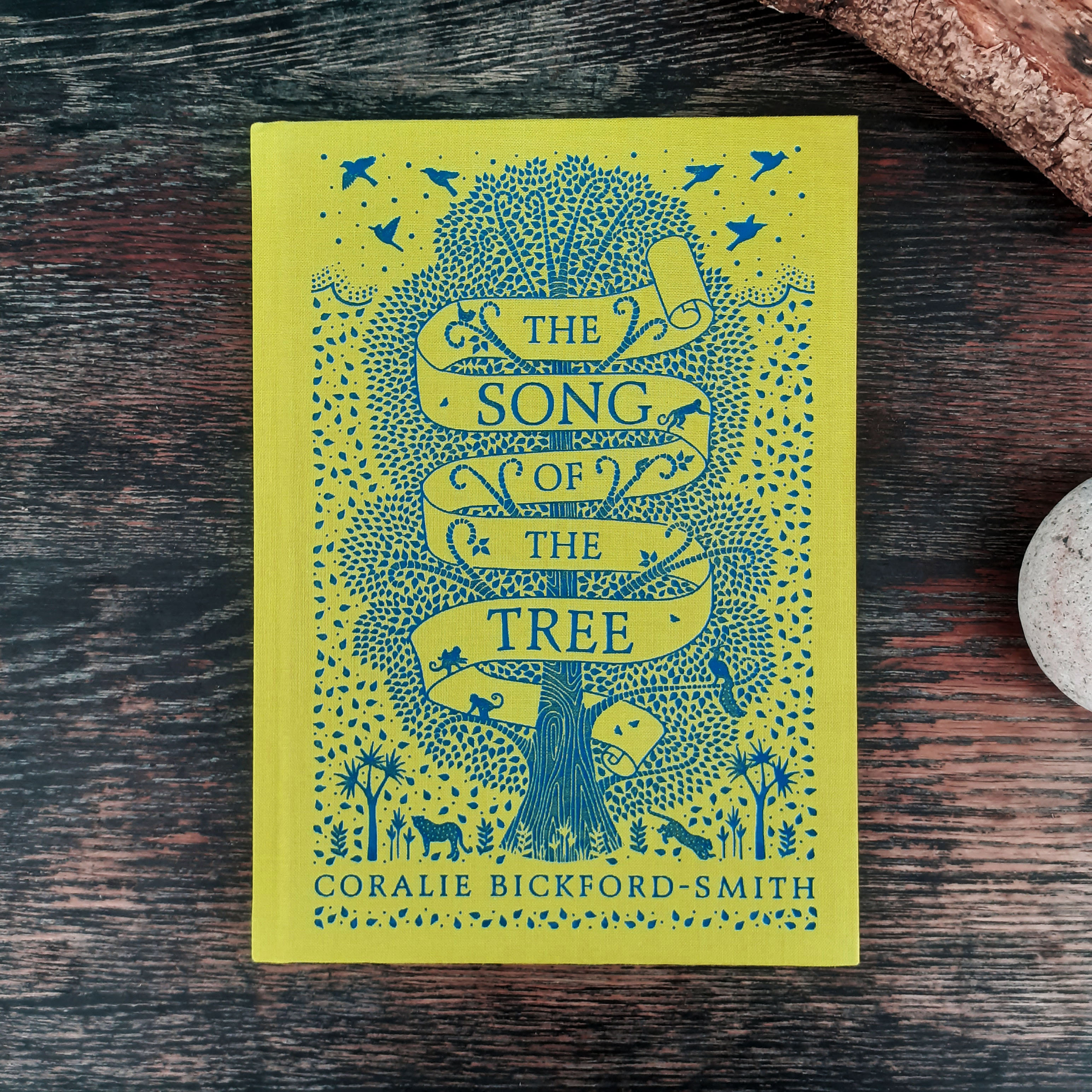
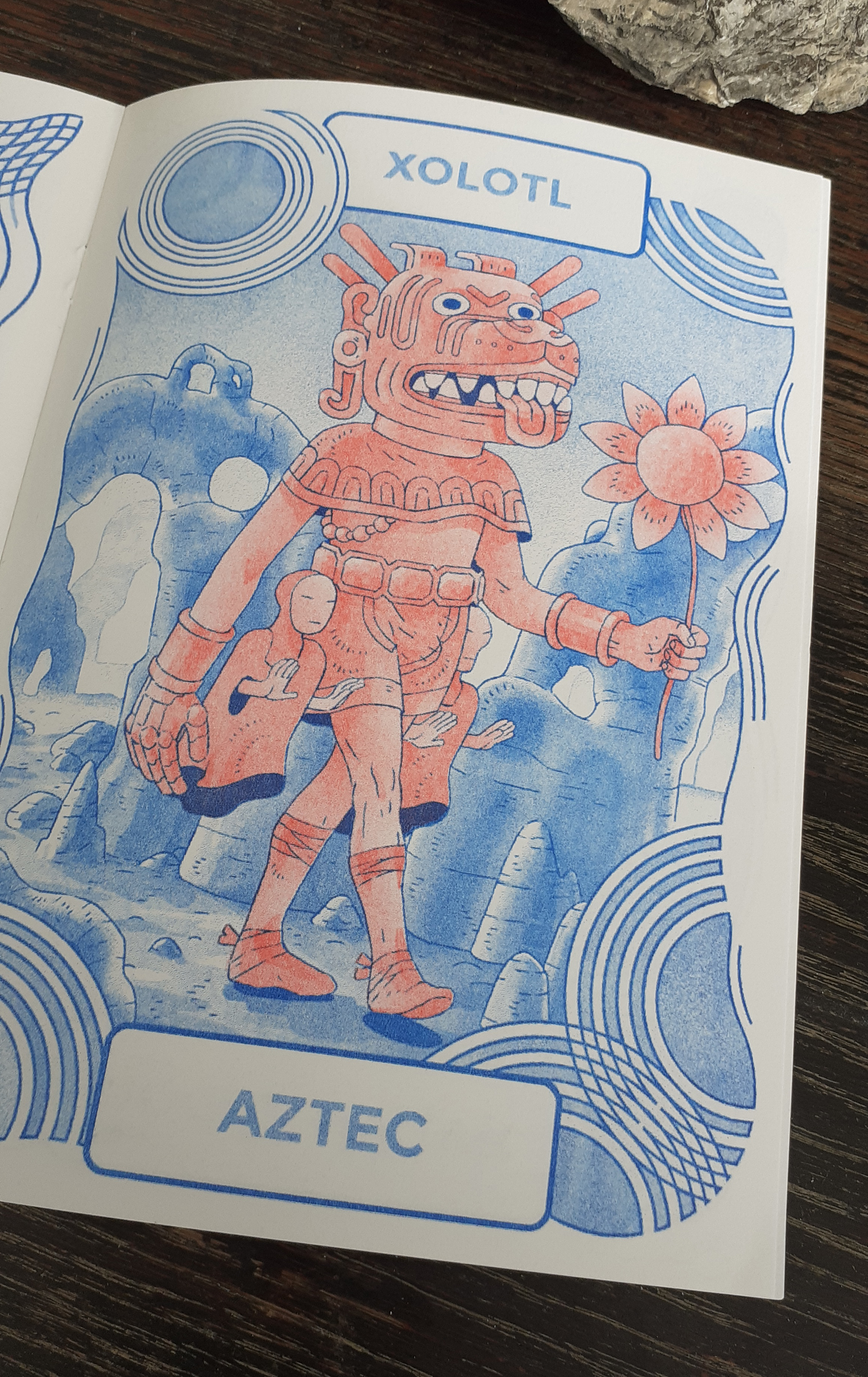
I picked up a picture book recently, so I want to share it here. I’ve missed visiting book shops and food halls this year just to see modern designs on full display (in their natural habitat… in competition with each other). The book I picked up is called The Song of the Tree, and it’s written and illustrated by Coralie Bickford-Smith.
I’ve seen Coralie Bickford-Smith’s designs at work on cloth-bound reprints of classic books in different stores before, but I was never interested in the gift-market classic literature reissues myself (I don’t seem to have a lot of family or friends who read physical books).
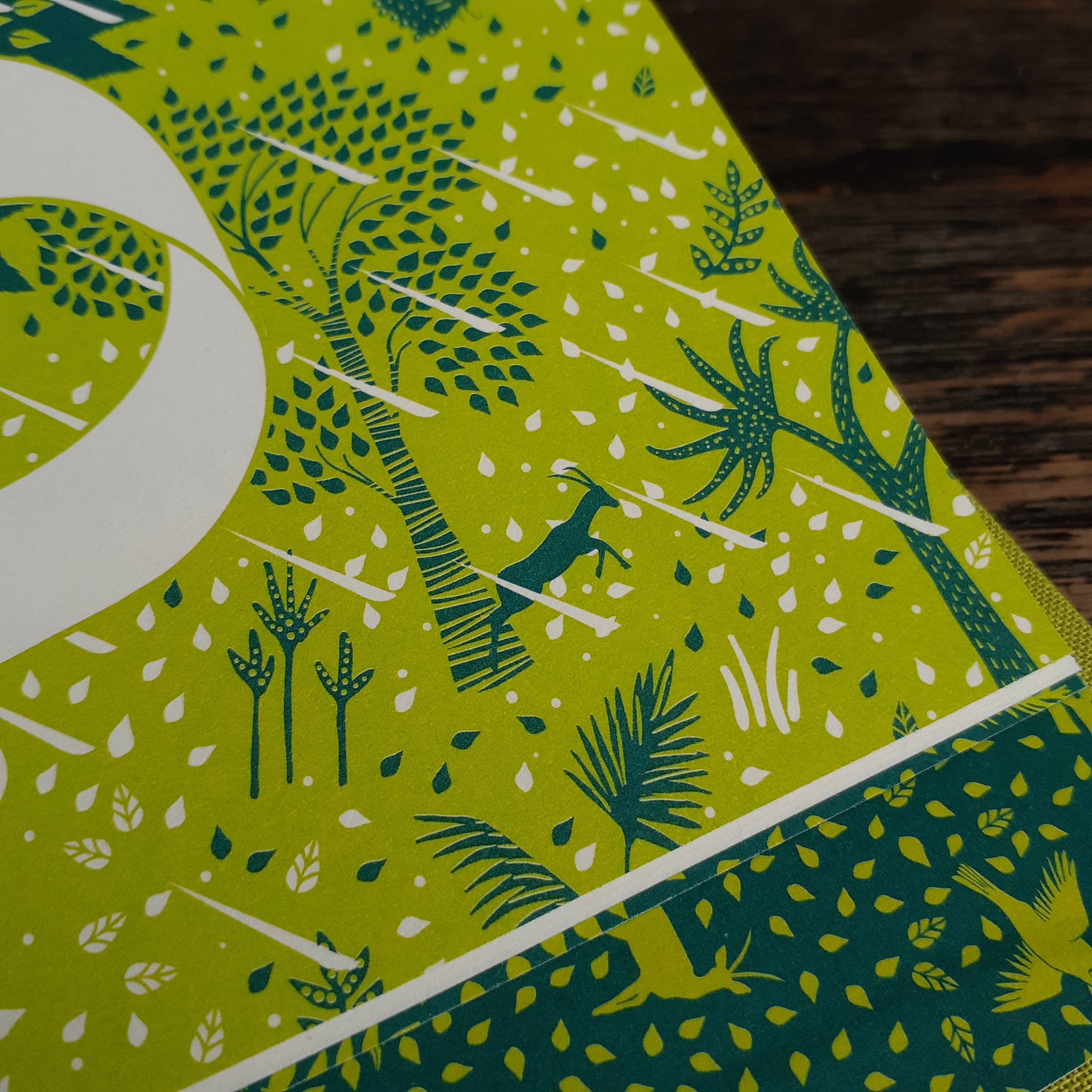
Cloth-bound children’s book by Coralie Bickford-Smith
I’ll share a few of the photographs of the book I took. Bear in mind that these are taken in natural winter light, and I feel in person, the colours are much more vibrant and deep.
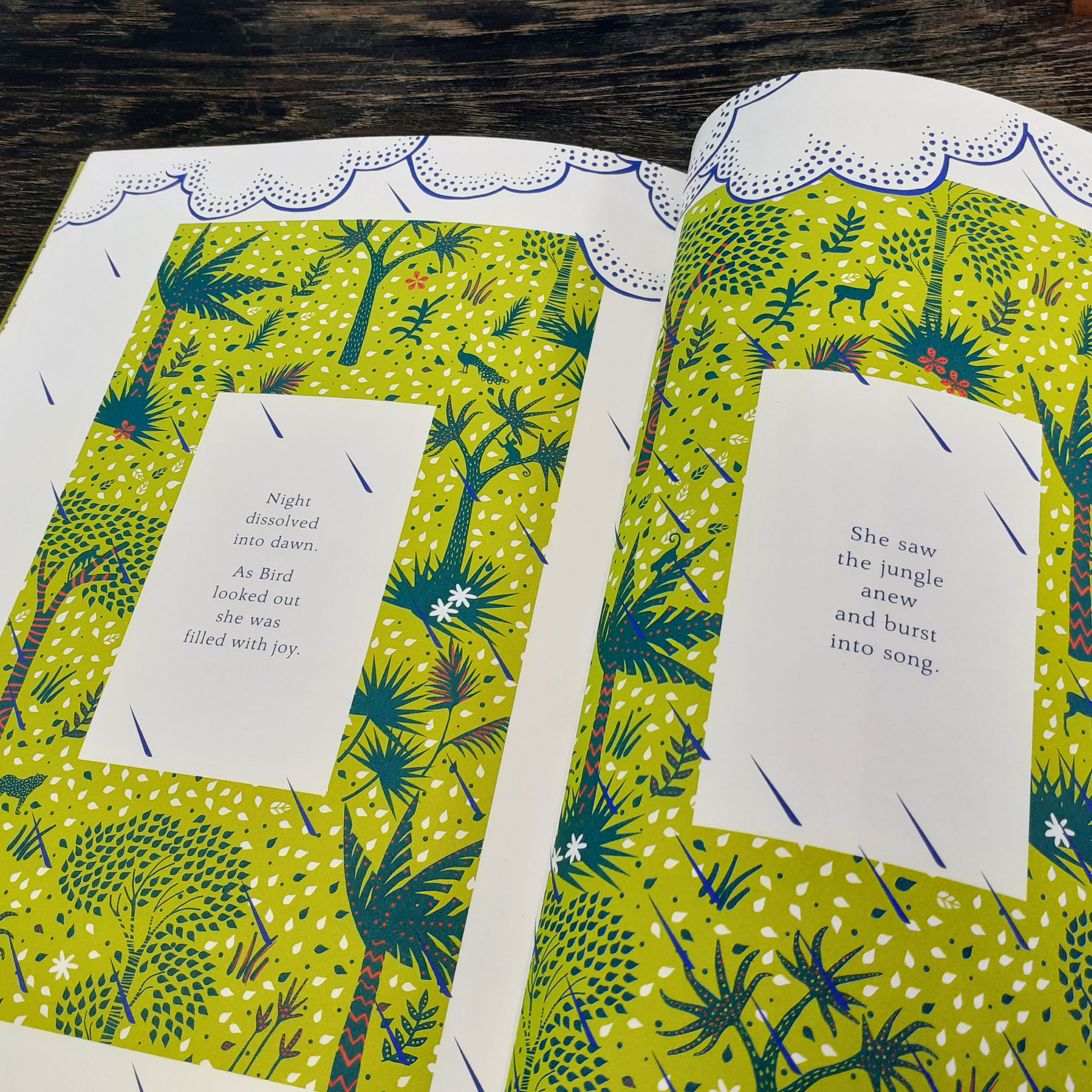
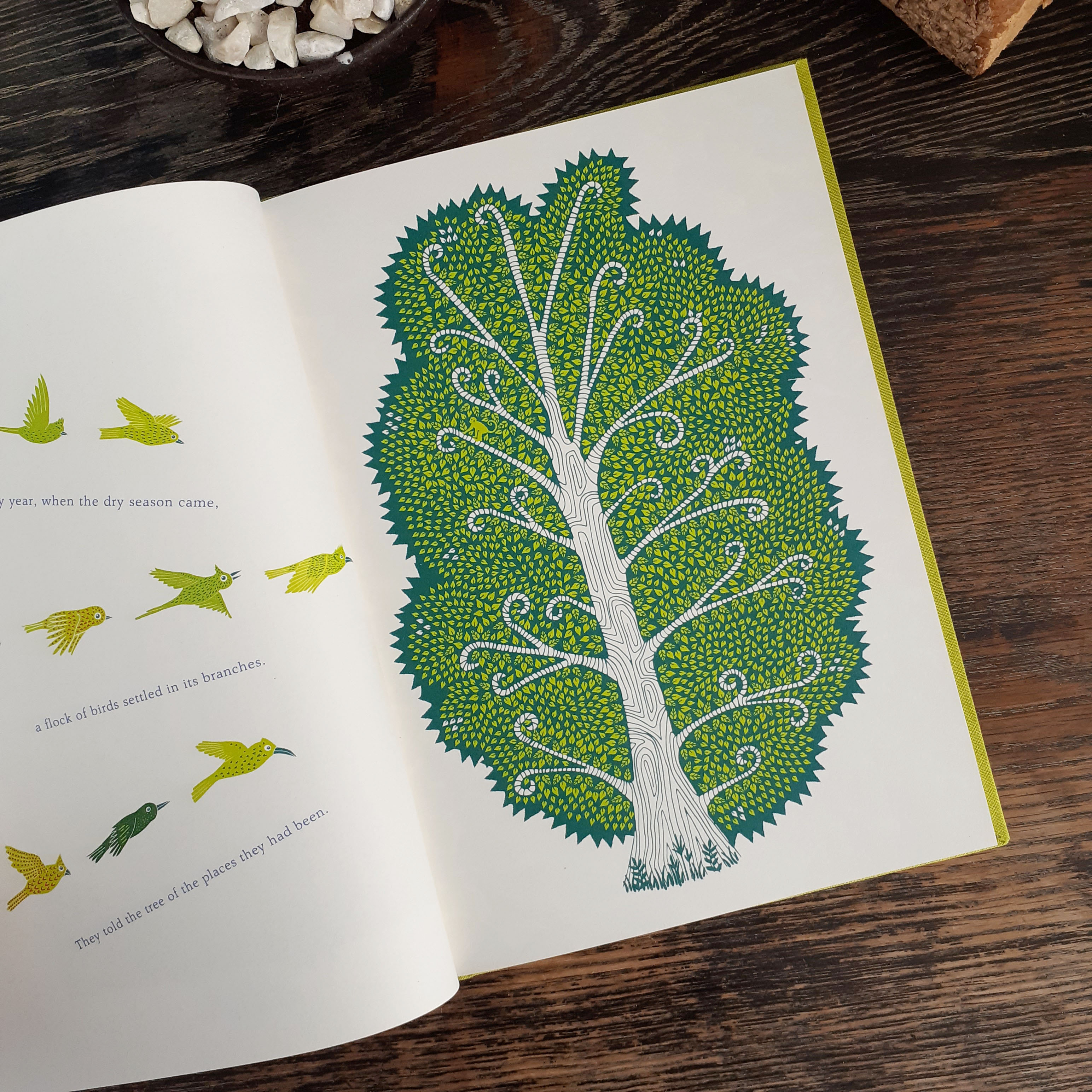
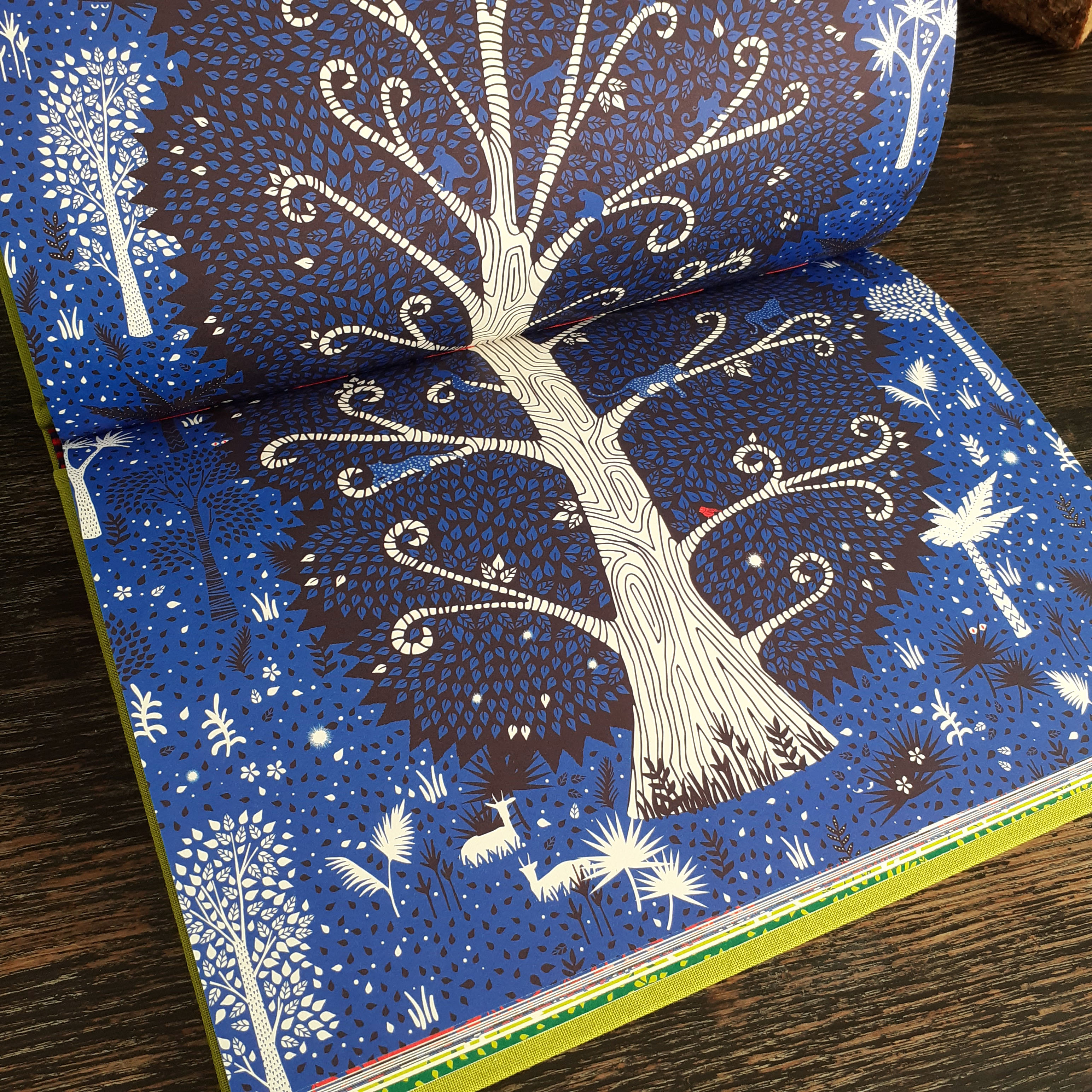
The deceptively simple shapes that make up patterns, plants, and animals give the impression of Lino or wood-block printing. There’s a great balance of detail and negative space.
The use of text makes reading the story engaging. Some pages, you have to tilt the book to read.
On most pages you’re rewarded for looking closely at the illustration – you’ll see delicate little animals hidden about the foliage.
Anyone who appreciates storytelling though words and pictures – child or adult – can enjoy this book; it’s a decent length, about 50 pages long.
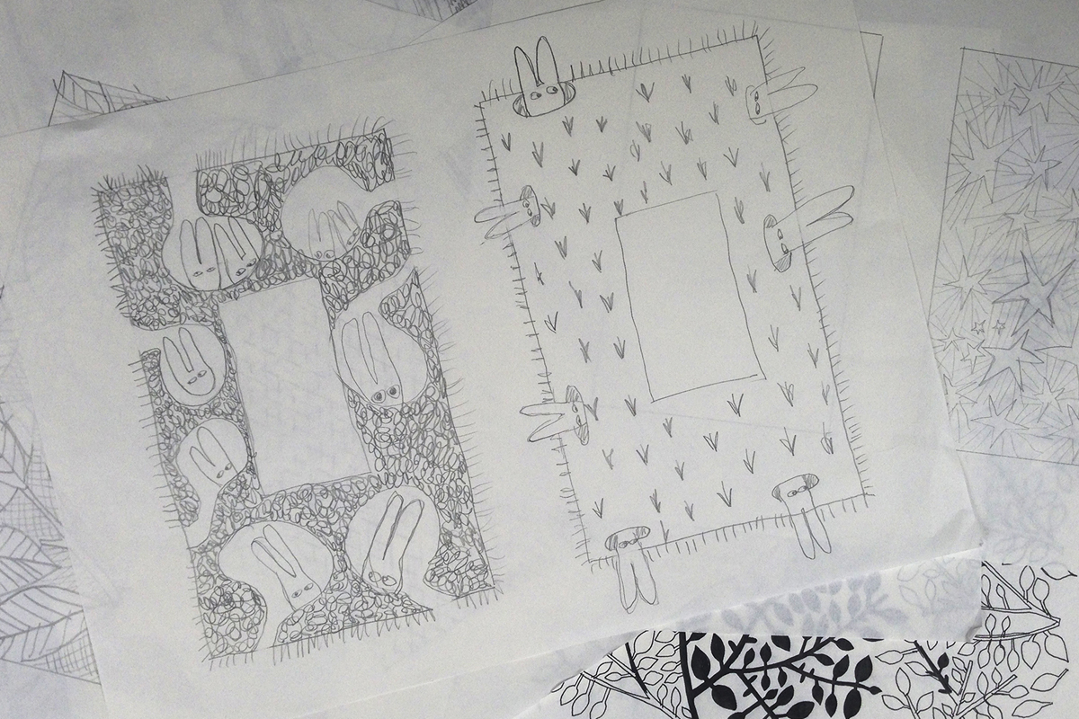
This image shows Coralie Bickford-Smith’s book illustration development
Some of the development work that goes into creation of Bickford-Smith’s books is recorded on her own website. In the above image you can see great understanding of editorial layout being put to use in a picture book’s layout.
I have other books on the shelf that I want to photograph and share here for those who may be interested. I’m also eyeing some new design-related publications to add to my small collection of creative books. I hope to share more soon.
When next you’re able to visit a brick and mortar book store (safely!) I’d recommend checking out the children’s section if it’s not somewhere you usually check out – you may even find some unexpected stimulation for your creations by flicking though some choice books.
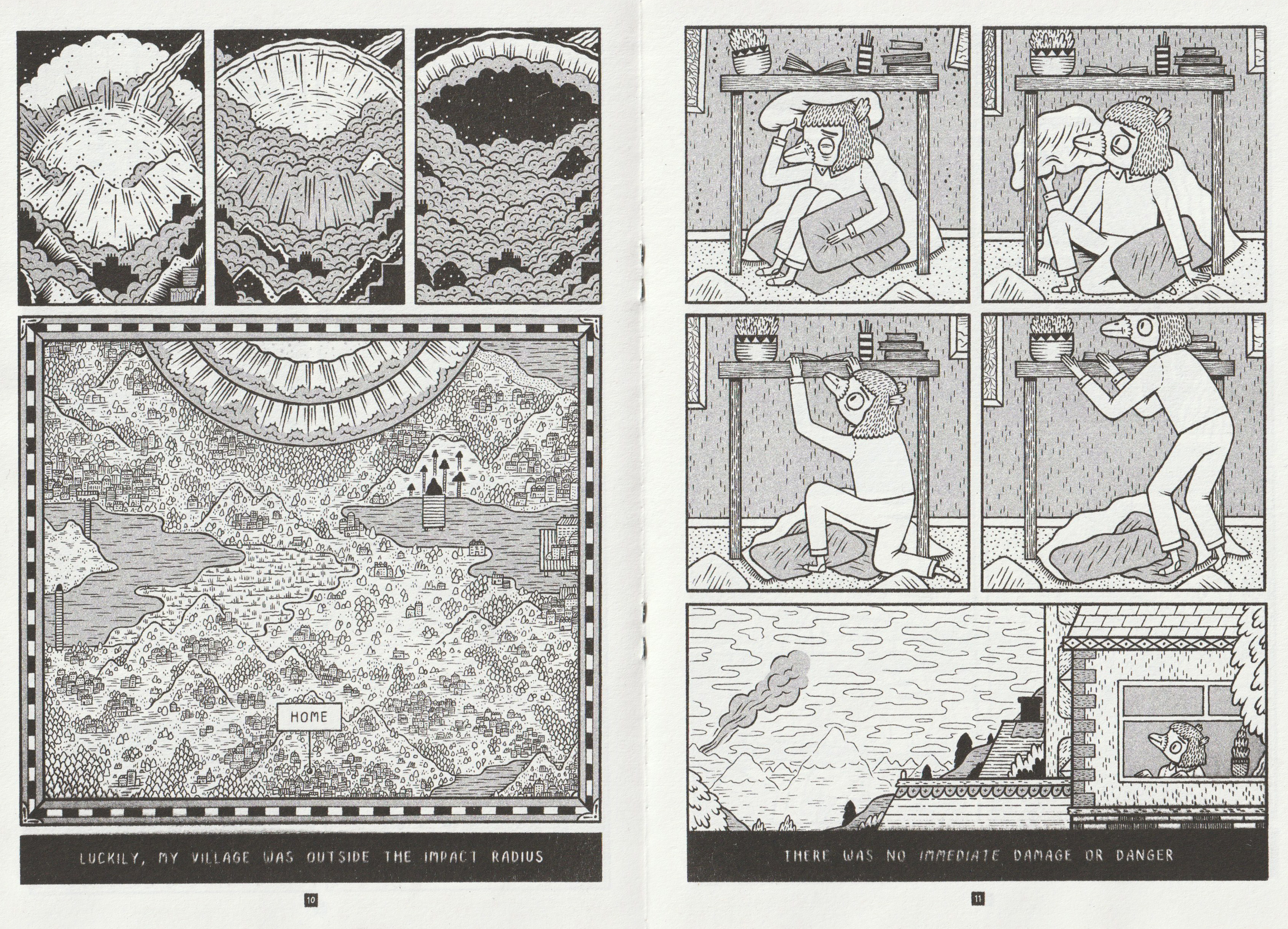
Since any significant travel has been restricted for months, I’ve tired to satiate the desire for exploration by traversing the local woodland and such. It’s a solitary activity, and thus I’ve much time to think to myself. I thought about how much overseas traveling there is to look forward to in the future once such movement is safe.
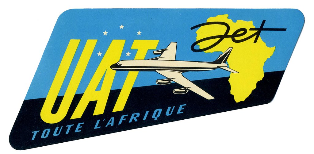
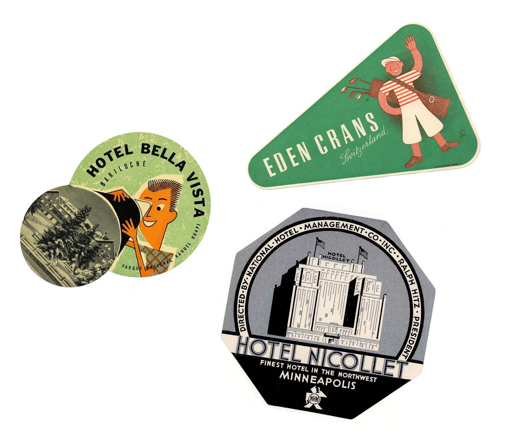
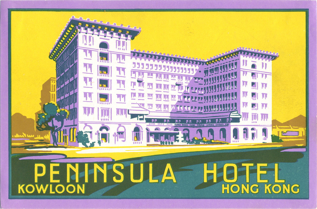
Luggage labels like this were crafted to advertise airline and hotel services in the 20th centuary
When I looked through my last passport, I found very few ink stamps on the pages despite how much I had traveled with it. A lot of the documentation of our travel these days is digital. Long gone is the era of travel ephemera such as luggage labels; the kind that airlines and hotels used to slap on vacationer’s suitcases. Never have I seen luggage labels in person. But exposure to them in vintage cartoons and film leaves me with a romantic impression of them. (And perhaps, a romantic impression of travelling itself.)
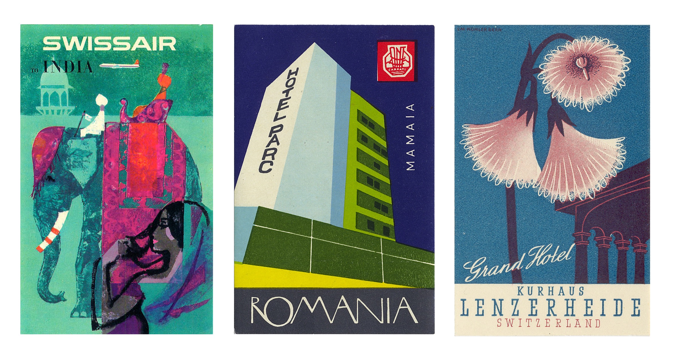
Vintage airline and hotel luggage labels
In searching for these specific paper ephemera, I ran across the flikr account of Tom Schifanella, Art of the Luggage Label. All of the images I have shared here are sourced from Tom Schifanella’s account, and so I encourage you to browse through the albums if any of these designs pique your interest.
Different shapes that baggage labels take on
I want to share a few labels that stood out to me for one reason or another, even labels that I don’t feel affinity for – because it’s still possible to appreciate and understand the thought and concept of the designs.
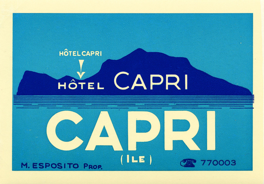
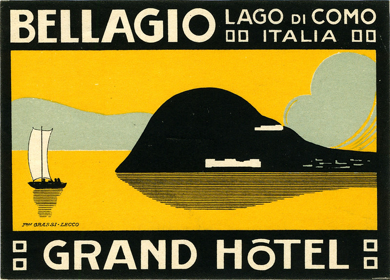
Location-Centric Illustration
The following couple of labels are minimalist depictions of Italian holiday destinations surrounded by water. I like these designs for their limited use of colour; while the design for Hotel Capri uses three colours in total, the Grand Hotel in Lake Como uses four. The bold, sans-serif typeface helps the text read on the small scale that these images would be printed.
A baggage label illustrating the island of Capri, ItalyLabel for a hotel situated in Bellagio, Italy
Despite my attraction to these illustrations for their deceptively simple designs, the corporate illustrations of luggage labels are not all subject to strict restrictions of colour or texture.
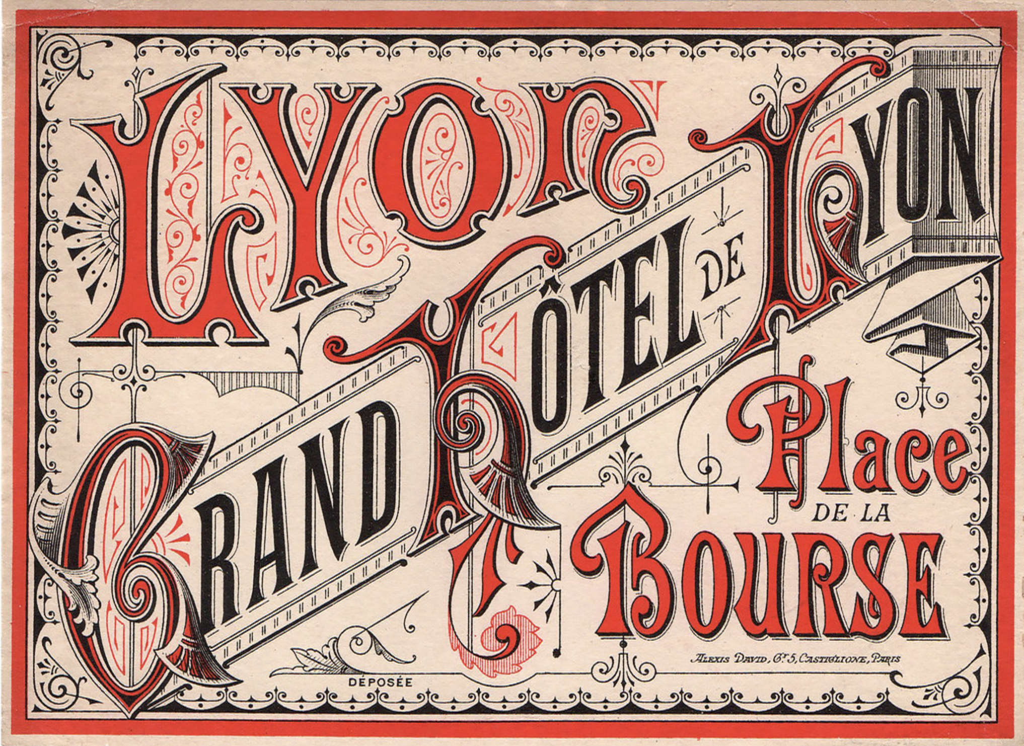
Typography-Focused Design
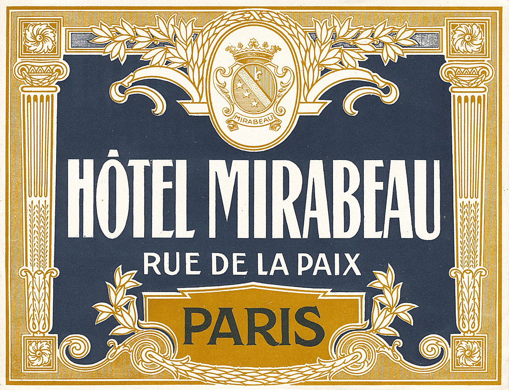
These French hotel luggage labels are almost excessively ornate. While the highly-detailed graphic direction doesn’t appeal to me personally, these designs communicate clearly feelings of grandeur and wealth.
The label for Grand Hôtel de LyonHôtel Mirabeau labek
These decadent visuals aren’t ubiquitous today as this visual direction isn’t always practical or very suited for many modern services and goods, thus the old-school draftsmanship skills used to create these are not so freely taught or learned to students of design today.
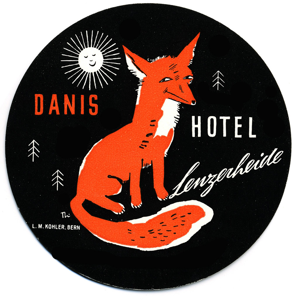
Swiss Style
These circular labels are all happen to be advertisements for hotels in Switzerland. They’re all functioning on a limited colour palette, too.
Fox Label from a Hotel in Lenzerheide, Switzerland
This illustration brings up feelings of outdoor activities and exploration in the mountains. The stylisation is nostalgic to European children’s books from childhood.
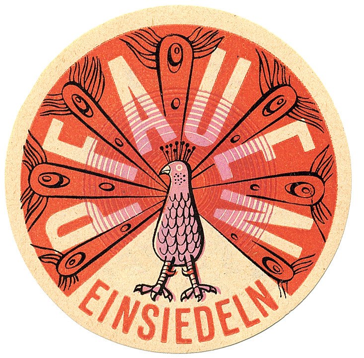
A peacock promoting a hotel located in Einsiedln, Switzerland
‘Pfauen’ here means peacock, and peacocks bring to mind elegance and beauty. This design takes advantage of the circle shape with a clean, considered illustration. The registration of the pink ink looks to be off, but it also lends this piece more character.
Sun label from a hotel in Arosa, Switzerland
While this graphic doesn’t immediately communicate to me traditional ‘hotel’, I can feel a connection to mountainside spas where one can enjoy the closeness of nature. I can’t help but think of The Sun tarot card when looking at this…? The design does interest me, and makes me wonder what the hotel attached to this sticker was like.
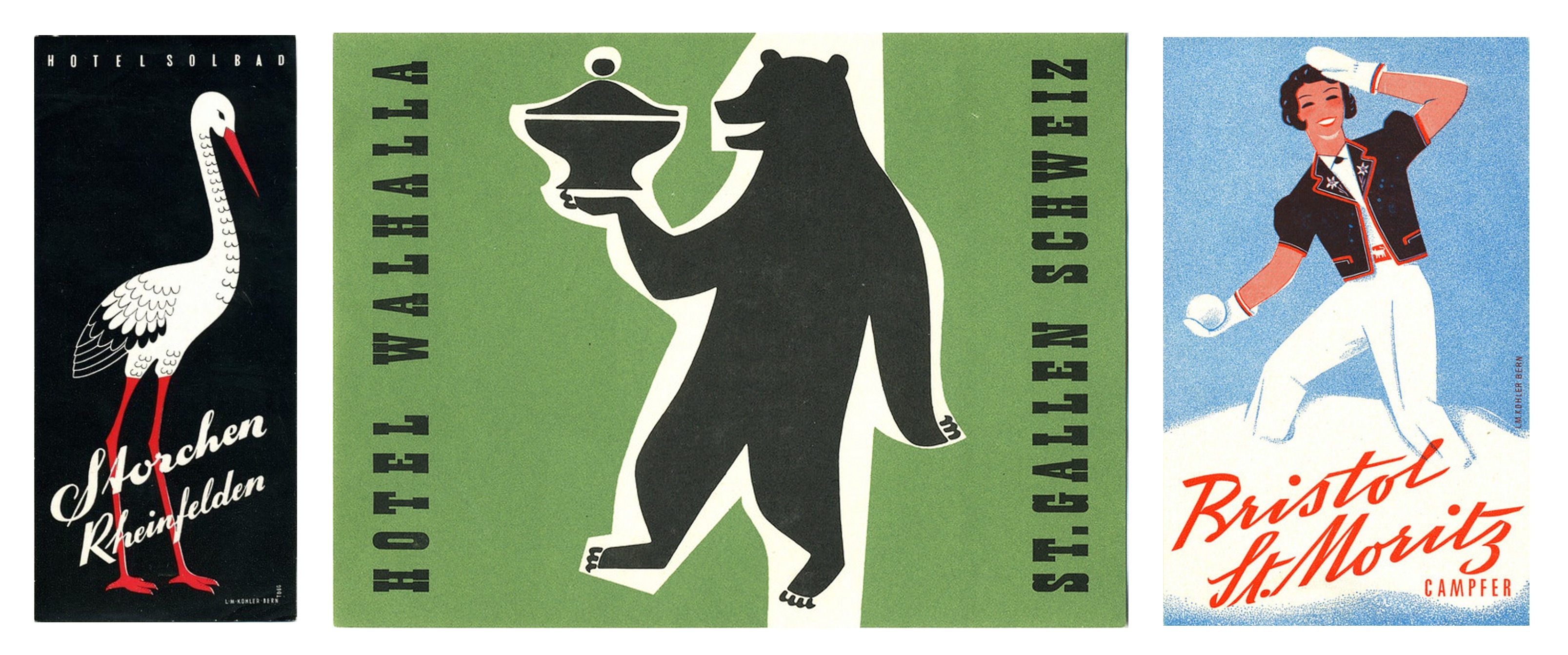
More examples of mid-century Swiss Style
There is so much variety in these miniature illustrations, it’s a little overwhelming tying to take them all in at once – they’re in competition with each other, after all!
A number of these label illustrations are a shock as I would not have even contemplated some of the colour combinations employed, and yet I enjoy them. Other designers have made considerate use of black and I also consider that bold and brave – I’m always wary of how absolute and black is and its power to overwhelm an image. So, in reflection, I realise I can be more adventurous when illustrating in the future.
While it was an impulsive action to seek out these luggage labels, it was rewarding. I found a whole world of corporate design I knew next to nothing about. There’s definitely a lot to pull from if you’re looking to find inspiration from past eras. But in imitating past design it’s important to think about why you want your work to be informed by older works, and if it really does communicate what you want.
Think about why these illustrations have been saved and are still appreciated now – many able to outlive the services they promoted. A lot of thought and heart went into these labels to ensure their impressions stuck!
I have written about the odd zine that I happened to pick up in the past, and very recently, in fact! I’ve decided to share a number of zines that I have on-hand in one post to show off the variety than can be found. This is not as in-depth a look as an entry would be looking at a single piece, but be prepared to eyeball a lot of images. This entry is picture-heavy!!
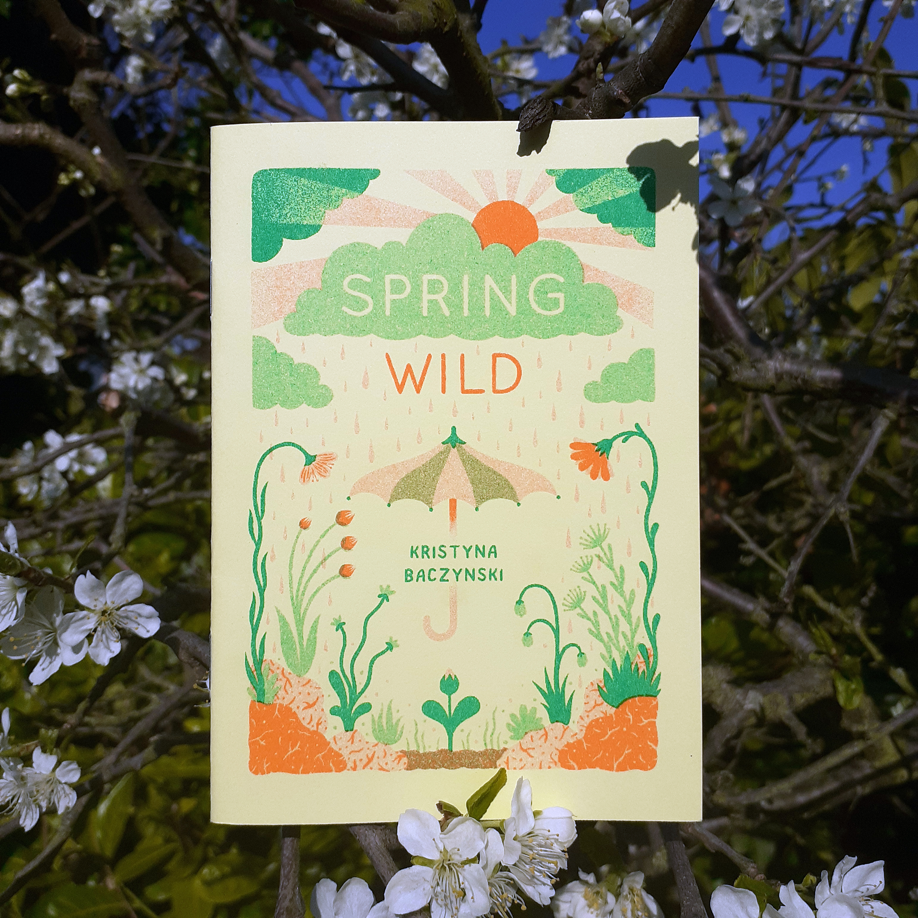
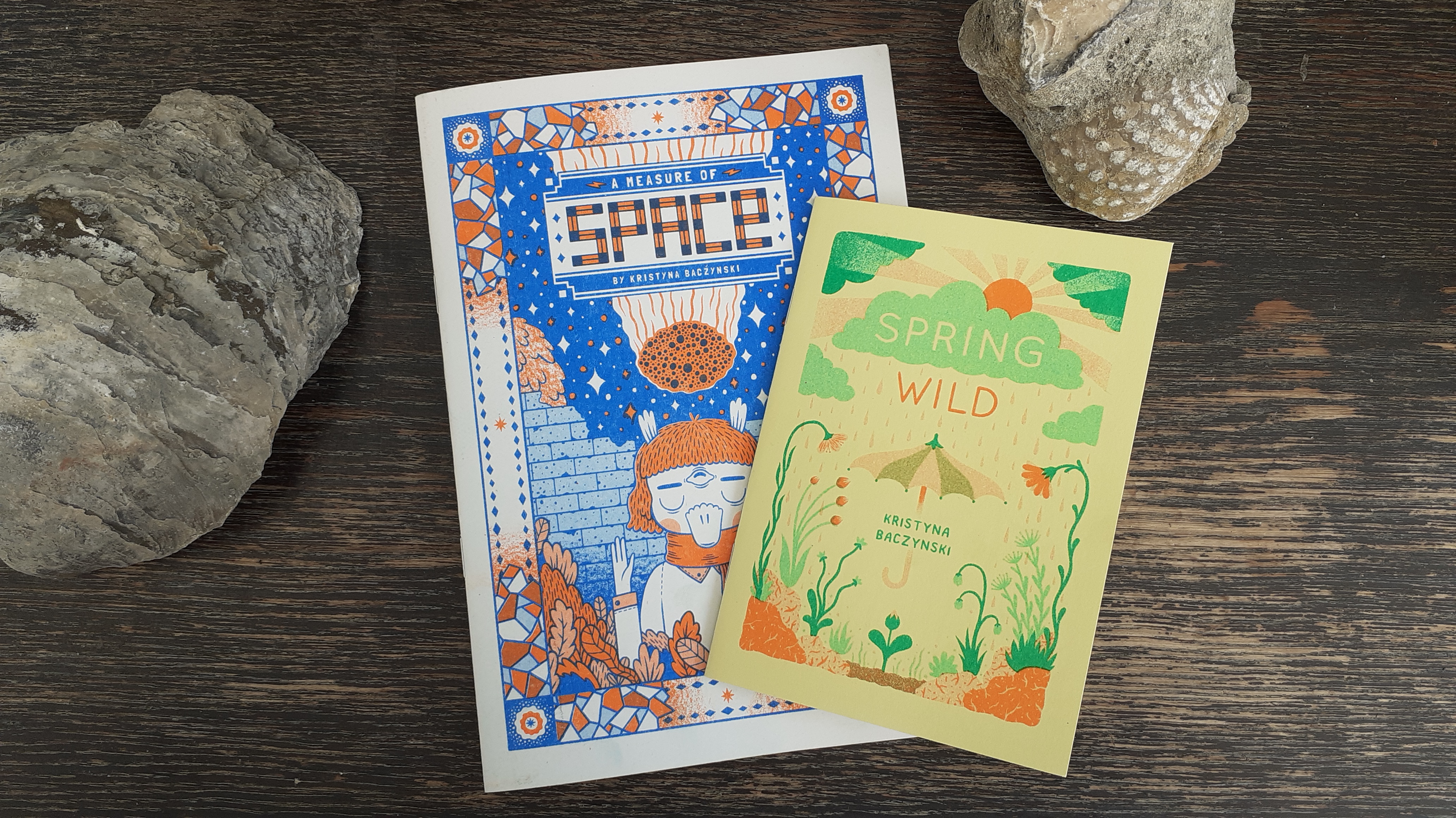
Firstly, I want to show a couple of zines by Kristyna Baczynski, Spring Wild, and A Measure of Space. Both are risograph-printed, with vibrant covers and monochrome insides. They’re very easy on the eye.
Risograph-prizted zine, Spring wild by Kristyna Baczynski
The cover of the zine Spring Wild is two tone. The inside is a dark green ink on light green paper. It’s not possible to go outside and enjoy the wildlife beyond back gardens as I write this, but this small zine is a little catalogue of spring-time plants native to European countries. The body copy is in printed handwriting. It’s full of charming illustrations and wit.
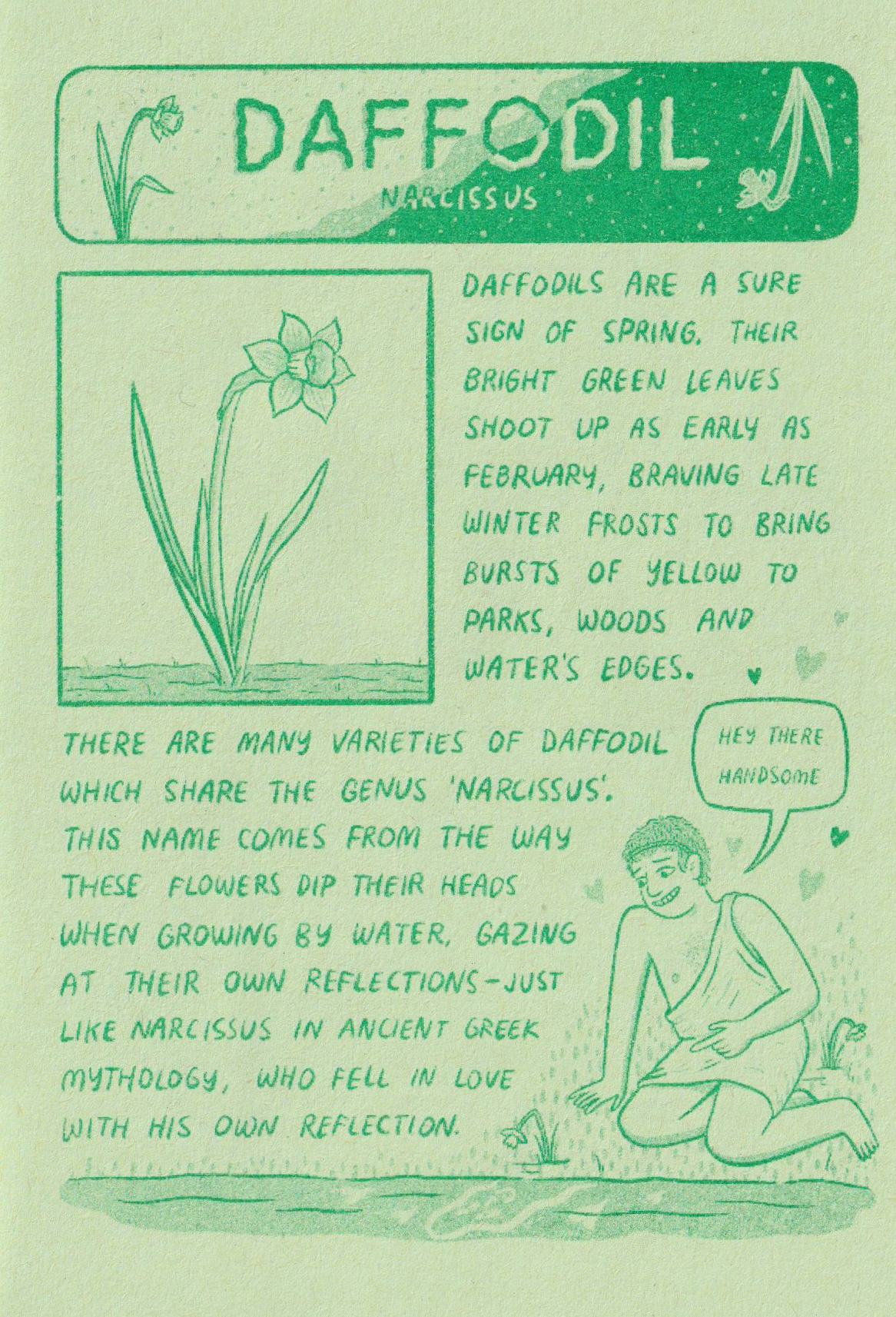
Spring Wild’s page on the Daffodil
Ordinarily, I’d avoid scanning books with their spine at risk of damage, but a thin zine is much less likely to be harmed by scanning its pages, so I feel at ease sharing some clean pictures of some of the publications’ contents here.
Copies of A Measure of Space and Spring Wild, by Kristyna Baczynski
Many zines you’ll see out in the wild (on any (comic) book store shelves) are printed in monochrome, which is to keep costs down as they’re not often made with the intention of making a big profit. (More likely, the zines will be worth more second-hand if the creator’s work is coveted.) Most of the zines I have in possession are of a single colour.
Pages 10 and 11 of A Measure of Space
Working in black and white, A Measure of Space has plenty of visual clarity that may come across as cluttered if it were coloured haphazardly. I actually like pouring over some of the more jam-packed comic panels to make out little details.
Both of Baczynski zines are bound saddle stitch (with staples) and so are most of the zines I own. Finding ones tied together with other materials is a welcome surprise.
It feels quite special to find a zine with a cover that’s a different colour paper or card from the rest of the internal pages. I haven’t many zines that are printed on coloured paper as of writing.
Above is a page from How To… Make A Zine, a photocopied mini zine made from a single sheet of white A4 printing paper. This tiny publication is all about… (you guessed it) …how to make zines!
Because there are no hard and fast rules to the medium, I’ve acquired zines of all different sizes, contents, and materials. Some zines are even made from a single sheet of A4 and folded into 8-pages (including the front cover and back cover).
Pages from ICEBERG by Hayley Wells
The scan above shows pages from a tiny zine, made from only one piece of off-white printing paper. Hayley Wells’s ICEBERG consists of full-page collage illustrations and small pieces of text formed from what look to be old-school rubber or metal alphabet stamps. For a monochrome zine, it stands out among other’s I’ve seen due to it’s unique visual presentation.
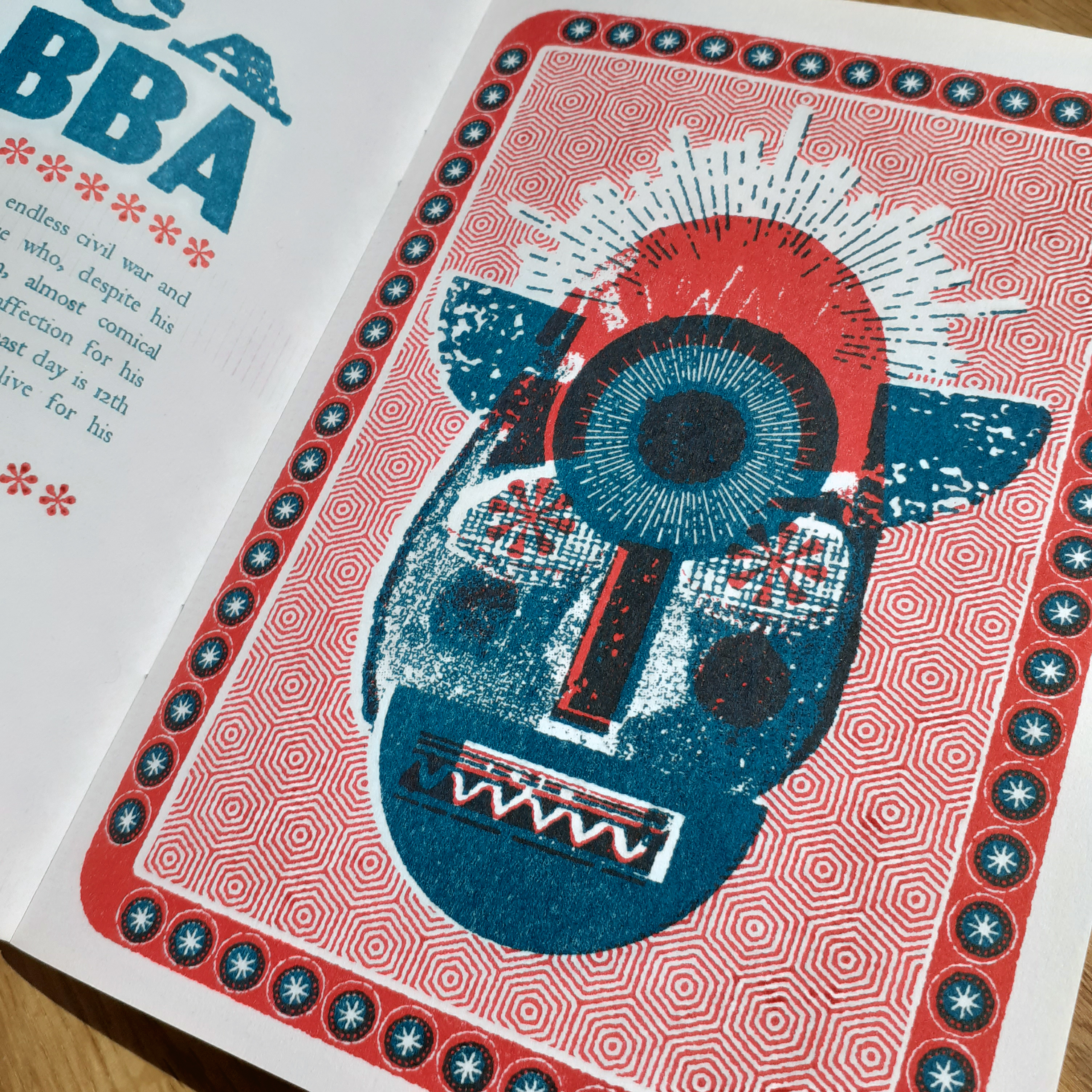
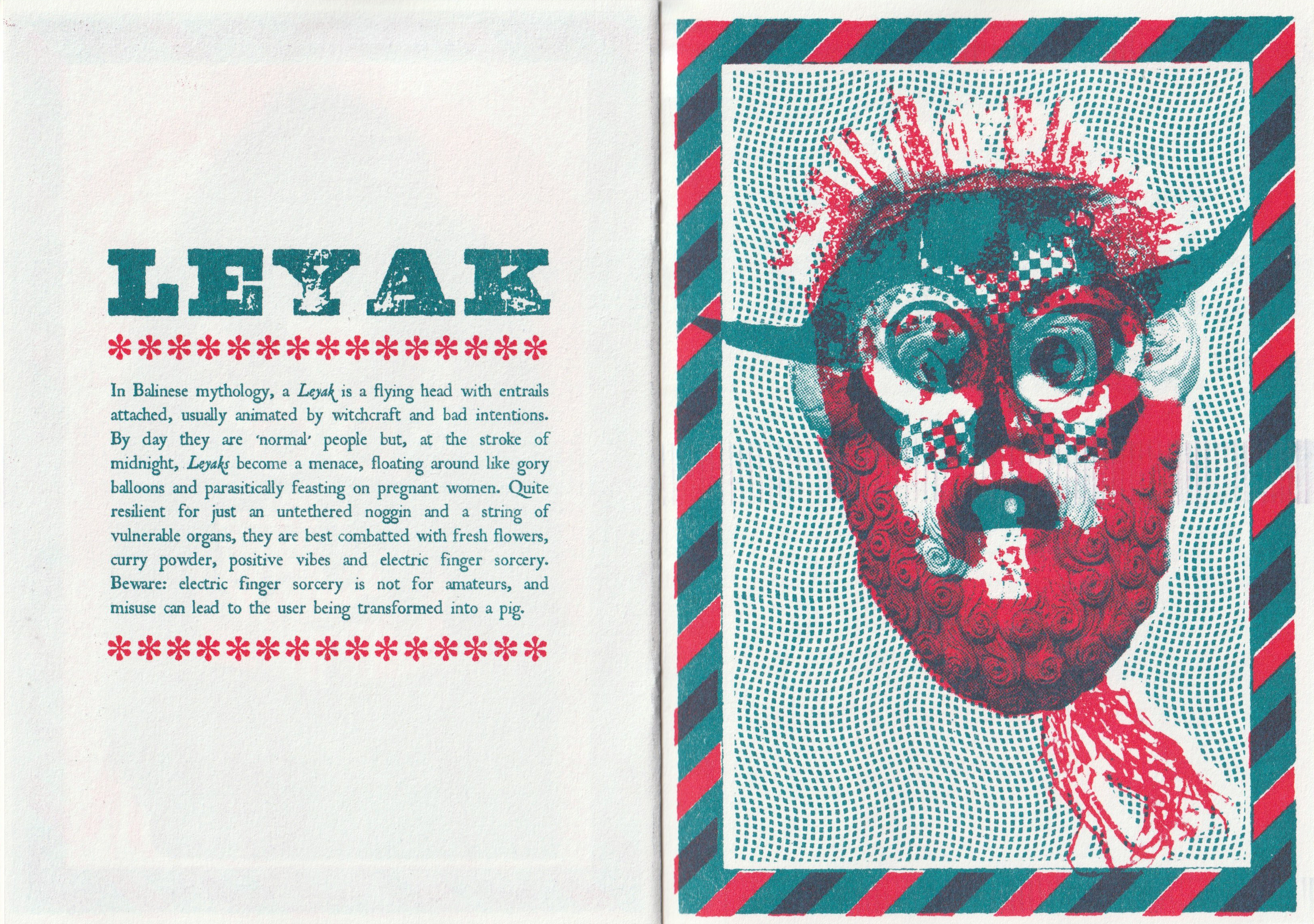
Lesser Seen Folk Demons is a beautiful risograph-printed zine using two colours. It’s a modern bestiary of spooks and creeps and we may find around the world if we’re lucky. It’s 24 pages long. Each demon gets a description, and an full-page illustration made from collage. Part of the allure of this sort of publication to me is stems from media from childhood that focused on bestiaries and lore of fictional monsters.
Illustration of Unca Grabba in Lesser Seen Folk Demons
It feels much like a slender book; there’s a forward by Dr. Mathew Cheeseman of the university of Derby… there’s an ISBN in the back of the zine, along with the printing credits (year of publication, and edition etc.).
Page spread on the Leyak
The text in this book uses just two fonts; one for headers and one for body copy. The tone of voice is very tongue-and-cheek. A page on The Deadly Diddlio reads:
THE DEADLY DIDDLIO
The inhabitants of Pyefleet-In-Water, eastern England live in fear of The Deadly Diddlio, a malevolent wind-borne spirit who is purported to visit their small island once a year to bring discord, broken windows and sexual mayhem. Dating back to the twelfth century, this somewhat unpleasant avatar can only be combated by interpretive dance, and lots of it. He’s a pain in the arse, basically, and bloody ugly to boot.
Actually, this book’s concept is not too unlike thoughts I’ve had about crafting illustrative bestiary-like zines, albeit with a vastly different tone of voice and art direction. Seeing this out there proves that there are people that genuinely enjoy such specific content. (I guess I should step on it already and draft such a bestiary of my own subject choices, huh.)
You can be sure that there will be more small press works that I’ll want to share on my blog in future entries. There’s also plenty other content that I want too share here. Look forward to it all!
Every now and again, I like to pick up some printed media for new reading material. Small print works are the most accessible to me right now, so I’ll share some pictures and thoughts on a very small – but very strong – zine I bought made by a Japanese creator, Stainperfect.
I have shared on my blog other zines that I’ve picked up in the past by different creators. So be sure to check the ‘zine‘ tag if you’re interested!
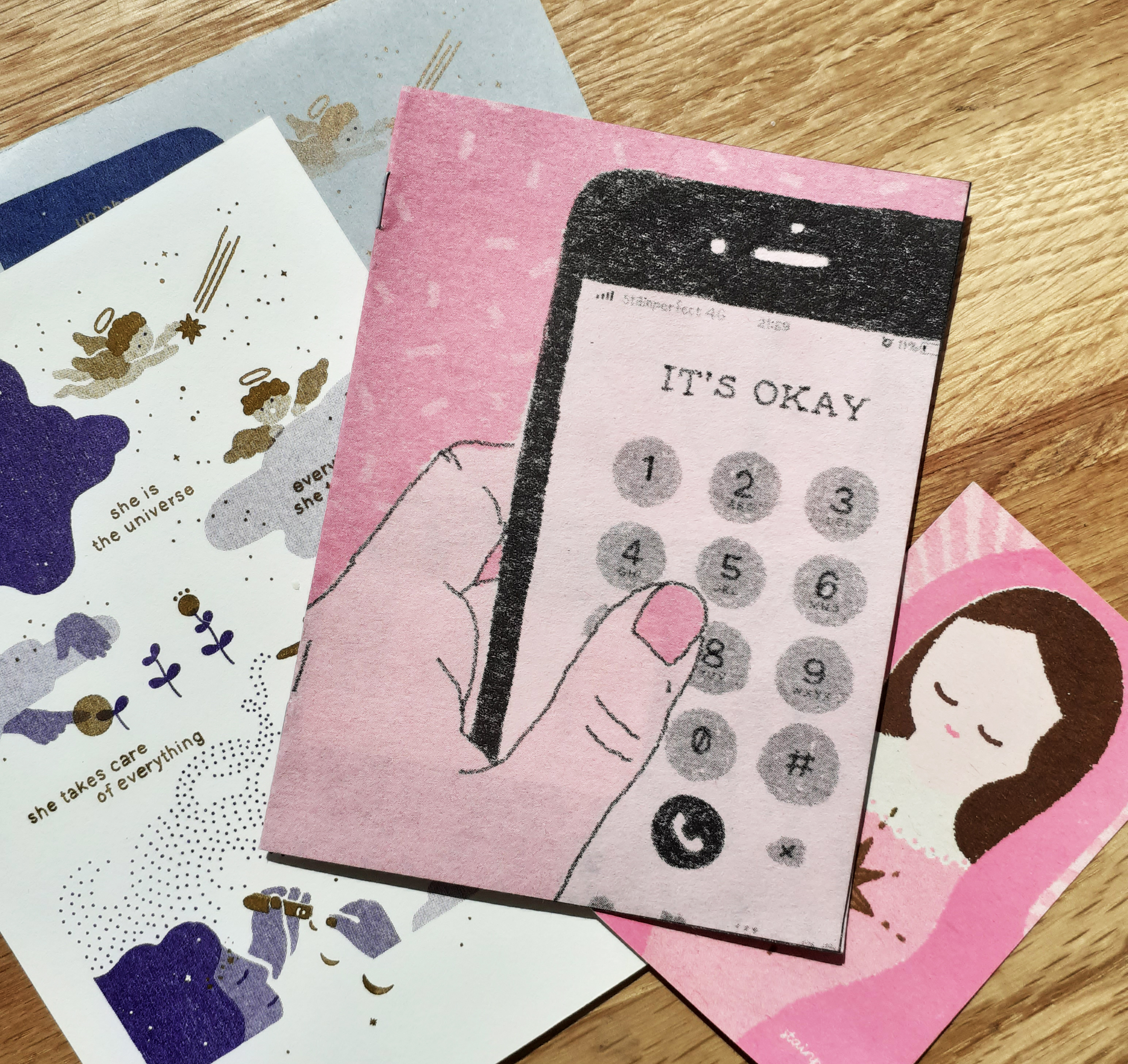
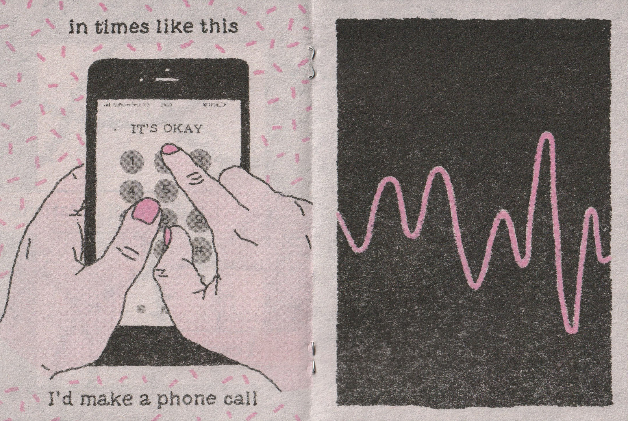
IT’S OKAY by Stainperfect
The zine IT’S OKAY is about C6 in size. Including front and back covers, the zine is 8 pages; the narrative is 7 pages long. It’s pink and black risograph ink on thin, newsprint-like pink paper. (The large-areas covered in black riso ink means the black may rub off easily!)
There are no faces or names in the comic. I feel that this choice was made so that the reader may identify with the story all the stronger, on perhaps, a personal-level.
Page 3 and page 4
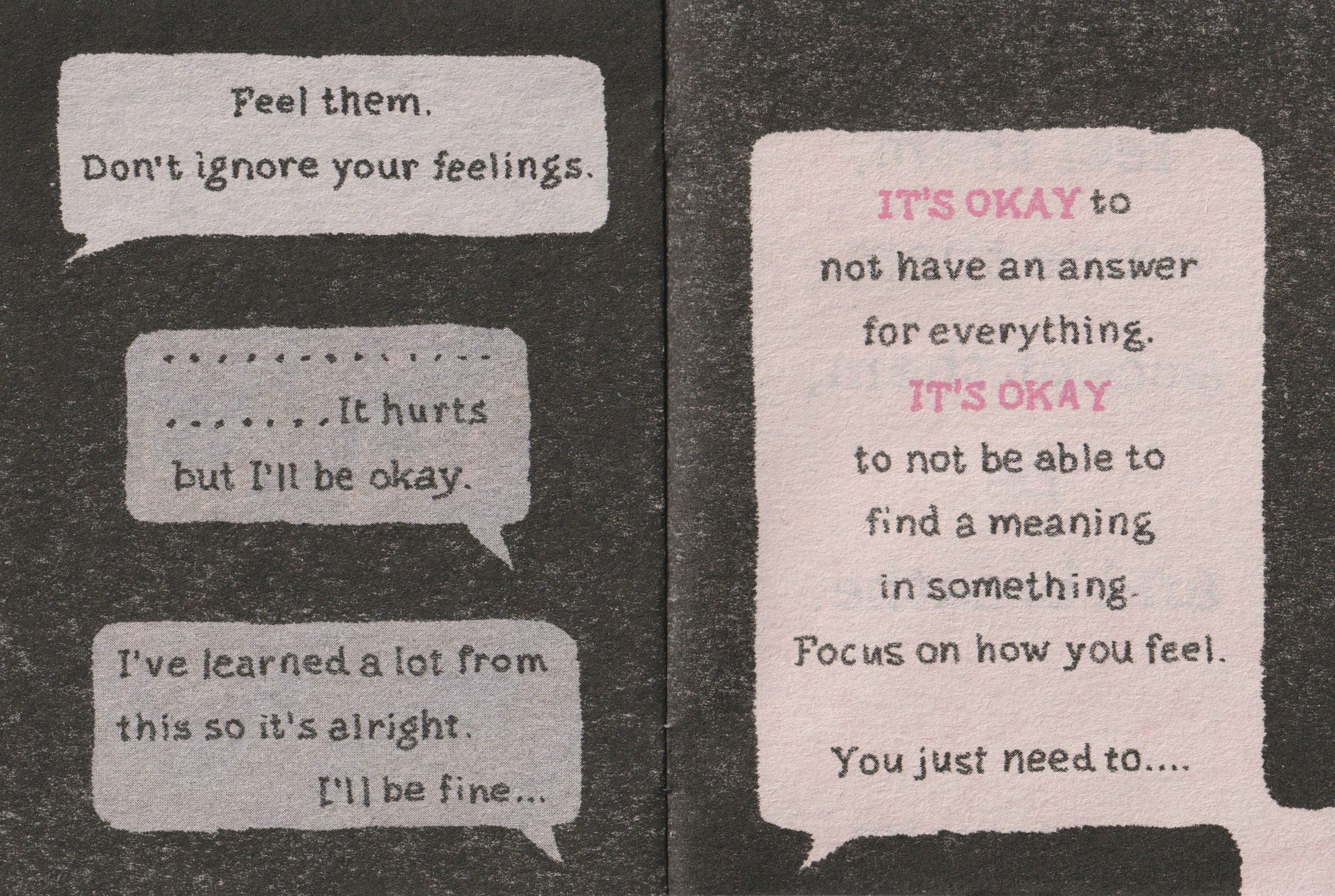
Page 5 and page 6
It reads to me that the author made a big realisation when talking to their friend over the phone, and the lesson can be taken to heart by the reader.
Like all art forms, this story can be interpreted differently depending on the person reading it, or how they even wish to view it. For me, the story is about accepting your feelings – all of them – and recognising them for what they are. Feelings can’t be simply categorised into ‘good’ or ‘bad’, they just are. It’s OK to feel all sorts of different things… to react a certain way to a situation or event.
In my own time, I’ll be picking apart more zines in detail; the paper qualities, page counts, and contents etc. as I really want to get down to making some myself. Maybe even making use of risograph facilities at some point. So you can be sure that they’ll be a few more blog entries on whatever zines I find posted here!
Next time you pick up a new piece media to read, think about why it appeals to you. Did you chose it because of the colours the object is made of, or the lack of colours used? Maybe the content’s message? Or the imagery either inside or conjured up by the text…? Maybe the types of materials used in making it just stood out to you!
After finishing much research for a current project, I came across a striking food product that is unlike any other chocolate product I’ve seen before. I’ve not included it in sketchbook research because I found it so late, but I also feel that it would be best too here on my blog.
The Super Delicious Limited Company chocolate bar packaging is designed and illustrated by by Zilin Yee, an independent graphic designer, while the copywriter for the project was Herbie Phoon. Zilin Yee used the programs Adobe Photoshop and Adobe Illustrator to craft the very tactile-looking packages, informed by the physical qualities of Joss paper.
A product “based on the idea of the joss paper culture“
The traditional, bamboo-made Joss paper is burned during ancestral worship ceremonies. Joss paper includes variants known as ghost or spirit money, which are highly colourful ‘afterlife bank notes’, burned at funerals. The packaging designs capture the brightness and patterns of the ghost bank notes.
Many different packages
This package illustration is strongly reminiscent of ghost money, featuring an emperor
The chocolate bar’s packaging all feature very whimsical and playful illustrations. The line of packages are of course, tied together by their visual theme, and typography. The brand logo, product name, and weight are positioned in different places on each package, which is unusual as the same placement would unify a product feasting differently designed packaging.
The colours and patterns are enough to make me want to buy this
If I were to see this sort of product package design in the west, it would undeniably have strong shelf presence going for it, even among other ‘designer’ or ‘premium’ chocolate bars with outrageous packaging design, Super Delicious Limited Company chocolate wears its inspiration on its sleeve (…or box).
The design inspiration has no immediate relation to chocolate (or the origin of the cocoa bean) but it stands out due to the unique route the designer chose to take. Sometimes a product doesn’t have to ‘fit in’ with the status quo to be desired. More-so than other chocolate bars, the visuals of these packages are the real draw to the item, and that’s worth thinking about in future packaging projects.
The summer is fast approaching. The academic year is reaching it’s end. Sure, student timetables are out of whack now, but it’s important to keep going. I need to set myself goals over the summer months to keep my creativity and interest in design up. I’m looking back at a project not long since handed in, and I know that I want to revise elements of it already.
I handed in my responsive project – a live brief outcome from the UN and the World Health Organisation. I will admit that I swayed the brief to suit my own emotional and mental-wellbeing, from ‘raising awareness of Covid-19 to prevent the spread’ to ‘coping with the pandemic through activities’. The thing is, I had to write a proposal, so I found justification in the angle I ‘tackled’ the brief. In modifying the brief, I could focus more on subjects that would help me cope, while being – theoretically – more productive.
Essentially, to address the problem of Covid-19, I chose to design for a child audience, and ‘market’ an activity that would be cultivating inside-grown plants from mail-order seed packets. The real drive for the project being to give kids more structure and short-term goals at home when schools were closed. I wanted to include two mini zines (8 pages each) with information and facts on the types of plants that can be grown from the seeds, and garden insects that are beneficial to outdoor plant growth.
I explored a couple of different illustration routes to see what could suit seed packet design and little booklets, but it was a lot to take on in such a short space of time. I only got as far as making mockups of the basic layout for a proposed packet design, and one zine. I made many illustrations, but I don’t think they’ll go to waste. This project included my first tries at creating digital collage.
Hover fly digital ‘paper’ collage
Although it’s far more time-consuming than I had thought – I still felt a lot of gratification upon finishing any insect collages. I am very happy with how some of them turned out.
I wish I had shared more of my development work as I was working on the responsive project. I shared a little over some Microsoft Teams DMs and Discord, and got some interesting insights into other’s thoughts on paper collage. I realised the variety of the papers I could use – the ‘paper’ being digital – were bigger than I thought. Newsprint and even photographs can be utilised for different textures and to suggest different patterns.
Ground beetle digital collage
I’d like to make more bug collages over the summer, and fill a whole printed, colour booklet. I want to finish the black and white zine full of line garden insect drawings I started for my responsive brief, too. I’d want to make the hand-drawn illustration version downloadable, printable, so that folding it and colouring it is an activity on top of learning bug facts.
There’s a lot go milage in my proposal as it’s not explicitly Covid-19 specific, it can exist outside of the initial brief timeframe, which lends the ideas longevity. That’s why it’d be worth returning to the project in my own time.
One of the last modules of the academic year is a ‘personal project’. Again, I have full reign over how I want to approach design. It can be anything. ANYTHING! Naturally, I generated a number of ideas that I can’t possibly address within the soon-approaching deadline. Some ideas probably aren’t worth looking at closer than I already have. But the ideas that I can’t address in the meantime are worth looking at in the future. I can set myself goals to achieve some of these projects.
I thought a lot about different routes to take a ‘personal’ project
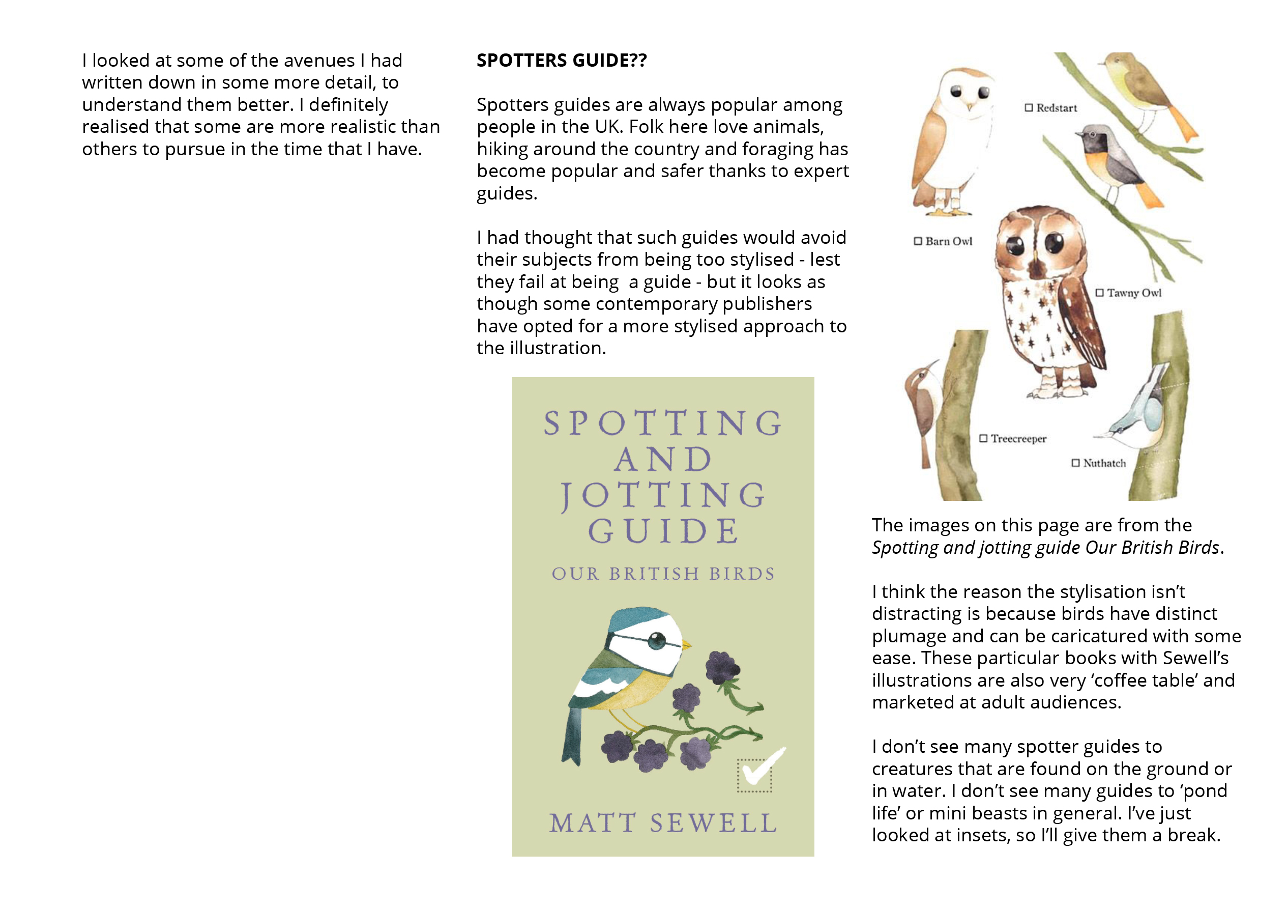
Some routes I was interested in were stationary sets – letter-writing sets… sticker design – health and wellbeing product packaging, spotters guides, and the good old bestiary. Here are a few notes I took in my sketchbook while musing over spotters guides and bestiaries:
SPOTTERS GUIDE??
I even thought about phone applications in relation to spotters guides
Etchings and ink illustrations of grotesques by Arent van Bolten, made between 1604 and 1616
Books full of creatures from folk tales, or video game monster indexes have always interested me. There’s definitely fun to be had in illustrating (and writing for) such things. So I can see myself making images for some variation of a bestiary myself.
Whatever routes I can venture down, it’s all an excuse to make illustration that I can put my heart into. Digital or analogue; I don’t think it matters much which I use, but the medium would probably change in relation to the illustration style I most want to dive into.
… But I chose what I had thought to be the quickest and most useful route to myself, thinking about the near-future. I’ll be looking at packaging design. I’ve worked on some before. I’ll put to the test the knowledge I’ve learned in the past!
Planning out projects during the summer months and staying up-to-date in wold design news is vital as to not lose the heart I need to find work in the creative industry. It’s also important to keep up my blog; write about any design I find of interest, show any development of interest, and so on. The next logical step… is to finish all of the modules I have already! But then… then I can work out a schedule for the summer. And meet unrealised goals.
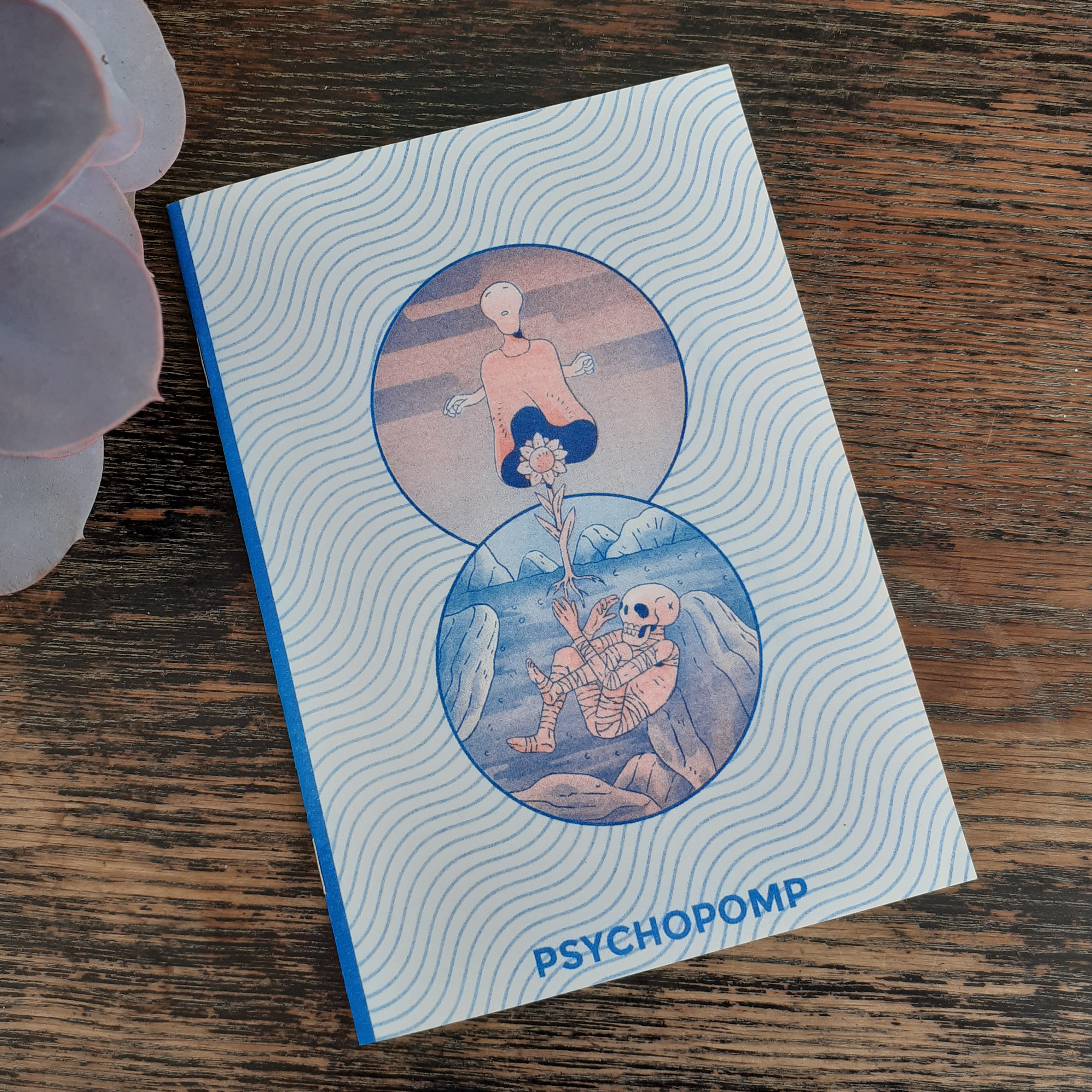
On the way home from campus the other week, I picked up a small illustration zine from one of the city’s comic book shops – Psychopomp. It’s a risograph-printed zine with artist interpretations of psychopomps (spirits, deities and so on who guide souls to an afterworld) from different cultures from around the globe.
Psychopomp is illustrated and bound (saddle stitch) by Tom Kindley and is 10 pages long. The copy I picked up is no. 16 out of 50 editions.
Cover of Psychopomp
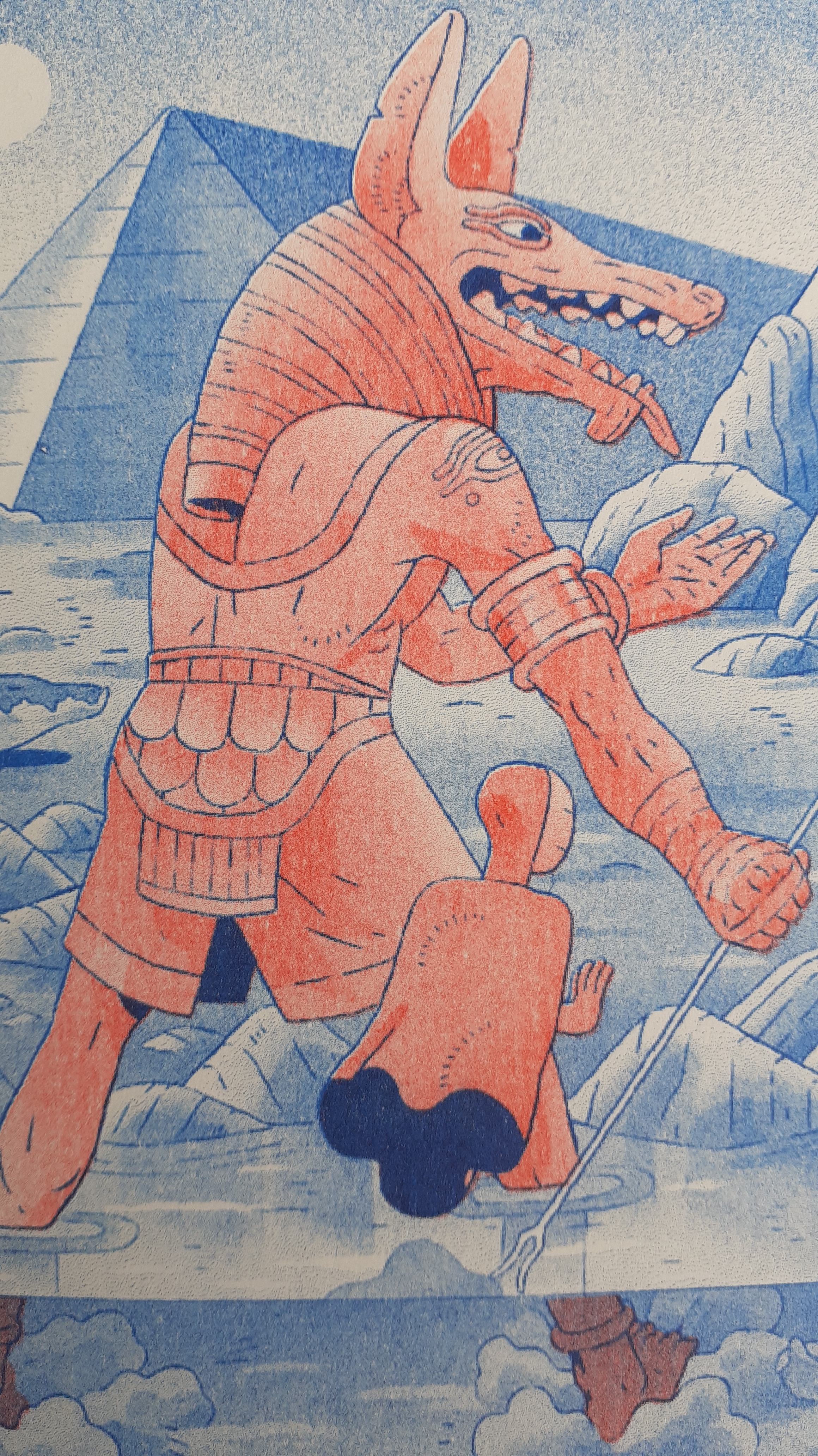
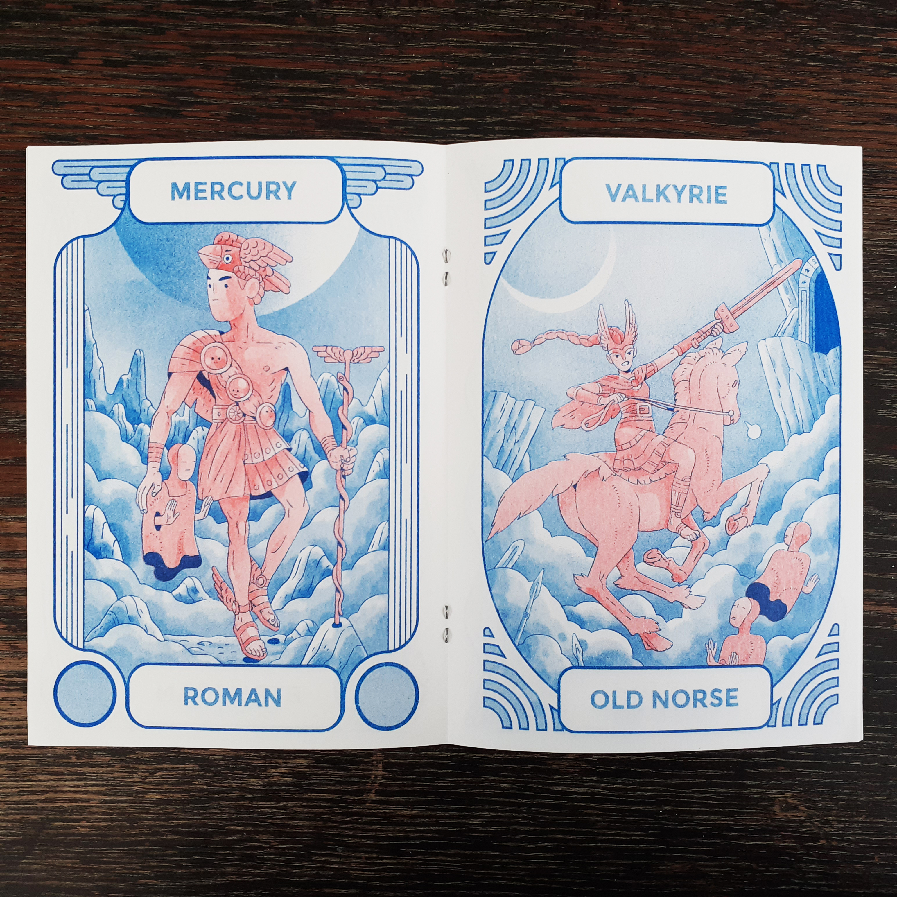
The zine is a two colour risograph publication – blue ink and red ink. It’s not without tone, however. Both layers are toned to give much depth in the illustrations. The red ink’s shading is fair and the deepest blue is used for outlines. It is difficult for me to capture on camera the exact tones of the printing ink. I’ll share a few pictures from inside the zine below.
The boarders of each page illustration are unique. The artwork throughout is quite detailed and fun to look at. I was aware of psychopomps, but unaware how just many different guides exited.
I am glad to find small press like these locally. Looking at them, I can see how they’re assembled – though it helps to have knowledge of risogrpah printing!
I’ve still yet to find the time to make personal illustrations of my own while studying, but I know I could also make artist books once I am in a more comfortable position with time and money to experiment. I will have alumni access to a risograph printer after graduating from studies and I want to make use of it. I’m not thinking about sales or profit so much as I am looking forward to exploration and self-expression at this point in time. But who knows what the future will hold!
A staff member from the college’s computing department sent out an e-mail to tutors requesting student aid to realise a ‘cartoon bumblebee illustration’. I knew it was a good request when the e-mail started off with “Hey up Muchachos” and stated the desire for the cartoon illustration to be ‘cute’!
The e-mail contained a bumblebee sketch by the staff member. The requirements were to either create a colourised and realised cartoon interpretation of the sketch, or a polished black and white drawing. I opted to go all-out and made a coloured illustration in Adobe Illustrator.
The finished Adobe Illustrator vector illustration!
The task was half-way realised by the staff’s sketch, (the body language and the level of anthropomorphism) but I watched some bumblebee videos online to look at the bugs closely and see if I could caricature them desirably. I very much liked the fluffy collar around the bee’s necks and wanted to show off how fluffy these bees are!
I drew a swarm of bees after watching the videos. My early sketches of the bees are so scrappy and wonky, I don’t want to share them here! I shared the final sketch over e-mail with the staff remember before diving into Digital art working. I simply traced over the finalised sketch in Adobe Illustrator.
Vector outline traced over my pencil drawing
I used different (default) brushes and of different thicknesses. (I’m reminded that I should make my own brushes for personal use.) I did use several layers for the brush outlines, and I could have made due with three or so. Every layer was labeled (that is, named correspondingly). Once I was satisfied with the outlines, I felt it was time to apply colour! Then the image took on life.
Block colours
I used the pen tool to draw block shapes under the outlines to colour large areas. If I took more time, these coloured layers would have been more smooth. Most of the shading was made using blob tool with the opacity lowered.
All outline and colour layers switched on
I made good use of opacity settings when adding (minimal) shading to the coloured layers. The wing’s opacity are especially low to emulate how thin and delicate real insect wings are.
Because the outlines are on separate layers, their colour can be changed easily
I was hesitant for the image to become too busy, so I down-played the shading. I’m happy with my outcome, but now feel that if any element should have been pushed further, it was the shading!
HAPPY!
Because the original file is a vector, the staff member the bee went to can be used at any scale. It would make for cute stickers…! The coloured layers can always be turned off at any time to make use of the outlines on their own. Come to think of it… I didn’t think to ask what the illustration is being used for! Huh!
Rendering the cartoon digitally was a relatively quick process – it was a day’s work to polish up the sketch I was provided with and to re-create it in a digital format. Still, each time I use a digital program, I feel better adjusted when using it. I gather that I’d feel the most comfortable if I created my own library of brushes for use in such jobs – it’s much faster than fumbling through the pre-made library of brushes just to find the closest tool to the one I want!
Writing to good friends and close family is something that I enjoy. I always have a reserve of stationery for when the need to write a letter arises. I enjoy discovering uniquely designed (illustrated) stationery, and I hope that those who receive my letters enjoy receiving them as much.
Let’s look at a few stationery items that I hand on-hand, and why I felt the need to invest in them!
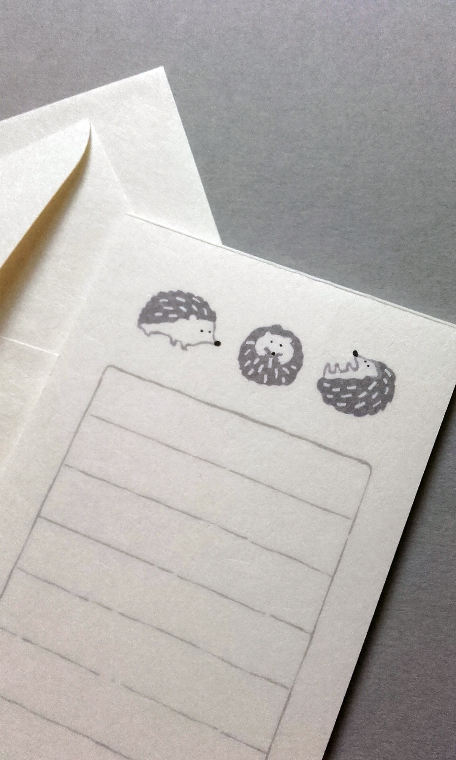
FURUKAWA SHIKO mini stationery, featuring a hedgehog motif.
The attraction to this tiny set of washi letter paper and envelopes, for me, was thee-fold; the hedgehog illustration, the material, and the diminutive size. The envelopes are 120×80mm. Not sure if they’re too small to send in the mail…!! I’ve used them to hand out notes in person.
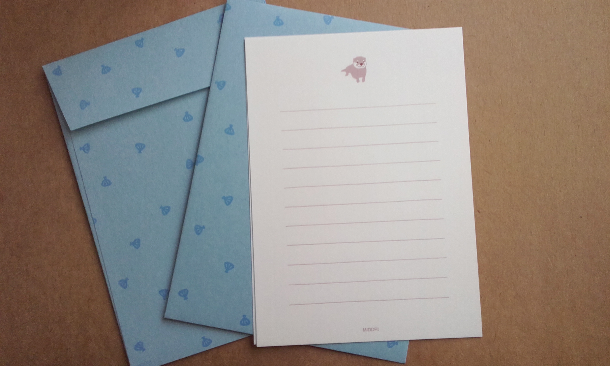
A petite letter set; good for brief letters. This letter set is made of sturdy, shell-patten envelopes (15×11cm) and washi letter paper (14×10cm) with a cute otter caricature at the top of each page. Fuzzy otter stickers are included to seal the envelopes. The simplicity and economic design is what persuaded me to buy these… alongside the cute otters.
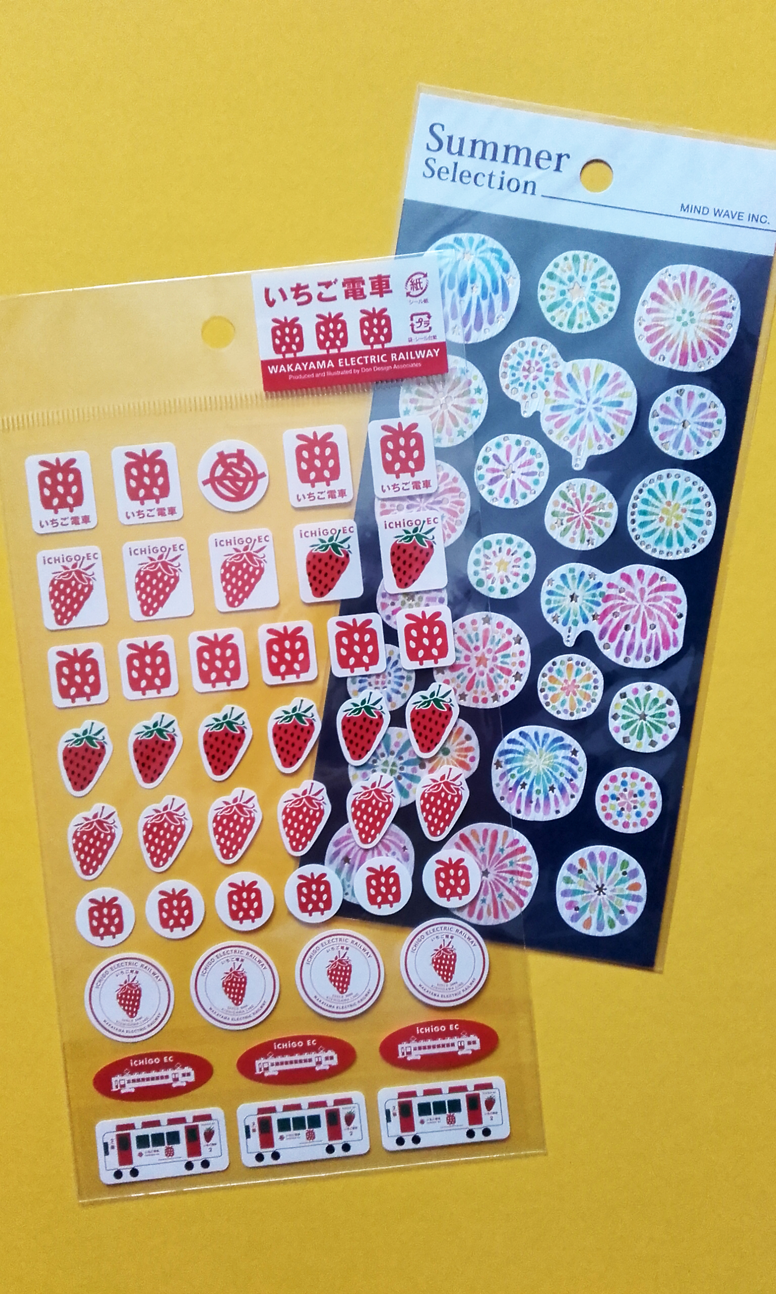
A set of iCHiGO EC stickers, and MIND WAVE Summer Selection (firework) stickers.
Everyone loves stickers, right? Both kids and big kids can enjoy them! Stickers are handy to have on-hand decorate envelopes or plain writing paper.
The Wakayama Electric Railway stickers are exclusive to the iCHiGO EC line – a strawberry-theemed, red and white train boarded with natural wood and wooden furniture. I like how minimal the use of colour is in these strawberry train stickers; most of the stickers are simply red on white. Along with two other themed trains on the Kishigawa Line, iCHiGO EC is a tourist attraction.
Firework (花火, Hanabi) stickers by MIND WAVE. I really like the stylisation of these fireworks. The material is a craft paper, with gold foil finish in places. The characters used to write ‘firework’ are ‘flower’ and ‘fire’ respectively, and you can see in these illustrations that the fireworks do look like flowers.
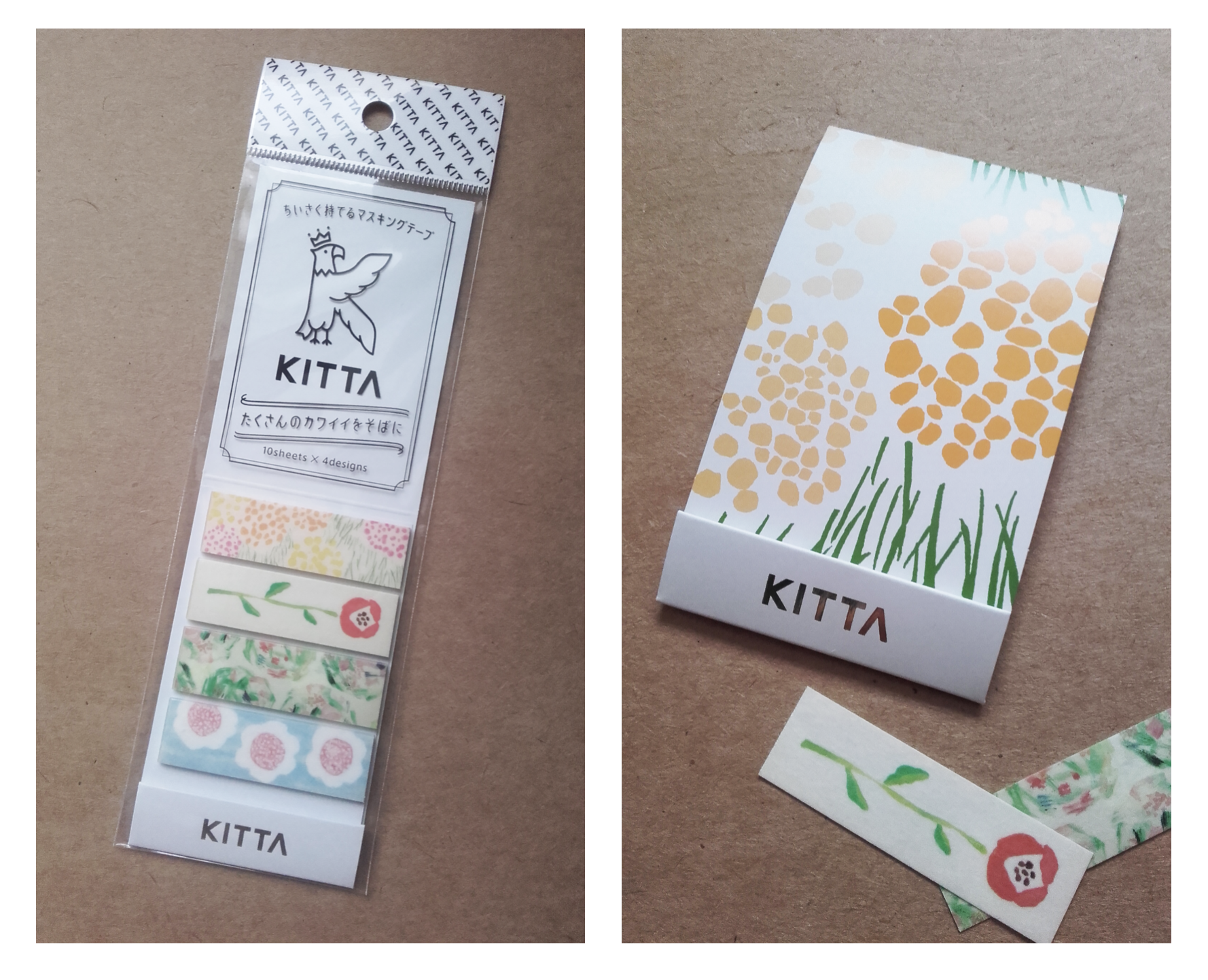
Portable washi tape stickers produced by KITTA.
All of the designs of these stickers are drawn analogue. All of the designs are made on paper with different pencils, markers, paints and such, and then scanned to make washi stickers, which lends the imagery a warm feeling.
The package design itself is neat. The stickers are tear-away strips stuck to a small sheet of card that folds in on itself. The card ‘wallet’ can be tucked away into a pencil case or planner, or wherever else is convenient.
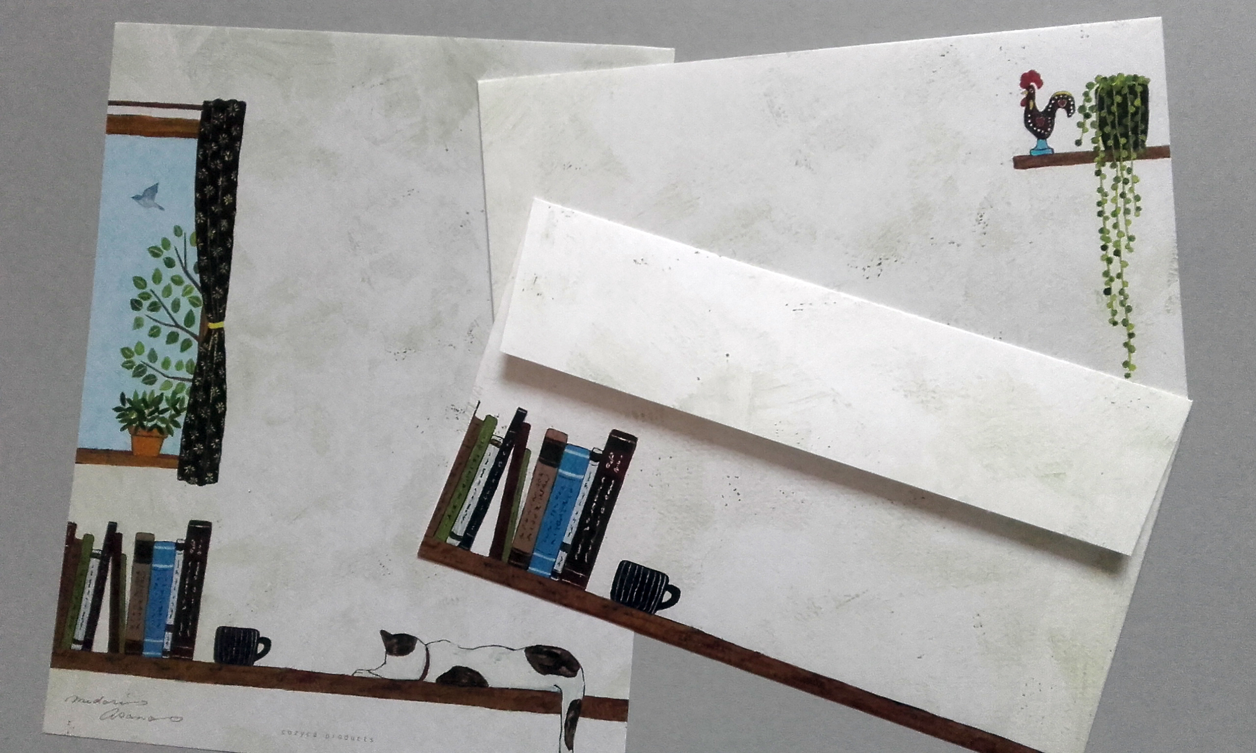
Cozyca Products My Room letter writing set, illustrated by Midori Asano.
I’ve used a number of Cozyca Products’ letter writing sets in the past. The envelopes and paper has always been washi, so they have a translucent element and delicate feel. Coupled with the types of illustrations chosen, the sets always feel mature, sophisticated, and even ‘cozy’.
Cozyca Products have made goods in collaboration with a number of well-established Japanese illustrators. Maybe I should look into writing about them in a future post? There’s certainly a varied range of visual directions.
Have the illustrations – visuals in general – of a product ever persuaded you to invest in it? Or perhaps the convenience or design itself won you over?
At some point, I’ll end up writing about the Digital Skills Application module in-depth; once I’ve some feedback. But I can already look on this module now and say with satisfaction that I have learned a lot.
During this module I’ve been met with some personal concerns. They have impeded progress somewhat.
One of the food package (for macaroni and cheese) presented as it would be for printing; with a cutter showing the net on top.
I always feel a level of frustration that the work that I produce doesn’t reach the level that I aim for. My skill level is always lower than needed for my desired outcome. I think, overall, I should be proud of myself and how far I’ve come in regards to digital artworking and using programs one entirely unfamiliar. I’ve made a food packaging box that’s convincing enough!
It may be strange to say so, (and maybe a bad sign) but I’m most pleased with the reverse of the package! I think the amount of information that was legally necessary to include aided me in deciding on the layout.
The back of the mac and cheese ready meal box.
Even from just glancing at the completed packaging net, one who knows what’s up can see the mistakes that I’ve made this time around. I will be sure to have a more coherent flow of assets when making such packaging in the future. Since I made each side of the box independently, the assets end jarringly at the edge of each side. I also learned a thing or five about scaling. I never drew these to scale! A big mistake.
One learns more from mistakes than getting things ‘right’ the first time. If everything went accordingly right off the bat, I wouldn’t be questioning myself so much; and actions or precautions I must take to avoid error might not stick. With all that’s gone on during this long module, I feel that I’m ready to move on and start a new one. A change is as good as a break.