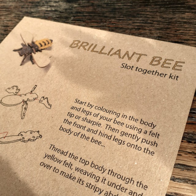
Some time ago, I was given a laser wood cut kit of a bee. It’s from a small design studio in the UK (Gilbert13). I took a few phone photographs as I put it together. I thought the kit was too cute to neglect sharing the design!
BUZZ!!
The piece of laser-cut wood is 21 centimetres by 13.5 centimetres. The kit comes with colour instructions printed on thin, brown card.
The instructions are very easy to follow; they’re accompanied by picture aids, after all. One is supposed to use a sharpie, or perhaps some other black felt-tip pen to colour the body of the insect, but I didn’t have one and used some brown ink to stain the wood. The colour is less subtle in person.
BUZZ BUZZ BUZZ!!
Putting together the bee I thought about how simple and easy the steps were – how ‘accessible’ the kit is, really – and that’s good design! It makes me want to try out crafting something through the use of a laser cutter, too.
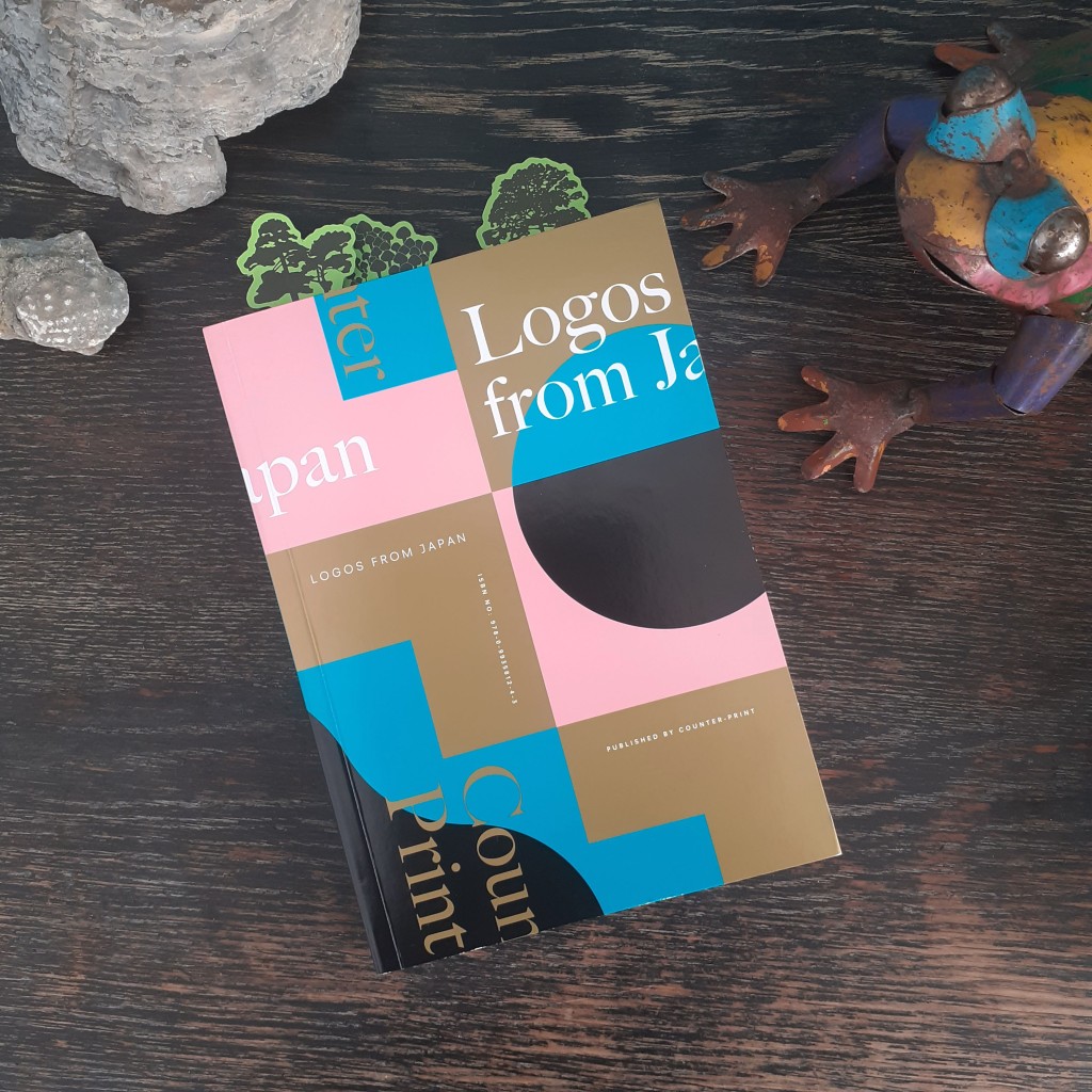
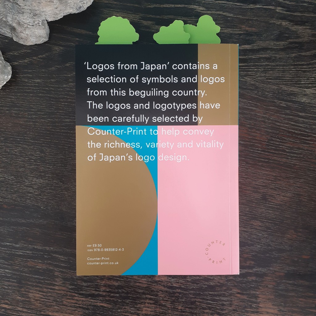
A good friend gifted me a new logo design book titled Logos from Japan. The book is published by Counter Print. It’s a continuation of the survey of design made to curate the graphic design book From Japan, but focusing only on the country’s logo design. I want to share some of the book on my blog.
It’s a paperback book of 160 pages, in full-colour, and has a short foreword on the selection of designs within.
The book is has grouped the logos by theme such as ‘Architecture’, ‘Natural’, and ‘Latin’. Each logo is labeled by name, with the information of the agency that created it, and the year it was made. There’s plenty of room allocated to each logo – many have a page or two of their own – and there’s photography of some of the designs at work on signage or print.
Animal environment and welfare foundation logo
Clothing store logo featured on signage and paper bags
There’s an interesting passage in the book’s foreword that highlights globalisation’s relationship with design and craftsmanship – homogenisation – and that Japanese design has thus far evaded strict international ‘rules’ popularised by Swiss design:
In 1996 the German graphic designer Olaf Lue wrote that German design no longer had any national attributes. Observing that some might favour this development, Lue also acknowledge that some might regret it. It was true that, throughout the latter half of the twentieth century, the spread of information and the effect if globalisation showed its impact on the world of design, as in many other areas. An ‘International’ or ‘Swiss’ style was prevalent in the West, characterised by cleanliness, readability and objectivity. However Japanese design remained largely recognisable, mixing extremely traditional elements of Japanese Art history and the highly modern influence of Western design.
Human figure-based logos
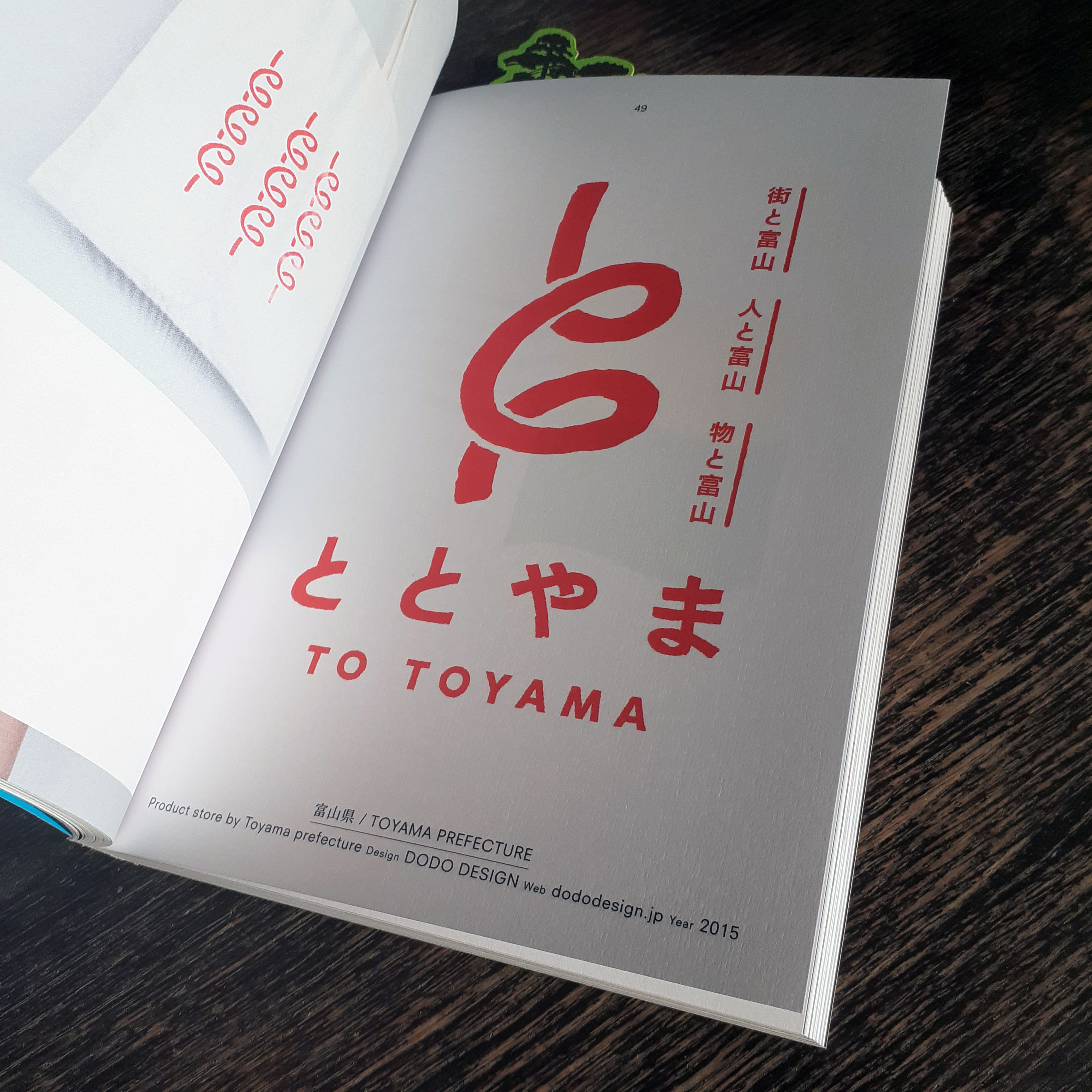
Toyama prefecture’s logo
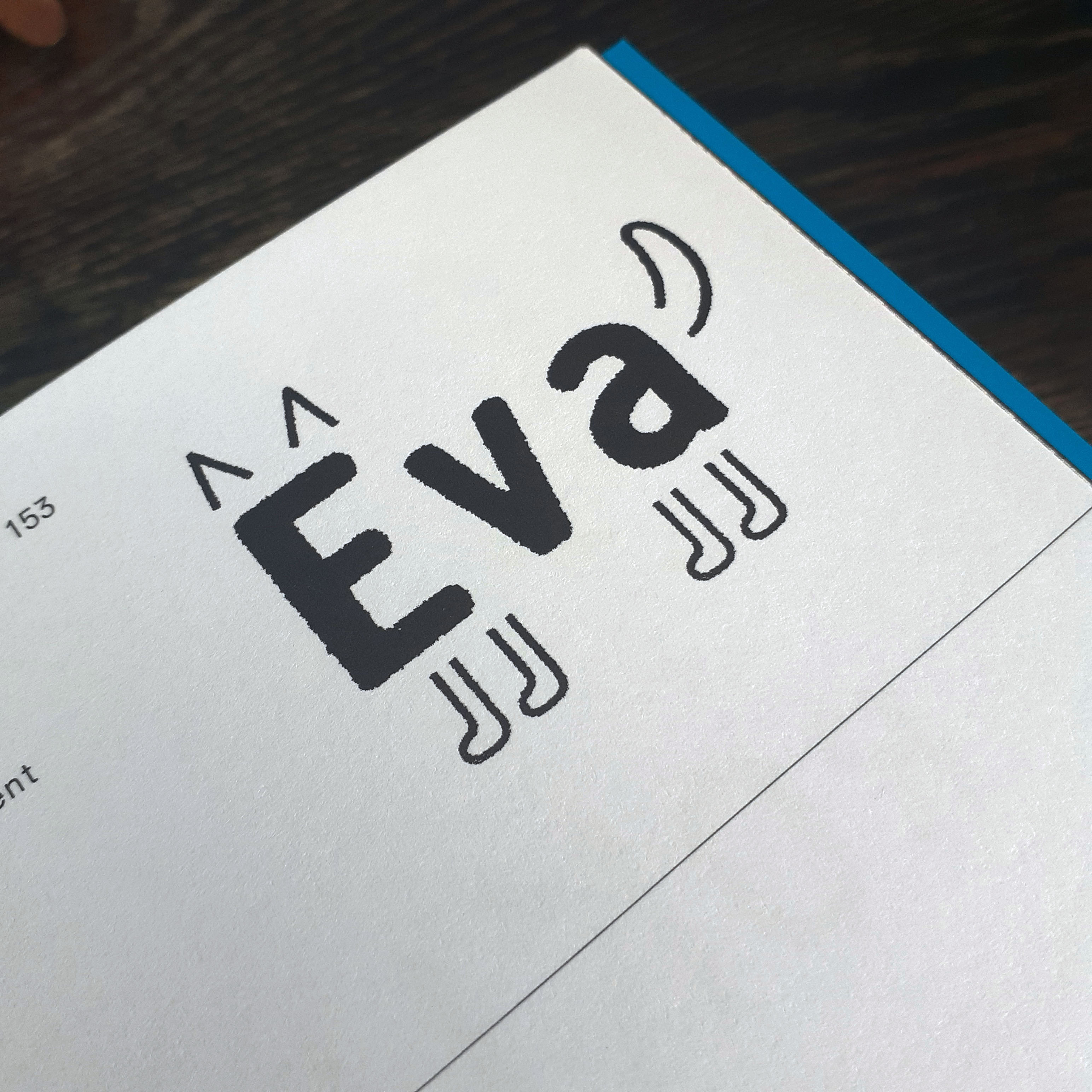
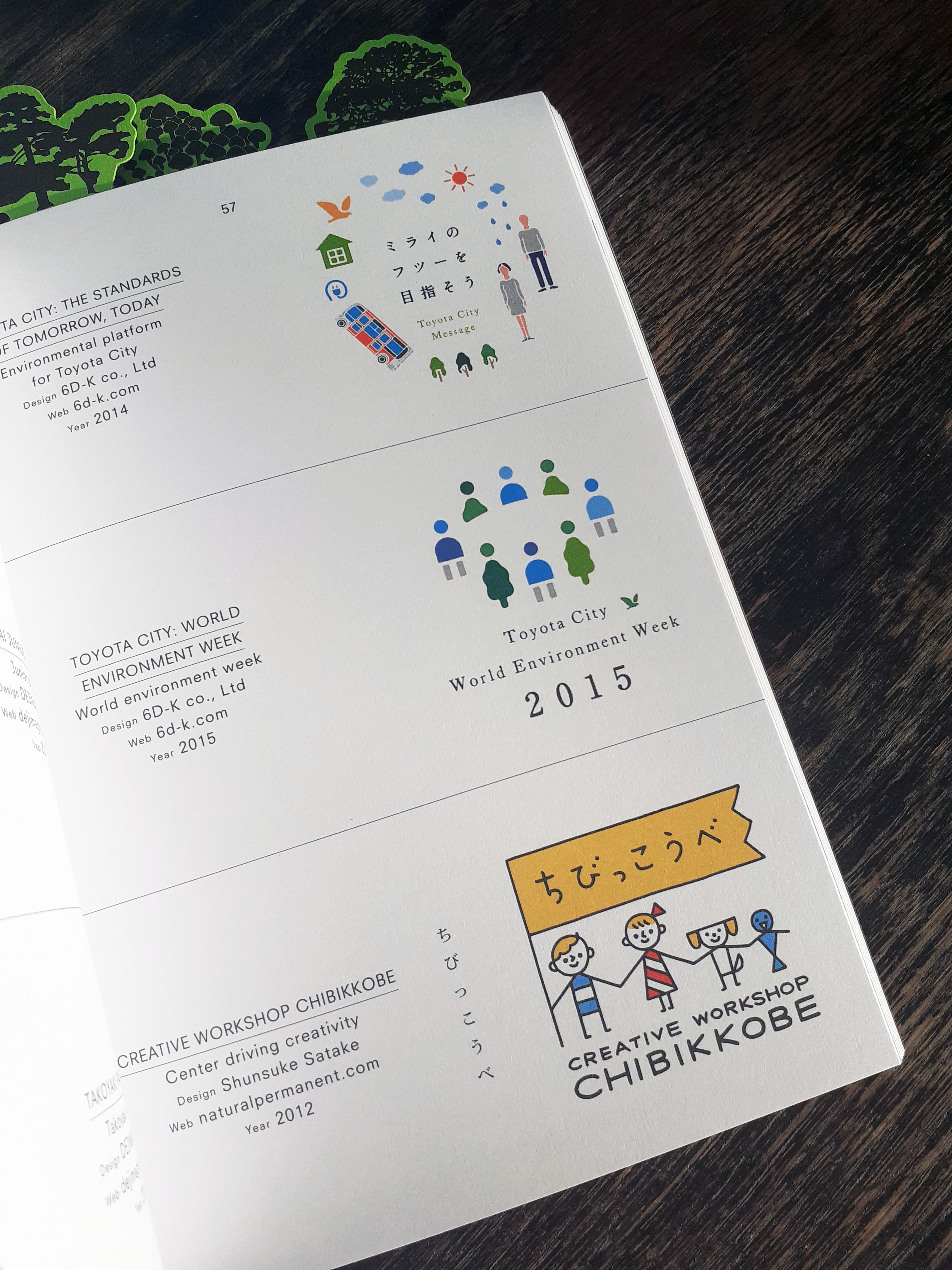
And this book really is a wonderful showcase of design that feels almost unreal in contrast to what I see of most UK, American, or European product and service logo branding. I see a lot more playfulness in Japanese logo design. Of course the playfulness is kept to appropriate services and products such as bike shops, T.V. stations, video game studios, patisseries, and so on, though I am used to seeing the these services represented through more serious, elegant, or corporate images.
The logos featured within this book are all from within the past couple of decades. As the forward explains the mentality behind modern Japanese logo design is to create something that captures the interest of the public eye in the moment:
Arguably, this could be seen as a less ‘long lasting approach’, and some of the logos will be seen as ‘of their time’ when looked upon from years to come. However today, when most identities are viewed on screen, there isn’t a permanence of print that companies are more inclined to quickly throw out their previous logo design in favour of a new one. As such, the style of Japanese logo design is constantly changing and a long lifespan for a logo is no longer expected to such a great intent.
I haven’t been taught to think about logo design as quite so ephemeral, and it’s an interesting view to read about. The transient nature of contemporary Japanese logo design is understandable when put into perspective of modern services and consumerism.
This book is very fun to flick through for the unique blend of tastes Japanese design has acquired. The number of colours used on some logo designs, and the colour combinations across these logos is a very interesting insight to design that does not follow international rules.
I’m very happy to add this book to my small collection of graphic design books. I really look forward to the day that I am able to visit libraries again to check out any recent publications for graphic design reference, too. The internet is handy to have at my fingertips, but sometimes I find holding and pouring over a book a better experience. Carefully curated publications like this shows why print is still around!
Here are recent vector illustrations of leaves made using Adobe Illustrator; I wanted to post some of them here. Made using basic knowledge and basic skills, but each time I practice a (digital) skill, I get better at it. I also don’t often draw or study plants enough!
Recently I’ve seen that my peers from the graphic design degree course we took are steadily moving forward with their personal goals and projects during the latest school term. I really want to make use of the campus facilitates to use the Risograph printer, sticker machine, and laser cutter etc. but I can’t use the facilities yet – maybe in the New Year I’ll be able to go into town to use the resources safely. The wait is really hard.
More leaves; differentiated by size and texture pattern
Reflecting, I need to organise what I have done this ‘term’ so far, what goals I need to meet, if I need to set some new goals, and who I want to talk to for advice to move onwards. I do realise it’s important to think positively at present, and not lament what I can’t do! Best to keep looking towards the next goal post.
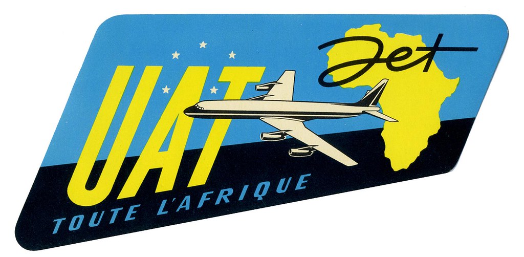
Since any significant travel has been restricted for months, I’ve tired to satiate the desire for exploration by traversing the local woodland and such. It’s a solitary activity, and thus I’ve much time to think to myself. I thought about how much overseas traveling there is to look forward to in the future once such movement is safe.
Luggage labels like this were crafted to advertise airline and hotel services in the 20th centuary
When I looked through my last passport, I found very few ink stamps on the pages despite how much I had traveled with it. A lot of the documentation of our travel these days is digital. Long gone is the era of travel ephemera such as luggage labels; the kind that airlines and hotels used to slap on vacationer’s suitcases. Never have I seen luggage labels in person. But exposure to them in vintage cartoons and film leaves me with a romantic impression of them. (And perhaps, a romantic impression of travelling itself.)
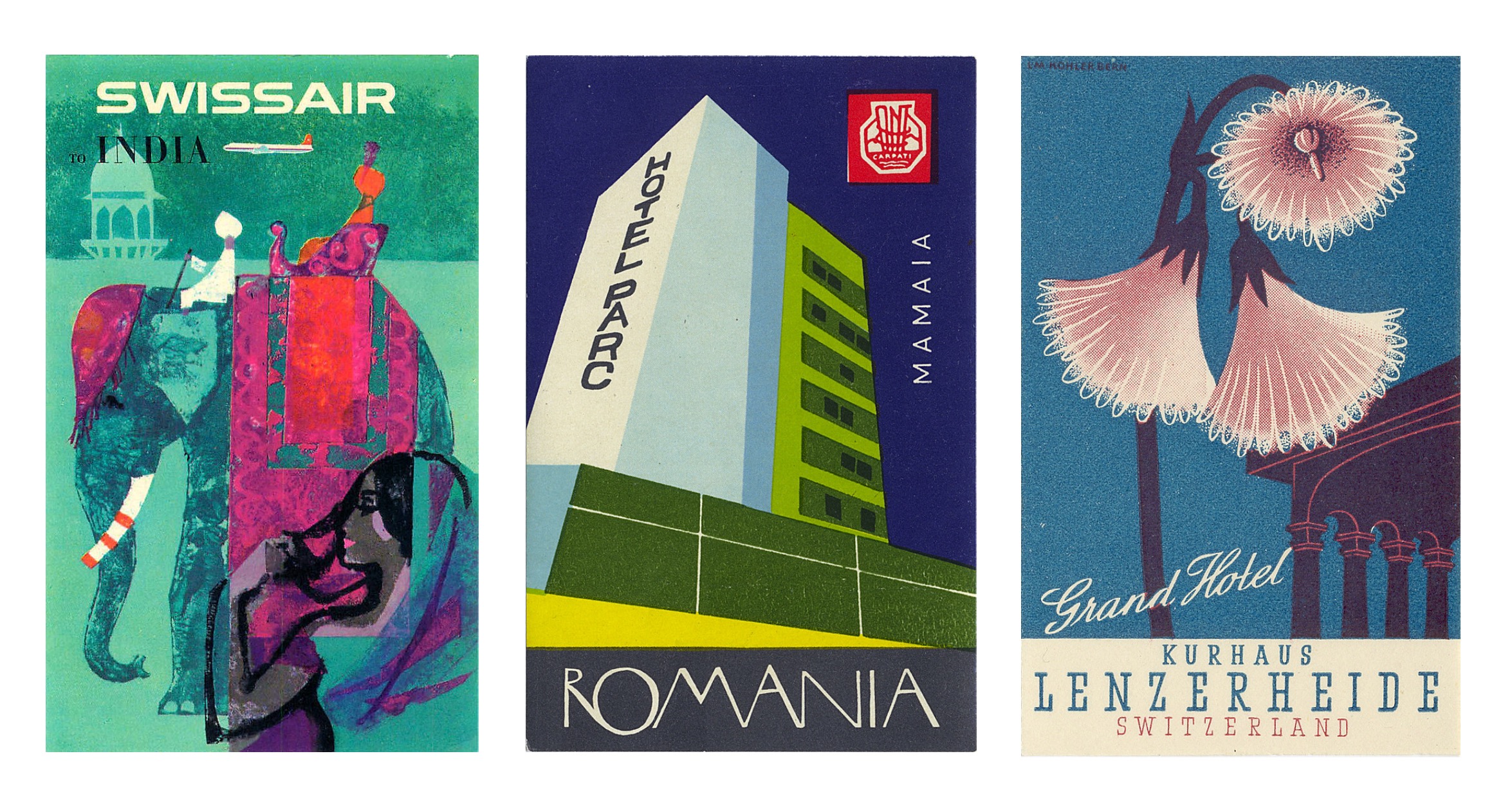
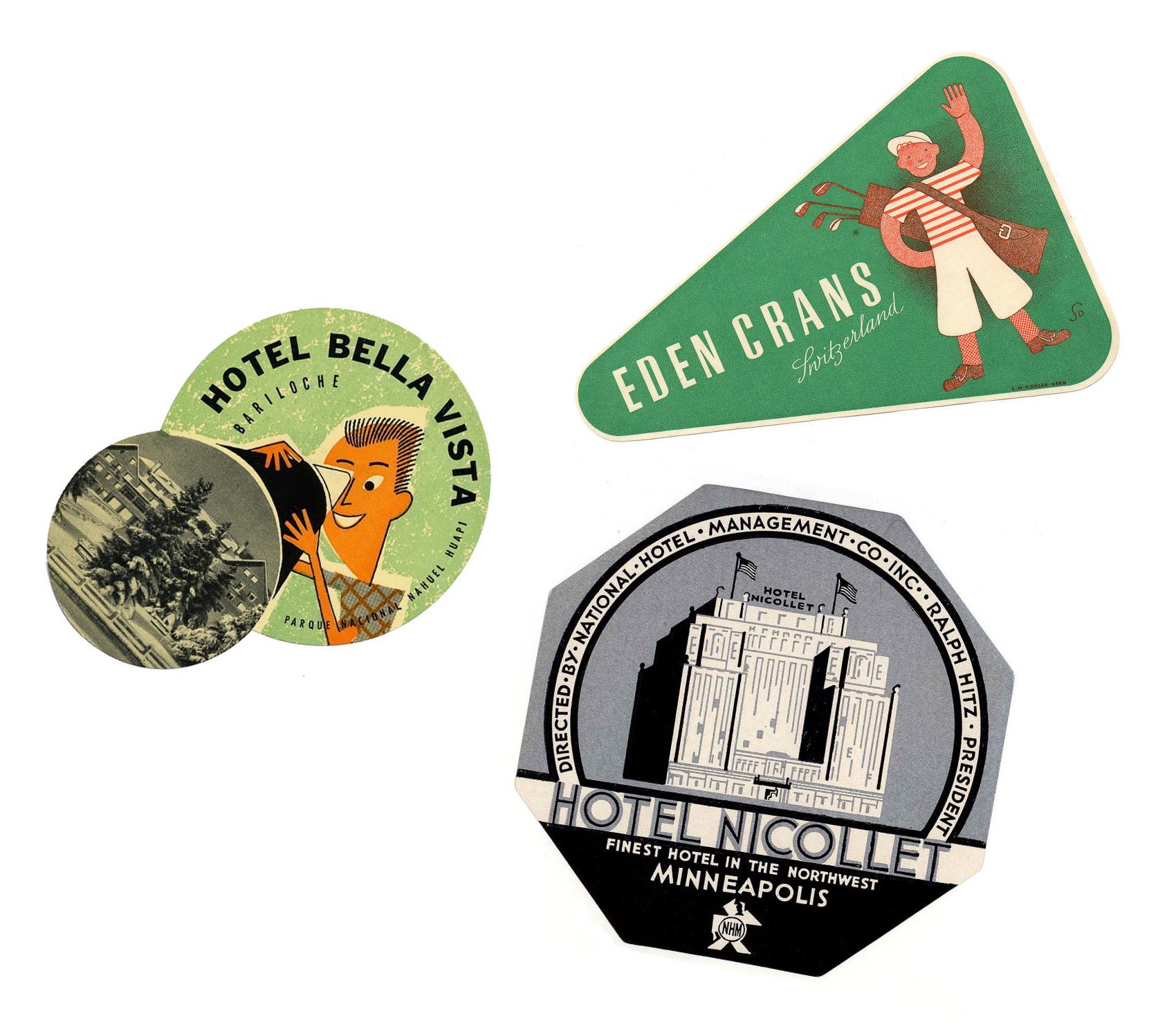
Vintage airline and hotel luggage labels
In searching for these specific paper ephemera, I ran across the flikr account of Tom Schifanella, Art of the Luggage Label. All of the images I have shared here are sourced from Tom Schifanella’s account, and so I encourage you to browse through the albums if any of these designs pique your interest.
Different shapes that baggage labels take on
I want to share a few labels that stood out to me for one reason or another, even labels that I don’t feel affinity for – because it’s still possible to appreciate and understand the thought and concept of the designs.
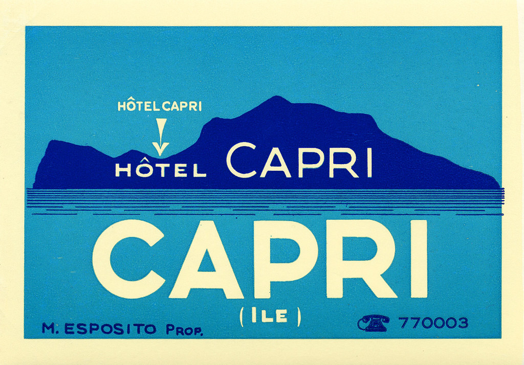
Location-Centric Illustration
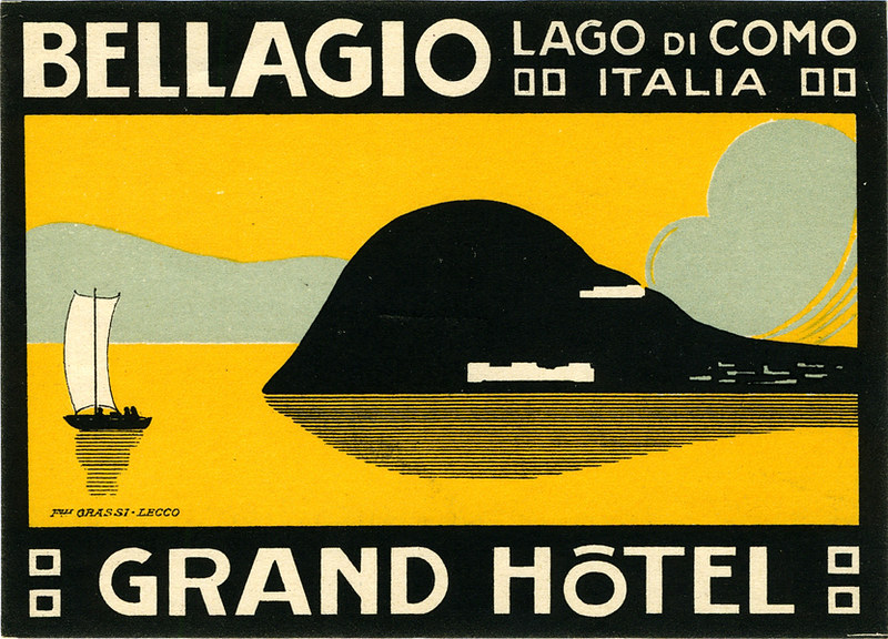
The following couple of labels are minimalist depictions of Italian holiday destinations surrounded by water. I like these designs for their limited use of colour; while the design for Hotel Capri uses three colours in total, the Grand Hotel in Lake Como uses four. The bold, sans-serif typeface helps the text read on the small scale that these images would be printed.
A baggage label illustrating the island of Capri, ItalyLabel for a hotel situated in Bellagio, Italy
Despite my attraction to these illustrations for their deceptively simple designs, the corporate illustrations of luggage labels are not all subject to strict restrictions of colour or texture.
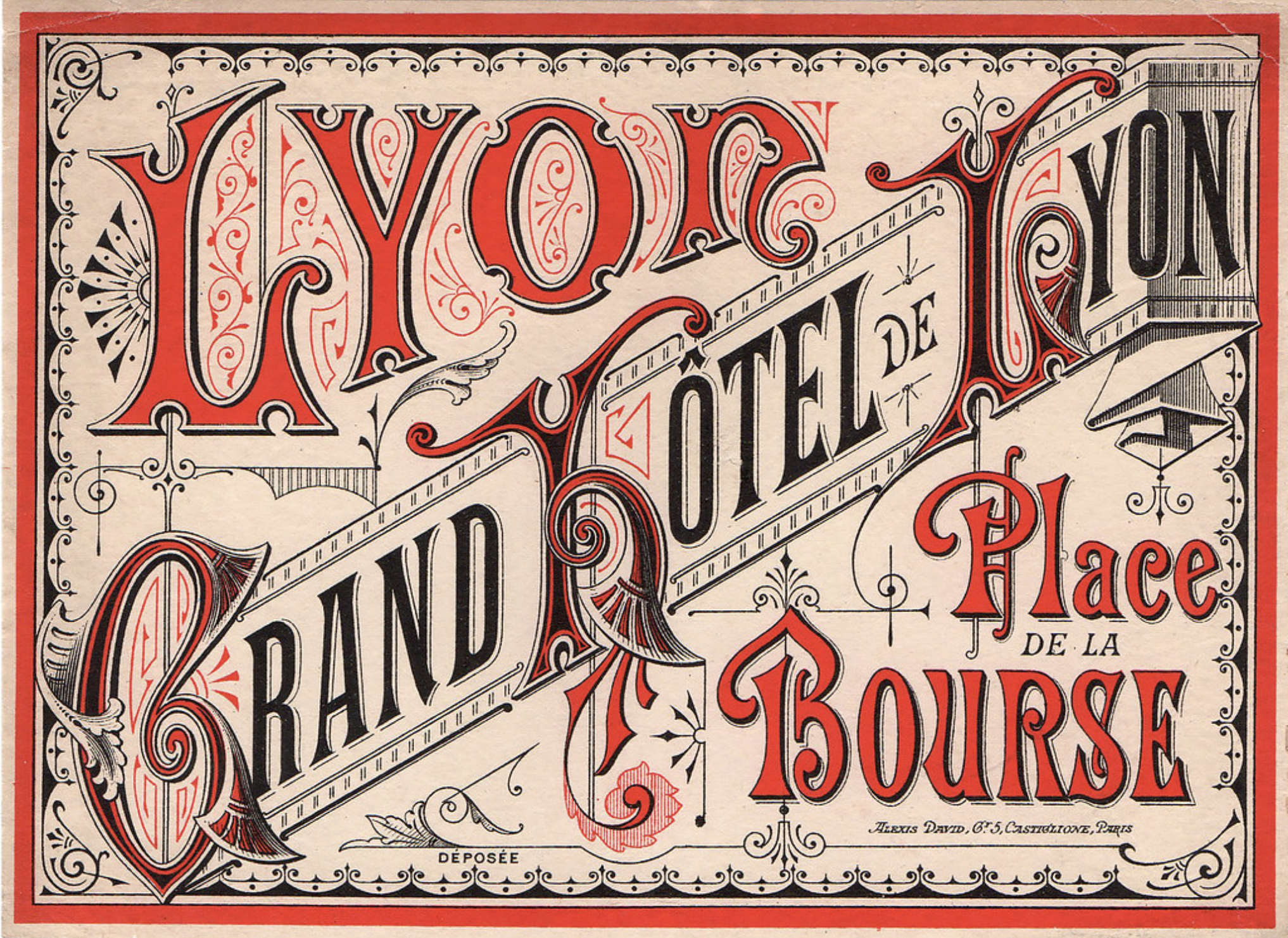
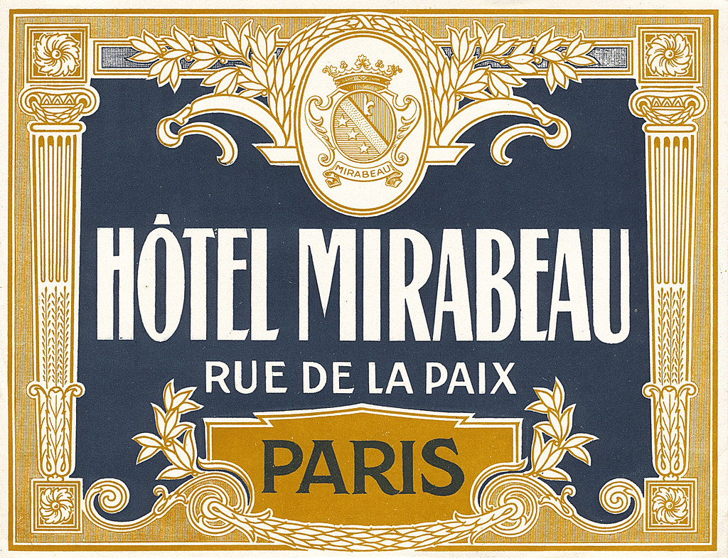
Typography-Focused Design
These French hotel luggage labels are almost excessively ornate. While the highly-detailed graphic direction doesn’t appeal to me personally, these designs communicate clearly feelings of grandeur and wealth.
The label for Grand Hôtel de LyonHôtel Mirabeau labek
These decadent visuals aren’t ubiquitous today as this visual direction isn’t always practical or very suited for many modern services and goods, thus the old-school draftsmanship skills used to create these are not so freely taught or learned to students of design today.
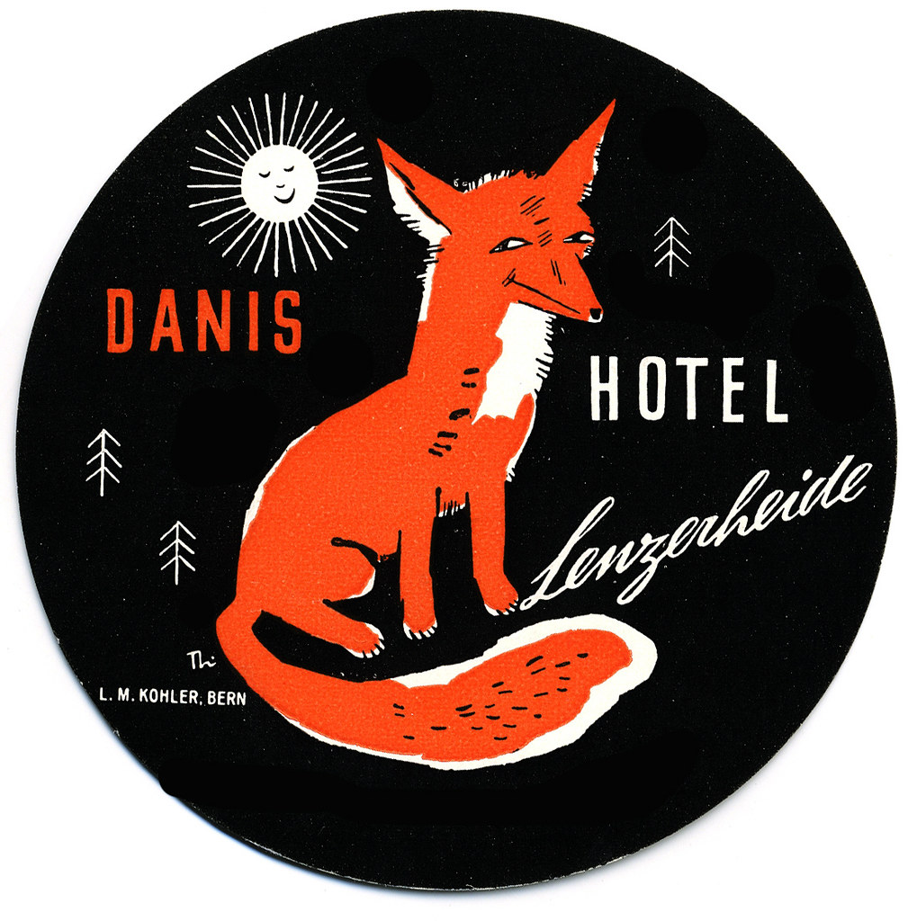
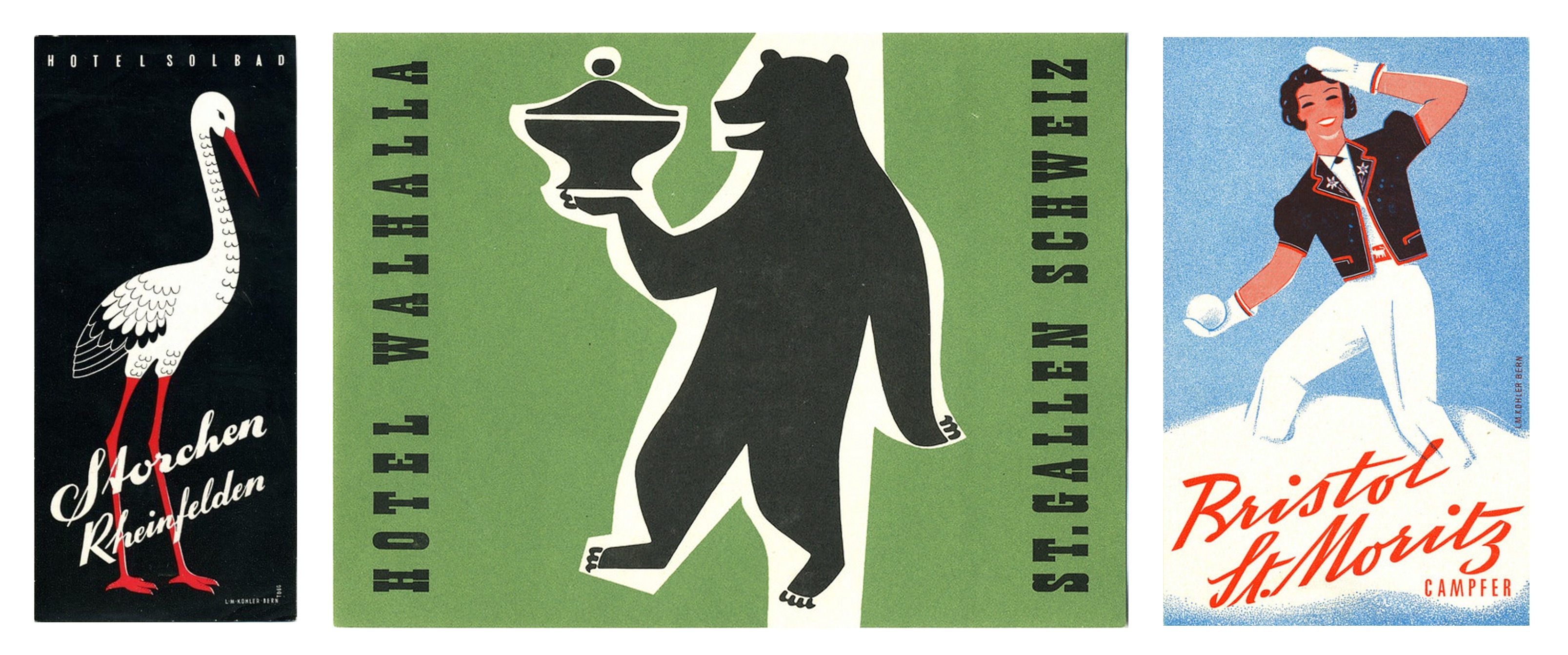
Swiss Style
These circular labels are all happen to be advertisements for hotels in Switzerland. They’re all functioning on a limited colour palette, too.
Fox Label from a Hotel in Lenzerheide, Switzerland
This illustration brings up feelings of outdoor activities and exploration in the mountains. The stylisation is nostalgic to European children’s books from childhood.
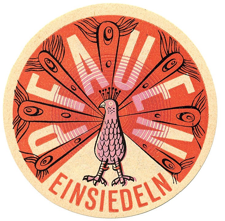
A peacock promoting a hotel located in Einsiedln, Switzerland
‘Pfauen’ here means peacock, and peacocks bring to mind elegance and beauty. This design takes advantage of the circle shape with a clean, considered illustration. The registration of the pink ink looks to be off, but it also lends this piece more character.
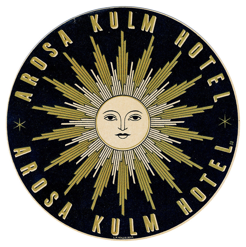
Sun label from a hotel in Arosa, Switzerland
While this graphic doesn’t immediately communicate to me traditional ‘hotel’, I can feel a connection to mountainside spas where one can enjoy the closeness of nature. I can’t help but think of The Sun tarot card when looking at this…? The design does interest me, and makes me wonder what the hotel attached to this sticker was like.
More examples of mid-century Swiss Style
There is so much variety in these miniature illustrations, it’s a little overwhelming tying to take them all in at once – they’re in competition with each other, after all!
A number of these label illustrations are a shock as I would not have even contemplated some of the colour combinations employed, and yet I enjoy them. Other designers have made considerate use of black and I also consider that bold and brave – I’m always wary of how absolute and black is and its power to overwhelm an image. So, in reflection, I realise I can be more adventurous when illustrating in the future.
While it was an impulsive action to seek out these luggage labels, it was rewarding. I found a whole world of corporate design I knew next to nothing about. There’s definitely a lot to pull from if you’re looking to find inspiration from past eras. But in imitating past design it’s important to think about why you want your work to be informed by older works, and if it really does communicate what you want.
Think about why these illustrations have been saved and are still appreciated now – many able to outlive the services they promoted. A lot of thought and heart went into these labels to ensure their impressions stuck!
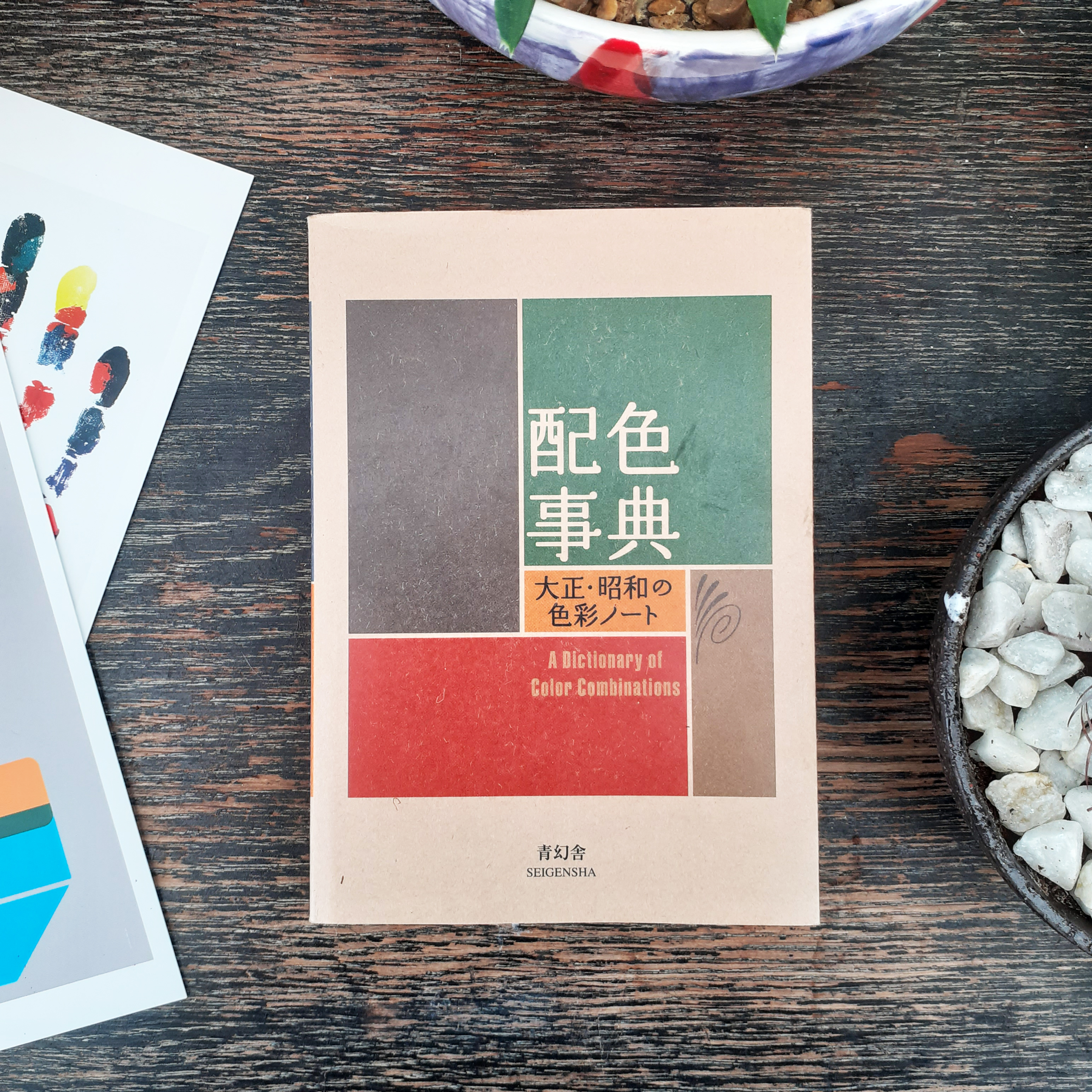
I picked up a new book as I want to add to the small pool of design reference books I have. The book is called A dictionary of Color Combinations, and is published by SEIGENSHA. The small amount of text within the book is primarily written in the Japanese language, but the practical nature of the book means it is accessible to those who can not read the Japanese text.
A dictionary of Color Combinations
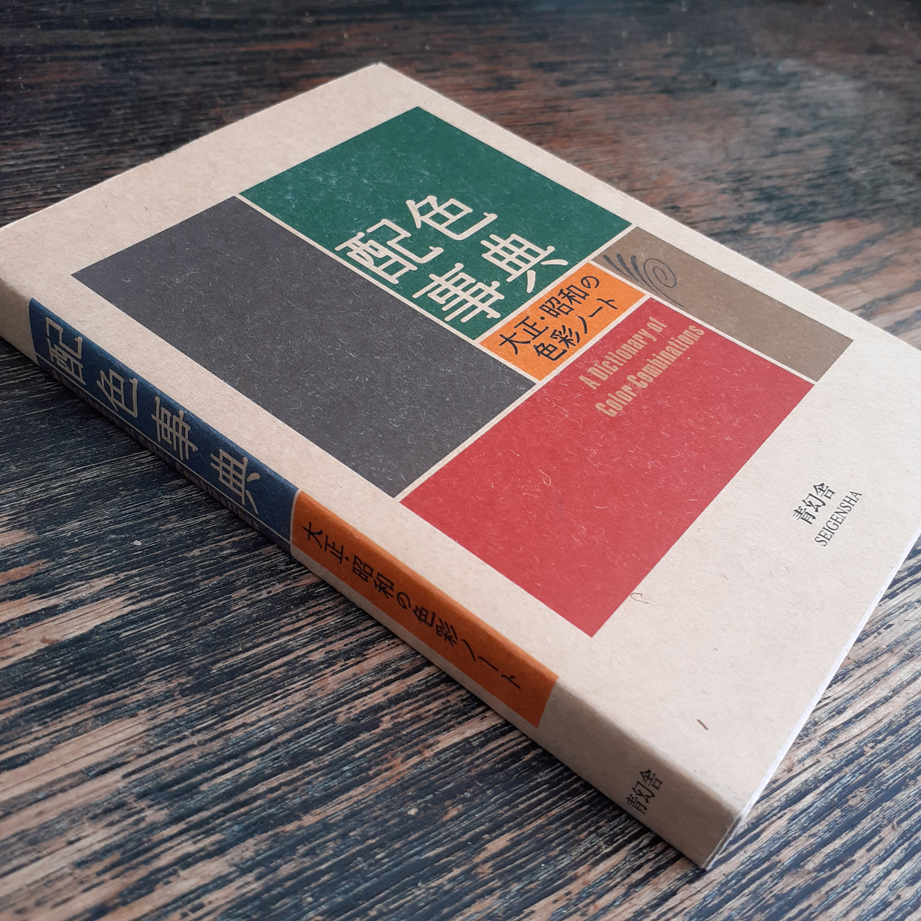
The book itself is a lovely object
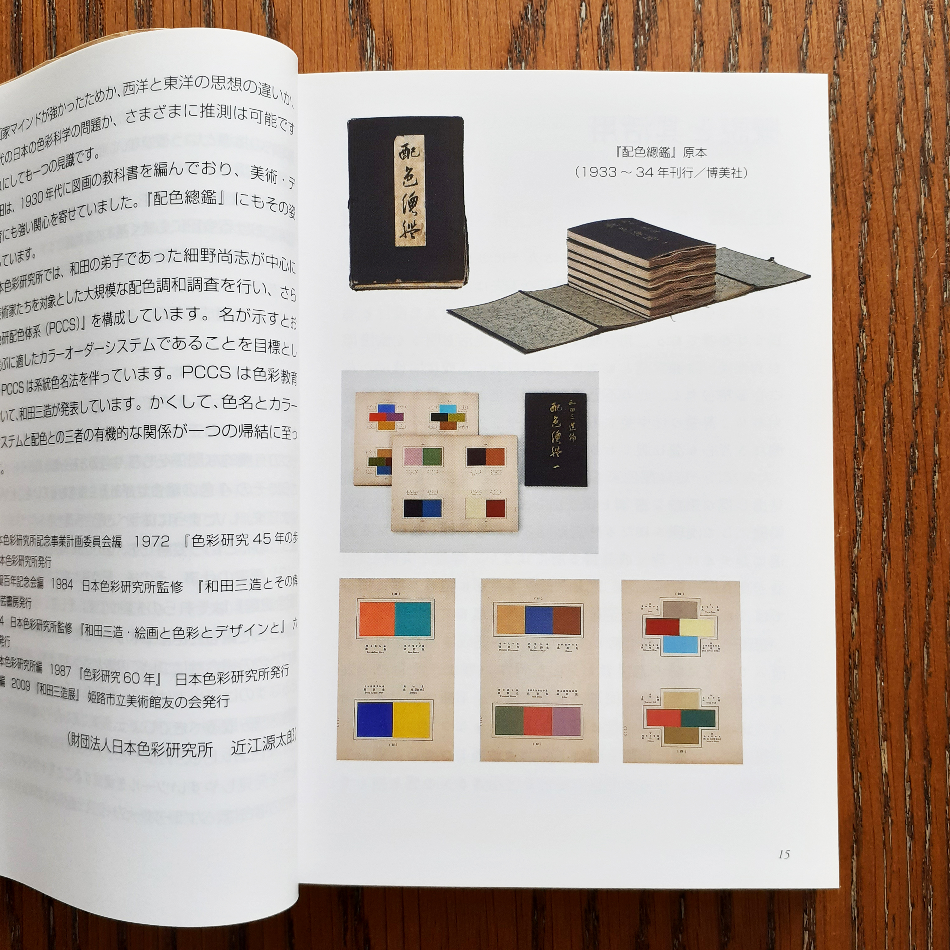
The contents of the book are sourced from the work of Sanzo Wada (和田 三造). Sanzo Wada created 6-volumes of colour studies (Haishoku Soukan) between 1933 to 1934 (in the pre-war Shōwa era). Sanzo Wada studied western style painting at the Tokyo School of Fine Arts and later worked as an instructor at the school. This book’s dust jacket states that he was a working artist of many disciplines; while he was a costume designer for theatre and movies, he was best-known for his woodblock artworks.
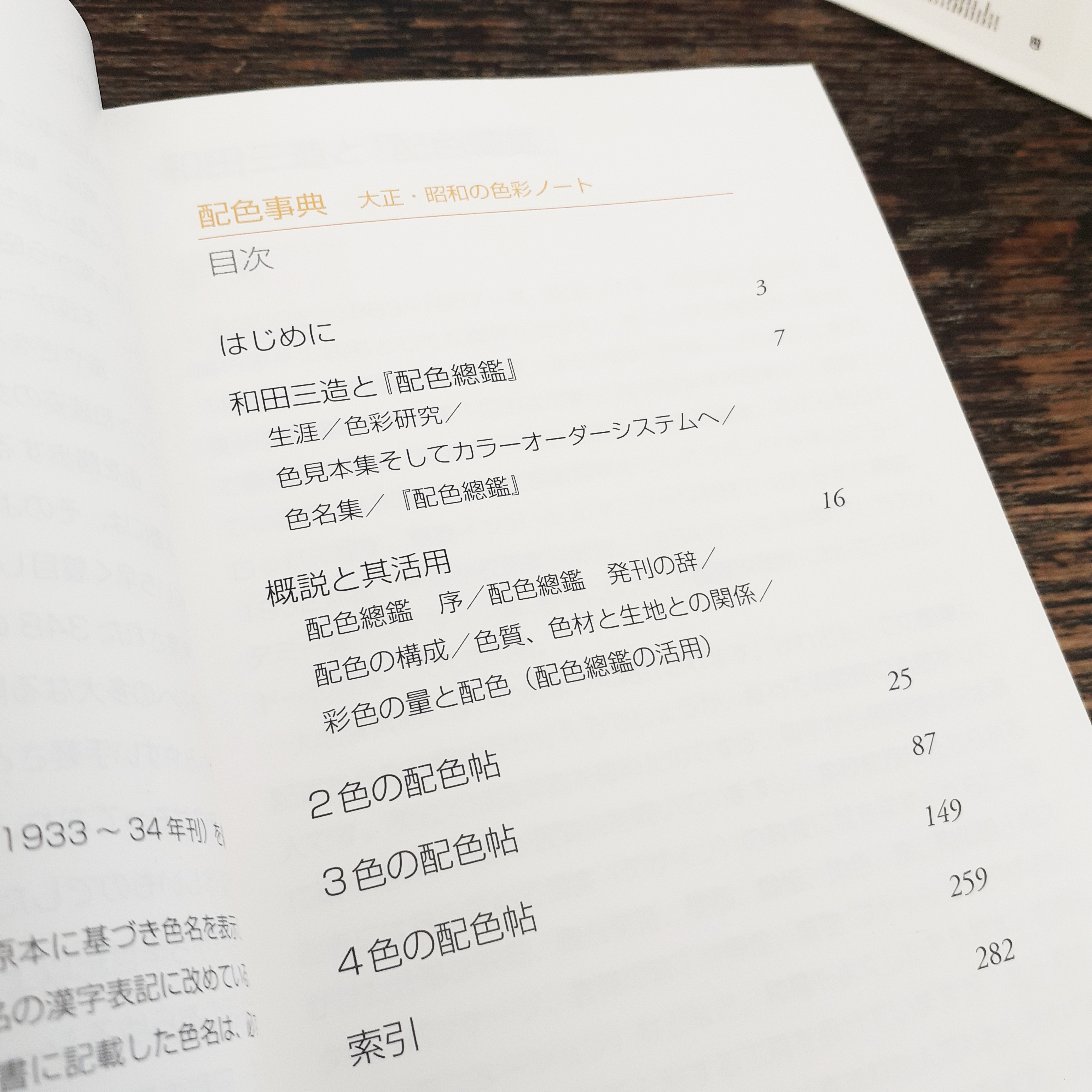
Contents page
Details on the source materials
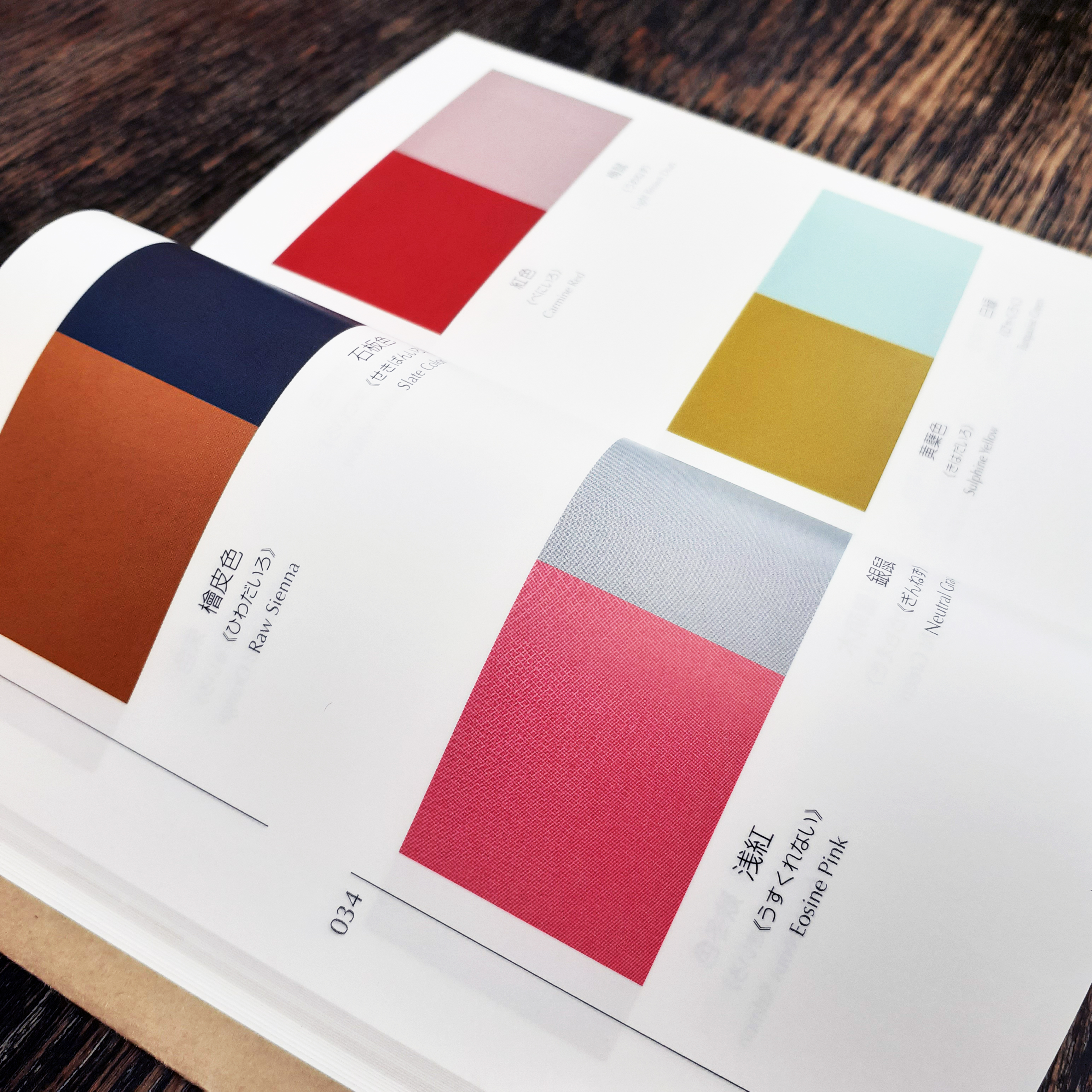
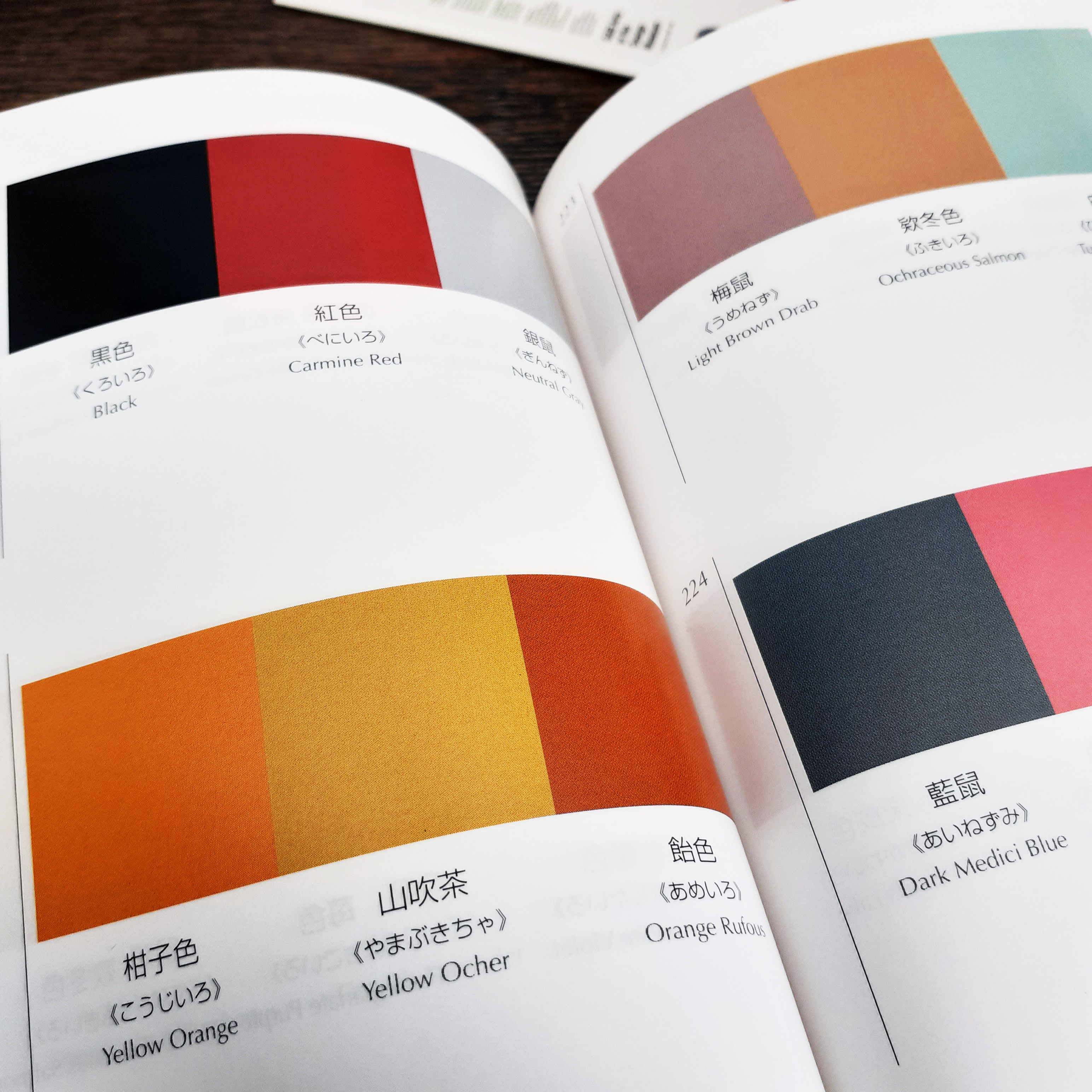
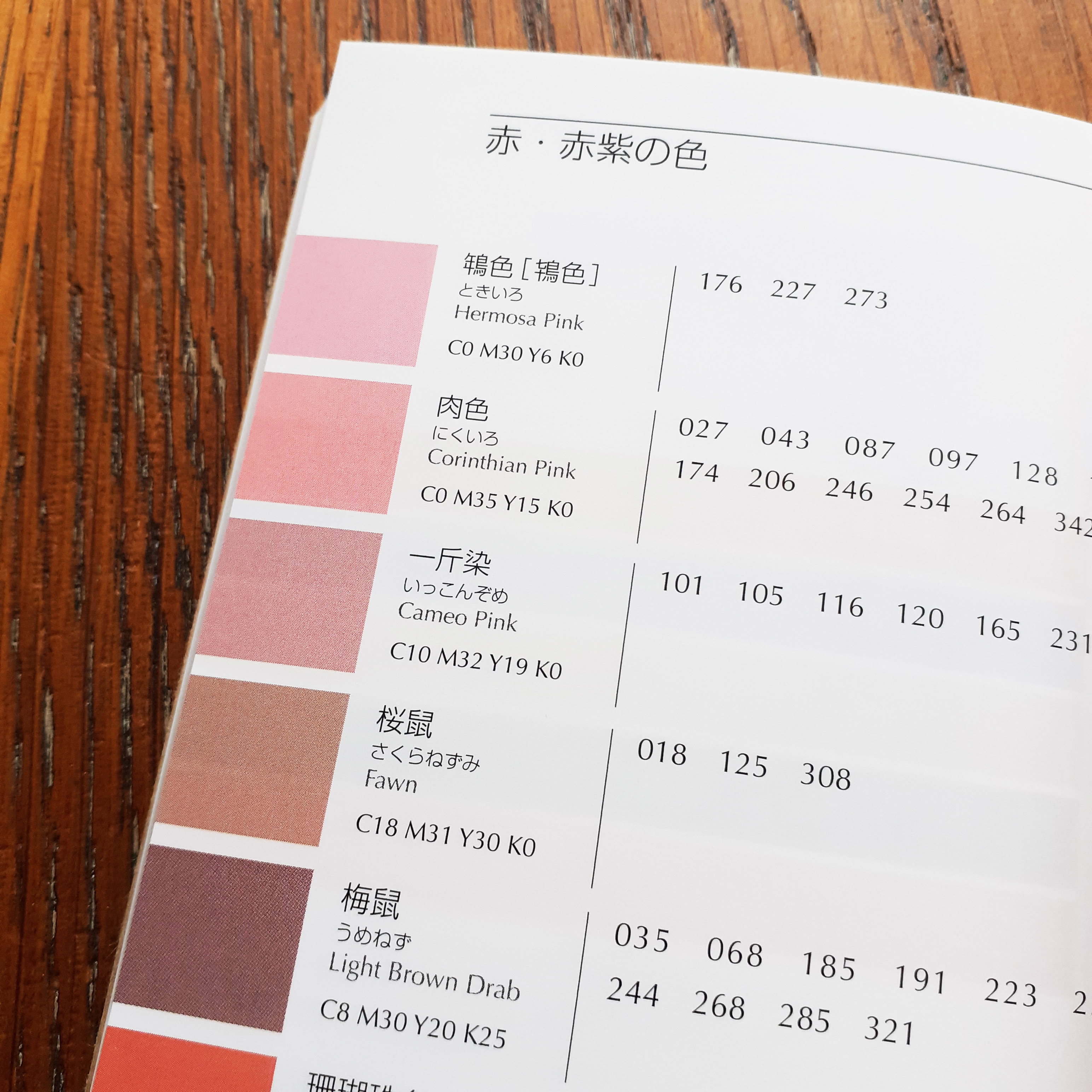
The book sports a thin brown paper dust jacket, and is rather small being A6 (so you could say it’s a ‘pocket-sized’ reference book). It’s very dense, and there are more than 300 thin, but glossy pages. Over 200 of the pages are dedicated to colour combinations (348 unique combinations in all). There is a section for colour pairings, and then three and four colour combinations. Each colour is given its Japanese name first, and then an English name.
Pairs of colors
Groups of three cololours
Even though the contents are from back in the 1930s, it’s clear that Sanzo Wada was progressive in colour theory studies, and the colours grouped together here will work to suit contemporary western sensibilities. I can imagine looking to this book when stuck on illustrative projects with mature audiences and certain demographics in mind. The books gives the CMYK (the cyan, magenta, yellow, and key/black) code of each colour towards the back. (The CMYK colour range is used for any design intended for print.) This is very friendly feature for those working digitally.
Colours and their codes
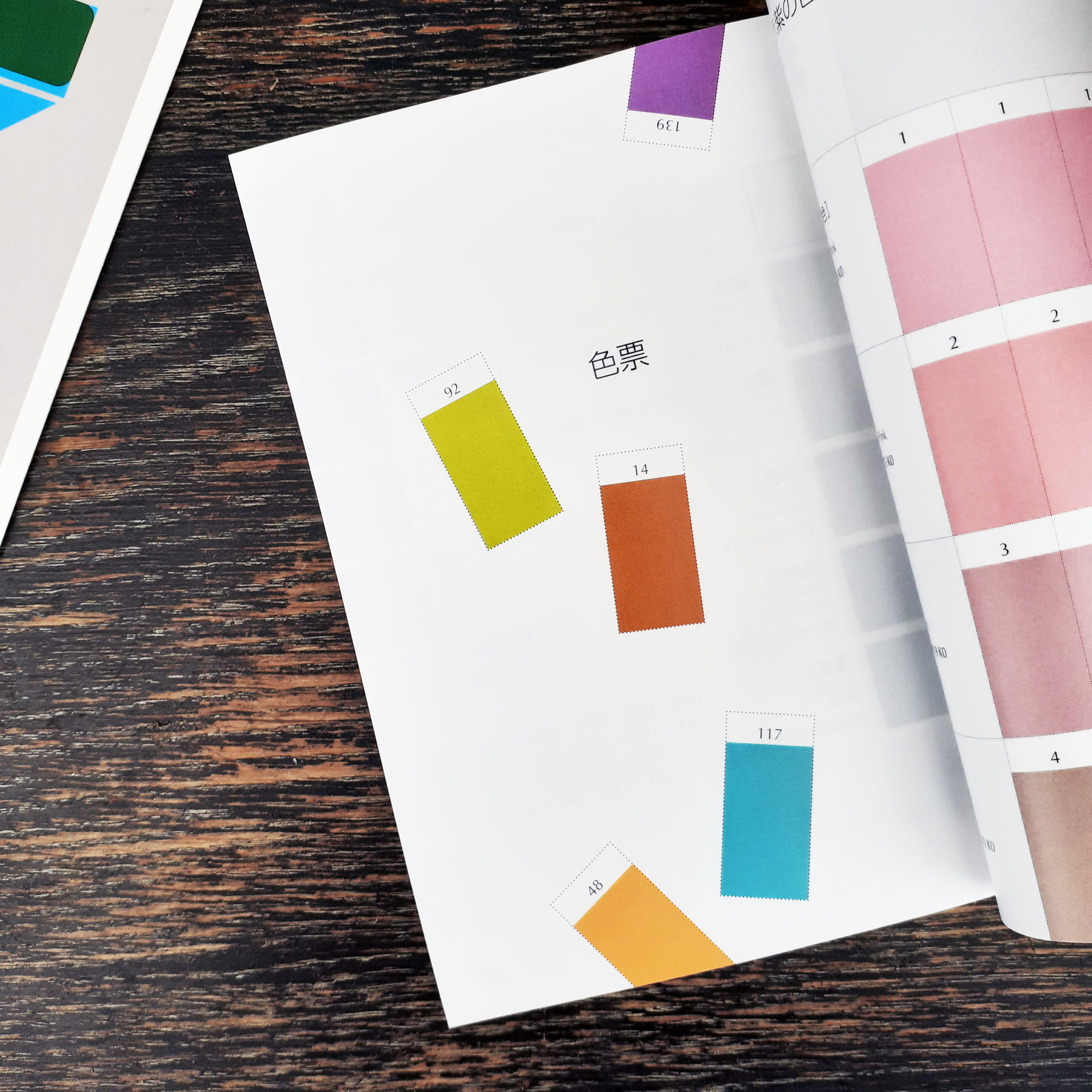
Using the cut-out swatches provided, it’s possible to arrange new combinations
At the tail-end of the book are plenty of colour swatches in which one can cut out and make one’s own colour combinations. (I personally can’t bring myself to cut such a book up… but the practicality is a nice thought.)
The back of the book
The insides and usefulness of a design book is more important than its image, but this book happens to look and feel nice. (It’s actually a difficult book to photograph given how tight the binding is, but I hope the pictures I took showcase the contents and overall look well enough.)
If this looks like a useful book to you – for use in interior design, fashion, graphic design – then it’s good to know that the book has been in continuous print since 2010 and is not difficult to come by.
I’ve yet to write up my time spent with the corporateadvertisement agency Festland in ST. Gallen. I wanted to share something that delighted me when I was working there. Festland has a large library of books and I took some time out to browse through them. The majority were in German, but some were of other languages.
There were also many recent magazine subscriptions that the agency shelved in the waiting area and corridor. I’m sure they’re primarily there for the clients to browse through as I didn’t see any staff making use of them.
Festland’s book resource
Many design books consisted primarily of images (just the way I like it) and so I could enjoy heavy tombs full of photography. One such book that stood out was Unter den Brüken (‘Beneath the bridges’) and had many beautiful pictures of notable bridges about Switzerland and the areas underneath and around them.
Unter den Brüken is a rectangle… a brick-like book…
The physical traits of Unter den Brüken are beautiful. It’s an art object, for sure. My phone photos don’t do it justice. The thick, cardboard cover features numerous rectangles cut out – in a seemingly random placement – teasing us with the vibrant title page underneath.
The title page is a beautiful safety-orange
Turn past the title page and see there’s a map with the country’s bridges marked out by orange rectangles. Now the reasoning behind the haphazard-looking cover pattern reveals itself!
Map with bridged marked out
Once opened, the rectangle-shaped book forms a neat square, and the pictures inside are square, too.
Page 124 of Unter den Brüken
Each page showed either a photo of one of the bridges’ unique structure and characteristics, or the surrounding area the bridge cut through. Some locations has several photos taken at different times of the year, to show how the change of the seasons effects the area.
Transutopia
There were some fine art books, such as Transutopia. The library art books were in German (of course) but the works covered were world-wide; some classic, some contemporary. You’ll know many classic works catalogued even if you can’t read these books (and hey… they’re full of drawings and pantings… art is a universal language if there ever was one).
Inside the art book, Transutopia
Transutopia is a catalogue of modern artworks. Like almost all books I encountered in Switzerland, the editorial layout was organised by strict rules, immediately obvious to anyone used to reading books with a more clumsy layout. The text is organised to aid memory (the line you left off on) and is much more pleasing to the eye with the rhythm it flows in. No justified text here. I’d like to discuss Swiss typography rules in a later post, using printed media I picked up while away.
Helvetica Homage to a Typeface
There was a tiny (tiny!) book full of photos of Helvetica in use about the world; on signposts, on posters, on decals etc. It was nice to flick through during a lunch break.
Inside Helvetica Homage to a Typeface
I’m sure I took more photos of the library books than I’ve got to show, but I must’ve misplaced them! Oh well. I was gifted the book TYPE FOR TYPE Custom Type Solutions for Identity Design by the agency as a leaving present, so when I share, I’ll have to take many photos of it! …It’s an art object.
Bilingual book, Office style Guide Das Arbeitsbuch (‘Office style Guide The Workbook’)
There were good books that had wandered out of the library bookcase.
About the studio there was a guide to office layouts, Office style Guide Das Arbeitsbuch. It’s a workbook with cardboard templates and stencils to cut out, draw, and model studio plans with. The books is bilingual, so just flip it upside down and turn it over to read it in English. It’s also insightful into the types of studio a person might want to build.
An explanation of office layouts and any corresponding productivity change
The book’s divided into sections each covering ‘different feeling’ studio types (such as industrial-themed studio) which include the materials that are best suited to an aesthetic. It’s well-known that the work environment effects the mood and thus the productivity of those inside it. The book gets quite analytical with MATH! With FACTS! FIGURES!
Truth be told, I’d not given that much thought to the process of creating the ideal layout for a creative studio. (I don’t own an agency, so I don’t need to, really.) I realise, if you have a large space, you may dedicate serape rooms to different functions, such as a room just for staff who need solitude or for absolute privacy with a client. There may be a part of the studio for relaxing and reading. Festland had such areas and rooms. But Festland was large – two stories – compared to other creative studios I have visited that were just single-rooms.
If there’s anything I’m expecting from other agencies from now on, it’s a decent library of creative books!
Lately, I find myself tangled up in unhelpful thoughts about the future. Sometimes, an almost overwhelming feeling of dread and apprehension if I’ve been thinking too hard. When I was facing personal problems, and self-doubt in relation to work and careers in the past, I reached for a book by Adrian Shaughnessy; How to be a graphic designer without losing your soul. It helped reaffirm my choice to study graphic design and my goal to enter the creative industry with a better understanding of integrity.
Again, I have been facing some self-doubt and uncertainty, and felt the need to retreat into the library for some advice. One of the books I pulled out and decided to check out also happened to be edited by Adrian Shaughnessy.
The book I picked up is named Studio Culture. It shares an understanding of many different founders of graphic design studios and those who are work within them.
Library copy of Studio Culture
Here is the book’s blurb:
Studio Culture provides a unique glimpse into the inner workings of 28 leading graphic design studios. In a series of penetrating interviews, the secret life of the studio is revealed, and the mechanics of building and maintaining a vibrant studio culture are laid bare with disarming frankness.
Even flicking through the book casually in the library before checking it out, I really felt the sincerity, and was surprised how direct the interviewees were. It felt like the image I had of design studios were now incongruent with the reality of these studios, so I had to borrow the book.
You see, I am both exited and nervous for a short work placement in a graphic design agency that I will be attending abroad in the near future. I don’t feel that the studios on campus are an accurate reflection of real-wold work ethos or camaraderie of a modern studio (sorry!) and I feel the need to better acquaint myself with what to expect in a healthy studio.
Inside Studio Culture. These pages showcase work by Atelier David Smith.
As stated in the blurb, the book shares with the reader insight to 28 different studios across the globe. Each studio is given a chapter to itself in which contains an interview; each interview is either conducted in-person, over the phone, or through e-mail.
The presentation of the written information is easy to digest. We’re given the studio’s names, the year they’re founded, the number of personnel at work, the location of the studio, and their web domain (at the time of printing). Each studio is given a short bio, and there’s some photography of the interior (and sometimes and exterior) of the studios, which is much appreciated, although most of these images are printed very small. Each studio shares work from past projects as a spread of images.
Here’s an excerpt of a conversation held between Shaugnessay and Urs Lehni of Switzerland-based studio Lehni-Trüb:
Were you inspired by any studios?
That’s a difficult question to answer. We could respond by dropping a bunch of names of designers and studios, but I think we were much more interested in certain attitudes and forms of practice. As examples we could name a certain approach in recent book design from the Netherlands; conceptual art of the late 1960s; or some playful manifestations of design in Italy during the 1970s: although there are just commonplaces for many designers…
What I like about your work is its lack of showiness – the absence of graphic effects and tricks. This makes it hard to detect your stylistic influences. In what way do the three influences you mention above inspire your work?
We doubt big ideas and concepts. As soon as something becomes too slick, we try to saw one leg off to unbalance it again. We like ambivalence more than clarity. Maybe this results from a lack of security and the lack of a serious attitude, or maybe it is simply questioning the recurring demand to always be inventive and unique. Deception, appropriation and imitation are helpful strategies to find our way out of this, in equal measure good and bad.
All of the interviews (regardless of the information channel) feel genuine and feel valuable.
The book lead me to look up a number of foreign studios. Here is a graphic by Non-Format for the 2018 Only Connect Festival of Sound organised bynyMusikk.
Early in the book, Shaugnessay makes a point about our workplace needing to be considered in order for us to do our best work. There’s a lot of focus on the psychological hygiene of a studio.
The types of people in the workspace are considered and Shaugnessay shares personal mistakes in employing certain folk:
When I first started hiring designers, I made some terrible mistakes by employing designers purely on the strength of their work. I hired people who had impressive portfolios but whose human characteristics were sometimes less impressive. These were talented people who needed a lot of maintenance; in other words, they were people who needed to be told what to do.
Shaugnessay believes that modern studios are non-hierarchical and democratic, and as such, ‘telling people what to do’ doesn’t fit. His view being that the competent design studios will work on the notion that ‘the boss is dead’; the contemporary studio is a place of equality. But he also mentions the existence of studios running on an autocratic model. Because of course there would be.
Chapter containing an interview with New York-based Pentagram
…it is mentioned that the ‘virtual studio’ already exists. There are studios who are based in different locations such as Non-Format and Universal Everything, and carry out tasks without hinderance through modern communications technology.
With all the advancements of digital platforms to craft work, I am glad to hear that the hand-made is respected. Shaugnessay explains:
An area for making things with our hands is often considered unnecessary in todays all-digital studios. This is a mistake. Design suffers when it loses contact with it’s made-by–hand artisan roots. No matter how small the studio, we should try to find space for an area where things can be made, cut, distressed, painted and built. An area for photography is equally useful.
We’re also informed that in the studio everyone should be respected. This includes cleaners. Such a statement seems to be ‘obvious’ – a basic understanding of respect for different tasks different people carry out – but if you’ve ever worked in a place where there has been a clear hierarchy of ‘most valued to least valued persons’ with clear inequality of respect and appreciation, then you’ll know that it has the potential to damage interpersonal relationships and cripple work ethic.
Lots of tiny, tiny print
In regards to the physical characteristics and design of the book, I liked the lightweight, matte paper used. But my eyes did not appreciate the tiny type and I would have liked for some of the images to have been larger (I wanted to better appreciate the interiors and exteriors of the studio photographs). Of course, the book would have been much thicker if it were given a larger size font; it’s already quite dense at over 300 pages.
This book was first printed back in 2009, but I feel that the contents are still relevant as of writing. I’d recommend this book to all students studying graphic design who are preparing to enter the creative industry. It will aid in getting a better grip on the structures of modern studios, and what to expect when working in them.
As an introductory to a new module (Contextual Studies) I watched Margaret Gould Stewart’s TED Talk concerning Designing for Scale, How giant websites design for you (and a billions others, too). I’ve noted some of the key information presented.
Concerning the difficulties of designing for scale, Stewart stated:
“It’s hard in part because it requires a combination of two things: audacity and humility. Audacity to believe that the thing that you’re making is something that the whole world needs, and humility to understand that as a designer, it’s not about you or your portfolio; it’s about the people you’re designing for, and how your work just might helming them live better lives.”
The big take away from this TED Talk, for me, was to take in mind technological limitations of users. When designing a website that is intended for use for people across the globe, such as Facebook, it has to look good on the oldest possible desktop computer monitor or most basic of smart phones. All elements have to look good and perform well – from the icons to the chosen typeface.
This statement that concerns the user stuck out:
“Designing for low-end cell phones is not glamorous design work, but if you want to design for the whole world, you have to design for where people are, and not where you are.”
Prioritising the user is the right mentality.
I can’t ignore that Stewart, being an employee of Facebook, isn’t going to deliver a talk that is not biased towards the company’s work mentality and ethics. Bias is something to keep in mind when watching, listening to, or reading any media, when it comes to citing such media later on!
I look forward to sharing research and relevant findings on my blog, once I have gotten an idea of what topic I should pursue.
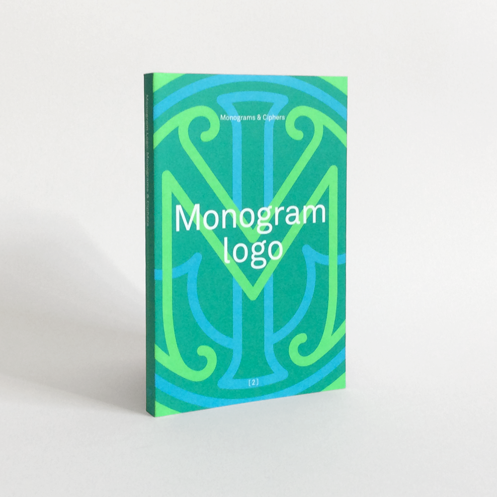
Borrowing a book titled Monogram Logo (published by Counter-Print) from the studio out of vague interest, I’m finding myself appreciating the art behind crafting solid monograms. Whether the designs are fun and playful, or elegant and assured of itself, there is a lot of good design packed into this physically small book.
Monogram Logo by Counter-print, 2014
Since the book I have ahold of isn’t my copy, I won’t scan pages from the book, I’ve found a few images of the contents here.
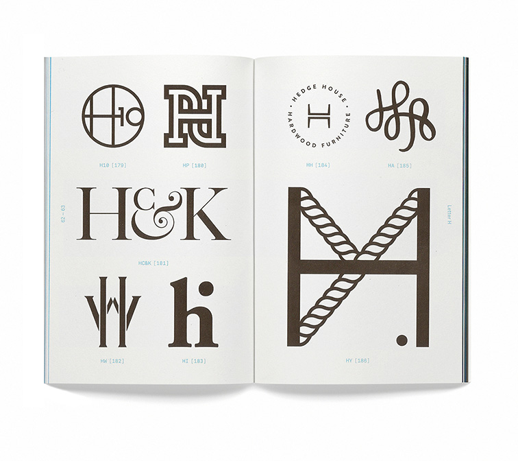
Page spread from the “H” section of the book.
There are only so many letters in the English alphabet; so there are people, services, companies and so on, who will inevitably share the same set of initials! This book groups monographs by the leading letter of the insignia. There is a section for almost every letter in the alphabet.
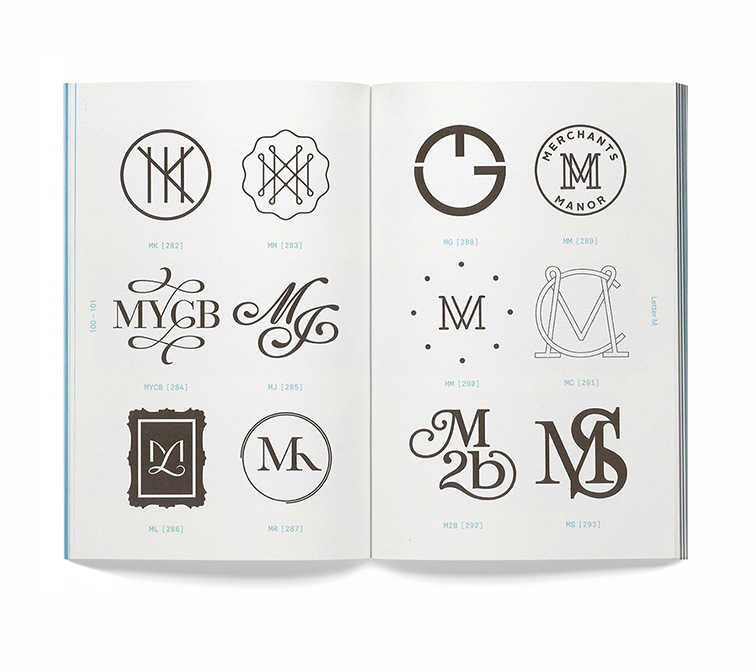
Collection of “M”-centred monograms.
The number of monograms on each page differs and they are speed out in an easily-digestible manner – all numbered and tased with the letters used to construct each monogram. Each “chapter” – for lack of better word – lists the graphic’s origin, purpose, the designer and year it was created.
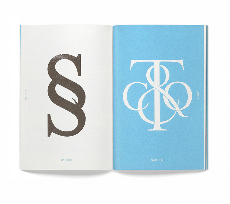
End of “S” and start of “T”.
The book itself is a beautiful object. No doubt about it. But it’s also a resource of inspiration and knowledge.
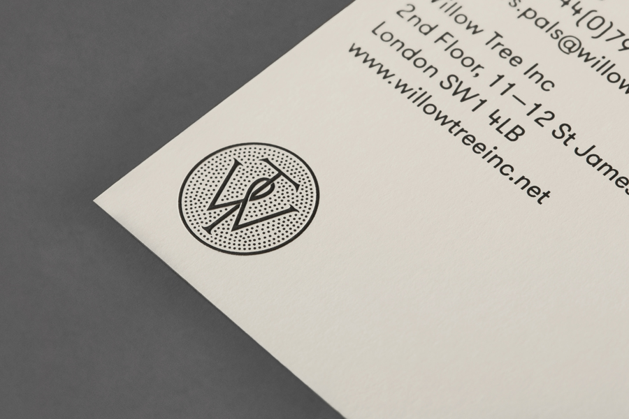
BP&O mockup of the Willow Tree logo, designed by Bunch.
The above mockup for the Willow Tree logo from the renowned agency BP&O shows the standard of monogram and cipher icons chosen for the book.
Searching for the logos seen in the book online, I can find some of them in use, out in the wild.
Myself, I’ve the initials “I”, “N”, and “C”. Of course it spells out the abbreviation of “incorporated”, but it’s also a homophone for “ink”. I’d like to make some rough drawings of my initials to see if I can’t also create a type-based icon or monogram to use myself (even as a stamp).
Do you have a favourite logo made of type that forms a monogram? Does it capture the spirit of the product or service that it’s trying to convey?
On the commute from home to campus, and then back again, I’ve had time to read. I had missed reading regularly! The cover of the novella I’m presently reading (a UK Penguin edition (and translation) of Bohumil Hrabal’s Closely Watched Trains) is composed of a photomontage. I’ve been thinking about what I’ll read next, and how many books will catch my eye for their cover.
Chip Kidd created the iconic Tyrannosaurus rex skeleton silhouette for the 1990 science fiction novel Jurassic Park – the same dinosaur’s silhouette was used to create the park’s logo used Steven Spielberg’s film adaption. The inspiration for the skeleton silhouette came from a visit to a New York museum, and a non-fiction dinosaur book purchased while there.
Chip Kidd’s cover for Michael Crichton’s 1990 novel, Jurassic Park
I have never looked for in-depth information on graphic designers who work with publishers and authors in the past. It’s something worth looking into. With a quick search however, I did find an insightful video published by Random House; with commentary by their own book cover designers.
In this short video, The Art of Cover Design, a small number of Random House book cover designers’ insights; Robbin Schiff, Chip Kidd, Christopher Brand, and Peter Mendelsund tell us about making book covers they feel will have the most impact and most importantly, “last”.
“You never really want to call out a character in full, because a very important part of reading is being able to imagine the characters yourself.” – Peter Mendelsund, The Art of Cover Design
In referring to his cover jacket for The Girl with the Dragon Tattoo, Mendelsund remarks “Can you get away with a day glow cover, on a book like this?” and it’s taking such risks that arguably make the first edition book cover stand out.
Peter Mendelsund has created many designs for books whose authors are no longer around to discuss choices with. I imagine it is both freeing and daunting – if one doesn’t limit one’s own routes and alternatives to the endless possibilities of a design.
I’ve been thinking to myself, it would be nice to create some art for the covers of books that I am fond of. Or maybe books that I have been newly introduced to… It would be worth fiddling with my schedule to find time to create some book cover artworks, even rough drafts, and share them online.
Are there books that you feel you’d like to design a cover for…?