Graphic Design Festival Scotland 2018 – Entry 03

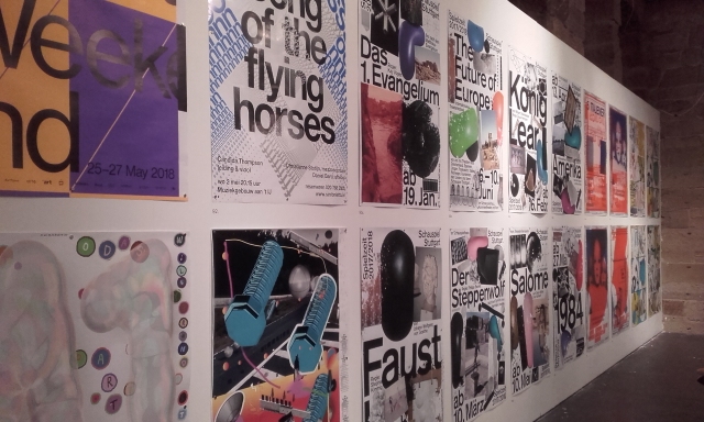
Time to wrap up the trip to Graphic Design Festival Scotland 2018! I’d like to go through the process of risograph printing in more detail in future, but for now I’ll share the basics while I record the riso and book making workshop.

The workshop I’d signed up for was held by Good Press, an independent book store and volunteer run organisation promoting the production and sale of self-published books. They’ve almost no restrictions for the contents of the books, but if you want them to stock your book, best be sure sure your work is in good taste!

20181023_095220
Set up for Good Press’s workshop. Though, I don’t remember being awarded a “Certificate of Achievement”…

The aim of the Good Press workshop “Property, Concrete Poetry & Poor Art”, was to to produce a small, collaborative publication full of insight to Glasgow’s many facets; to celebrate Glasgow. There were a good deal of people who turned up, so the workshop split into two groups to make two independent zines with the same aims.

The tools given were papers, a card viewfinder, marker pens, and thick graphite pencils. Everyone was free to use phones or cameras to record imagery, but the final outcomes were made with only the aforementioned tools.

As a group, or as individuals, participants left The Lighthouse in search of street art, architecture, people, and lost items. Now, it was my first time visiting the city, so I was rather unknowledgeable about the place. I did find myself making rubbings of signs, taking pictures of buildings and scribbling sketches of patterns as I tried to learn more.

By the end of the hour spent researching the city and its people, everyone needed enough information to form two A3 sheets of paper to contribute to the zine.

20181023_104810
Panda spotted, opposite The Lighthouse!

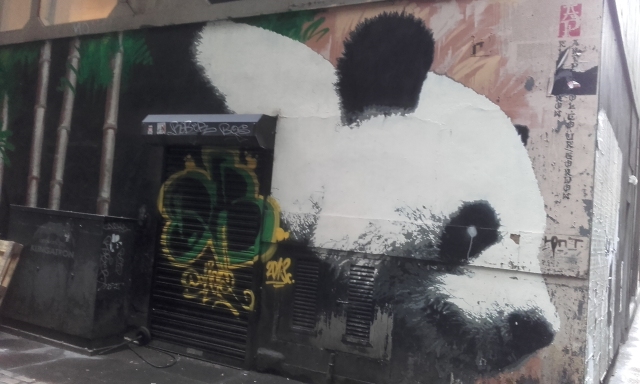
For such a big place, Glasgow was extremely tidy! I was hard-pushed to find any trash or misplaced belongings scattered about. There happened to be plenty graffiti down side streets, but it was more or less just folks tagging themselves than a serious piece of street art. It was also an extremely cold and gloomy day to hunt about an unfamiliar city. Not everyone ventured out, or even very far from home base.

20181023_144823
The composition I arranged for the teal layer of my print.

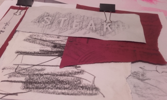
Above, I’ve collected rubbings from a steak house and public sculpture, a phrase taken from a neon sign in a small café, and quick impressions of buildings – they’re all held together with bulldog clips.

I amassed enough details to form the image I wanted, and I took a good while to adjust the compositions of the both images I needed to form the final visual. You see, both A3 compositions were to be layered on top of each other by the riso printer.

The riso printer works similarly to a monochrome photocopier – in that it copies whatever happens to be put on its glass, but it also burns whatever it has captured into a stencil, and then the stencil is used for multiple prints. While a riso printer can only print in one colour at a time, and only use one stencil at a time, after waiting for prints to dry, you can easily layer other images and colours not unlike screen printing.

43492624_1077867025717618_2834377497784196359_n
The groups folding their finished riso prints in preparation for binding the pages. Photograph credit to Graphic Design Festival  Scotland’s Deskgram.

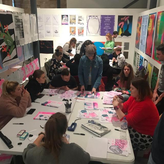
Teal and pink sure were a popular combination of colours! And once everyone had enough copies of their work, (about 12 sheets per person,) we all folded our A3 pages in half to form double-sided A4 sheets. We all laid out our work on the floor in a row, to get a better idea of the contents of the zine. We took little time to decide on the page order. Once decided, with the open end of the sheets all aligned as the spine, the pages were stapled together to form the book.

zine cover
For the group I worked in, this became the cover.

I was happy to have my print function as both the cover and first page of the publication. My piece was the most dense with colour, and that’s partly due to my use of bulldog clips instead of glue to hold my work together. The gradients of colour are shadows caused by outside light that got though the gap between the printer’s glass and the lid, as the clips don’t allow the lid to close flat.

I feel the group I worked in generally wanted to celebrate the city’s visuals and communicate in pictures more so than words, because sculpture and street art were common topics. I found the experience enlightening and fun, and I look forward to using risograph printers in future.

Graphic Design Festival Scotland 2018 – Entry 02

Hey, now that I’ve got more time, how about a real introduction to the Graphic Design Festival Scotland, then? This creative festival has been around since 2014. It’s held in Scotland’s National Centre for Design & Architecture, The Lighthouse, and each year, GDSF hold events, including one to two day workshops that anyone can take part in – if you book in advance. The workshops can include anything from making your own animations and typeface to printmaking sessions and learning to code websites. I picked a risograph printing and book making workshop to try out something new.

20181022_185115
One wall of the highest-rated International Poster Competition entries from 2018

The main attraction of GDFS would be the poster design competitions and galleries. There are two divisions; a national campaign for youths across Scotland (aged 8-26 ) called Young and Powerful, and the International Poster Exhibition, which is open to everyone the world over to submit their poster entries. Now, these posters can cover a wide range of subjects, be it a comment or critique on the state of the world, an advertisement, or a just personal thought. Regardless of the content, they’re exhibited in a celebration of contemporary design. Below are a handful of the International Poster Competition entries that were originally created to promote various creative arts events.

134787_large
“Nacht van de Beeldende Kunst” by Vrints-Kolstern & Christophe Synak, 2018

“Nacht van de Beeldende Kunst” (Night of the Visual Arts) is a temporary, public celebration of contemporary art, and the exhibitions are open until the early hours of the morning, so it’s pretty fitting for such an ad to be dominated by deep black. The initials are skilfully pushed to near-abstraction, while still retaining legibility. 

de1e496b49079056c6abd486d04f9fef
“Minuit avant la Nuit” by Formes Vives, 2018

This advertisement for the music festival “Minuit avant la Nuit” (Midnight before the Night) is the type of imagery that rewards the viewer the more time spent with it; I hadn’t noticed the eyes within the shadow of the moon the first time I saw the ad. Besides the screen-printed aesthetic, I feel that the most attractive quality is the hand written text.

d39adf28-dc28-4372-8f8d-a9da233a7f27_rw_1920
“Trommeln über Mittag” by Erich Brechbühl, 2018

When surround by many brightly coloured posters, the pastel palette in this piece feels refreshing! This is a theatre poster for a comedy about “esoteric therapies”. All the information needed is presented to us, but to read it all, the viewer is eased into a visual rhythm.

tfddrdr
“TU-Nantes 17” by Super Terrain, 2016

If the mix of hot and cool colours don’t catch your eyes, then the light that catches the metallic text will! There is a lot going on in Super Terrain’s posters that are better appreciated in person, the colour gradients, the textures, and the typefaces. This is a fun, loud, and energetic composition, perfectly tailored to sell the creative events of dance performances, choreography workshops, and film screenings.

Seeing all of the posters at the event, and looking a little a closer at a select few has been rewarding. All these posters are so different in goal and execution, but all are successful in informing their respective target audiences the necessary information in order to perform as poster advertisements. This is because each graphic designer has a clear understanding of their audience, and how to market to their audience’s interests and sensibilities through the medium of posters.

As long as the target audience’s tastes are put first when creating an advertisement, the message should reach them with ease, create excitement, and even lead to an audience reaction.

Graphic Design Festival Scotland 2018 – Entry 01

Earlier this week, I was in Glasgow to attend an international poster exhibition, and a risograph printing and bookmaking workshop held by Graphic Design Festival Scotland, within The Lighthouse. I took many photographs of the poster gallery, and later picked up the show’s poster catalogue (as well as a book on USSR design from 1950 to 1989). In a future post, I’d like to go over a few of the high-ranking poster entries that exhibited this year’s international poster exhibition. There was a real mix of design to enjoy! I don’t plan on critiquing the posters, rather, I’d like to show the ones I liked, and share why I liked them, or why exactly they work as posters.

134786_large
“Antwerp Art 2018”, an international poster competition entry for this year’s GDFS by Vrints-Kolsteren, 2018

As for the book I brought back, Designed in the USSR 1950 – 1989 is full of wonderful design choices, and covers everything from matchboxes to automobiles. There’s even a section dedicated to sweet wrappers! Besides the fantastic colour palettes, there are so many unique typefaces to discover, too. Below is one of many posters from within the book; this one advertising a movie concerning high school students who form a secret society for the offended and weak.


133-Drug-Moi-Kol-ka
“My friend Kolka!” movie poster by Miron Lykyanov, 1961

Since I took so many photographs during the trip, (of the posters, the workshop, Mackintosh tea rooms, the botanical garden etc.) they’ll take some sorting through. The process of risograph printing is relatively new to me, so it will do me good to write about the process.

Screen Shot 2018-10-26 at 12.01.11
“Funny Zoo” chocolate wrappers, 1950s – 1970s

Reading week begins after the weekend, so by then I’ll have time to write up on the poster exhibition, the workshop, and maybe share more pictures of the USSR design book that I’ve picked up too. I also saw plenty of other nice collections of books when in town, and made note of the publishers or jacket designers.

Here’s hoping that my (phone camera’s) photos are up to scratch! There’s a lot to write about, and it’ll be much more fun to share with pictures!


Catch you later! And if you should spot any mistakes here, do let me know!