The Vasseur BALTIC Artists’ Awards – BALTIC Centre for Contemporary Art

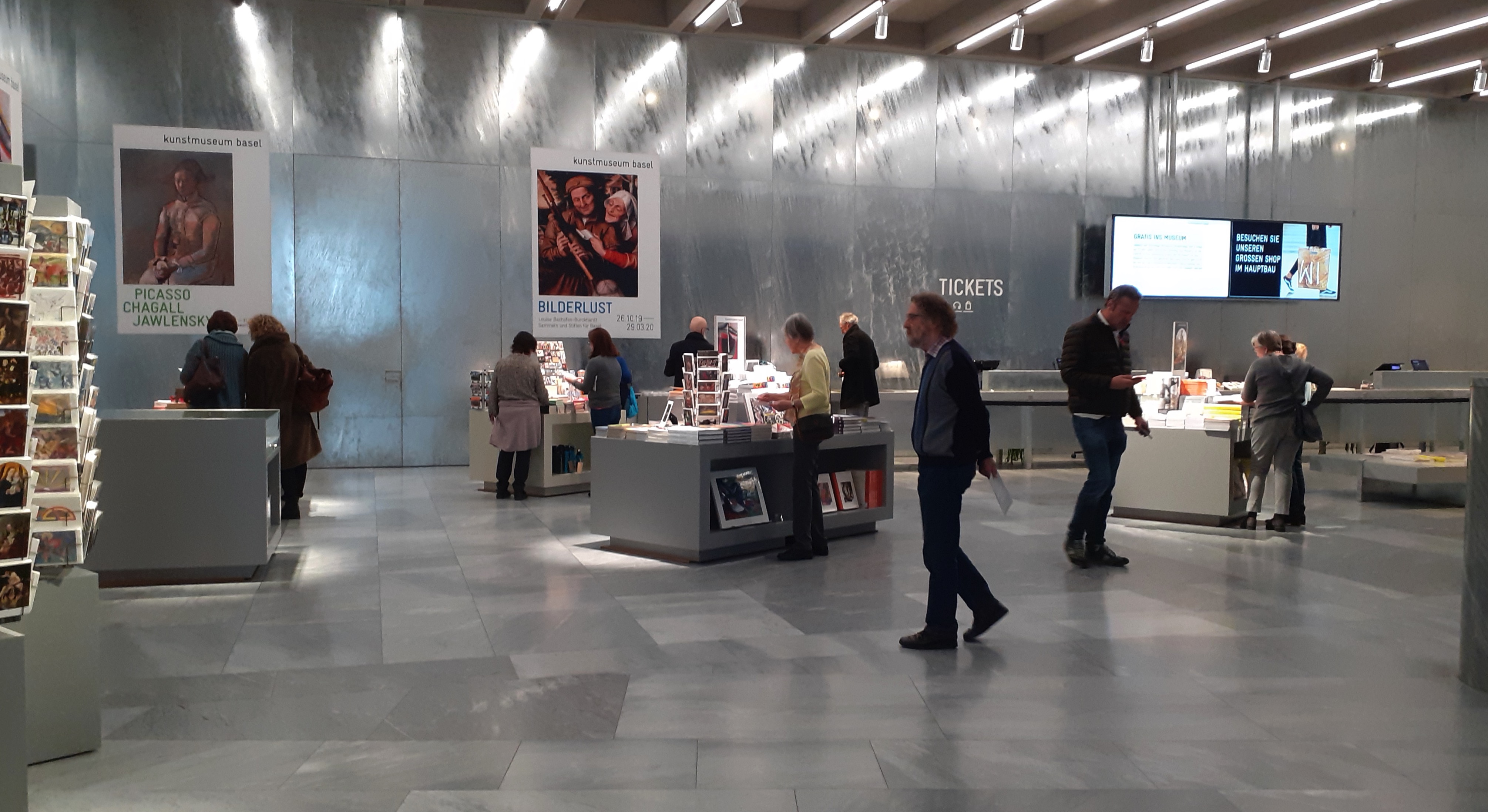
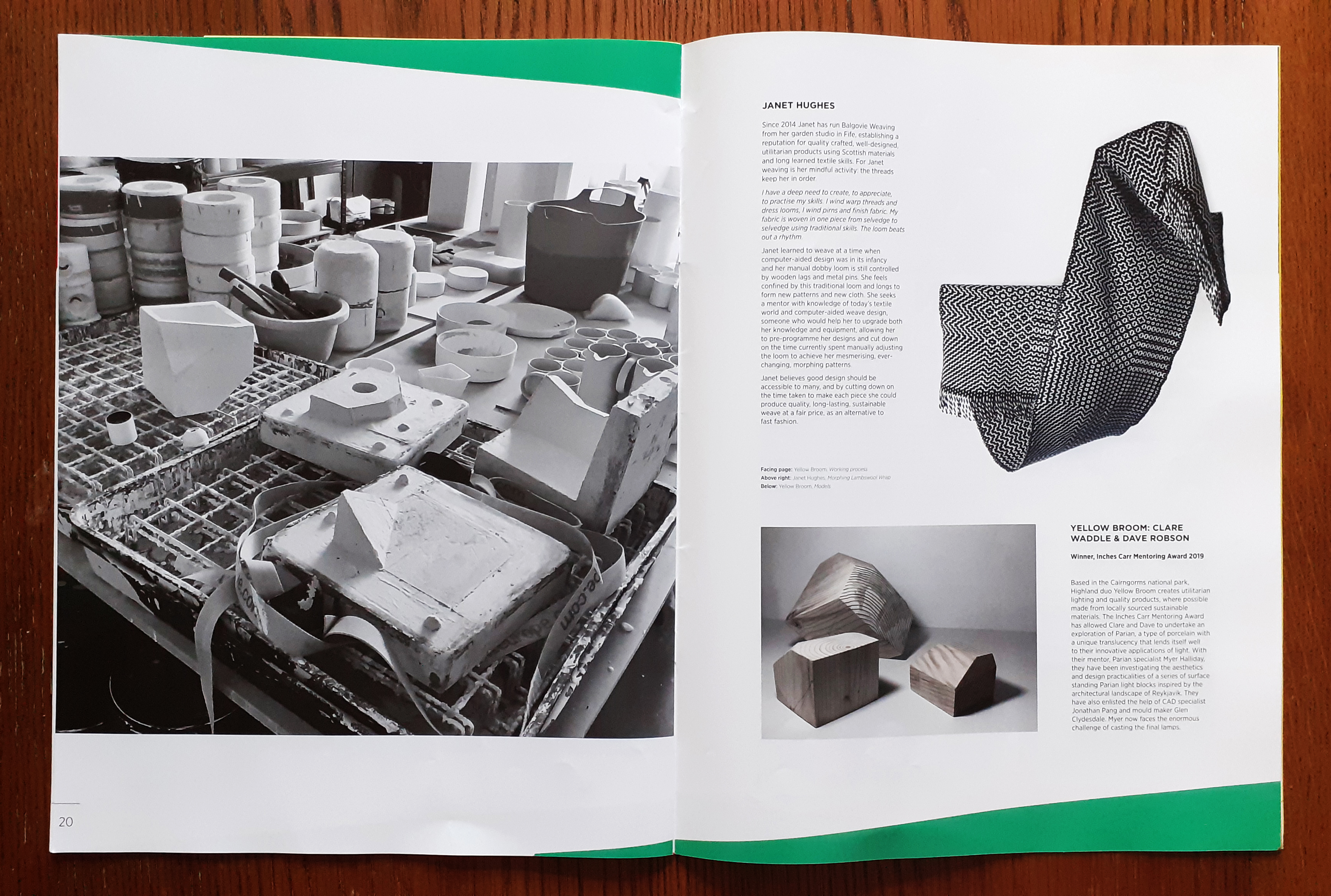
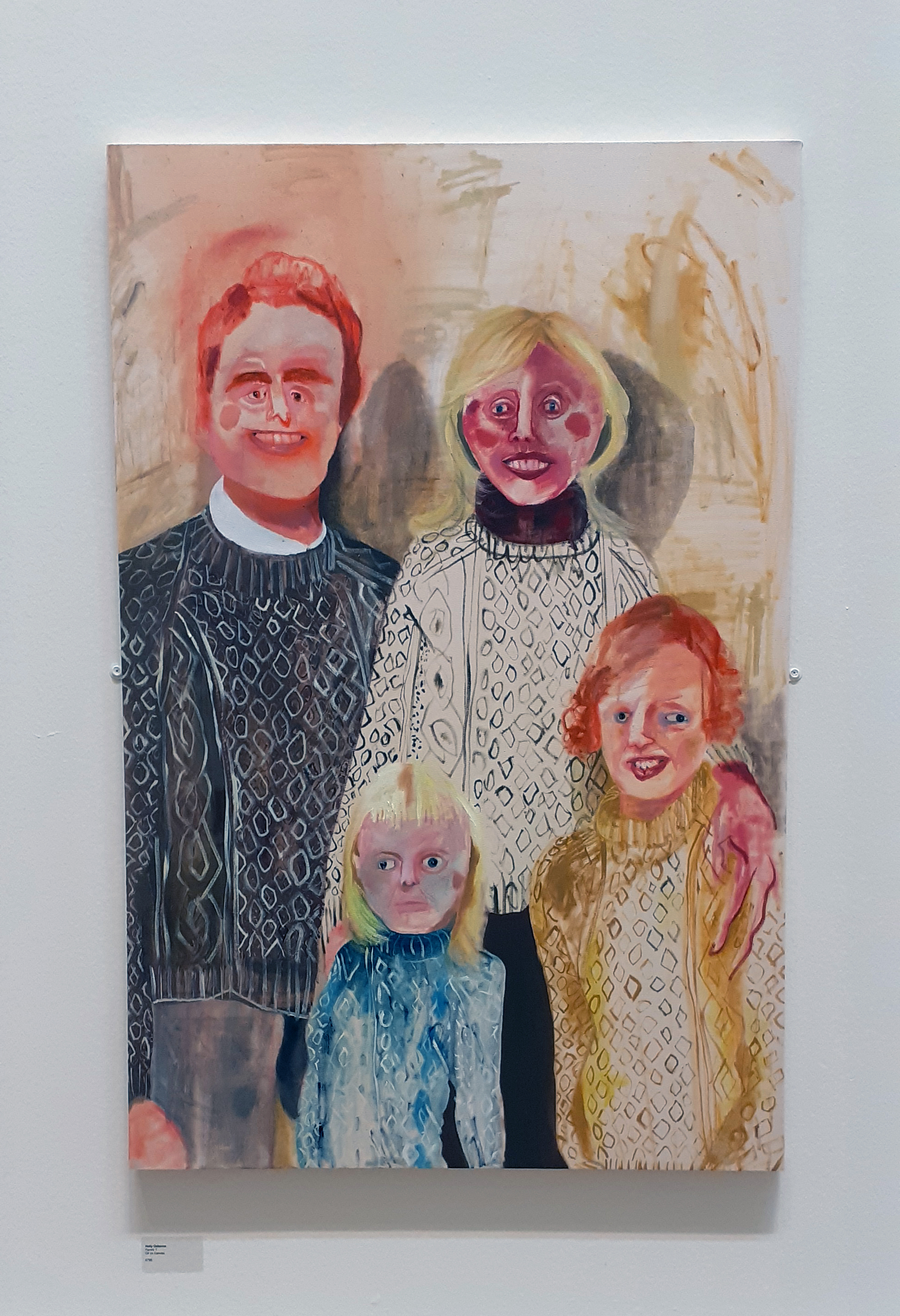
I met with a good friend recently, and we made a trip to the BALTIC art gallery in the quayside of Gateshead (north east of England). It is free entry. Galleries are good spaces to spend your time on a rainy day.

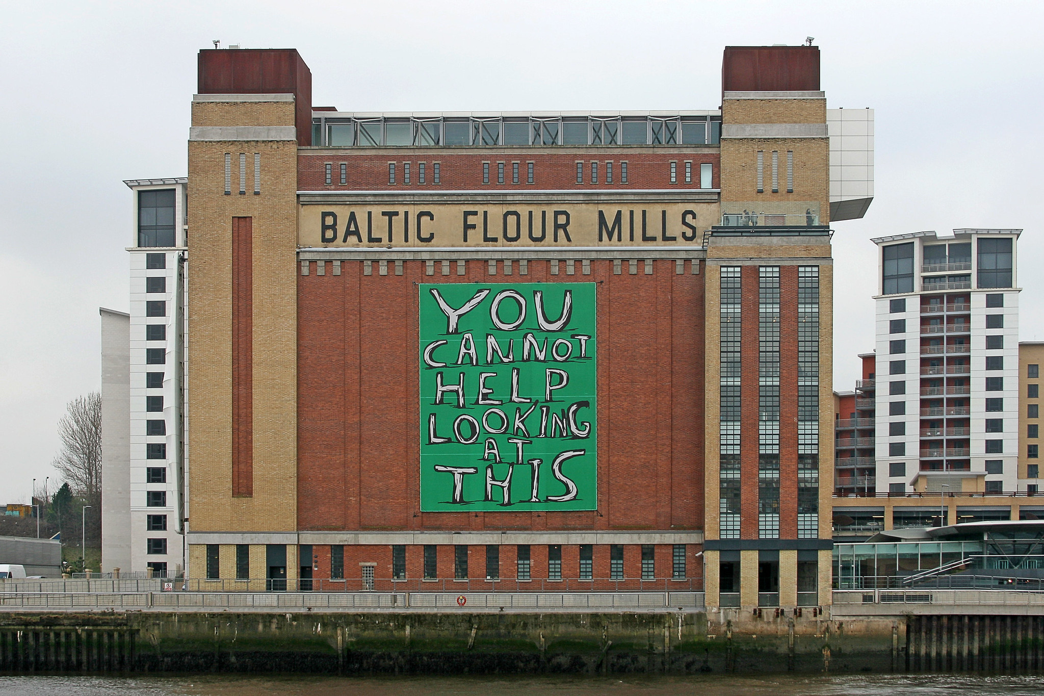
For those who do not know of the BALTIC Centre for Contemporary Art, it’s a multi-floored art gallery, redeveloped from a flour mill. You can read about the art gallery’s history on their own website here.

BALTIC art gallery outside building
The BALTIC from across the river Tyne, 2007, photograph © Leo Reynolds

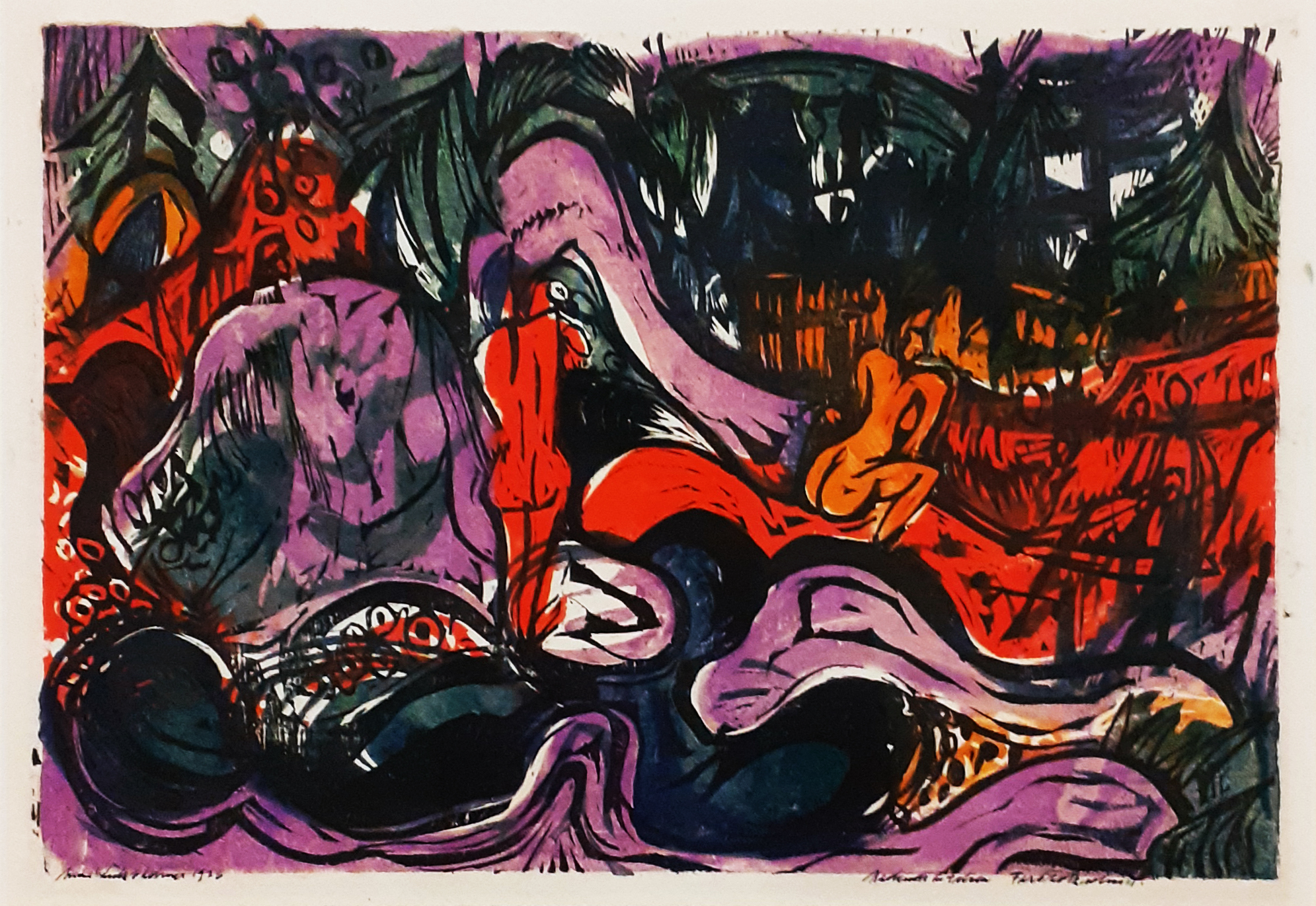
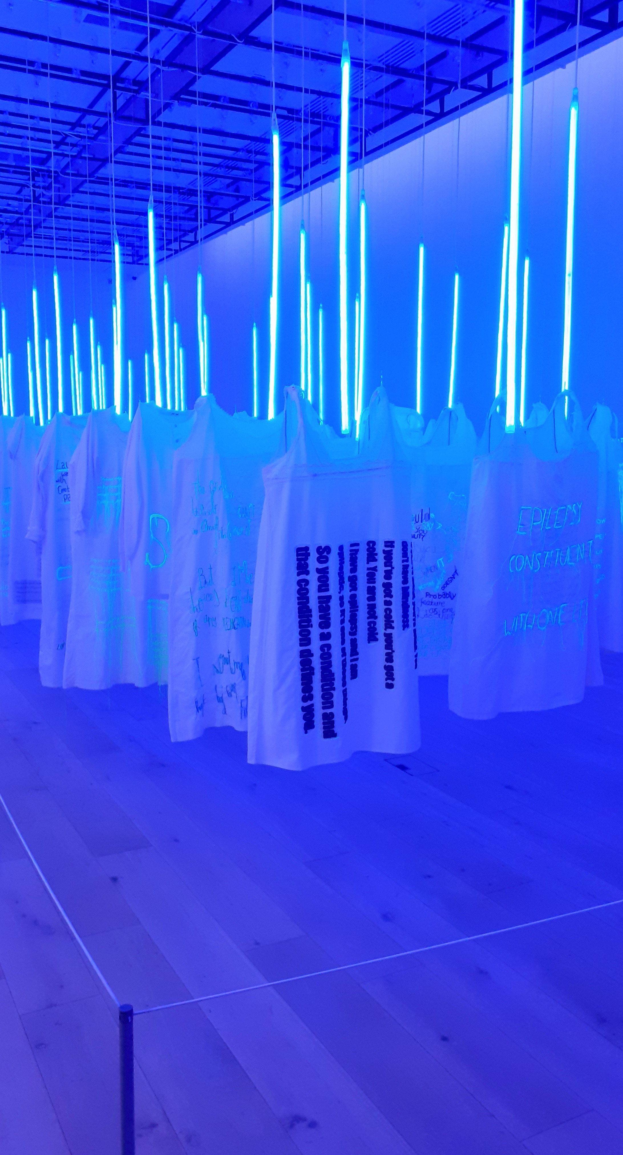
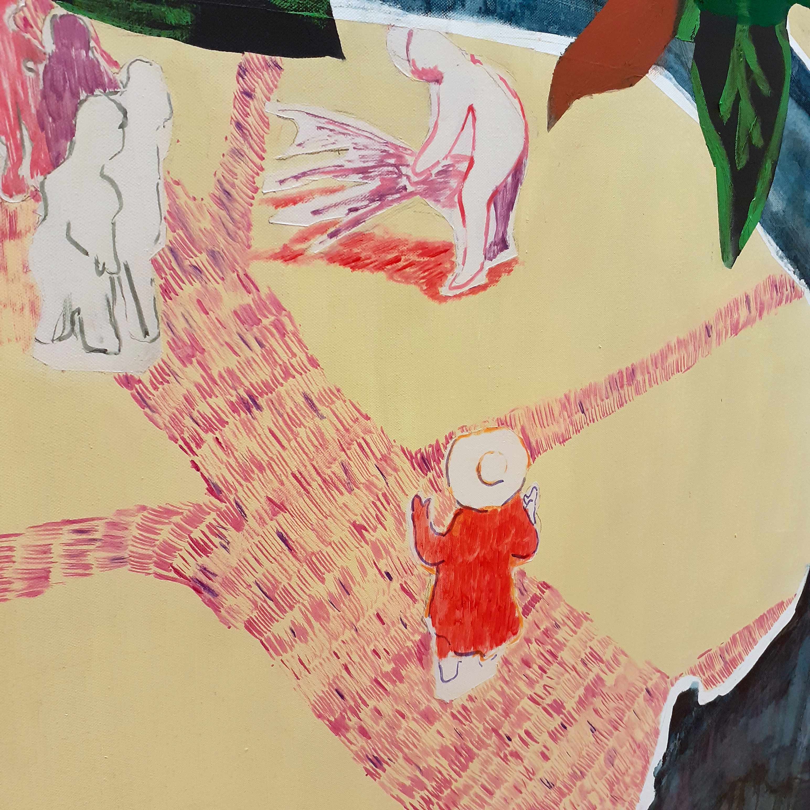
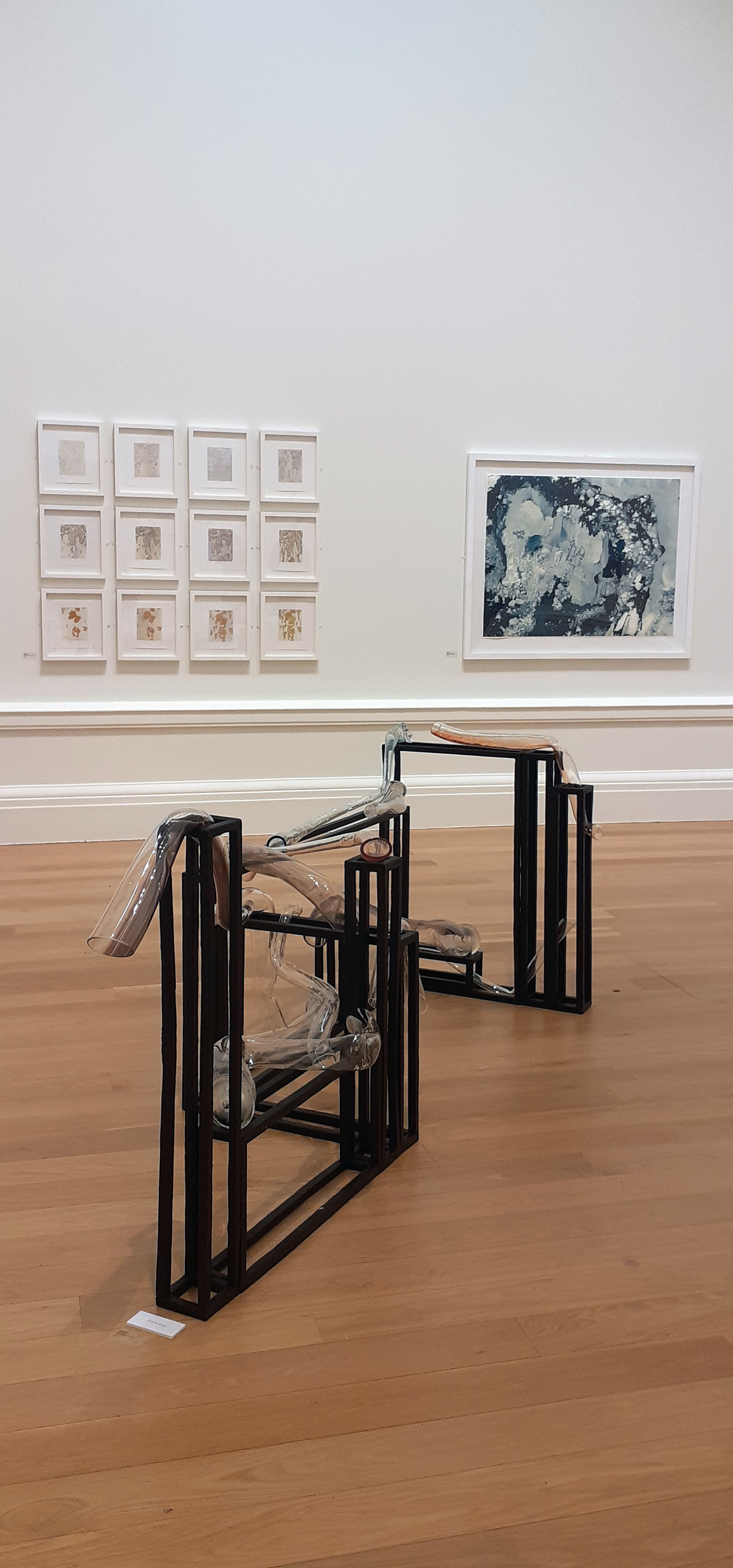
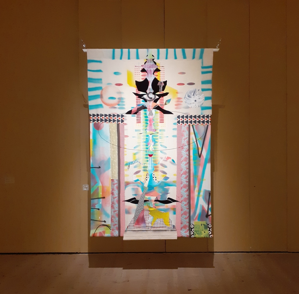
I took my time to soak in the contemporary art pieces and I very much enjoyed the atmosphere of the shared space; everyone brought together from their drive to enjoy art. I have some photographs to share of Laleh Khorramian‘s work that was part of The Vasseur Baltic Artists’ Award. It was the only exhibition that I took any photographs of, but not the only space that I found myself contemplating or reacting to.


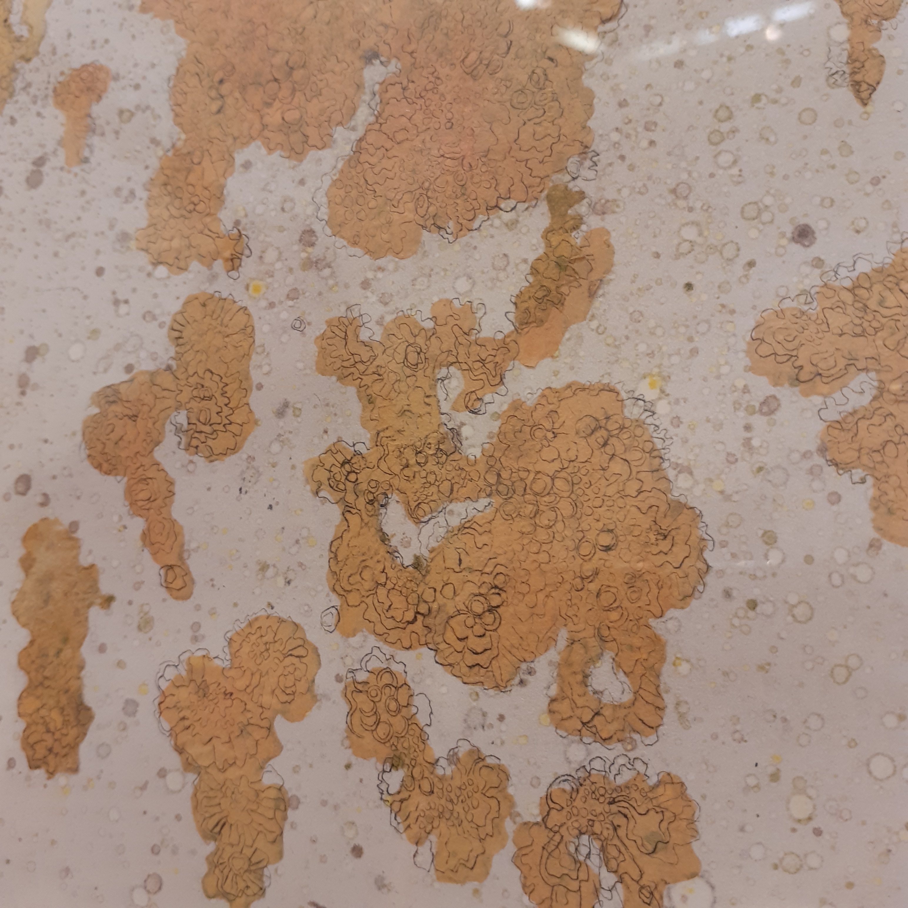
Laleh Khorramian is an artist from Iran, who presently lives in New York, America. The Baltic’s own website describes her work as “…using the ordinary to portray the epic, the universal and the transient, in a search for worlds beyond our own”. In the exhibition there are pieces created by drawing, printing, collage, and painting.

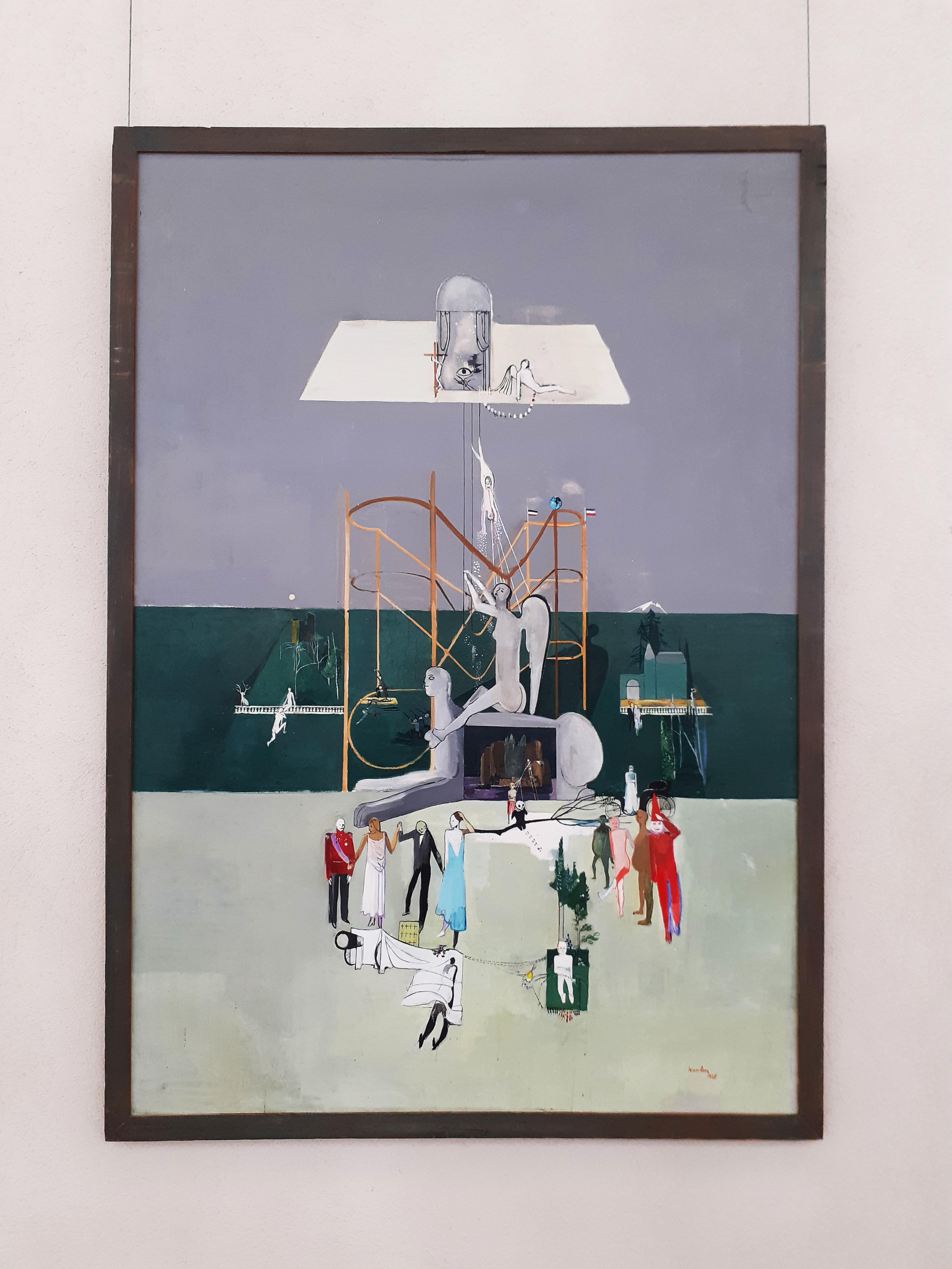
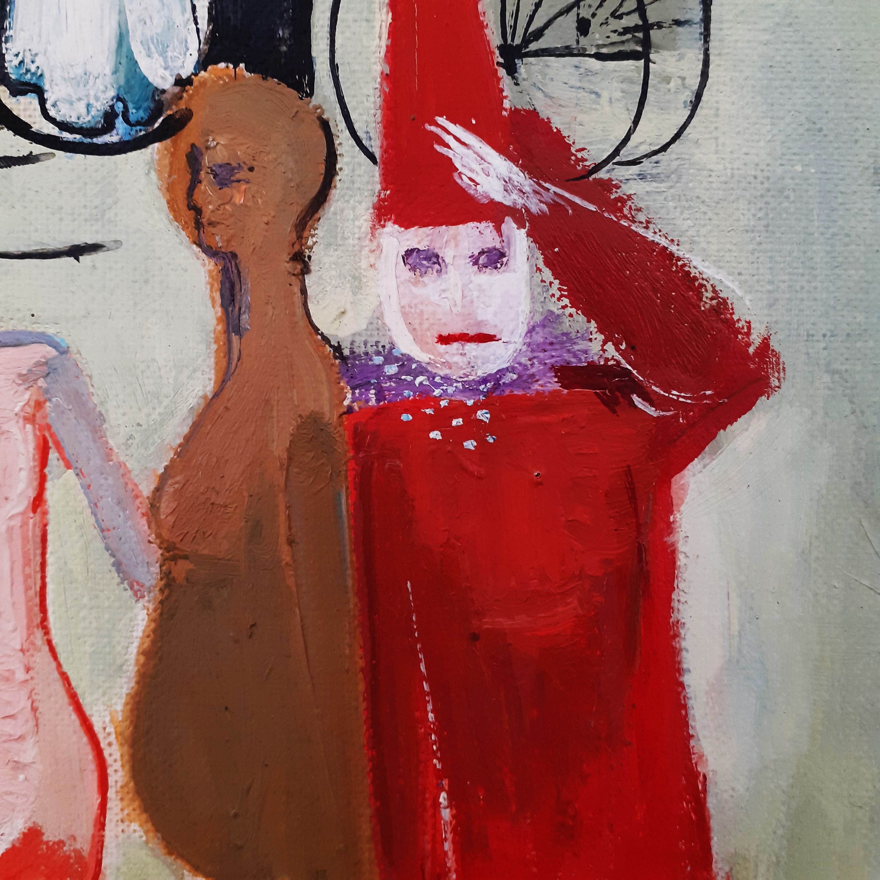
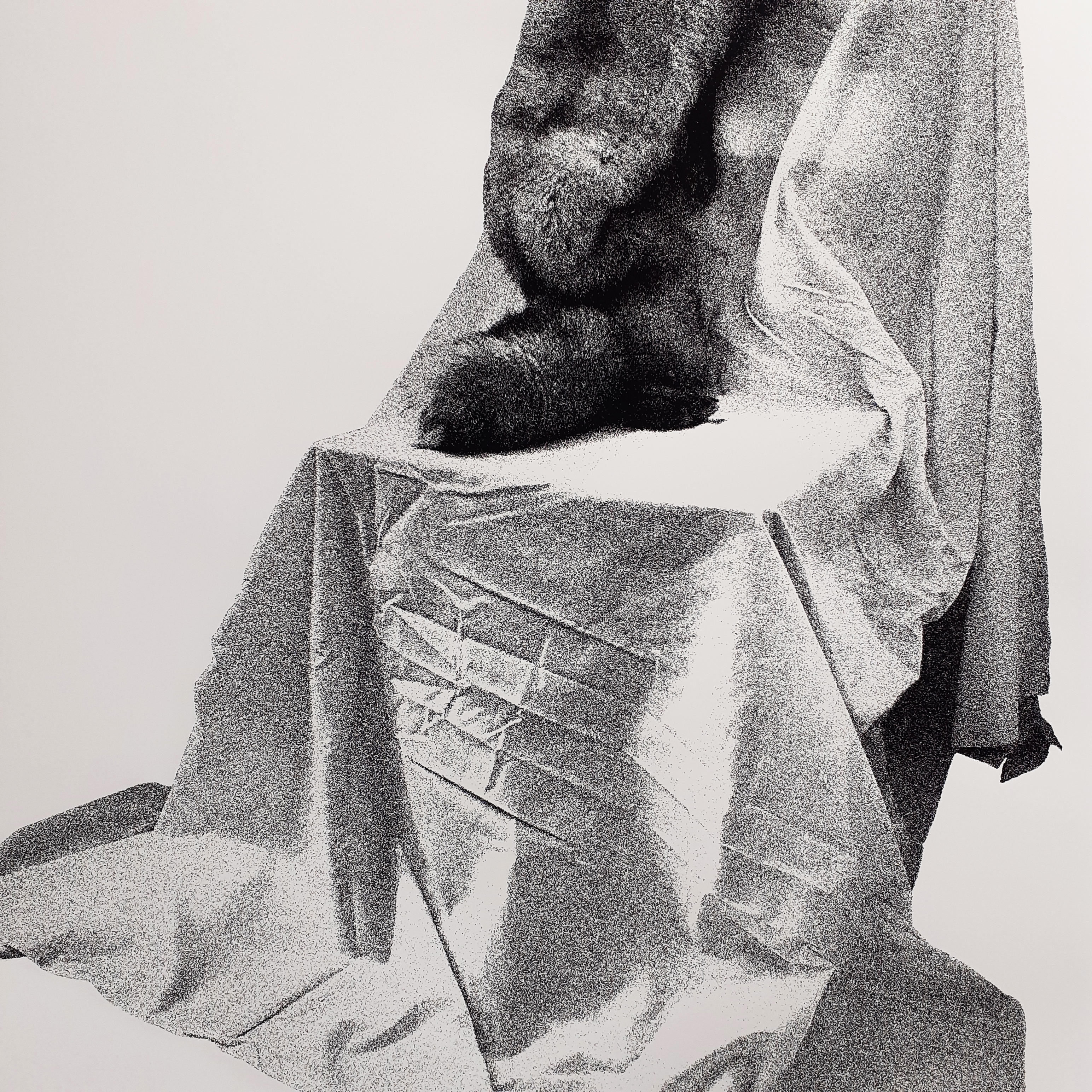
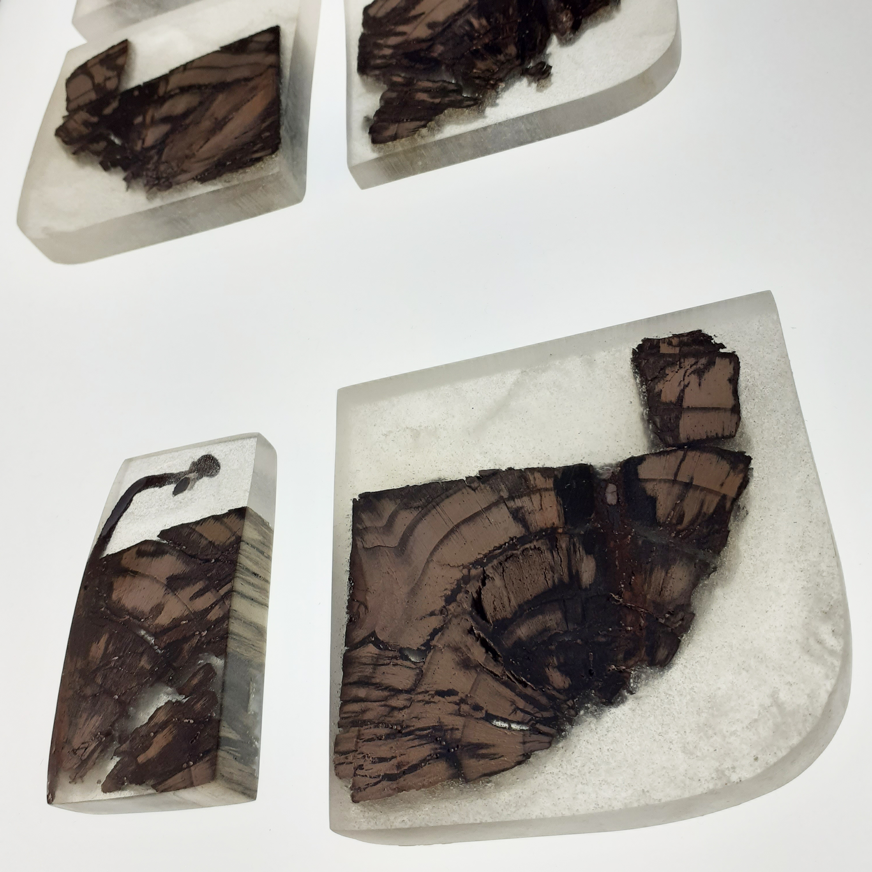
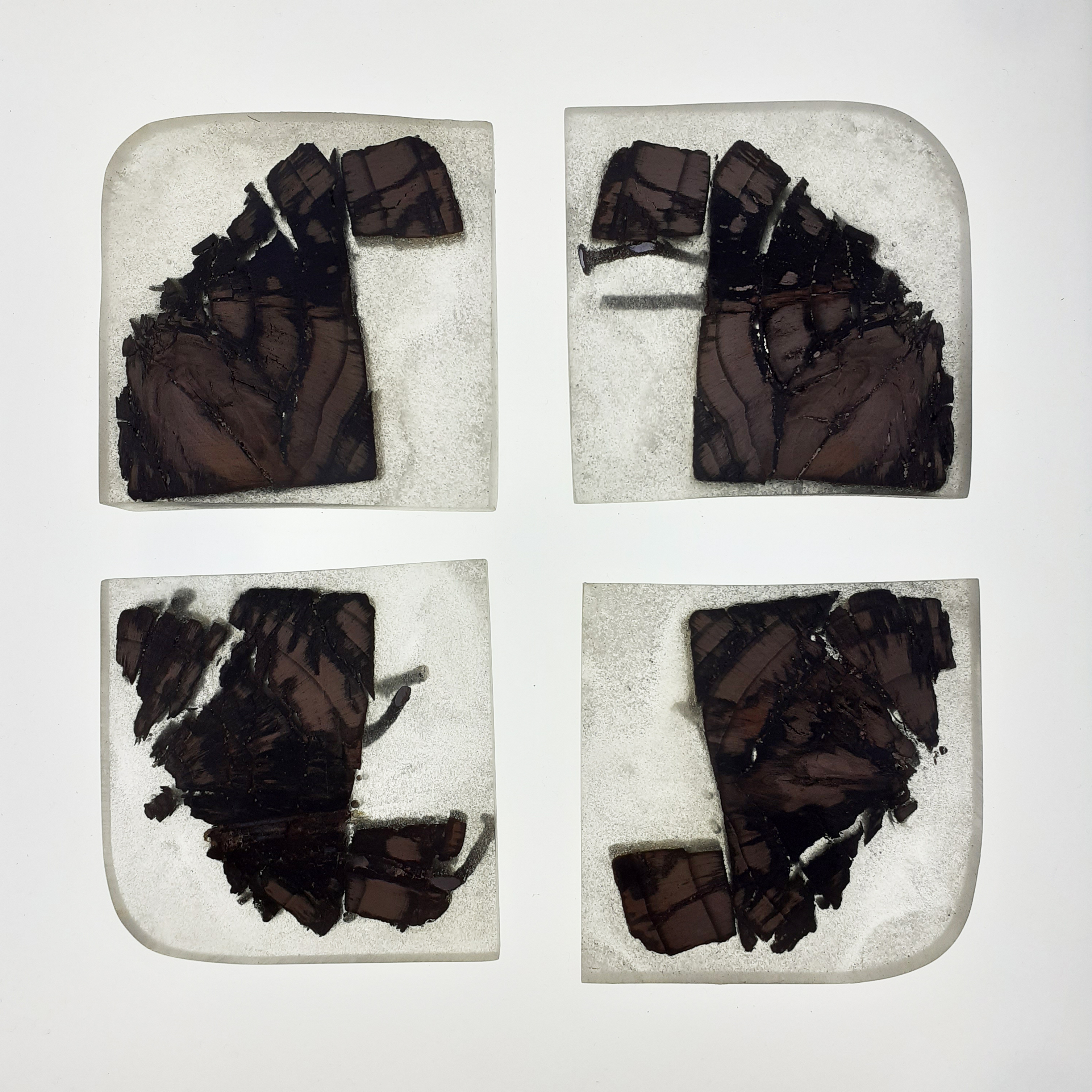
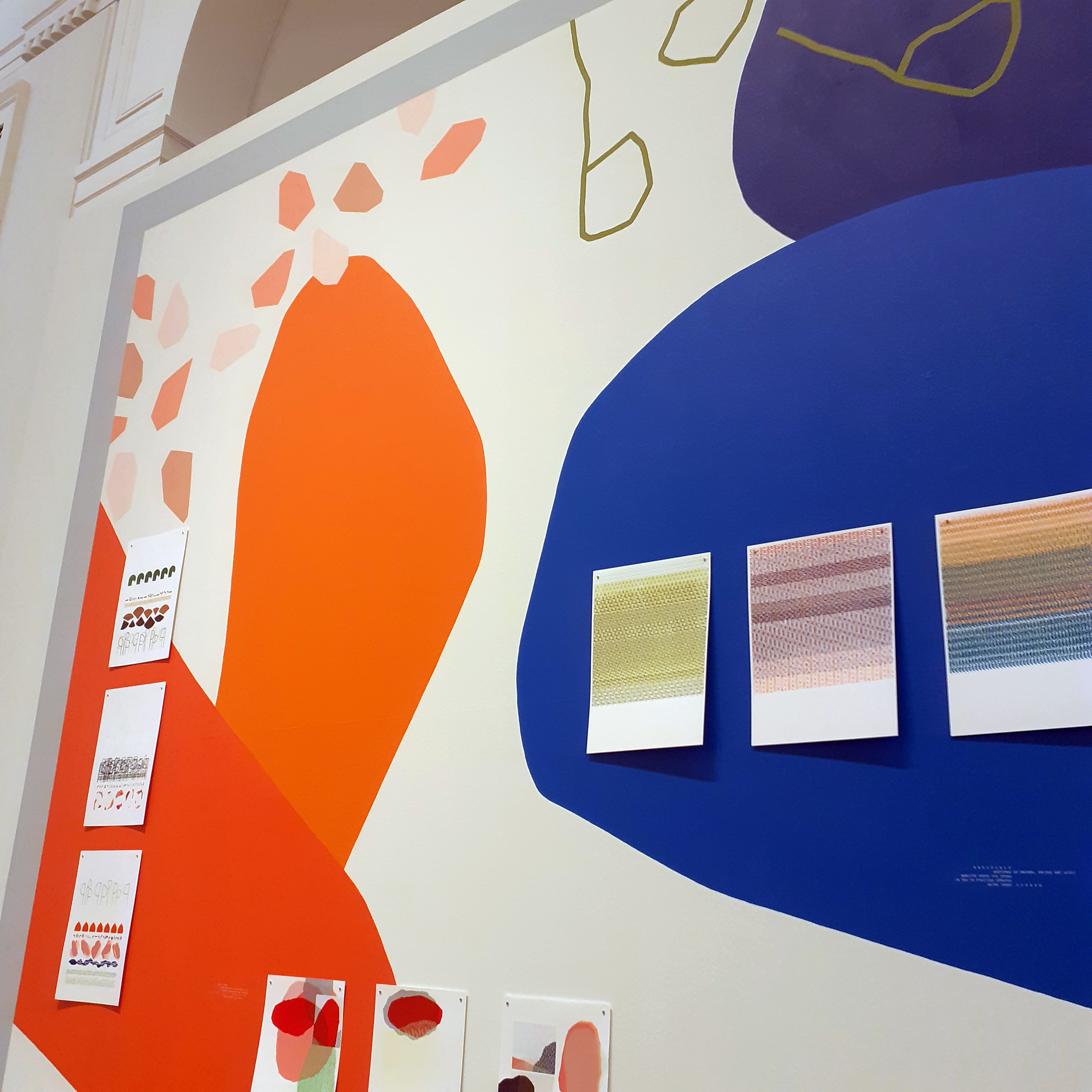
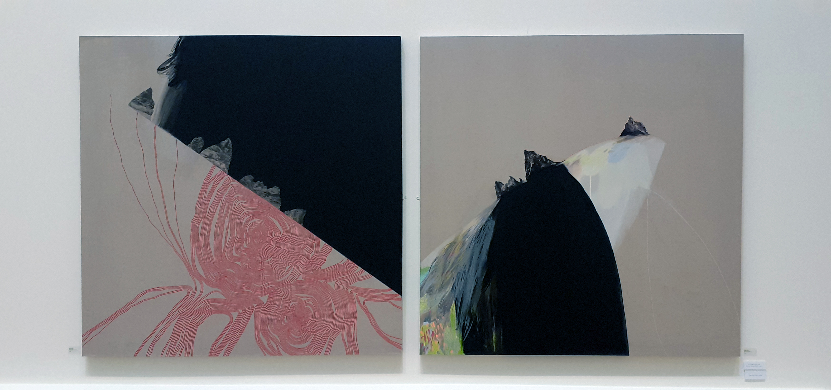
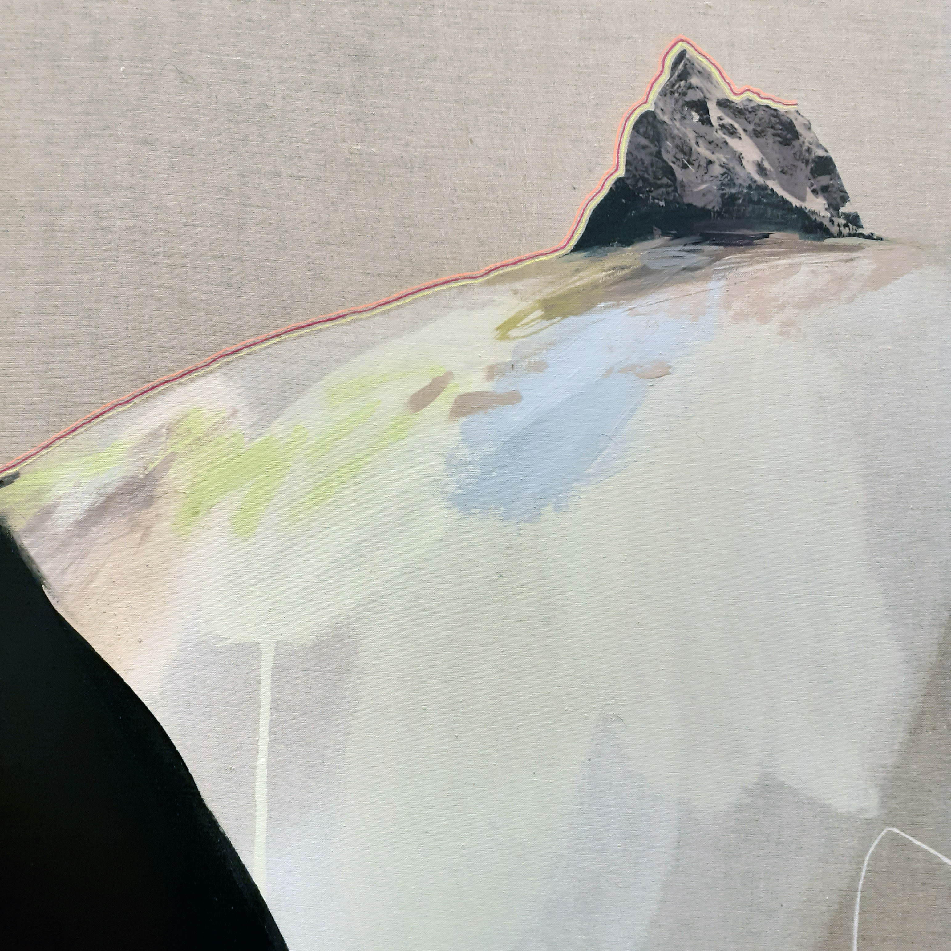
These pieces below are three of Khorramian’s tapestries, of which are created from a wide variety of materials, including: velvet, silk, cotton, and hand-dyed fabrics. They showcase the artist’s collage and quilting skills. The tapestries lead me to a mediative state – being almost overwhelming when trying to focus on each one in their entirety. It was good to take time to contemplate each element of the grander picture.

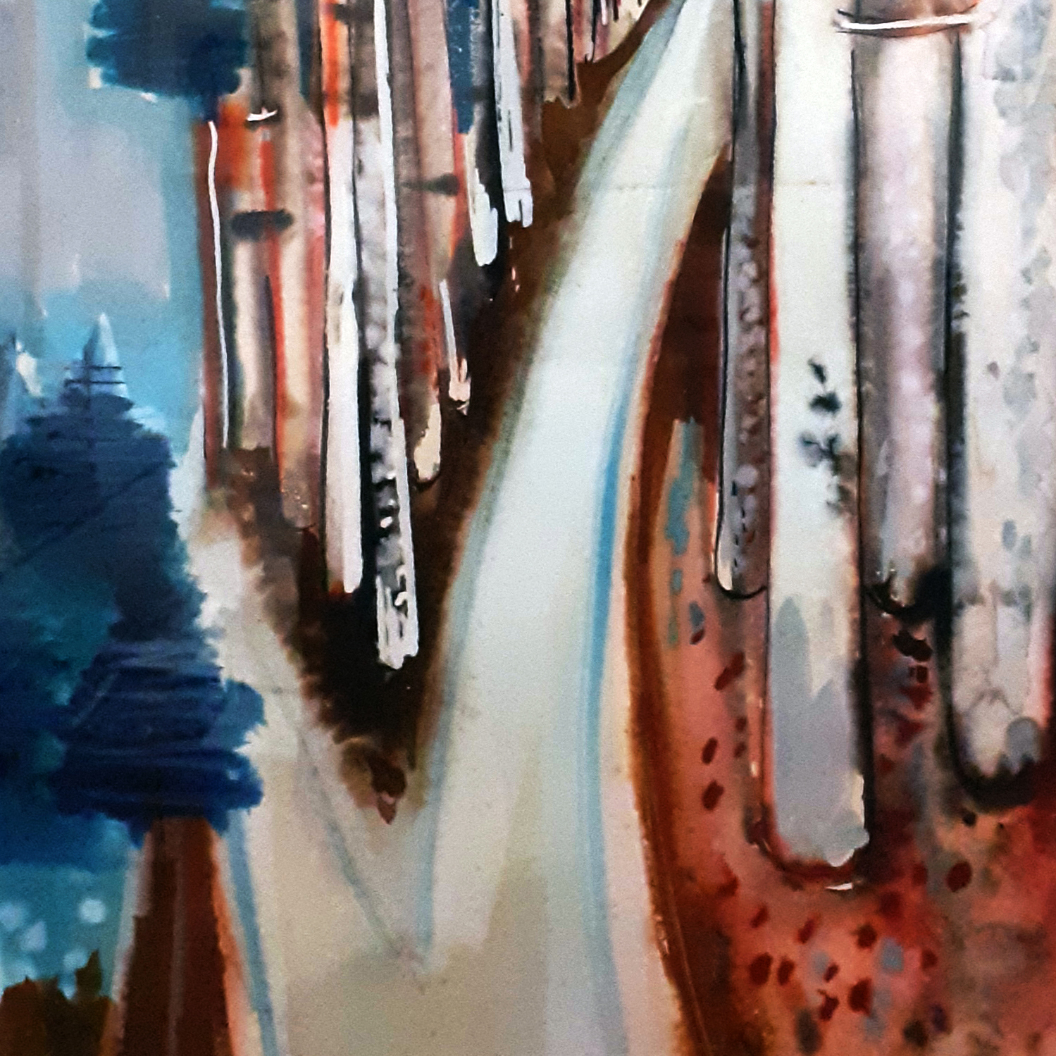
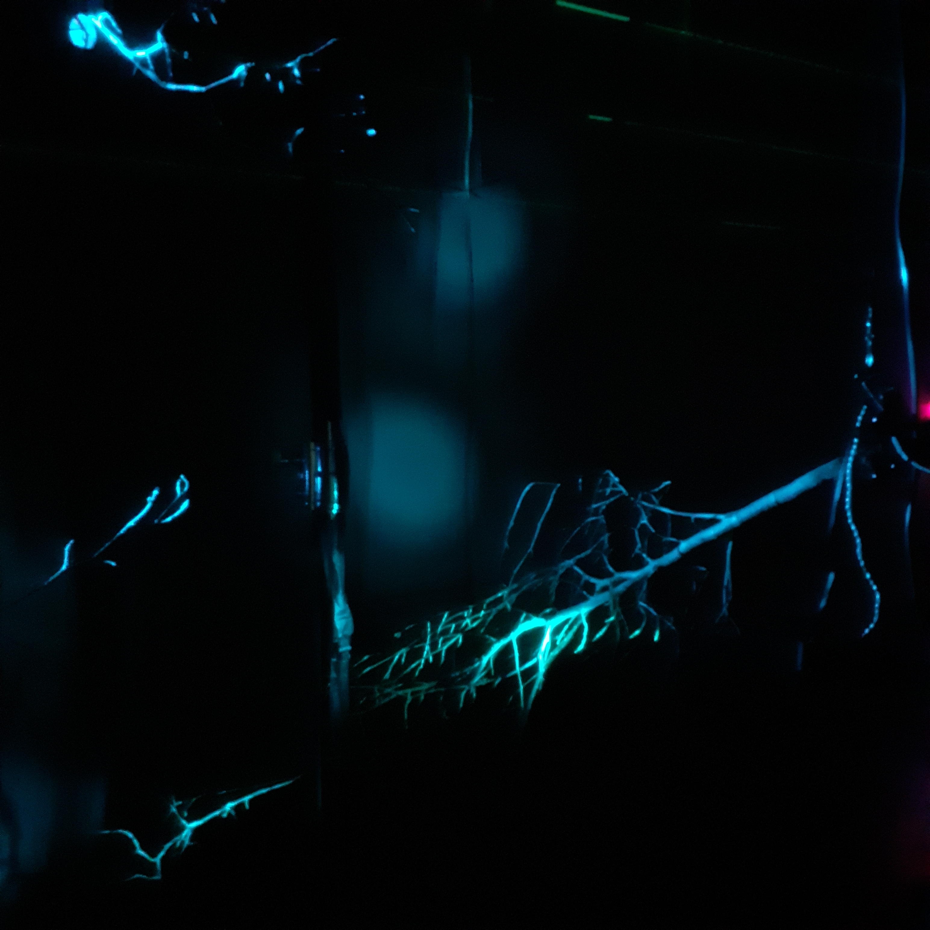
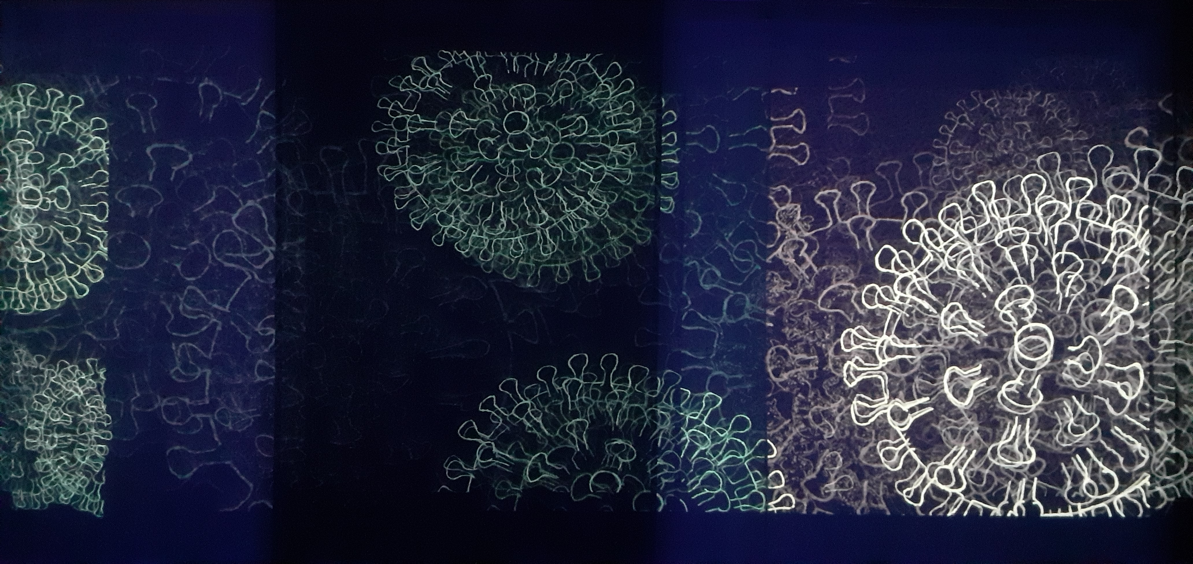
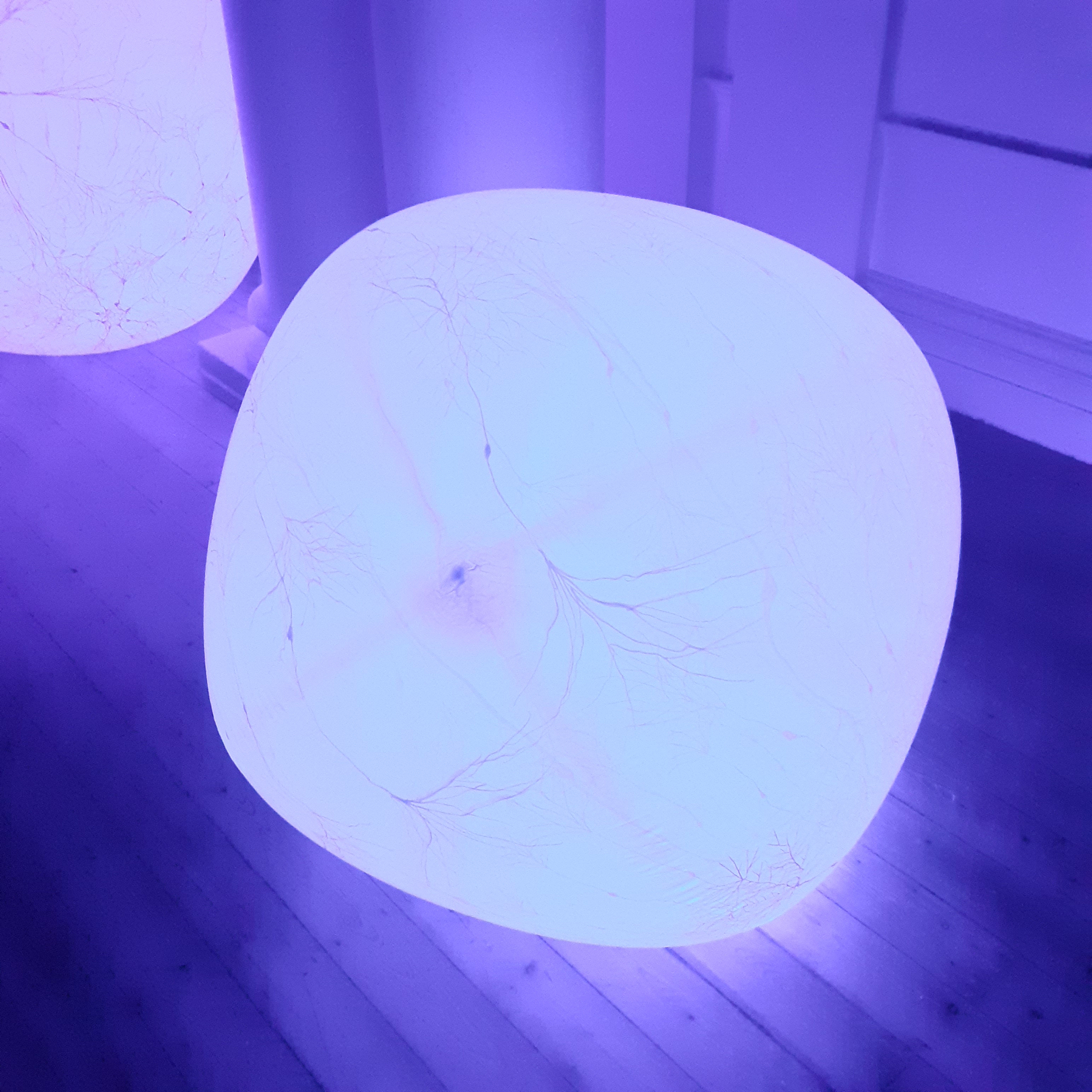
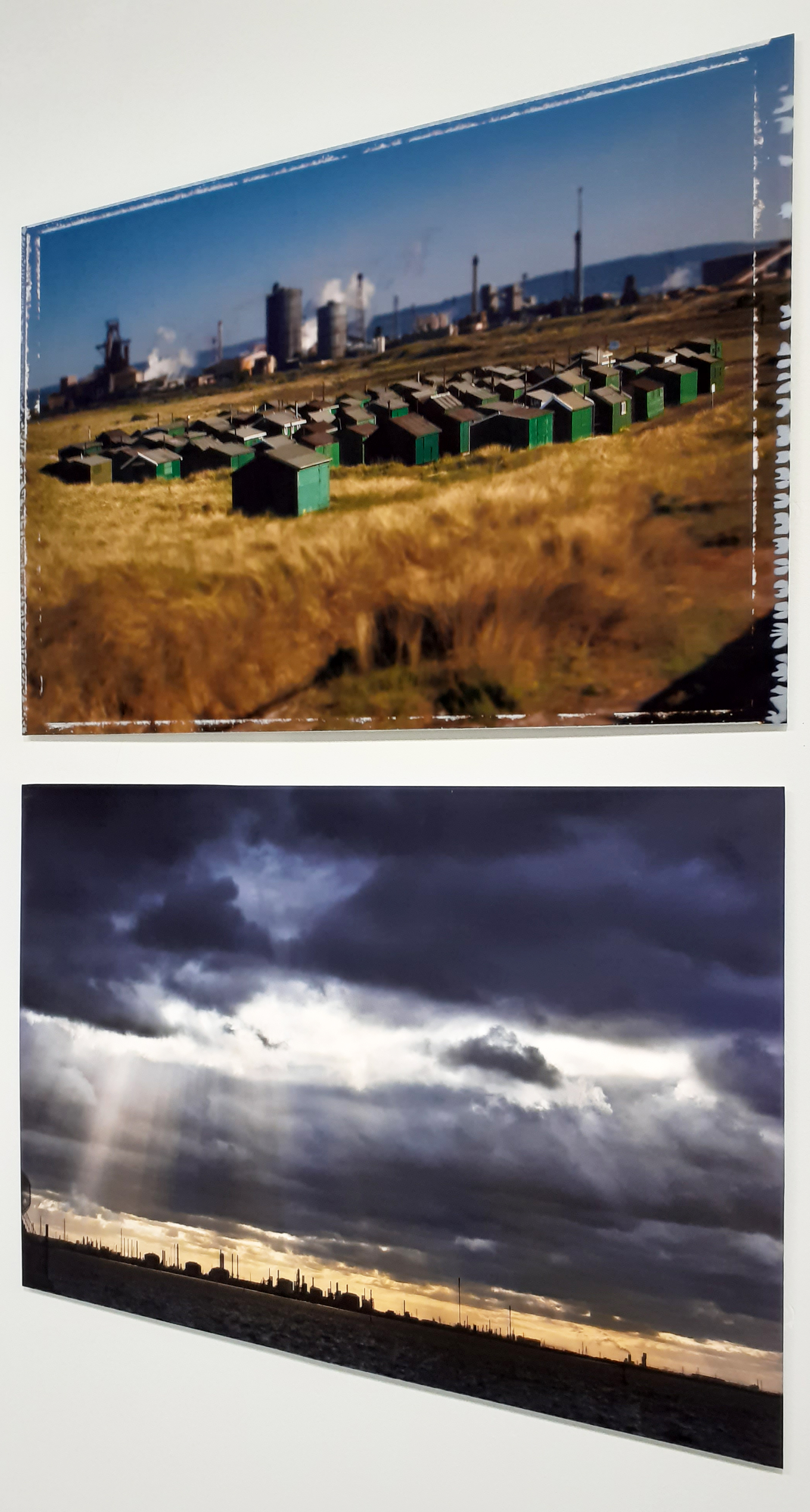
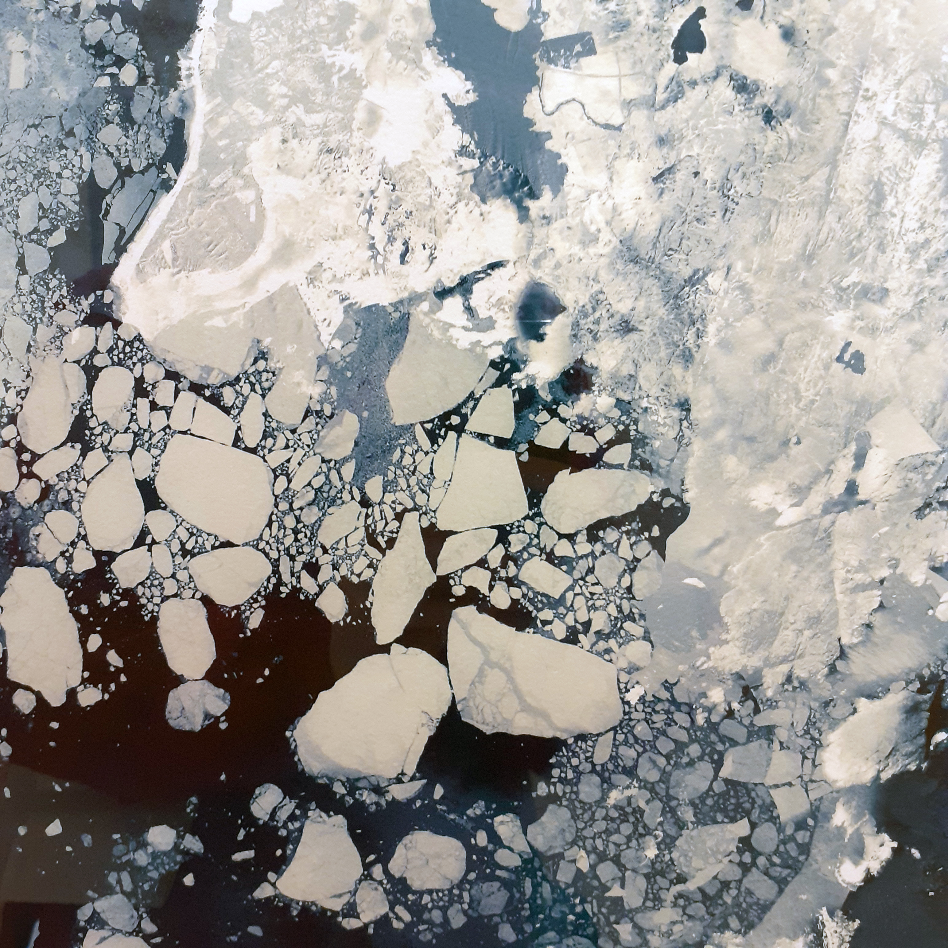
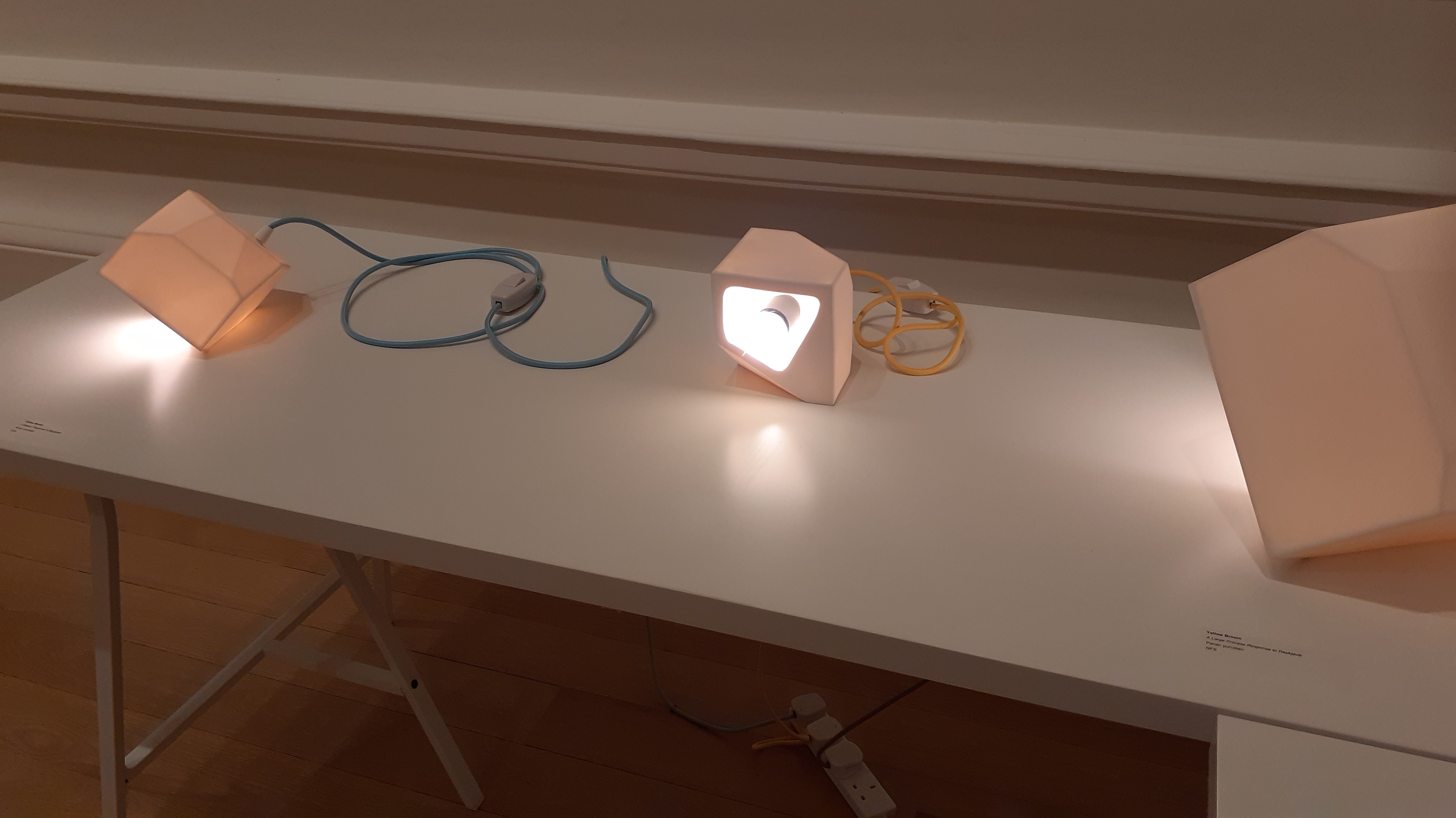
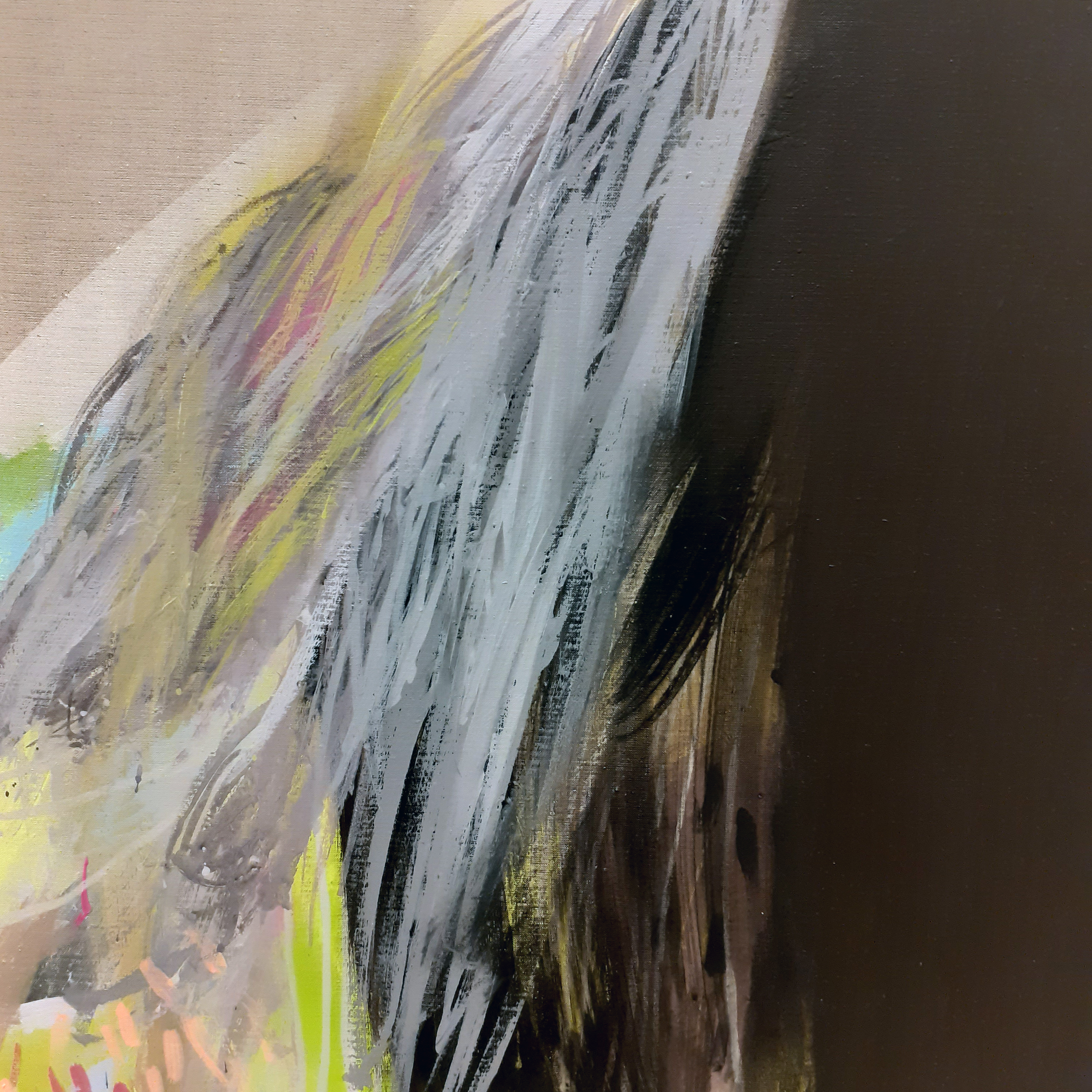
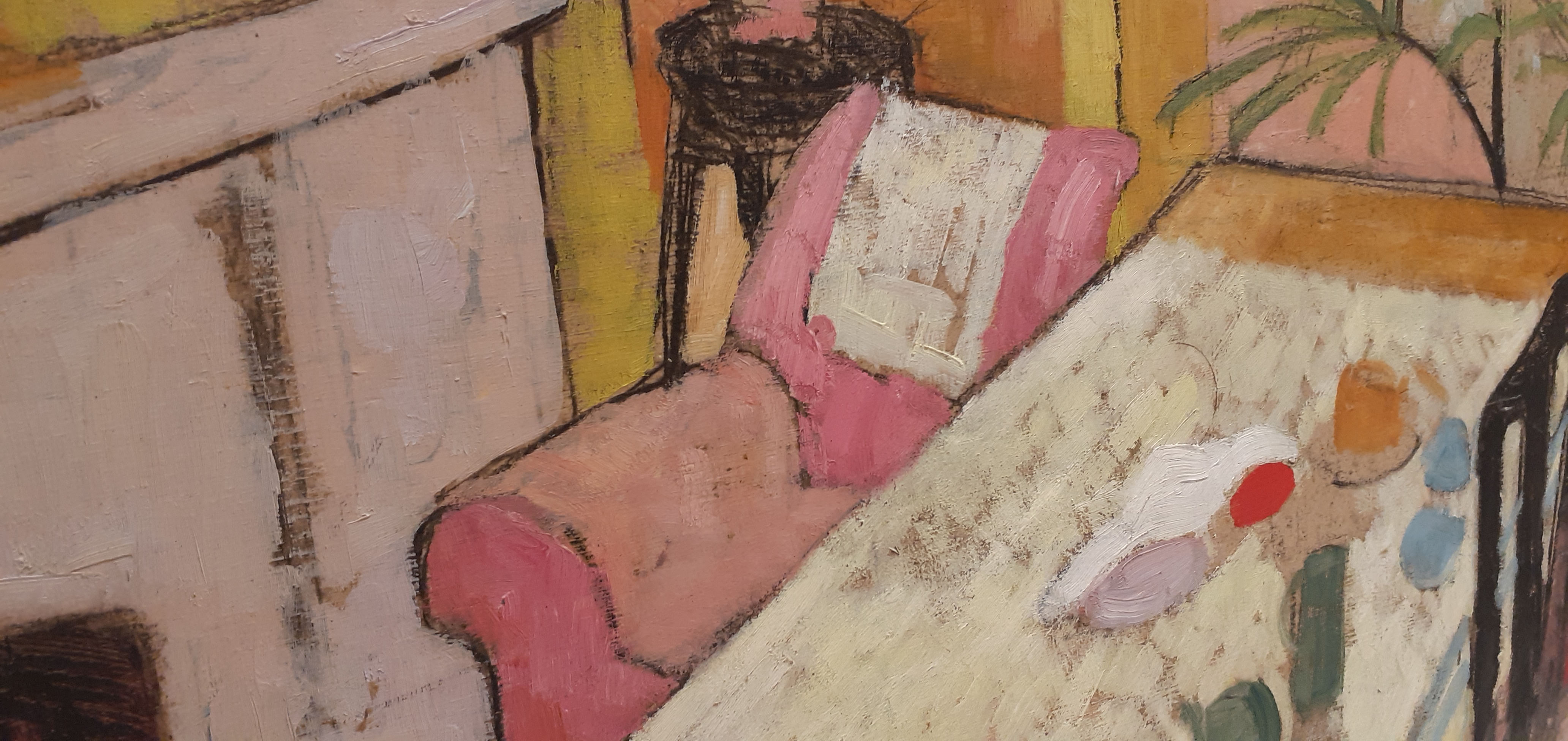
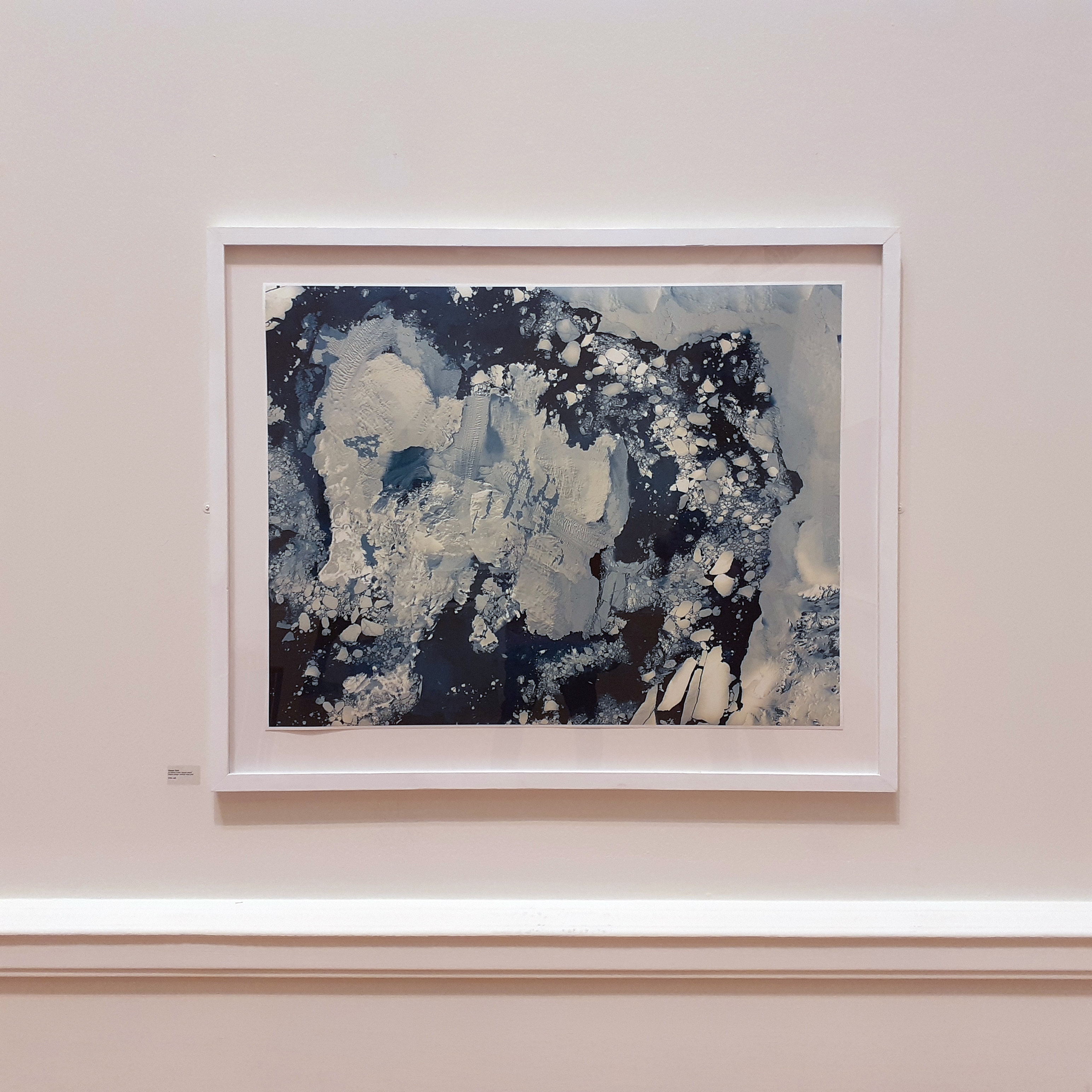
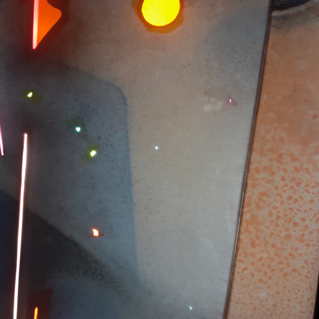
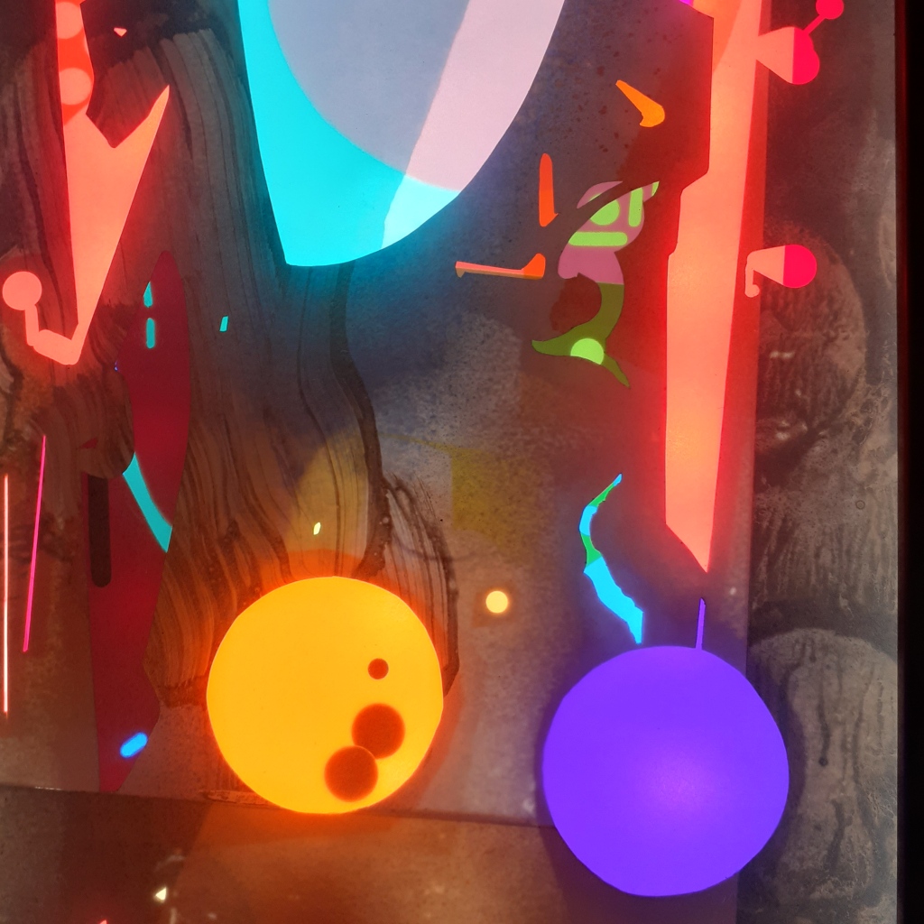
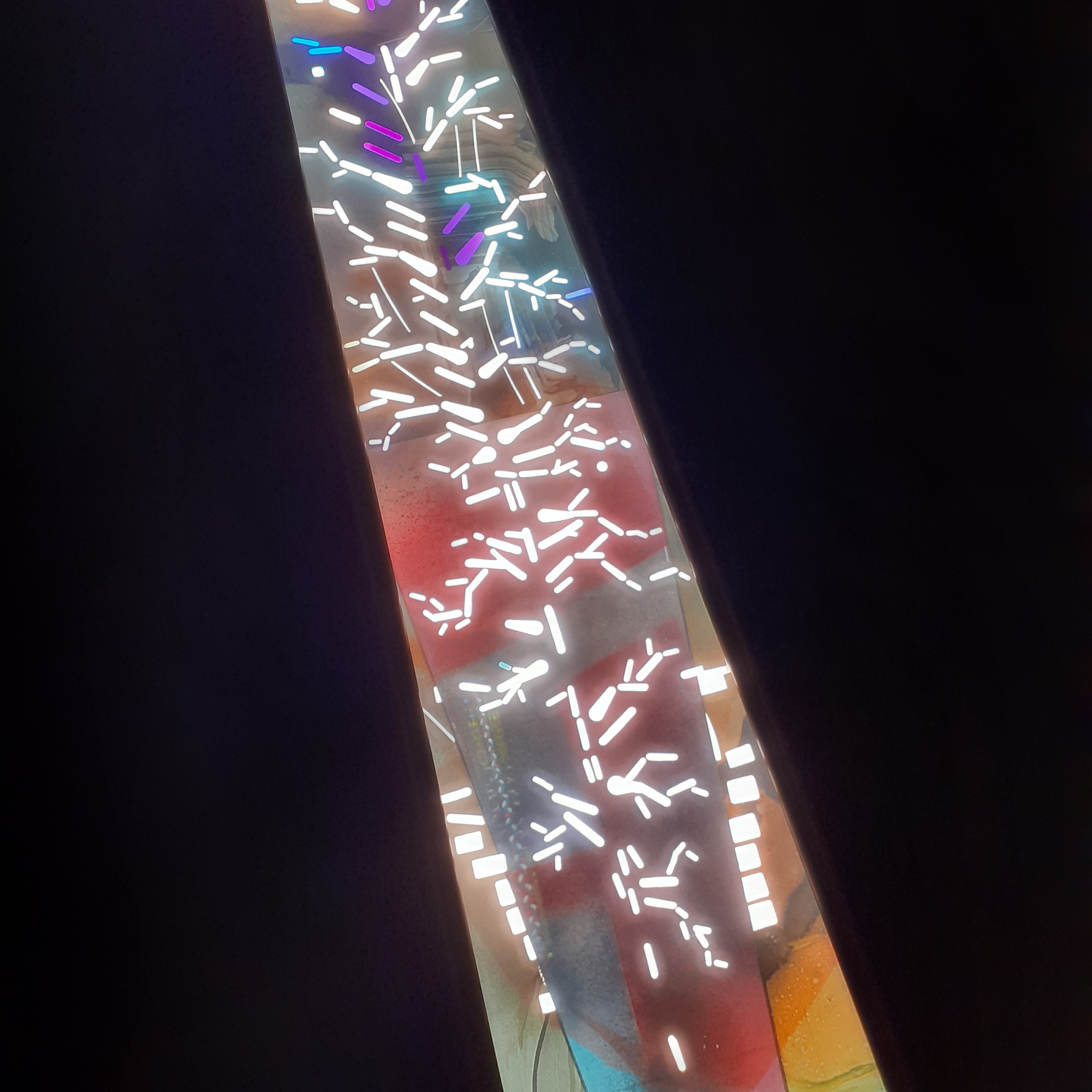
The following images are of Laleh Khorramian’s light box installations. They use an extensive variety of mediums, being: oil paint, spray paint, polypropylene, coloured gels, Plexiglass, LED modules, African mahogany, pine, aluminium, and lacquer.

The leaflet the gallery provided descries the light boxes as so:

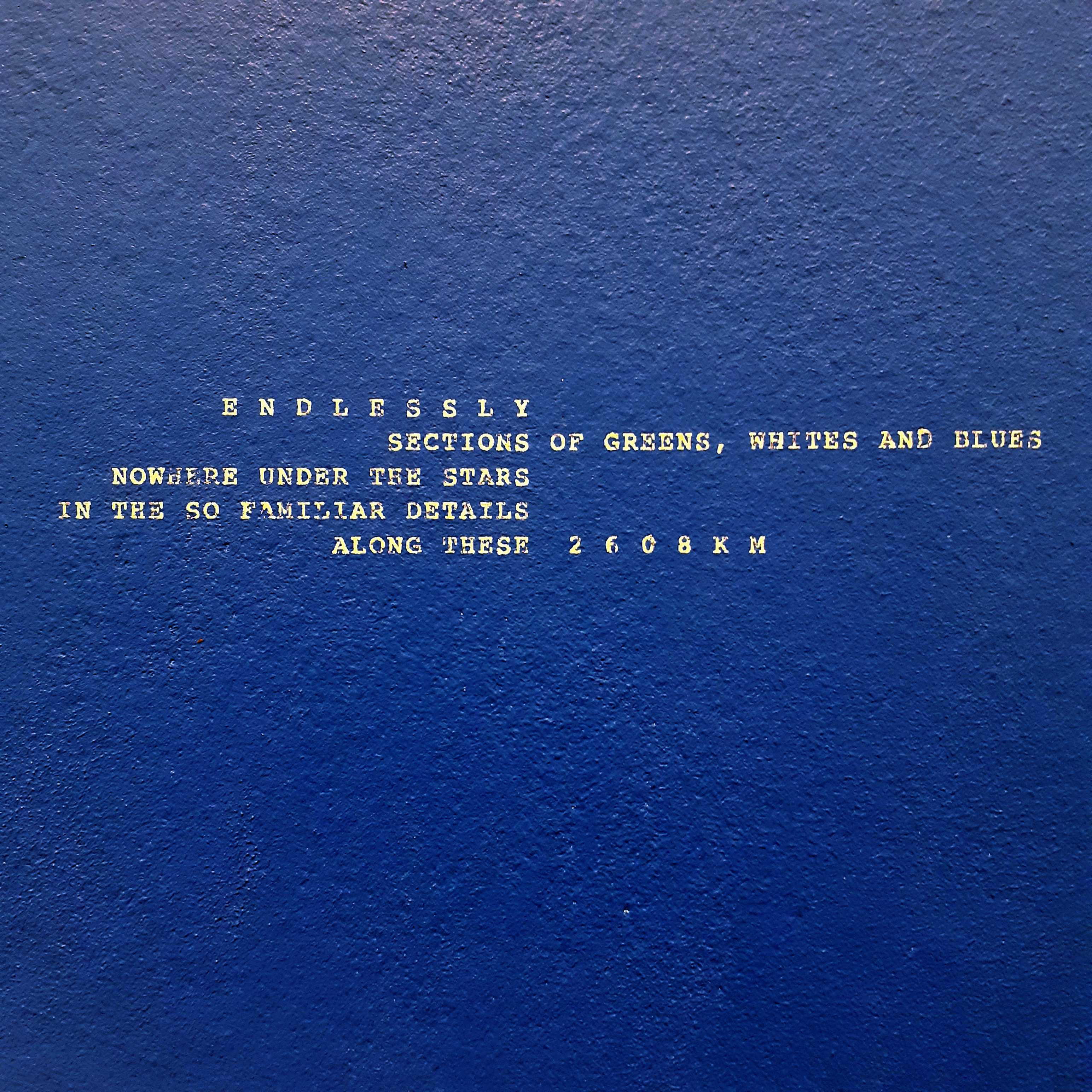
Khorramian’s light boxes feature monotypes connected to cut-out shapes and coloured gels. These improvisations of colour and light radiate like stained glass windows. The trapezoidal window series (2022) included repeated motifs such as spheres, platted braids, and tree branches. They form a central spine, snaking down the length of each box. With these works, Khorramian invites us to think about origin stories, space and time and the cosmos.

trapezoidal window trees
trapezoidal window (trees)
trapezoidal window trees detail
Detail of trapezoidal window (trees)

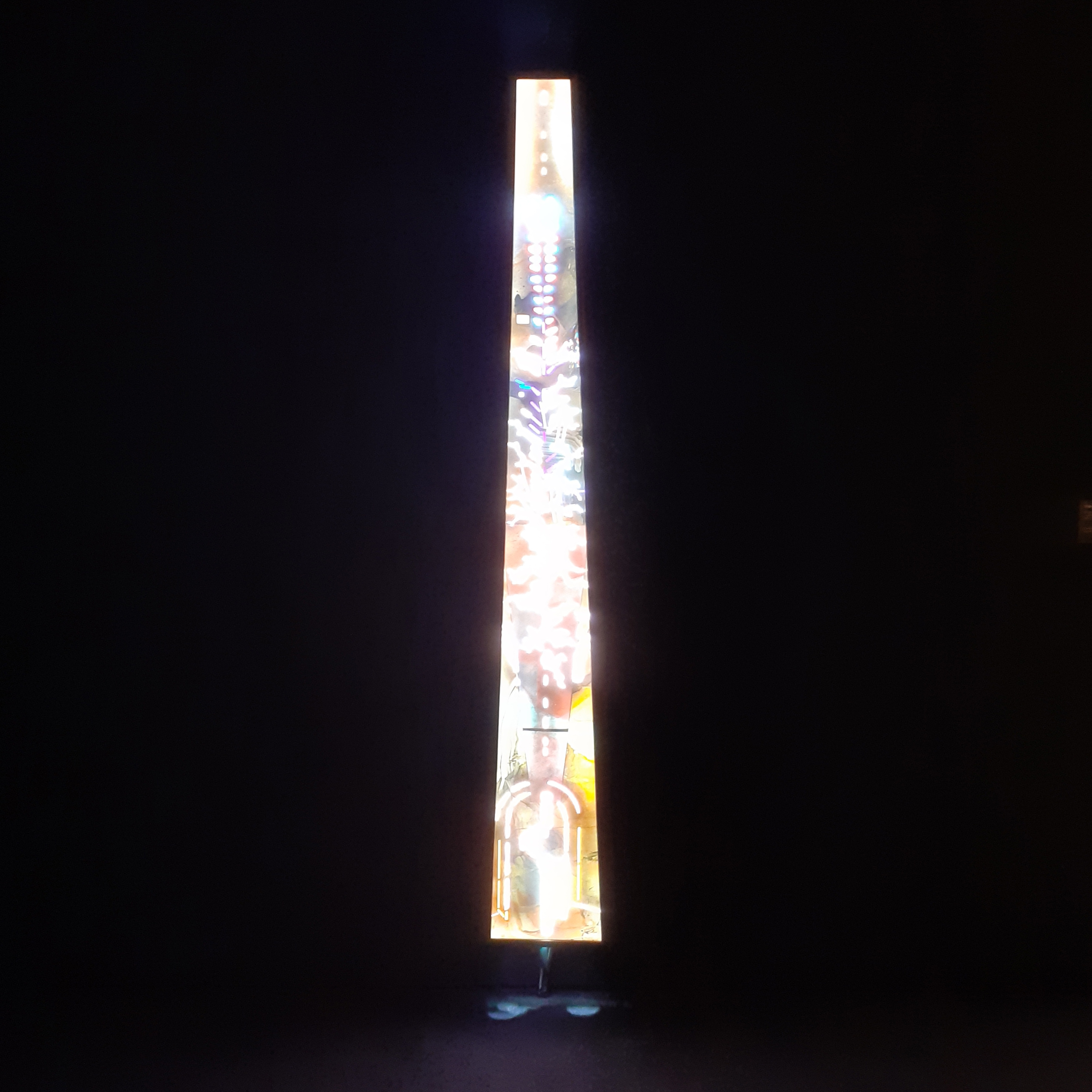
I enjoyed the trapezoidal series, and very much enjoyed the work Fontanelle at the back of the gallery; a sole window in an otherwise dark room, layered with an enlarged monotype. What you make of an artist’s work is entirely up to you. These sorts of installation work are best seen for yourself.


There were three floors with works on at the time of visiting. Actually, two of the elevators were out of operation, so my friend and I used the stairwell and made our way up the gallery one floor at a time. It was good to break up the intensity of the exhibitions with climbing the building in-between each gallery room.

If you are able to visit the Baltic Centre for Contemporary Art, I recommend that you snap up that opportunity to expose yourself to the work inside. The contents of the gallery change regularly. If you want to read BALTIC’s accessibility guide, it can be read here.

Kunstmuseum Basel – Old Building

Mentioned in my entry about my visit to the Meisterwerke der Sammlung Im Obersteg  exhibition in Kunstmuseum Basel, I also saw the works on show in the Old Building. There was no ‘special’ exhibition held. Due to the particular lighting of the gallery, I have only a few pictures to share.

The characteristics of the Old Building and difference in the display of work to the New Building were immediately evident. The Old building’s galleries are mostly constructed of long rows of corridors, and allowed less natural light inside from the placement of the windows and the building itself (but of course, the windows that could let much light in were covered with thin, pale curtains to block the UV rays from damaging any artworks). Many rooms had dark wood paneling in contrast to the newer building’s concrete and metal.

maxsulzbachner01
Badende (1926) Max Sulzbachner

If you visit Switzerland to see their established artists, here’s the gallery to visit; granted you’re not out to take too many pictures of the works unmarred by the strobe lightings’ glare.

There were four floors to the Old Building, and one floor dedicated to Swiss illustrator, painter, graphic artist, prop master… and mask maker, Max Sulzbachner. All of Sulzbachner’s paintings, prints, drawings, and props were framed behind glass or encased in display boxes (and the artificial strobe lights make it impossible to take pictures without their reflections). These rooms were quite dim at times, and cramped-feeling. I must’ve been spoiled by visiting the much more open-plan New Building first.

waldweg_detail
Detail from Waldweg (1930) Max Sulzbachner

I enjoyed some of Sulzbachner’s works much more than others. Perhaps because I understand very little about stage shows. There was a variety of mediums; woodcuts, paintings using gauche, oil and ink… unfortunately, due to the dimness of many of the rooms and corridors, I don’t have much worth sharing here.

If you’re fluent in high German, you’ll find a lot to read about Max Sulzbachner in this museum. In fact, to get the most out of the gallery spaces, it’s best to know high German. No multi-lingual tombstones here!

am_urnersee
Am Urnersee (1849) Alexandre Calame

There were oil on canvas works by the Swiss painter Alexandre Calame who focused on landscape scenery. I would have liked to have seen more of this artists work. Alexandre Calame also drew scenery in a very traditional manner (not illustrative).

am_urnersee02
Detail from Am Urnersee (or ‘By the Lake of Uri’ in English)

The intimate details one can see in many large-scale paintings up-close are on show in Calame’s work. A great deal of traditional (i.e. conventional oil) paintings are best appreciated at a distance, but looking very closely at Calame’s landscape paintings, the marks made are clean.

To be expected, there are many famous Swiss landscape painter’s works on show (though many of those artists painted portraits, too). I like how soft and comforting the colours in Ferdinand Holder’s pieces are. I particularly enjoyed Genfersee mit Jura (‘Lake Geneva with Jura Hills’). If you enjoy almost dream-like pastel landscapes with a grand yet grounded feel to them, Holder’s artwork is worth researching.

thissistheone
Das Leben (1935) Walter kurt Wiemken

In one of the longer corridors, Walter kurt Wiemken’s oil painting, Das Leben (or ‘The Life’ in English) caught my eye. There’s so much going on in this picture, you could spend a log time mulling over it. Why are all of these figures gathered? Why the cannons? The angels? The clown! It’s very fun for me to look at.

detailclowsn
Check out…. this funky little clown… Das Leben (detail)

I spent less time in the Old Building as I was aware that I had little time to spend exploring it the museum’s closing, and I had to head out of the city before long. …I missed seeing a lot of the oldest paintings that were in the collection. There was even a third building to Kunstmuseum Basel (that I had no time to visit)! Such is life.

Still, even though I left without taking many (good) pictures, I can look back and say it was great to be introduced to a number of artists foreign to me. Hopefully, the next time I visit any foreign galleries, I have the time on my hands to spend a whole day on them!

Kunstmuseum Basel – Obersteg Collection

While in Switzerland, I visited Kunstmuseum Basel to view the Meisterwerke der Sammlung Im Obersteg (‘Masterpices in the Obersteg Collection’showcasing four floors of work, but featuring art by Picasso, Chagall, and Jawlensky. I’m going to share a few of the pictures that I took.

I found getting to Basel and the museum itself relatively painless (my specific journey took a few hours). It has to be said that the bus and train system across Switzerland is easy-to-use even if it’s your first visit. Basel is also chock-full of art galleries… so I was surprised to hear one of them is just simply called… ‘Kusnstmuseum’.

kunstmuseum admission
Inside Kunstmuseum Basel’s New Building


The Meisterwerke der Sammlung Im Obersteg exhbition was held in the Kunstmuseum’s New Building. At the time of visiting (early March) the gallery spaces were quite quiet and no group tours were permitted.

The following photographs show only a very, very small few of the works on show. (Of course, I’m biased to which pieces I like, too!)

Jawlensky self portrait
Self-Portrait (1911) Alexej Von Jawlensky

Jawlensky’s use of colour is so vibrant and confident! I’d never seen his work in person before and I am so glad that I got to see some in Basel.

stormy landscape
Stormy Landscape (1915) Alexej Von Jawlensky

Jawlensky wall
Wall of Jawlensky’s work


landscape with church
Landscape With Church (1909) Wassily Kandinksy

Kneeling nude on yellow ground
Kneeling Nude on Yellow Ground (1913) Cuno Amiet

I took a lot of photographs of the paintings that were shown without glass. (Because my phone camera isn’t really made for talking shots with glare and reflected light!) Seeing many oil paintings in person again was great. The vibrant colour palettes and strong figures were inspiriting.

20200307_141506
Portrait of the Model Giulia Leonardi (1910) Ferdinand Hodler

leon bonhomme 4
Works by Léon Bonhomme

effigy of a fruitbearing rock
Effigy of a Fruitbearing Rock (1958) Jean Dubuffet

The varied figures and mediums used was a highlight for me. Yes, there were also many oil paintings, but even then, each artist uses them in their own way cultivated through their unique exploration of the medium.


chagall empty
A quiet room with Chagall’s work on display

me and the village
Me and the Village (1911) Marc Chagall


Baboon and her young
Baboon and her Young (1951) Pablo Picasso

I really like the strong shapes and contrasting textures that the baboon is composed of. Her face very much looks like the Citroën 2CV, don’t you think?

reclining nude
Reclining Nude (1934) Pablo Picasso

The exhibition housed a pair of Picasso’s harlequins (which were a big feature). I can’t say that they’re easy to photograph and I didn’t get good photographs of them, but I was very happy to see them in person! (I made sure to buy a notebook with one of the pantings printed on the cover.)


The ground floor had on show a few rooms of modern artworks.

carl andre
Cedar Piece (1959/1964) Carl Andre

In the gallery space above, you can see Cedar Piece by Carl Andre in the foreground, and clockwise, from the left: the florescent light Untitled (1969) by Dan Flavin, the aluminium sculpture Untitled (1970) by Donald Judd, and the painting Untitled (1968) by Blinky Palermo.

I also visited the Kunstmuseum’s Old Building and saw 4 floors of art there. If I share any photographs of the artwork, I’ll make a separate blog entry.


kunst stuff
Some items I bought from the gift shop

Looking back, I’m really happy that I made my way out to Basel to see the museum, even if I was on my own. (It may have been more exiting to see and share with someone else, but there are always future gallery exhibitions to go to.)

I bought myself a notebook with one of Picasso’s harlequins, and a couple of postcards. I have already sent the postcard of Sam Gilliam’s work (Rondo) to a friend who the work reminded me of.

Until I can visit galleries again in the future, I have the memories of visiting Kunstmuseum Basel, and feel that now is a good time to create for the sake of creating. When last did you put aside time to make something that shows how you feel…?

Hatton Gallery – Art & Science

I visited the Hatton Gallery within Newcastle University’s campus for their Illuminating the Self exhibition during February. There were three gallery spaces open to the public, and I wish to share some of the contents from two of the rooms in this blog post.

The Illuminating the Self exhibition showcases artworks in response to the University’s current research and progress in understanding the causes of epilepsy and the treatment of it.

Andrew_carnie_work01
A detail from an installation by Andrew Carnie


Susan Aldworth’s installation Out of the Blue (and artist book) explores “…the human perspective of living with epilepsy and the potential impact of technological interventions within the brain.” Aldworth’s piece is within a small room, and somewhat interactive.

light_up_shirt1
Shirt with embroidery

Aldworth’s installation includes Victorian undergarments that have been embodied by community sewing groups and students from the Royal College of Needlework, using ultraviolet threads. The clothes are hung from the ceiling amongst strobe lights.

out of the blue 01
The artist book cover is embodied much like the installation garments.

out of the blue 02
This book is one of 15 copies

Inside the artist book are photographs of models wearing the embodied Victorian garments and the testimonies of individuals living with epilepsy.

light_up_shirt2
The installation

The suspended clothes were blocked off by a barrier. The lights flickered on and off in groups seemingly at random – maybe there was a pattern to it. I spend a good 20 minutes in the room, looking through the artist book and noticing the light pattern change.


There was a small room with work by Marianne Wilde concerning gene and embryonic research during the 1990s. I only appreciated the screen prints of MRI videos in this room, but the works were entirely difficult to photograph, and I can’t do them justice with my phone photography. There were glass and mixed media sculptures, videos and objects left from a performance piece.


The largest gallery space was a dark room filled with installations by Andrew Carnie; full of art in response to the perspective of living with epilepsy, it is a complimentary show of work to Susan Aldworth’s piece.

blue_matter
Still of the video projection Blue Matter

The largest artwork was a screen-projection of drawings and computer animation called Blue Matter. Large sheets of thin, black material ran the length of the long room and were used to display the images. The simple-looking pattern and outline images were layered and changed gradually, always forming different compositions.

Balloons triggered by sound
Balloons

There were two eyeball-like balloons that expanded, lit up, and collapsed in response to those walking about the space. I don’t recall how long I spent in this room, but it was long enough to notice the balloons inflate and collapse a number of times. The space was quiet when I was visiting (at midday).

hatton spin 01
Electric light and fan installation piece

In the corner of this dark room was a small electronic piece made of fans and lights. I took short videos of it. I really liked the momentum and pace the art was set to display text and spin its lights.

There was a LOT going on in Carnie’s exhibition space; but again it is difficult to photograph the type of artwork on show. There were many strange constructs as part of the installation. If it were possible, I’d recommend for those interested in the subject matter and works to go and see this for yourselves, with your own eyes.

As to be expected of contemporary artwork, the response to current topics and scientific research was enlightening and engaging to see. I feel my understanding of epilepsy, those who live with it, and the way it is treated today is stronger, too.

Creative Industries – Staff Exhibition 2020

On the 31st of January 2020, I visited the preview night of the creative industry staff artworks exhibition, held within Newcastle College’s Mandela Building. The exhibition runs until the 21st of February this year. The opportunity to visit during opening night brings with it the usual perks; conversation, atmosphere, and drinks.

t print 01
Print (detail) by Hania Klepackia

Within exhibition were photography, digital photomontages, prints, collage, sculpture, watercolour paintings, acrylic paintings, oil paintings, mixed-media, video,  pottery, found objects, and more.

The exhibitions space is relatively small, but it was used most practically; there wasn’t any wasted space.

Here are a very small number of photos that I took of artworks on display. Not every piece had a name, but all of the works were credited.


kerl b 01
Wire bird sculptures by karl Mercer

t sculpture
Close up of karl Mercer’s sculptures. These are 1:1 to the bird they’re modelled after.

I’ve had conversations with friends in the past about sculpture. Some who create sculpture believe that the medium used to create pieces should be embraced; that is, the materials should not be obscured and be readily obvious to the viewer. I have not yet formed a view on that particular argument myself. No deception is involved in the presentation of these birds.


Laura Sedgwick Photo 01
Photography by Laura Sedgwick

t photos 01
Photography by Graham Stouph

Getting to talk to some of artists was an opportunity that felt good to take advantage of. When asked, staff shared the thoughts or reasons behind creating pieces, the inspirations, or the mediums used with me. Overall, it was a very casual opening night.

I don’t believe that every staff member exhibiting happened to be present at the opening show. None of my tutors were exhibiting work, and I only talked to a few of the staff to ask about their pieces – admittedly, the staff members I already knew.


sb resin 03
Stories by Steve Baxter (driftwood cast in resin)

sb resin 01
These pieces were created with found driftwood cast in opaque resin, displayed over a lightbox.

Most of the artwork on display was for purchase. There was no price tags, but the artists were happy enough to talk to those interested about pricing.


Since most everything I’ve made recently has been digital –  for the sake of replication, mostly –  it was nice to see work that there are only single copies of. It’s harder to share these works because of their solitary existence, but of course, as with any gallery viewing, it feels as if I am privileged to see them in person. And that’s not to say that digital artwork – sometimes freely circulated on the internet – is not as valuable, but it certainly is refreshing.

As it’s been a while since I have visited any of the art galleries in the city of Newcastle, I wish to see their current exhibitions. Maybe some of my peers will show an interest in seeing them together, if I invite them.

SSA|VAS OPEN – Collaborative Exhibition

I visited Edinburgh and saw the SAA|VAS OPEN exhibition at the Royal Scottish Academy with a friend. The SSA|VAS OPEN exhibition runs from the 22nd of December 2019 to the 30th of January 2020. It is a collaborative exhibition between the Society of Scottish Artists and Visual Arts Scotland.

this one looks like ice
Detail from An Island in Time – Glacier Island, Alastair Clark

I’m going to share a number of images I took while in the exhibition. Although I bought a brochure, I am not able to pair up every photograph of artwork with the artist or details of the medium at present. I try my best, going off my photographs and the brochure; not every piece appears within catalogue as a picture.

SSAVAS 2019 catalogue
Inside the The SSA|VAS OPEN 2019 catalogue

The A3 glossy catalogue is 27 pages long and cost £2. The catalogue has a nice layout, but of course it is too small to show all artist’s work visually, and in detail.


artist book 02
Table display of various artist books

artist books 01
An artist book that incorporates printmaking


Wiggly
Gallery space. In the foreground: Mermaid by Sam Shendi


responce to
Part of an installation, Yellow Broom (Clare Waddle & Dave Robson)


There is an exchange project between the Engramme Studios in Quebec, Canada, and SSA, Scotland. There was a whole room dedicated to the Engramme exchange artwork. I very much liked the mural.

this is the pnne
Mural featuring screen prints by Ilana Pichon

OK THIS IS COOLL I LIKE THIS ONE
Detail from mural


rowan paron pair
Left: Steep Decline, right: Climate Precipice, Rowan Paron

These pieces are acrylic and print collage on linen.

rowan paron detail 02
Climate Precipice detail, Rowan Paron

rowan paton detail 01
Climate Precipice detail, Rowan Paron


this spectacualr darkness
Jeff Zimmer, The Light does not know what to do with me, and This spectacular darkness

A couple of kilnformed black glass artworks. I liked the playful nature of these pieces.


concrete c
Concrete Multitude by William Braithwaite

i like this one a lot
I like this one a lot. Why didn’t I take a picture of the description sticker???

setail joseph buhat
Detail of Manobo Tree, oil on canvas painting by Joseph Buhat


this is old
Right, Edinburgh Interior, oil on hardboard, Wilhelmina Barns-Graham (1937) left, Barns-Graham working on Edinburgh Interior in her studio in Alva Street, photograph, unknown photographer (November 1937)

more old detail
Detail from Edinburgh Interior

In one room, there was a place reserved to promote the Wilhelmina Barns-Graham Trust. As a student, the artist Wilhelmina Barns-Graham benefited from a number of bursaries and scholarships. The Wilhelmina Barns-Graham Trust supports recent gradates with a cash prize.

As the booklet I picked up states:

Scottish and St Ives based artist Wilhelmina Barns-graham, CBE (1912-2004), established the Trust in 1987. Through exhibitions and publications, it aims to promote and broaden the understanding and reputation of her work as one of Britain’s most significant 20th-century artists. The trust actively supports individuals to fulfil their potential in the visual arts by providing financial support in education funding artists’ residencies.


big hits 02
Video and booklet, Big Hits (Wars and Songs Commencing from the Year I was born), Alessandro Di Massimo

There were a few videos dotted around the gallery space, and an entire room dedicated to video artwork.


melted glass and stuff
In the foreground, Pathways by Doug Mackie (Pulled glass on charred wooden plinths)

keep rhisisss oeee
Alastair Clark, An Island in Time – Glacier Island, digital collage

lichen-like
Detail of mixed-media lichen…

There were so many pieces that these photographs show only a very small portion of the works on display. Still, I want to add more pictures to this post at a later date. When I find I have the time, I’d like to comb through the pieces shared here that are missing information and amend this post.


giftshop goods royal acadamy scotland
Picked up a postcard, and a couple of unrelated things from the gift shop!

After seeing this exiting exhibition, I felt totally pumped to make artwork myself, but I’ve little time to do more than doodle right now… (That is still better than nothing!)

I hope this entry may encourage readers who have not visited an art show in some time to check out accessible galleries to visit in the near future! After viewing fresh artworks, you may find yourself inspired to create and learn more. You may even find a new favourite artist!

Keith Haring @ the Tate Liverpool – RAW & HONEST

I recently visited the Tate Liverpool‘s exhibition of works by Keith Haring (1958–1990). The exhibition is the first major UK showing of Haring’s art.

“My support network is not made by museums and curators but real people, and that’s good because everything I’ve ever tried to do was cut through all that bullshit anyway.” – Keith Haring, Keith Haring: The Authorised Autobiography, © John Gruen, 1991

Of course I’ve seen Keith Haring’s work before – ripoffs of it, too. Though I admittedly went in knowing little about the artist and activist. To understand a work of art, one has to have knowledge of the time period that the artist was surrounded in –  for their art is a reaction to it, and a reflection of it.

tokyo pop shop
Keith Haring, Tokyo Pop Shop, circa 1980s. Photo by Tseng Kwong Chi

Haring’s art responds to many issues he was concerned about, such as capitalism, political dictatorship, racism, drug addiction, homophobia, and AIDS awareness.

The influence of television and cartoons (specifically Walt Disney’s works) and vibrant, expressive book illustration (by DR. Seuss) were apparent, but the works can communicate heavy messages that ask the viewer to commit to reflection.

Visitors were handed out small booklets to ‘decode’ the recurring symbols in Haring’s work (the flying saucer, the baby, the barking dog…). The booklets are written in plain English, (i.e. no art bollocks) and was much appreciated.

untitled kh
Untitled acrylic on canvas.

What hit me the most about the paintings, videos, and drawings was that they are not affected; Haring’s works are raw and powerful. I feel that some of the intimacy comes from the immediacy and spontaneous-feelings Haring presents us – the works don’t suffer from overthinking or overworking.

The street culture vibes are also really apparent. There were a good amount of Haring’s subway drawings, or photographs of them. Whether an artwork is acrylic on canvas or ink on paper, they radiate a confident and direct energy.

ero drawinga
Series of erotic drawings.

I was thankful for the variety of mediums on display; collage, ink drawings, acrylic paintings, mixed media, video, and so on. And I found the categorisation – the organisation, rather – easy to navigate without be overwhelmed by the sheer amount in view.

The exhibit included a blacklit room with large, fluorescent acyclic paintings inside… the loud music made the viewing extra fun and immersive. …I liked that my clothes lit up, too. Things like that, you have to visit to experience.

spray paint detail
Detail from an ink and spray paint on paper piece.

“The saucers were zapping things with an energy ray, which would then endow whatever it zapped with its power.” – Keith Haring

I rather liked seeing all of the Adamski flying saucers and their lasers zapping… whatever happened to be around. It made me laugh. There were a great deal of storybord-looking comics with surreal happenings. The fact that they lack any written words mean that there are less barriers for viewers to understand them. Or to make of them what they will, anyway.

P A E KH
Display cabinet with paraphernalia relating to Keith Haring’s activism.

There was a whole section of the gallery space dedicated to Haring’s activism. Haring was diagnosed with AIDS in 1988. To speak about his own illness, to generate activism and awareness about AIDS, Haring’s artworks became a means of expression for these issues also.

marriage of heaven and hell
The Marriage of Heaven and Hell, 1984 © Keith Haring Foundation. Photo by Tseng Kwong Chi , 1984 © Muna Tseng Dance Projects, Inc., New York

Having seen just a fraction of Keith Haring’s work, I still feel very lucky. Nothing beats seeing artwork in person, and if you’ve the opportunity to see someone’s artwork in the flesh, and want to understand the artist better, then take the opportunity!!

At the end of my visit I treated myself to a fridge magnet and a tote bag, as well as some postcards that I’ll send out to friends and family. I would have liked to have been able to pick up the exhibition catalogue, but, maybe the next time I visit a museum I can do just that!