Modern Logo & Symbol Design – Logos from Japan

A good friend gifted me a new logo design book titled Logos from Japan. The book is published by Counter Print. It’s a continuation of the survey of design made to curate the graphic design book From Japan, but focusing only on the country’s logo design. I want to share some of the book on my blog.

It’s a paperback book of 160 pages, in full-colour, and has a short foreword on the selection of designs within.

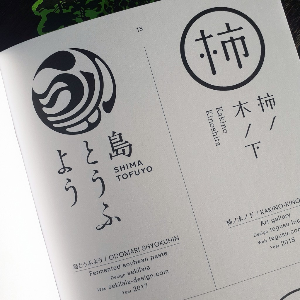
The book is has grouped the logos by theme such as ‘Architecture’, ‘Natural’, and ‘Latin’. Each logo is labeled by name, with the information of the agency that created it, and the year it was made. There’s plenty of room allocated to each logo – many have a page or two of their own – and there’s photography of some of the designs at work on signage or print.

animal welfare
Animal environment and welfare foundation logo
apparel logo design
Clothing store logo featured on signage and paper bags

There’s an interesting passage in the book’s foreword that highlights globalisation’s relationship with design and craftsmanship – homogenisation – and that Japanese design has thus far evaded strict international ‘rules’ popularised by Swiss design:

In 1996 the German graphic designer Olaf Lue wrote that German design no longer had any national attributes. Observing that some might favour this development, Lue also acknowledge that some might regret it. It was true that, throughout the latter half of the twentieth century, the spread of information and the effect if globalisation showed its impact on the world of design, as in many other areas. An ‘International’ or ‘Swiss’ style was prevalent in the West, characterised by cleanliness, readability and objectivity. However Japanese design remained largely recognisable, mixing extremely traditional elements of Japanese Art history and the highly modern influence of Western design.

inside book
Human figure-based logos
Toyama
Toyama prefecture’s logo

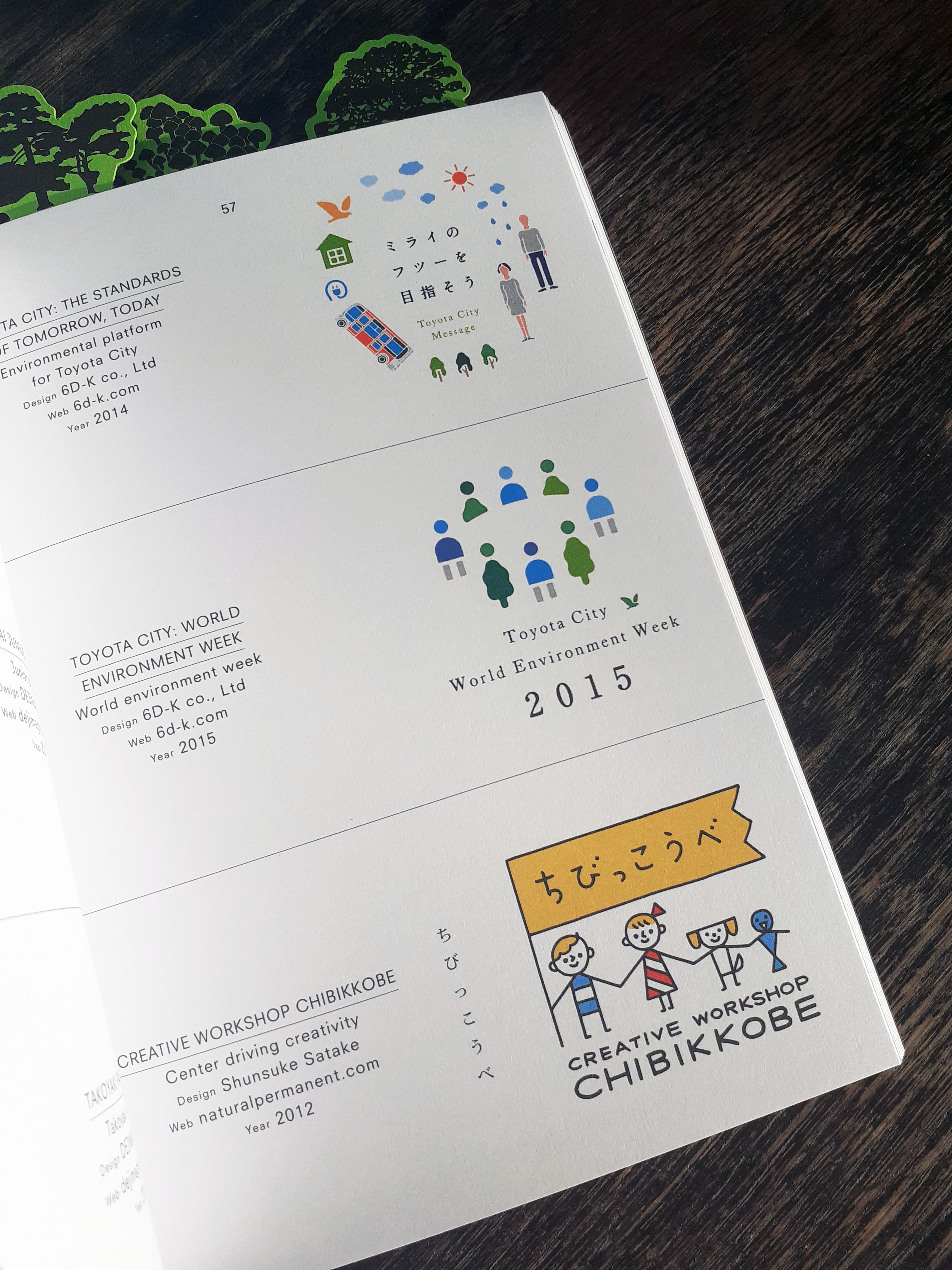
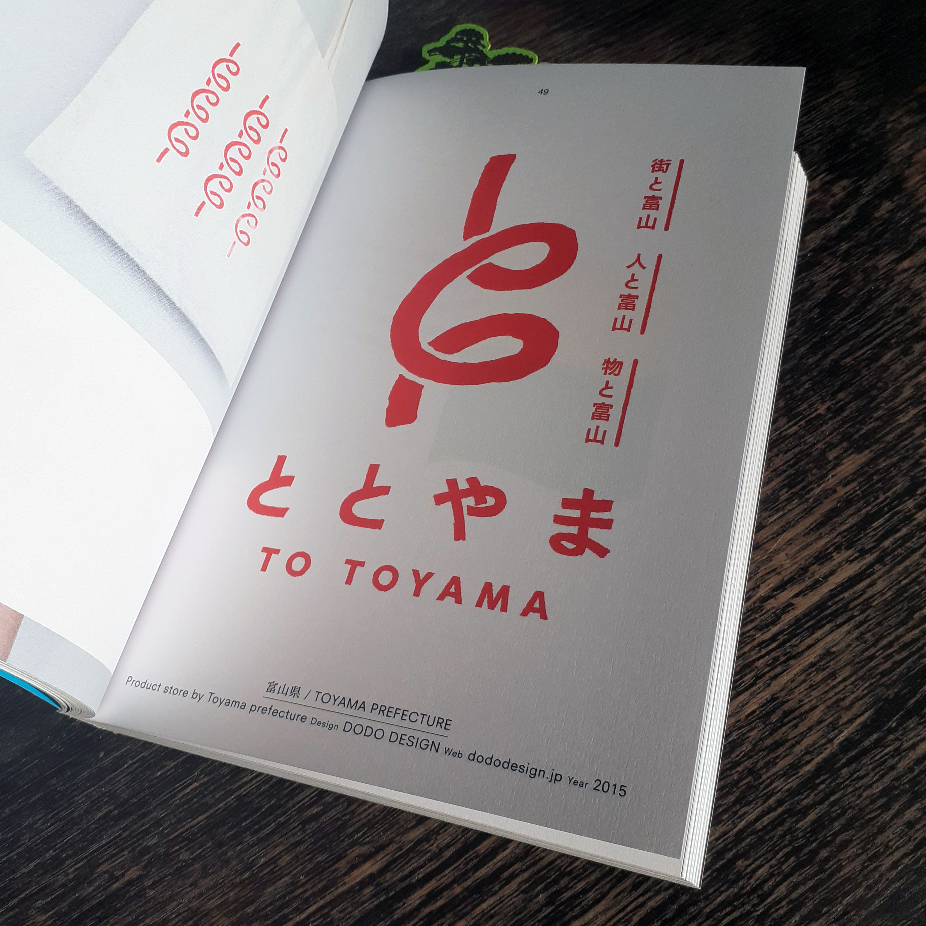
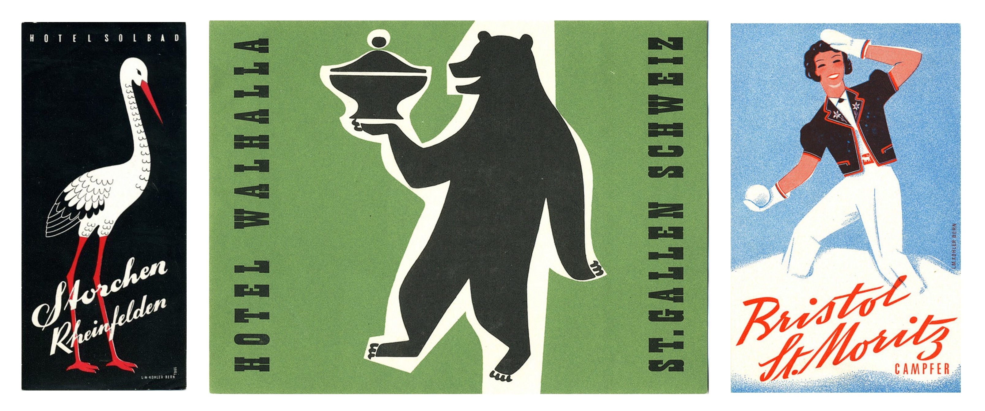
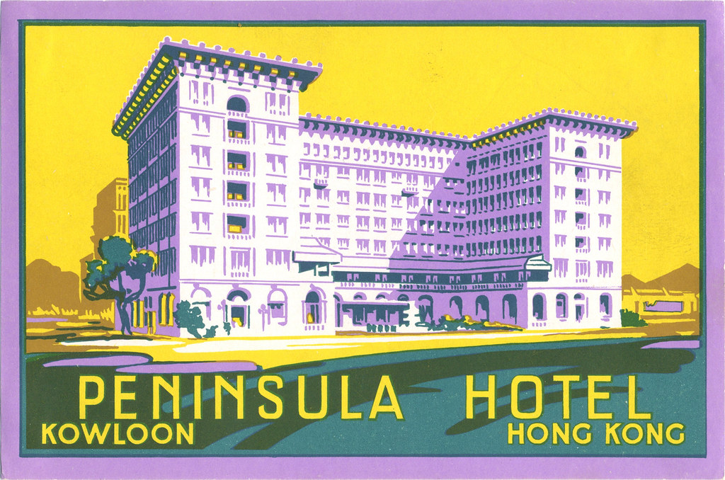
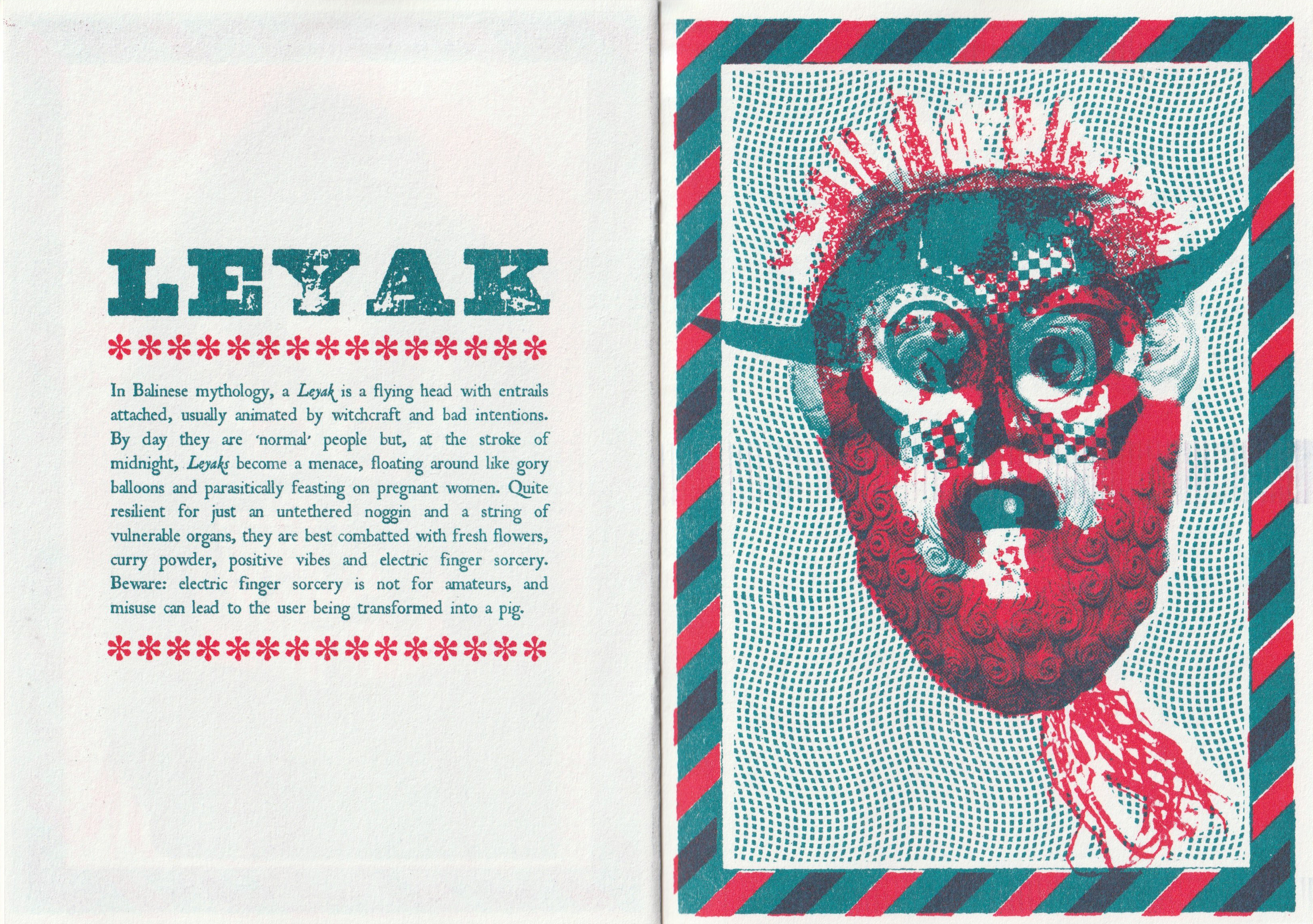
And this book really is a wonderful showcase of design that feels almost unreal in contrast to what I see of most UK, American, or European product and service logo branding. I see a lot more playfulness in Japanese logo design. Of course the playfulness is kept to appropriate services and products such as bike shops, T.V. stations, video game studios, patisseries, and so on, though I am used to seeing the these services represented through more serious, elegant, or corporate images.

The logos featured within this book are all from within the past couple of decades. As the forward explains the mentality behind modern Japanese logo design is to create something that captures the interest of the public eye in the moment:

Arguably, this could be seen as a less ‘long lasting approach’, and some of the logos will be seen as ‘of their time’ when looked upon from years to come. However today, when most identities are viewed on screen, there isn’t a permanence of print that companies are more inclined to quickly throw out their previous logo design in favour of a new one. As such, the style of Japanese logo design is constantly changing and a long lifespan for a logo is no longer expected to such a great intent.

I haven’t been taught to think about logo design as quite so ephemeral, and it’s an interesting view to read about. The transient nature of contemporary Japanese logo design is understandable when put into perspective of modern services and consumerism.

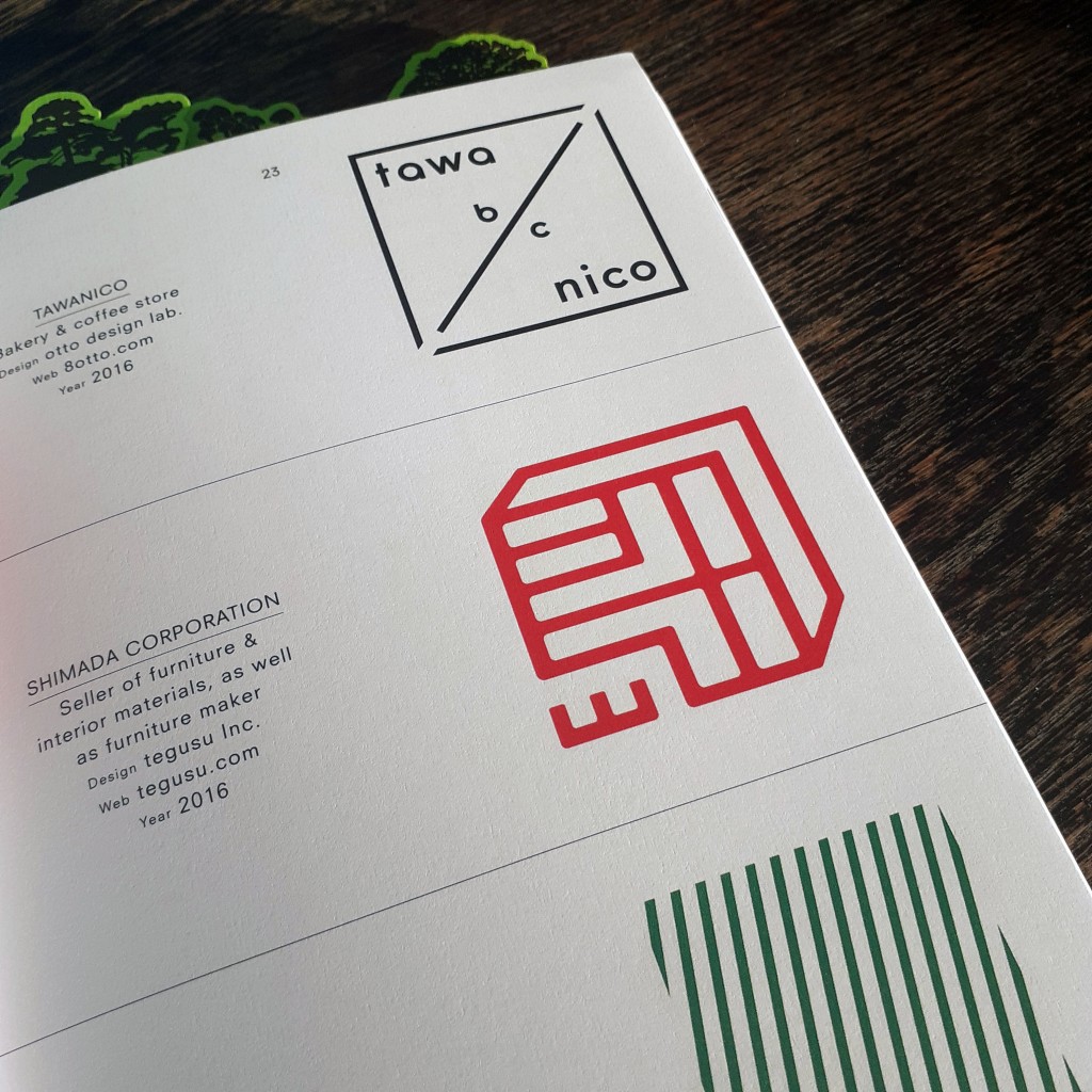
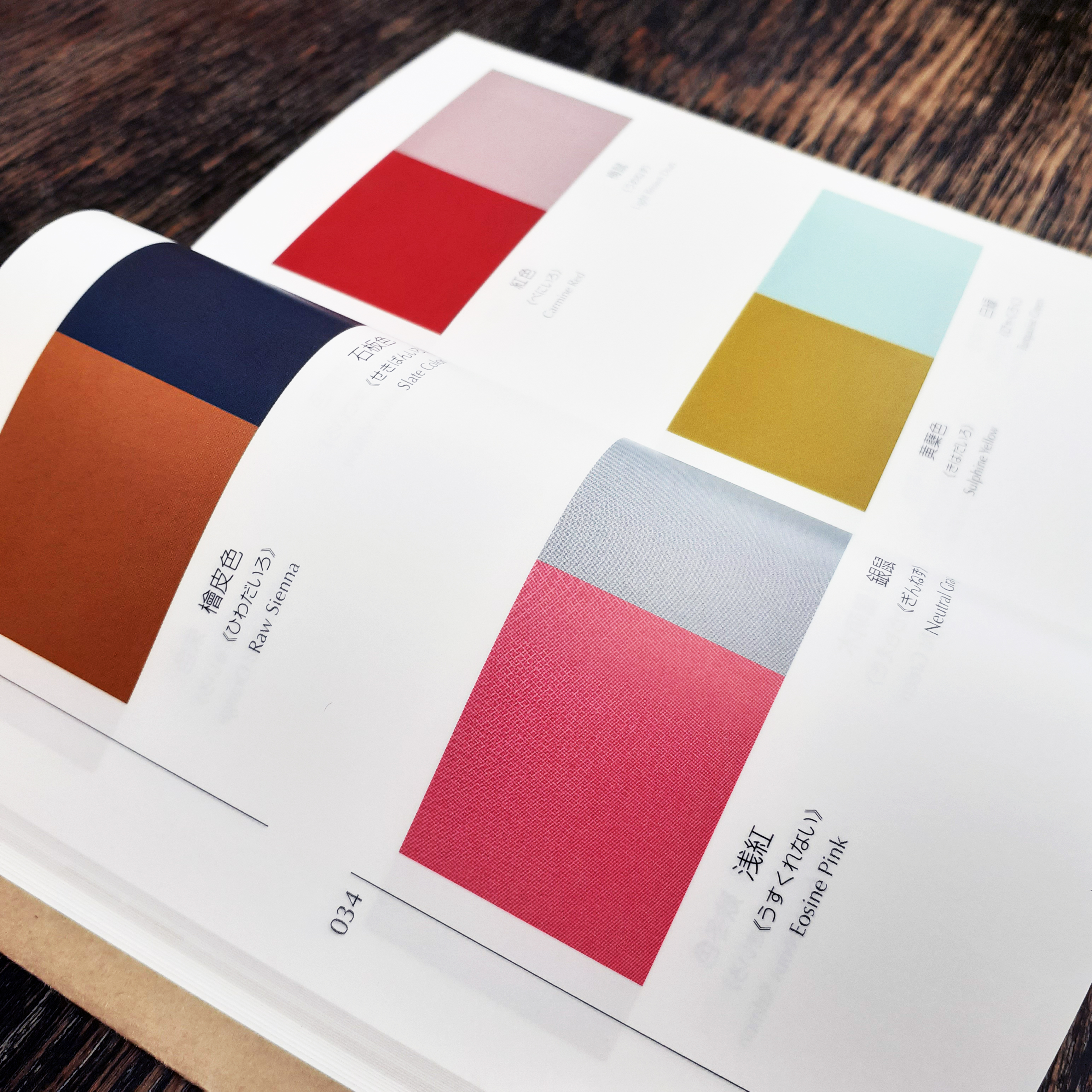
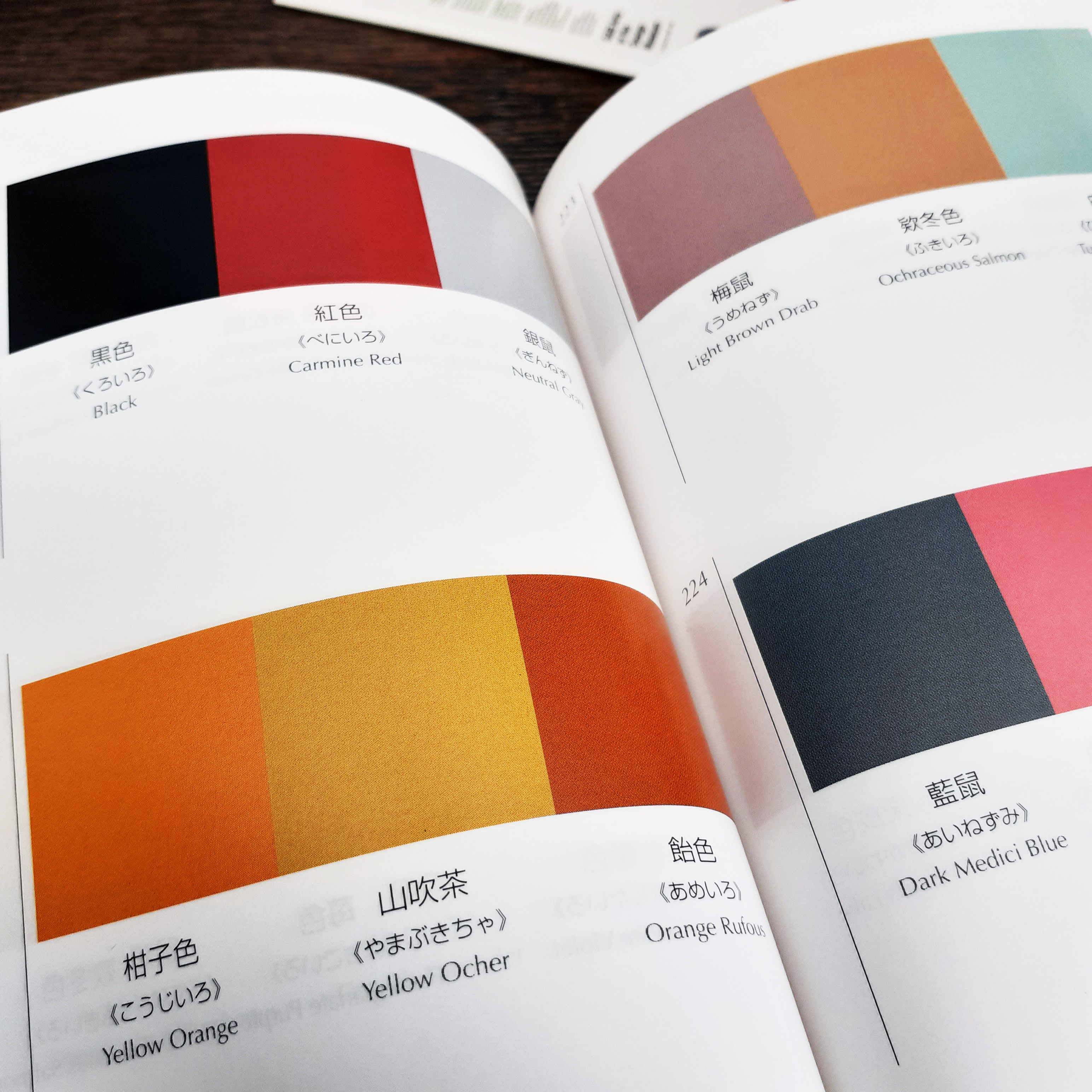
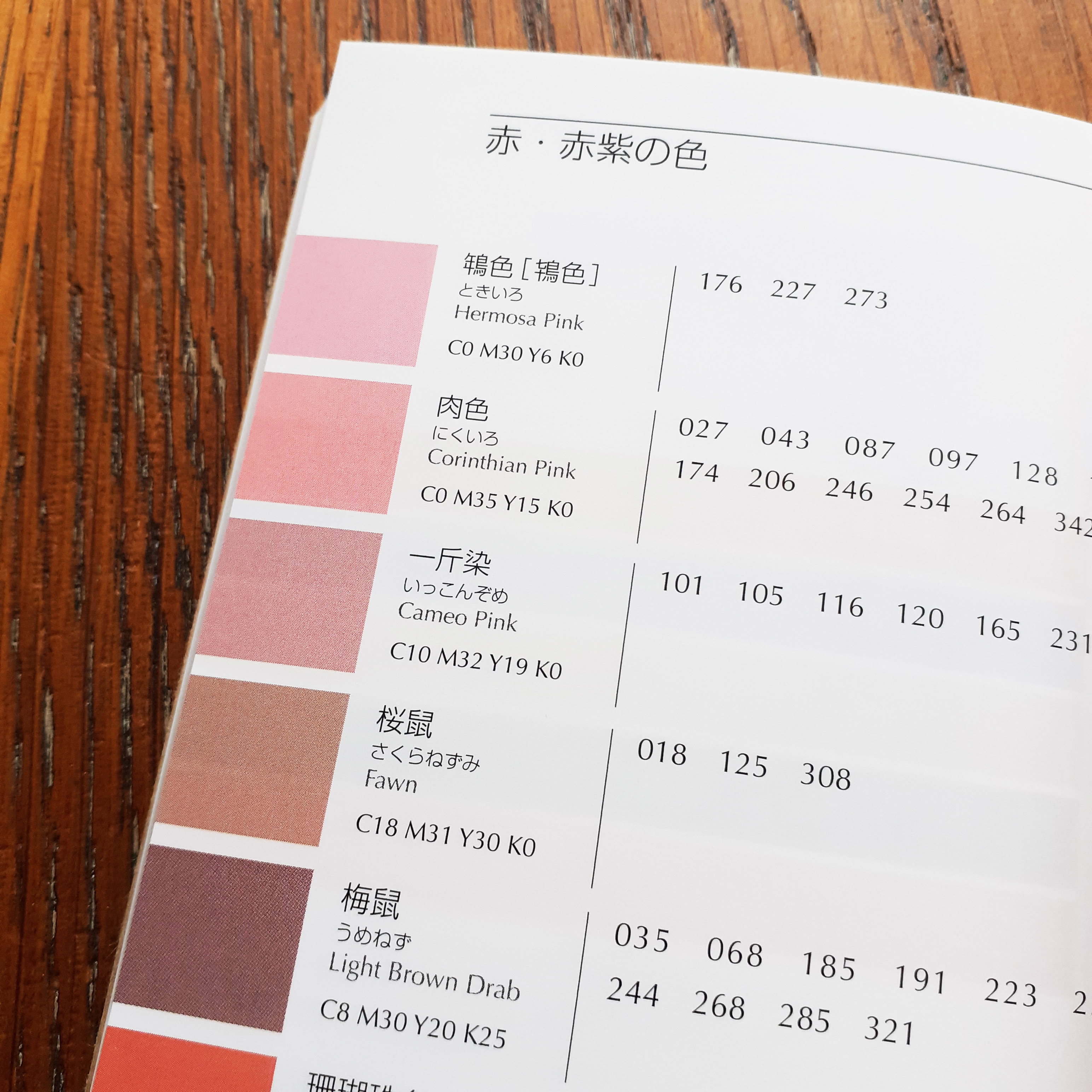
This book is very fun to flick through for the unique blend of tastes Japanese design has acquired. The number of colours used on some logo designs, and the colour combinations across these logos is a very interesting insight to design that does not follow international rules.

I’m very happy to add this book to my small collection of graphic design books. I really look forward to the day that I am able to visit libraries again to check out any recent publications for graphic design reference, too. The internet is handy to have at my fingertips, but sometimes I find holding and pouring over a book a better experience. Carefully curated publications like this shows why print is still around!

Book Illustration – Coralie Bickford-Smith

I picked up a picture book recently, so I want to share it here. I’ve missed visiting book shops and food halls this year just to see modern designs on full display (in their natural habitat… in competition with each other). The book I picked up is called The Song of the Tree, and it’s written and illustrated by Coralie Bickford-Smith.

I’ve seen Coralie Bickford-Smith’s designs at work on cloth-bound reprints of classic books in different stores before, but I was never interested in the gift-market classic literature reissues myself (I don’t seem to have a lot of family or friends who read physical books).

book-cloth
Cloth-bound children’s book by Coralie Bickford-Smith

I’ll share a few of the photographs of the book I took. Bear in mind that these are taken in natural winter light, and I feel in person, the colours are much more vibrant and deep.

The deceptively simple shapes that make up patterns, plants, and animals give the impression of Lino or wood-block printing. There’s a great balance of detail and negative space.

book_pic_1
book_pic_2

The use of text makes reading the story engaging. Some pages, you have to tilt the book to read.

book_pic_3
book_pic_4

On most pages you’re rewarded for looking closely at the illustration – you’ll see delicate little animals hidden about the foliage.

Anyone who appreciates storytelling though words and pictures – child or adult – can enjoy this book; it’s a decent length, about 50 pages long.

develop
This image shows Coralie Bickford-Smith’s book illustration development

Some of the development work that goes into creation of Bickford-Smith’s books is recorded on her own website. In the above image you can see great understanding of editorial layout being put to use in a picture book’s layout.

I have other books on the shelf that I want to photograph and share here for those who may be interested. I’m also eyeing some new design-related publications to add to my small collection of creative books. I hope to share more soon.

When next you’re able to visit a brick and mortar book store (safely!) I’d recommend checking out the children’s section if it’s not somewhere you usually check out – you may even find some unexpected stimulation for your creations by flicking though some choice books.

Vintage Illustration – Luggage Labels

Since any significant travel has been restricted for months, I’ve tired to satiate the desire for exploration by traversing the local woodland and such. It’s a solitary activity, and thus I’ve much time to think to myself. I thought about how much overseas traveling there is to look forward to in the future once such movement is safe.

airline label
Luggage labels like this were crafted to advertise airline and hotel services in the 20th centuary

When I looked through my last passport, I found very few ink stamps on the pages despite how much I had traveled with it. A lot of the documentation of our travel these days is digital. Long gone is the era of travel ephemera such as luggage labels; the kind that airlines and hotels used to slap on vacationer’s suitcases. Never have I seen luggage labels in person. But exposure to them in vintage cartoons and film leaves me with a romantic impression of them. (And perhaps, a romantic impression of travelling itself.)


various luggage stickers
Vintage airline and hotel luggage labels

In searching for these specific paper ephemera, I ran across the flikr account of Tom Schifanella, Art of the Luggage Label. All of the images I have shared here are sourced from Tom Schifanella’s account, and so I encourage you to browse through the albums if any of these designs pique your interest.

even more various luggage stickers
Different shapes that baggage labels take on

I want to share a few labels that stood out to me for one reason or another, even labels that I don’t feel affinity for – because it’s still possible to appreciate and understand the thought and concept of the designs.


Location-Centric Illustration

The following couple of labels are minimalist depictions of Italian holiday destinations surrounded by water. I like these designs for their limited use of colour; while the design for Hotel Capri uses three colours in total, the Grand Hotel in Lake Como uses four. The bold, sans-serif typeface helps the text read on the small scale that these images would be printed.

Hôtel Capri sticker
A baggage label illustrating the island of Capri, Italy
Grand Hôtel Bellagio sticker
Label for a hotel situated in Bellagio, Italy

Despite my attraction to these illustrations for their deceptively simple designs, the corporate illustrations of luggage labels are not all subject to strict restrictions of colour or texture.


Typography-Focused Design

These French hotel luggage labels are almost excessively ornate. While the highly-detailed graphic direction doesn’t appeal to me personally, these designs communicate clearly feelings of grandeur and wealth.

Lyon hotel sticker
The label for Grand Hôtel de Lyon
Lyon hotel sticker
Hôtel Mirabeau labek

These decadent visuals aren’t ubiquitous today as this visual direction isn’t always practical or very suited for many modern services and goods, thus the old-school draftsmanship skills used to create these are not so freely taught or learned to students of design today.


Swiss Style

These circular labels are all happen to be advertisements for hotels in Switzerland. They’re all functioning on a limited colour palette, too.

anotherswiss hotel sticker
Fox Label from a Hotel in Lenzerheide, Switzerland

This illustration brings up feelings of outdoor activities and exploration in the mountains. The stylisation is nostalgic to European children’s books from childhood.

swiss hotel
A peacock promoting a hotel located in Einsiedln, Switzerland

‘Pfauen’ here means peacock, and peacocks bring to mind elegance and beauty. This design takes advantage of the circle shape with a clean, considered illustration. The registration of the pink ink looks to be off, but it also lends this piece more character.

sun hotel sticker
Sun label from a hotel in Arosa, Switzerland

While this graphic doesn’t immediately communicate to me traditional ‘hotel’, I can feel a connection to mountainside spas where one can enjoy the closeness of nature. I can’t help but think of The Sun tarot card when looking at this…? The design does interest me, and makes me wonder what the hotel attached to this sticker was like.


Swiss style labels
More examples of mid-century Swiss Style

There is so much variety in these miniature illustrations, it’s a little overwhelming tying to take them all in at once – they’re in competition with each other, after all!

A number of these label illustrations are a shock as I would not have even contemplated some of the colour combinations employed, and yet I enjoy them. Other designers have made considerate use of black and I also consider that bold and brave – I’m always wary of how absolute and black is and its power to overwhelm an image. So, in reflection, I realise I can be more adventurous when illustrating in the future.

Hong Kong hotel
Still standing, just modified

While it was an impulsive action to seek out these luggage labels, it was rewarding. I found a whole world of corporate design I knew next to nothing about. There’s definitely a lot to pull from if you’re looking to find inspiration from past eras. But in imitating past design it’s important to think about why you want your work to be informed by older works, and if it really does communicate what you want.

Think about why these illustrations have been saved and are still appreciated now – many able to outlive the services they promoted. A lot of thought and heart went into these labels to ensure their impressions stuck!

Sanzo Wada – “Haishoku Soukan”

I picked up a new book as I want to add to the small pool of design reference books I have. The book is called A dictionary of Color Combinations, and is published by SEIGENSHA. The small amount of text within the book is primarily written in the Japanese language, but the practical nature of the book means it is accessible to those who can not read the Japanese text.

a_dictionary_of_color_combinantions_front01
A dictionary of Color Combinations

a_dictionary_of_color_combinantions_front02
The book itself is a lovely object

The contents of the book are sourced from the work of Sanzo Wada (和田 三造). Sanzo Wada created 6-volumes of colour studies (Haishoku Soukan) between 1933 to 1934 (in the pre-war Shōwa era). Sanzo Wada studied western style painting at the Tokyo School of Fine Arts and later worked as an instructor at the school. This book’s dust jacket states that he was a working artist of many disciplines; while he was a costume designer for theatre and movies, he was best-known for his woodblock artworks.

a_dictionary_of_color_combinantions_index
Contents page

Color_combinations_01
Details on the source materials

The book sports a thin brown paper dust jacket, and is rather small being A6 (so you could say it’s a ‘pocket-sized’ reference book). It’s very dense, and there are more than 300 thin, but glossy pages. Over 200 of the pages are dedicated to colour combinations (348 unique combinations in all). There is a section for colour pairings, and then three and four colour combinations. Each colour is given its Japanese name first, and then an English name.

a_dictionary_of_color_combinantions_2colors
Pairs of colors

a_dictionary_of_color_combinantions_3colors
Groups of three cololours

Even though the contents are from back in the 1930s, it’s clear that Sanzo Wada was progressive in colour theory studies, and the colours grouped together here will work to suit contemporary western sensibilities. I can imagine looking to this book when stuck on illustrative projects with mature audiences and certain demographics in mind. The books gives the CMYK (the cyan, magenta, yellow, and key/black) code of each colour towards the back. (The CMYK colour range is used for any design intended for print.) This is very friendly feature for those working digitally.

color-combinations05
Colours and their codes

a_dictionary_of_color_combinantions_swatches01
Using the cut-out swatches provided, it’s possible to arrange new combinations

At the tail-end of the book are plenty of colour swatches in which one can cut out and make one’s own colour combinations. (I personally can’t bring myself to cut such a book up… but the practicality is a nice thought.)

a_dictionary_of_color_combinantions_back01
The back of the book

The insides and usefulness of a design book is more important than its image, but this book happens to look and feel nice. (It’s actually a difficult book to photograph given how tight the binding is, but I hope the pictures I took showcase the contents and overall look well enough.)

If this looks like a useful book to you – for use in interior design, fashion, graphic design – then it’s good to know that the book has been in continuous print since 2010 and is not difficult to come by.

Hoard of zines – Hoard of art

I have written about the odd zine that I happened to pick up in the past, and very recently, in fact! I’ve decided to share a number of zines that I have on-hand in one post to show off the variety than can be found. This is not as in-depth a look as an entry would be looking at a single piece, but be prepared to eyeball a lot of images. This entry is picture-heavy!!


Firstly, I want to show a couple of zines by Kristyna Baczynski, Spring Wild, and A Measure of Space. Both are risograph-printed, with vibrant covers and monochrome insides. They’re very easy on the eye.

spring_wild_tree
Risograph-prizted zine, Spring wild by Kristyna Baczynski

The cover of the zine Spring Wild is two tone. The inside is a dark green ink on light green paper. It’s not possible to go outside and enjoy the wildlife beyond back gardens as I write this, but this small zine is a little catalogue of spring-time plants native to European countries. The body copy is in printed handwriting. It’s full of charming illustrations and wit.

narcissus_page
Spring Wild’s page on the Daffodil

Ordinarily, I’d avoid scanning books with their spine at risk of damage, but a thin zine is much less likely to be harmed by scanning its pages, so I feel at ease sharing some clean pictures of some of the publications’ contents here.

tabletop_zines01
Copies of A Measure of Space and Spring Wild, by Kristyna Baczynski

Many zines you’ll see out in the wild (on any (comic) book store shelves) are printed in monochrome, which is to keep costs down as they’re not often made with the intention of making a big profit. (More likely, the zines will be worth more second-hand if the creator’s work is coveted.) Most of the zines I have in possession are of a single colour.

page10_and_11_measure_of_space
Pages 10 and 11 of A Measure of Space

Working in black and white, A Measure of Space has plenty of visual clarity that may come across as cluttered if it were coloured haphazardly. I actually like pouring over some of the more jam-packed comic panels to make out little details.

Both of Baczynski zines are bound saddle stitch (with staples) and so are most of the zines I own. Finding ones tied together with other materials is a welcome surprise.


It feels quite special to find a zine with a cover that’s a different colour paper or card from the rest of the internal pages. I haven’t many zines that are printed on coloured paper as of writing.

inside_H2MAZ
Page from How To… Make A Zine, by Hayley Wells

Above is a page from How To… Make A Zine, a photocopied mini zine made from a single sheet of white A4 printing paper. This tiny publication is all about… (you guessed it) …how to make zines!

Because there are no hard and fast rules to the medium, I’ve acquired zines of all different sizes, contents, and materials. Some zines are even made from a single sheet of A4 and folded into 8-pages (including the front cover and back cover).

inside_iceberg
Pages from ICEBERG by Hayley Wells

The scan above shows pages from a tiny zine, made from only one piece of off-white printing paper. Hayley Wells’s ICEBERG consists of full-page collage illustrations and small pieces of text formed from what look to be old-school rubber or metal alphabet stamps. For a monochrome zine, it stands out among other’s I’ve seen due to it’s unique visual presentation.


Lesser Seen Folk Demons is a beautiful risograph-printed zine using two colours. It’s a modern bestiary of spooks and creeps and we may find around the world if we’re lucky. It’s 24 pages long. Each demon gets a description, and an full-page illustration made from collage. Part of the allure of this sort of publication to me is stems from media from childhood that focused on bestiaries and lore of fictional monsters.

LSFD01
Illustration of Unca Grabba in Lesser Seen Folk Demons

It feels much like a slender book; there’s a forward by Dr. Mathew Cheeseman of the university of Derby… there’s an ISBN in the back of the zine, along with the printing credits (year of publication, and edition etc.).

LSFD_Page15Page16
Page spread on the Leyak

The text in this book uses just two fonts; one for headers and one for body copy. The tone of voice is very tongue-and-cheek. A page on The Deadly Diddlio reads:

THE DEADLY DIDDLIO

The inhabitants of Pyefleet-In-Water, eastern England live in fear of The Deadly Diddlio, a malevolent wind-borne spirit who is purported to visit their small island once a year to bring discord, broken windows and sexual mayhem. Dating back to the twelfth century, this somewhat unpleasant avatar can only be combated by interpretive dance, and lots of it. He’s a pain in the arse, basically, and bloody ugly to boot.

Actually, this book’s concept is not too unlike thoughts I’ve had about crafting illustrative bestiary-like zines, albeit with a vastly different tone of voice and art direction. Seeing this out there proves that there are people that genuinely enjoy such specific content. (I guess I should step on it already and draft such a bestiary of my own subject choices, huh.)


You can be sure that there will be more small press works that I’ll want to share on my blog in future entries. There’s also plenty other content that I want too share here. Look forward to it all!

Super Delicious Limited Company – Chocolate Bar

After finishing much research for a current project, I came across a striking food product that is unlike any other chocolate product I’ve seen before. I’ve not included it in sketchbook research because I found it so late, but I also feel that it would be best too here on my blog.

The Super Delicious Limited Company chocolate bar packaging is designed and illustrated by by Zilin Yee, an independent graphic designer, while the copywriter for the project was Herbie Phoon. Zilin Yee used the programs Adobe Photoshop and Adobe Illustrator to craft the very tactile-looking packages, informed by the physical qualities of Joss paper.

dragon chocolate01
A product “based on the idea of the joss paper culture

The traditional, bamboo-made Joss paper is burned during ancestral worship ceremonies. Joss paper includes variants known as ghost or spirit money, which are highly colourful ‘afterlife bank notes’, burned at funerals. The packaging designs capture the brightness and patterns of the ghost bank notes.

a bunch of chcolate
Many different packages

hellmoeny chcoolate
This package illustration is strongly reminiscent of ghost money, featuring an emperor

The chocolate bar’s packaging all feature very whimsical and playful illustrations. The line of packages are of course, tied together by their visual theme, and typography. The brand logo, product name, and weight are positioned in different places on each package, which is unusual as the same placement would unify a product feasting differently designed packaging.

dragon coco
The colours and patterns are enough to make me want to buy this

If I were to see this sort of product package design in the west, it would undeniably have strong shelf presence going for it, even among other ‘designer’ or ‘premium’ chocolate bars with outrageous packaging design, Super Delicious Limited Company chocolate wears its inspiration on its sleeve (…or box).

The design inspiration has no immediate relation to chocolate (or the origin of  the cocoa bean) but it stands out due to the unique route the designer chose to take. Sometimes a product doesn’t have to ‘fit in’ with the status quo to be desired. More-so than other chocolate bars, the visuals of these packages are the real draw to the item, and that’s worth thinking about in future packaging projects.

Up-cycle Design – C5 Envelopes

Alongside the desired phone calls or video chats to keep up distance relationships, I’ve found myself both sending and receiving more postcards or letters to keep in contact with loved ones. A few weeks ago I ran out of envelopes to send letters to friends and family, so I decided to up-cycle some paper from around the house to make envelopes. I used an old copy of Creative Review – a commercial creativity and graphic design magazine.

The insides of Creative Review are varied. The magazine covers the current visual trends, notable student graduate work, interviews from designers or creative directors, art exhibitions, the news on the latest popular media (films, video games, etc.).

THIS ONE
These C5 envelopes made from a 2001 issue of Creative Review

I was familiar enough with basic envelope nets to bash out some C5 envelopes in a short time. I used a popular culture review page, an art exhibition review, and a printing service advertisement to make radically different envelopes.

As I have already cut up my 2001 copy of Creative Review, here are a few images of the magazine’s insides of another issue (taken from their website). These are page spreads of of a 2018 issue, showing the magazine’s variation of editorial design.

CR_spreads_OCT18_p54-55
The Place issue: October/ November 2018

CR_spreads_OCT18_p78-79
The Place issue: October/ November 2018

CR_spreads_OCT18_p148-149
The Place issue: October/ November 2018

A single page of Creative Review is large enough to make a single C5 envelope, with room to arrange the placement of the net. Part of the fun is figuring what imagery or text would look most exiting on the envelope. Even the advertisements can hold some interesting photos and design!

EAT_MOUSE
LICK, LICK

This envelope is my favourite of the three shown here. The placement of the stamp looks as though the ‘design’ is interacting with it. It sparks ideas for illustrated envelopes.

I’ve mentioned my affinity for stationery design (particularly illustration) in the past, and that at some point I’d like to try my hand at designing some letter writing sets. There’s definitely something to be gained from experimenting with the materials (and imagery) that make up mundane objects to generate new excitement in them. I received a positive response to these envelopes when I sent them out to others in the post!

Unrealised Goals – Finish them in summer 2020

The summer is fast approaching. The academic year is reaching it’s end. Sure, student timetables are out of whack now, but it’s important to keep going. I need to set myself goals over the summer months to keep my creativity and interest in design up. I’m looking back at a project not long since handed in, and I know that I want to revise elements of it already.


I handed in my responsive project – a live brief outcome from the UN and the World Health Organisation. I will admit that I swayed the brief to suit my own emotional and mental-wellbeing, from ‘raising awareness of Covid-19 to prevent the spread’ to ‘coping with the pandemic through activities’. The thing is, I had to write a proposal, so I found justification in the angle I ‘tackled’ the brief. In modifying the brief, I could focus more on subjects that would help me cope, while being – theoretically – more productive.

Essentially, to address the problem of Covid-19, I chose to design for a child audience, and ‘market’ an activity that would be cultivating inside-grown plants from mail-order seed packets. The real drive for the project being to give kids more structure and short-term goals at home when schools were closed. I wanted to include two mini zines (8 pages each) with information and facts on the types of plants that can be grown from the seeds, and garden insects that are beneficial to outdoor plant growth.

I explored a couple of different illustration routes to see what could suit seed packet design and little booklets, but it was a lot to take on in such a short space of time. I only got as far as making mockups of the basic layout for a proposed packet design, and one zine. I made many illustrations, but I don’t think they’ll go to waste. This project included my first tries at creating digital collage.

new_hoverfly
Hover fly digital ‘paper’ collage

Although it’s far more time-consuming than I had thought – I still felt a lot of gratification upon finishing any insect collages. I am very happy with how some of them turned out.

I wish I had shared more of my development work as I was working on the responsive project. I shared a little over some Microsoft Teams DMs and Discord, and got some interesting insights into other’s thoughts on paper collage. I realised the variety of the  papers I could use – the ‘paper’ being digital – were bigger than I thought. Newsprint and even photographs can be utilised for different textures and to suggest different patterns.

paper_cutouts_beetle
Ground beetle digital collage

I’d like to make more bug collages over the summer, and fill a whole printed, colour booklet. I want to finish the black and white zine full of line garden insect drawings I started for my responsive brief, too. I’d want to make the hand-drawn illustration version downloadable, printable, so that folding it and colouring it is an activity on top of learning bug facts.

There’s a lot go milage in my proposal as it’s not explicitly Covid-19 specific, it can exist outside of the initial brief timeframe, which lends the ideas longevity. That’s why it’d be worth returning to the project in my own time.


One of the last modules of the academic year is a ‘personal project’. Again, I have full reign over how I want to approach design. It can be anything. ANYTHING! Naturally, I generated a number of ideas that I can’t possibly address within the soon-approaching deadline. Some ideas probably aren’t worth looking at closer than I already have. But the ideas that I can’t address in the meantime are worth looking at in the future. I can set myself goals to achieve some of these projects.

idea geneation
I thought a lot about different routes to take a ‘personal’ project

Some routes I was interested in were stationary sets – letter-writing sets… sticker design – health and wellbeing product packaging, spotters guides, and the good old bestiary. Here are a few notes I took in my sketchbook while musing over spotters guides and bestiaries:

spottersguide01
SPOTTERS GUIDE??

spottersguideexample01
I even thought about phone applications in relation to spotters guides

beasteriesexample
Etchings and ink illustrations of grotesques by Arent van Bolten, made between 1604 and 1616

Books full of creatures from folk tales, or video game monster indexes have always interested me. There’s definitely fun to be had in illustrating (and writing for) such things. So I can see myself making images for some variation of a bestiary myself.

Whatever routes I can venture down, it’s all an excuse to make illustration that I can put my heart into. Digital or analogue; I don’t think it matters much which I use, but the medium would probably change in relation to the illustration style I most want to dive into.

… But I chose what I had thought to be the quickest and most useful route to myself, thinking about the near-future. I’ll be looking at packaging design. I’ve worked on some before. I’ll put to the test the knowledge I’ve learned in the past!


Planning out projects during the summer months and staying up-to-date in wold design news is vital as to not lose the heart I need to find work in the creative industry. It’s also important to keep up my blog; write about any design I find of interest, show any development of interest, and so on. The next logical step… is to finish all of the modules I have already! But then… then I can work out a schedule for the summer. And meet unrealised goals.

Zürich – Grossmünster & Sigmar Polke’s Stained Glass

At the risk of my blog becoming too much like a travel diary, I want to post about my trip to Zürich last month. I visited Zürich briefly to see Grossmünster and Sigmar Polke‘s stained glass. (Grossmünster means ‘large cathedral’.) It’s forbidden to take photography inside of the building, so I had thought it would be somewhat redundant to write up about the visit without pictures of my own.

Good thing there are a few images on the internet from the years when the works were promoted by cultural and tourism websites!

sigmar polke windows grossmunster
Agate window, King David, and The Son of Man, Sigmar Polke

Pictures taken from Swissinfo.ch

Firstly, getting to Zürich from Steckborn was a breeze with the BBS trains and buss phone app. It took a buss and three trains, but I got there. I was determined to get there!

There is a large bronze water fountain and statue of Alfred Escher outside of the Zürich HB train station (the largest train station in Switzerland). You can’t miss the monument exiting the station if you’re headed for the Romanesque ex-cathedral .

Zürich has its own Kunsthaus (art house) a National Museum, and even vintage a Toy Museum, so really, there’s so much about the city that I didn’t get to see in the single morning I was able to spend there. Definitely, it’s a place to head to again in the future. Or if you happen to visit Switzerland, know that Zürich has a lot to offer in art and design.

agate windows sigmar polke
Agate windows

So… who is the artist behind the stained glass…? Born 1941 in Oels, Poland, Sigmar Polke and his family were expelled to communist East Germany after the war. The consumer culture he grew up immersed in had a lasting impact on his work, his earliest successful works depicting consumer goods. In his works, Polke made use of very unconventional mediums, such as meteorite dust or detergent.

Polke trained as a glass painter in Düsseldorf and studied for six years at Düsseldorf Academy of the Arts. He’s had his work exhibited in Zürich’s Kunsthaus. The stained glass on show in Grossmünster display Polke’s interest in alchemy, transformation, and religion.

gm_sp_door_glass
Photograph of the windows above Grossmünster’s front door

Photo from grossmuenster.ch

It was between 2006 and 2009 that Polke completed his stained glass windows in which Grossmünster commissioned. I had just visited some other places of worship in Germany prior to seeing Grossmünster’s very unconventional windows, which set it apart from much more conservative churches.

The agate windows are particularly spectacular for their colour arrangement. Acording to the English-language booklet I bought from the visit, agate stone slices have been used in window-making since the Middle Ages. Modern technology allows us to thinly cut the rocks and we can see the coagulation of the time and energy within the stones.

windows sigmar polke1
Scapegoat and The Prophet Elijah 

Each of Polke’s windows carry some religious significance. The Scapegoat… burdened by people’s guilt. Its embedded wounds are represented by the precious stone tourmaline.

The Prophet Elijah depicts a medallion with Elijah’s ascension; Elijah rides a fiery chariot into the world beyond, and discards his coat, and disciple Elisha picks it up. The coin-like medallion here is also reference to the need to pay a fee to pass into the afterworld.

Polke
Because I couldn’t take photos, I bought postcards instead.

The ex-cathedral is said to have been built over the course of the 11th and 13th centuries CE, and the contemporary stained glass of Sigmar Polke is skilful as to be in harmony with the historic site. The masterful understanding and control over light – both light’s celebration and obstruction within these windows – are something I’ve not really experienced before.

I made sure to pick up postcards of Polke’s work to send off to family and friends before leaving. Visiting the building is something I can’t recommend to those who are entirely uninterested in religion, or those who feel uncomfortable in places of worship. But if you’re comfortable enough to spend time in a quiet church to contemplate the windows, it’s worth seeking out Grossmünster. As with other cathedrals, there’s always the crypt to check out, too; there’s a large statue of the Holy Roman Emperor, Charlemagne, who in legend is said to have founded Grossmünster. Believe the legend or not, it’s up to you.

Easter – Läderach Goods

It’s a Sunday – a chill day – it also happens to be Easter. So I thought to share a relaxed post of some pictures and thoughts of some Easter-marketed Swiss chocolate (and their packaging). I picked up these items while in Switzerland.

At the end of my last full day in Switzerland last March, I visited ST. Gallen’s Läderach chocolate shop to pick up some of their fabled goods. Among the most well-known chocolate brands in Switzerland, Läderach has been around since 1962. Of course with the Easter-themed goodies on sale, I couldn’t not pick them up to share with family once I got home.

alltheladerach
Läderach chocolate that I brought back from Switzerland.

Not pictured: the rest of the Swiss chocolate I brought over with me.

I felt that I had to pick up some chocolate eggs and a little hare. I did buy a nice pre-packaged selection of FrischSchoggi – that’s ‘fresh chocolate’ in English. Läderach’s FrischSchoggi are displayed as large slabs that can be broken up upon request of a customer and are priced according to weight.

Anyway, let’s look at the two Easter-related items that I bought. It’s an opportunity to critique at types of packaging design that I have not yet looked at.

eggsboxladerach
Plastic and cardboard egg box packaging

It’s not strange to come across real hen and duck eggs stored in plastic boxes, but the type I’m most used to seeing are the cardboard variant. Here, the point to using plastic is that the consumer can see these hand-painted chocolates inside of the packaging. It’s not the most environmentally conscious choice of material, but it can be recycled.

For those wondering, the flavours of chocolate eggs inside are strawberry, milk, and orange!

laderacheggsgold
Raised foil text on the egg box’s cardboard wrap

The wrap around cardboard label is predominantly beige with cocoa-coloured silhouettes of springtime grass, flowers, and… flecks of pollen!? The matte finish on the wrap around  features the brand’s logo in raised gold foil text. It’s mature and understated, and to me, it speaks ‘luxury’. Definitely this is a treat for the adult market.

backofladerachegges
The necessary info is stickerd onto the back

All of the ingredients and storage instructions of Läderach confectionary are in German. On the back of the chocolate egg box, the weight, storage, expiry date, and ingredients are found on a white sticker with black text which is slapped onto the underside of cardboard wrap. Note that the sticker acts to further secure the cardboard wrap, along with two smaller, round stickers.

Thinking about the product from an ethical perspective, the use of plastic isn’t great, but overall, the materials used to make this egg box can be recycled, and that’s good. As stated before, the plastic material chosen allows for the potential customer to see the product while keeping the chocolate both safe and clean. After all, the nature of this consumable can’t be compared to say, a fruit, which doesn’t need packaging at all.

cleochocolate
Raspberry flavour mini Cleo

These small, stylised chocolate hares are so cute that I had to pick one up for myself! The mould is elegant and sleek, but the painted eye adds a cute (and maybe a somewhat perturbed) look. Cleo came in many flavours. The mini Cleo that I picked up is raspberry, but the option of milk and dark chocolate were there.

These little chocolate hares stand up inside a plastic bag, with a cardboard backing for support. There’s a sticker atop each bag adorned with the store logo. From the front, the strip of cardboard support has a simple grass field illustration and the product name at the top. At the base of the cardboard backing is the ‘Chocolatier Suisse’, printed in gold, in the same font that adorns base of many of their year-round packaging.

Speaking of the standard packaging, the Läderach branding uses almost exclusively white, gold, and black. (Can’t really go wrong with those colours.)

backofcleo
Reverse side to the mini Cleo chocolate

The back of the Cleo product shows the legally required product information which is stickerd onto the back of the plastic bag, made visible by the white of the cardboard strip. The sticker label states the weight, storage, expiry date, and ingredients of the treat.

The overall presentation of the product is unfussy by design. The packaging used can be recycled, but it is less so than a traditional cardboard package that Easter confectionary is often sold in. I don’t believe that I have seen moulded chocolates presented individualy like this in any other shop, so to me, the packaging is somewhat of a novelty!

In the future, I’ll keep in mind Läderach’s packaging design in comparison to our equivalent domestic products aimed at the same audience. The pervasive usage of white and gold is light and friendly, yet chic. Läderach definitely has it’s own identity, even if it’s a relatively young company in the grand scheme of chocolatiers!