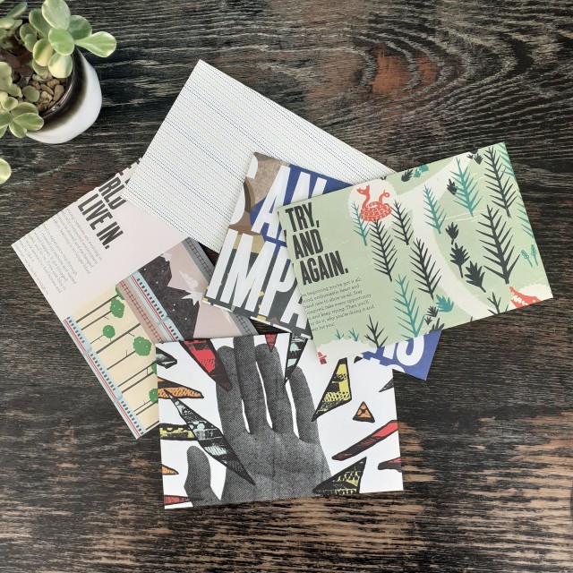
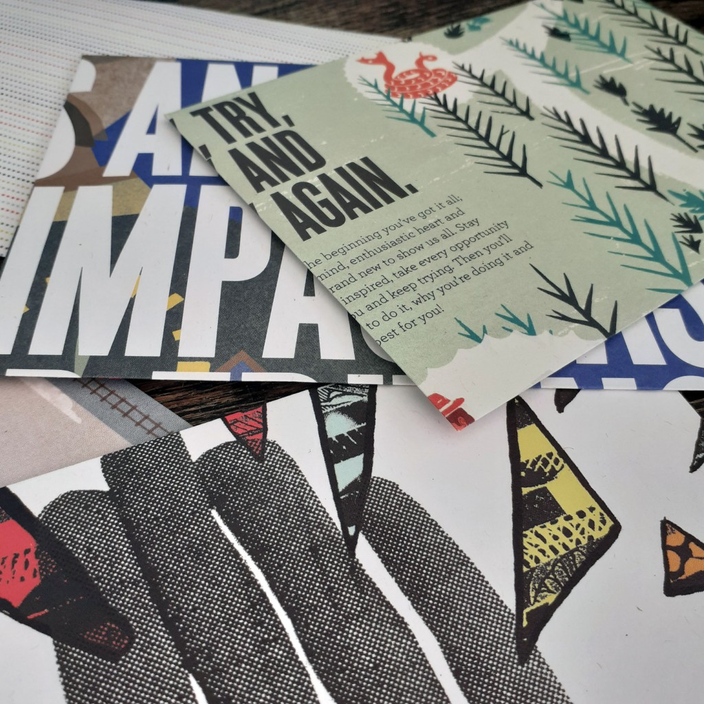
Once again I turn to some outdated printed media to craft some envelopes. They’re for personal use, so I doesn’t matter what the end result looks like. They fair fine enough in the post. I used a copy of YCN Student Annual 2010/2011. As the name implies, it’s a book full of graphic design work by students.
These aren’t a standard size envelope, but they fit A5 paper folded in half. And that’s good enough for my personal correspondence needs.
Using these makes snail mail quite a lot more fun and personable than it already is.
I hope to share some more of the specific art and design books that reside on my bookshelf in the near future. I’m reading a few essays that are not directly related to design, but I may find myself sharing such media here, too. Sometimes it’s good to read outside of your interests and you may find yourself some nugget of wisdom that’d otherwise go overlooked.
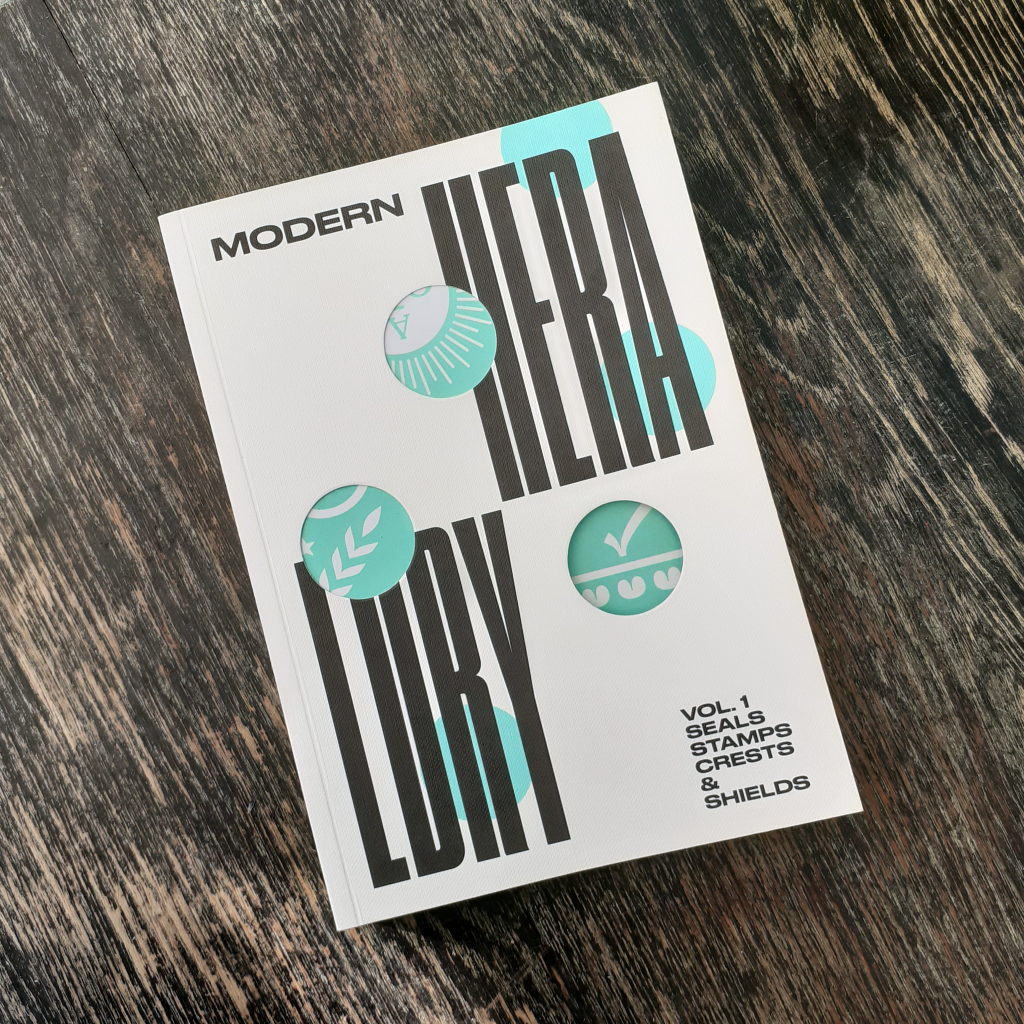
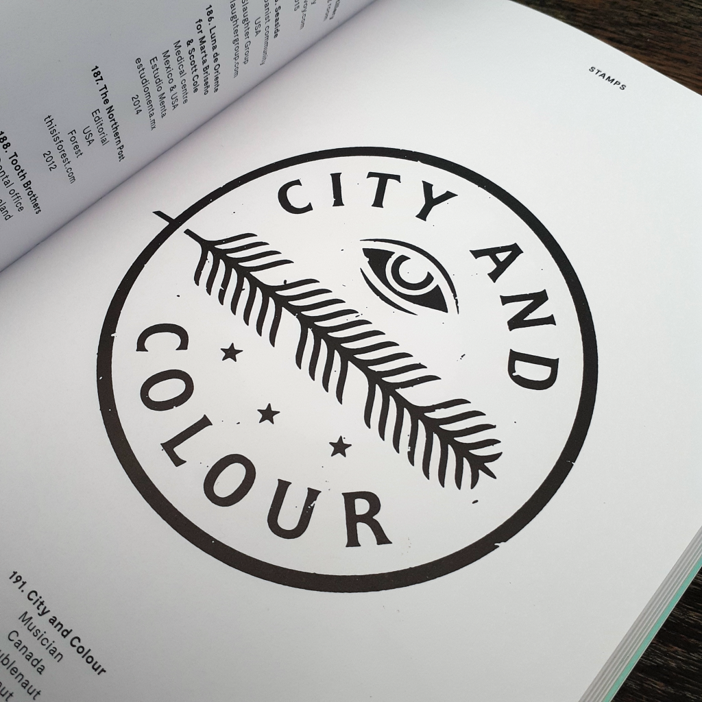
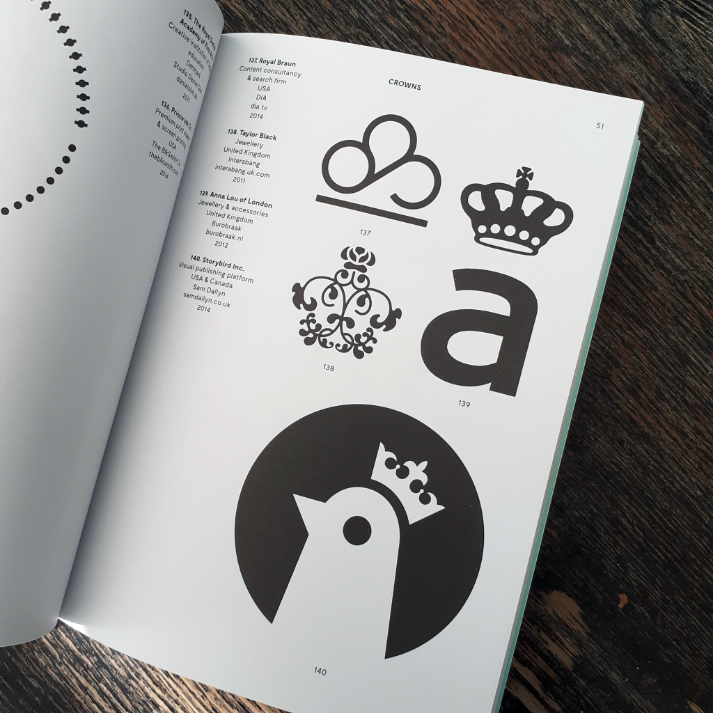
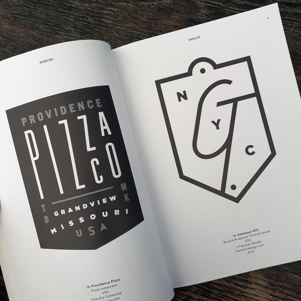
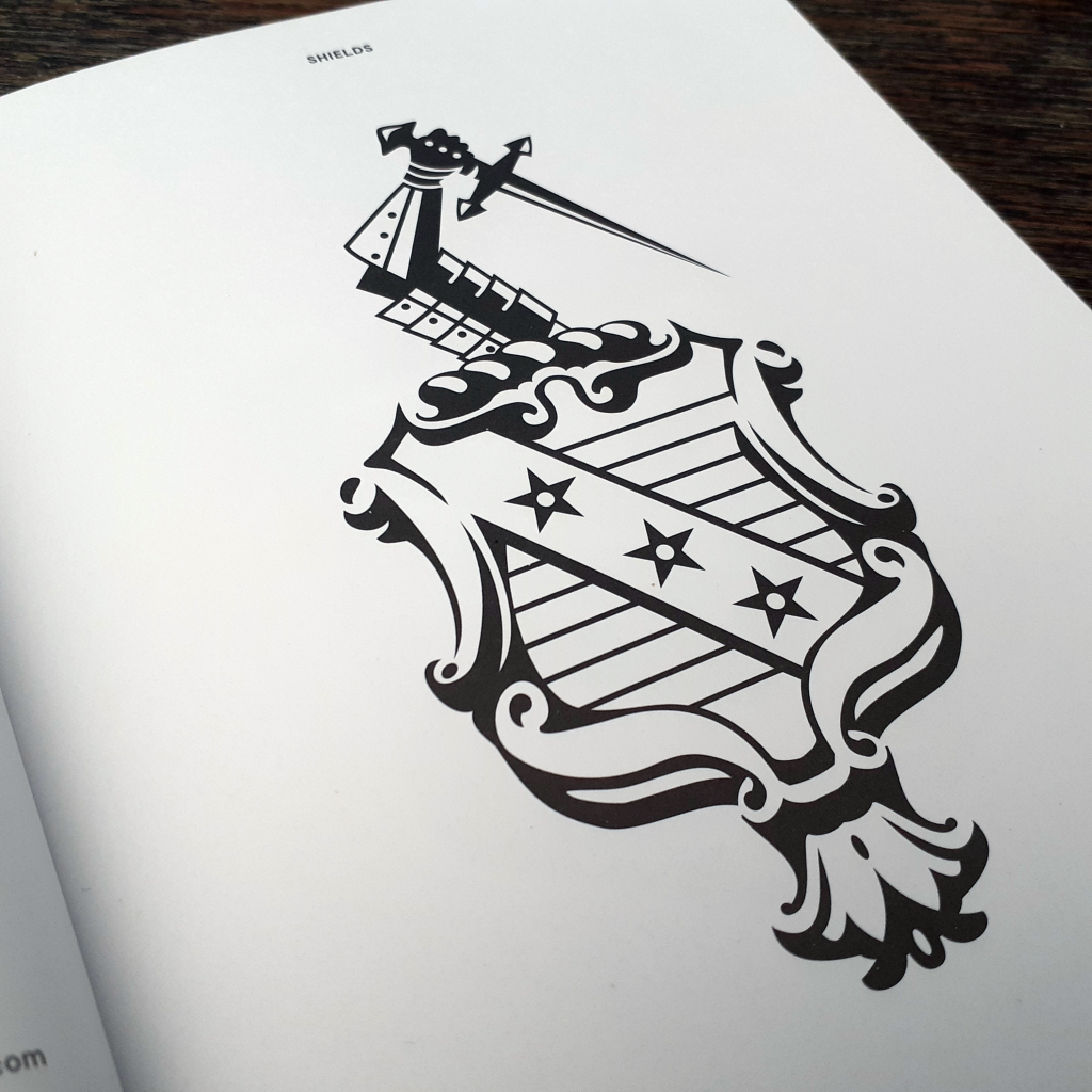
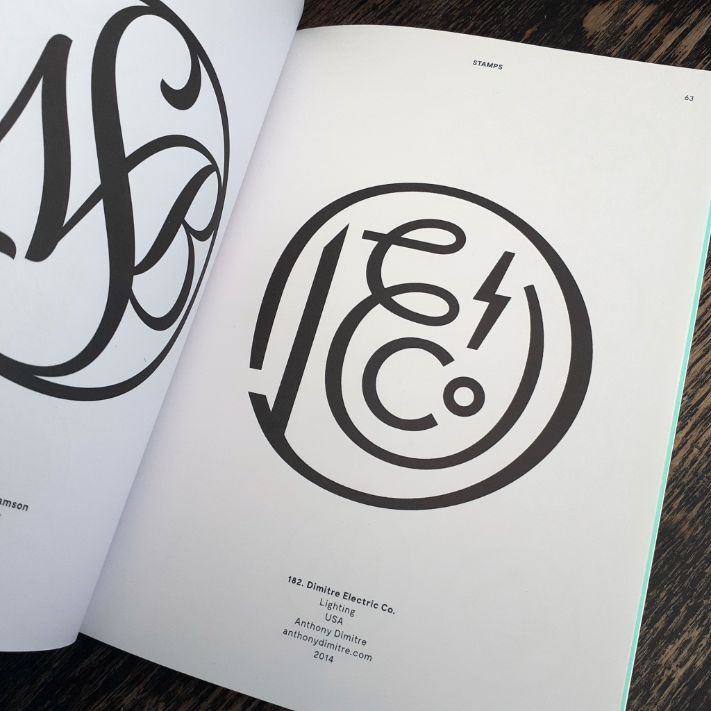
Long time no blog, huh?? I thought to share some books on my shelf that others may find of interest for design reference and inspiration. The book I picked out today is Modern Heraldry VOL. 1 Seals Stamps Crests & Shields (2015) published by Counter Print. This blog entry isn’t an endorsement of the publisher, rather it’s my desire to point others to useful printed references in place of using the internet for the majority of gathering material to spark projects and the imagination.
I won’t be ‘reviewing’ the book here; I don’t feel the need to. All I can say is it feels good to have on the bookshelf. You never know when such a thing will come in handy. (Even for rendering fictitious logo designs for movie or stage prop design, or environment/background illustration.)
The book is akin to a visual dictionary. The language of design in dense, and this books sorts the best of the best modern symbolic logo designs into easily referenced sections of shields, seals, crests, flags & ribbons, and laurels. It’s a very pleasant book to page through.
The blurb states: “Modern Heraldry is a comprehensive and profusely illustrated guide to more than 350 trademarks, based in heraldic symbology, from all over the world.” Indeed, the book is an eye-opener to overseas logo design that otherwise would go unnoticed to me. It’s always a treat to see how other countries navigate design ‘trends’, and what design rules their work adheres to. The world is far more connected now than the previous century, so it’s reassuring to see vastly different takes on say, a café logo from different countries. (Of course the intended market audience and the quality of the product or service sold effects the image and logo even within the same country.)
I hope you can enjoy the few images that I’ve shared here. At some point, I’ll show some of the second volume of Modern Heraldry. I’ve a small number of other books by the same publisher, but I do own some interesting and equally specific graphic design books that I would like to share here. A previous graphic design book I covered on my blog would be Logos from Japan. It’s a fascinating insight into foreign logo and symbol design.
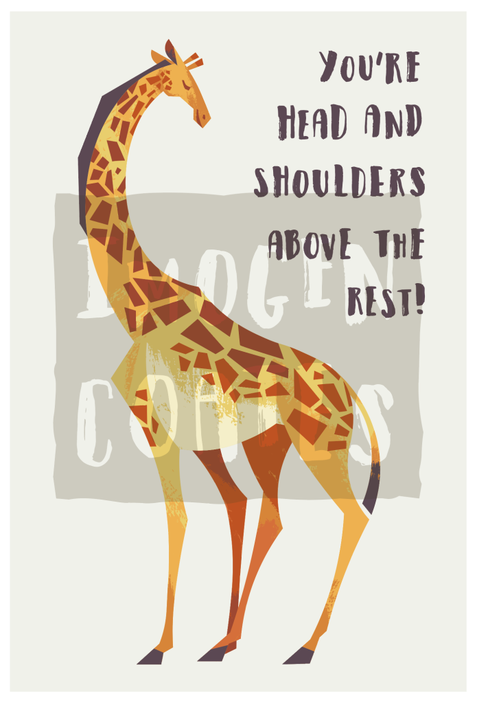
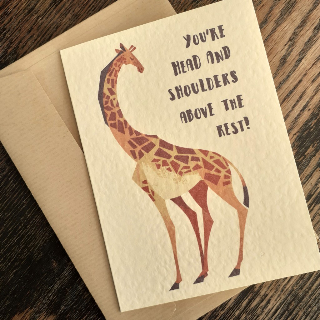
I made a cute (and perhaps even funny) animal illustration out of a quick sketch I scribbled down in trying to cheer myself up. I’ve not seriously looked at the subject in question before though, and I rather enjoyed looking at reference material for the giraffe caricature. I learned that there were many types of giraffe, which I suppose shouldn’t have been a shock. I boiled down the essence of the creature in my illustration.
You probably recognise the animal below from the long neck, the horns, and the spots. But! Did you know, giraffes actually have those camouflage spots all over their bodies? For ease of reading, there’s no need to adopt physical traits 1:1. Spots all over the body would have made the figure too cluttered. You have to be the judge of what you simplify and what you discard, when creating a cartoon out of a pre-exiting subject.
I know I’ll sound like a broken record for those who have read my more recent posts that contain my works, but this really is the last vector art I’ll be making in Adobe illustrator for the foreseeable future. I’m going to look at using different programs that I can make more experimental digital paintings in. The overall style will change in relation to the tools, but my sensibilities remain the same. I’m exited more than nervous to venture into Clip Studio Paint. It’s not an ‘industry standard’ but at this point, I don’t see why I shouldn’t use it to make personal work.
One drawback I found in using Abode illustrator for this mid-century style illustration was that I could never render enough elements to form a background unless said background elements lacked in texture. Obviously, I don’t use the program in a standard way (if there is one) but it was frustrating how slow the program would run if I began to use too many textures (or individual objects) in a piece. I’m lacking in skill when it comes to drawing environments, so I want to improve in that area, and moving to raster painting, I can draw with much more freedom.
I found the same digital image prints differently on varying card stock. It’s muted on this textured, cream card, but the image is more vibrant on a rougher, grey card I had on-hand. There are pros and cons to the characteristics of both card types mentioned. I’ve still yet to look into different card for mass printing from home. I am in the middle of researching those who stock card and envelopes for bulk purchase. I’ve gotten my hands on some free samples, to mull over the colours, sizes, and textures of envelopes. Testing paper for printing on… is much more intimidating.
It might be quite some time before I share any more polished work, given I want to teach myself digital painting, but I’ve been wanting to share some graphic design books here, and maybe other media and resources, too… who knows!
No matter what, time marches on, huh? It’s already spring! I’m very happy about that, though. A change of season is exactly what I need.
I said a while back that I’d practice raster illustration – digital painting – and… I’ve not yet done that. Some time last year I did invest in Clip Studio Paint. Unfamiliar programs are always intimidating, not unlike new mediums, and since I’m in no rush to familiarise myself with the program, I’ve only drawn a little in it. I really should have made it a New Year’s goal to work in it and understand the interface and tools.
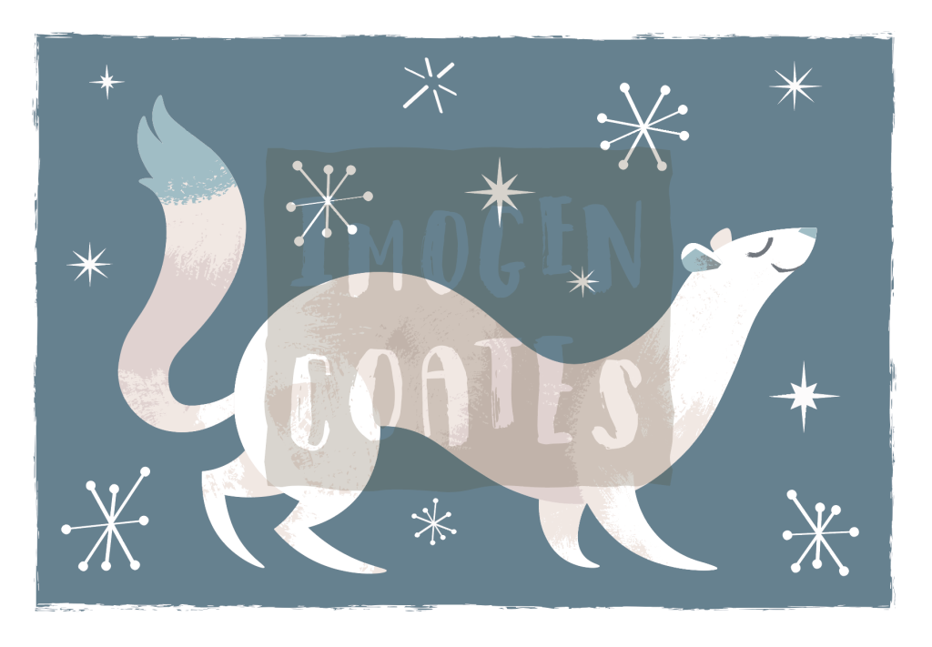
While it was still the cold and rainy winter, I made a vector illustration of a little ermine in the powder snow. You might not tell if I wasn’t to say, but each snowflake here is unique. I would like to print these next winter on cards, mayhaps.
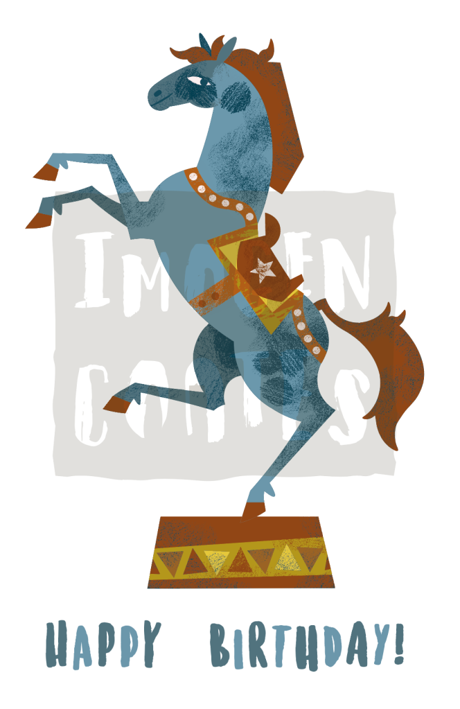
I dug into an older illustration that I’d used for risograph printing, because I still liked the full-colour image and I made a mock birthday card illustration out of it. I still have a lot to learn typography-wise, but it’s good practice. I want to make new purposely made illustrations for occasion cards.
With the weather brightening up, and even heating up, I’ll have more drive and energy to make!
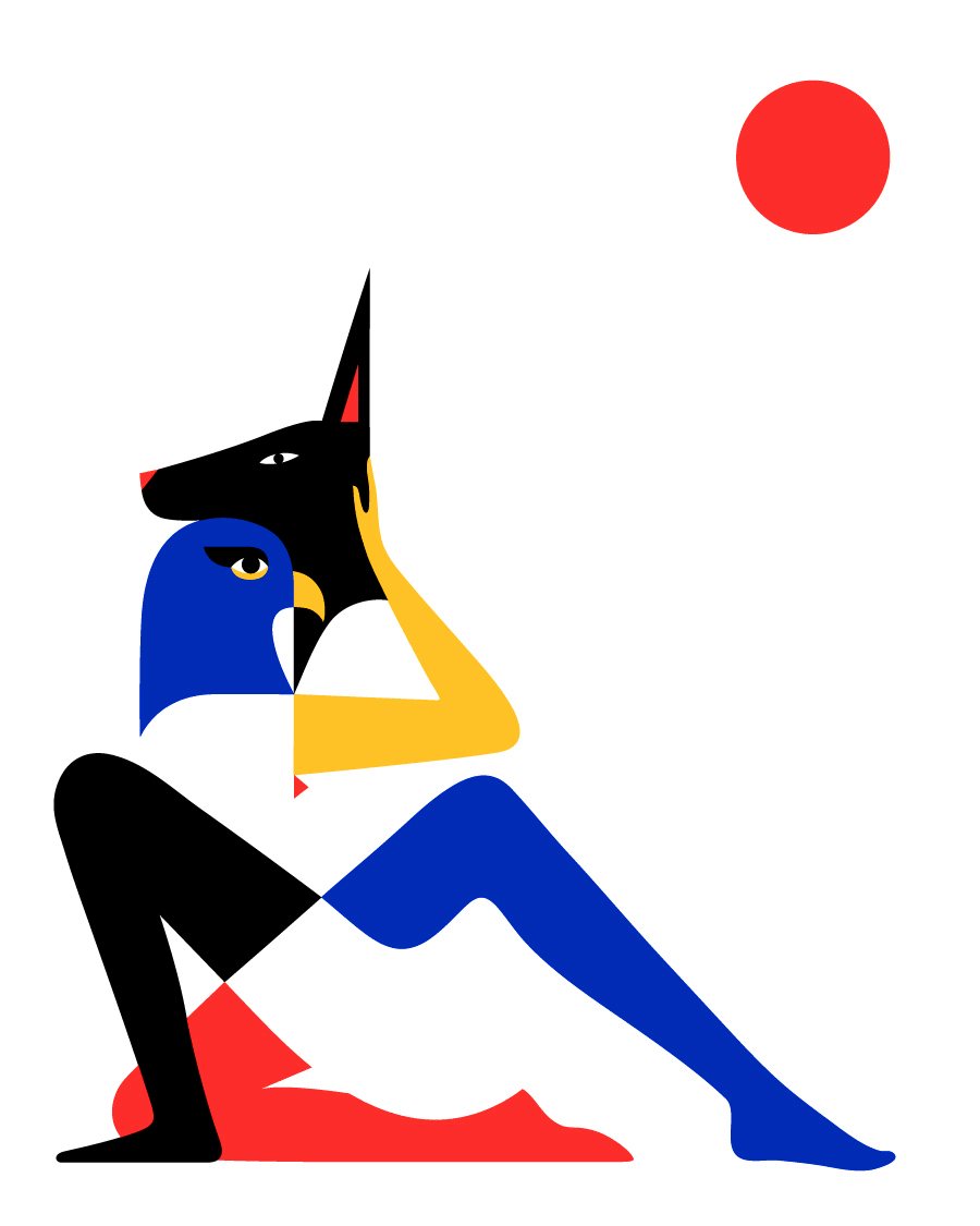
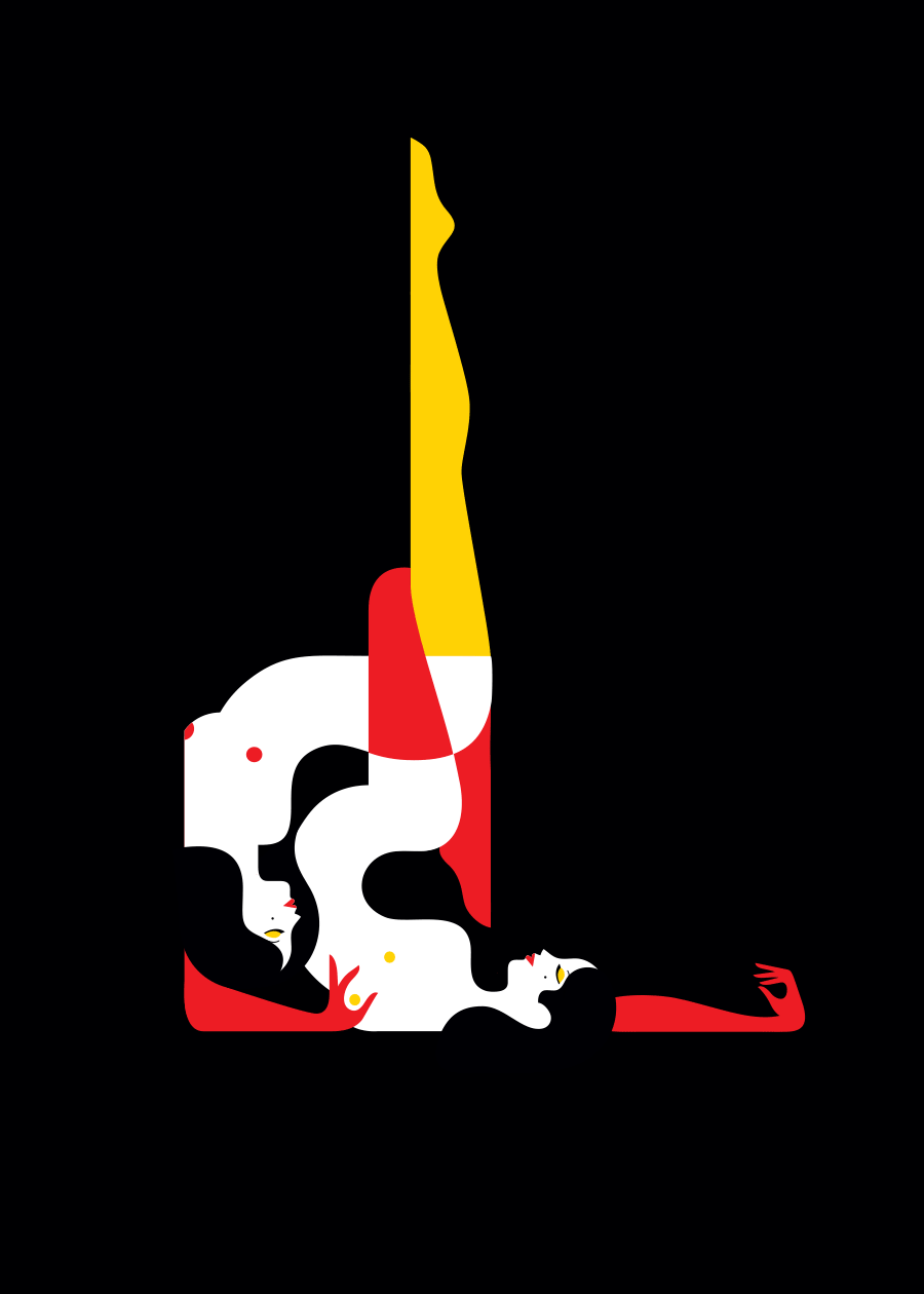
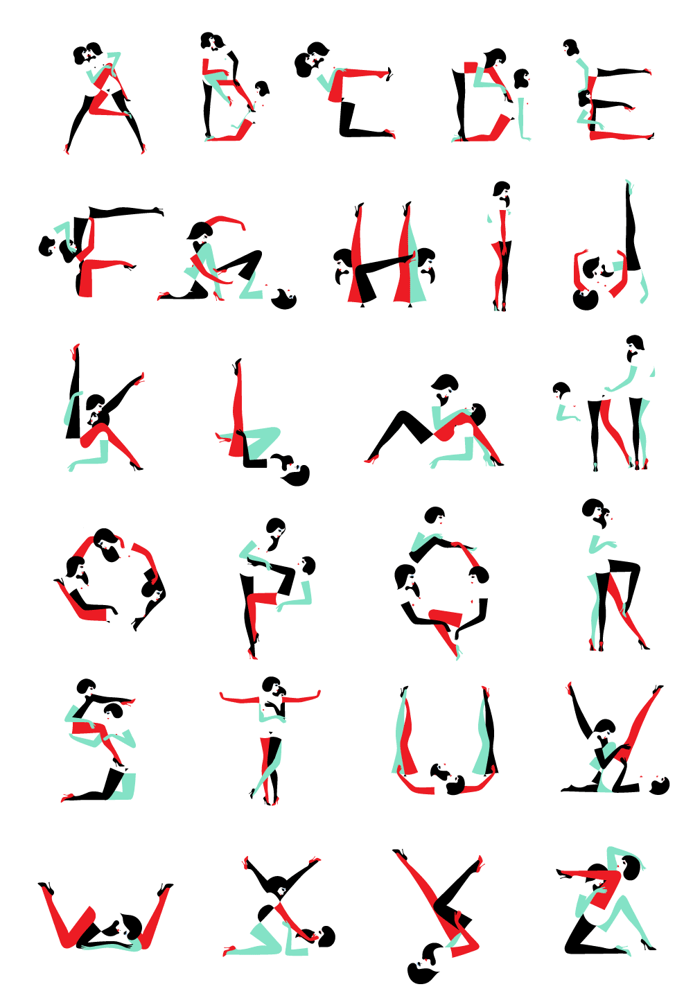
It’s been a while sine I had written about a designer or illustrator. Today, let’s look at the artist Malika Favre. Favre creates artworks that incorporate the sensilbilies of op art (optical art manipulating the viewer’s perception of colour and form that often result in illusion) and pop art.
Cover illustration for Equality Highlights issue 18Window display illustration for Bucherer
Favre has worked for many magazines as a cover illustrator, including, Vogue, Metropolitan Magazine, and The New Yorker. She has designed book covers for Penguin Press, too.
Personal Works
The few personal works that Favre offers as prints, are sensual and evocative. The confidence in line work, the vivid and emotive feel are sensibilities that are felt throughout her works. With the very limited colour palette, here you can see Favre pushing negative space.
EgyptianThe Kama SutraAlpha Pin Ups
Object Design
Let’s have a look at Farve’s design choices applied to physical media.
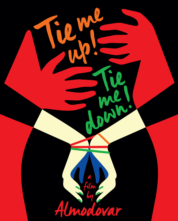
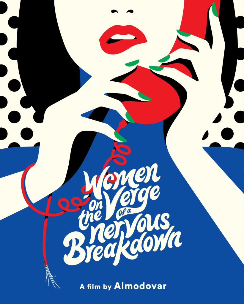
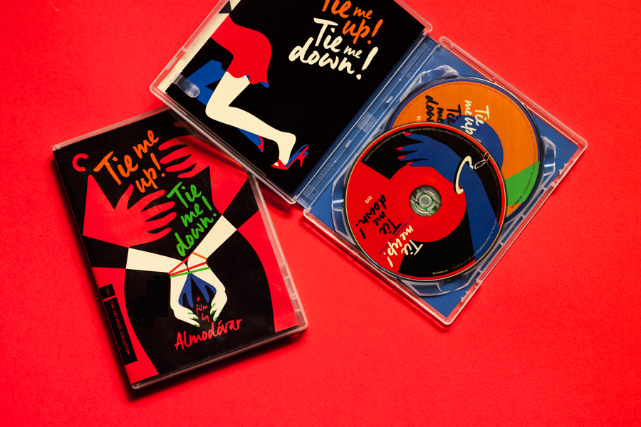
Below are DVD covers for reprints of the films Tie Me Up! Tie Me Down! and Women on the Verge of a Nervous Breakdown, Favre’s covers were made in 2015, and 2017, respectively.
For those who are already fans of Pedro Almodóvar’s films, I can see the appeal in owning these reissues with Favre’s slick cover and disk designs, but I feel that the illustrations would surely draw in new viewers, too.
Tie Me Up! Tie Me Down! DVD case, insert, and disks
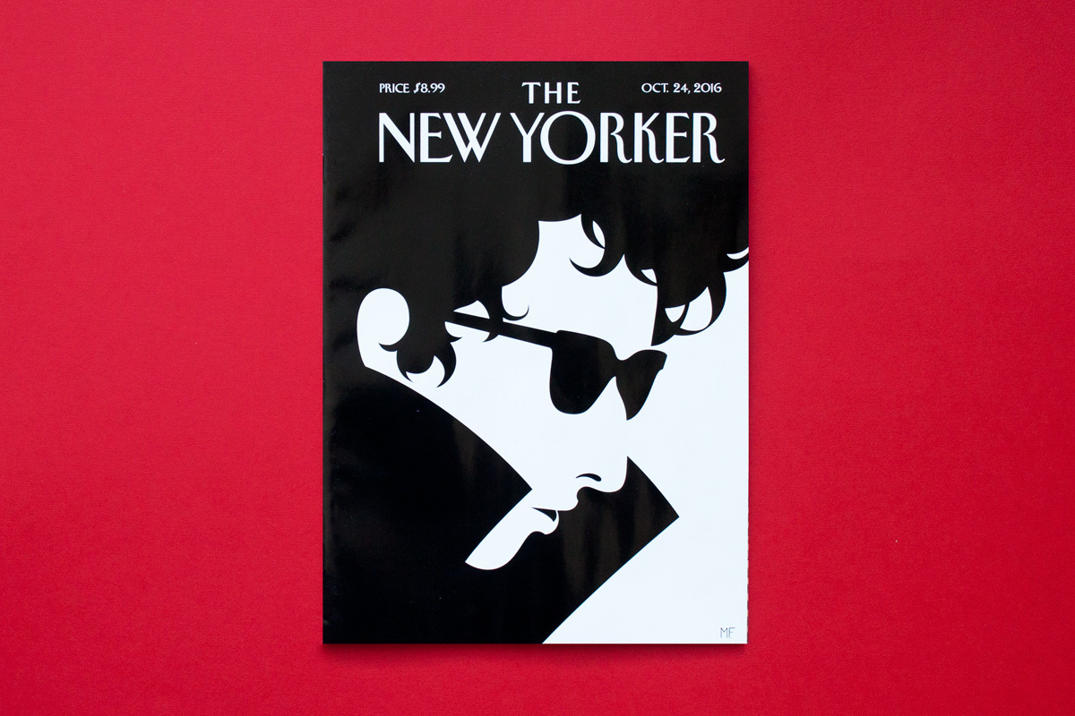
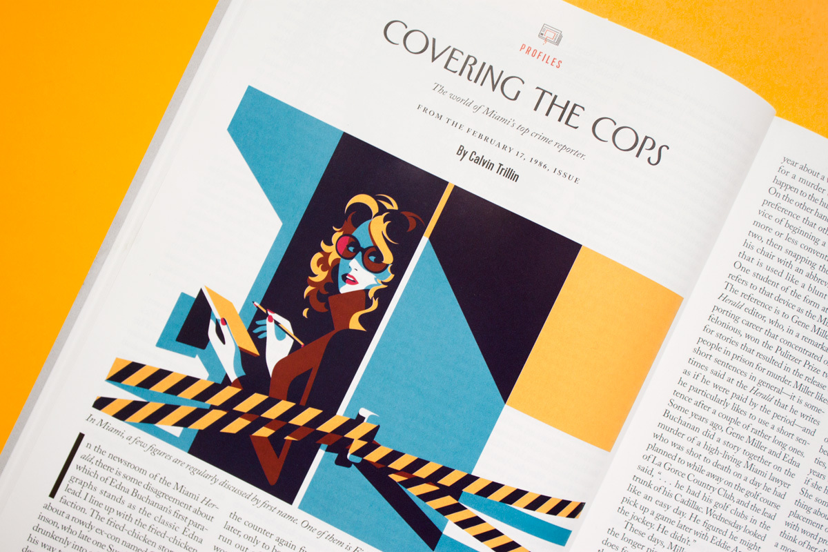
Favre’s also illustrated many covers for The New Yorker, and illustrated editorials for the same publication. Given the demographic of the magazine, the sophisticated and informed fiction, poetry, and articles are a good match for Favre’s sleek and precise artworks. The illustrations are not going to steal the readers’ attention away from the body copy, and instead elevate the overall presentation.
The New Yorker cover illustration, 2016Editorial illustration for Covering the Cops, The New Yorker
Favre’s distinct style and work suits very much print media; magazine and book covers, editorial illustration, poster design, etc. Because the feel of these works aren’t chasing a trend, I don’t see these illustrations losing their charm in future years. As with any particular style, it’s worth noting that they work best with particular demographics and themes.
I am very much impressed with Favre’s use of colour – all of it is flat, leading to ease of reading the optical illusions. What characteristics within Favre’s work stand out to you, dear reader?
There are a couple of personal projects that I’ve been slowly chipping away at. It’s difficult to move any faster than I am when most critique is from a small number friends who want to give any, and I’ve been away from academic pressure. I’ve feel like I’ve had a difficult time structuring myself. I don’t have access to all of the tools needed to reach the end of projects, so nothing I’ve done really has a ‘completed’ feeling. I’m going to log some project progress here so that I can better see how much farther I have to go.
Assets from last year that I’ll put to use on stationery
I’ve wanted to make stationery for some time now, I’d like to finalise some of the letter paper designs that I had worked on. I do need more specific critique on those works though. I thought making sticker sheets would be a fun (smaller, and more straight-forward) project.
You may think stickers superfluous, but they can brighten up diaries, notebooks, and workspaces in general. I’d argue that their surface value of being “nice to look at” is good enough.
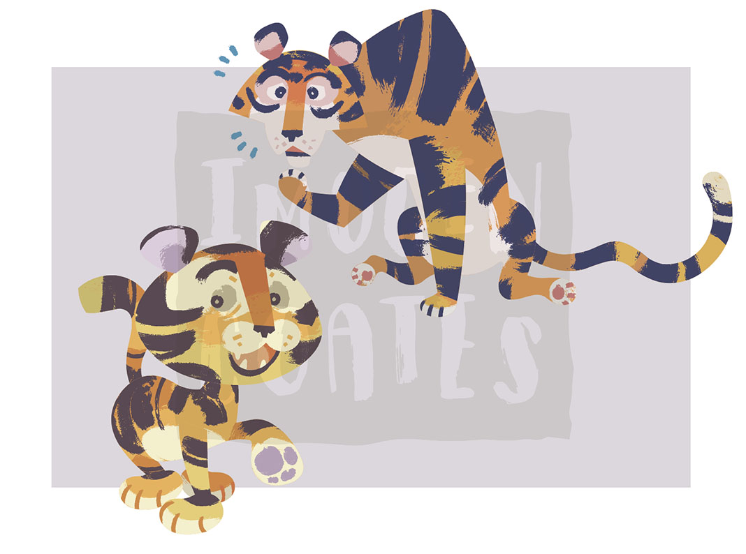
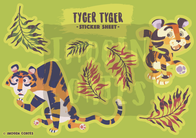
I have a few assets from digital illustration experimentation in that I’d very much like to put to use, such as these pair of tigers. The current plan for a tiger sticker sheet is simply both of the tigers, with a small selection of leaves. The colours are bold and cheerful.
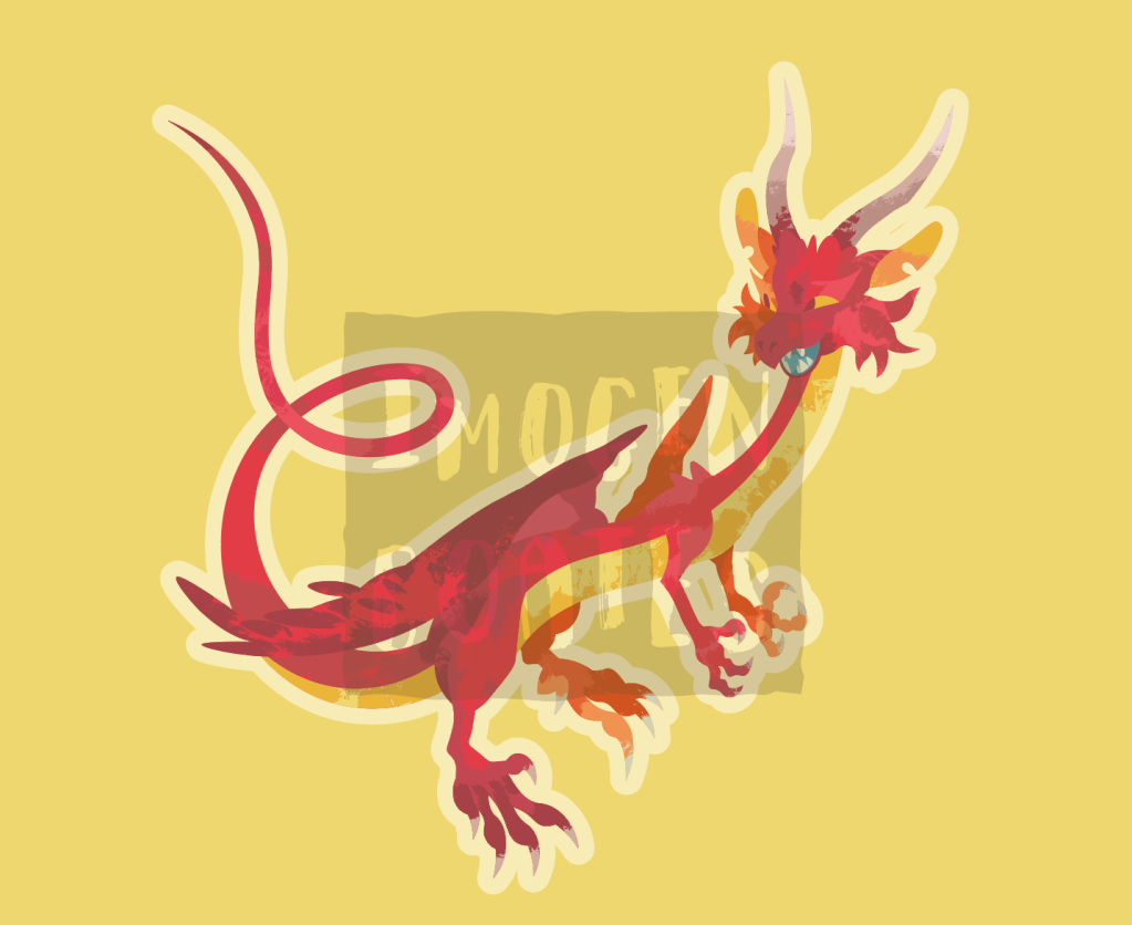
There are two dragon graphics I made with the intent of printing them as large stickers, rather than part of a sheet of stickers. Personally, I’d like to have some big stickers to place on sketchbooks and such, and I know others would, too.
I don’t want to squander space when printing, so I’d like to add some smaller stickers to avoid such waste. I’d like to add relevant objects such as coins, pearls, or jewel encrusted daggers or staffs – anything that you’d find in a dragon’s hord. But It also depends how competent I am at designing them!
I know the compact design of the first dragon graphic is much less fussy than the second. I anticipate the red dragon may be a little more difficult to peel and stick place. I don’t have any plans to adjust the design however. I’d like to see how practical it is once printed.
To help remedy some creative blocks I mentioned, I do want to support students though the alumni scheme I was offered, and I feel it will help build up confidence weakened though lack of any real meaningful academic discussion and exercises. I’m more than happy to share skills and methods of creativity with students. I hope that I can visit the school campus safely, and even have the access to tools I don’t have. Maybe even make use of the facilities from departments outside of graphic design (such as the textile department). I’ll be printing stickers the first change I get. I look forward to recording the results of trial sticker printing on my blog!
Since writing up my thoughts onLong Way North, I had wanted to write about and share another animated movie with strong design choices that really appeal to my tastes.
The Little Prince and the Eight-Headed Dragon is a 1963 animated feature from the Japanese studio Tōei Dōga (which was later renamed Toei Animation). The film is known in Japan as Wanpaku Ōji no Orochi Taiji (わんぱく王子の大蛇退治) literally meaning “the naughty prince’s Orochi slaying”.
Perhaps this feature is best known outside of Japan as an influence cited by Genndy Tartakovsky for the art direction of the 2001 TV series Samurai Jack, and Yōichi Kotabefor the visual design choices seen in the 2002 video game The Legend of Zelda: The Wind Waker.
Unlike Long Way North, it’s a little difficult for me to find details on those who worked on this film, or any history in regards to its development. The character animator of this film is Yōichi Kotabe, whom I have mentioned already for his contributions to The Wind Waker.
My copy of The Little Prince and the Eight-Headed Dragon is a Japanese DVD (sans subtitles in any form). This copy isn’t cleaned up at all; any artefacts and damage from the original source seem to be intact. It’s possible to enjoy the film grain in all its glory! (In all seriousness, the practice of digitally scrubbing film grain from old animated features isn’t something I think much of; the grain is part of the medium, and it comes off to me as a ridiculous betrayal to present the work as something it is not.)
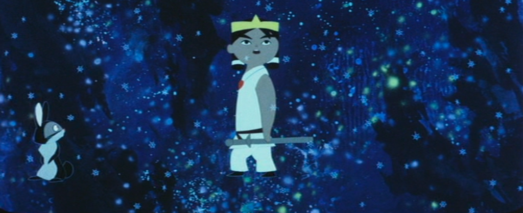
The film’s most important characters and events are derived from Japanese mythology. If you’re familiar with any gods from Shintō religion, you’ll notice their portrayal here is with much artistic licence. In the 1963 film, the protagonist, prince Susanō, is represented as a young boy, rather than an adult, most likely for the child audience to better understand or empathise with his actions and motives.
A brief summary of the film:
Prince Susanō is the youngest child of the creation deities Izanagi and Izanami. When his Izanami dies, the prince resolves to travel to heaven to bring her back.
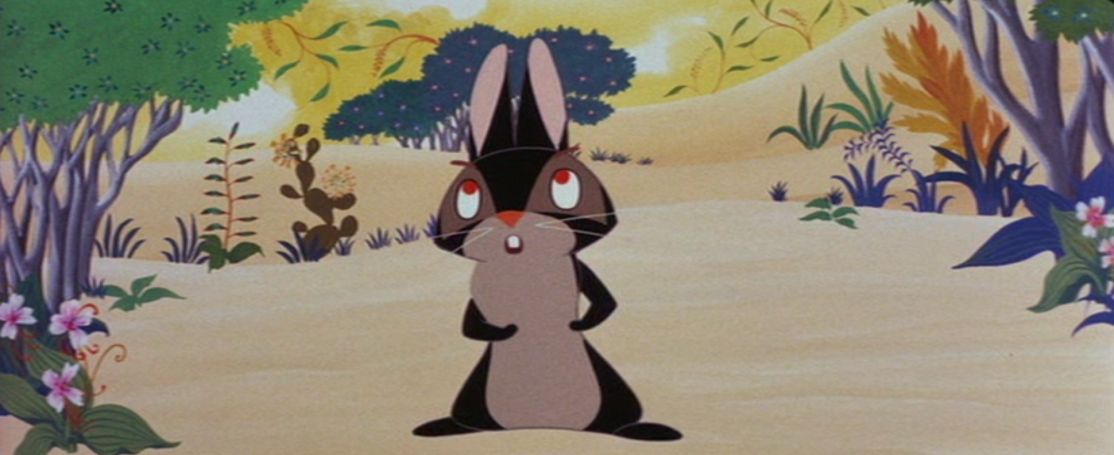
Prince Susanō constructs a boat, and leaves home with his rabbit friend, Akahana, in search of his older siblings, thinking they can aid him in reaching their mother. Susano’s brother Tsukiyomi, and sister, Amaterasu, are of no aid, however. They have accepted their mother’s ascent to the afterworld.
Susanō and Akahana leave Tsukiyomi’s moon kingdom and press onwards to find Amaterasu
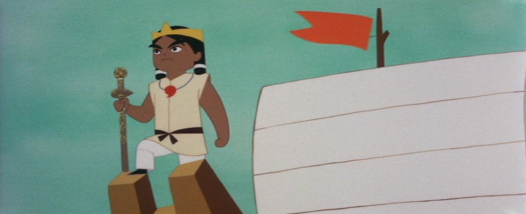
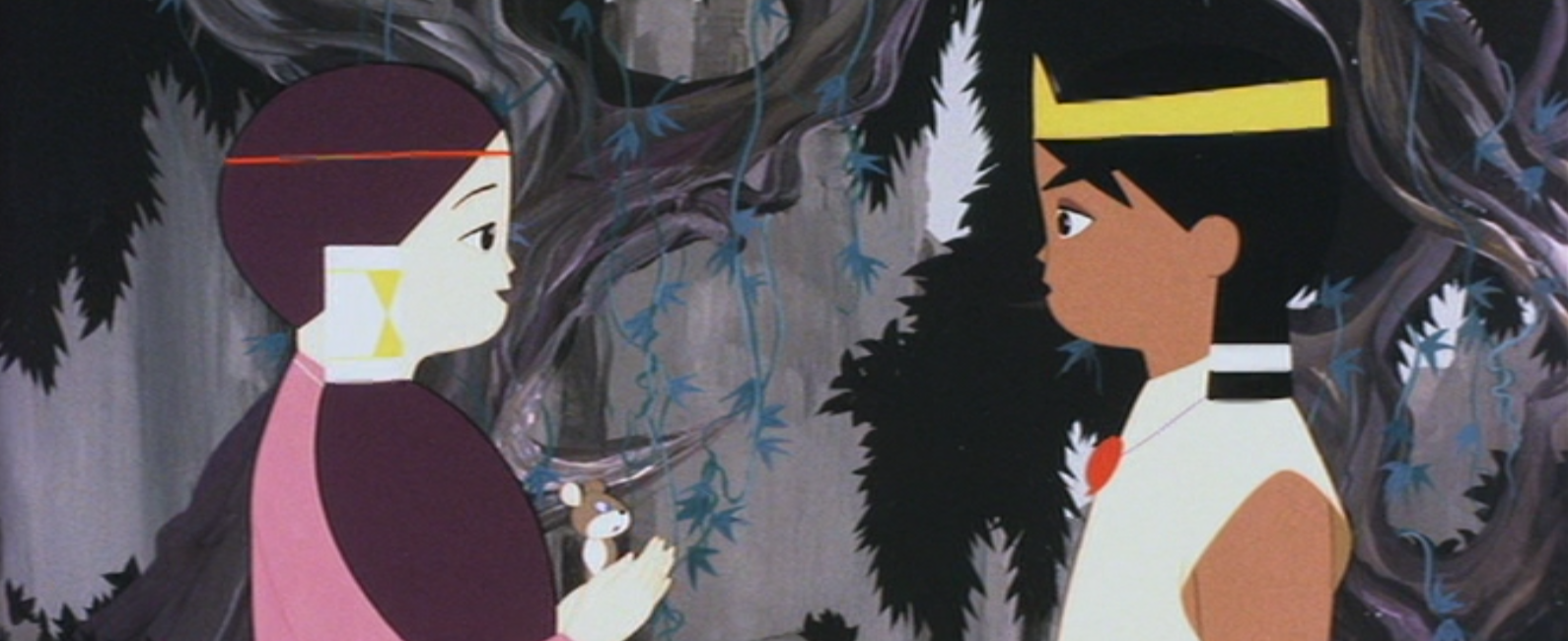
Making friends during their travels, the gentle giant named Titanbō joins Susanō and Akahana. The trio eventually arrive at a village suffering under the grips of a monster. The village’s young maiden Kushinada is next in line to be devoured as sacrifice to the eight-headed, eight-tailed beast, Orochi.
Susanō meets the gentle and reserved kushinada and is captivated by her
The prince is infatuated with young Kushinada, andso decides to rid the village of the hydra-esque Orochi. Susanō is willing to fight to the death with the monster!!
After a terrible battle, Susanō bests Orochi, and is greeted by his mother up in the heavens, who praises him for his good deeds before leaving him. The prince finally accepts that he will not be seeing his mother again.
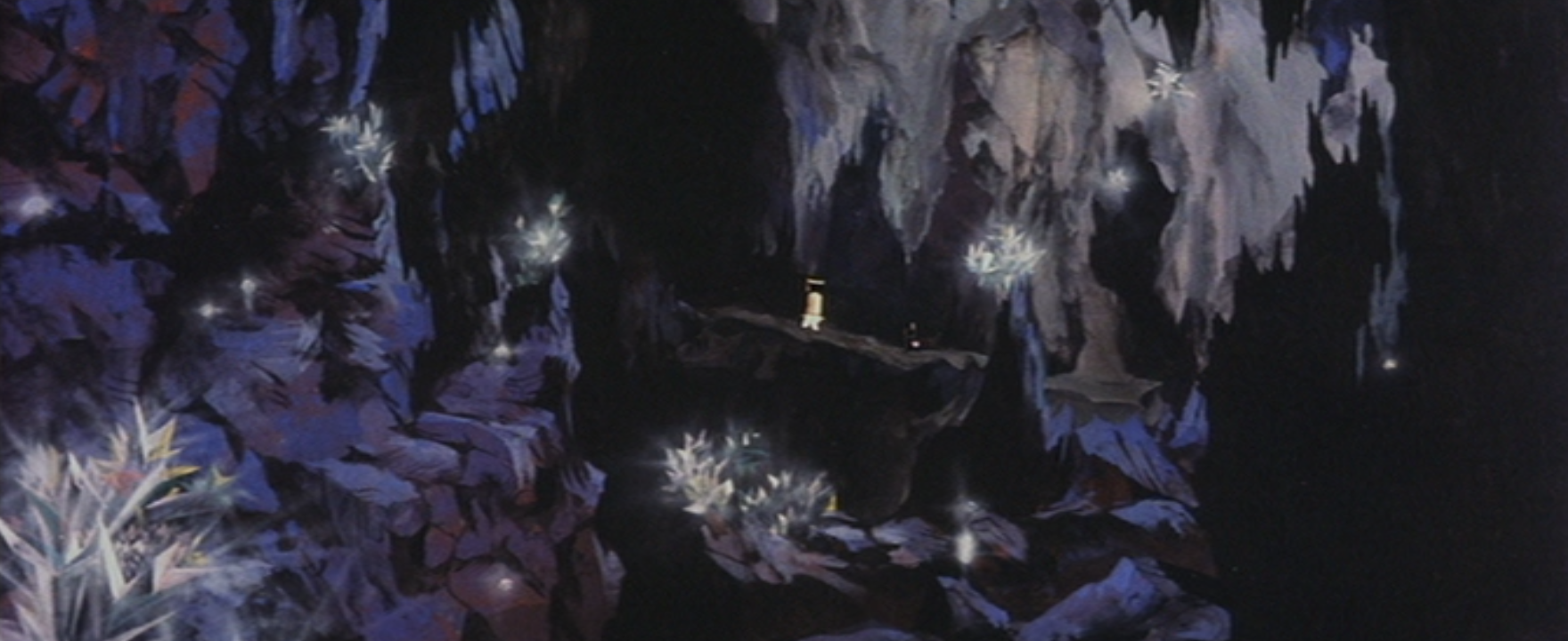
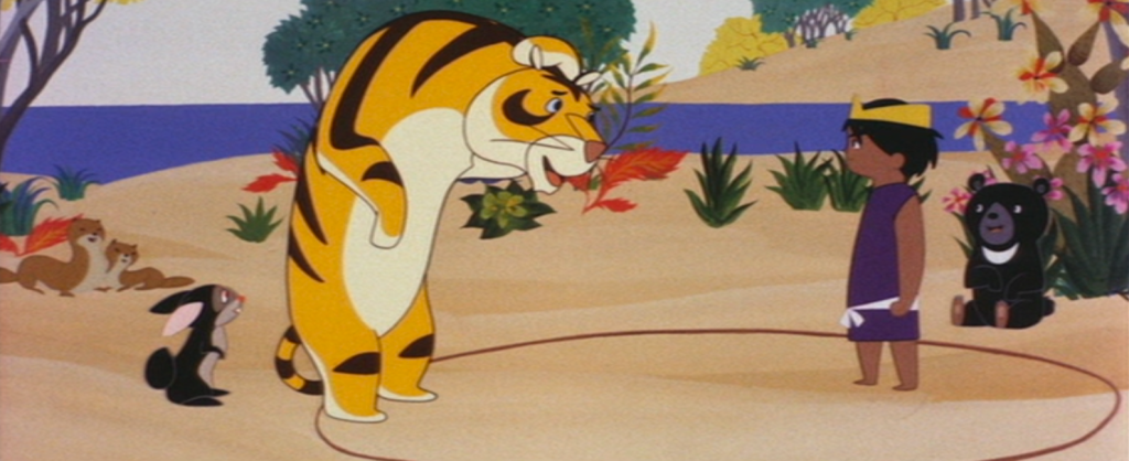
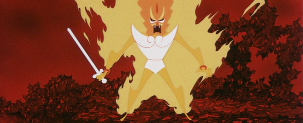
One thing that stands out about this movie compared to features released by Toei, is the much more angular character designs, and the abstract environments that are stripped back with many elements represented as symbolic shapes.
The economy seen in the character designs to me, feel very modernist, and very confident. A keen viewer will notice that most characters have coloured outlines, rather than black outlines, which gives a softer look to many of the designs.
While the film was created for and marketed to children, it is still a showcase of some experimental sequences and unique design visual choices for cel animation that I can only better appreciate and understand as an adult.
Sharing a lot of screen shots only does the movie so much justice… Really, you have to see The Little Prince and the Eight-Headed Dragon in motion to appreciate the skills and craft behind the animation!
The video embedded below is a sequence that presents great abstract character design and colour usage. As I have taken the video from sakugabooru, it is also an example of sakuga. While sakuga (作画) literally means ‘drawing pictures’, animation fans will use it to define fluidity in a sequence that uses little to no trickery or animation shortcuts.
The original Japanese film isn’t streaming anywhere, as far as I am aware. (Tell me if you know otherwise!) The only way to own a copy of the original film is to buy it from Japan. If you’re willing to watch this feature in any from, the English dub that was produced by Frontier Enterprises back in 1964 is available to watch on the Internet Archive.
I’d like to share more animated features, or even animated shorts on my blog in the future! Overseas works, and older films are particularly interesting to me for their (most often unfamiliar) design principles. I believe it’s good to be ‘challenged’ every so often by work that presents itself in a way you’re not expecting!
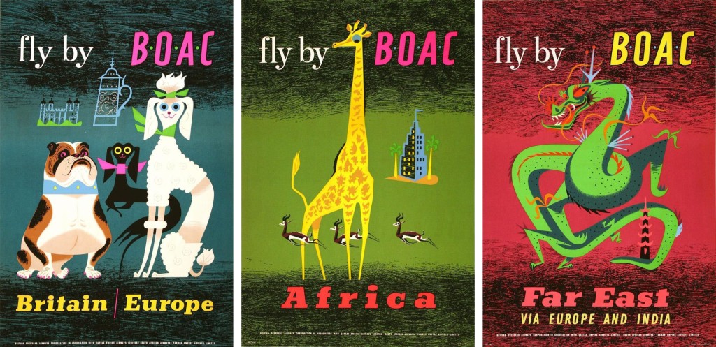
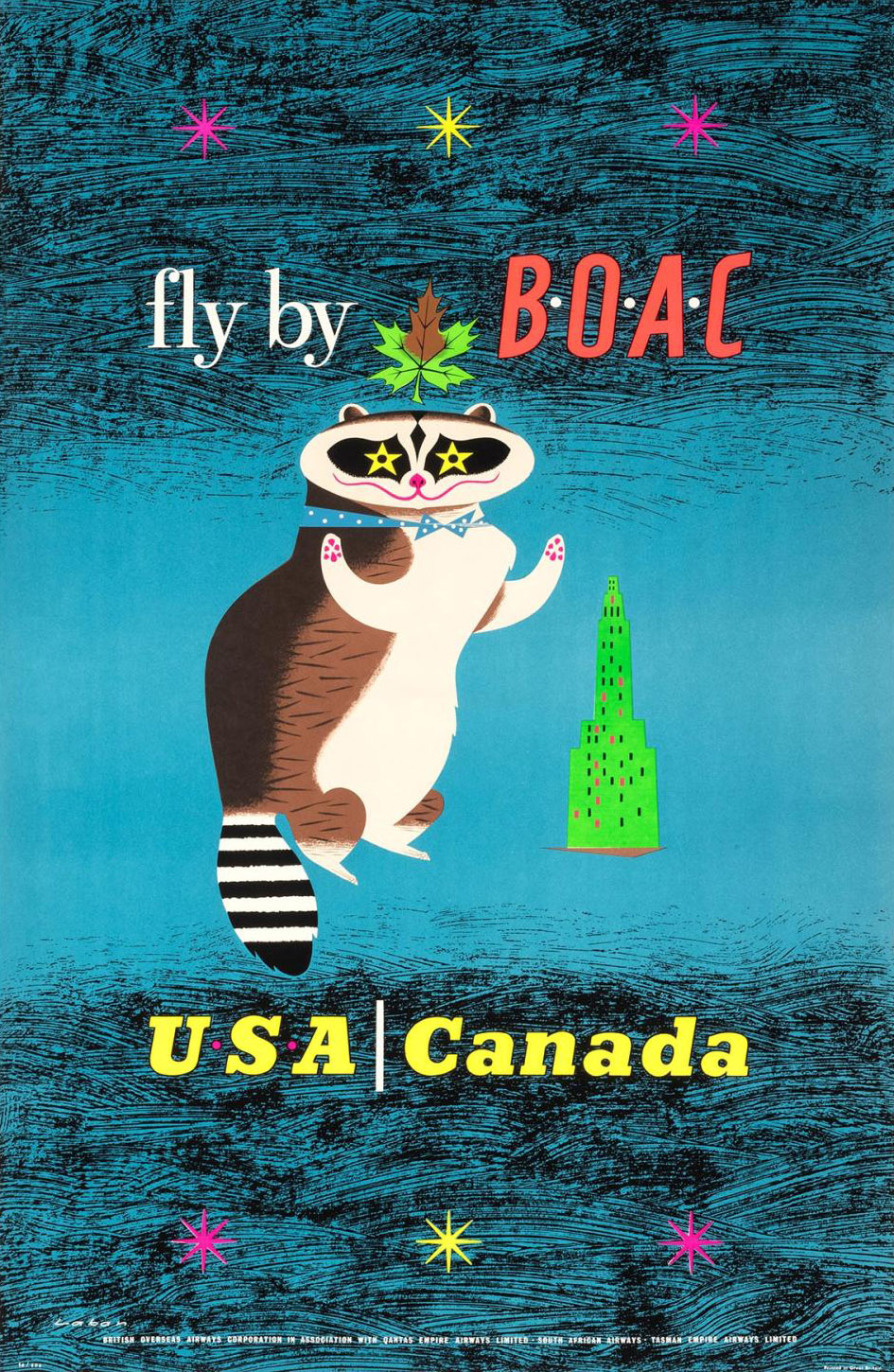
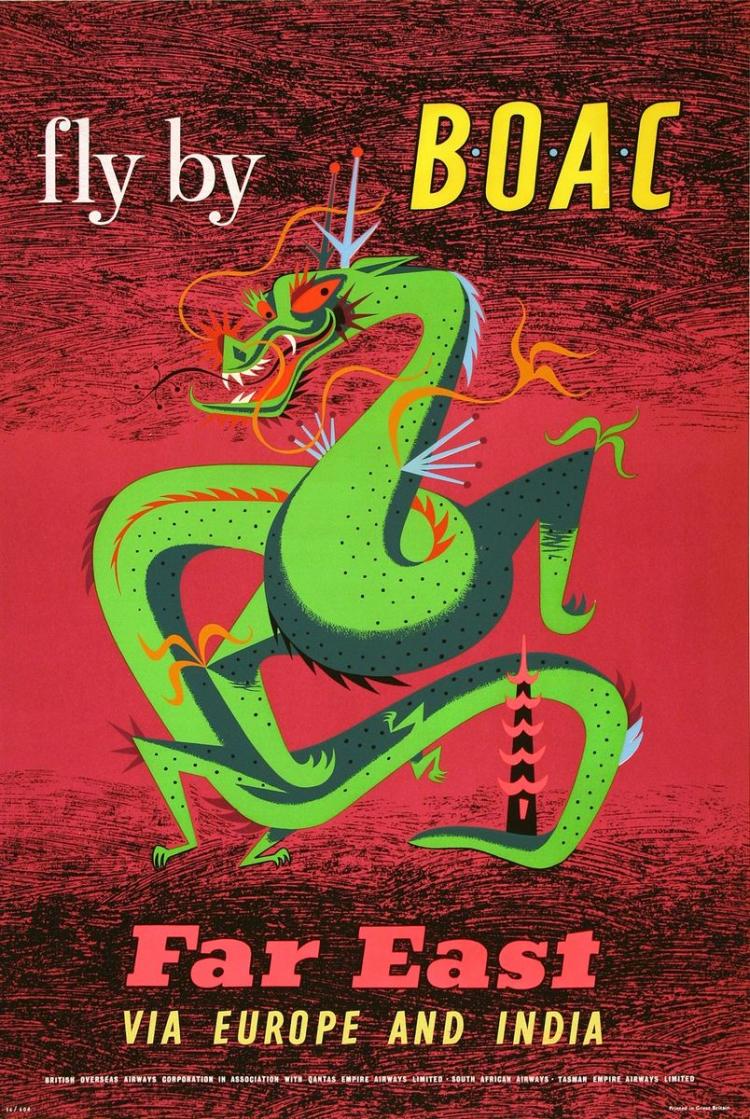
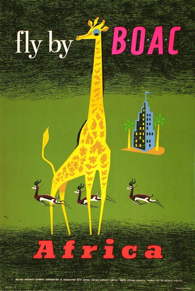
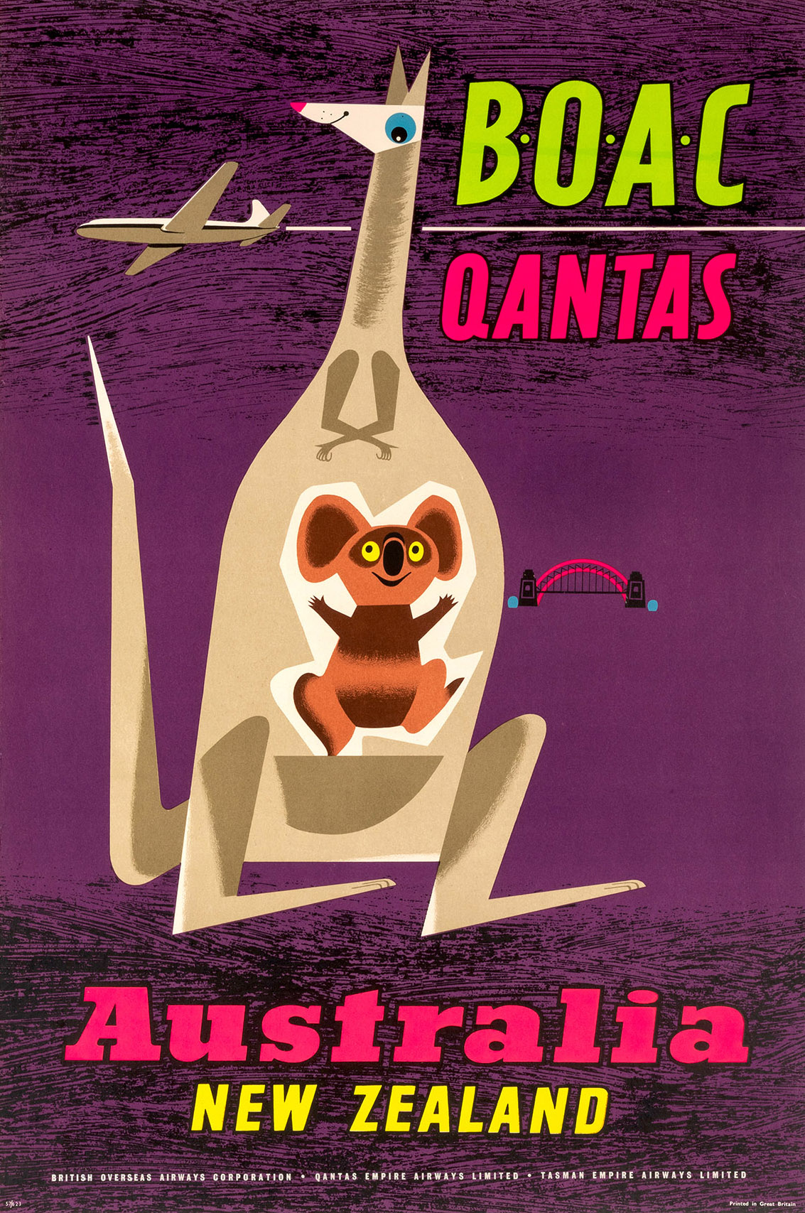
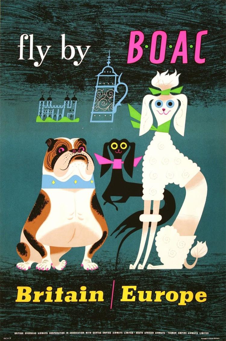
Being stuck inside most of the day, with no plans to go anywhere anytime soon, I’m daydreaming about travel. I wrote about hotel luggage labels from the ‘golden age of travel’ last year. Now, I want to share some posters by British freelance illustrator Maurice Laban (1912-1970). The following poster advertisements were were made in the late 1950s, and were used to promote the British Overseas Airways Corporation (or BOAC) and Qantas.
The images I’m sharing here are from the art auction site invaluable. Go have a look over there to see these posters at a higher resolution (as well as other vintage posters from this era) if you’re into this type of commercial art.
U.S.A. | Canada
This is my favourite of the posters. I love the racoon’s eyes being stylised as stars! Quite dazzling! The racoon is a little more anthropomorphic than the other animals in this set – standing on its back legs, and wearing a bow tie.
Far East VIA EUROPE AND INDIA AfricaAustralia NEW ZEALAND Britain / Europe
Another poster that I really like. I just find the dogs’ faces very humorous.
These digitised images here aren’t likely as vivid as the physical posters; the original works having been produced through serigraphy (screen printing).
Creatives behind commercial illustration in the 20th century weren’t generally recognised for their contributions as graphic designers are today, and it makes finding information on freelance illustrators such as Maurice Laban difficult. But the fact that these pieces were preserved at all shows their lasting appeal… thank you for the inspiration, Maurice Laban!
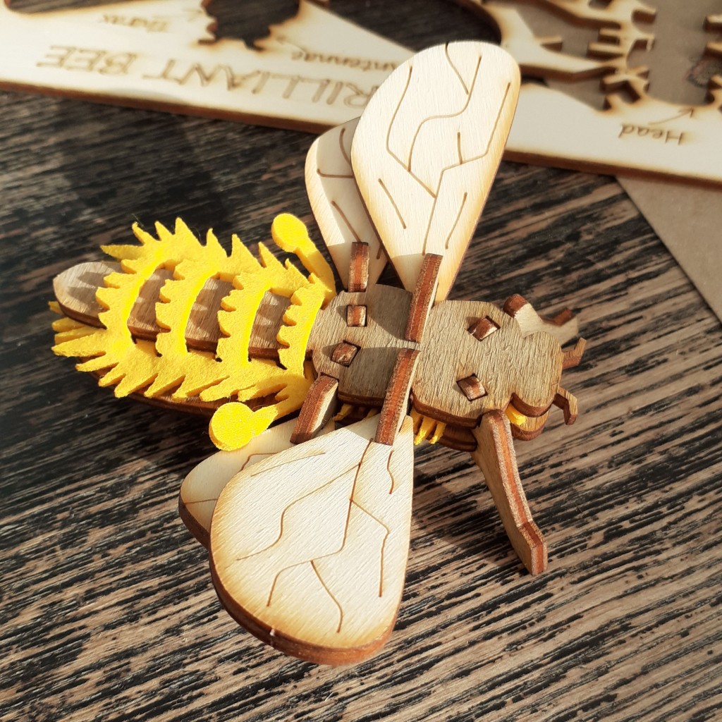
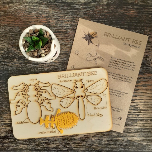
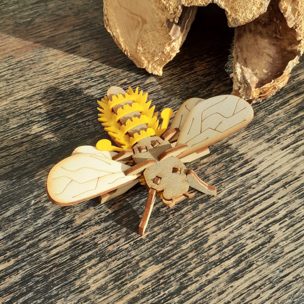
Some time ago, I was given a laser wood cut kit of a bee. It’s from a small design studio in the UK (Gilbert13). I took a few phone photographs as I put it together. I thought the kit was too cute to neglect sharing the design!
BUZZ!!
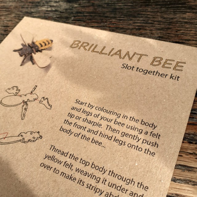
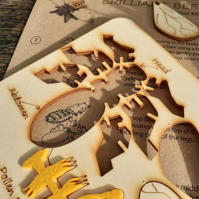
The piece of laser-cut wood is 21 centimetres by 13.5 centimetres. The kit comes with colour instructions printed on thin, brown card.
The instructions are very easy to follow; they’re accompanied by picture aids, after all. One is supposed to use a sharpie, or perhaps some other black felt-tip pen to colour the body of the insect, but I didn’t have one and used some brown ink to stain the wood. The colour is less subtle in person.
BUZZ BUZZ BUZZ!!
Putting together the bee I thought about how simple and easy the steps were – how ‘accessible’ the kit is, really – and that’s good design! It makes me want to try out crafting something through the use of a laser cutter, too.
Today I decided to write about something that doesn’t concern books, exhibitions, or cool product design. I decided I’ll share some images and thoughts from a foreign animated film I recently watched.
Long Way North (or Tout en haut du monde meaning ‘At the very top of the world’) is an animated co-production between French and Danish studios made in 2015. The director is Rémi Chayé. Chayé kept the film’s budget modest; instead of flexing animator skills through unnecessary details and constant movement, the film is decisive with its visual information and contains more moving holds (quiet scenes of slight movement). These choices and sensibilities make it refreshing for me to watch.
I appreciate an animated feature that tells an offbeat narrative, or takes on a visual identity that’s unique to itself, as a respite from the over-played and safe stories and looks of America’s animated blockbusters. Seeking out and choosing to support smaller films like this means we can see more variation.
Here is a trailer with English subtitles:
I would recommend watching the film in its original language audio (to enjoy the French voice actors) with English subtitles, if you can. The region 2 DVD I found comes with both French and English audio and English subtitles.
I summarise the story as thus, but be warned as it contains spoilers:
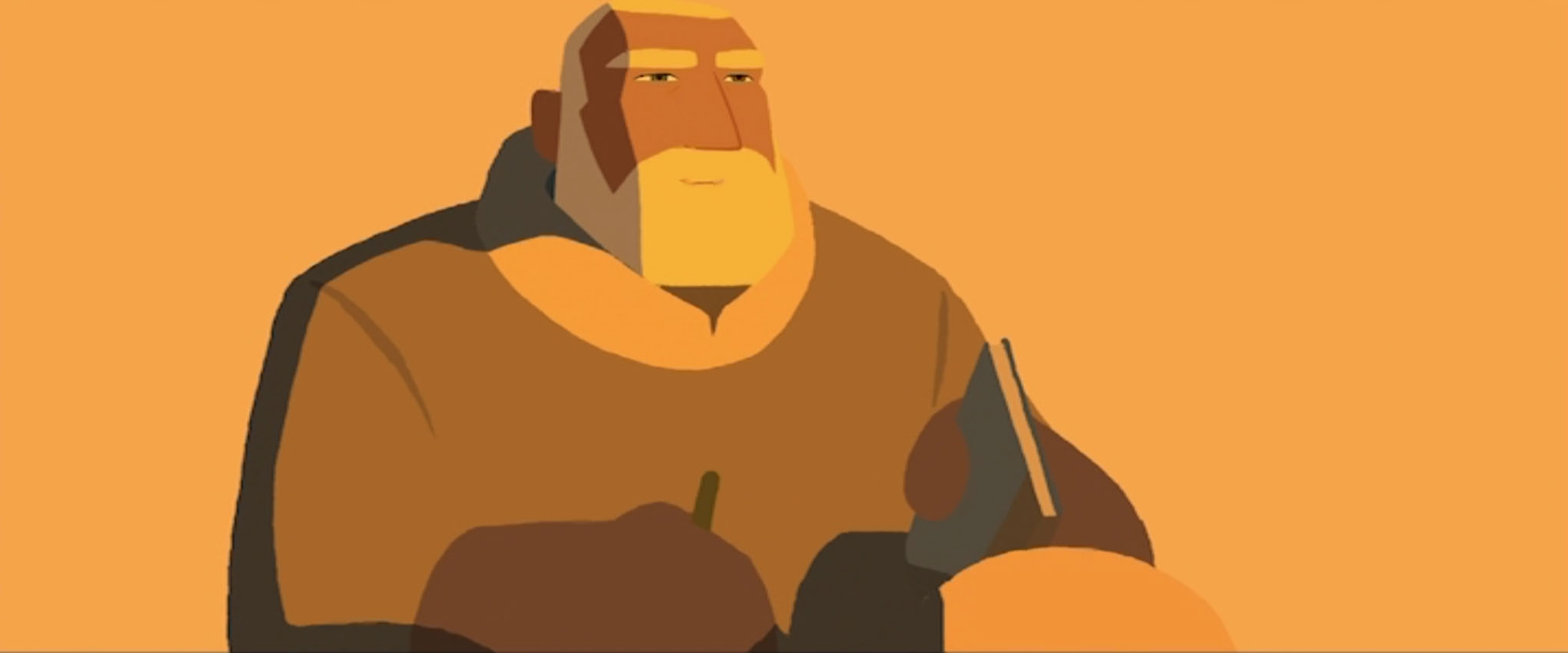
In the late 19th century, the Tsar of Russia has funded the construction of a great icebreaker, the Davaï, and its voyage to the North Pole. The crew is lead by the explorer Oloukine, grandfather to a young aristocratic girl named Sasha. The Davaï leaves with much fanfare, but years pass, and the Davaï and the exploration team fail to return. A reward for the ship is offered by the Tsar, but all search parties failed to find the ship.
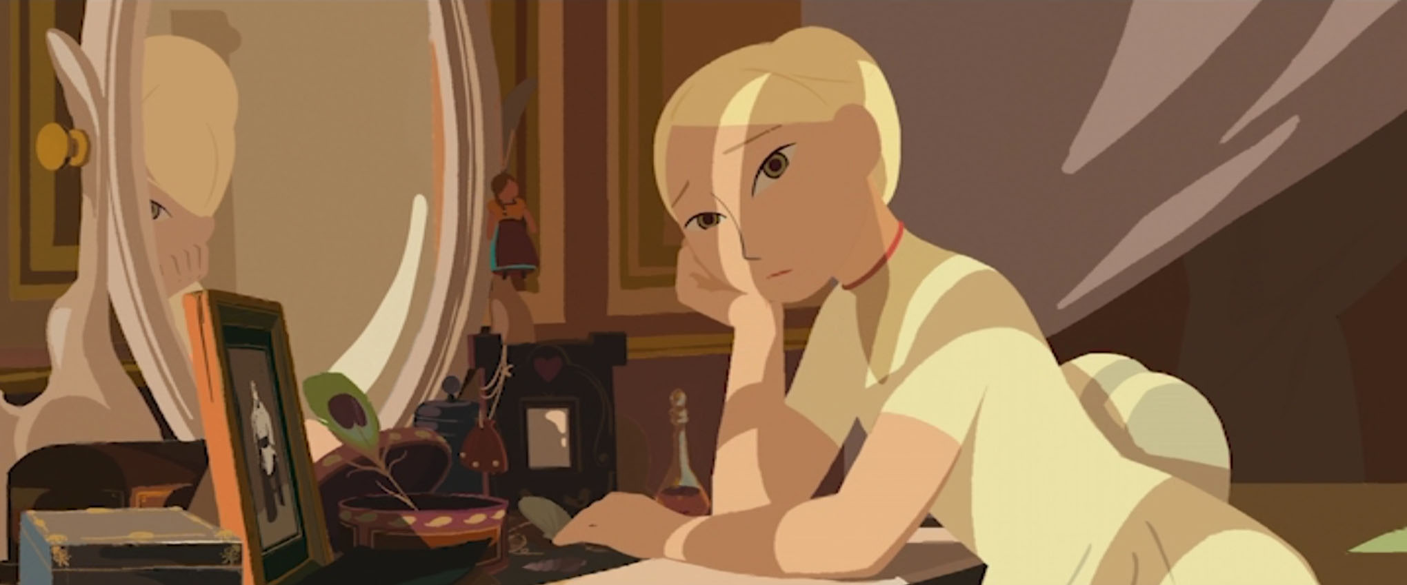
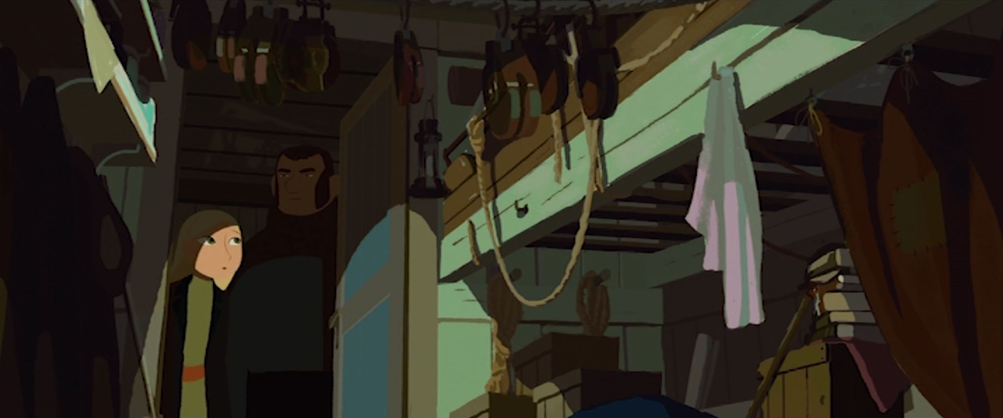
15-year-old Sasha still believes that the Davaï, her grandfather, and his crew will return. On the night of her debutante ball, Sasha sneaks into the newly built library wing of her family home, dedicated to Oloukine and filled with his belongings. She is searching for a pair of earrings her grandfather brought back for her years ago, and finds her grandfather’s exploration route through the Artic. During the ball she discloses her findings to her family and guests – that the Davaï’s search parties took the wrong routes – but the findings are brushed off as fantasy, and Sacha’s claims do nothing but strain her family’s relationship with prince Tomsky whom sees Oloukine’s efforts as a waste of resources.
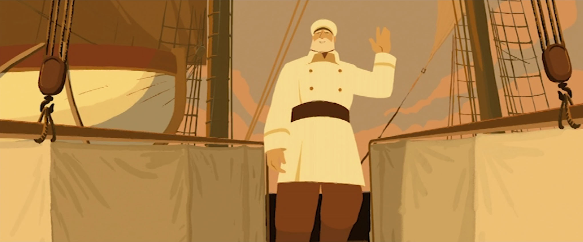
Sasha runs away from home at night, determined, and carrying what little comfort she can. She travels to the coast in search of an ice-breaking ship, and finds one named the Norge. Sasha bargains with the crew mate Larson, believing he is the captain of the ship. She offers her earrings in return for passage to the Artic. The Norge’s captain Lund grants Sasha aboard his ship to seek out the Davaï, if only because she had already been promised passage by second mate Larson.
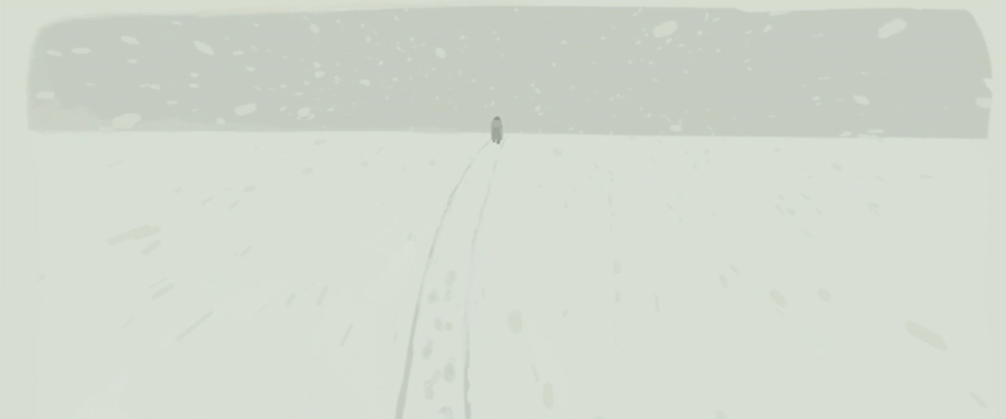
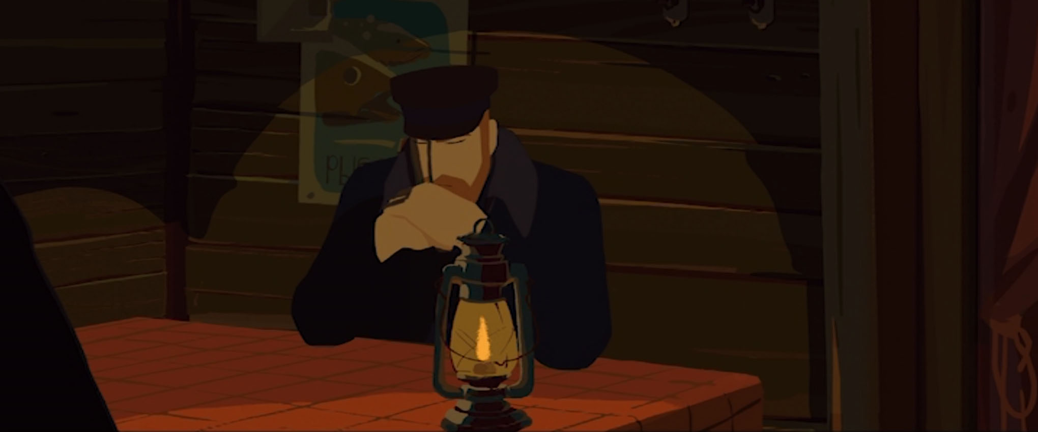
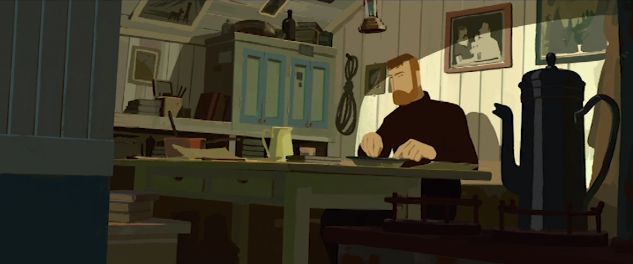
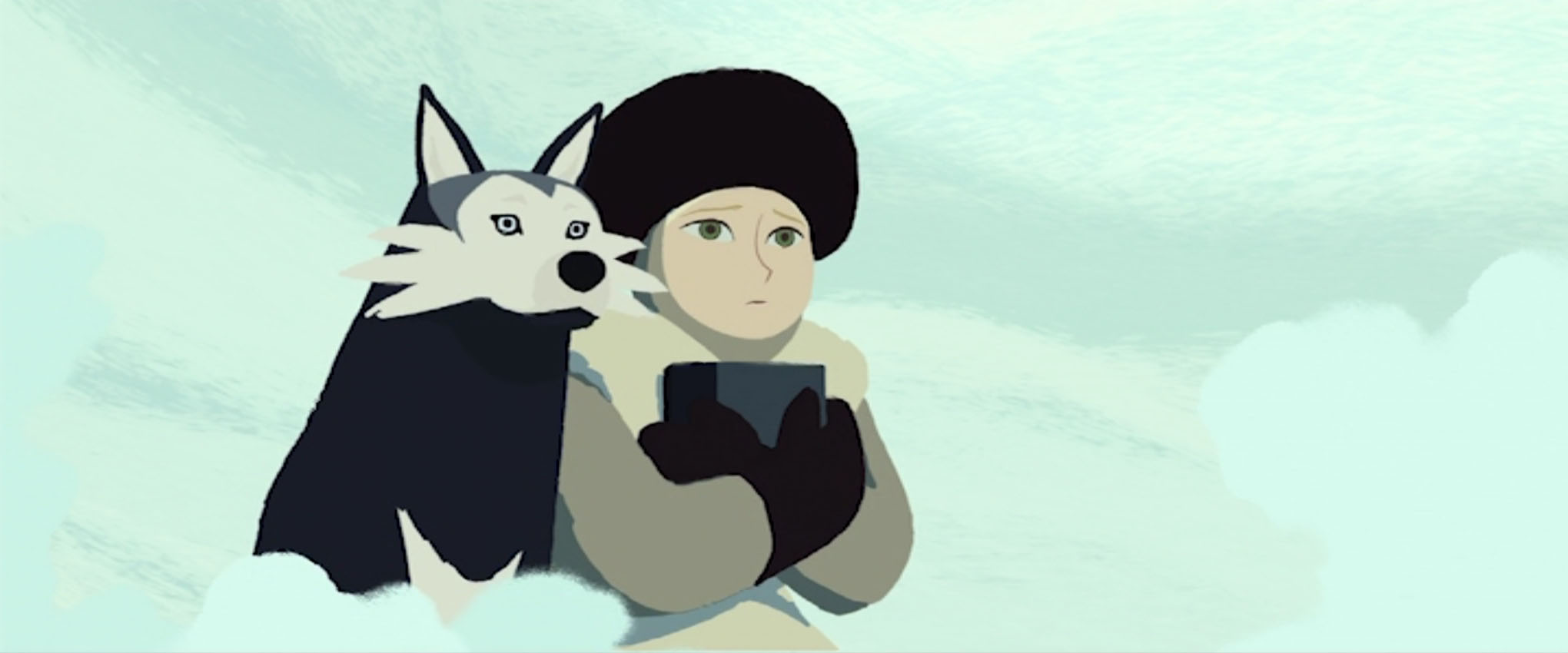
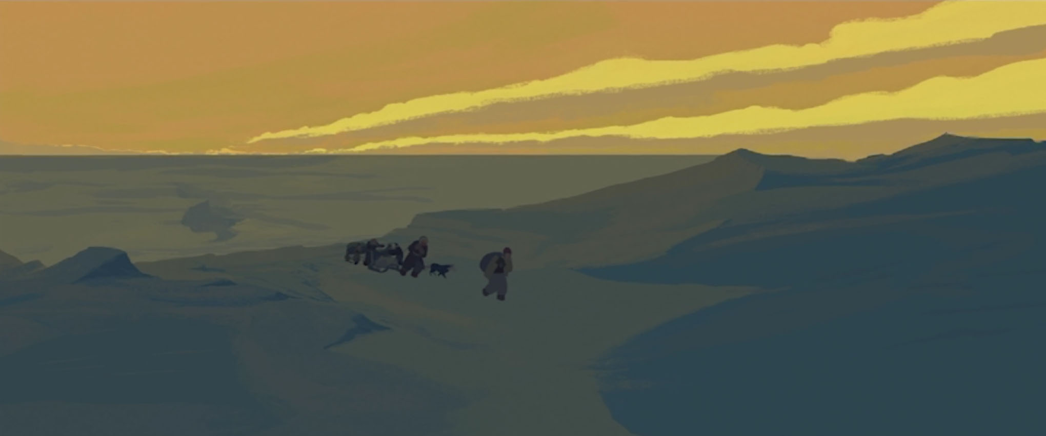
The relationship between the crew and Sasha is tentative at first, and gradually warms up to an amicable alliance as they cross the water to the Artic. But as soon as the Norge is met with the harsh environment, things take a turn for the worst. The Norge is sunk by an avalanche, and Lund is injured due to Larson’s inadequate performance. While the tools and supplies saved from the wreck can sustain the crew for a short while, the men begin to turn on each other, and blame Sasha for their predicament.
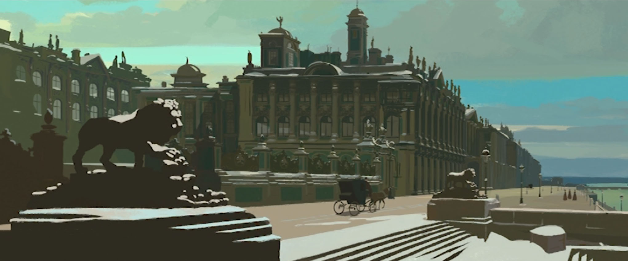
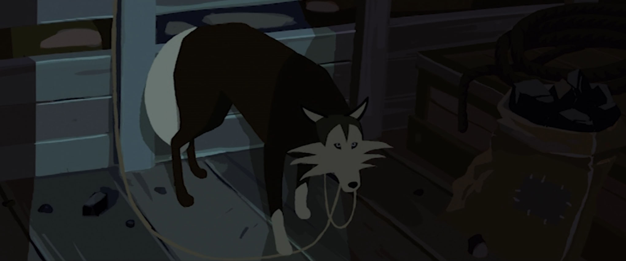
With even the young deckhand Katch turned against Sasha, she leaves camp and is followed by one of the ship’s huskies. Led by the dog, Sasha finds her grandfather’s frozen body and his logbook, in hand. It reveals the last actions of the Davaï’s crew, and the coordinates to the ship. Sasha returns to camp after being found by Katch. Lund’s crew free the landlocked Davaï using their remaining dynamite, and use the vessel to return to ST. Petersburg.
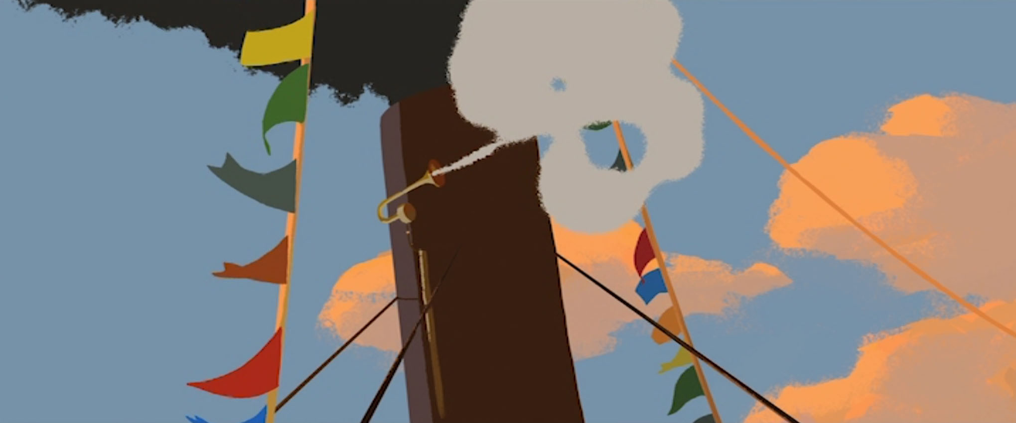
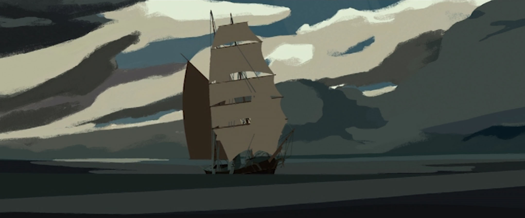
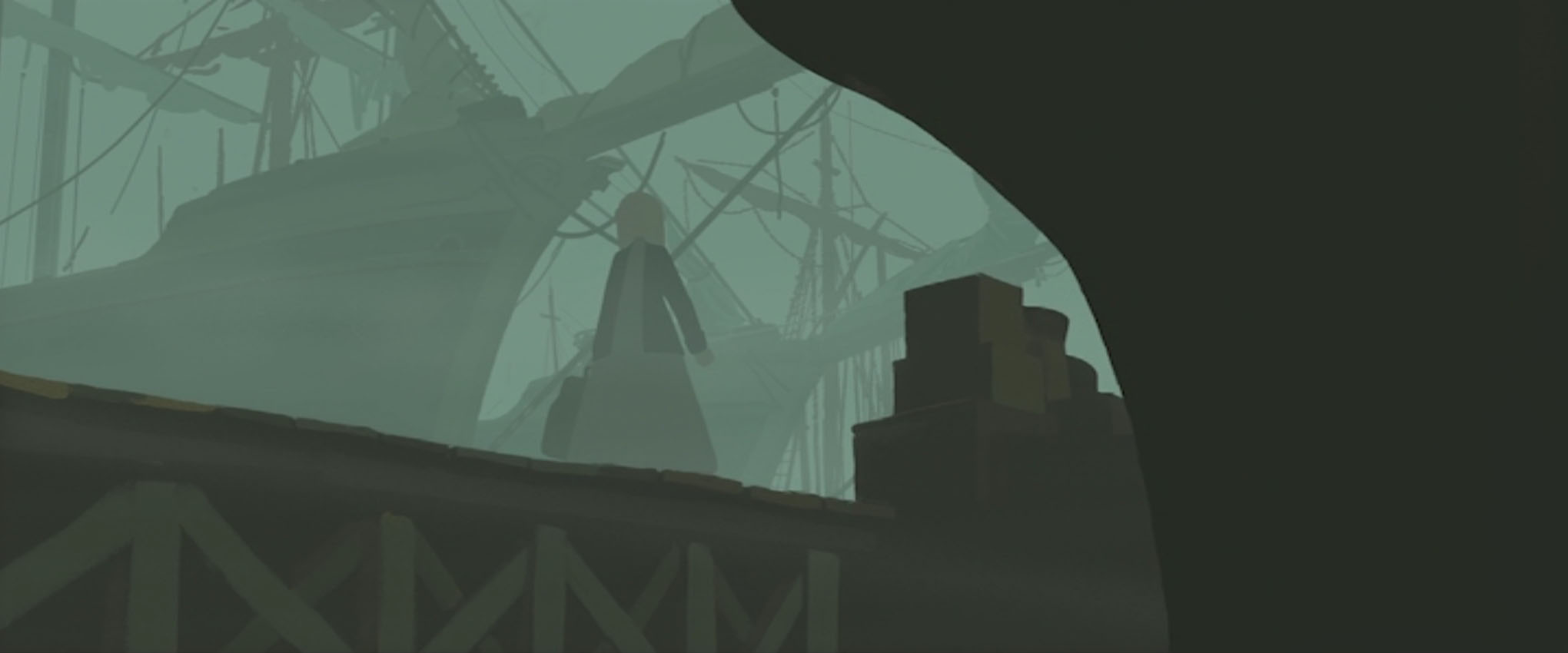
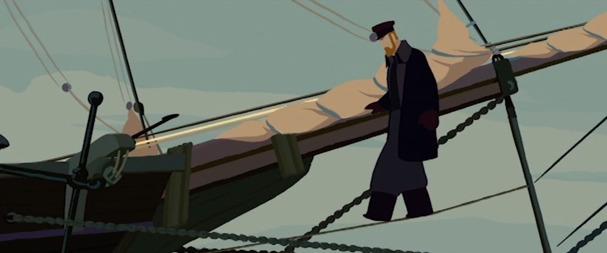
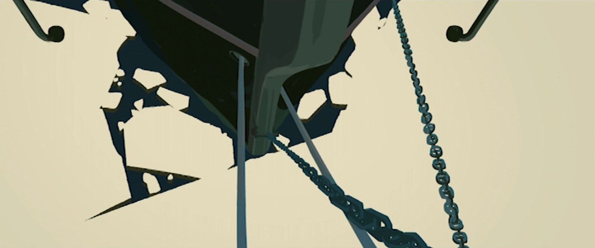
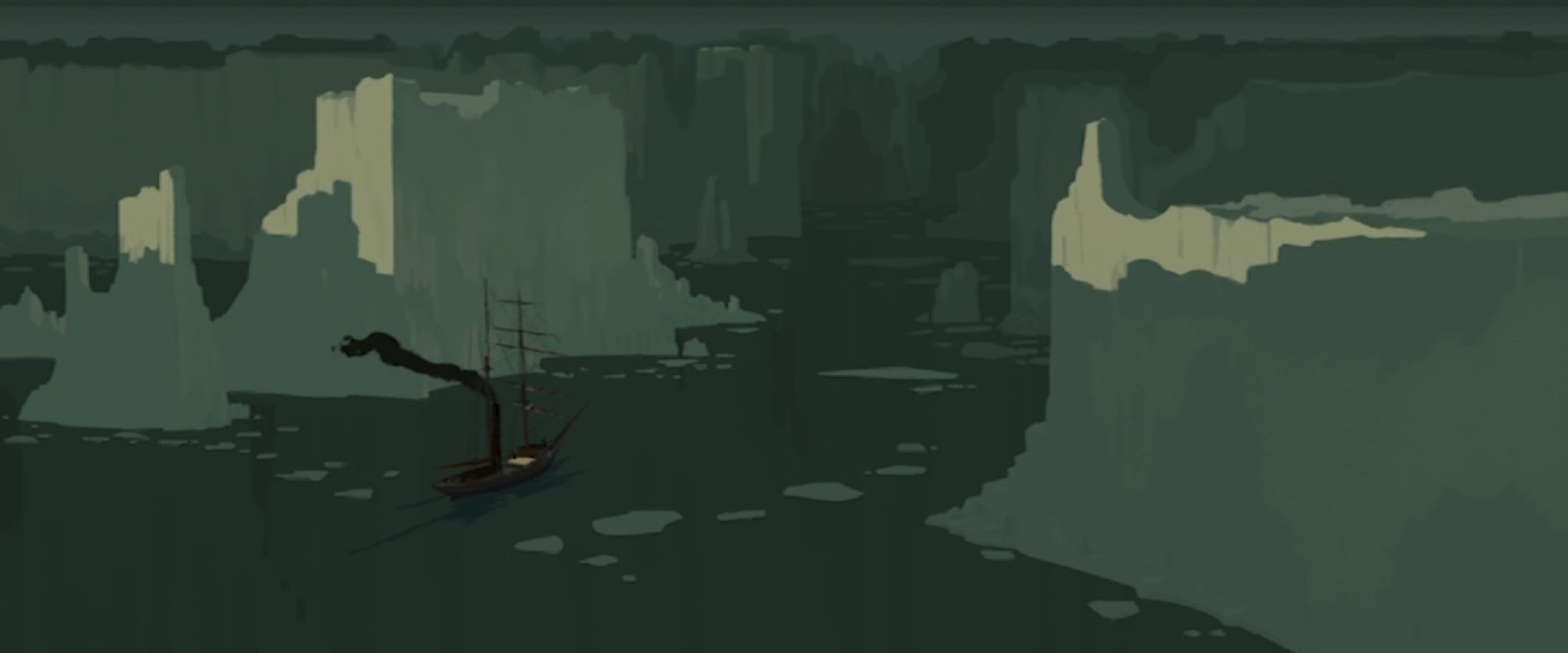
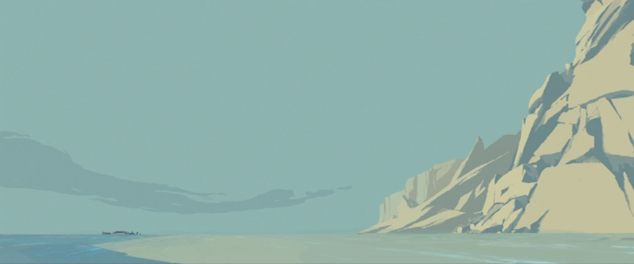
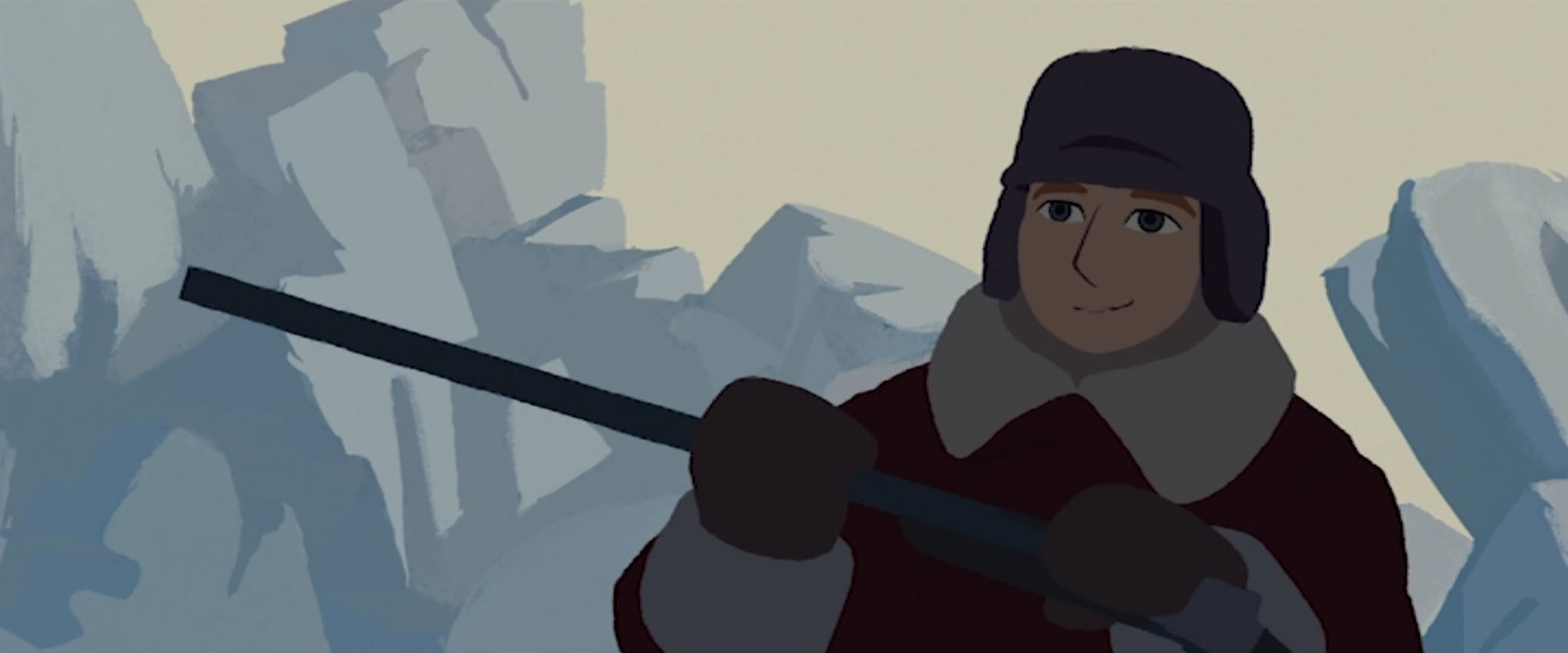
The widescreen (2.35:1) film makes great use of the dimensions for both its vast urban and country environments, and busy interior set designs.
Whether a scene takes place in the early morning, day, dusk, or late at night, the choice of colours closely imitate the feeling of real naturalistic lighting. As the film progresses, the warmer tones lessen in frequency to match the atmosphere and settings.
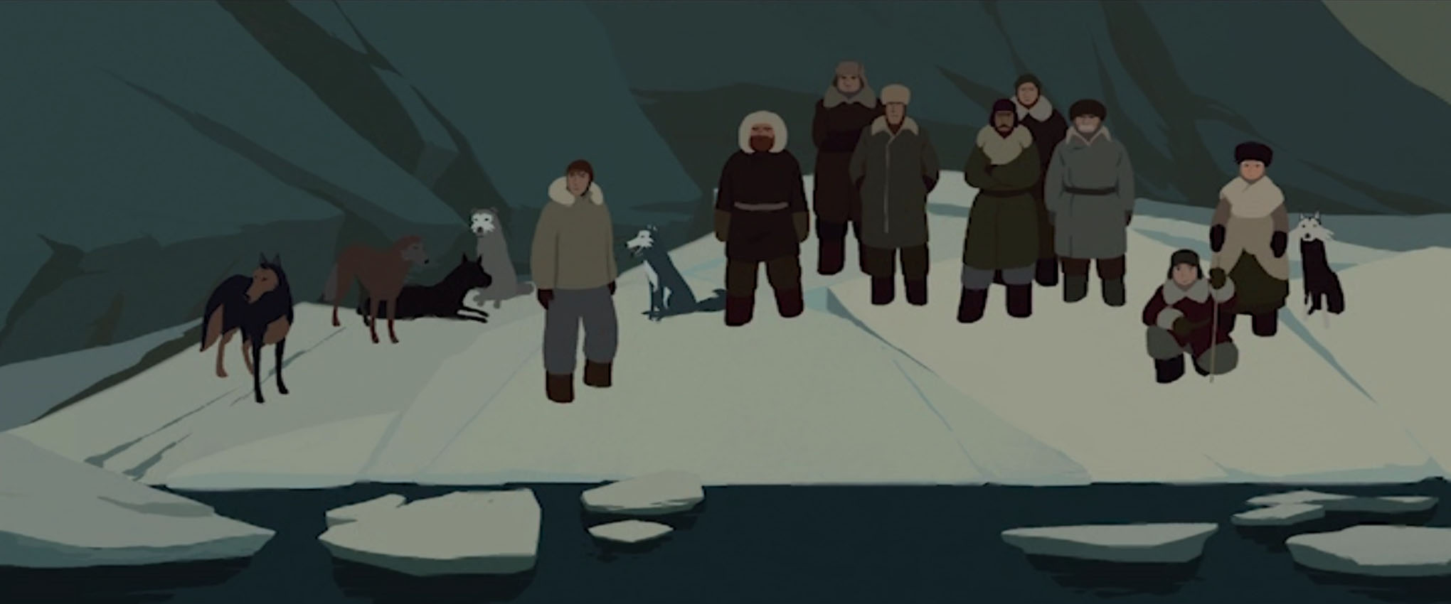
Even though the people in the film are heavily stylised – as are the spaces they inhabit – they still feel and act human. This is down to the writing, the dialogue, and the animation. While Sacha’s motivation to find the Davaï is the driving force of the feature, captain Lund’s brother and second mate Larson clearly has something to prove. When characters are met with difficult choices, the darker side of human nature shows itself. I don’t have any clips of character interactions to share, the character acting is well-done.
While on-board the ship, the ‘camera’ moves about to emulate the motion of the ocean waves. A lot of the compositions are tightly executed.
The sound design of the film is great, too. (The DVD I have came with surround sound.) The feature is mature enough to let silence and noise take their turns to speak in place of the characters. Like any form of design, if the sound department does a good job, it’s often uncredited, but if the sound design is bad, we’re more likely to be upset and complain.
Hah. I wan’t going to include as many images as I did in this write up, but I took many screen grabs as I watched the movie again, still as impressed as my first viewing of the arrangement of the figures and backgrounds – and the very confident use of negative space.
I haven’t done much in the way of digital painting lately, and looking at this film it makes me think “Ah! I need to step up my game!” and practice with more adventurous palettes next time I make studies. Rémi Chayé cited Russian realist painter Ilya Repin as a source of inspiration behind the art direction. It is also worth noting that while it’s conventional to illustrate or animate figures and objects with outlines, the film does away with them, not only giving the film a unique appearance, but it is also closer to realist paintings and a real perception of our world.
I hope that if you have not yet seen the film, dear reader, that you may feel inclined to seek it out now. It’s worth a watch for the visuals alone! I admit that I enjoyed writing up thoughts on this film, and would like to share other lesser-known (and less accessible) animated features on my blog.