Zine Pickup – Pizza and Japan

Picked up a couple of zines to go towards self-publication research. One is a text-heavy personal zine (often shortened to ‘perzine’) and the other is a collection of photographs. I won’t be keeping either of them; I don’t have the space, but we’ll take a quick look at ’em here and now.

Neither zine is a standard print size, and both use different printing methods!

ZINE I PICKED UP
Two zines by Awkward Ladies Club, plus a vinyl sticker

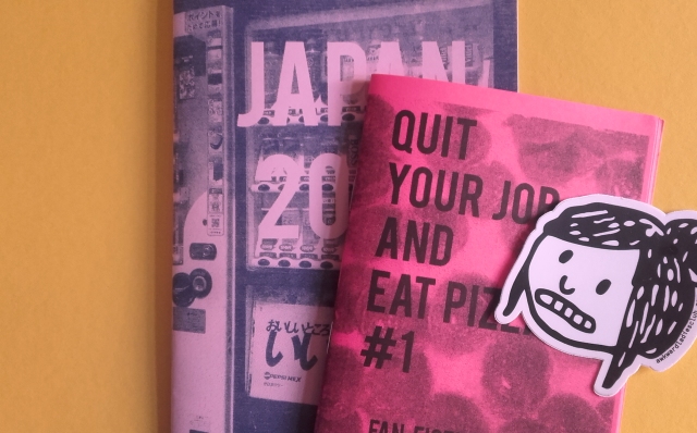
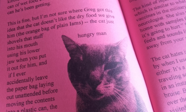
Quit your job and eat pizza #1 Fan Fiction Piracy is printed on playful, hot pink paper and has a silkscreened cover, and photocopied interior. Bound by staples; ‘saddle stitch’ binding. It’s really, very tiny in my hands, but it’s 24 pages long.

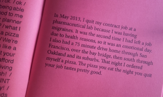
The opening segment of Quit your job and eat pizza #1 covers the authors leave from work due to their health, the medication they take, and how they administer it. We’re even treated to diagrams of a samavel injector and the graphic representation of the drug sumatriptan. (I learned something science-y, something… medical!)

INSIDE PIZZA ZINE
It’s called a perzine for a reason!

There’s a section titled sci-fi zine piracy in the 1990s. Before the internet became commonly accessible, before fans of movies, television shows, and cartoons had any shared online spaces to show their fan creations (usually prose or illustration) many dedicated fans made zines covering their favourite media and circulated them in conventions. Today, a lot of fans’ secondary content is shared freely on the internet. What I didn’t expect, was to read that folks pirated the rarer zines back then by photocopying an original copy and selling the bootlegs! To combat cheap, illicit copies, some authors produced zines on a particular coloured paper, or stamped the original run for authenticity.

It’s easy to understand why some zines would be coveted; regardless of the genre, if the content was desirable, but the print run was low in number, the second-hand price would be driven up.

HUNGRY MAN
Hungry … man … Hungry-Man

There’s a whole section dedicated to rotten cat teeth, and one focusing on community college print-making. A real variety here.

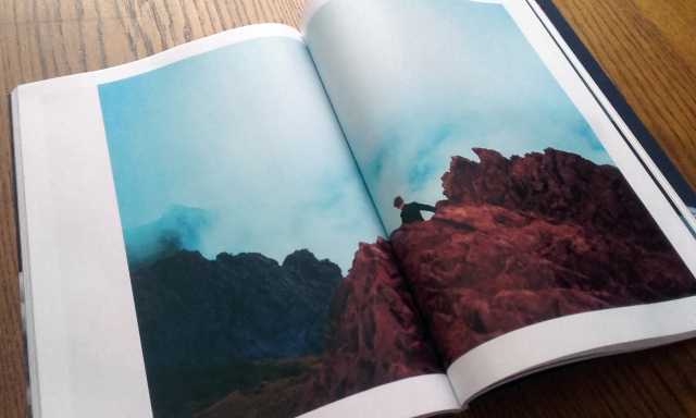
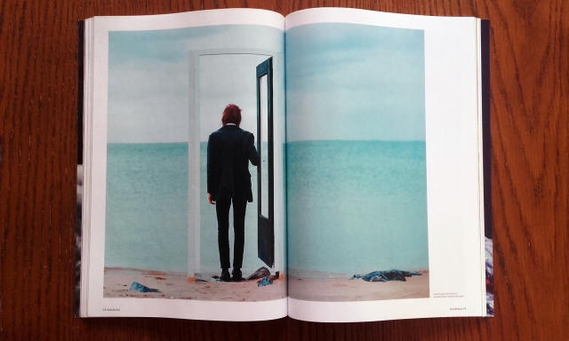
JAPAN 2009 is risograph printed in federal blue ink on pink paper. It’s saddle stitch. The size is 5.5″ x 8.5″ and it’s 22 pages long. It’s a collection of photos from a trip to Kobe and Tokyo; all without commentary. It’s interesting to see foreign images without context, though I recognised some landmarks and objects.

The photographs are split between the country’s aforementioned prefectures Kobe and Tokyo, which you could see as ‘chapters’. Despite the name, this photograph collection was first printed in 2014, and the copy seen here is from 2019. This is where small-press collecting can get confusing; there’s no way to tell which printing (edition) the copy I have is other than the point of purchase.

gachapon machine
Gachapon (toy vending) machines lined up…

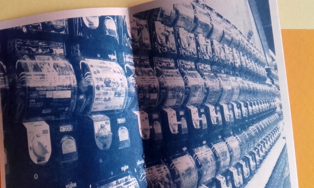
Some photographs take up the entirety of the page. The centrefold shows an image of numerous gachapon machines. Gacha machines take coins, and in return, give up plastic balls with surprise plastic clutter inside (i.e. super-small ‘toys’). The name of the machine comes from the Japanese onomatopoeia for the metal crank turning –  ‘gasha’ (ガシャ) –  and the sound the plastic ball makes as it drops – ‘pon’ (ポン).

Tanuki i guess
Detail from a shopfront. A curled-up tanuki?

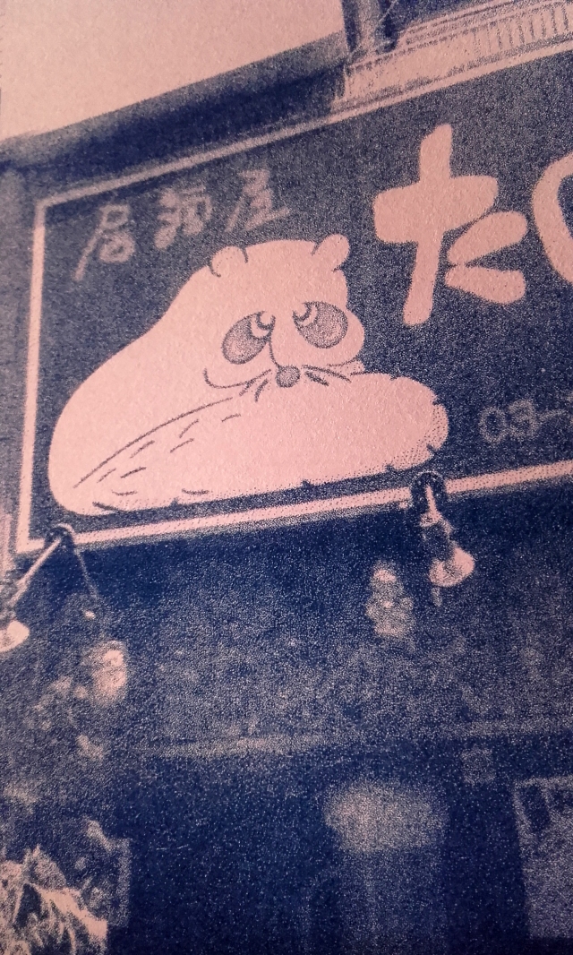
Shopfront with what I’m assuming to be a stylised tanuki (racoon dog). Difficult to tell without seeing any of those telltale balls on display!

JAPAN 2009 is a neat concept. To group photographs from a trip that may otherwise get little exposure and bind them without context, leaves more room for a reader’s personal interpretation. Sort of lends some mystique to the collection of images? Equally, a sort of predominately visual travel-diary may make for a fun project to work on in the future.

Have you read or bought any zines lately?

Physical Book – Emotional Impression

Thinking about some of the physical limitations of a printed book – they become worn with age and may fall apart with use – unavoidable characteristics of physical publications. Printed media may endure damage through love or mistreatment, and it’s something that e-books, online articles, do not have to bear.

Recently, a good friend returned to me a book of mine; Slaughterhouse Five by Kurt Vonnegut. This ratty, paperback book was first given to me by another good friend as a birthday gift. I received it unexpectedly in the post; it smelled very strongly of cigarettes, the corners already dog-eared, and the pages yellow with age. The copy is from the year 2000.

I loved reading this book. I read it commuting to and from campus, and sometimes before bed or just at rest in my room. I can’t know if Billy Pilgrim’s unreliable narrative is so memorable for Vonnegut’s witty writing, or if my experience with the story was influenced by the interaction with this particular copy of the book. I’ve yet to read any other books by Vonnegut. (Though I found this book funny where as the friend who gifted it to me found it lonely.)

SH5 01
The cover of this edition, to me, is unremarkable, but if you look closely, within the yellow number 5 are toy soldiers (the cheap, plastic, green kind).

Another book that I had made strong emotional ties to would be an ex-library copy of The Little Prince by Antoine De Saint-Exupéry. My mother brought the hardback home one day when the city library cleared out many of its old books. It already had loose binding, and the cover had been sun-bleached. I read it once I got my hands on it, but being a child, didn’t fully grasp the depth. Revisiting it as a teenager I wasn’t much more moved. Reading it as an adult, I was.

LP HB 01
Hardback copy of The Little Prince. This edition is from 1991.

There’s an illustration early in the book of a boa constrictor having eaten a elephant, Drawing Number One. It was ‘drawn’ by the narrator in childhood – and those I’ve discussed the book with tend to bring the picture up for it’s significance; the adults in the narrator’s life dissuaded him from pursuing a career in art only after a couple of drawings!

During summer, I saw a stranger wearing a t-shirt with Drawing Number One printed on it, and immediately felt overwhelmed by sadness and bitterness, and I do not consider myself a sentimental person. The illustrations in this book really left an impact. But the significance of the story did, too.

LP HAT 01
Drawing Number one

It’s difficult to say if the impression these stories left is because I feel that they are well-written or if it was because the objects’ presence felt more like a person; battle scarred and weary. I was less anxious to treat the books so carefully as they were already worn and kept them on-person while reading them.

Now, an e-book doesn’t wear out. An advantage, and yet, could it be a loss? Can you tell if an e-book has been well-loved?

I need to look closer at e-books and the platforms that digital books are accessed on to get a better understanding of their advantages over print.

The Magazine – Tactile Sensation

Visiting the campus library for hands-on research on print – on magazines – I borrowed a couple of the journals that interested me due to the contents, the materials used, and editorial layouts, and I will share photos of those journals, too.

(Just bear In mind that the old phone I’m using to take pictures… is on its way out.)

british journal of photography cover
Library journals borrowed

The two magazines borrowed are a copy of British Journal of Photography, and a copy of Aesthetica.

The following photographs are of the December 2019 edition of British Journal of Photography, titled Cool + Noteworthy.

BJOP 01
Article on Aïda Mulneh’s commissioned artwork
BJOP 02
The gloss on the pages gives the journal a ‘premium feel’

The heavy, glossy paper used in the centre of the British Journal of Photography adds value to the object; I can tilt the book and enjoy the light’s changing reflection, I can run my fingers over the soft surface, I can listen to the sounds the glassy pages make as I turn them.

BJOP 03
Matter and Moonvoyage from artist Paul Cupido’s book Éphémère
BJOP 06
Large photograph from a fashion article
BJOP 05
Article on cartography

The articles are all laid out in grids with the text aligned left. The general layout is restrained, or reserved.

The following photographs are taken of Aesthetica’s June/July 2019 edition.

20191214_141243
Piece from Of Rainbows and other Monuments, Clemens Ascher

The two-page image spreads are numerous in Aesthetica, and I’m trying to imagine how they’d display on-screen. There’d be a lack of fold in the centre of the page, of course, and I feel that the small loss of image in the centre of the page in print is a characteristic specific to print that would be somewhat missed in a digital format.

flowers ind ecember
Pages showing artwork from Flowers in December, 2016 by Sanja Maruśić
flowers in december
More artwork by Sanja Maruśić, from Flowers in December, 2016

Looking at pages with such large images makes holding the physical book so rewarding. I am reminded that the copyright of an image is different than copyright of text. Many copyrighted images can not be printed freely without consent.

BJOP 04
Article on photography and its power to incite change

There are no excessively glossy pages in this Aesthetica issue; but the pages are a decent thickness. This magazine is much denser than British Journal of Photography, being 162 pages long, than the Journal’s 98 pages.

The dimension and weight of the physical magazine is something that a digital edition can’t recreate. All sorts of material read on the same hand-held device will feel the same size and weight. A reader is removed somewhat from an on-screen book as there is less touching involved.

Next, I want to research some magazines that are exclusively published online and see how they show off their strengths (and weaknesses) through specific characteristics that are bound to the screen. It’s only just to look at the counterpart to print and give credit when due.

In Print – Still Demand

For contextual studies research on print, I took myself to the library to see what magazine subscriptions are currently available to borrow. There was such variety; fashion, photography, history, art, engineering, dance, politics… too many subjects to name, actually.

I picked up many magazines and looked through them, trying to gauge their credit and purpose. Here are some of the magazines of interest. I took note of the materials used and the editorial layouts.

gappress copies
Copies of gap PRESS

The magazine gap PRESS – ‘gap’ standing for ‘groupe avant-premiere’ – covers international runway fashion shows and presentations within the fashion industry. On the magazines website, access to digital archives are available for customers who have bought physical copies.

gappress inside
Bilingual contents of gap PRESS

The contents of gap PRESS are all bilingual; in English and Japanese. Real people have gone though with the task of translating the contents, and will have been met with thorough scrutiny before publication. A machine translation we may use online doesn’t compare to a human translation.

elle decortaion magasines
ELLE Decoration magazines

I picked up a copy of ELLE Decoration from the racks because a copy had marbled wallpaper featured on the mate cover, and it caught my eye instantly. The size of the magazine – standard –  was big and bright enough to pull me over with an enticing cover alone.

elle decoratio spread
Two-page spread of interior design in ELLE Decoration

The inside of ELLE Decoration is full of photography and large speeds of interiors that have been skilfully paired with fonts and a considered amount of text on each page. The layout has room to breathe.

trands digital ad
Two copies of Collezioni Trends Magazine

Collezioni Trends Magazine is published three to four times a year. Collezioni Magazine is a compressive guide to textiles, printed after thorough research, it includes information from international trade shows and exhibitions. The paper was regular weight for a magazine; felt that it could tear easily.

TRENDS DIGIITAL COPY ONLINE
Digital preview of a copy of Collezioni Trends Magazine

Collezioni Trends Magazine is available as a digital preview. I flicked through it online – of course the pages are but a small selection, and out of sequence – the point of the free sample is to expose enough contents to entice newcomer subscribers.

The experience of looking though the sample of the magazine online wasn’t really impactful on my safari browser however. There’s a emulated page-turn animation as I ‘flick through’, but there’s a lack of actual articles to read – here I’m greeted with images only. (Beggars can’t be choosers…)

20191213_141523
ImagineFX advertising the sales of its digital magazine

I saw other magazines which promoted the sales of digital editions. I feel that the push of the digital copy sales is simply that; to sell more copies, than to phase out the print editions.

Many of the cheaper magazines had glossy covers, but the usual thiner, duller, recycled paper inside. When the inside of a magazine had some thicker cardboard pull-out of glossy spread inside, it was a surprise and felt like an incentive to buy.

After thinking about the magazines strengths and drawbacks, here are some unbiased pros and cons that I feel the physical magazine possesses:

PROS

  • Portability of the magazine – possible to take it about freely
  • Possessing a physical copy instills a strong sense of ownership
  • Physical characteristics such as paper quality (weight and material) are part of the user’s experience of the item

CONS

  • Takes up physical space
  • Depending on the content, the item may be a waste of resources
  • The printed information within may quickly become outdated or redundant

Of course I could look at the printed magazine and compare it to online counterparts. For example, digital media can often be stored on several devices, and thus essentially be ‘several copies’, but when you buy a physical magazine once, it’s just the one copy. Still, a hardcopy has the benefit of being internet and electricity-free; you can read a magazine without internet access, and it won’t run out of battery, unlike a device.

Seeing all of these magazines in print, I am not convinced that print is dead! There is still high demand for so many magazines of varying subjects and differing demographics, as seen by the racks in the library!

Contextual Studies – International Zine Festivals

Looking into the state of physical print in the 21st century for contextual studies, I have looked into the specific self-publication of zines.

Self-publishing printed media is a culture itself. The culture of fanzines has been around since the 1930s. Besides fanzines, news zines and personal zines are staple genres. Truthfully, there is no hard rule on what content a zine should hold.

People may think of use of photocopiers when they think ‘zine’ and saddle stitch binding (using a stapler) but the use of the Risograph machine is popular today too, along with other forms of binding.

CAITLIN TAGUIBAO
Risograph printed zine for sale at Zine Day Osaka by artist Caitlin Taguibao.

The boundary of what can be considered a zine seems to be played with continuously by self-published creatives. I’ve seen almost inappropriately sized miniature zines (with tiny text) and unwieldily, long leporello zines.

ZINEDAYOSAKA 02 photo copyright レトロ印刷 (retro JAM)
Workshop at Zine Day Osaka (image copyright レトロ印刷 @retro_JAM)

The desire to share out thoughts and feelings about anything and everything though text, photos, and drawings is universal. Art; self-expression is being human.

There are many established self-publication festivals around the world, from Canada’s Canzine Vancouver, Scotland’s Glasgow Zine fest, to Belgium’s Cultures Maison. Some events are multi-day and bring in large, international crowds such as Japan’s Tokyo Book Fair, but smaller celebrations such as Japan’s Zine Day Osaka takes place over a couple of days and have their own dedicated producers and following ensuring a continuation of zine culture.

NYC FEMINIST FANZINE
Table spread of zines at NYC Feminist Fanzine.

Some zine festivals stick to one subject matter or concern, such as New York’s NYC Feminist Fanzine. Some festivals provide a safe-space for expression or for minorities to gather and connect.

STICKY INSTITUTE
Zines sold at Australia’s Festival of the Photocopier.

There are so many festivals around the globe celebrating self-publishing; zines, artist books and so on, that I can’t track them all down or list them here.

I have two zines from America to share at a later date. Both risograph; one a personal zine with a mixture of contents, and the other a zine of photographs. There’s something special about holding a limited-press book in-hand, isn’t there?

Contextual Studies – The Observatory Podcast

Regarding the contextual studies essay module, students were presented with eight pre-constructed questions to choose from if the wish to do so. I had wanted to pic a unique topic for myself to sink into. The most important outcome of the module is to make a prediction within design. (The prediction don’t have to come true, I guess. But it should be backed up with facts!)

I had considered looking at ‘toy engineering’. These days, there are a lot of health and safety standards put in place to keep the products’ target safe from accidental injury or even death. The needs of the consumer change, and the product evolves to keep up. But, perhaps the topic is too niche…? My knowledge of toy engineering is more-or-less specific to one brand.

‘Sustainability in toy packaging’ is another topic that I could make predictions of. I had difficulty finding much (any) academic information cataloguing the materials used in toy packaging design – either vintage or contemporary. Sustainability in toy packaging may be itself a strange topic to want to look at, as toys themselves are not generally considered sustainable. The materials used in production aren’t always considered for their longevity. (Much to any toy collector’s dismay…)

The eighth pre-constructed question was the only topic that really connected with me: “Creators and publishers of printed zines and magazines are dealing with the growing possibility of their medium being rendered obsolete by the expansion of online media. Is print media dying out?”

So. I need to stop stalling, and find some sources to work with! I’ll pursue this question until I find some guidance for looking into other options. It’s good practice to dive into a podcast on the topic of print media’s future, and see what reliable information I can pull out.


I listened to the podcast below, Episode 96: Wither the Magazine, by Jessica Helfand and Michael Beirut, who “…discuss the changing of the guard at New York magazine… and the fate of online publications such as Rookie and Design Sponge, which are both winding down.”

My notes on The Observatory podcast, Episode 96: Whither the Magazine

@ 06:29 

Beirut “It’s interesting just to think about what’s the future of hand-held magazine, in the age of mobile, tablets, digital, whatever. Because the point of entry is just so different.”

Beirut talks about the reader’s interaction with the online magazine – one may be on social media (eg. twitter) looking at fashion trends and find themselves directed to a magazine though a tweet. The reader may not stay on the magazine article itself for long, or they may look at other articles on the same website.

Beirut is suggesting that tweets direct the reader to cherry-picked content.

On print magazines, Beirut comments that they have a “beautiful tension between expectations and surprise.”

^ Of course, this ‘tension’ subjective to the consumer! It is a truth that the suspense of ‘turning the page’ is a characteristic of print media.

@ 8:25 

Helfand “…many magazines have online counterparts.”

^ It’s a statement, but it is unbiased and truthful.

@ 9:26

Helfand shares a story of when she was the art director for the Sunday Magazine at the Philadelphia Enquirer. When Helfand found someone sitting in front of her on an Amtrak train reading her magazine… she watched observantly… “What he did is, was he started at the back, he looked at the crossword puzzle, he pulled it out, he went to the food page, he looked at that and then he threw it on the ground and went to the business section.” Helfand laughs, and recalls that she started to cry. Then shares with us how humbling the experience was, stating, “You just don’t really ever know how people consume the things that you design.”

Beirut then suggests that the information’s delivery could have been inefficient…

@ 10:45 

Beirut “…there’s just so much romance associated with putting out a magazine…”

^ A very subjective statement.

Michael Beirut subscribes to a great number of magazines including The New Yorker, The Atlantic, Vanity Fair, and so on, so it’s not surprising to hear such a strong opinion on print magazine from Beirut.

@ 17:03 

Beirut “…the death of the magazine has been announced loudly, over, and over, and over again; we’re in a golden age of magazine and publication design.”

Helfand “Right; print isn’t dead.”

Beirut “Yeah, print’s not dead. And new magazines spring up all the time.”

This string of conversation shows that both are very firm believers that the magazine isn’t dead; print isn’t dead.


Taking everything I’ve just heard in consideration, I feel as if there will be a lot of strong opinions on the topic of “print media dying out”… I’d expect to dig up polarising opinions. Printed media is something that I feel strongly about, too, in a positive light. Though I am well aware of the number of benefits to online platforms as alternatives to printed-format books, newspapers, and magazines. There’s always – at the very least – two sides to an argument.

Contextual Studies – Signing up to TED

In the past, I’ve casually watched some TED Talks over at YouTube. But for the current Contextual Studies module, having a TED account should make research far less frustrating, and perhaps, even fun!

SIGNING UP TO TED TALKS
Home page of TED

I’m going to personalise my account and let the site know what interests me, to garner a tailored feed of information. This is an advantage over my YouTube account, which is cluttered with other interests.

Thinking about the module – though I’m unsure of the topic I’ll choose just yet – I decided to punch ‘communication’ into the search box as communication is very important to me. I am genuinely invested in keeping in contact with others – especially through writing letters. I’m wary of miscommunication, whether the communication be in person, by written letter, over the phone, and so on, despite the expectation and inevitability of misunderstandings.

TED Talk communication search results
This search results stood out to me

This search results stuck me of interest because I often worry about my ‘tone of voice’ over text and e-mail particularly – and both of these forms of communication are needed to keep up both personal and professional contacts.

TONE SETTER
Details about the speaker in the above video

The site’s videos each have detailed written information on the talk’s topic and the speaker. Many videos on the site have an audio transcription, and that makes quoting the speakers much faster and easier.

Of course my fellow peers are encouraged to use this website as a resource, but I would also encourage anyone who is interested in broadening their knowledge in their fields of interest. There’ll even be something for you!

Contextual Studies – Exercise in Collecting Information

A short exercise of Research Principles was given to students kick off thoughts on how to approach research into the Contextual Studies essay. We combed through two articles on the typeface Helvetica Now.

I was presented with two printouts of online articles; this one from The Guardian, and another from the website Dezeen.

HELVELTICA NOW 01
Helvetica Now symbols from Dezeen’s article.

The point of the articles being printed out was to highlight them much as one would a personal textbook, newspaper, or magazine, etc.

A good tip was to read through the source material twice; highlighting text only the second time though. There’s no need to rush if you plan your time.

HIGHLIGHTING IS P FUN
The trick is not to go overboard with highlighting.

I think it’s important for students to note, not to go bananas with highlighting information. If you end up highlighting almost the entirety of a paragraph, you’re only going to have to scout through it again to find the most relevant of information.

The most important of information to seek out in a reference material are:

  • The source’s credibility
  • The subject’s historical context
  • Relevant technology
  • Individual designers & agencies
  • Visuals (photos, diagrams, illustrations)

Looking at the two sources handed out, students were asked, “How can you be sure of the validity of a source material?” There are a number of answers! Credibility is dependant on the writer (potential bias), the type of publication (eg. broadsheet vs. tabloid newspaper), the date published (as design is constantly changing), just to name a few.

These two sources would be considered trustworthy; one being a broadsheet-quality newspaper and the other a respected online magazine, specifically covering architecture, interiors and design. But you can also say these sources are both opinionated.

HEL MONOTYPE
Image above from Deezen’s article, showing “…three sizes in the font family to suit different uses”.

The Dezeen article was peppered with imagery that would be suited for use as visual support in a contextual study paper. Just as long as all imagery is rightly credited in the paper.

I think, while I already knew most of what was delivered, it’s doesn’t hurt to be reminded of basic principles of academic study, and I did take away some new knowledge.

I’m not sure of the topic I’m going to pursue yet. Students were handed a list of 8 questions that hit the target outcomes. The 8th question, regarding predictions of “the death of print media” was the only one that stood out to me as a topic I could get into. I can submit my own essay topic, and it will be be signed off by a lecturer if only it hits the criteria of the module’s target outcomes. The topic must involve a prediction of future design trends!

Margaret Gould Stewart – Designing for Scale

As an introductory to a new module (Contextual Studies) I watched Margaret Gould Stewart’s TED Talk concerning Designing for Scale, How giant websites design for you (and a billions others, too). I’ve noted some of the key information presented.

Concerning the difficulties of designing for scale, Stewart stated:

“It’s hard in part because it requires a combination of two things: audacity and humility. Audacity to believe that the thing that you’re making is something that the whole world needs, and humility to understand that as a designer, it’s not about you or your portfolio; it’s about the people you’re designing for, and how your work just might helming them live better lives.”

The big take away from this TED Talk, for me, was to take in mind technological limitations of users. When designing a website that is intended for use for people across the globe, such as Facebook, it has to look good on the oldest possible desktop computer monitor or most basic of smart phones. All elements have to look good and perform well – from the icons to the chosen typeface.

This statement that concerns the user stuck out:

“Designing for low-end cell phones is not glamorous design work, but if you want to design for the whole world, you have to design for where people are, and not where you are.” 

Prioritising the user is the right mentality.

I can’t ignore that Stewart, being an employee of Facebook, isn’t going to deliver a talk that is not biased towards the company’s work mentality and ethics. Bias is something to keep in mind when watching, listening to, or reading any media, when it comes to citing such media later on!

I look forward to sharing research and relevant findings on my blog, once I have gotten an idea of what topic I should pursue.