Animation – “The Little Prince and the Eight-Headed Dragon”

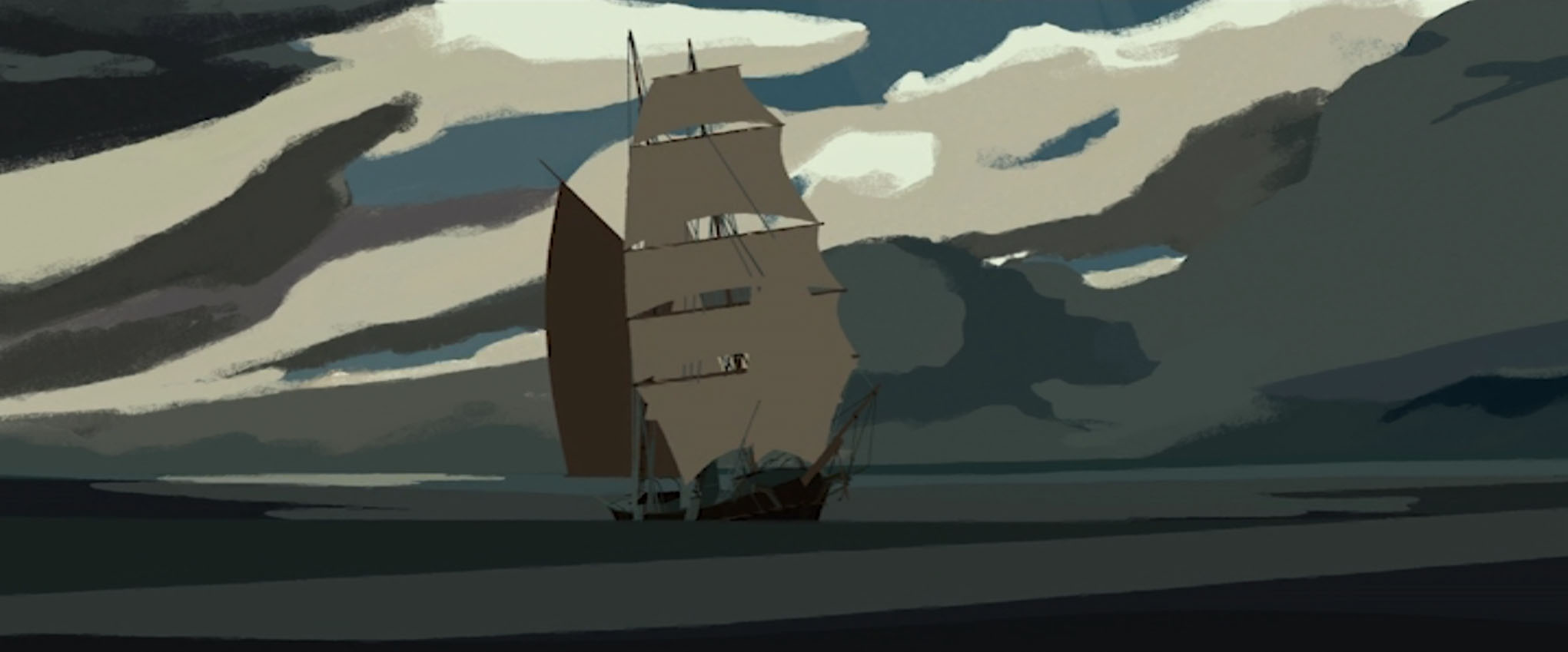
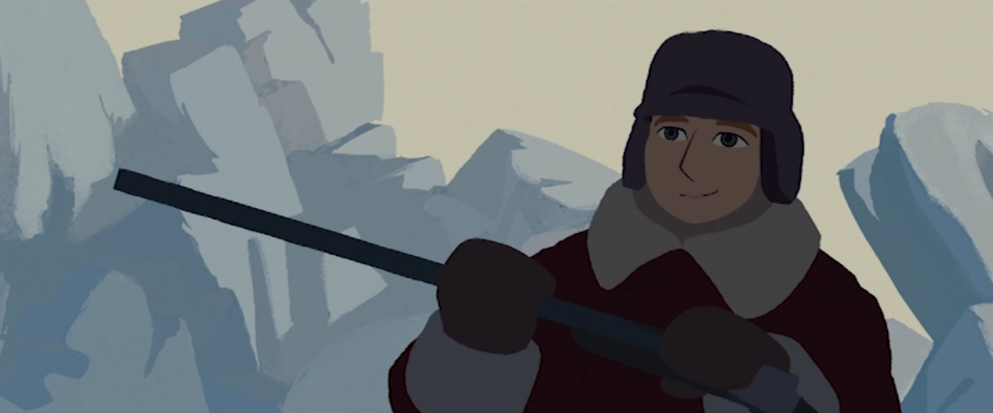
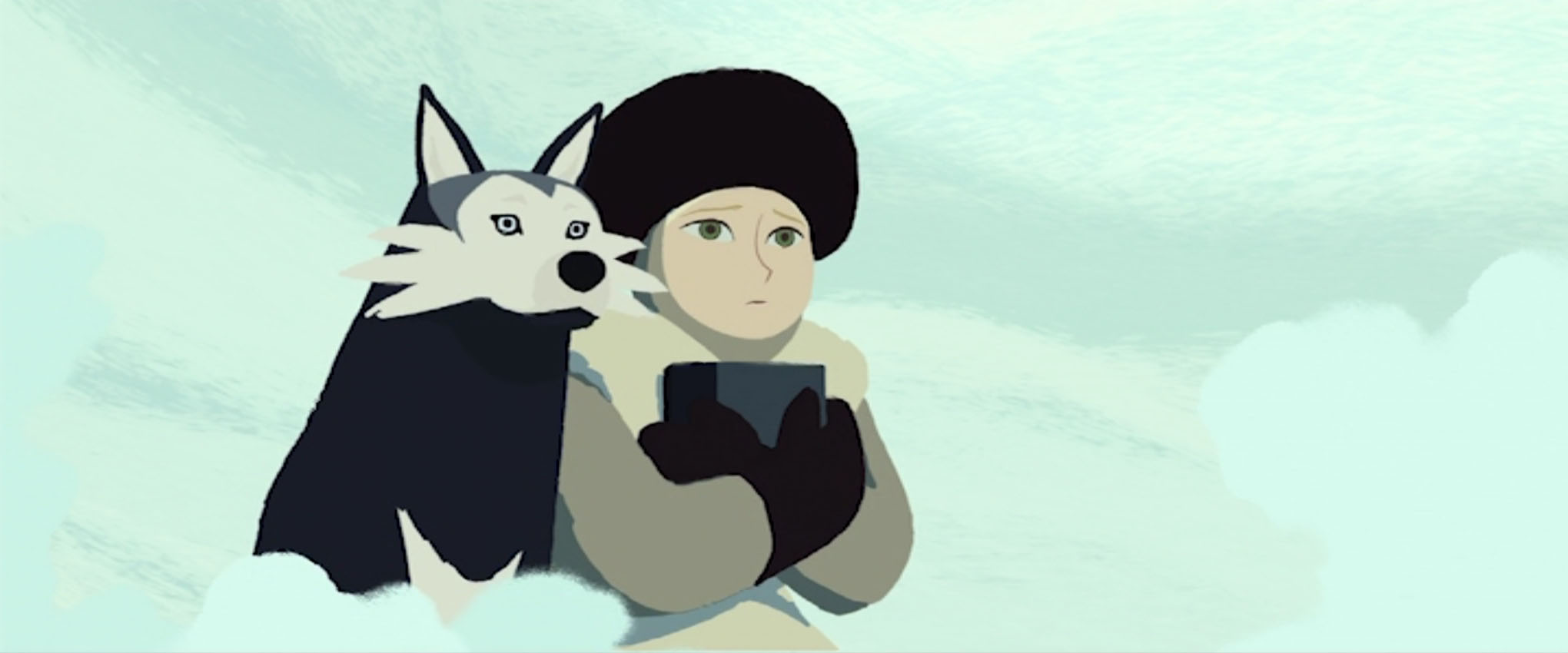
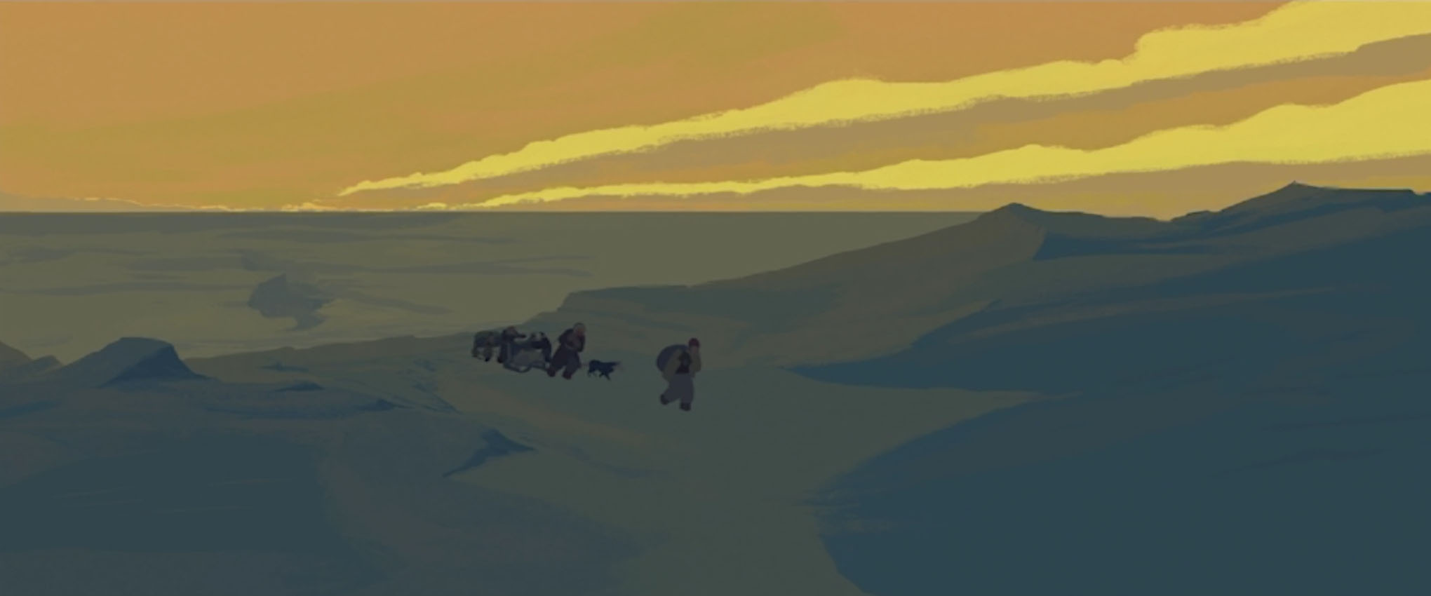
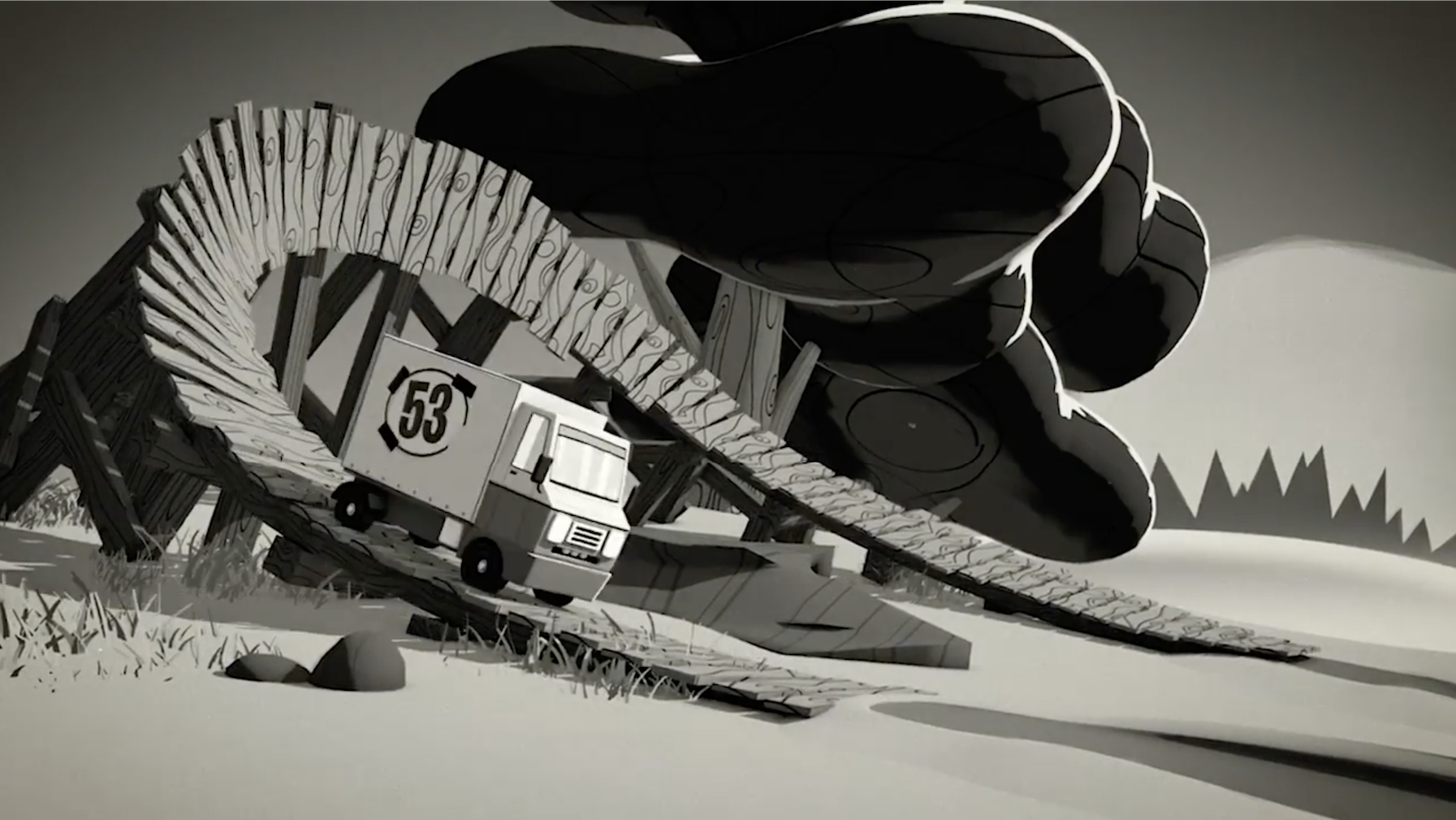
Since writing up my thoughts on Long Way North, I had wanted to write about and share another animated movie with strong design choices that really appeal to my tastes.

The Little Prince and the Eight-Headed Dragon is a 1963 animated feature from the Japanese studio Tōei Dōga (which was later renamed Toei Animation). The film is known in Japan as Wanpaku Ōji no Orochi Taiji (わんぱく王子の大蛇退治) literally meaning “the naughty prince’s Orochi slaying”.

Perhaps this feature is best known outside of Japan as an influence cited by Genndy Tartakovsky for the art direction of the 2001 TV series Samurai Jack, and Yōichi Kotabe for the visual design choices seen in the 2002 video game The Legend of Zelda: The Wind Waker.

Unlike Long Way North, it’s a little difficult for me to find details on those who worked on this film, or any history in regards to its development. The character animator of this film is Yōichi Kotabe, whom I have mentioned already for his contributions to The Wind Waker.

My copy of The Little Prince and the Eight-Headed Dragon is a Japanese DVD (sans subtitles in any form). This copy isn’t cleaned up at all; any artefacts and damage from the original source seem to be intact. It’s possible to enjoy the film grain in all its glory! (In all seriousness, the practice of digitally scrubbing film grain from old animated features isn’t something I think much of; the grain is part of the medium, and it comes off to me as a ridiculous betrayal to present the work as something it is not.)

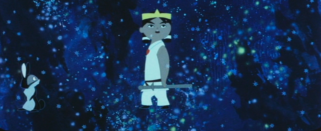
The film’s most important characters and events are derived from Japanese mythology. If you’re familiar with any gods from Shintō religion, you’ll notice their portrayal here is with much artistic licence. In the 1963 film, the protagonist, prince Susanō, is represented as a young boy, rather than an adult, most likely for the child audience to better understand or empathise with his actions and motives.


A brief summary of the film:

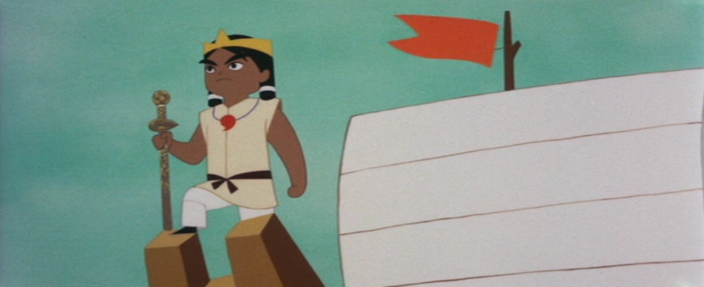
Prince Susanō is the youngest child of the creation deities Izanagi and Izanami. When his Izanami dies, the prince resolves to travel to heaven to bring her back.

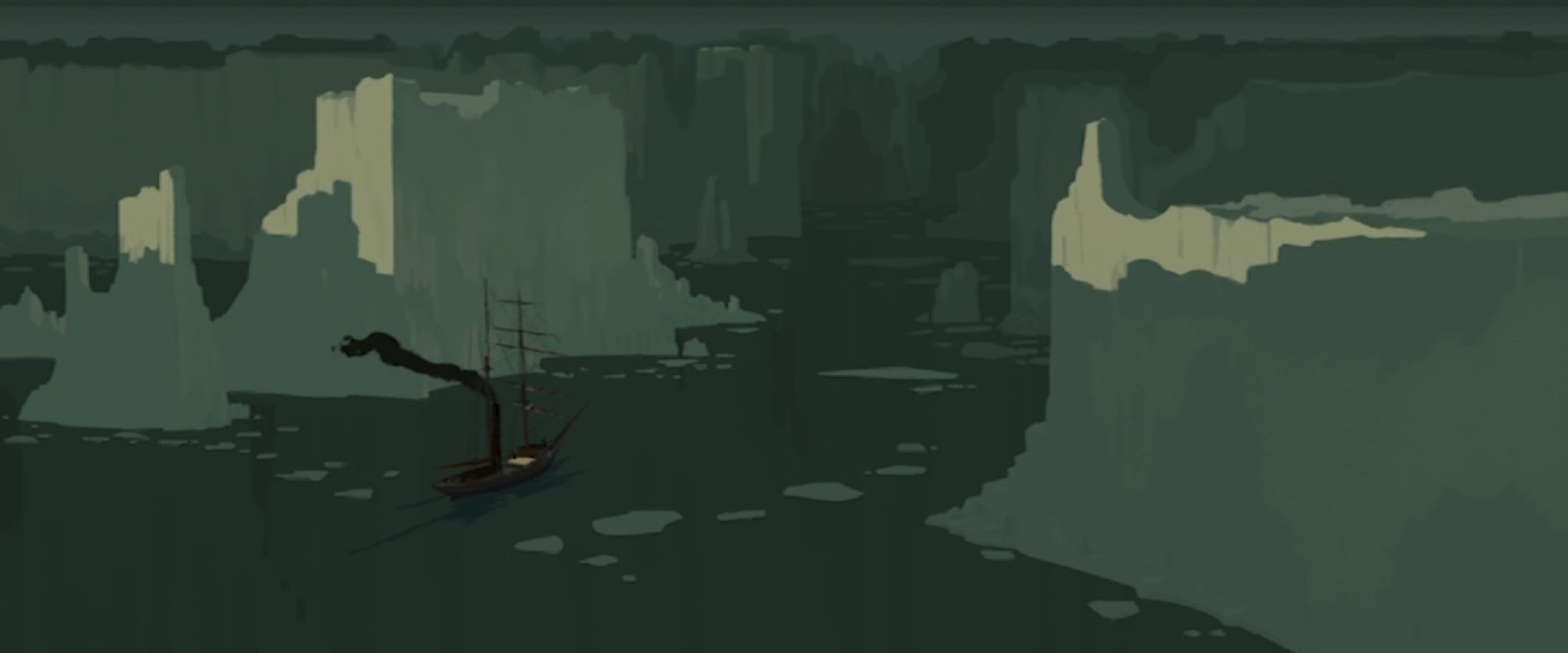
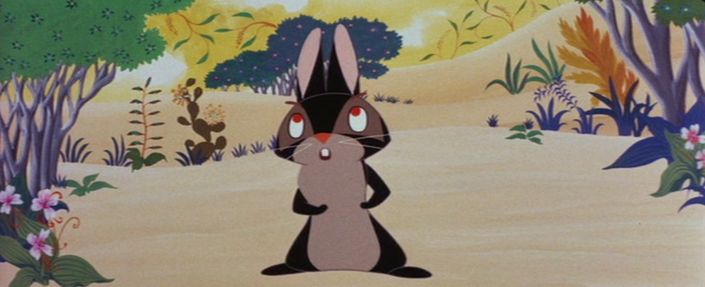
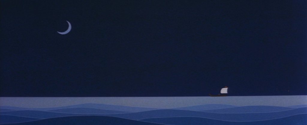
Prince Susanō constructs a boat, and leaves home with his rabbit friend, Akahana, in search of his older siblings, thinking they can aid him in reaching their mother. Susano’s brother Tsukiyomi, and sister, Amaterasu, are of no aid, however. They have accepted their mother’s ascent to the afterworld.

the duo venture onwards
Susanō and Akahana leave Tsukiyomi’s moon kingdom and press onwards to find Amaterasu

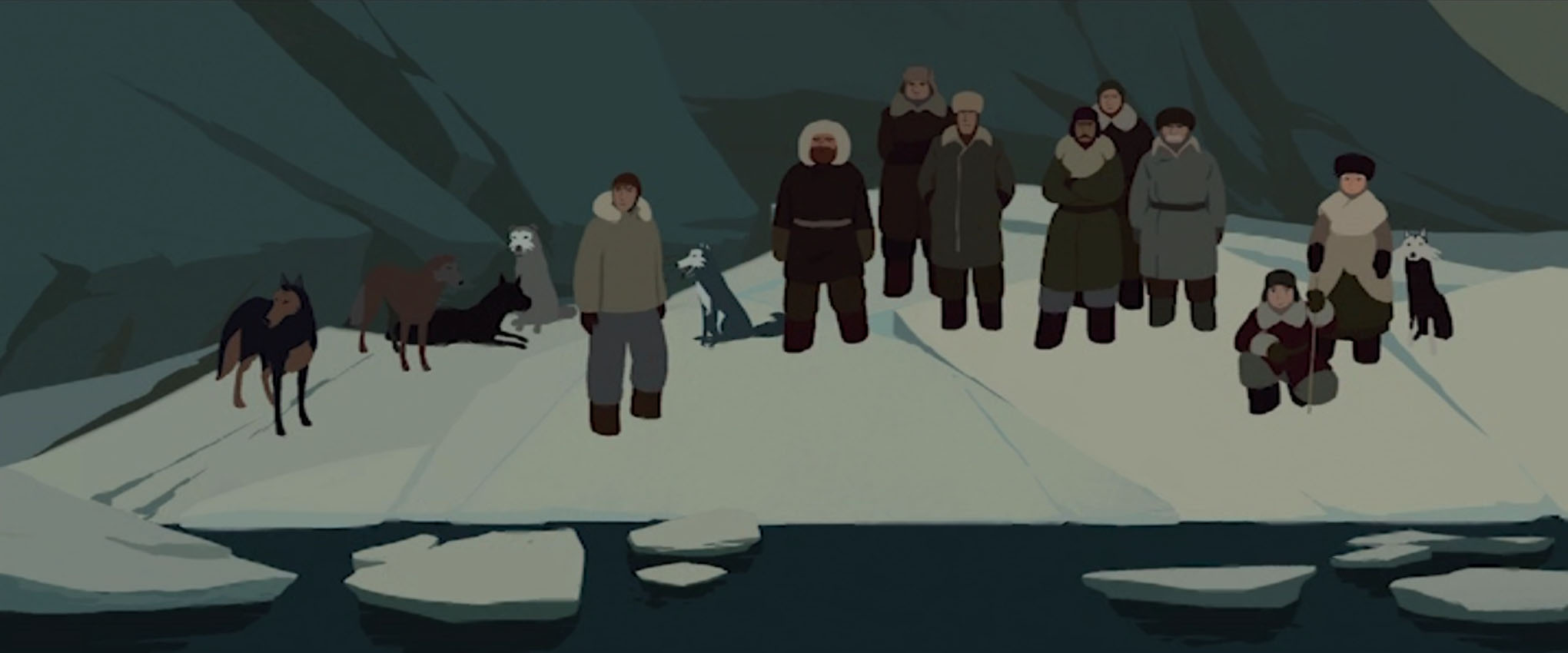
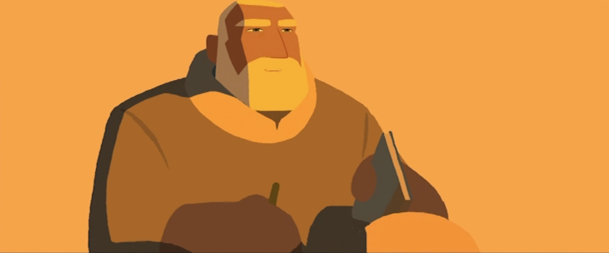
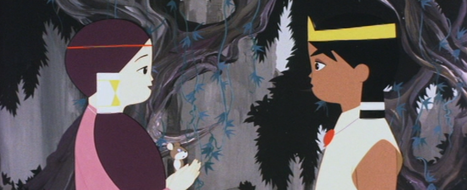
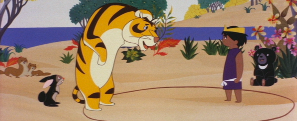
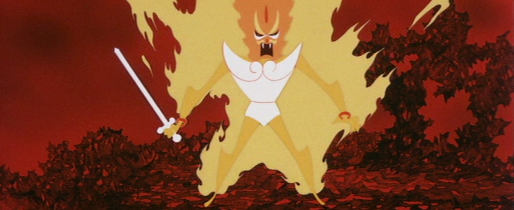
Making friends during their travels, the gentle giant named Titanbō joins Susanō and Akahana. The trio eventually arrive at a village suffering under the grips of a monster. The village’s young maiden Kushinada is next in line to be devoured as sacrifice to the eight-headed, eight-tailed beast, Orochi.

susanō_and_kushi
Susanō meets the gentle and reserved kushinada and is captivated by her

The prince is infatuated with young Kushinada, and so decides to rid the village of the hydra-esque Orochi. Susanō is willing to fight to the death with the monster!!

After a terrible battle, Susanō bests Orochi, and is greeted by his mother up in the heavens, who praises him for his good deeds before leaving him. The prince finally accepts that he will not be seeing his mother again.


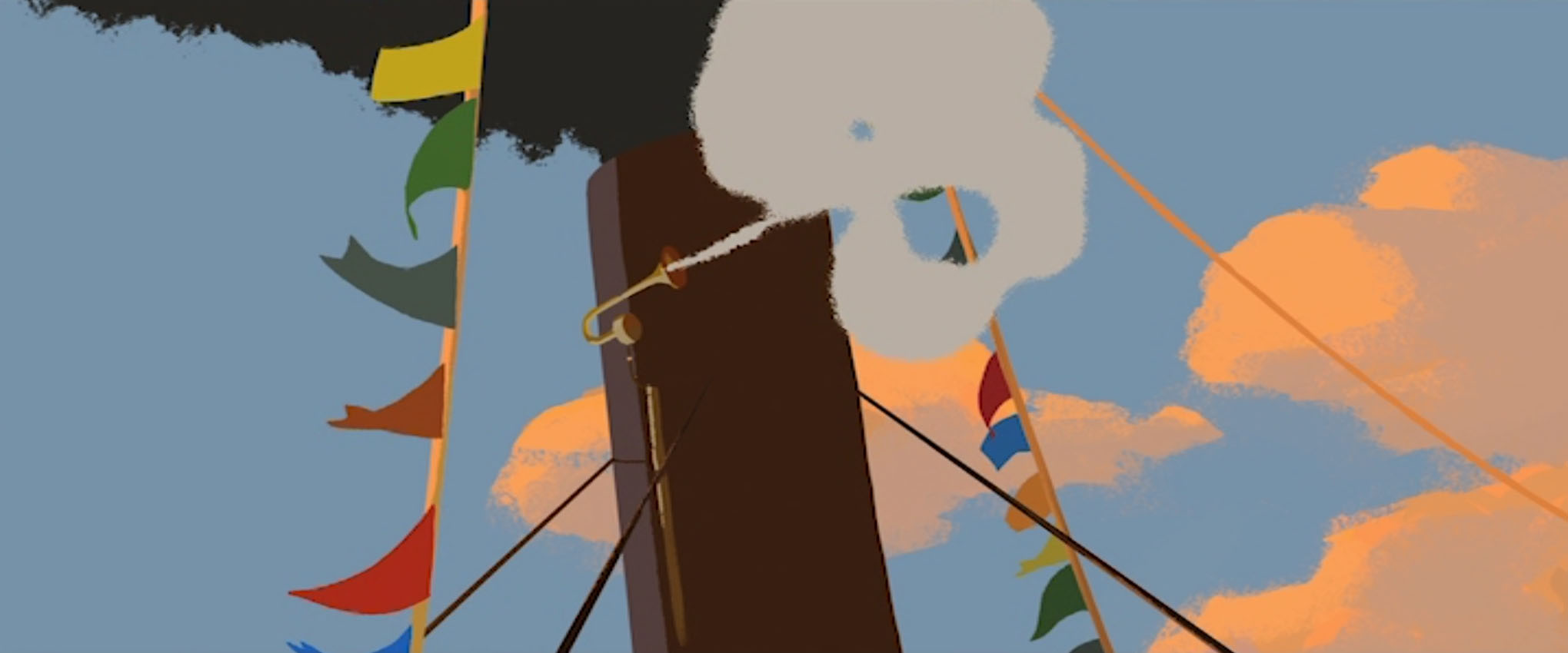
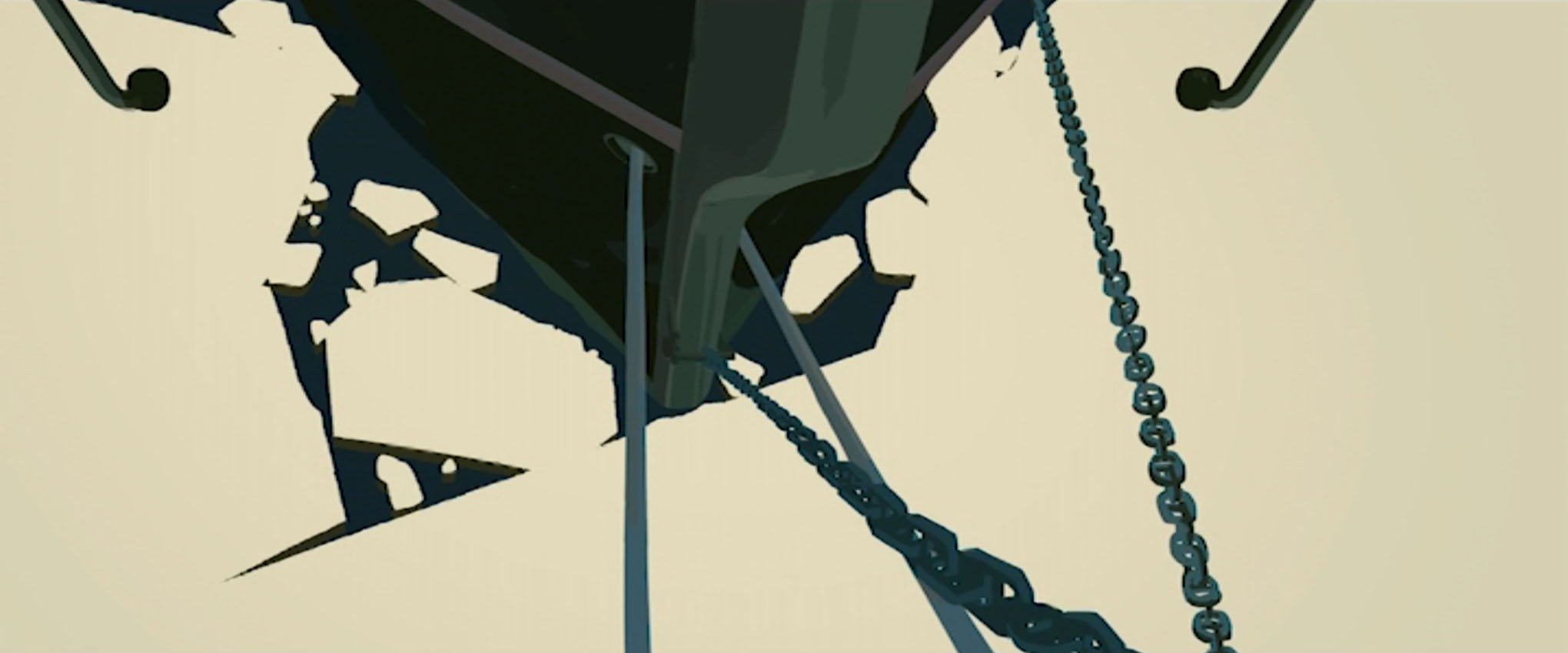
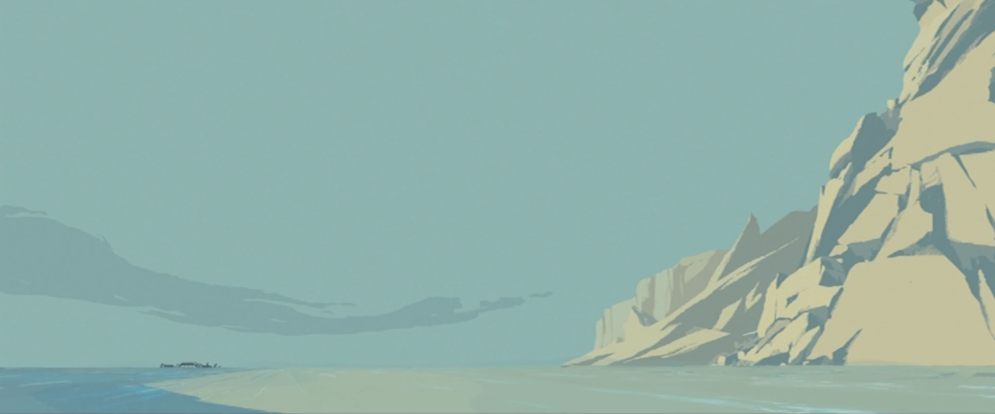
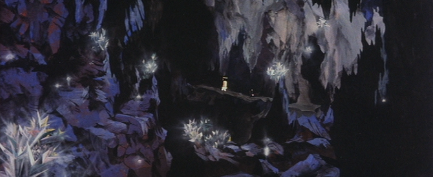
One thing that stands out about this movie compared to features released by Toei, is the much more angular character designs, and the abstract environments that are stripped back with many elements represented as symbolic shapes.

The economy seen in the character designs to me, feel very modernist, and very confident. A keen viewer will notice that most characters have coloured outlines, rather than black outlines, which gives a softer look to many of the designs.

While the film was created for and marketed to children, it is still a showcase of some experimental sequences and unique design visual choices for cel animation that I can only better appreciate and understand as an adult.

Sharing a lot of screen shots only does the movie so much justice… Really, you have to see The Little Prince and the Eight-Headed Dragon in motion to appreciate the skills and craft behind the animation!

The video embedded below is a sequence that presents great abstract character design and colour usage. As I have taken the video from sakugabooru, it is also an example of sakuga. While sakuga (作画) literally means ‘drawing pictures’, animation fans will use it to define fluidity in a sequence that uses little to no trickery or animation shortcuts.

The original Japanese film isn’t streaming anywhere, as far as I am aware. (Tell me if you know otherwise!) The only way to own a copy of the original film is to buy it from Japan. If you’re willing to watch this feature in any from, the English dub that was produced by Frontier Enterprises back in 1964 is available to watch on the Internet Archive.

I’d like to share more animated features, or even animated shorts on my blog in the future! Overseas works, and older films are particularly interesting to me for their (most often unfamiliar) design principles. I believe it’s good to be ‘challenged’ every so often by work that presents itself in a way you’re not expecting!

Auteur Animation – “Long Way North”

Today I decided to write about something that doesn’t concern books, exhibitions, or cool product design. I decided I’ll share some images and thoughts from a foreign animated film I recently watched.

Long Way North (or Tout en haut du monde meaning ‘At the very top of the world’) is an animated co-production between French and Danish studios made in 2015. The director is Rémi Chayé. Chayé kept the film’s budget modest; instead of flexing animator skills through unnecessary details and constant movement, the film is decisive with its visual information and contains more moving holds (quiet scenes of slight movement). These choices and sensibilities make it refreshing for me to watch.

I appreciate an animated feature that tells an offbeat narrative, or takes on a visual identity that’s unique to itself, as a respite from the over-played and safe stories and looks of America’s animated blockbusters. Seeking out and choosing to support smaller films like this means we can see more variation.

Here is a trailer with English subtitles:

I would recommend watching the film in its original language audio (to enjoy the French voice actors) with English subtitles, if you can. The region 2 DVD I found comes with both French and English audio and English subtitles.


I summarise the story as thus, but be warned as it contains spoilers:

In the late 19th century, the Tsar of Russia has funded the construction of a great icebreaker, the Davaï, and its voyage to the North Pole. The crew is lead by the explorer Oloukine, grandfather to a young aristocratic girl named Sasha. The Davaï leaves with much fanfare, but years pass, and the Davaï and the exploration team fail to return. A reward for the ship is offered by the Tsar, but all search parties failed to find the ship.

15-year-old Sasha still believes that the Davaï, her grandfather, and his crew will return. On the night of her debutante ball, Sasha sneaks into the newly built library wing of her family home, dedicated to Oloukine and filled with his belongings. She is searching for a pair of earrings her grandfather brought back for her years ago, and finds her grandfather’s exploration route through the Artic. During the ball she discloses her findings to her family and guests – that the Davaï’s search parties took the wrong routes – but the findings are brushed off as fantasy, and Sacha’s claims do nothing but strain her family’s relationship with prince Tomsky whom sees Oloukine’s efforts as a waste of resources.

Sasha runs away from home at night, determined, and carrying what little comfort she can. She travels to the coast in search of an ice-breaking ship, and finds one named the Norge. Sasha bargains with the crew mate Larson, believing he is the captain of the ship. She offers her earrings in return for passage to the Artic. The Norge’s captain Lund grants Sasha aboard his ship to seek out the Davaï, if only because she had already been promised passage by second mate Larson.

The relationship between the crew and Sasha is tentative at first, and gradually warms up to an amicable alliance as they cross the water to the Artic. But as soon as the Norge is met with the harsh environment, things take a turn for the worst. The Norge is sunk by an avalanche, and Lund is injured due to Larson’s inadequate performance. While the tools and supplies saved from the wreck can sustain the crew for a short while, the men begin to turn on each other, and blame Sasha for their predicament.

With even the young deckhand Katch turned against Sasha, she leaves camp and is followed by one of the ship’s huskies. Led by the dog, Sasha finds her grandfather’s frozen body and his logbook, in hand. It reveals the last actions of the Davaï’s crew, and the coordinates to the ship. Sasha returns to camp after being found by Katch. Lund’s crew free the landlocked Davaï using their remaining dynamite, and use the vessel to return to ST. Petersburg.


The widescreen (2.35:1) film makes great use of the dimensions for both its vast urban and country environments, and busy interior set designs.

Whether a scene takes place in the early morning, day, dusk, or late at night, the choice of colours closely imitate the feeling of real naturalistic lighting. As the film progresses, the warmer tones lessen in frequency to match the atmosphere and settings.

Even though the people in the film are heavily stylised – as are the spaces they inhabit – they still feel and act human. This is down to the writing, the dialogue, and the animation. While Sacha’s motivation to find the Davaï is the driving force of the feature, captain Lund’s brother and second mate Larson clearly has something to prove. When characters are met with difficult choices, the darker side of human nature shows itself. I don’t have any clips of character interactions to share, the character acting is well-done.

While on-board the ship, the ‘camera’ moves about to emulate the motion of the ocean waves. A lot of the compositions are tightly executed.

The sound design of the film is great, too. (The DVD I have came with surround sound.) The feature is mature enough to let silence and noise take their turns to speak in place of the characters. Like any form of design, if the sound department does a good job, it’s often uncredited, but if the sound design is bad, we’re more likely to be upset and complain.

Hah. I wan’t going to include as many images as I did in this write up, but I took many screen grabs as I watched the movie again, still as impressed as my first viewing of the arrangement of the figures and backgrounds – and the very confident use of negative space.

I haven’t done much in the way of digital painting lately, and looking at this film it makes me think “Ah! I need to step up my game!” and practice with more adventurous palettes next time I make studies. Rémi Chayé cited Russian realist painter Ilya Repin as a source of inspiration behind the art direction. It is also worth noting that while it’s conventional to illustrate or animate figures and objects with outlines, the film does away with them, not only giving the film a unique appearance, but it is also closer to realist paintings and a real perception of our world.

I hope that if you have not yet seen the film, dear reader, that you may feel inclined to seek it out now. It’s worth a watch for the visuals alone! I admit that I enjoyed writing up thoughts on this film, and would like to share other lesser-known (and less accessible) animated features on my blog.

Creative Freedom – FREITAG Animations

I thought to write a quick post on some short films made for a Swiss bag, accessory, and clothing company, FREITAG. These animations function as engaging and sharable video advertisement even though they are not marketed as a conventional commercials.

TRUCKIN screen shot
Screen shot of FREITAG video TRUCKIN’ from the ‘TARP BLANCHE’ series

The company FREITAG and its products were born from graphic designers Markus and Daniel Freitag, who in 1993 were in search of waterproof and durable bags to safely transport their creative work in. They found the right materials within the streets of Zurich –  truck tarpaulins, discarded bicycle inner tubes and car seat belts. Their items have taken off in popularity across the globe. Today, with the consumer being ever-more conscious of their purchases, the durability of FREITAG bags and the option to trade in bags one has tired of in exchange for a different or new one puts these items ahead of other long-lasting bag options.

The following three videos are from the 2017 ‘TARP BLANCHE’ series, in which the creatives involved had full authority to tell a story about FREITAG as they envisioned. The narratives get pretty wild.

Big Buddy Blue, by Team Tumult:

THE PICKING, by Burcu & Geoffrey:

TRUCKIN’, by Neil Stubbings:

There are other videos in the series, that can be found on FREITAG’s YouTube Channel. Along with many other interesting promotional videos.

I particularly like the aesthetic of TRUCKIN’, which borrows its purposely monochrome palate and silliness from the hand drawn animations of the 1920s. As with the other short films within the series, this animation explores the creation of the first FREITAG bags with a very unique and warm narrative that keeps the viewer’s attention from start to finish.

Have you watched and shared any company ‘promotional videos’ that act as advertisement for a product or service lately? Did they hit that ‘shareable sweet-spot’ many genuine adverts have aimed for?


A proposition – it’s a benefit, it’s a promise

In advertising, a proposition is to promise something; to offer a benefit. With so many companies competing with their own brands of what are essentially the same items, each brand needs a proposition if it hopes to capture an audience. The Unique Selling Proposition or USP was developed by Rosser Reeves, who was a pioneer of television advertising during the 1950s. His words, “Buy this product and you will get this specific benefit.” describe this marketing concept. Reeves understood that consumers were given too much information in advertisements and streamlined the delivery for them, and in the process, increased the sales of products he produced advertisements for. Naturally, as consumers evolved, and learned to better scrutinise marketing tactics and products themselves, different categories of propositions came into use as marketing tools.

A Single Minded Proposition or SMP is the one thing – the most important thing – that the audience needs to know. While this 1950s commercial for Anacin (produced by Rosser Reeves) lists its benefits compared to its competitors, it hammers home the SMP by the end of the video; that it’s “fast pain relief. I admire the short animations in this advert that attempt to visualise the pain of a headache.

Today, Emotional Selling proposition or ESP has essentially replaced USP. A person’s buying behaviour is more closely linked to their brain’s limbic system (which process feelings such as hunger, thirst, response to pain, and levels of pleasure etc.) than their brain’s neocortex (which is in charge of spatial reasoning, and conscious thought etc.). Identifying a product or service’s emotional selling point is now just as important as knowing the unique selling point. Although modern advertisement relies on the theory of ESP, before it was named and capitalised on, the concept was recognised early by the businessman and Revlon cosmetics founder Charles Revson, who knew that he was not simply selling products, but was marketing “hope” (or rather, the feeling of hope) to the consumer.

Controversy – free exposure!

We previously looked at the advertisement agency Mother; now let’s look at a “banned” advert that they produced; Iceland‘s “no palm oil Christmas” television advert. It did not comply with the Broadcast Committee of Advertising Practice (BCAP) code that Clearcast requires an advertisement to do, in order to be approved for airing on television.

The advertisement is not “holiday-themed”; it’s Iceland’s statement of intent to remove palm oil from their own products. It highlights the impact of palm oil on the environment, and was deemed “too political” (due to it’s roots as a Greenpeace video).

In spite of – or rather, because of – the television ban, it quickly gained awareness and support over social media (Facebook) and by word of mouth. The controversy surrounding the ban was covered in several newspapers, such as Metro, The Guardian and The Independent, further promoting Iceland’s stance on palm oil, and the store’s image itself. Clearcast became an easy mark for negative thoughts on the whole ordeal.

Iceland’s official video even flaunts the word “Banned” in the title.

But, surely, Iceland knew – before submitting the commercial – that it would not pass Clearcast’s standards? Why then, use a retooled Greenpeace campaign video, knowing it would be deemed unfit to air? Because Iceland’s executives also knew it couldn’t be outright forbidden from public sight, and they knew that it would thrive online. It certainly propelled Iceland into the minds of the public unlike ever before. Iceland’s public image and stance on palm oil became a heated discourse thanks to this piece of media. It was a carefully calculated move.

Still, it should be noted that advertisements do have the power and potential to change the target’s mindsets and behaviour. They don’t simply have to market something, but can be used as campaigns. Iceland’s bold, environmentally-conscious move here puts them ahead of their competitors in the minds of many who realise that their everyday consumerist choices do have an impact, and also wish to take environmental conservation and sustainability seriously.