Character Design – Adobe Illustrator Vector

A staff member from the college’s computing department sent out an e-mail to tutors requesting student aid to realise a ‘cartoon bumblebee illustration’. I knew it was a good request when the e-mail started off with “Hey up Muchachos” and stated the desire for the cartoon illustration to be ‘cute’!

The e-mail contained a bumblebee sketch by the staff member. The requirements were to either create a colourised and realised cartoon interpretation of the sketch, or a polished black and white drawing. I opted to go all-out and made a coloured illustration in Adobe Illustrator.

bumble bee blue bacground
The finished Adobe Illustrator vector illustration!

The task was half-way realised by the staff’s sketch, (the body language and the level of anthropomorphism) but I watched some bumblebee videos online to look at the bugs closely and see if I could caricature them desirably. I very much liked the fluffy collar around the bee’s necks and wanted to show off how fluffy these bees are!

I drew a swarm of bees after watching the videos. My early sketches of the bees are so scrappy and wonky, I don’t want to share them here! I shared the final sketch over e-mail with the staff remember before diving into Digital art working. I simply traced over the finalised sketch in Adobe Illustrator.

BW BEE IN ILLUST
Vector outline traced over my pencil drawing

I used different (default) brushes and of different thicknesses. (I’m reminded that I should make my own brushes for personal use.) I did use several layers for the brush outlines, and I could have made due with three or so. Every layer was labeled (that is, named correspondingly). Once I was satisfied with the outlines, I felt it was time to apply colour!  Then the image took on life.

block colour bumbebee
Block colours

I used the pen tool to draw block shapes under the outlines to colour large areas. If I took more time, these coloured layers would have been more smooth. Most of the shading was made using blob tool with the opacity lowered.

all of the bumblebee layers
All outline and colour layers switched on

I made good use of opacity settings when adding (minimal) shading to the coloured layers. The wing’s opacity are especially low to emulate how thin and delicate real insect wings are.

bumblebee bg pink
Because the outlines are on separate layers, their colour can be changed easily

I was hesitant for the image to become too busy, so I down-played the shading. I’m happy with my outcome, but now feel that if any element should have been pushed further, it was the shading!

bumble bee coral bacground
HAPPY!

Because the original file is a vector, the staff member the bee went to can be used at any scale. It would make for cute stickers…! The coloured layers can always be turned off at any time to make use of the outlines on their own. Come to think of it… I didn’t think to ask what the illustration is being used for! Huh!

Rendering the cartoon digitally was a relatively quick process – it was a day’s work to polish up the sketch I was provided with and to re-create it in a digital format. Still, each time I use a digital program, I feel better adjusted when using it. I gather that I’d feel the most comfortable if I created my own library of brushes for use in such jobs – it’s much faster than fumbling through the pre-made library of brushes just to find the closest tool to the one I want!

Cinema 4D – First Steps

I’ve written an in-depth summary of the session using Cinema 4D in one of my digital workbooks, but it’s good to share a very brief walkthrough here – without mountains of strange jargon. The more I go over a process, the more likely I’ll remember it, too.

Cinema 4D is a modeling, animation, motion graphic and rendering application. In graphic design, it’s a useful tool to create mock-ups of imagined products. It can be used alongside Adobe programs.

3d bottle perspective
The first object that I modded in Cinema 4D.

I created models of a (beer) bottle and a drinking glass in the session. The bottle was a walkthrough. It would have gone smother if the class was patient enough to listen to instructions before jumping onto the process. It’s always best to listen fully to any instruction, and repeat it after. How else are you going to hear the entirety of the steps if your attention isn’t fully drawn to the instructor…?

Capture 01
Tracing an image in Adobe Illustrator.

I know how to draw basic shapes and make simple vector illustrations in Adobe Illustrator. Illustrator is used to create models in Cinema 4D. Although any vectors need to be saved as an older file type to be compatible with C 4D.

For better proportions, I traced an image of a bottle; just the left-hand side of it. Note that there is no dimension to my tracing; the bottom of the bottle is flat, because the program C 4D will add all the volume I need in due time.

Capture 02
An imported vector drawn in Adobe Illustrator in Cinema 4D.

The program C 4D allows for the user to move about the X, Y, and Z axis. It’s possible to move perspective and change views from 3D to 2D. Imported files aren’t placed on the handy coordinates of 0,0,0, so I have to move my drawing manually using perspective tools. Moving the image to 0,0,0, I know it’s centre of the space I’m working in.

full front bottle
A change in perspective.

Quite simply, I move my view of the drawing, navigating with the tabs atop the screen, so I can see my drawing face-on as it was in Adobe Illustrator, and I prepare to sue the lathe tool – to transform my 2D drawing into a 3D object.

Capture 05 tjickk
Thickening my lathed object.

Lathing the line isn’t enough to make it thick – that tool just makes the line three dimensional. I add thickness to my new object creating an outline… and the bottle is ready to be given a skin (a texture) to emulate a real bottle.

Textures can be found in the “content browser” tab on the far right of the screen. By selecting  “presets”, then “visualise” and finally, the “material” option, it’s possible to choose from a range of already existent textures. 

I picked a translucent glass texture, but I also wanted to make a blue glass bottle…? There a slider to change the colours used on any pre-existing or new textures one uses. Slide it until you find the desired colour.

bottle lighting
I have applied a glass texture to the bottle. The environment has a and floor, sky, and of course, lighting here.

It was amazing to see that my 2D vector was transformed into an object that looked like one in the real-world; something that I could imagine picking up.

And thats’ where this program comes in handy… modeling an object that could be a potential product to be sold in stores in C 4D helps show clients, and co-workers a solid visualisation.

Capture 15
Adjusting a texture (Newcastle Brown Ale label) to fit a model proportionately.

Objects such as bottles usually come equipped with labelling. I used Adobe Photoshop to create a texture, becoming a label for the bottle. I used an image of the Newcastle Brown Ale label. There are different ways to apply textures. If I had an objet that suited a wrap-around texture, I could do just that. In this case, I just need a label to fill one view of the bottle.

The finished render was alright. I made some mistakes such as leaving a hole in the bottom of the bottle – easily amended by fiddling with the “outlines”, and the label was originally too high up on the bottle, leading it to be scrunched. Again, such an error is fixed easily, if you know what tools you need to adjust the mistake.

I repeated a number of these steps (many not fully-detailed here) to create a glass cup. I was happy that I retained a lot of the knowledge. The program still feels daunting, but I have many lessons to go! Many chances to practice and improve.

Adobe InDesign – Research Notes

Practicing the apps provided in Adobe’s creative cloud is something I’m woking on both actively as I collect research to present, and in my own time to make personal graphics and documents. For my course’s current module on food packaging I’m making an entirely digital notebook and development sketchbook using InDesign.

I’m still feeling clumsy while using it, but keeping to personalised grid layouts helps keep the information presented on the page manageable to both myself and the reader. That means, that the entirety of a page does not need to be filled for the sake of it. There should be room to breathe.

PAXKAGING PROJET ADIN 03
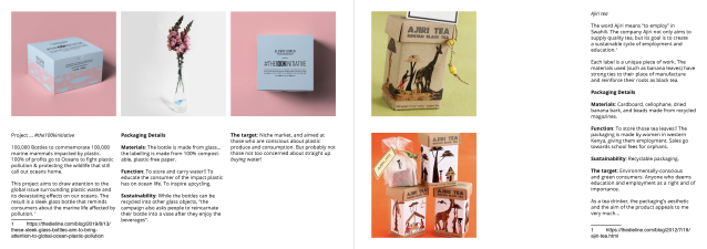
A research sketchbook page, with columns and gutters displayed

There are a lot of tools that need to be set up manually in InDesign, such as the spell-checker and page numbering. The layout is entirely up to the user. I used a three-column layout on a landscape document. The gutters are intentionally wider on the insides of the pages for binding purposes.

PAXKAGING PROJET ADIN 02
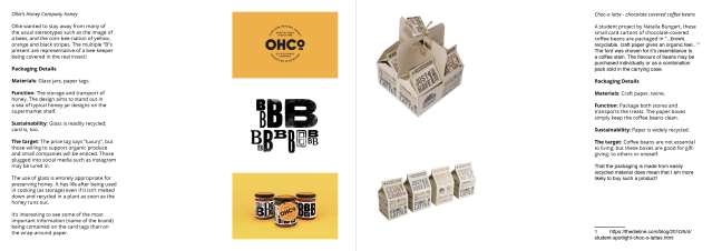
A two-page spread; clean, and easy on the eyes

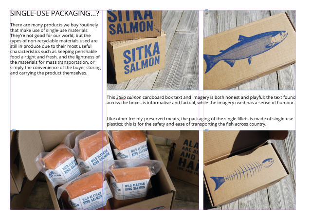
I’m keeping in mind that even in using as few as three Columns, I can use a grid layout to display image and text in varied ways to keep up interest. It’s alright for the images I place to bleed off the page, but I’ve yet to do so. I’m taking small steps. I have to walk before I can run.

PAXKAGING PROJET ADIN 04
Another page with some of my guides turned on

I wish that I had taken more opportunity to study sturdy editorial layout of magazines, pamphlets, and books in the past! I think I’d be able to make decisions with less hesitation and thus work faster. Working slowly is also hard on me mentally as it drains energy over a prolonged period.

PAXKAGING PROJET ADIN 01
The grid layout should be evident without the guides

I have had to rework my InDesign research document from scratch due to technical issues (both errors on my behalf, and the campus technology in which I was using) but it has reinforced some of my knowledge of the program. It is still very vast, and I know I’ll never become an expert in a program that constantly changes (for user “convenience”) but the foundation is becoming stable enough to build upon.

Next time I post about this program, surely I’ll have become far more confident and less restrictive of how I present information. I want for anything I share – even facts and photos in a research document – to be engaging with the reader!