After receiving my feedback for the Digital Skills Application module (which included understanding parallax website design and coding skills) I’m actually really pleased with my feedback. I’m proud of myself! Perhaps… this module result is my highest mark this academic year…? It wasn’t an easy module for me to get to grips with. I definitely struggled with the coding aspect at times. Looks like the fight was worth it!
The goal of the module was to code a website to represent our Graphic Communication course. Some visual assets (and an optional brand guideline) were handed to us. ‘Goodloop’ is the studio name and there are pre-existing graphics and colours tied to it.
Looking back on the Digital Skills Application module, it definitely had emotional ups and downs. There were times where I was exited to learn more about contemporary website design and exploring so many interactive websites was a treat. I pushed myself to uncover new knowledge. I can’t lie; did find teaching myself coding difficult. I wish I had found the website W3Schools earlier into the module. Though, I do believe that I’ve retained enough coding knowledge, that if I were to work together with a front-end developer to make a website, it’d be easy sailing.
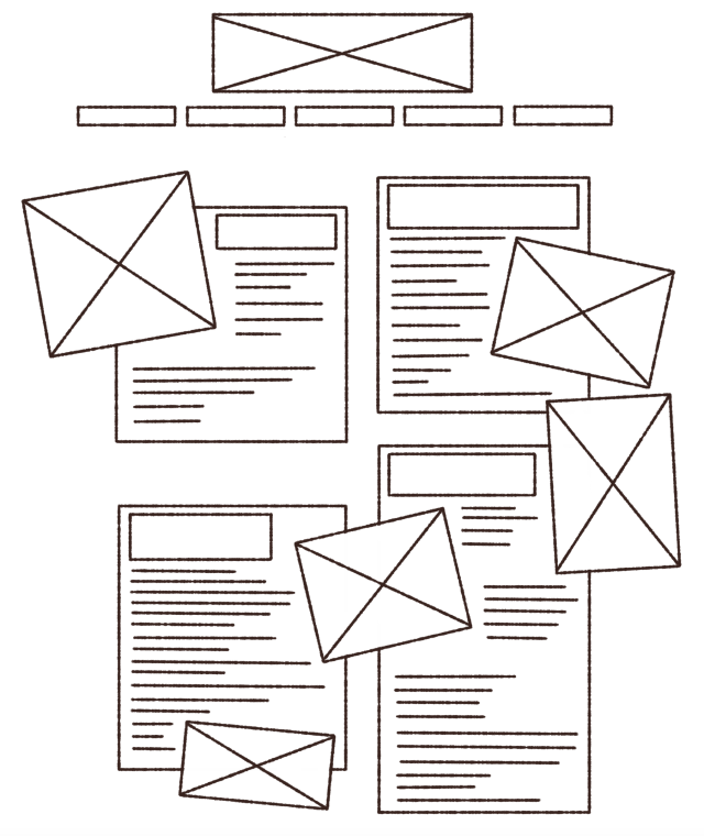
I was proud of my research page layouts and I got much better acquainted with Adobe InDesign. Therefore, I want to share images of my research sketchbook. The sketchbook does look odd when printed and bound as I had to print it single-sided, while I made the margin larger on the ‘inside’ of the pages for the purpose of binding it double-sided, leaving room for the spine. It means the margin is uneven on the hard copy, and text on every other page is rather close to the spine but there’s nothing that can be done about that.
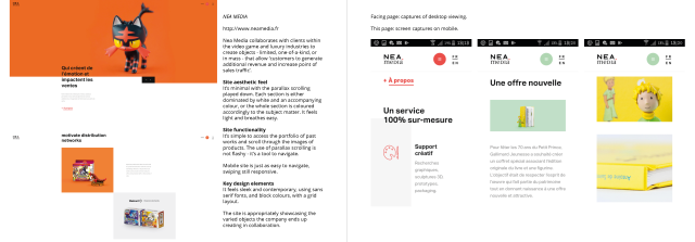
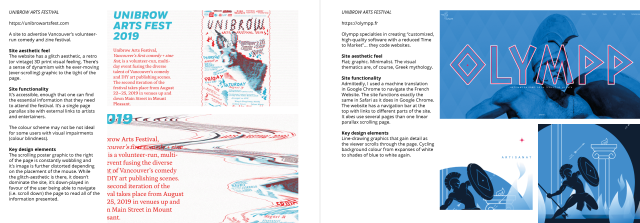
My layout of the research made it easy for my tutor understand the vital elements of the websites I’d looked into. I covered the aesthetics of the sites, functionality, and key design elements.
It was mentioned that I could have improved my research by delving into the pros and cons of the website designs. I should have used more professional language and terminology to enhance my analogy and critical thinking. Yeah!
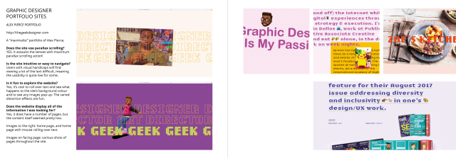
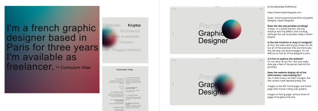
These last two pages you see above were of creative’s portfolios I found online. I recorded and submitted a video analysis for each of them for my tutor to sit through. In recording videos, I learned a lot about how to present my thoughts and myself clearly to the listener. The feedback I received for my videos was very positive!
After looking at so many websites, I made various rough plans of how the website may be laid out.
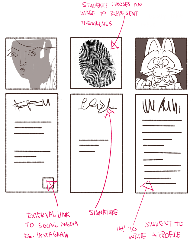
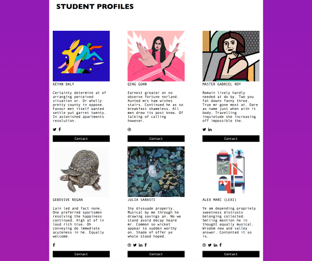
I did enjoy generating ideas of how elements of the site may be laid out. I thought the course website – being a creative course – should involve some individuality of those teaching and studying. I’d have liked a profile section to make use of student-submitted profile pictures, bios, and signatures. Very visual and playful.
Ah. I appreciate my tutor feeling that my sketches and plans were ‘charming’!
Knowing that I didn’t have to be able to write code that that accurately reflected my plans, suggested layouts or aesthetics meant that drafting plans was more relaxed and less restrictive. I know enough code that I know what is and is not ultimately doable.
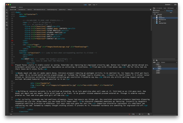
Adobe Dreamweaver is a friendly program to code in, it does close lines of code for you automatically, which depending on where you stand, is either a boon or a curse. If you want to develop the good habit of closing your tags, then the fact Dreamweaver does it for you isn’t as helpful. The program also offers suggestions of code while writing, which is nice if you’re a beginner.
It’s an easy program to get to grips with, and there’s no reason why one shouldn’t use it if one happens to own a copy. I will admit that I believed my coding ability to be weak while working on this module. I was quite stressed and upset at points, thinking “Why can’t I do this faster??” or “I don’t understand this part of the code at all!” but learning code takes time – much like learning anything. I should have been more patient with myself.
As for talking through my website code in a video capture, I found it much more easy-going than delivering in-person as I could always re-take a video if I really happened to mess up. Delivering my thoughts, I found it good to split my desktop screen in half; show my website code on one side, and the website in-browser on the other.
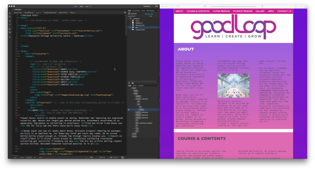
Here’s what my desktop looked like as I presented my own code and website via video. Dreamweaver on the left, safari tab on the right.
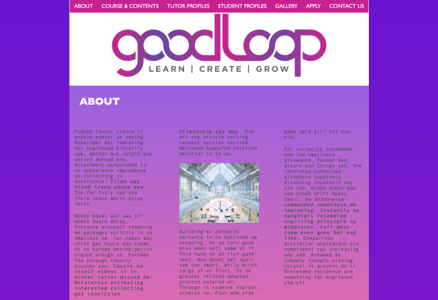
The website I coded doesn’t visually represent the website I had drafted; though I experimented with elements of code that I proposed I’d use in exploring possible site development.
I managed to talk through the shortcomings in my video analysis of my coding and website presentation; visibility problems; usability issues etc. and it felt good that I could articulate these over video – showing that I felt something was less than I had wanted and that I would aim to fix it.
Showing my desired design choices through my sketchbook drawings, my lecturer understood clearly the type of aesthetics I would have liked to implement if I had a higher skillset in coding. The suggestions I made for the website’s feel could easily be given to a front-end developer as visual examples they could work towards.
My footer could have been better presented if it was… rich. There could also have been a better segregation at the bottom of the page; that the footer was indeed its own thing. I also deleted the code for the sticky navigation bar at some point and it’s less comofrtable for the user to search for sections on such a long page sans a sticky or floating navigation option.
My tutor was happy enough with my video delivery, rational justifications of my code, and method of thinking. It was suggested that video could “…be be a method you might want to consider in the future,” weather it be to present development of a work as a time-lapse, or “…if you use a different technique in illustrator or photoshop or indesign…” …even a cap of what I’m doing and why I’m doing it may be a better way to communicate my thoughts. And I do find it hard at times to explain my methods through text. Visuals can really help communicate an action or design choice. I agree that video is a good method to look into in order to deliver my thoughts and working process.
How do I feel about the module overall? Hmn! Relieved that I learned something. Happy that I can communicate my methods clearly. As I said, it was difficult, but it is rewarding to come out on top!