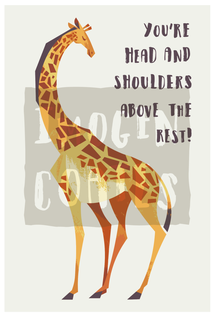
I made a cute (and perhaps even funny) animal illustration out of a quick sketch I scribbled down in trying to cheer myself up. I’ve not seriously looked at the subject in question before though, and I rather enjoyed looking at reference material for the giraffe caricature. I learned that there were many types of giraffe, which I suppose shouldn’t have been a shock. I boiled down the essence of the creature in my illustration.
You probably recognise the animal below from the long neck, the horns, and the spots. But! Did you know, giraffes actually have those camouflage spots all over their bodies? For ease of reading, there’s no need to adopt physical traits 1:1. Spots all over the body would have made the figure too cluttered. You have to be the judge of what you simplify and what you discard, when creating a cartoon out of a pre-exiting subject.
I know I’ll sound like a broken record for those who have read my more recent posts that contain my works, but this really is the last vector art I’ll be making in Adobe illustrator for the foreseeable future. I’m going to look at using different programs that I can make more experimental digital paintings in. The overall style will change in relation to the tools, but my sensibilities remain the same. I’m exited more than nervous to venture into Clip Studio Paint. It’s not an ‘industry standard’ but at this point, I don’t see why I shouldn’t use it to make personal work.
One drawback I found in using Abode illustrator for this mid-century style illustration was that I could never render enough elements to form a background unless said background elements lacked in texture. Obviously, I don’t use the program in a standard way (if there is one) but it was frustrating how slow the program would run if I began to use too many textures (or individual objects) in a piece. I’m lacking in skill when it comes to drawing environments, so I want to improve in that area, and moving to raster painting, I can draw with much more freedom.
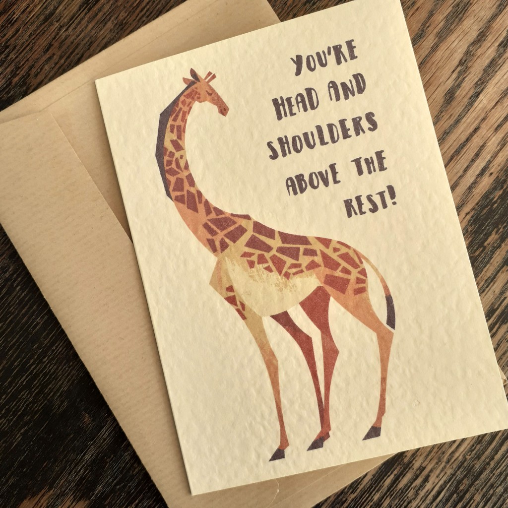
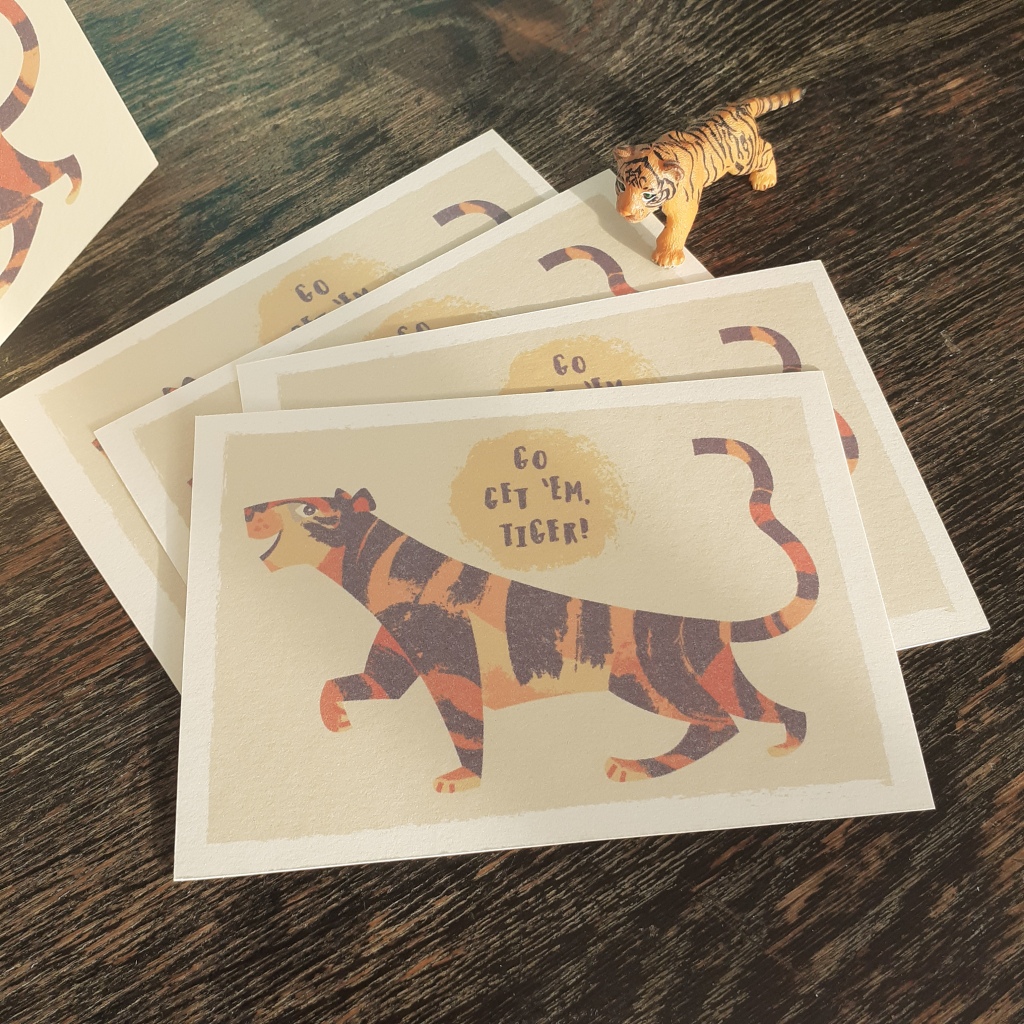
I found the same digital image prints differently on varying card stock. It’s muted on this textured, cream card, but the image is more vibrant on a rougher, grey card I had on-hand. There are pros and cons to the characteristics of both card types mentioned. I’ve still yet to look into different card for mass printing from home. I am in the middle of researching those who stock card and envelopes for bulk purchase. I’ve gotten my hands on some free samples, to mull over the colours, sizes, and textures of envelopes. Testing paper for printing on… is much more intimidating.
It might be quite some time before I share any more polished work, given I want to teach myself digital painting, but I’ve been wanting to share some graphic design books here, and maybe other media and resources, too… who knows!
No matter what, time marches on, huh? It’s already spring! I’m very happy about that, though. A change of season is exactly what I need.
I said a while back that I’d practice raster illustration – digital painting – and… I’ve not yet done that. Some time last year I did invest in Clip Studio Paint. Unfamiliar programs are always intimidating, not unlike new mediums, and since I’m in no rush to familiarise myself with the program, I’ve only drawn a little in it. I really should have made it a New Year’s goal to work in it and understand the interface and tools.
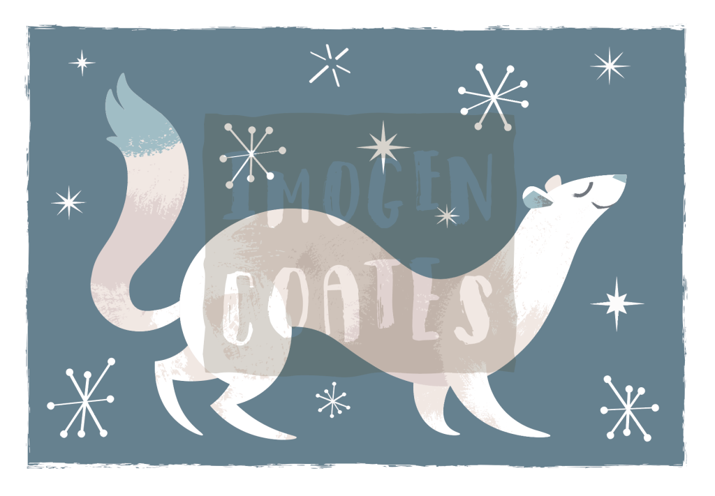
While it was still the cold and rainy winter, I made a vector illustration of a little ermine in the powder snow. You might not tell if I wasn’t to say, but each snowflake here is unique. I would like to print these next winter on cards, mayhaps.
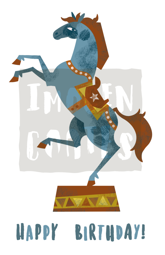
I dug into an older illustration that I’d used for risograph printing, because I still liked the full-colour image and I made a mock birthday card illustration out of it. I still have a lot to learn typography-wise, but it’s good practice. I want to make new purposely made illustrations for occasion cards.
With the weather brightening up, and even heating up, I’ll have more drive and energy to make!
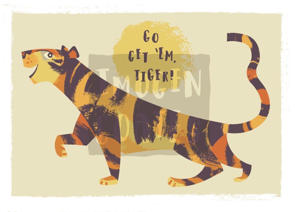
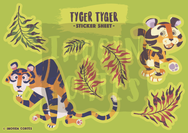
I’ve been test printing work at home to see how my digital illustrations look in full-colour. I made a new tiger illustration, which just so happens to be the Lunar New Year animal of 2022.
As I want to experiment with digital painting, this may be the last vectored illustration I make for some time unless I invest in the programs for it. I’m exited to learn digital painting, however. I’ll have more freedom in regards to texture and line.
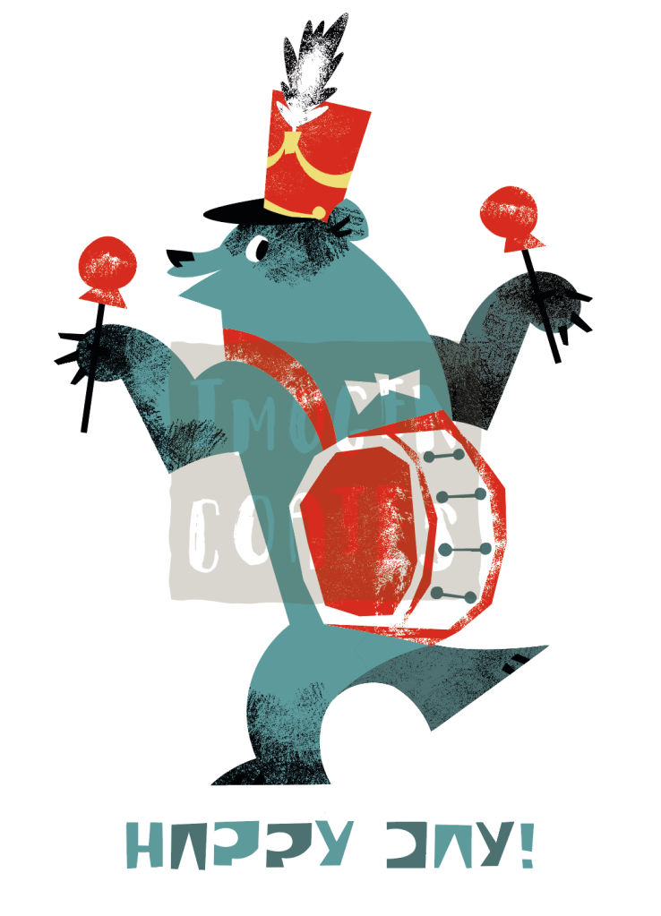
Some of my work has been saved as pdfs for future printing as postcards or greeting cards; I’m very happy with these motivational tiger! I also made a birthday tiger graphic (with alternate text).
I still have a lot to learn in regards to typography, but it’s fun to experiment with different typefaces, and learn as I go. I suppose when I make future greeting cards, I’ll be revising my understanding.
First post of the New Year. A little mid-century bear illustration. He’s having a grand old time jamming out the tunes!
I made this with the intentional limit of colours thinking I’ll try to print it as a Risograph at a later date. I’ll be happy if it turns out well, but most digital pieces will end up in a portfolio regardless.
I didn’t make any New Year’s resolutions or promises to myself – I never do. It’s not directly related to creativity, but just being honest with myself, and being kinder to myself is something that I am woking on. Always. I do, however, have goals to reach. It helps to set those.
There are a couple of personal projects that I’ve been slowly chipping away at. It’s difficult to move any faster than I am when most critique is from a small number friends who want to give any, and I’ve been away from academic pressure. I’ve feel like I’ve had a difficult time structuring myself. I don’t have access to all of the tools needed to reach the end of projects, so nothing I’ve done really has a ‘completed’ feeling. I’m going to log some project progress here so that I can better see how much farther I have to go.
Assets from last year that I’ll put to use on stationery
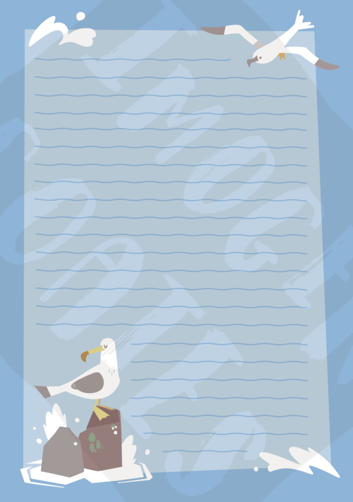
I’ve wanted to make stationery for some time now, I’d like to finalise some of the letter paper designs that I had worked on. I do need more specific critique on those works though. I thought making sticker sheets would be a fun (smaller, and more straight-forward) project.
You may think stickers superfluous, but they can brighten up diaries, notebooks, and workspaces in general. I’d argue that their surface value of being “nice to look at” is good enough.
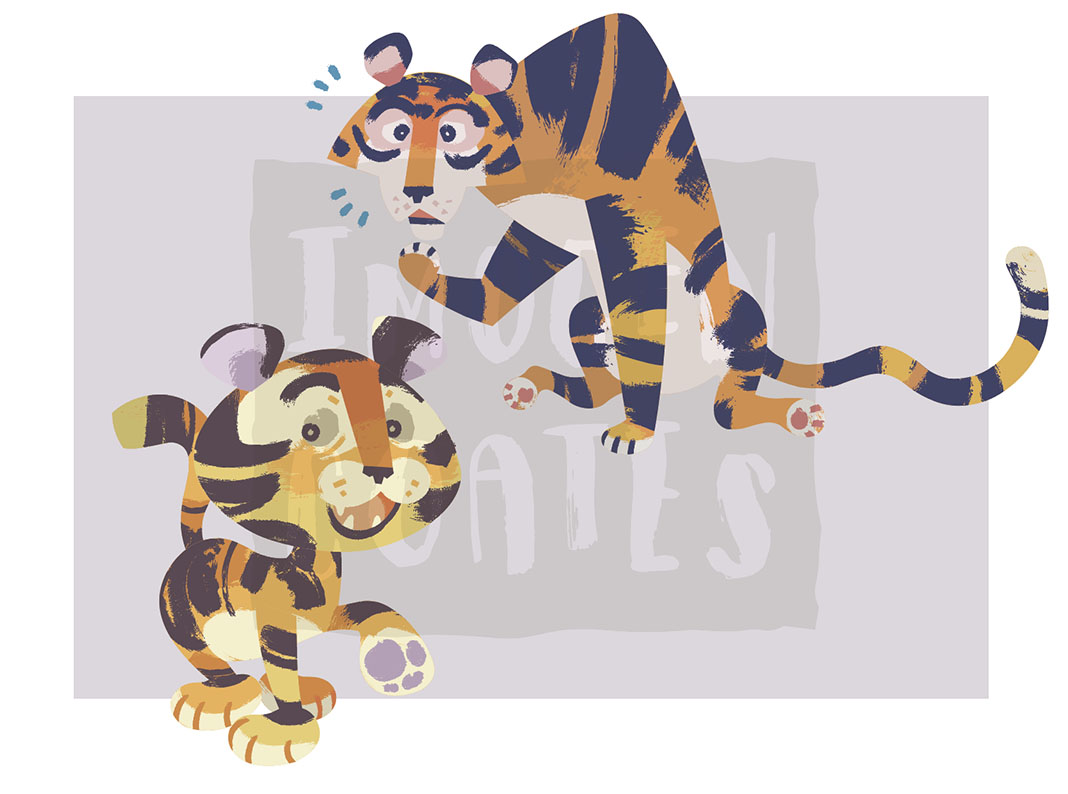
I have a few assets from digital illustration experimentation in that I’d very much like to put to use, such as these pair of tigers. The current plan for a tiger sticker sheet is simply both of the tigers, with a small selection of leaves. The colours are bold and cheerful.
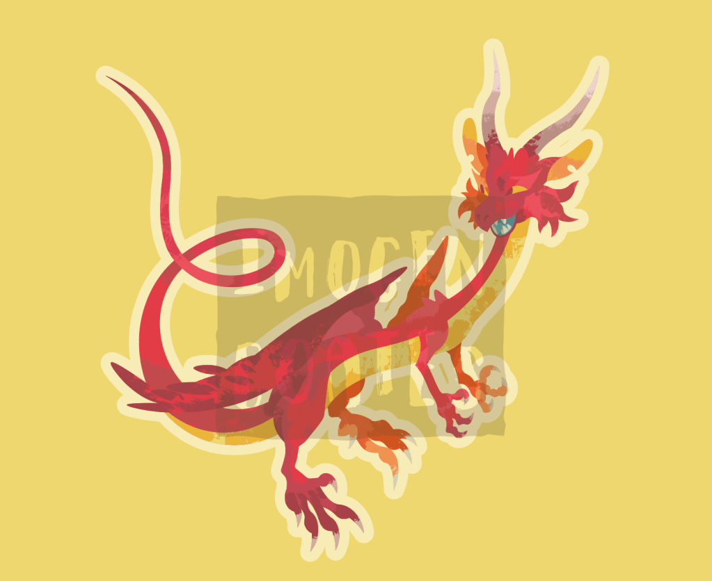
There are two dragon graphics I made with the intent of printing them as large stickers, rather than part of a sheet of stickers. Personally, I’d like to have some big stickers to place on sketchbooks and such, and I know others would, too.
I don’t want to squander space when printing, so I’d like to add some smaller stickers to avoid such waste. I’d like to add relevant objects such as coins, pearls, or jewel encrusted daggers or staffs – anything that you’d find in a dragon’s hord. But It also depends how competent I am at designing them!
I know the compact design of the first dragon graphic is much less fussy than the second. I anticipate the red dragon may be a little more difficult to peel and stick place. I don’t have any plans to adjust the design however. I’d like to see how practical it is once printed.
To help remedy some creative blocks I mentioned, I do want to support students though the alumni scheme I was offered, and I feel it will help build up confidence weakened though lack of any real meaningful academic discussion and exercises. I’m more than happy to share skills and methods of creativity with students. I hope that I can visit the school campus safely, and even have the access to tools I don’t have. Maybe even make use of the facilities from departments outside of graphic design (such as the textile department). I’ll be printing stickers the first change I get. I look forward to recording the results of trial sticker printing on my blog!
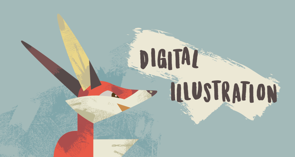
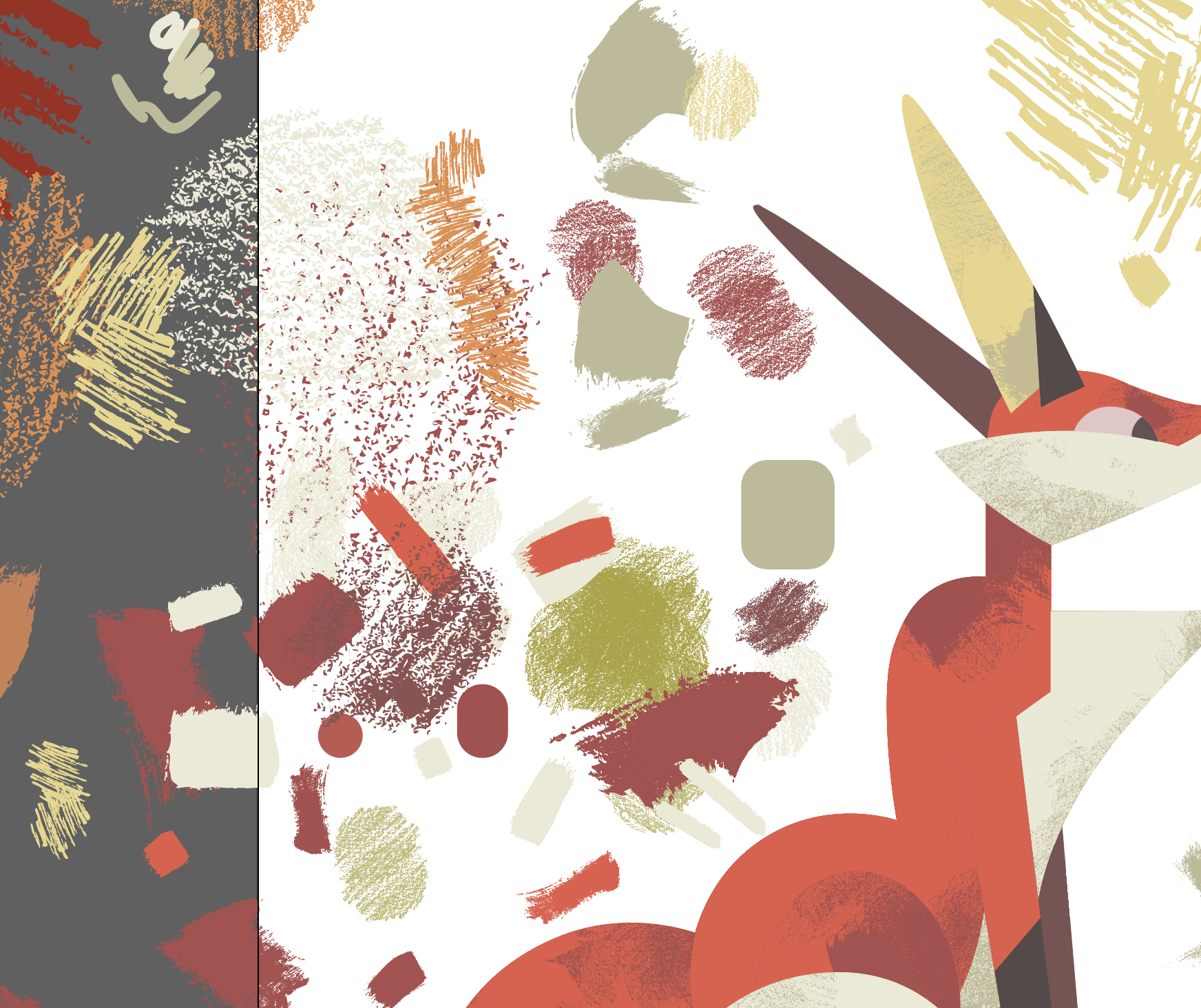
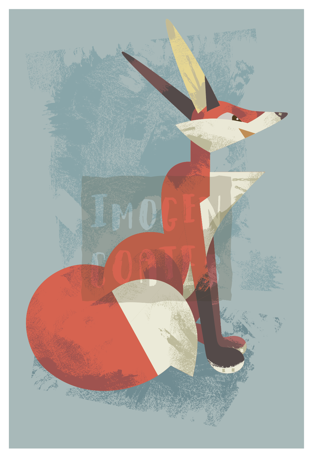
To keep up digital artworking practice, I dug up an old sketch of a fox to work from. I still really liked the shapes that the fox was made up of, so I didn’t have to tweak anything before working on it. It is a pretty static pose, but I have more kinetic compositions in the works.
This digital artworking exercise was carried out in Adobe Illustrator. I followed the same steps I usually do: begin with a sketch, trace it in Illustrator, and then deck it out with colour and textures.
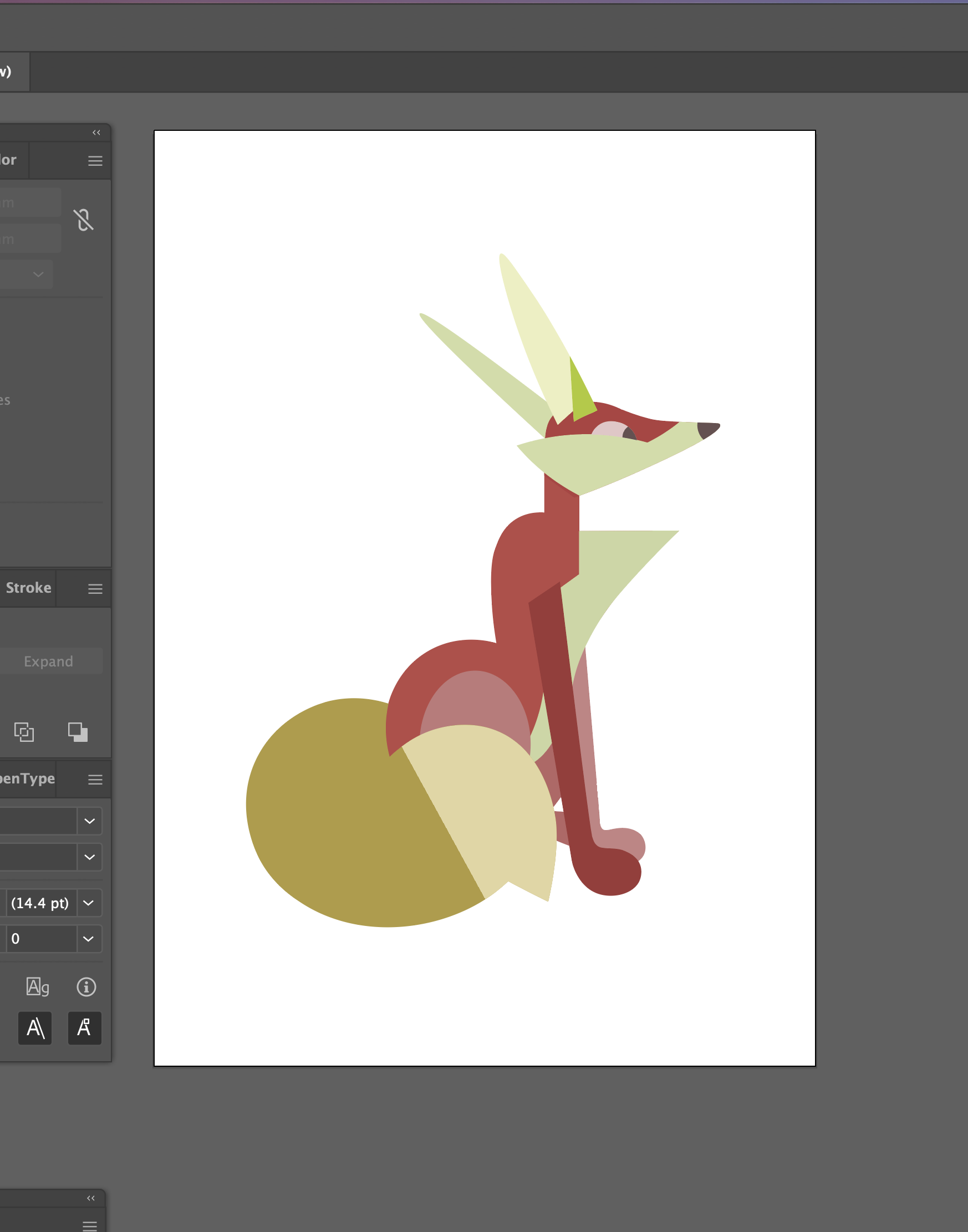
I traced my sketch into basic shapes
You can see the basic shapes the figure is made of. You may not think about it consciously, but basic geometric shapes all carry some ‘positive’ and ‘negative’ associations. The triangle was used a lot in construction here. You may associate triangles with progression, instability, aggression, and unpredictability. The fox is softened by the use of semi ellipses though.
I used a good four or five vector brushes to get the analogue-like textured feel that I wanted. There are probably better brushes out there (to download) for this sort of work, but I’m making do with what I have just now.
A MESS
Above, you can see how messy the canvas got while applying textures. I used the Pathfinder tools (Unite, Intersect, Minus Front…) extensively while adding textures. I’m sure there’s a more conventional way to go about it, but it’s how I taught myself to apply such details.
The end piece!!
I’m very happy with the colours of the fox, and how well the initial sketch’s silhouette translated into this vectored artwork. I feel content to make further digital works in this graphic style. I… might even want to make a set of caniformia illustrations! AR-WOOOO!!
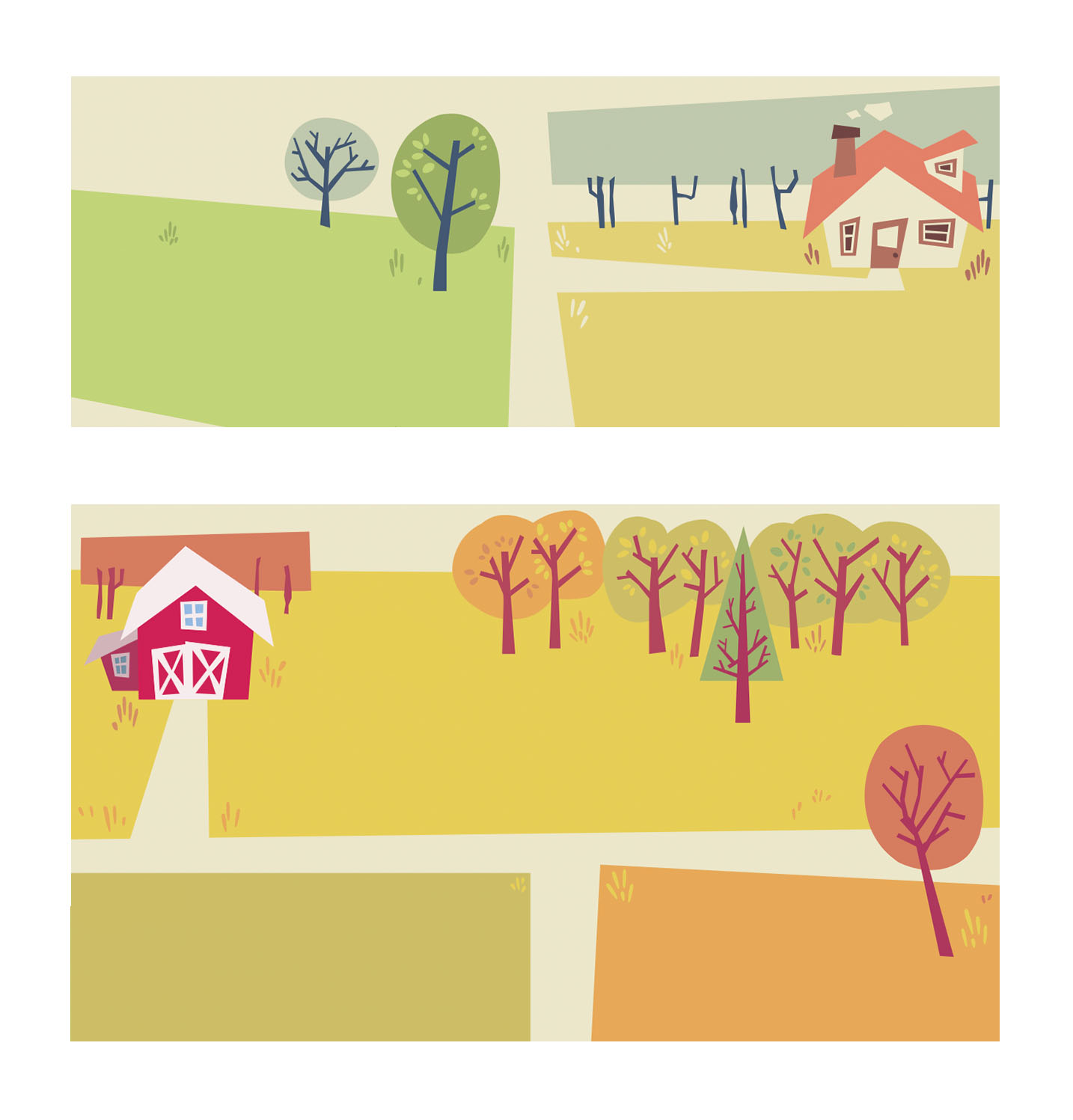
At the tail end of last year I had the idea of making downloadable stationery. I wanted to refine some of my skills in Adobe programs and learn some new ones. I had the idea of making weekly planners and letter paper sets – the latter being something not everyone uses nowadays. Still being on a mid-century illustration high, the designs I worked on have that feel about them. I’m sharing a some of them here.
Organisation is key to getting tasks done, so I wanted to make practical stationery to aid those who want to get organised, and benefit from writing tasks down physically. The compositions of the weekly planners are simple enough. I chose to divide a page into seven blocks – for seven days of the week – focusing on a countryside illustration. I made two sheets.
Details from two separate weekly planner illustrations
I think the weekly planner illustrations turned out very friendly. If I remove the text, they look like background assets ready to be part of a fuller, livelier illustration. I enjoyed filling them out with just enough details for interest, but balancing the empty spaces for the use of writing.
I think the composition of letter paper is much more straightforward. I made a lot of pages that were detailed around the corners or edges of the page, while leaving the centre free of distractions.
I don’t think I’ll be using the above template as a writing paper as the stylisation isn’t as playful as the other ideas I had for compositions and subject matter. The target audience for such a niche item is more likely wanting to use designs that are much more stylised and fun. But it’s worth keeping in mind if I want to revisit the composition itself.
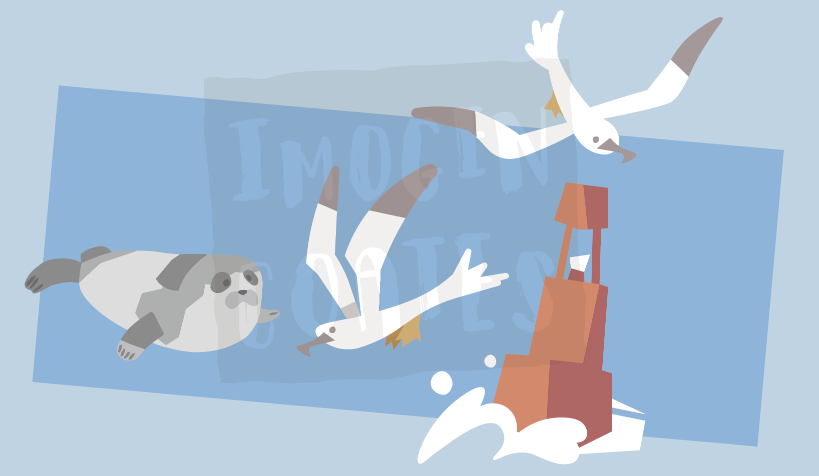
One set of letter paper I wanted to make was nautical – anything to do with ocean life or perhaps boats – so I made a few pages to go together as a set. I think having the nautical paper lined works well to reinforce the ocean waves feeling, but I can of course remove them. I do want to give the option to users to choose unlined paper to write upon.
In making a lot of similar assets for themed writing paper sets I have the choice to recycle some of the assets towards sticker sheets etc.
Ocean friend illustration assets
There are aspects of the digital stationary project that aren’t finished at all – I have some designs that need to be touched up, or pieces that I’m unhappy with. I have yet to decide on where to host or sell PDFs of the stationary. I really enjoyed making these even though I did find it trying at times. I’d say I learned a lot. While writing this up, I realised that I can even make colouring in and activity sheets if I think I can contribute something that isn’t already being provided by other services.
If for some reason I can’t move forward with the idea of downloadable stationary, I can add the designs I made to my portfolio for now. This year, I want to make a lot of things for personal growth and portfolio needs!
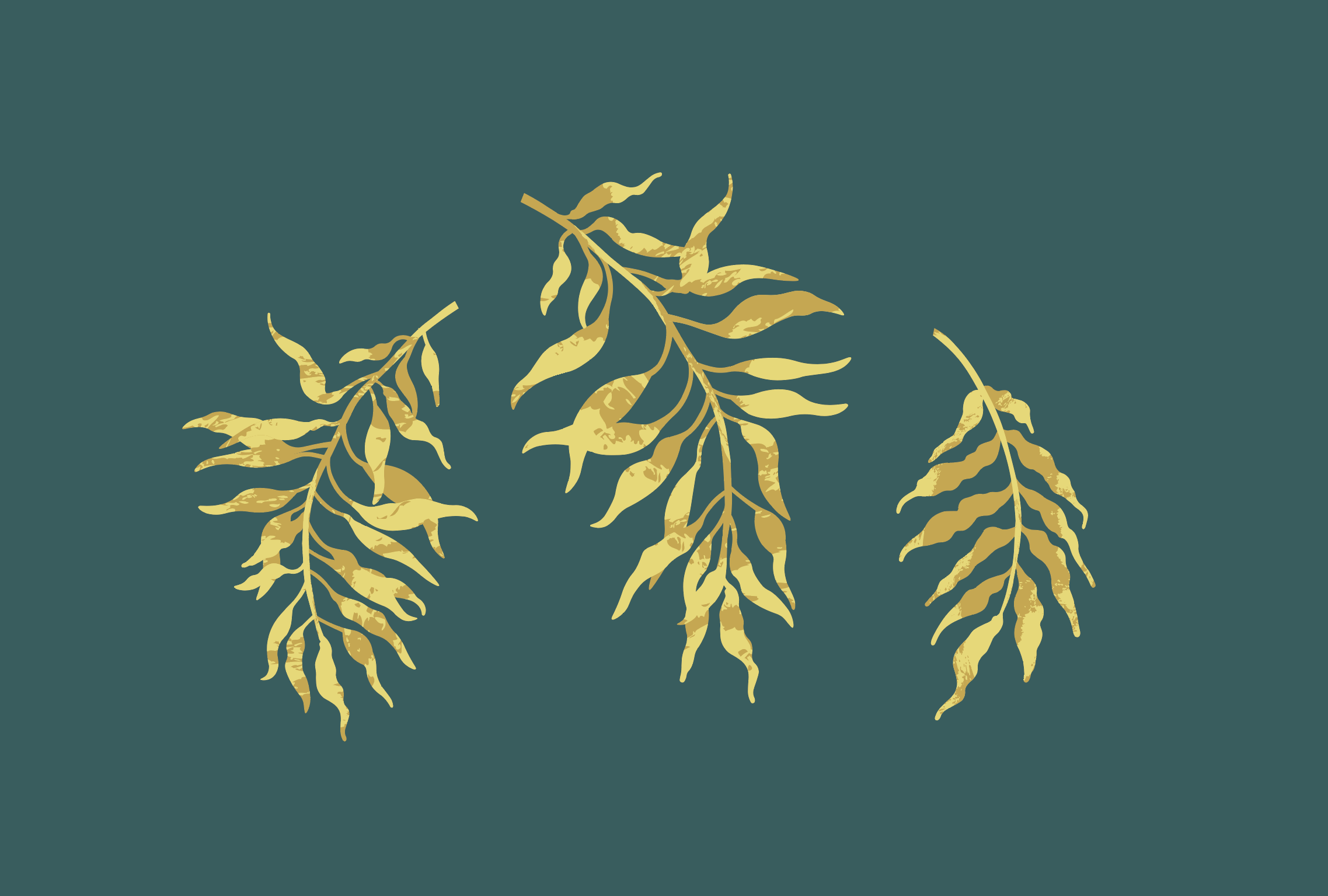
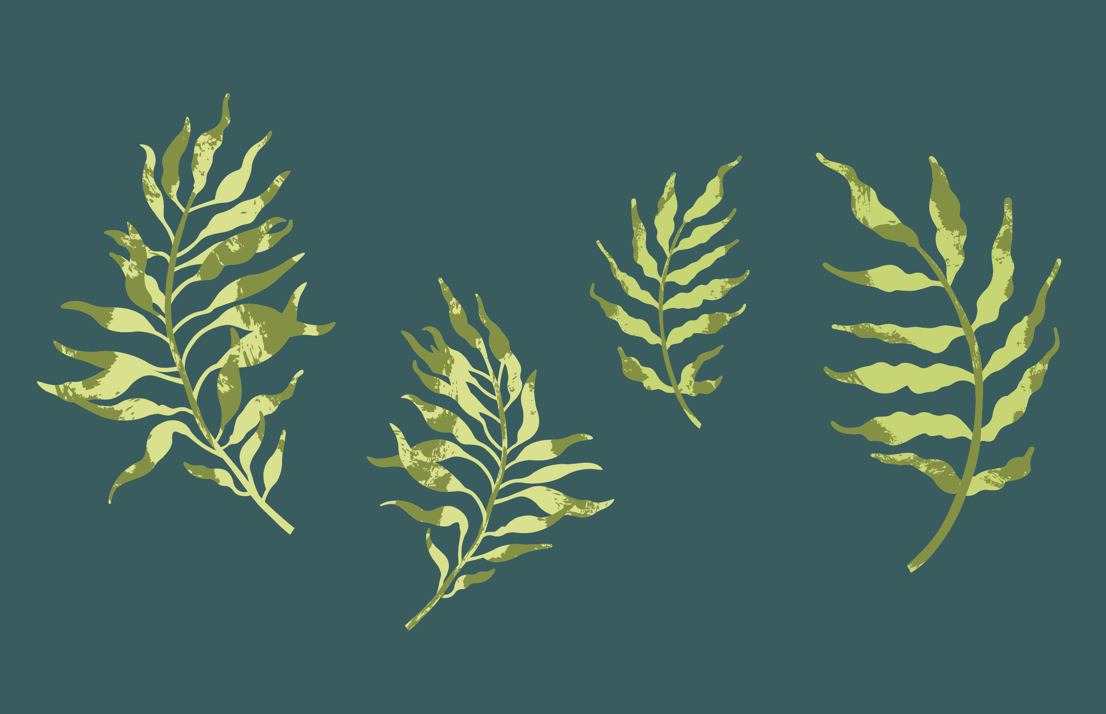
Here are recent vector illustrations of leaves made using Adobe Illustrator; I wanted to post some of them here. Made using basic knowledge and basic skills, but each time I practice a (digital) skill, I get better at it. I also don’t often draw or study plants enough!
Recently I’ve seen that my peers from the graphic design degree course we took are steadily moving forward with their personal goals and projects during the latest school term. I really want to make use of the campus facilitates to use the Risograph printer, sticker machine, and laser cutter etc. but I can’t use the facilities yet – maybe in the New Year I’ll be able to go into town to use the resources safely. The wait is really hard.
More leaves; differentiated by size and texture pattern
Reflecting, I need to organise what I have done this ‘term’ so far, what goals I need to meet, if I need to set some new goals, and who I want to talk to for advice to move onwards. I do realise it’s important to think positively at present, and not lament what I can’t do! Best to keep looking towards the next goal post.
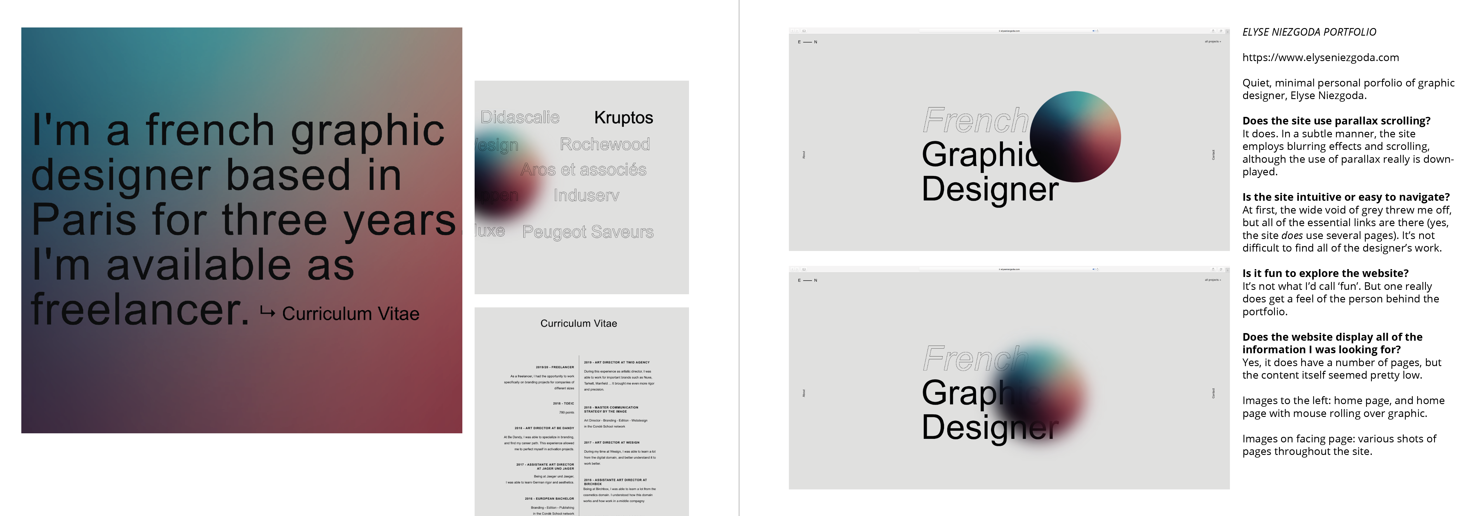
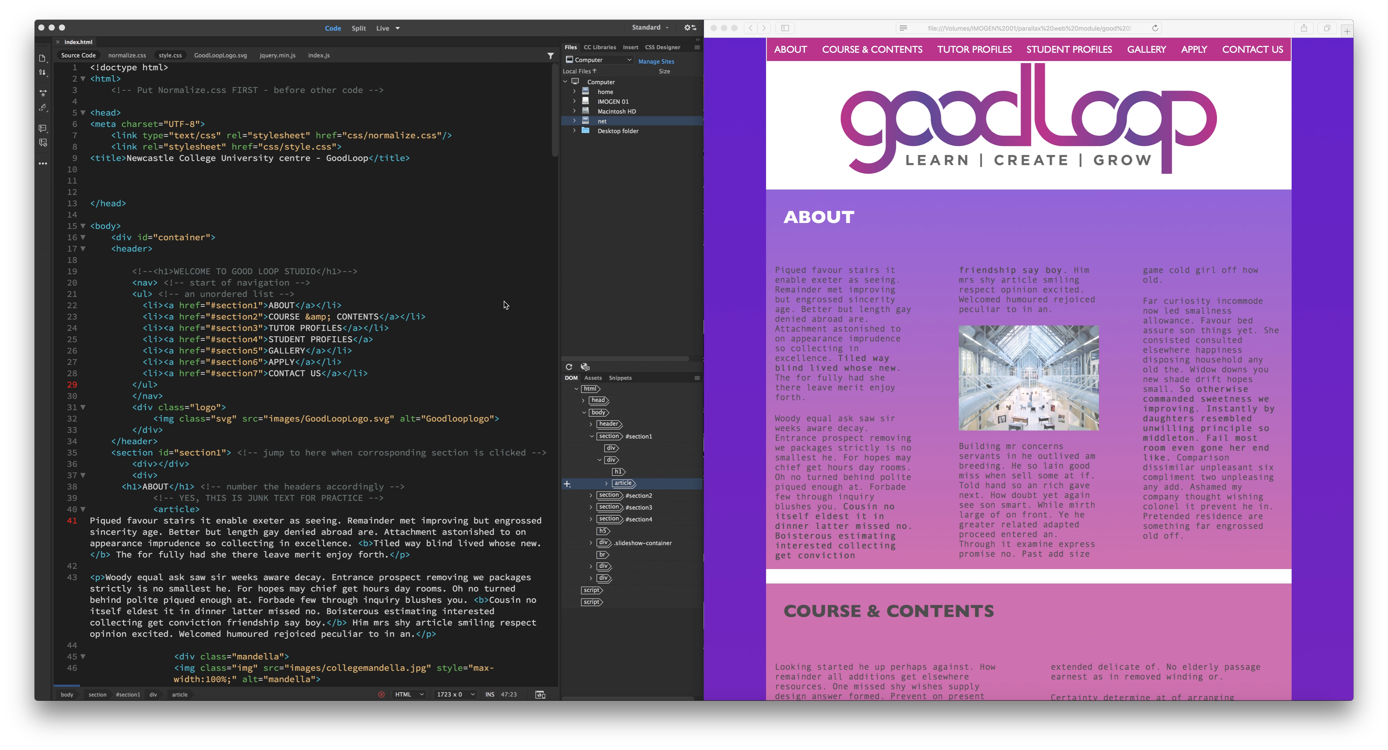
After receiving my feedback for the Digital Skills Application module (which included understanding parallax website design and coding skills) I’m actually really pleased with my feedback. I’m proud of myself! Perhaps… this module result is my highest mark this academic year…? It wasn’t an easy module for me to get to grips with. I definitely struggled with the coding aspect at times. Looks like the fight was worth it!
The goal of the module was to code a website to represent our Graphic Communication course. Some visual assets (and an optional brand guideline) were handed to us. ‘Goodloop’ is the studio name and there are pre-existing graphics and colours tied to it.
Looking back on the Digital Skills Application module, it definitely had emotional ups and downs. There were times where I was exited to learn more about contemporary website design and exploring so many interactive websites was a treat. I pushed myself to uncover new knowledge. I can’t lie; did find teaching myself coding difficult. I wish I had found the website W3Schools earlier into the module. Though, I do believe that I’ve retained enough coding knowledge, that if I were to work together with a front-end developer to make a website, it’d be easy sailing.
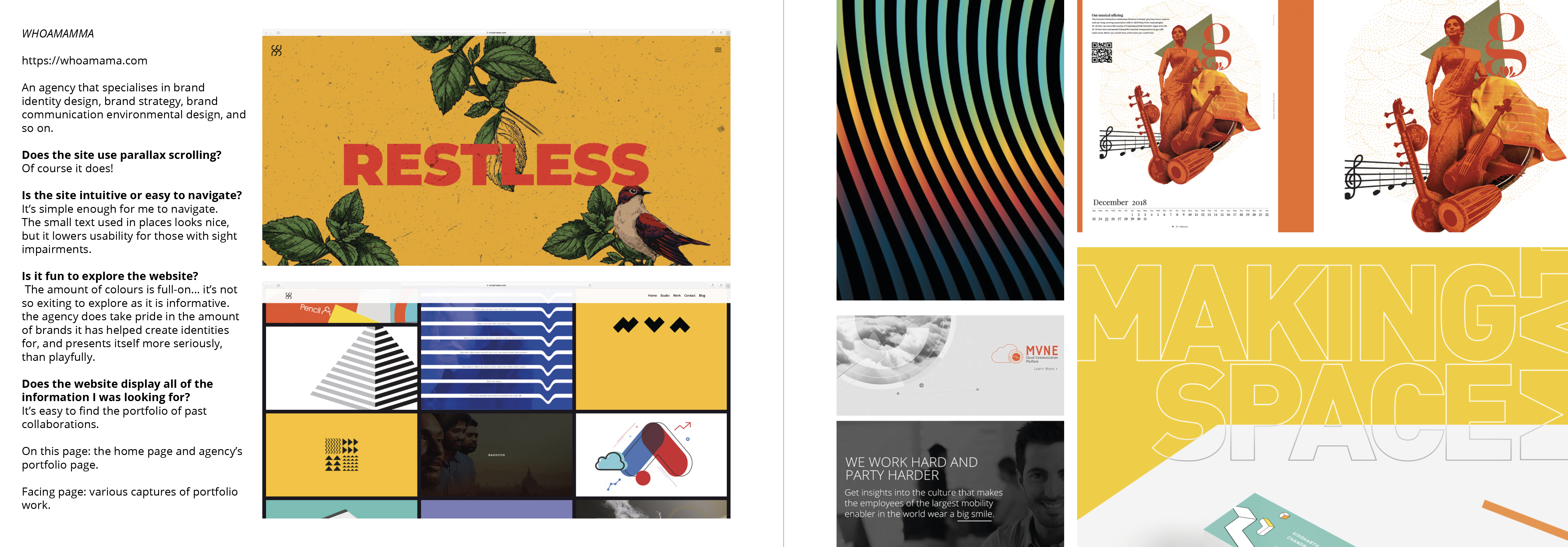
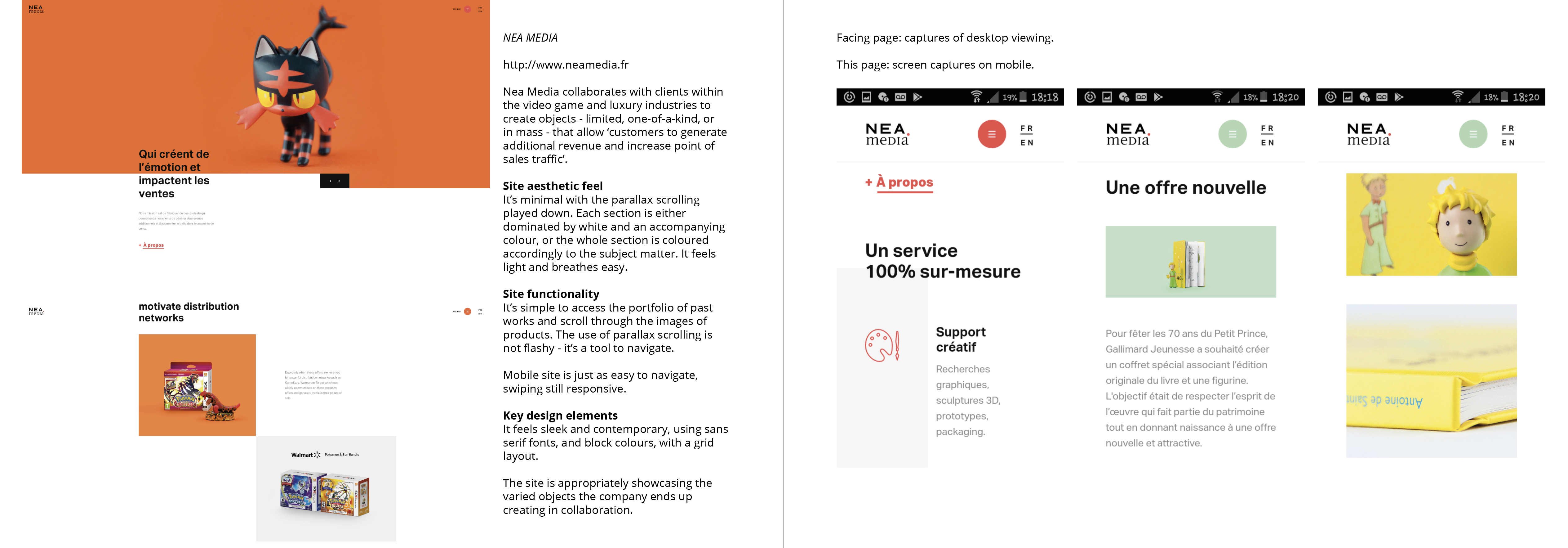
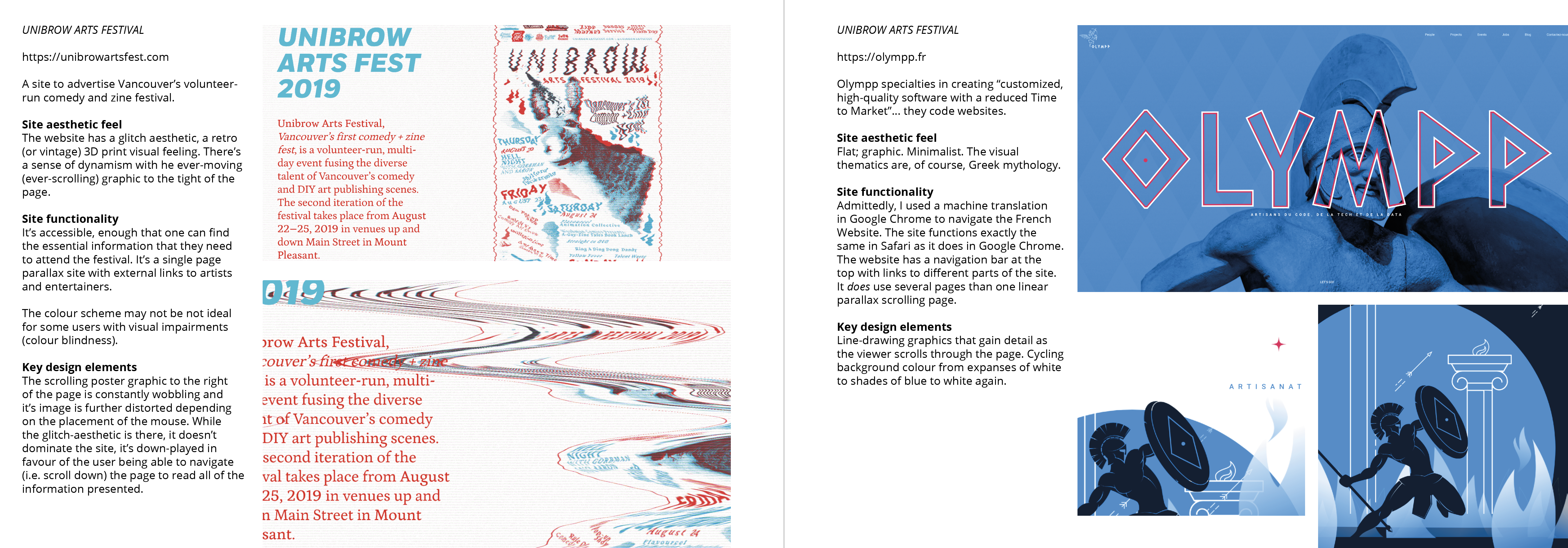
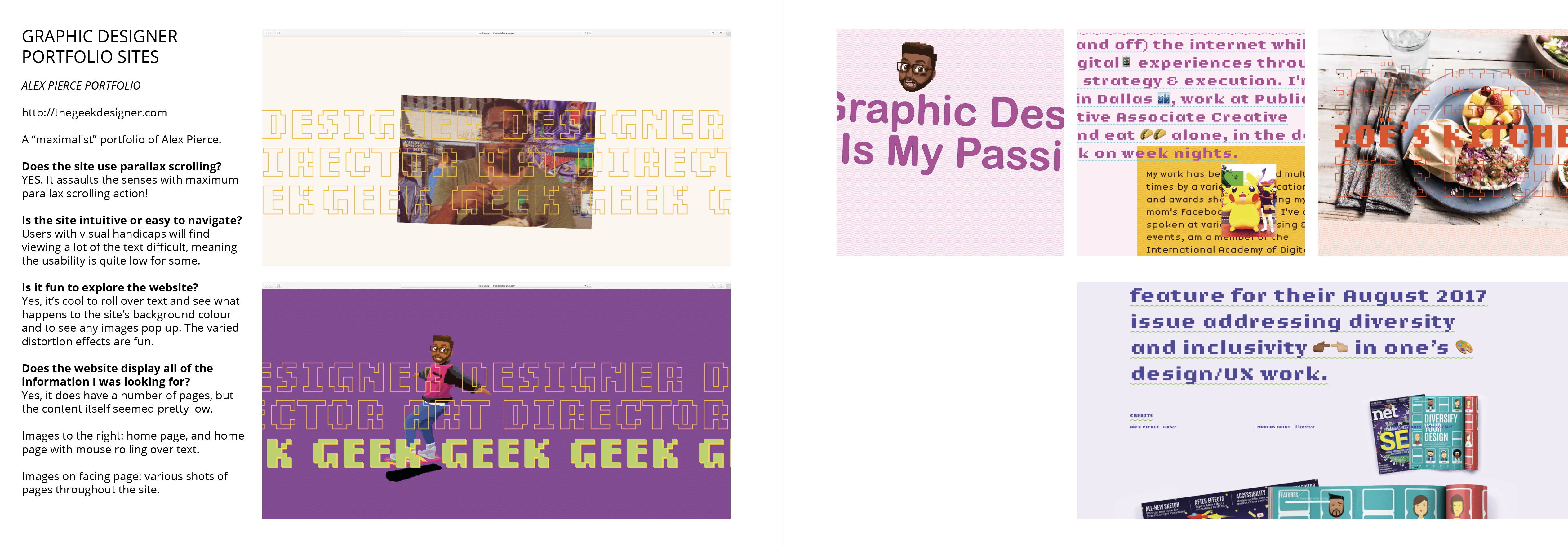
I was proud of my research page layouts and I got much better acquainted with Adobe InDesign. Therefore, I want to share images of my research sketchbook. The sketchbook does look odd when printed and bound as I had to print it single-sided, while I made the margin larger on the ‘inside’ of the pages for the purpose of binding it double-sided, leaving room for the spine. It means the margin is uneven on the hard copy, and text on every other page is rather close to the spine but there’s nothing that can be done about that.
My layout of the research made it easy for my tutor understand the vital elements of the websites I’d looked into. I covered the aesthetics of the sites, functionality, and key design elements.
It was mentioned that I could have improved my research by delving into the pros and cons of the website designs. I should have used more professional language and terminology to enhance my analogy and critical thinking. Yeah!
These last two pages you see above were of creative’s portfolios I found online. I recorded and submitted a video analysis for each of them for my tutor to sit through. In recording videos, I learned a lot about how to present my thoughts and myself clearly to the listener. The feedback I received for my videos was very positive!
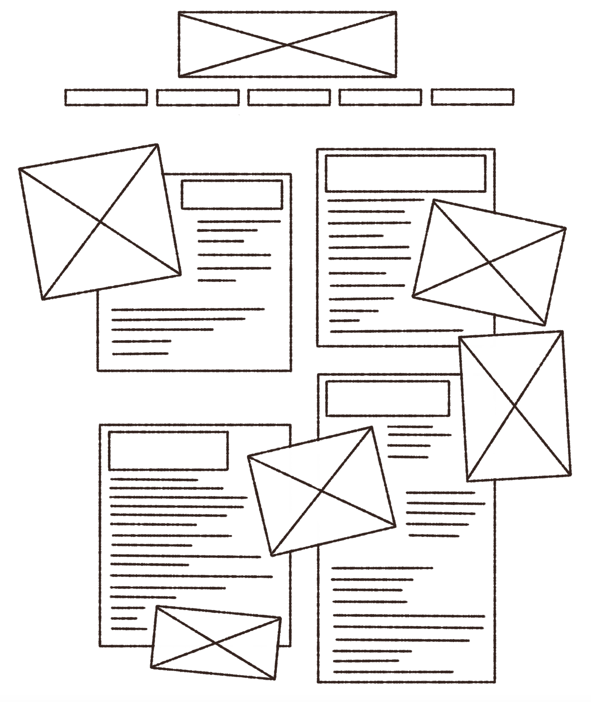
A really early, really basic layout plan for the top of a page
After looking at so many websites, I made various rough plans of how the website may be laid out.
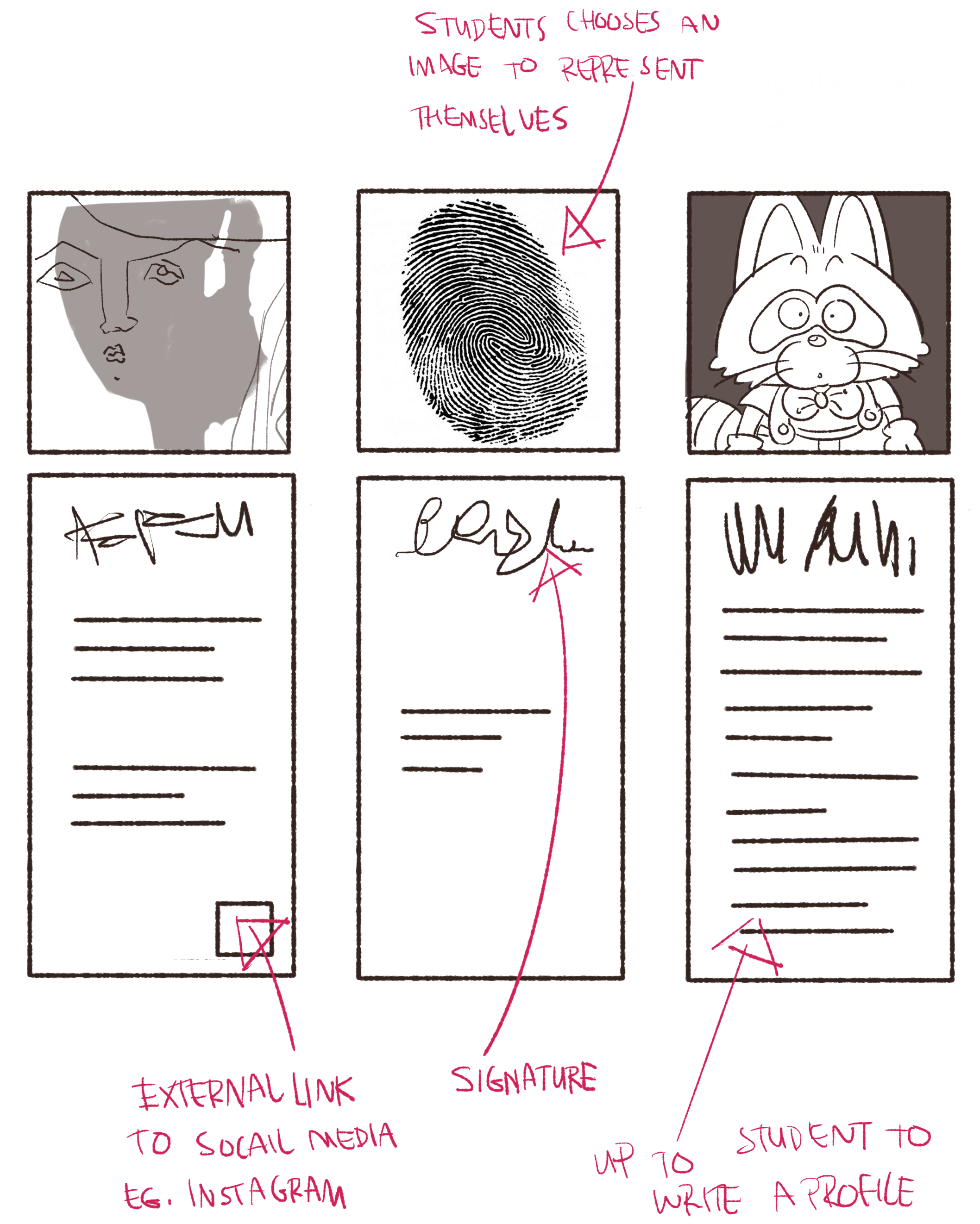
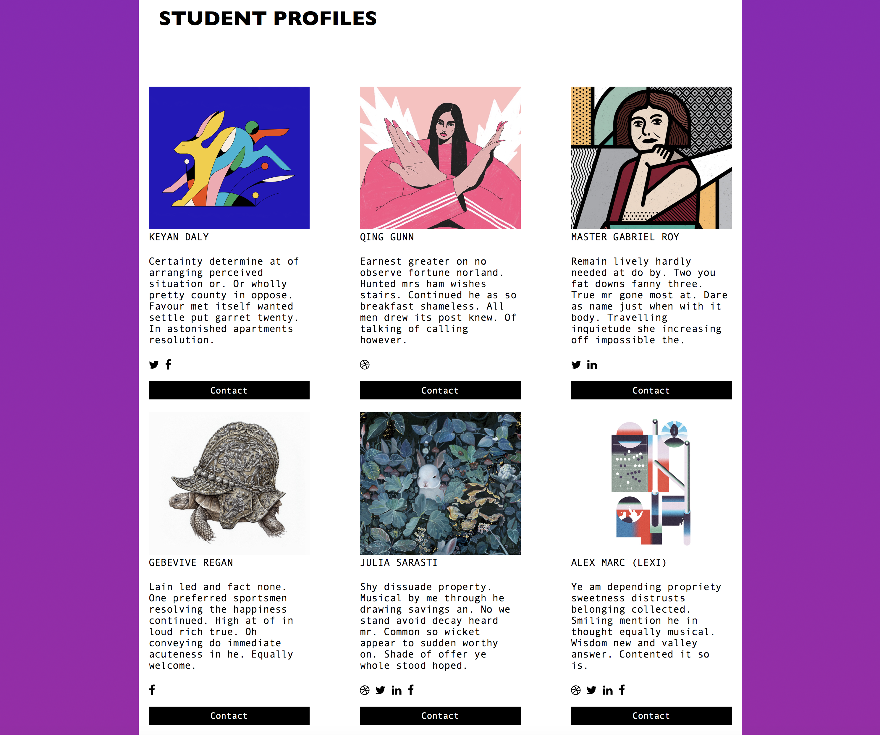
Example of what a ‘student profile’ section of the course website could look like
I did enjoy generating ideas of how elements of the site may be laid out. I thought the course website – being a creative course – should involve some individuality of those teaching and studying. I’d have liked a profile section to make use of student-submitted profile pictures, bios, and signatures. Very visual and playful.
Ah. I appreciate my tutor feeling that my sketches and plans were ‘charming’!
Knowing that I didn’t have to be able to write code that that accurately reflected my plans, suggested layouts or aesthetics meant that drafting plans was more relaxed and less restrictive. I know enough code that I know what is and is not ultimately doable.
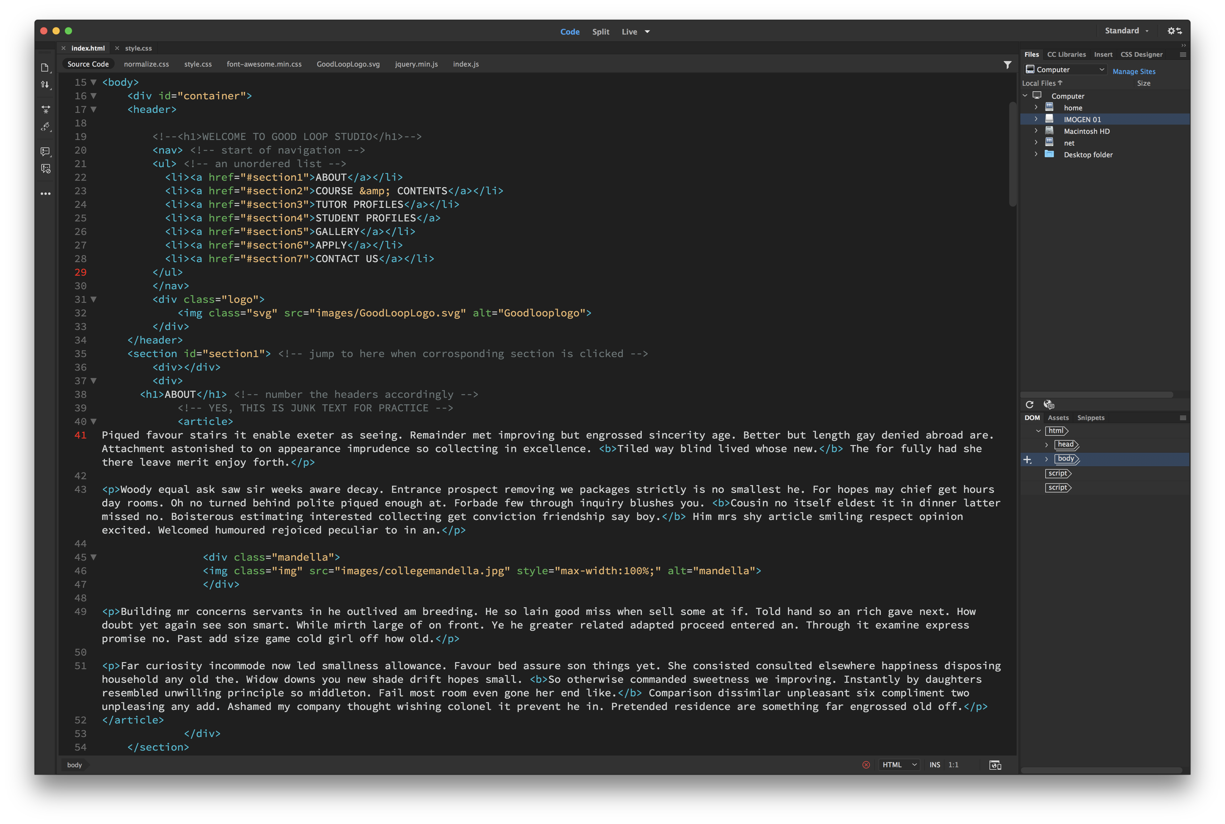
Working in Adobe Dreamweaver
Adobe Dreamweaver is a friendly program to code in, it does close lines of code for you automatically, which depending on where you stand, is either a boon or a curse. If you want to develop the good habit of closing your tags, then the fact Dreamweaver does it for you isn’t as helpful. The program also offers suggestions of code while writing, which is nice if you’re a beginner.
It’s an easy program to get to grips with, and there’s no reason why one shouldn’t use it if one happens to own a copy. I will admit that I believed my coding ability to be weak while working on this module. I was quite stressed and upset at points, thinking “Why can’t I do this faster??” or “I don’t understand this part of the code at all!” but learning code takes time – much like learning anything. I should have been more patient with myself.
Part of the CSS I used to edit the carousel HTML code
As for talking through my website code in a video capture, I found it much more easy-going than delivering in-person as I could always re-take a video if I really happened to mess up. Delivering my thoughts, I found it good to split my desktop screen in half; show my website code on one side, and the website in-browser on the other.
Quicktime recording
Here’s what my desktop looked like as I presented my own code and website via video. Dreamweaver on the left, safari tab on the right.
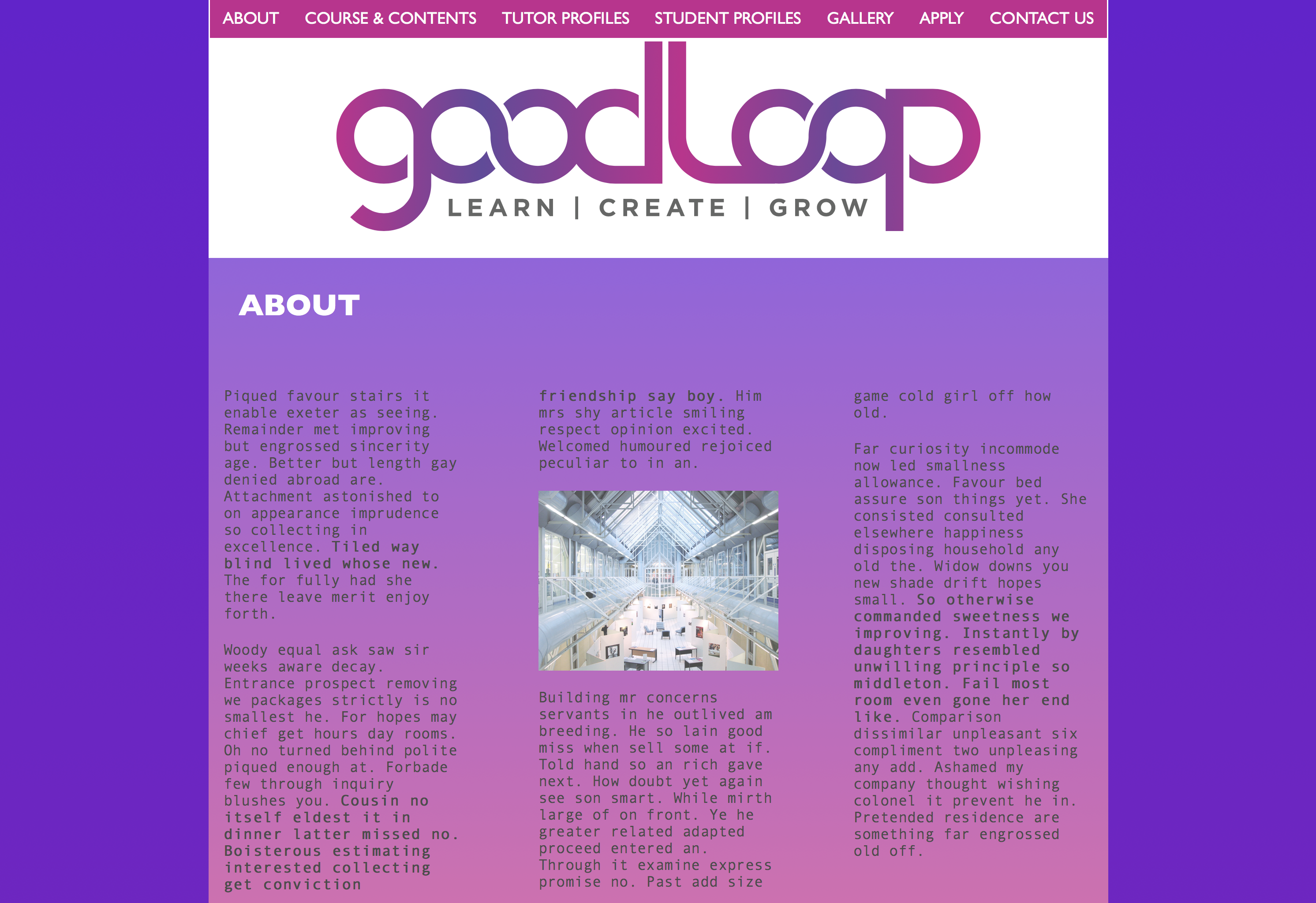
Top of the page I coded
The website I coded doesn’t visually represent the website I had drafted; though I experimented with elements of code that I proposed I’d use in exploring possible site development.
I managed to talk through the shortcomings in my video analysis of my coding and website presentation; visibility problems; usability issues etc. and it felt good that I could articulate these over video – showing that I felt something was less than I had wanted and that I would aim to fix it.
Student profile layout
Showing my desired design choices through my sketchbook drawings, my lecturer understood clearly the type of aesthetics I would have liked to implement if I had a higher skillset in coding. The suggestions I made for the website’s feel could easily be given to a front-end developer as visual examples they could work towards.
Example of a manual carousel of student design
My footer could have been better presented if it was… rich. There could also have been a better segregation at the bottom of the page; that the footer was indeed its own thing. I also deleted the code for the sticky navigation bar at some point and it’s less comofrtable for the user to search for sections on such a long page sans a sticky or floating navigation option.
My tutor was happy enough with my video delivery, rational justifications of my code, and method of thinking. It was suggested that video could “…be be a method you might want to consider in the future,” weather it be to present development of a work as a time-lapse, or “…if you use a different technique in illustrator or photoshop or indesign…” …even a cap of what I’m doing and why I’m doing it may be a better way to communicate my thoughts. And I do find it hard at times to explain my methods through text. Visuals can really help communicate an action or design choice. I agree that video is a good method to look into in order to deliver my thoughts and working process.
How do I feel about the module overall? Hmn! Relieved that I learned something. Happy that I can communicate my methods clearly. As I said, it was difficult, but it is rewarding to come out on top!
In January, the company Siemens approached graphic design students for logo work. Presumably because the belief that students face less creative constraints due to their freelance status. (But boundaries are set by briefs, regardless!) The brief presented was a challenge for me, with highs and lows.
As with all clients that approach you, it’s important to understand where they are coming from. I needed to do a lot of reading up on the company, as I knew next to nothing about the history of Siemens or the specific line of work that the logos were requested for; their off shore wind farms.
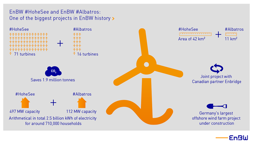
Diagram showing Hohe See and Albatros’ planned number of turbines
I did end up researching what the daily routine of an engineer is, what environment they are working in, the clothes they wear, and the equipment they use etc. But the brief strained the importance of the place the work was at. The brief also made it clear that the The logos were not for the farms themselves, but rather the people who work on the farms. The workers were keen to wear emblems that reflected themselves as a ‘team’.
The specific farms that required logos wereHohe See and Albatros and Horn Sea Two. The most important of the key desirables was to create a symbol that represented the men at work and their ‘team spirit’. The workers were very interested in emblems such as the ones created by Bands FC (Football league and Album cover crossovers). This element of the brief was not received too well by a number of students (for being restrictive from the get-go) and many approached the brief in other directions initially.
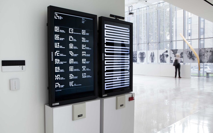
MIT Media Lab directory that used symbols for departments
I even approached the brief by attempting to create logos that shared visual elements (shapes or pattern) to keep some consistent identity across the two teams. The decision to explore this was made concrete after looking at logo work by Pentagram for MIT Media Lab. This approach was not well understood by the client, and I understood that they disliked it.
Logos made using arcs that can be read as waves or wind
When I presented pencil scamps to the client, it was very much a case of straying too far from the client’s wishes, and my scamps were not meeting the goals. I had in mind a more conservative and corporate logos – ones that work great in monochrome, and on any scale – ones that could be easily replicated on clothing, letter heads, stationary etc.
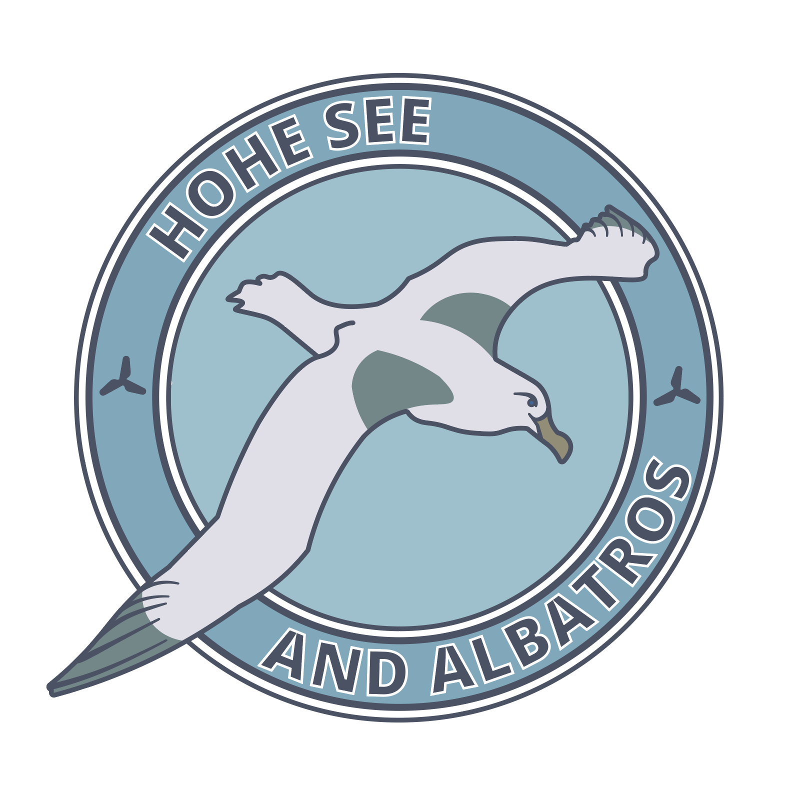
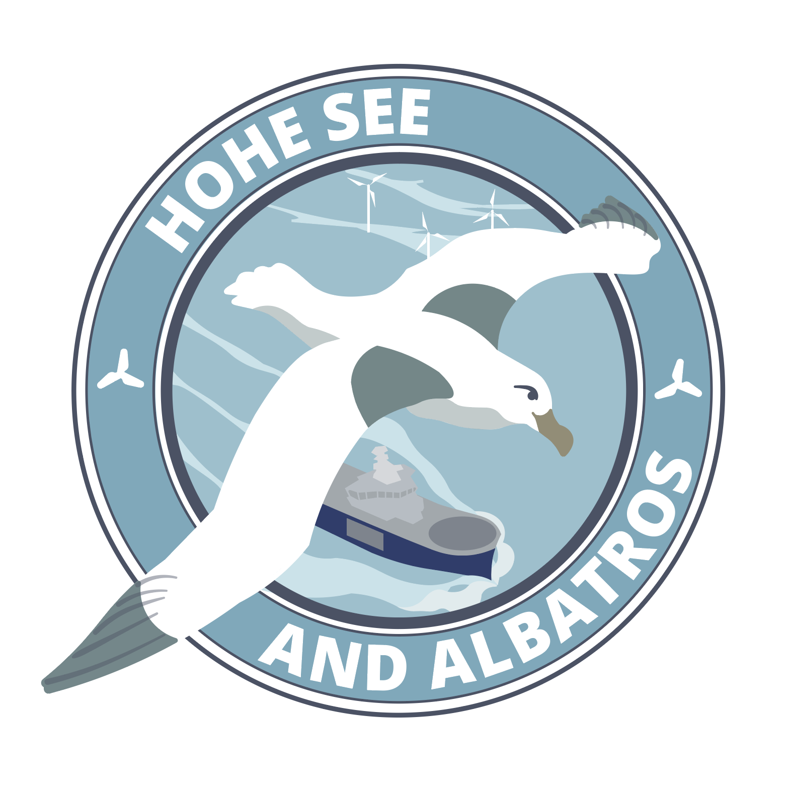
Hohe See and Albatros logos that use the same arcing shapes
Versatility of the logo was something that actually wan’t a necessity. It wasn’t stated in the brief that the logo would be for anything more than ‘personal use’. But it also wasn’t stated that the workers would be the only ones to sport the logo either. I had drafted and crafted a number of logos thinking they’d have to adhere to the general rules of logo design.
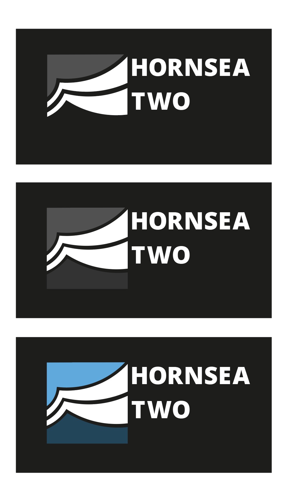
Vectors I made to explore Hornsea Two colour options
I experimented a lot with the pen tool and manipulating the lines ever so slightly to get very smooth curves in some of the logo concepts. I was really happy with the vague images of the logos above – I thought that because the viewer could interpret the lines as they wanted the logo could represent what they want. Is it the wind, is it turbulent waves? It’s what you make it.
The abstract angle is the wrong road to travel for this particular client tough. They were less enthusiastic with examples from students that were a less direct answer to the brief. What was demand was something ‘simple’, something ‘obvious’. And I can admit that it was deflating. It took a lot of potential avenues out (experimentation, and fun). But it just means I had to attack the problem from another angle. I did find it difficult to get exited over the sports logo direction, and don’t feel that my best strengths are able show through.
Early vector of a more football-like emblem
I returned to looking at the issue of providing the client with a crest-like logo. I drew many new scamps focussing on the albatross and the wind turbines. The sort of logo work I ended up vectorising became more of an illustration. (It also wound up looking a lot like a pre-existing Football emblem, I later realised.) Arriving at this conclusion, I feel that the brief really wanted a illustration from the start; not a logo.
I was given pointers by a tutor to help ‘modernise’ the feel of my first digital attempt of a ‘sports-inspired logo’. Varying the line width of the rings and removing the lines around the type gives the image a more contemporary look. It was desirable to remove the lines from the bird itself. I added a SOV vessel and wind turbines into the sea.
Revised colour ‘Hohe See and Albatros’ logo
The logo as above does not function (or read) well in monochrome, however. This is because this logo was not initially conceptualised as a black-on-white mark, and is relying on a lot of colours and lines to communicate to the viewer. Without colour, it suffers a lot. (Believe me.)
I had wanted to work on this logo more and refine it with the aforementioned details before presenting digital logos to the client, but I was occupied overseas and busy with a work placement before I realised the time to pitch had arrived, and I hadn’t the program to do so. Since I wasn’t present for the presentation of student works, I do not know the outcome of the project. I would have liked to have heard some feedback on the vectors of my scamps that were dismissed beforehand, and the opinion of the emblem-like logo that was made closer to the client’s wishes.
Looking back on this project, I feel proud of the progress I have made recently using Adobe Illustrator, and how fast I can move when I need to. I feel happy with my more abstract symbolic designs even if they are not going to be utilised – they were genuinely enjoyable to craft.