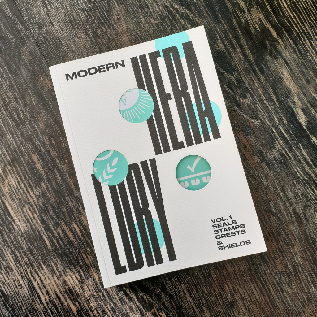
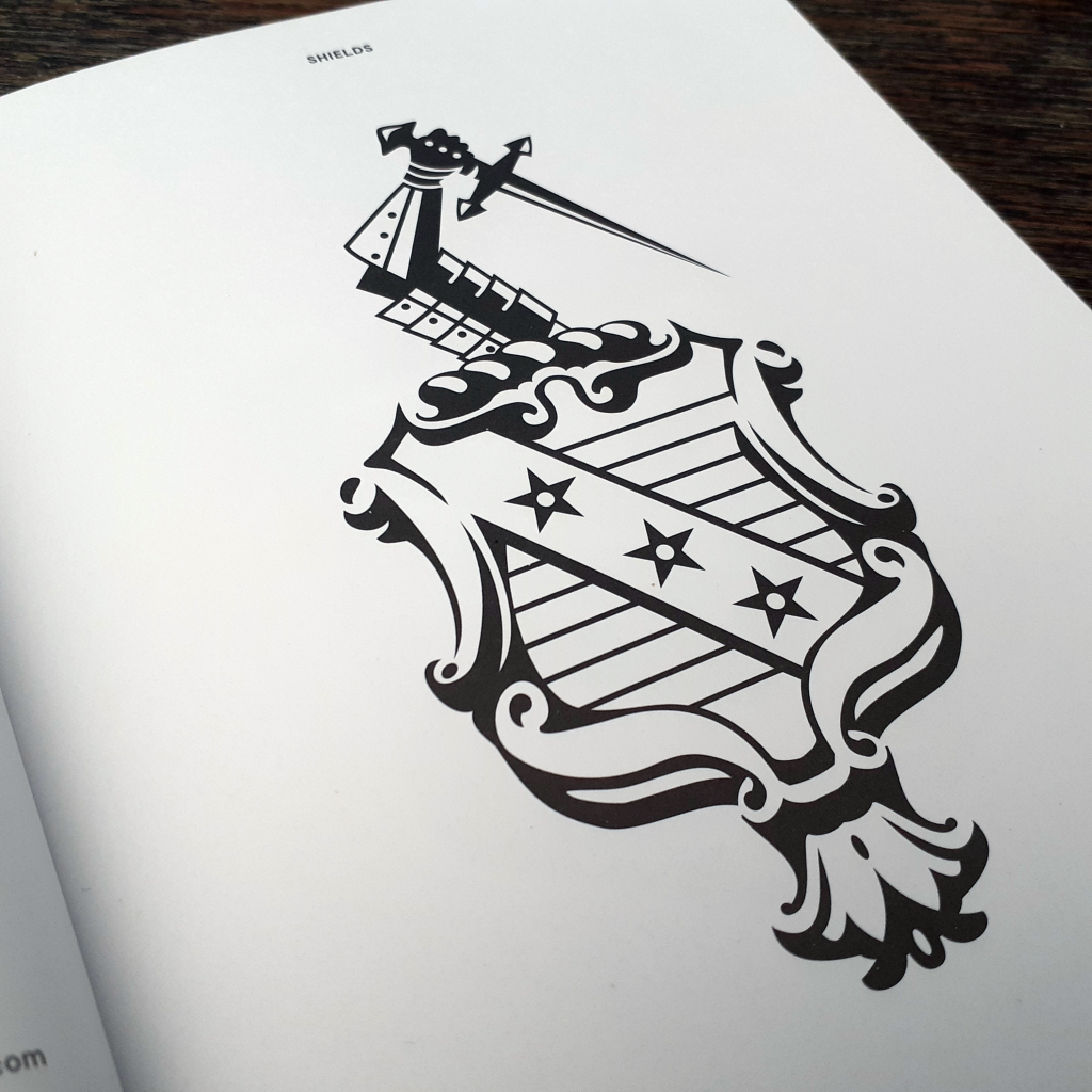
Long time no blog, huh?? I thought to share some books on my shelf that others may find of interest for design reference and inspiration. The book I picked out today is Modern Heraldry VOL. 1 Seals Stamps Crests & Shields (2015) published by Counter Print. This blog entry isn’t an endorsement of the publisher, rather it’s my desire to point others to useful printed references in place of using the internet for the majority of gathering material to spark projects and the imagination.
I won’t be ‘reviewing’ the book here; I don’t feel the need to. All I can say is it feels good to have on the bookshelf. You never know when such a thing will come in handy. (Even for rendering fictitious logo designs for movie or stage prop design, or environment/background illustration.)
The book is akin to a visual dictionary. The language of design in dense, and this books sorts the best of the best modern symbolic logo designs into easily referenced sections of shields, seals, crests, flags & ribbons, and laurels. It’s a very pleasant book to page through.
The blurb states: “Modern Heraldry is a comprehensive and profusely illustrated guide to more than 350 trademarks, based in heraldic symbology, from all over the world.” Indeed, the book is an eye-opener to overseas logo design that otherwise would go unnoticed to me. It’s always a treat to see how other countries navigate design ‘trends’, and what design rules their work adheres to. The world is far more connected now than the previous century, so it’s reassuring to see vastly different takes on say, a café logo from different countries. (Of course the intended market audience and the quality of the product or service sold effects the image and logo even within the same country.)
I hope you can enjoy the few images that I’ve shared here. At some point, I’ll show some of the second volume of Modern Heraldry. I’ve a small number of other books by the same publisher, but I do own some interesting and equally specific graphic design books that I would like to share here. A previous graphic design book I covered on my blog would be Logos from Japan. It’s a fascinating insight into foreign logo and symbol design.
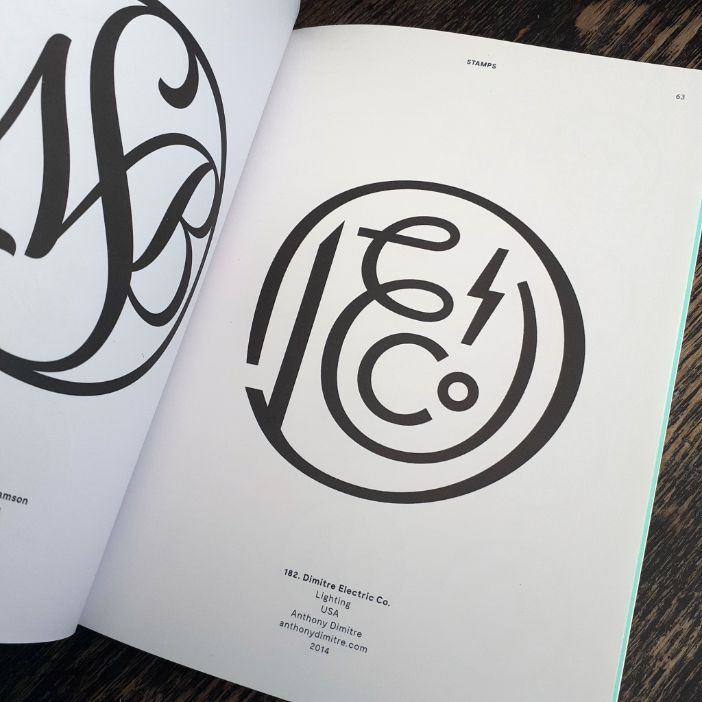
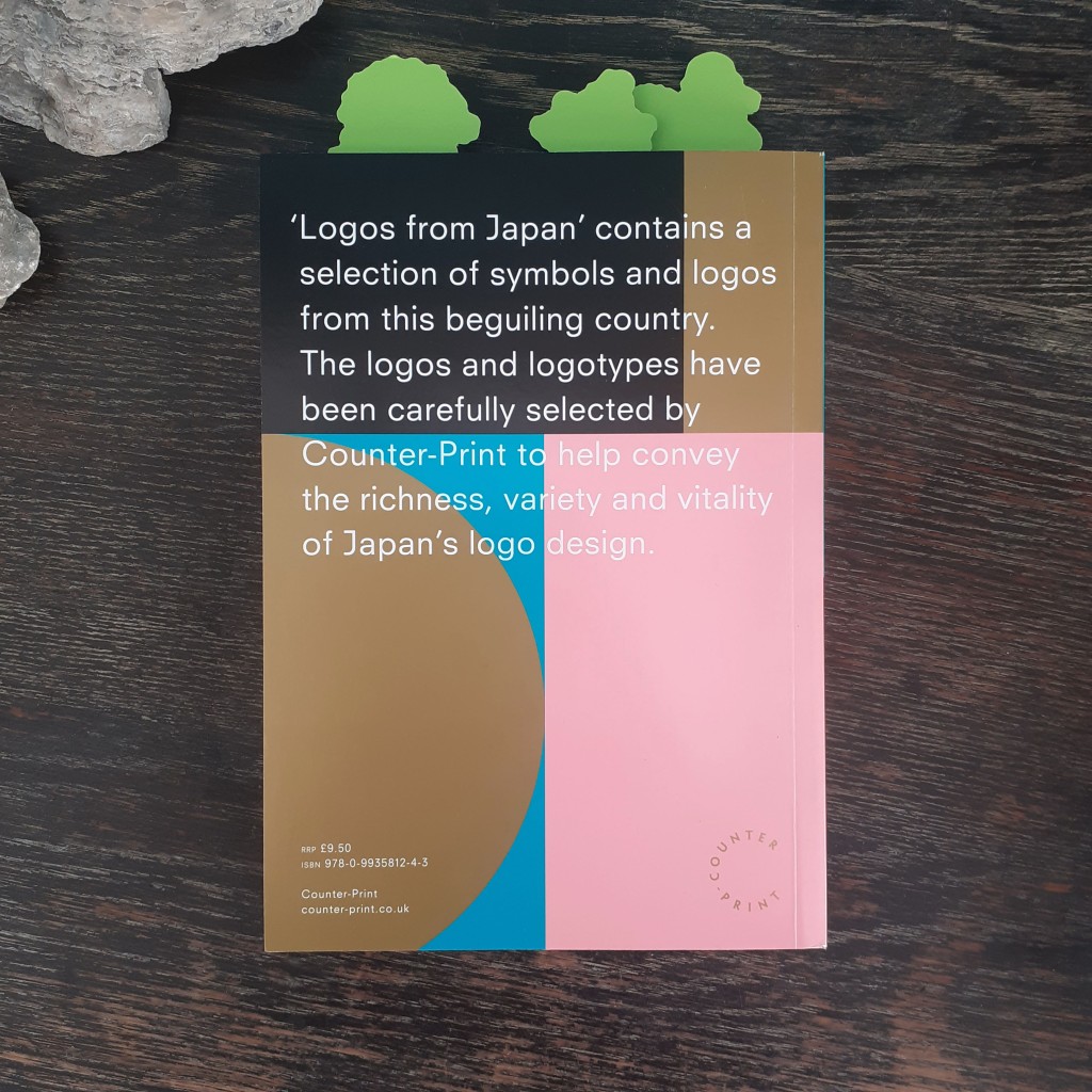
A good friend gifted me a new logo design book titled Logos from Japan. The book is published by Counter Print. It’s a continuation of the survey of design made to curate the graphic design book From Japan, but focusing only on the country’s logo design. I want to share some of the book on my blog.
It’s a paperback book of 160 pages, in full-colour, and has a short foreword on the selection of designs within.
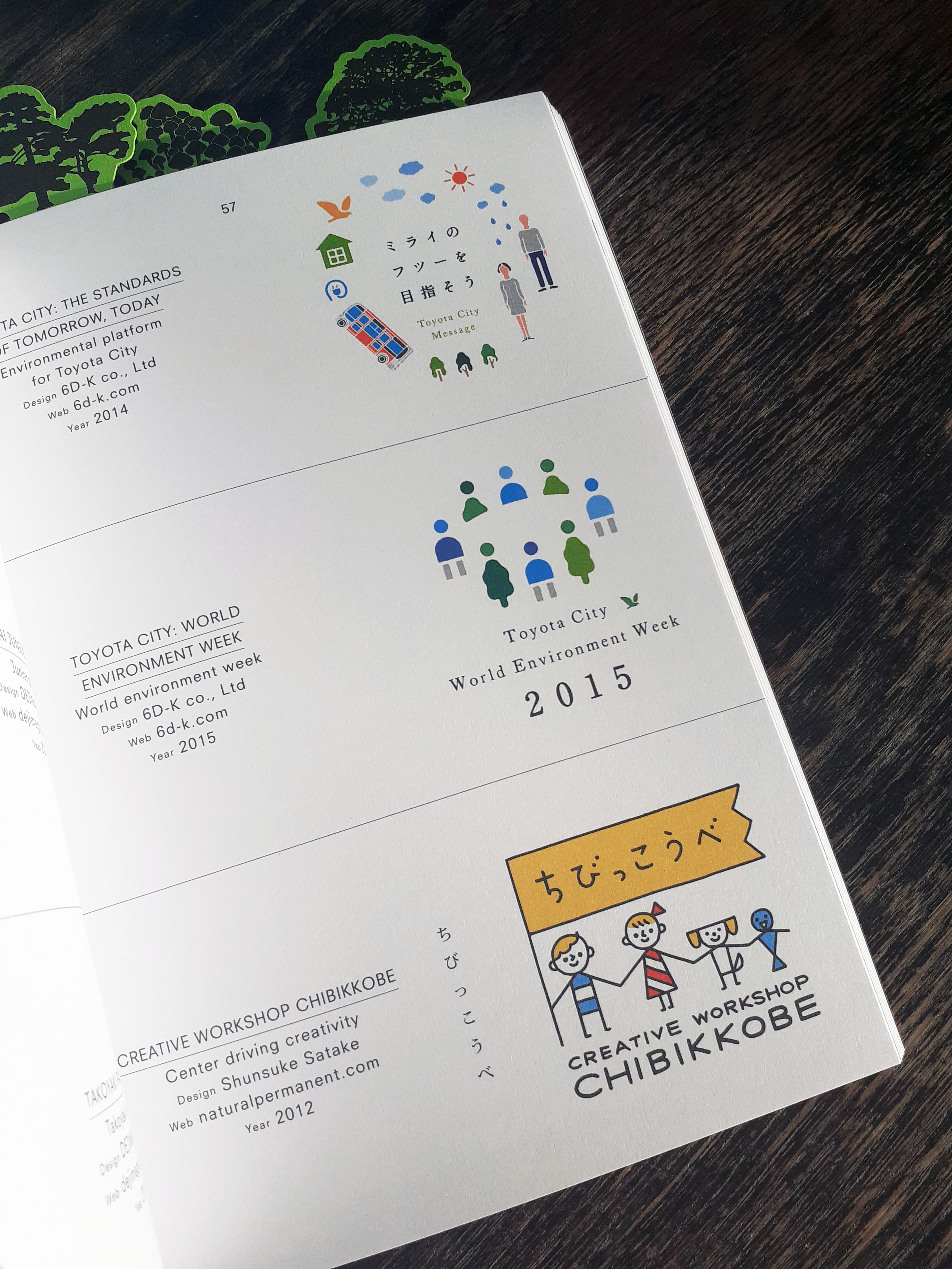
The book is has grouped the logos by theme such as ‘Architecture’, ‘Natural’, and ‘Latin’. Each logo is labeled by name, with the information of the agency that created it, and the year it was made. There’s plenty of room allocated to each logo – many have a page or two of their own – and there’s photography of some of the designs at work on signage or print.
Animal environment and welfare foundation logo
Clothing store logo featured on signage and paper bags
There’s an interesting passage in the book’s foreword that highlights globalisation’s relationship with design and craftsmanship – homogenisation – and that Japanese design has thus far evaded strict international ‘rules’ popularised by Swiss design:
In 1996 the German graphic designer Olaf Lue wrote that German design no longer had any national attributes. Observing that some might favour this development, Lue also acknowledge that some might regret it. It was true that, throughout the latter half of the twentieth century, the spread of information and the effect if globalisation showed its impact on the world of design, as in many other areas. An ‘International’ or ‘Swiss’ style was prevalent in the West, characterised by cleanliness, readability and objectivity. However Japanese design remained largely recognisable, mixing extremely traditional elements of Japanese Art history and the highly modern influence of Western design.
Human figure-based logos
Toyama prefecture’s logo
And this book really is a wonderful showcase of design that feels almost unreal in contrast to what I see of most UK, American, or European product and service logo branding. I see a lot more playfulness in Japanese logo design. Of course the playfulness is kept to appropriate services and products such as bike shops, T.V. stations, video game studios, patisseries, and so on, though I am used to seeing the these services represented through more serious, elegant, or corporate images.
The logos featured within this book are all from within the past couple of decades. As the forward explains the mentality behind modern Japanese logo design is to create something that captures the interest of the public eye in the moment:
Arguably, this could be seen as a less ‘long lasting approach’, and some of the logos will be seen as ‘of their time’ when looked upon from years to come. However today, when most identities are viewed on screen, there isn’t a permanence of print that companies are more inclined to quickly throw out their previous logo design in favour of a new one. As such, the style of Japanese logo design is constantly changing and a long lifespan for a logo is no longer expected to such a great intent.
I haven’t been taught to think about logo design as quite so ephemeral, and it’s an interesting view to read about. The transient nature of contemporary Japanese logo design is understandable when put into perspective of modern services and consumerism.
This book is very fun to flick through for the unique blend of tastes Japanese design has acquired. The number of colours used on some logo designs, and the colour combinations across these logos is a very interesting insight to design that does not follow international rules.
I’m very happy to add this book to my small collection of graphic design books. I really look forward to the day that I am able to visit libraries again to check out any recent publications for graphic design reference, too. The internet is handy to have at my fingertips, but sometimes I find holding and pouring over a book a better experience. Carefully curated publications like this shows why print is still around!
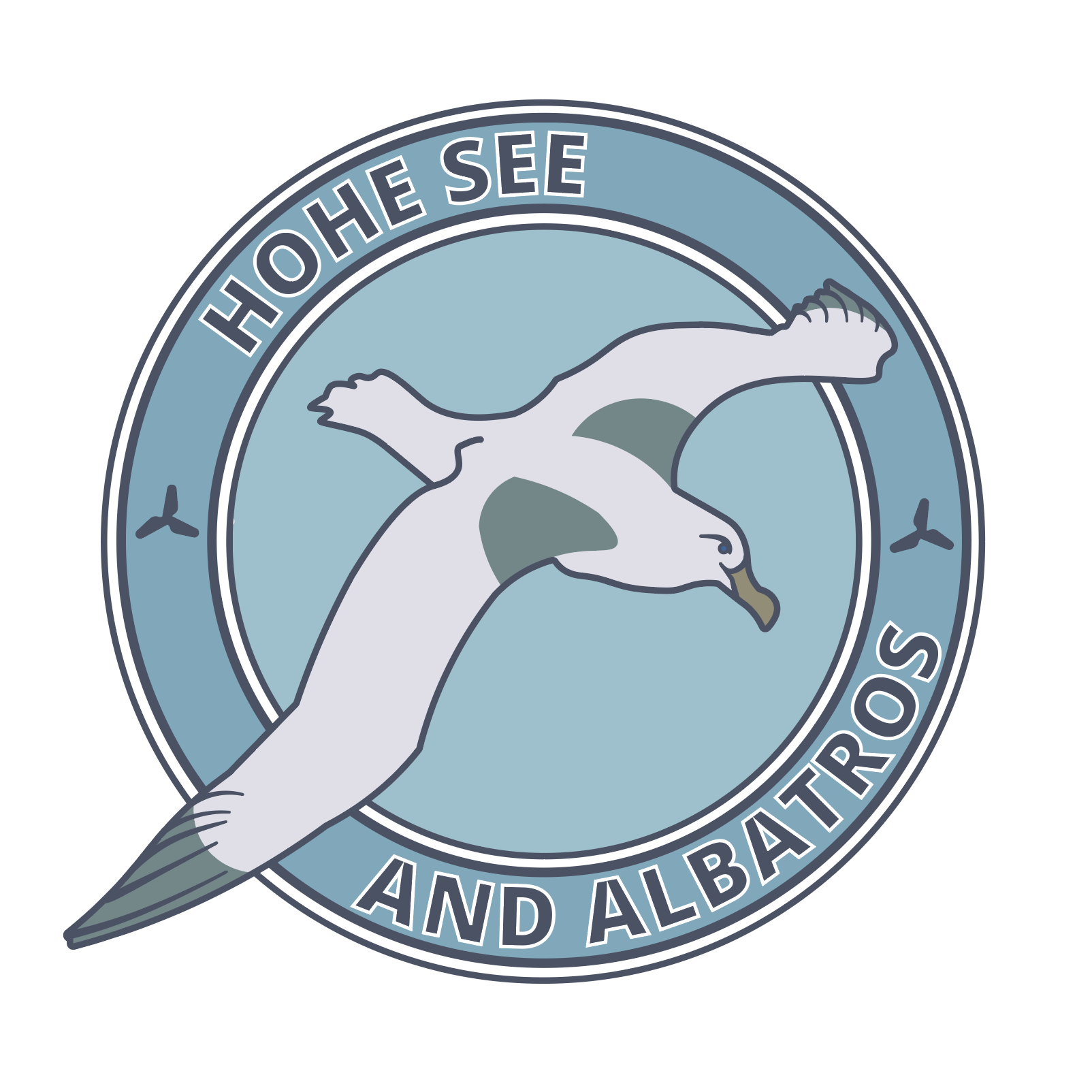
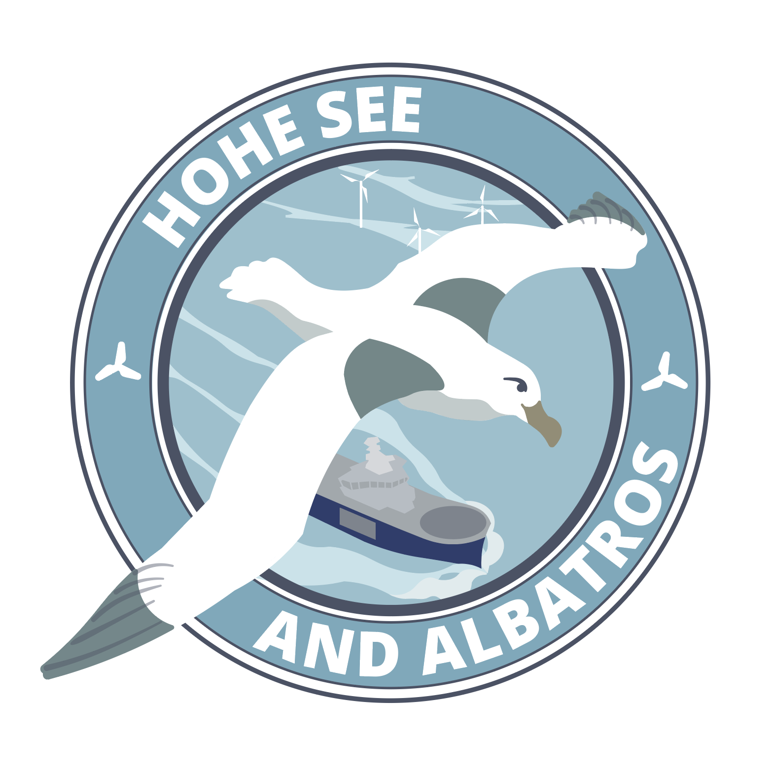
In January, the company Siemens approached graphic design students for logo work. Presumably because the belief that students face less creative constraints due to their freelance status. (But boundaries are set by briefs, regardless!) The brief presented was a challenge for me, with highs and lows.
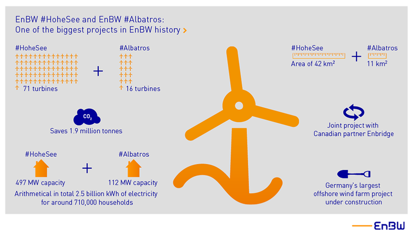
As with all clients that approach you, it’s important to understand where they are coming from. I needed to do a lot of reading up on the company, as I knew next to nothing about the history of Siemens or the specific line of work that the logos were requested for; their off shore wind farms.
Diagram showing Hohe See and Albatros’ planned number of turbines
I did end up researching what the daily routine of an engineer is, what environment they are working in, the clothes they wear, and the equipment they use etc. But the brief strained the importance of the place the work was at. The brief also made it clear that the The logos were not for the farms themselves, but rather the people who work on the farms. The workers were keen to wear emblems that reflected themselves as a ‘team’.
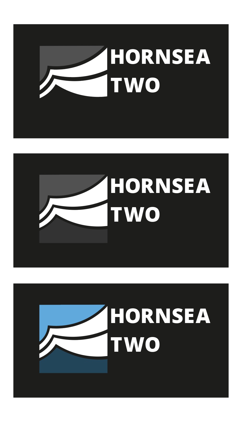
The specific farms that required logos wereHohe See and Albatros and Horn Sea Two. The most important of the key desirables was to create a symbol that represented the men at work and their ‘team spirit’. The workers were very interested in emblems such as the ones created by Bands FC (Football league and Album cover crossovers). This element of the brief was not received too well by a number of students (for being restrictive from the get-go) and many approached the brief in other directions initially.
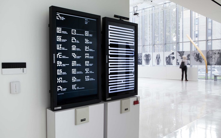
MIT Media Lab directory that used symbols for departments
I even approached the brief by attempting to create logos that shared visual elements (shapes or pattern) to keep some consistent identity across the two teams. The decision to explore this was made concrete after looking at logo work by Pentagram for MIT Media Lab. This approach was not well understood by the client, and I understood that they disliked it.
Logos made using arcs that can be read as waves or wind
When I presented pencil scamps to the client, it was very much a case of straying too far from the client’s wishes, and my scamps were not meeting the goals. I had in mind a more conservative and corporate logos – ones that work great in monochrome, and on any scale – ones that could be easily replicated on clothing, letter heads, stationary etc.
Hohe See and Albatros logos that use the same arcing shapes
Versatility of the logo was something that actually wan’t a necessity. It wasn’t stated in the brief that the logo would be for anything more than ‘personal use’. But it also wasn’t stated that the workers would be the only ones to sport the logo either. I had drafted and crafted a number of logos thinking they’d have to adhere to the general rules of logo design.
Vectors I made to explore Hornsea Two colour options
I experimented a lot with the pen tool and manipulating the lines ever so slightly to get very smooth curves in some of the logo concepts. I was really happy with the vague images of the logos above – I thought that because the viewer could interpret the lines as they wanted the logo could represent what they want. Is it the wind, is it turbulent waves? It’s what you make it.
The abstract angle is the wrong road to travel for this particular client tough. They were less enthusiastic with examples from students that were a less direct answer to the brief. What was demand was something ‘simple’, something ‘obvious’. And I can admit that it was deflating. It took a lot of potential avenues out (experimentation, and fun). But it just means I had to attack the problem from another angle. I did find it difficult to get exited over the sports logo direction, and don’t feel that my best strengths are able show through.
Early vector of a more football-like emblem
I returned to looking at the issue of providing the client with a crest-like logo. I drew many new scamps focussing on the albatross and the wind turbines. The sort of logo work I ended up vectorising became more of an illustration. (It also wound up looking a lot like a pre-existing Football emblem, I later realised.) Arriving at this conclusion, I feel that the brief really wanted a illustration from the start; not a logo.
I was given pointers by a tutor to help ‘modernise’ the feel of my first digital attempt of a ‘sports-inspired logo’. Varying the line width of the rings and removing the lines around the type gives the image a more contemporary look. It was desirable to remove the lines from the bird itself. I added a SOV vessel and wind turbines into the sea.
Revised colour ‘Hohe See and Albatros’ logo
The logo as above does not function (or read) well in monochrome, however. This is because this logo was not initially conceptualised as a black-on-white mark, and is relying on a lot of colours and lines to communicate to the viewer. Without colour, it suffers a lot. (Believe me.)
I had wanted to work on this logo more and refine it with the aforementioned details before presenting digital logos to the client, but I was occupied overseas and busy with a work placement before I realised the time to pitch had arrived, and I hadn’t the program to do so. Since I wasn’t present for the presentation of student works, I do not know the outcome of the project. I would have liked to have heard some feedback on the vectors of my scamps that were dismissed beforehand, and the opinion of the emblem-like logo that was made closer to the client’s wishes.
Looking back on this project, I feel proud of the progress I have made recently using Adobe Illustrator, and how fast I can move when I need to. I feel happy with my more abstract symbolic designs even if they are not going to be utilised – they were genuinely enjoyable to craft.
Borrowing a book titled Monogram Logo (published by Counter-Print) from the studio out of vague interest, I’m finding myself appreciating the art behind crafting solid monograms. Whether the designs are fun and playful, or elegant and assured of itself, there is a lot of good design packed into this physically small book.
Monogram Logo by Counter-print, 2014
Since the book I have ahold of isn’t my copy, I won’t scan pages from the book, I’ve found a few images of the contents here.
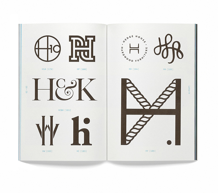
Page spread from the “H” section of the book.
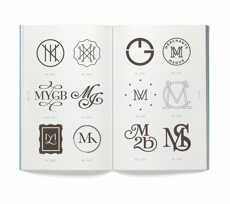
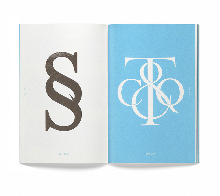
There are only so many letters in the English alphabet; so there are people, services, companies and so on, who will inevitably share the same set of initials! This book groups monographs by the leading letter of the insignia. There is a section for almost every letter in the alphabet.
Collection of “M”-centred monograms.
The number of monograms on each page differs and they are speed out in an easily-digestible manner – all numbered and tased with the letters used to construct each monogram. Each “chapter” – for lack of better word – lists the graphic’s origin, purpose, the designer and year it was created.
End of “S” and start of “T”.
The book itself is a beautiful object. No doubt about it. But it’s also a resource of inspiration and knowledge.
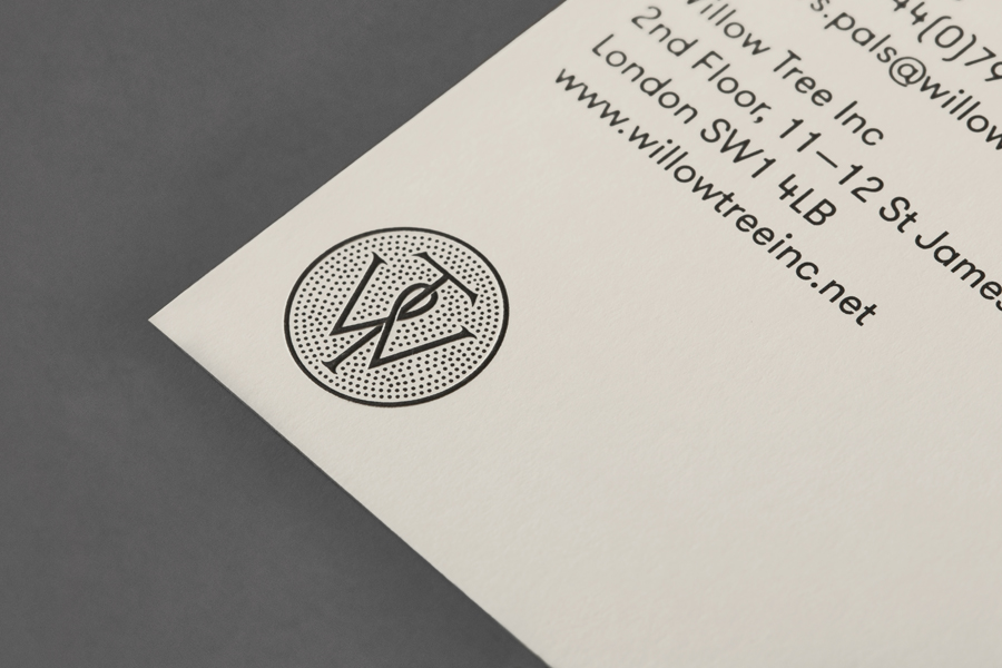
BP&O mockup of the Willow Tree logo, designed by Bunch.
The above mockup for the Willow Tree logo from the renowned agency BP&O shows the standard of monogram and cipher icons chosen for the book.
Searching for the logos seen in the book online, I can find some of them in use, out in the wild.
Myself, I’ve the initials “I”, “N”, and “C”. Of course it spells out the abbreviation of “incorporated”, but it’s also a homophone for “ink”. I’d like to make some rough drawings of my initials to see if I can’t also create a type-based icon or monogram to use myself (even as a stamp).
Do you have a favourite logo made of type that forms a monogram? Does it capture the spirit of the product or service that it’s trying to convey?
I’m not one to feel comfortable staying put for too long. The desire to travel and explore is strong; there’s only so such time I have to do so, after all. In the spirit of travel, let’s take a look at a small number of airline logos, and see how well they embody their companies ideals and character. There is beauty to be found in the logo designs of even the most corporate of identities!
The logo of Deutsche Lufthansa, by Professor Otto Firle, 1918
An encircled, angular crane with outstreched wings serves as Lufthansa’s logo mark. Originally, this logo was created for the defunct airline Deutsche Luft-Reederei, and subsequently bought by Lufthansa. The emblem possesses a distinctly retro but timeless feel, while the crane itself holds positive associations such as luck and longevity. The crane’s stylisaiton invokes immediacy, while the colour yellow also strikes faster than other colours; that is, we’ll register this before the other, different-coloured logos in a line-up of aeroplane tails.
KLM’s logo has gone though some drastic modifications since the company’s founding in 1919, though the regal crown remains essential – and so it should. The crown itself being made out of four clean circles, a cross, and rectangle is deceptively simple, yet immediately recognisable when removed from the logo type. The particular shade of blue has become an integral component of the companies identity, so much that they’ve capitalised on it’s patrons’ association of blue with their “Flying Blue” scheme (which is essentially air miles).
Qantas Airways uses the red kangaroo as their logo; the silhouette taken from the Australian one penny coin. Here, the straight lines of the triangle convey strength, professionalism and efficiency, while the kangaroo’s tail tapers off with a sense of elegance. The sleek and organic kangaroo also offsets the otherwise potential harshness of the triangle.
Undoubtedly, avians are a popular subject for airline logos; TACA Airlines uses a heavily-stylised eagle as their logo mark. To me, it almost didn’t register as a bird. It’s very elegant, and I wonder if the same effect could have been achieved using fewer lines. While I like the sweeping motion of the eagle, I feel it the bird lacks the urgency (and thus the impression of “speed”) that other, similar logos possess.
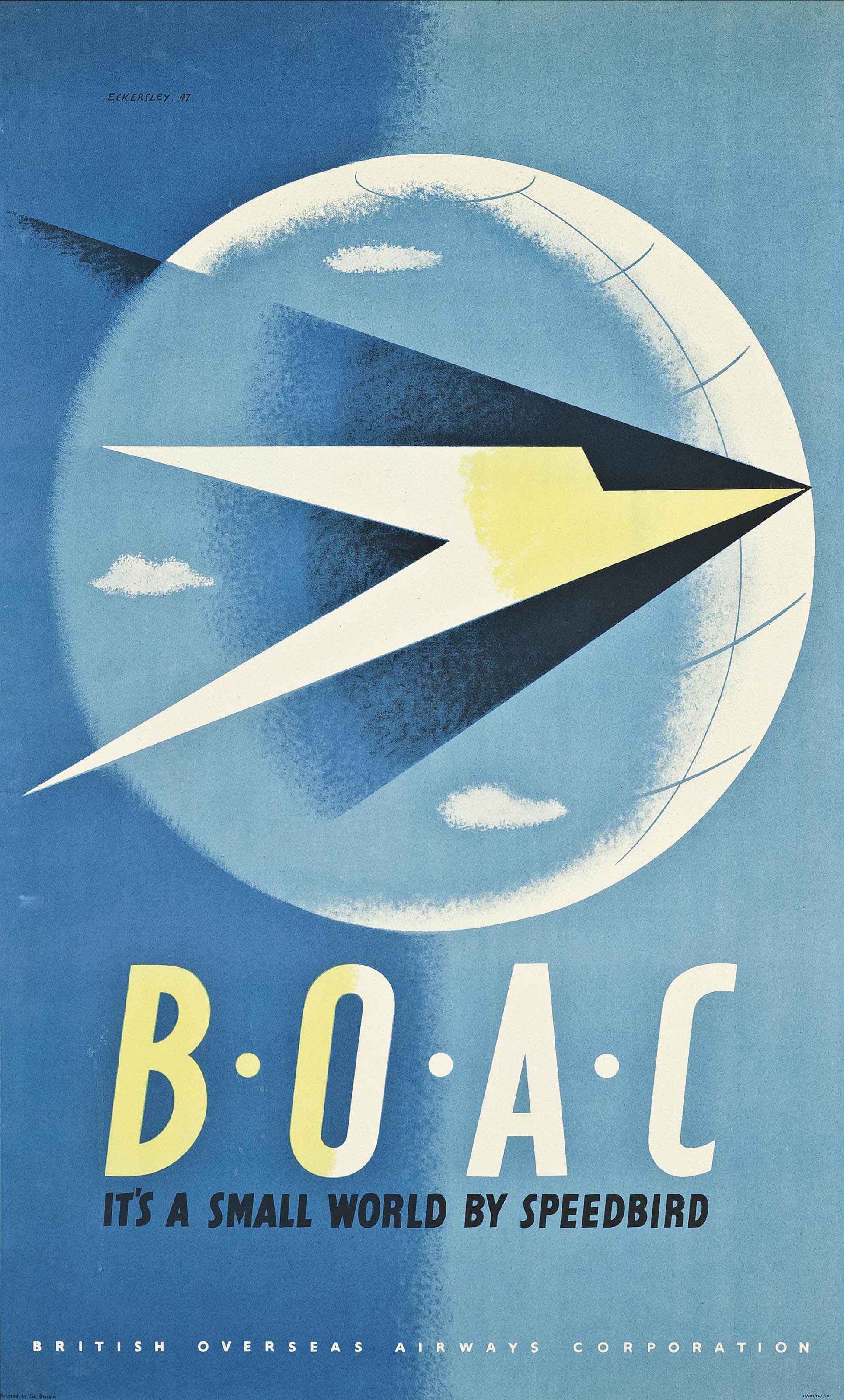
The now defunct British Overseas Airways Corporation (BOAC) used a greatly-stylised and angular bird in flight, known as the Speedbird, designed by the artist Theyre Lee-Elliott. The unwavering, direct lines that make up the Speedbird invoke efficiency, swiftness, and dedication. The slender logo mark is complimented by the thick sans-serif logo type.
Now, as my course approaches a new module, I need to turn my attention to the advertising industry. It would also be good to devote a whole post to travel posters in the future. Here, I want to share just one poster advertisement by the artist and graphic designer Tom Eckersley, for BOAC, as it features their logo, front and centre. The contrast of the sphere and the triangle-shaped bird creates tension and is the viewer’s focal point. I enjoy the minimal colour palette.
BOAC poster by Tom Eckersley, 1947
Are there any airline logos that you have an affinity for? And if so, do you feel that they communicate clearly their company’s identity and any values? I personally feel that the vintage logos here imbue the feeling of safety and a sense of reliability in this fast-paced and unpredictable world we live in, by simply standing firm though decades of change.
Have you ever been exposed to a design and wondered just how the piece arrived at the conclusion that it did? The ideation process reveals the evolution of a piece, be it a logo, a website, a tool, and so on. The ideation process covers all initial ideas and any problem solving needed to reach a sound and resolved piece. Let’s look at the redesigned logo of The New York Public Library, by graphic designer Mark Blaustein.
New York Public Library’s logo, Mark Blaustein, 2009
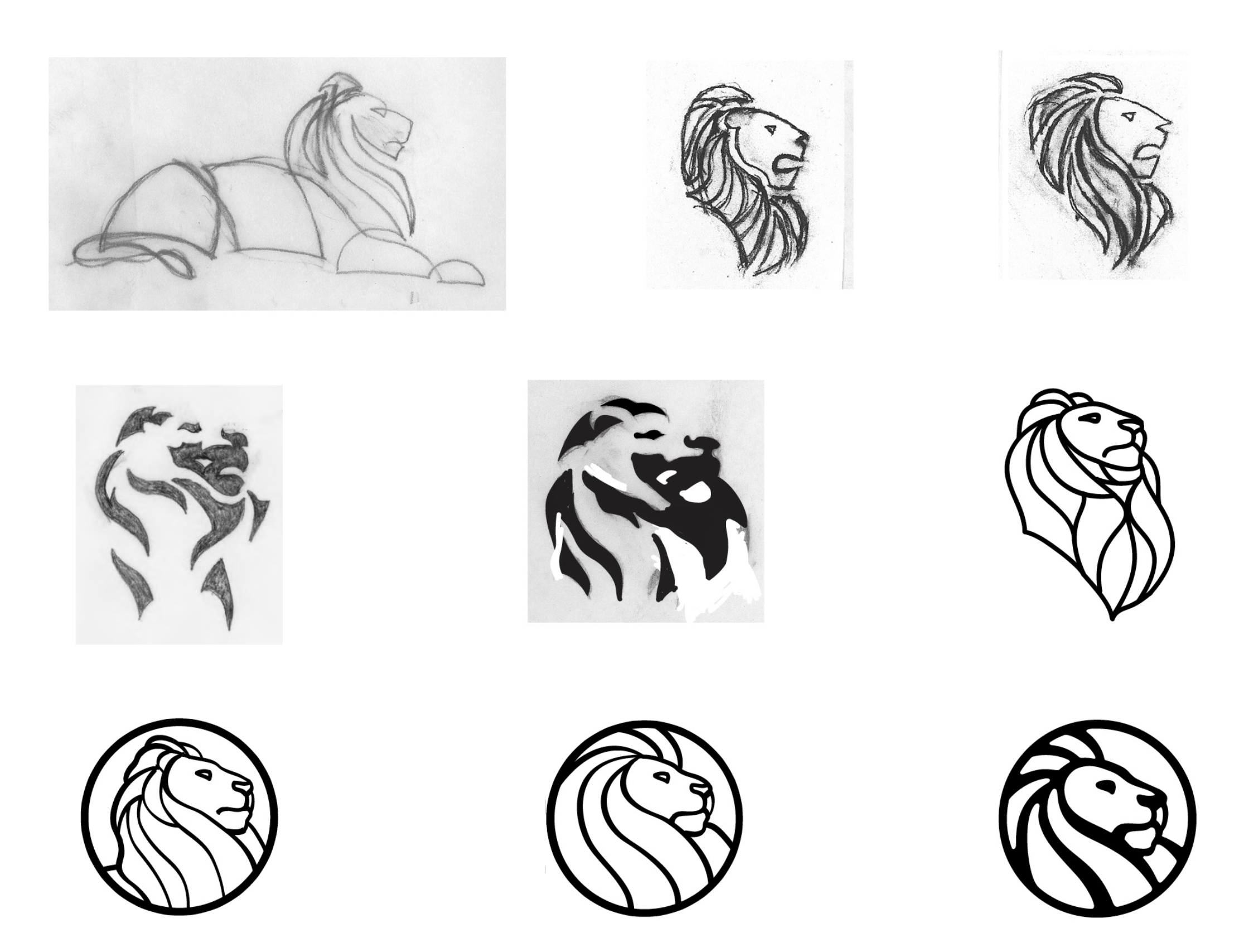
The image below shows the progress of distilling key elements in an initial sketch to create a solid icon. Mark Blaustein has recognised the economy of line and skilfully played it up to a logical conclusion.
Marc Blaustein’s ideation process of creating a new logo for The New York Public Library, 2009
Of course, the (sometimes arduous) process of logo ideation is a lot messier than clean picture shown above. As creatives, we’ll find ourselves swamped with ideas. If we have the time, we should pursue each road that appears before us, though not every road leads to a conclusion we would like. Basically, if you don’t try something out, you’ll never know if it works. And if something doesn’t work out, then you will have still learned from it.
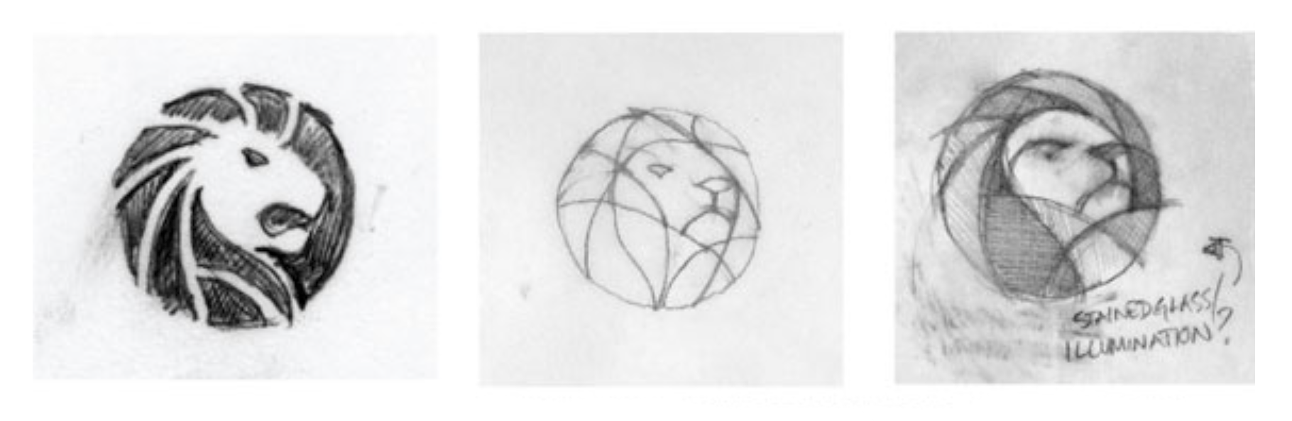
More of Marc Blaustein’s ideation process for The New York Public Library’s logo, 2009
Above are another set of ideation sketches by Mark Blaustein, investigating stain-glass aesthetics. (There were also organic motif routes such as leaves and fire that were explored.) Refined logos from this particular route would have been interesting to see! I do feel that some stain-glass elements went into the look of the final design.
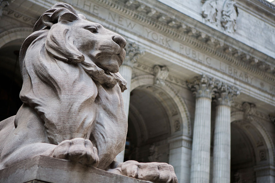
The library lion, Patience.
The original logo for The New York Public library was also a lion. Part of the library’s image are the stone lion statues, Patience, who watches the south side of the Library’s steps, and Fortitude, who guards the north of the building. It’s only fitting that the beast we call “the King of the jungle” must be symbolic of enlightenment; a monarch needs knowledge to rule justly, and fairly. The lion is strong, the lion is powerful because he has knowledge on his side.
The previous logo of The New York Public Library.
Above, we have the library’s previous logo; with the icon or mark to the left, and the logo type (the name of the business, company, studio etc.) to the right.
The old logo looks fine upon first viewing, doesn’t it? It has a vintage charm about it, too. But there are problems that come with such a detailed approach to logo design; it loses detail and becomes difficult to read once it is shrunk down. Where as the new design is suitable to print as part of a letter header, or fitting as a stamp or badge.
I did find a number of knee-jerk reactions to the new logo when it was first shown to the public; claims of it being “too corporate“. But such statements come down to general misunderstanding of how a logo must work. It must not simply look good, it also has so function as a memorable symbol, and in this case, encompassing all that the library stands for. The new logo is appropriate for branding material goods such as tote bags, can badges, and jewellery, which only reinforce the library lions’ popularity further, thus keeping the library in the minds of the public.
After looking at the both logos, do you feel that the previous design was suited to it’s job, and worked just fine? Or do you feel that Mark Blaustein’s design better reflects the library and works just as well (or perhaps even better)? For all the goals that it achieves, I prefer Mark Blaustein’s design.
I’m tying up loose ends of a project, and it requires tidying up my scamps. I want to reproduce them digitally. Now, I’m not used to Adobe Illustrator just yet, so I’ve a lot to learn about reproducing and rendering my drawings on a computer. I hope I can post variations of my designs once I’m done!
For the project, I’m working with an animal motif because the animal is central to the message. There are a plethora of brands, companies, charities, and digital programs etc. that utilise the charm of an animal in their logo. So let’s look at some logos with a wild side!
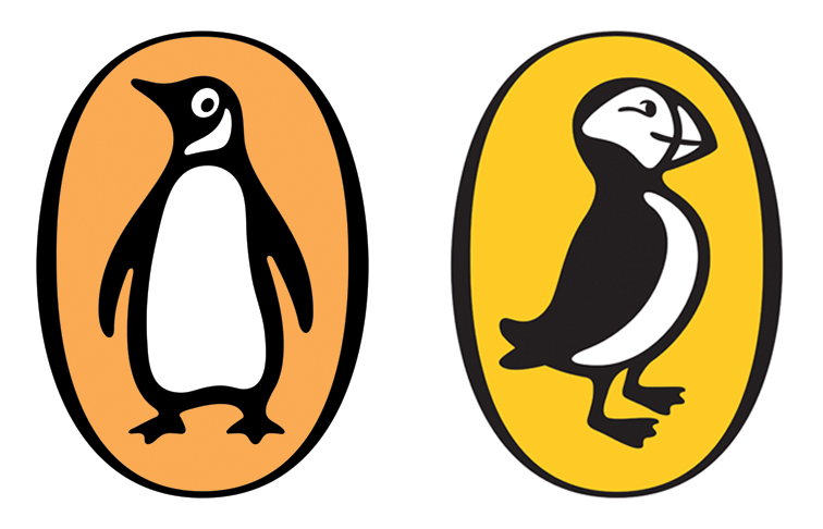
Penguin Publishing and Puffin Books – 2003 renditions by Pentagram
Though the designs have been revised a number of times, Penguin Publishing’s monochrome icon has been around since 1935! The penguin is a sharp-dressed and smart-looking bird. Puffin Books’ logo for their children’s imprint, is the much smaller, and mischievous bird.
WWF – logo designed in 1961 by Sir Peter Scott
WWF’s logo is perhaps one of the most recognisable animal logos in the world. It’s true expression is ambiguous – it doesn’t have a defined pair eyes, and because of this, we can project feelings onto the bear. It could be happy, sad, scared etc. If you look closely, don’t the three visible legs form a “W”…?
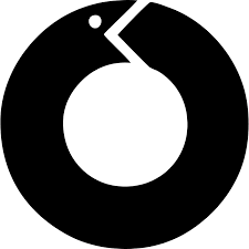
Pola Honora – logo designed in 1999 by Likovni Studio
The uroboros is symbolic of renewal, rebirth, and cycles. Here, the snake is used to promote water purification for a Croation company. The simplified shape of the mouth helps form an arrow, reinforcing a sense of motion, not unlike the the universal recycle symbol. Circles are also a friendly shape that are easily remembered.
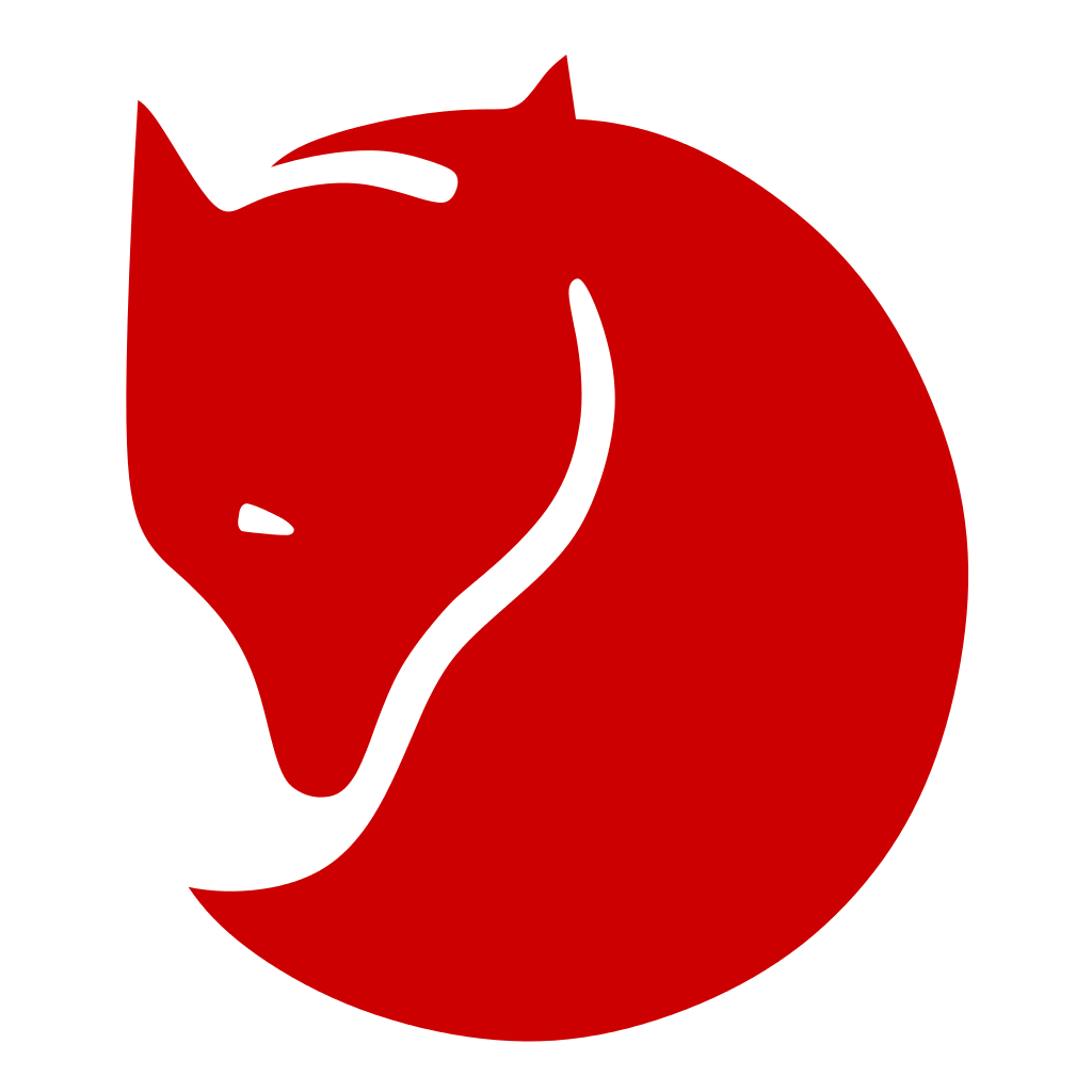
Fjällräven – logo designed in 1974
Fjällräven aim to inspire others to take an interest in the outdoors, to respect the world’s animals, nature, and other people. The mountain fox is wise and resililiant, possessing ideal traits of an outdoor adventurer, but at the same time, the fox isn’t without the cute features of other small, furry mammals. The logo is stylised so the consumer of the goods can interpret the logo however they like, and use it to define a part of their identity.
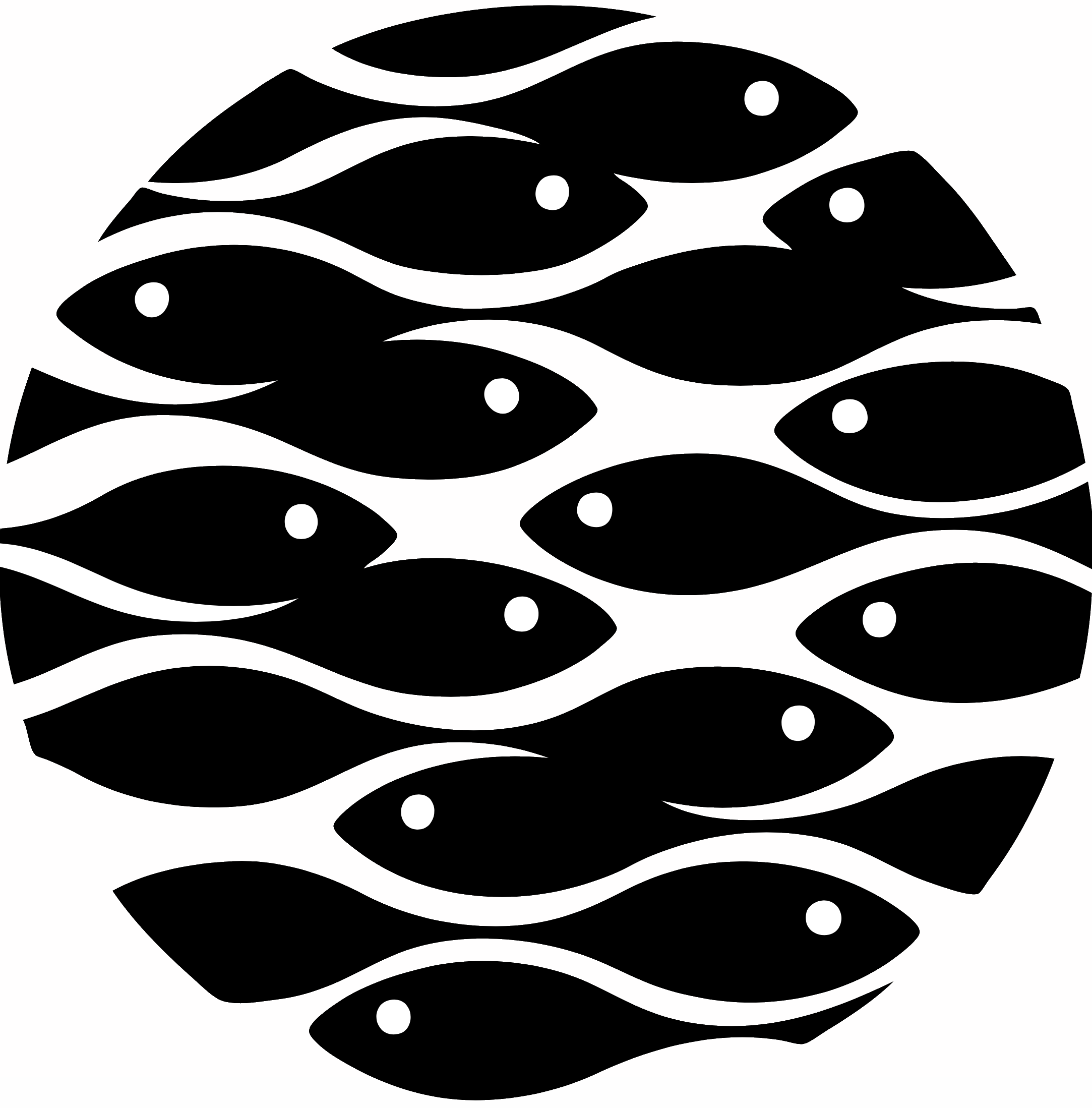
Oceano de Lisboa – designed in 1996 by Chermayeff & Geismar
The ripples on the surface of a body of water double as a school of fish. Lisbon oceanarium is a massively popular tourist attraction for visitors from around the world, and this stylish logo shows the aquarium’s competence from the get-go. The logo can be printed in colour, but more importantly, it works just as well in monochrome – which is how it’ll be seen when printed in a letterhead in business correspondence.
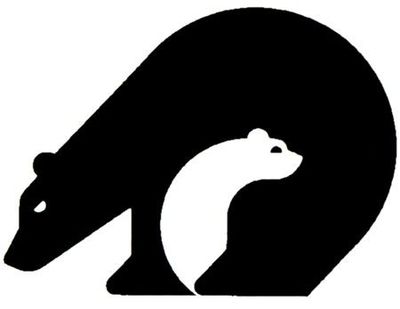
California Conservation Corp – logo designed in 1878 by Vanderbyl Design
An adult bear is wrapped around a cub in a defensive manner, the adult is prepared to protect its young, and the child is safe and content. Protection is what CCC is all about; its mission is to guard land and wildlife from flood, fire and other disasters.
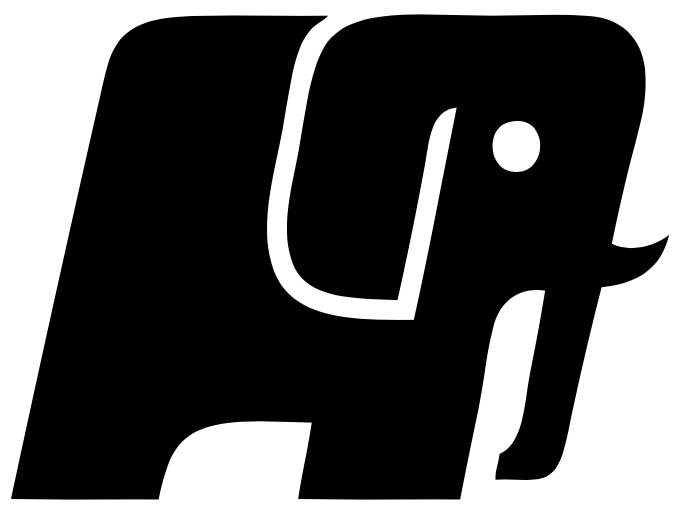
Pochin – logo created in 2001 by Funnel Creative
We acknowledge elephants as one of the most strong yet gentle creatures on the planet, and artist interpretations usually play up their literal strength, as seen here in Pochin’s logo for their business in property development. Because we recognise the elephant as sensitive and caring, we may assume the companies’ industrious workers are too.
Alright! We’ve looked at but a tiny handful of logos utilising the raw power of different animals. There are so many more that I’m sure you’re aware of, and maybe even fans of! So, do you have a favourite animal-centric logo? If so, is the animal vital to the message, or simply there for decoration?
Take that last point in mind if you’re to design a logo; if an animal’s symbolism can strengthen a message, then great! …But if it’s just there for looks, it may cause viewer confusion, and muddy your message!