The Vasseur BALTIC Artists’ Awards – BALTIC Centre for Contemporary Art

I met with a good friend recently, and we made a trip to the BALTIC art gallery in the quayside of Gateshead (north east of England). It is free entry. Galleries are good spaces to spend your time on a rainy day.

For those who do not know of the BALTIC Centre for Contemporary Art, it’s a multi-floored art gallery, redeveloped from a flour mill. You can read about the art gallery’s history on their own website here.
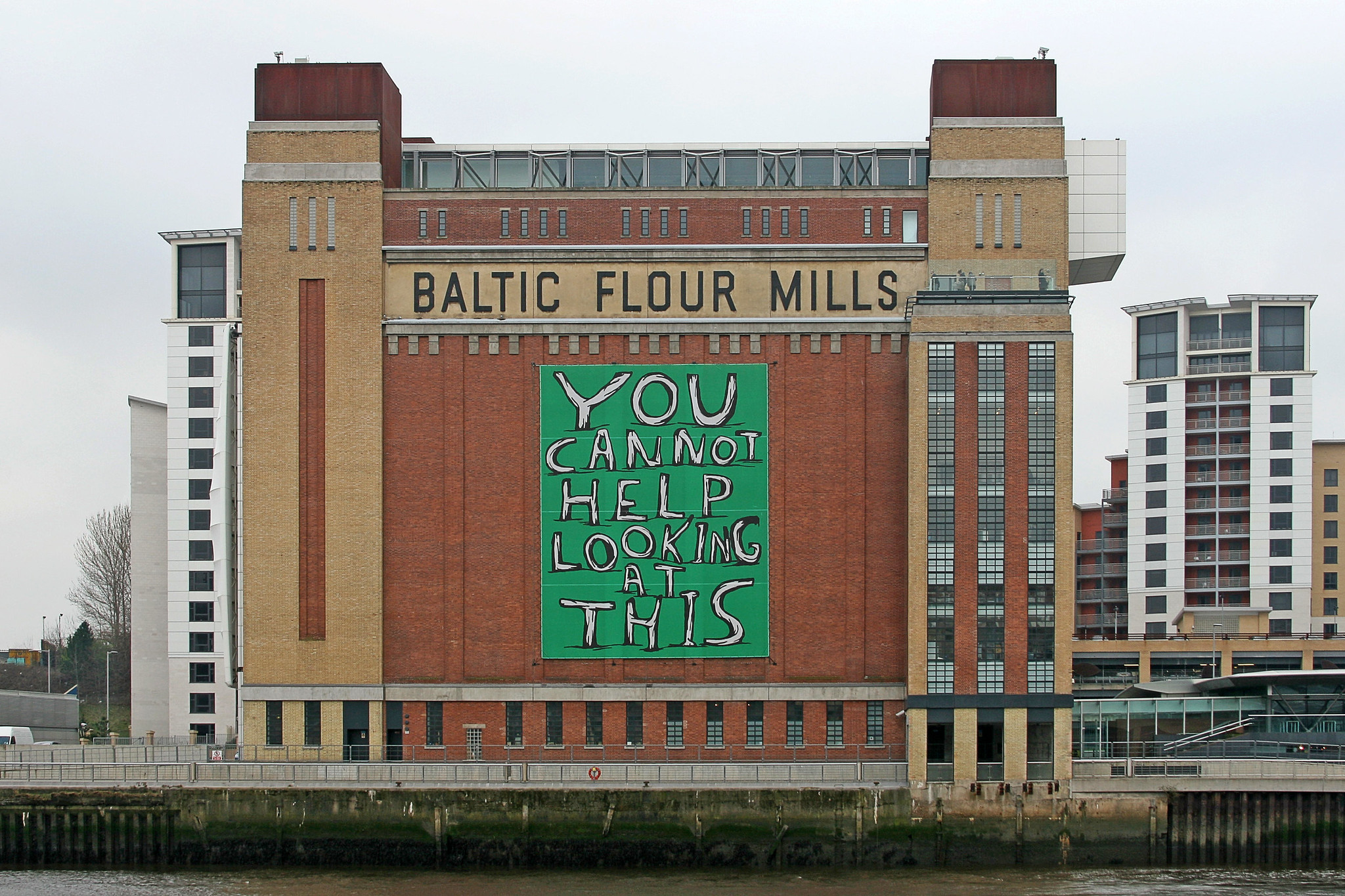
BALTIC art gallery outside building
The BALTIC from across the river Tyne, 2007, photograph © Leo Reynolds

I took my time to soak in the contemporary art pieces and I very much enjoyed the atmosphere of the shared space; everyone brought together from their drive to enjoy art. I have some photographs to share of Laleh Khorramian‘s work that was part of The Vasseur Baltic Artists’ Award. It was the only exhibition that I took any photographs of, but not the only space that I found myself contemplating or reacting to.


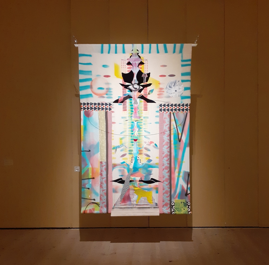
Laleh Khorramian is an artist from Iran, who presently lives in New York, America. The Baltic’s own website describes her work as “…using the ordinary to portray the epic, the universal and the transient, in a search for worlds beyond our own”. In the exhibition there are pieces created by drawing, printing, collage, and painting.

These pieces below are three of Khorramian’s tapestries, of which are created from a wide variety of materials, including: velvet, silk, cotton, and hand-dyed fabrics. They showcase the artist’s collage and quilting skills. The tapestries lead me to a mediative state – being almost overwhelming when trying to focus on each one in their entirety. It was good to take time to contemplate each element of the grander picture.

The following images are of Laleh Khorramian’s light box installations. They use an extensive variety of mediums, being: oil paint, spray paint, polypropylene, coloured gels, Plexiglass, LED modules, African mahogany, pine, aluminium, and lacquer.
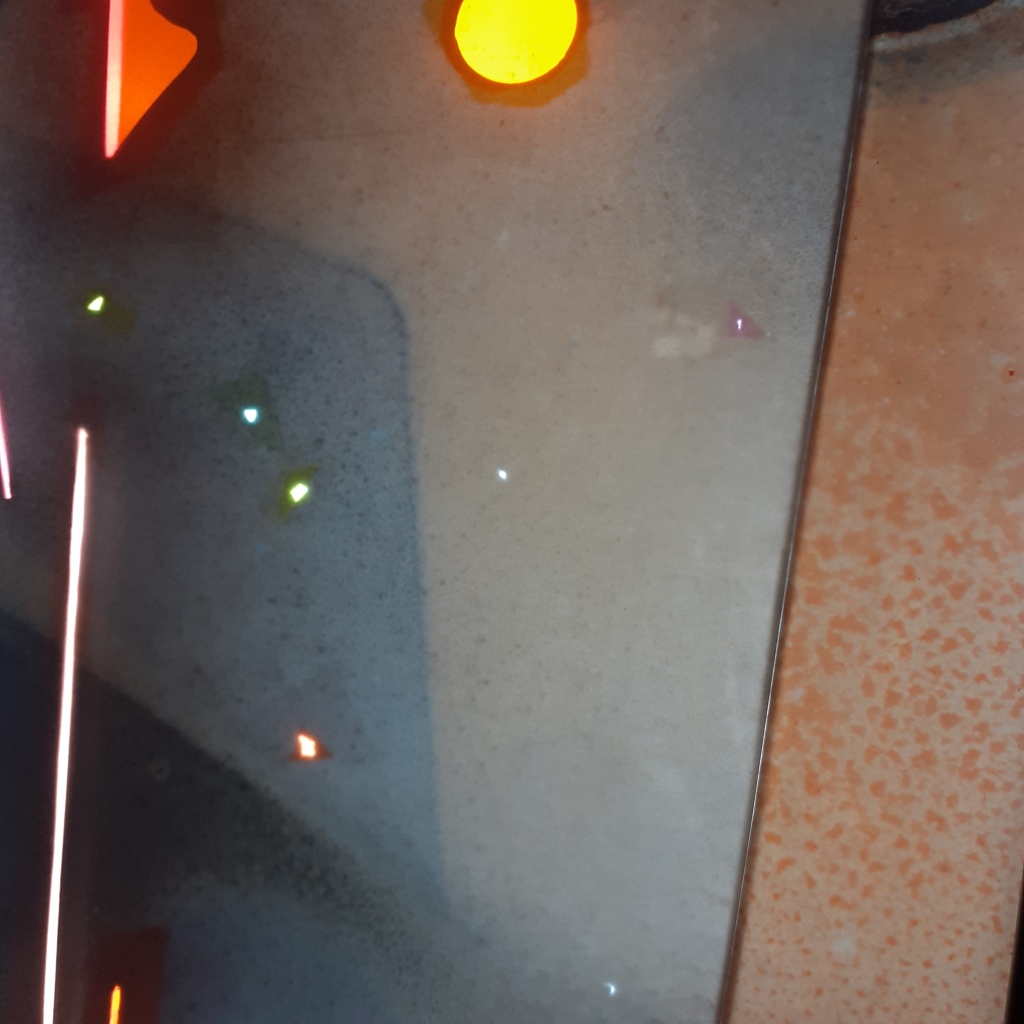
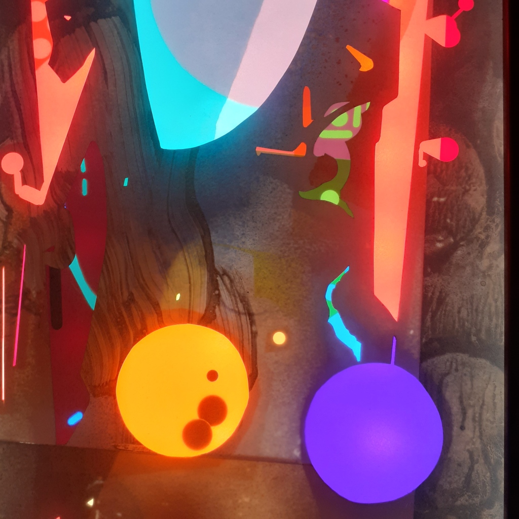
The leaflet the gallery provided descries the light boxes as so:

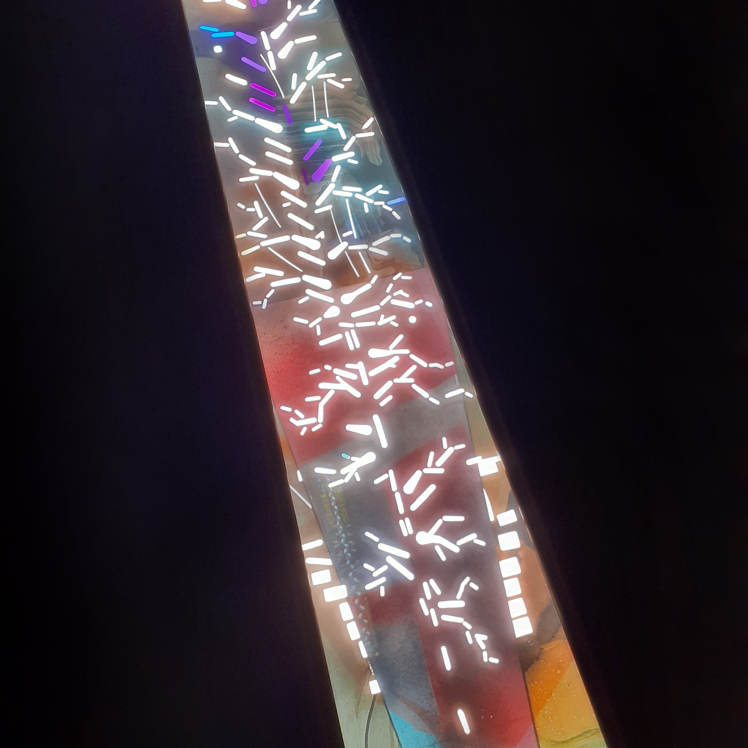
Khorramian’s light boxes feature monotypes connected to cut-out shapes and coloured gels. These improvisations of colour and light radiate like stained glass windows. The trapezoidal window series (2022) included repeated motifs such as spheres, platted braids, and tree branches. They form a central spine, snaking down the length of each box. With these works, Khorramian invites us to think about origin stories, space and time and the cosmos.
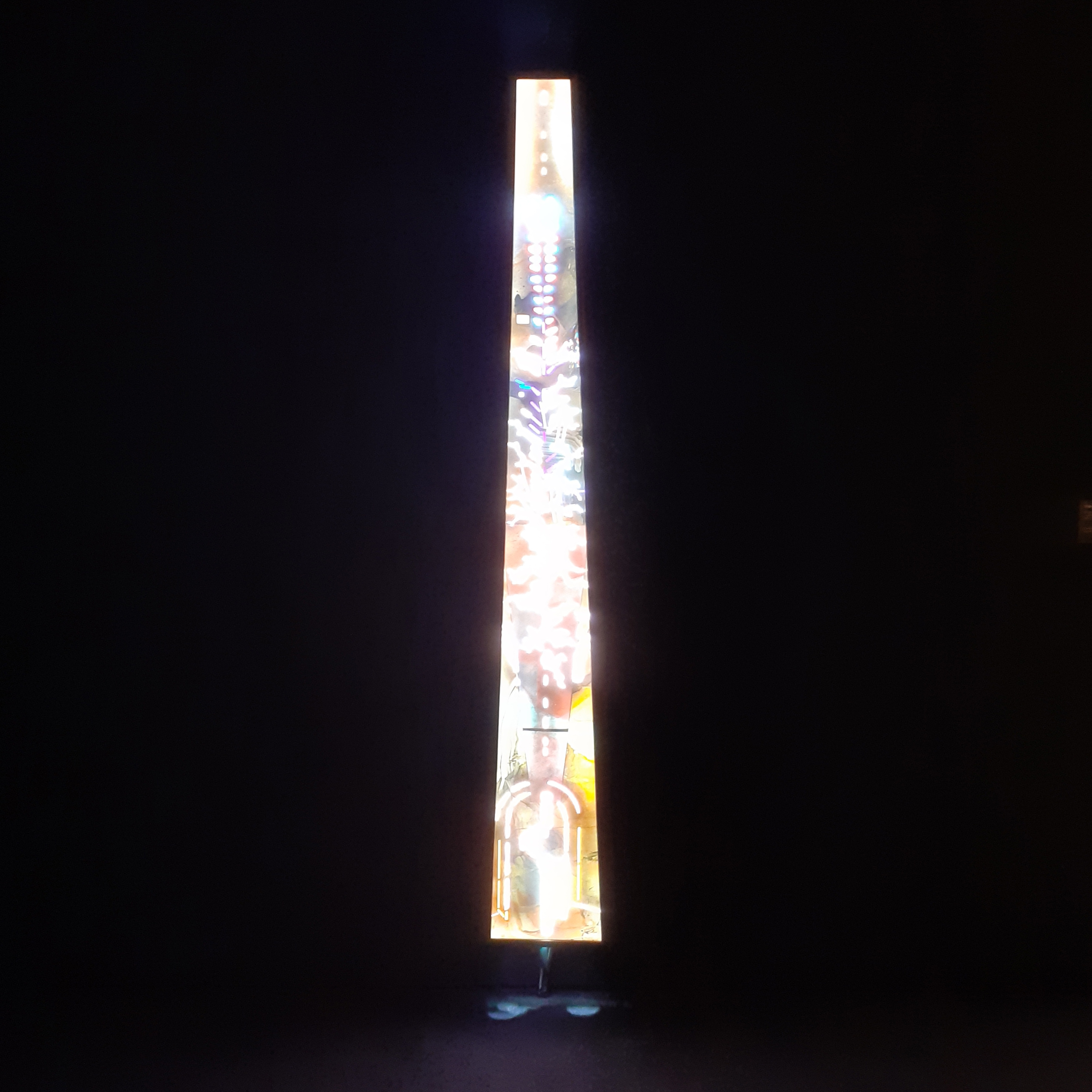
trapezoidal window trees
trapezoidal window (trees)
trapezoidal window trees detail
Detail of trapezoidal window (trees)

I enjoyed the trapezoidal series, and very much enjoyed the work Fontanelle at the back of the gallery; a sole window in an otherwise dark room, layered with an enlarged monotype. What you make of an artist’s work is entirely up to you. These sorts of installation work are best seen for yourself.


There were three floors with works on at the time of visiting. Actually, two of the elevators were out of operation, so my friend and I used the stairwell and made our way up the gallery one floor at a time. It was good to break up the intensity of the exhibitions with climbing the building in-between each gallery room.

If you are able to visit the Baltic Centre for Contemporary Art, I recommend that you snap up that opportunity to expose yourself to the work inside. The contents of the gallery change regularly. If you want to read BALTIC’s accessibility guide, it can be read here.
Personal Work – Anatomical Animal Studies

I have stumbled upon some anatomical studies I’d made in the past (though I never dated them) and thought to archive them in some form, and after much thought I decided to share them on this blog.

I am in the middle of coding a website for personal use, where personal art, and studies may find themselves catalogued in the future. (Who knows?)

These types studies aren’t of the usual subject matter I post (these being of the macabre in nature) so I have decided to share them behind a ‘read more’, so you may view the artworks as you please. The content are anatomical studies of bones and organs of a rodent and a cat, respectively.

Continue reading “Personal Work – Anatomical Animal Studies”

Up-cycle Design – Envelopes

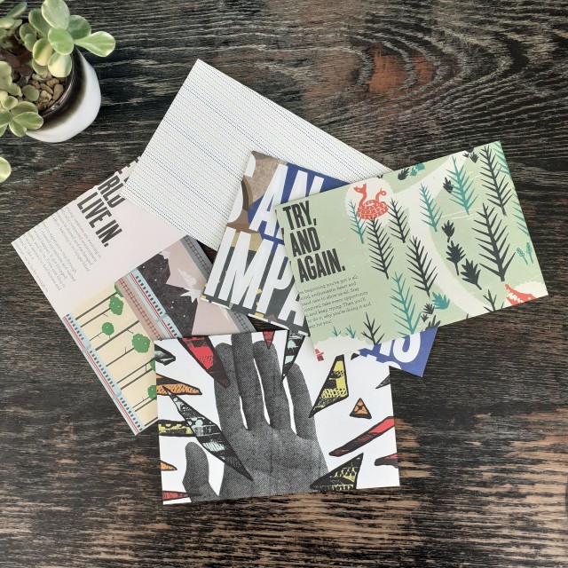
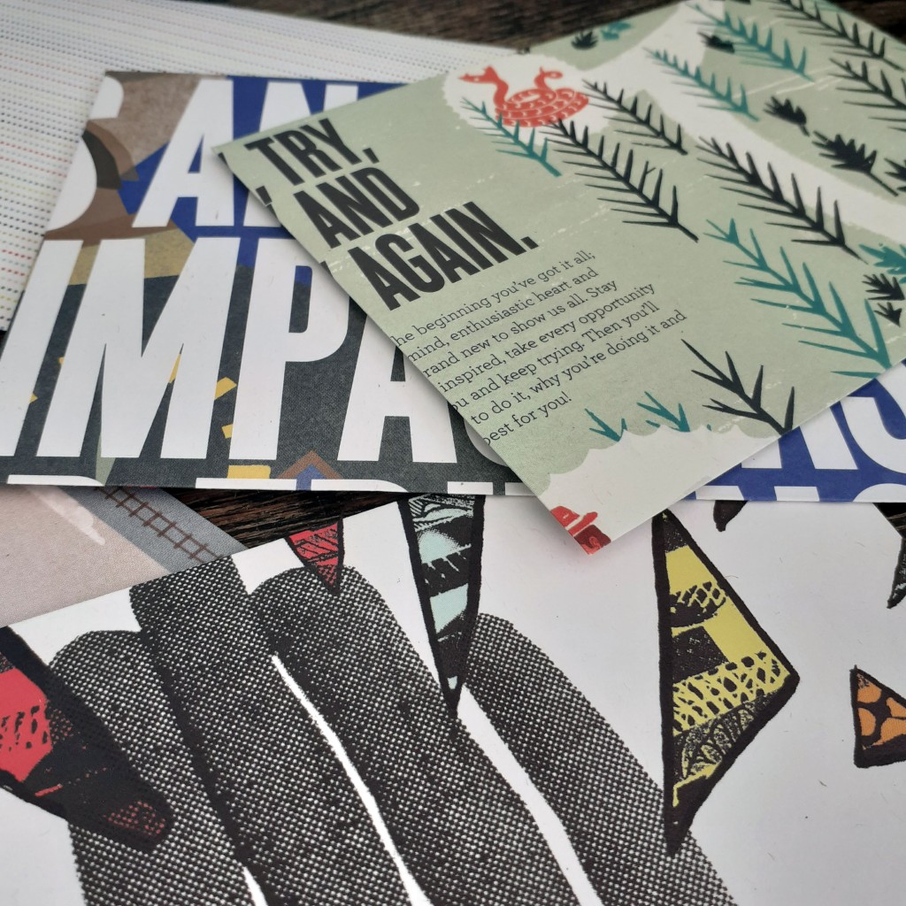
Once again I turn to some outdated printed media to craft some envelopes. They’re for personal use, so I doesn’t matter what the end result looks like. They fair fine enough in the post. I used a copy of YCN Student Annual 2010/2011. As the name implies, it’s a book full of graphic design work by students.

These aren’t a standard size envelope, but they fit A5 paper folded in half. And that’s good enough for my personal correspondence needs.

Using these makes snail mail quite a lot more fun and personable than it already is.

I hope to share some more of the specific art and design books that reside on my bookshelf in the near future. I’m reading a few essays that are not directly related to design, but I may find myself sharing such media here, too. Sometimes it’s good to read outside of your interests and you may find yourself some nugget of wisdom that’d otherwise go overlooked.

Albert Camus – “Create Dangerously”

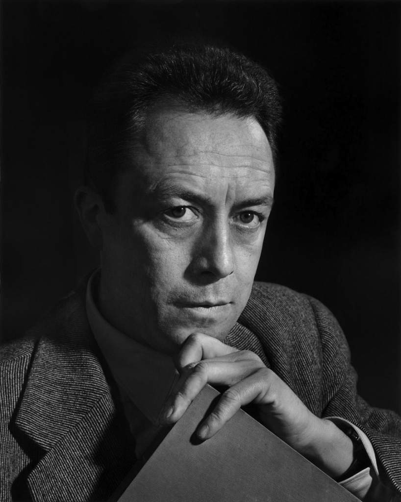
Recently, I read a translation of a well-known speech by the French-Algerian writer and philosopher Albert Camus. The speech I read was Create Dangerously, which was delivered in 1957 at the university of Uppsala in Sweden, and it concerns art and its relationship to its audience, and the power of art; “To create today means to create dangerously. Every publication is an act, and that act makes us vulnerable to the passions of a century that forgives nothing.”

The speech Camus gave is as relevant to the creatives of our time as it was to the creatives of the period it was given in. Perhaps it is of more significance today? I wanted to share a couple of extracts from the speech.

“Of what if art could speak, indeed? If it adapts itself to what the majority of of out society wants, art will be a meaningless recreation. If it blindly rejects that society, if the artist makes up his mind to take refuge in his dream, art will express nothing but a negation. In this way we shall have the production of entertainers or of formal grammarians, and in both cases this leads to an art cut off from living reality.”

Throughout his speech, Camus asks the artist to take responsibility for their creations. To be mindful of what you create, and what you are reacting to. Artists can speak for those who can not, after all.


In the past, I had been thinking about the lack of government funding that goes towards creative public endeavours, or the preservation of art (in all forms). But the suppression of art isn’t solely external. Camus explains to us:

“It is not enough to say that art is threatened by the state. If that were true, the problem would be simple: the artist fights for capitulates. The problem is more complex, more serious too, as soon as it becomes apparent that the battle is wages within the artist himself. The hatred of art, of which our society provides such fine examples, is so effective today only because it is kept alive by artists themselves. The doubt felt by artists who preceded us concerned their own talent. The doubt felt by artists of today concerns the necessity of their art, hence their very existence.”

I’m not going to let myself get dragged down by thoughts of “is this work purposeful?” anymore. I’ll create because that’s what I know, and I want to use art as a form of communication. I want to use art as a connection to others.


Now, I don’t see eye-to-eye with everything Camus presents us here. Camus views “art for art’s sake” (”l’art pour l’art”) as frivolity, and warns us against the superficiality of it all. That is, if you take the mindset ‘to the extreme’. The notion that if one creates art divorced from moral, political, utilitarian, and didactic function, that it doesn’t serve a purpose in society. I wonder if it is truly possible to divorce creations from the aforementioned functions. (For example, you can study a painting someone made ‘for experimental purpose’ and learn from it.) Tying art to function – or the lack of obvious practicilaity of my work – is what causes me great stress, after all. I think I’m fine if I create for the sake of it; I can not remove myself from the world so I need not worry about divorcing my creativity from humanity. I’ll try not to get caught up in frivolity.


If you want to read through the speech yourself, you may do so here, in a PDF format. I hope that this speech is of use to anyone who studies art or creates themselves. You may find some thoughts that aid you, or may even challenge your beliefs on the act of creation.

Design Reference Books – “Modern Heraldry VOL. 1”

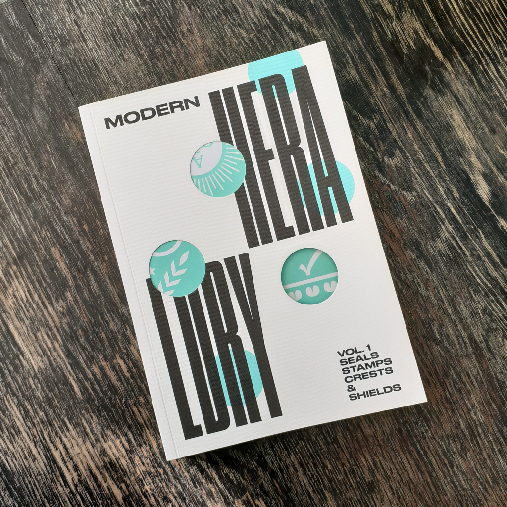
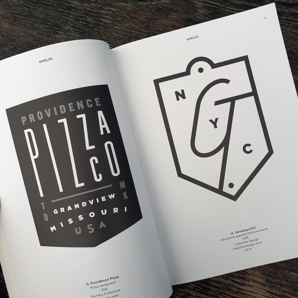
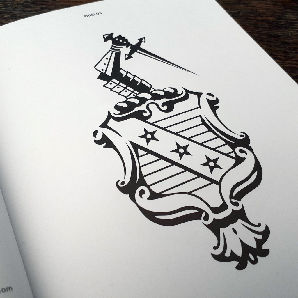
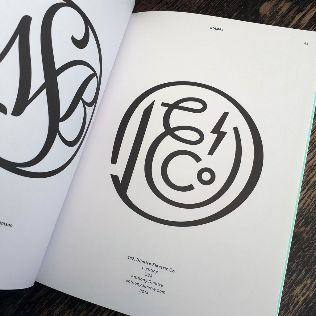
Long time no blog, huh?? I thought to share some books on my shelf that others may find of interest for design reference and inspiration. The book I picked out today is Modern Heraldry VOL. 1 Seals Stamps Crests & Shields (2015) published by Counter Print. This blog entry isn’t an endorsement of the publisher, rather it’s my desire to point others to useful printed references in place of using the internet for the majority of gathering material to spark projects and the imagination.

I won’t be ‘reviewing’ the book here; I don’t feel the need to. All I can say is it feels good to have on the bookshelf. You never know when such a thing will come in handy. (Even for rendering fictitious logo designs for movie or stage prop design, or environment/background illustration.)

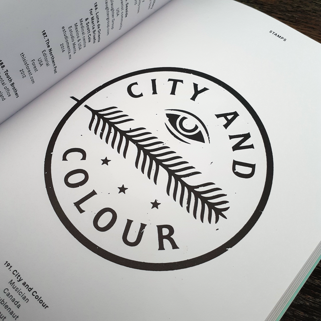
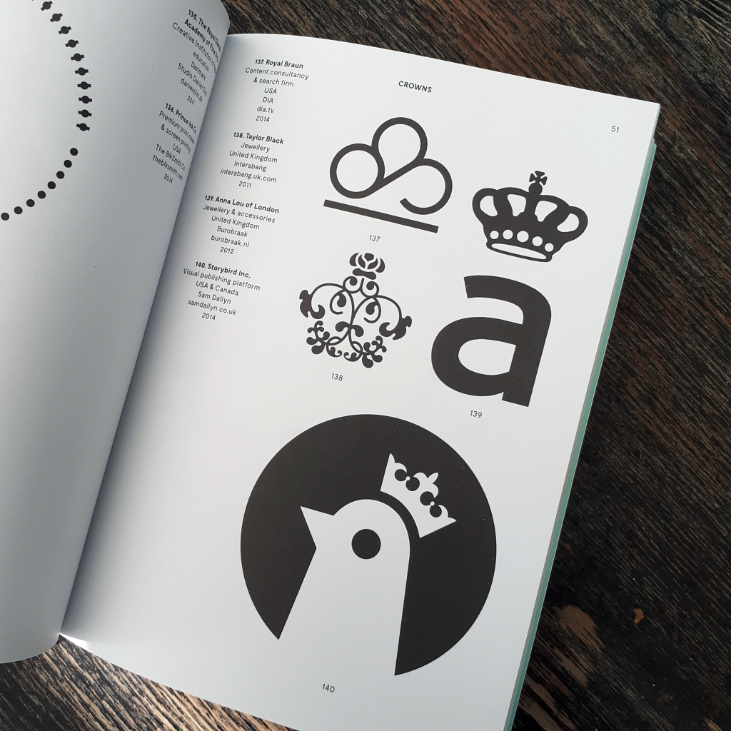
The book is akin to a visual dictionary. The language of design in dense, and this books sorts the best of the best modern symbolic logo designs into easily referenced sections of shields, seals, crests, flags & ribbons, and laurels. It’s a very pleasant book to page through.

The blurb states: “Modern Heraldry is a comprehensive and profusely illustrated guide to more than 350 trademarks, based in heraldic symbology, from all over the world.” Indeed, the book is an eye-opener to overseas logo design that otherwise would go unnoticed to me. It’s always a treat to see how other countries navigate design ‘trends’, and what design rules their work adheres to. The world is far more connected now than the previous century, so it’s reassuring to see vastly different takes on say, a café logo from different countries. (Of course the intended market audience and the quality of the product or service sold effects the image and logo even within the same country.)

I hope you can enjoy the few images that I’ve shared here. At some point, I’ll show some of the second volume of Modern Heraldry. I’ve a small number of other books by the same publisher, but I do own some interesting and equally specific graphic design books that I would like to share here. A previous graphic design book I covered on my blog would be Logos from Japan. It’s a fascinating insight into foreign logo and symbol design.

Digital Illustration – Motivational Giraffe

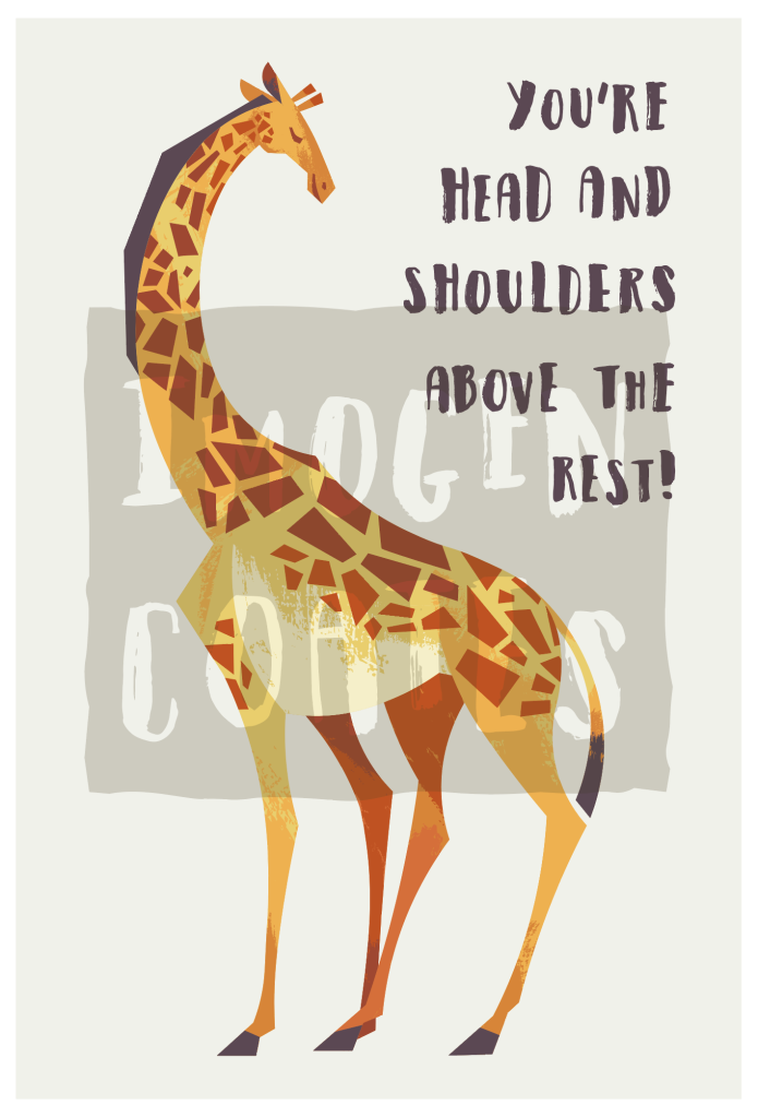
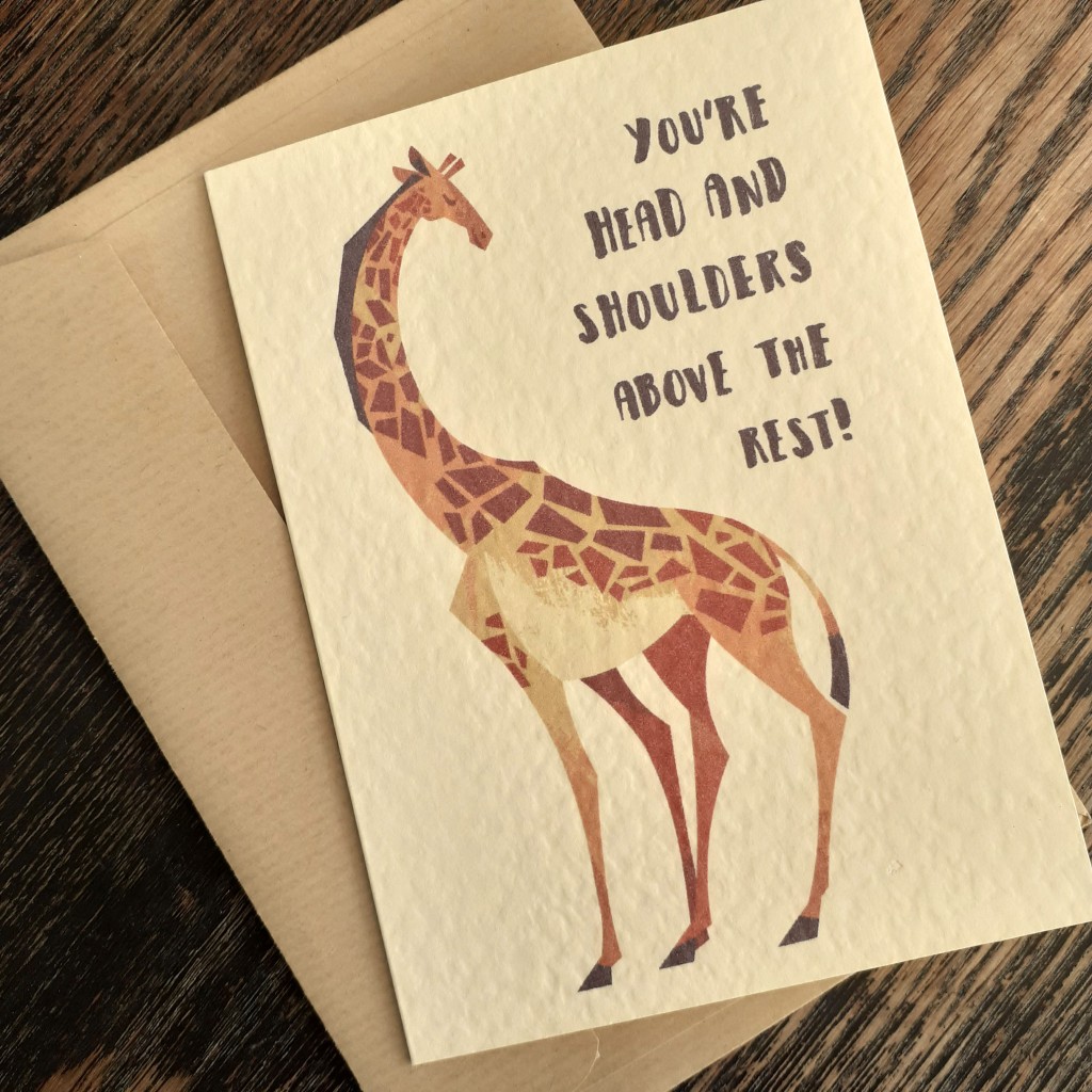
I made a cute (and perhaps even funny) animal illustration out of a quick sketch I scribbled down in trying to cheer myself up. I’ve not seriously looked at the subject in question before though, and I rather enjoyed looking at reference material for the giraffe caricature. I learned that there were many types of giraffe, which I suppose shouldn’t have been a shock. I boiled down the essence of the creature in my illustration.

You probably recognise the animal below from the long neck, the horns, and the spots. But! Did you know, giraffes actually have those camouflage spots all over their bodies? For ease of reading, there’s no need to adopt physical traits 1:1. Spots all over the body would have made the figure too cluttered. You have to be the judge of what you simplify and what you discard, when creating a cartoon out of a pre-exiting subject.

I know I’ll sound like a broken record for those who have read my more recent posts that contain my works, but this really is the last vector art I’ll be making in Adobe illustrator for the foreseeable future. I’m going to look at using different programs that I can make more experimental digital paintings in. The overall style will change in relation to the tools, but my sensibilities remain the same. I’m exited more than nervous to venture into Clip Studio Paint. It’s not an ‘industry standard’ but at this point, I don’t see why I shouldn’t use it to make personal work.

One drawback I found in using Abode illustrator for this mid-century style illustration was that I could never render enough elements to form a background unless said background elements lacked in texture. Obviously, I don’t use the program in a standard way (if there is one) but it was frustrating how slow the program would run if I began to use too many textures (or individual objects) in a piece. I’m lacking in skill when it comes to drawing environments, so I want to improve in that area, and moving to raster painting, I can draw with much more freedom.

I found the same digital image prints differently on varying card stock. It’s muted on this textured, cream card, but the image is more vibrant on a rougher, grey card I had on-hand. There are pros and cons to the characteristics of both card types mentioned. I’ve still yet to look into different card for mass printing from home. I am in the middle of researching those who stock card and envelopes for bulk purchase. I’ve gotten my hands on some free samples, to mull over the colours, sizes, and textures of envelopes. Testing paper for printing on… is much more intimidating.

It might be quite some time before I share any more polished work, given I want to teach myself digital painting, but I’ve been wanting to share some graphic design books here, and maybe other media and resources, too… who knows!

Good-Bye Winter – Hello Spring!!

No matter what, time marches on, huh? It’s already spring! I’m very happy about that, though. A change of season is exactly what I need.

I said a while back that I’d practice raster illustration – digital painting – and… I’ve not yet done that. Some time last year I did invest in Clip Studio Paint. Unfamiliar programs are always intimidating, not unlike new mediums, and since I’m in no rush to familiarise myself with the program, I’ve only drawn a little in it. I really should have made it a New Year’s goal to work in it and understand the interface and tools.

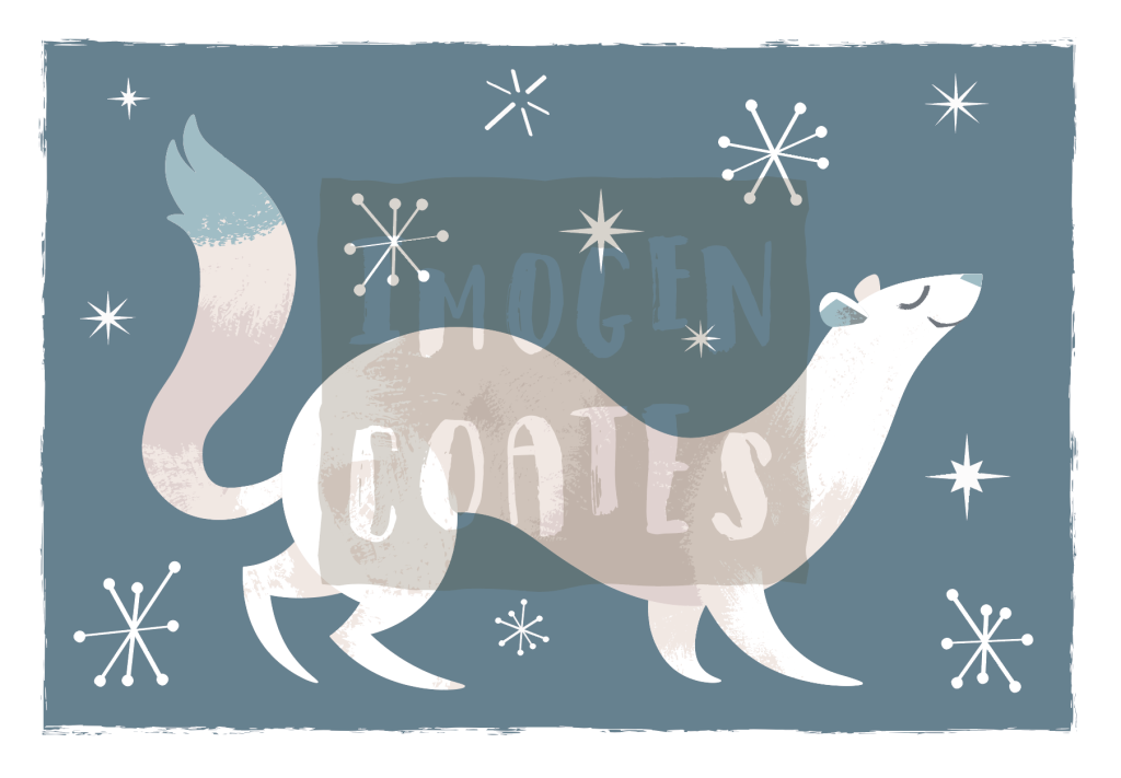
While it was still the cold and rainy winter, I made a vector illustration of a little ermine in the powder snow. You might not tell if I wasn’t to say, but each snowflake here is unique. I would like to print these next winter on cards, mayhaps.

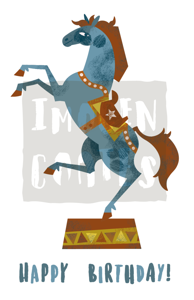
I dug into an older illustration that I’d used for risograph printing, because I still liked the full-colour image and I made a mock birthday card illustration out of it. I still have a lot to learn typography-wise, but it’s good practice. I want to make new purposely made illustrations for occasion cards.

With the weather brightening up, and even heating up, I’ll have more drive and energy to make!

Op and Pop Art – Malika Favre

It’s been a while sine I had written about a designer or illustrator. Today, let’s look at the artist Malika Favre. Favre creates artworks that incorporate the sensilbilies of op art (optical art manipulating the viewer’s perception of colour and form that often result in illusion) and pop art.

airline label
Cover illustration for Equality Highlights issue 18
airline label
Window display illustration for Bucherer

Favre has worked for many magazines as a cover illustrator, including, Vogue, Metropolitan Magazine, and The New Yorker. She has designed book covers for Penguin Press, too.


Personal Works

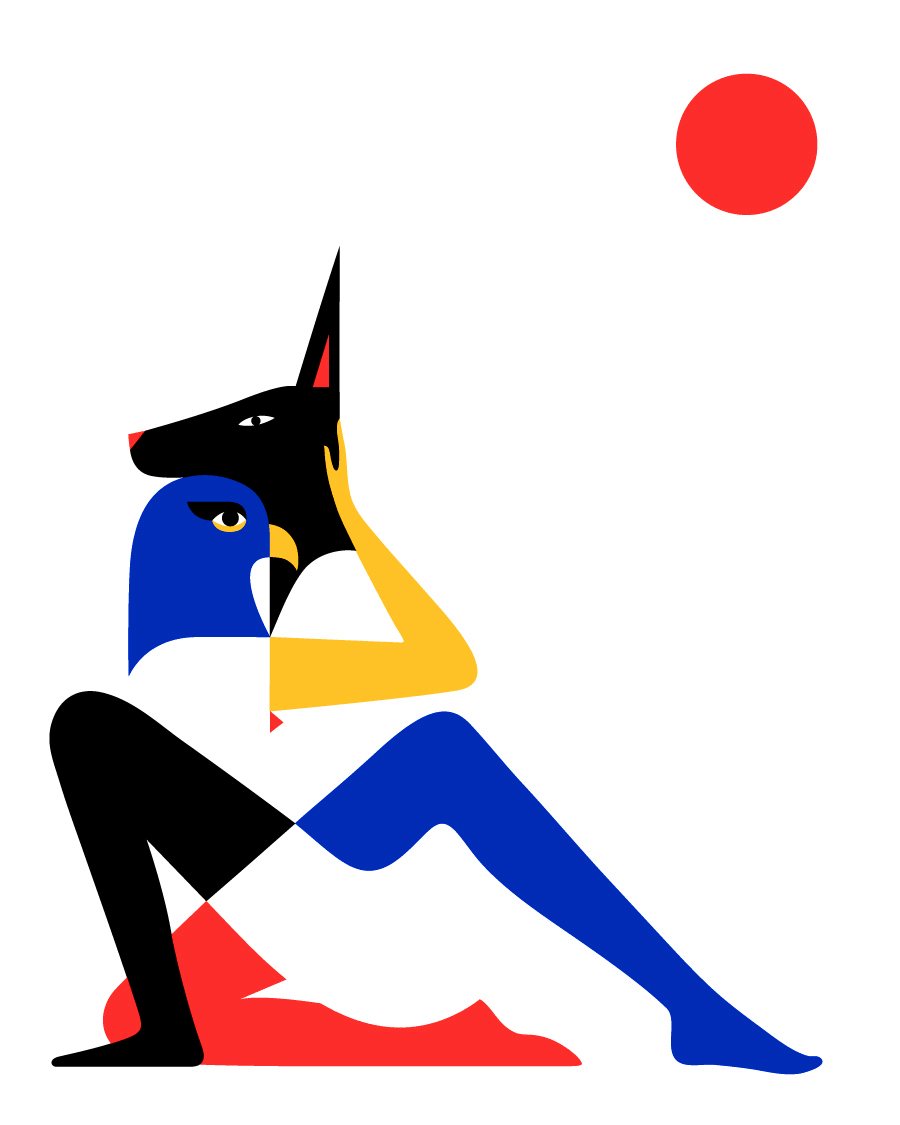
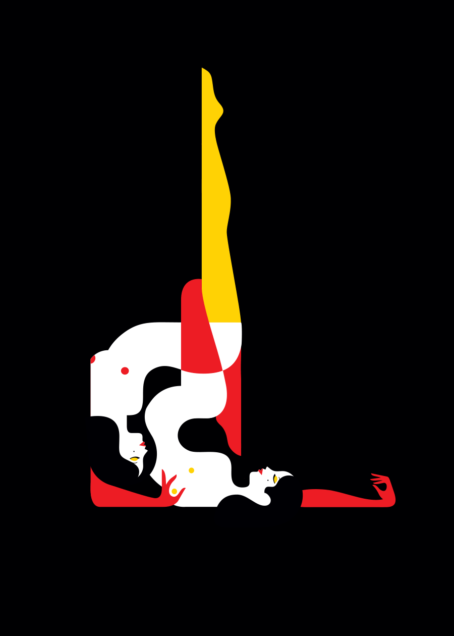
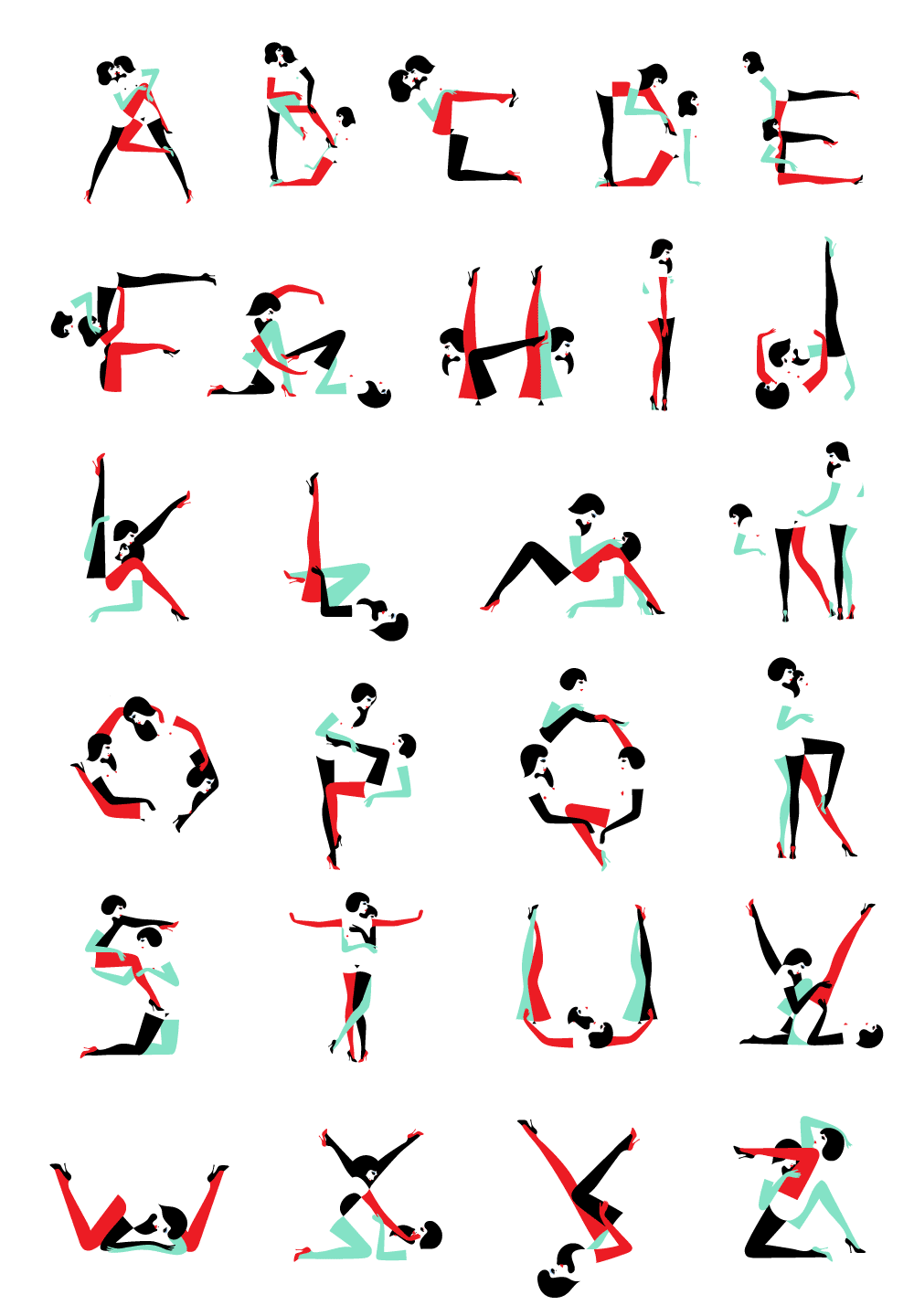
The few personal works that Favre offers as prints, are sensual and evocative. The confidence in line work, the vivid and emotive feel are sensibilities that are felt throughout her works. With the very limited colour palette, here you can see Favre pushing negative space.

airline label
Egyptian
airline label
The Kama Sutra
airline label
Alpha Pin Ups

Object Design

Let’s have a look at Farve’s design choices applied to physical media.

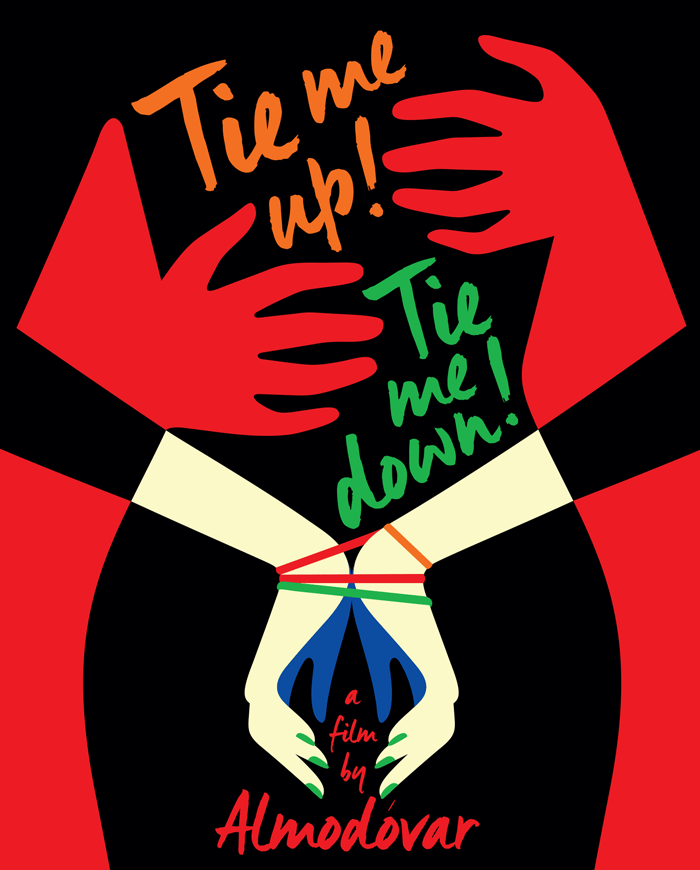
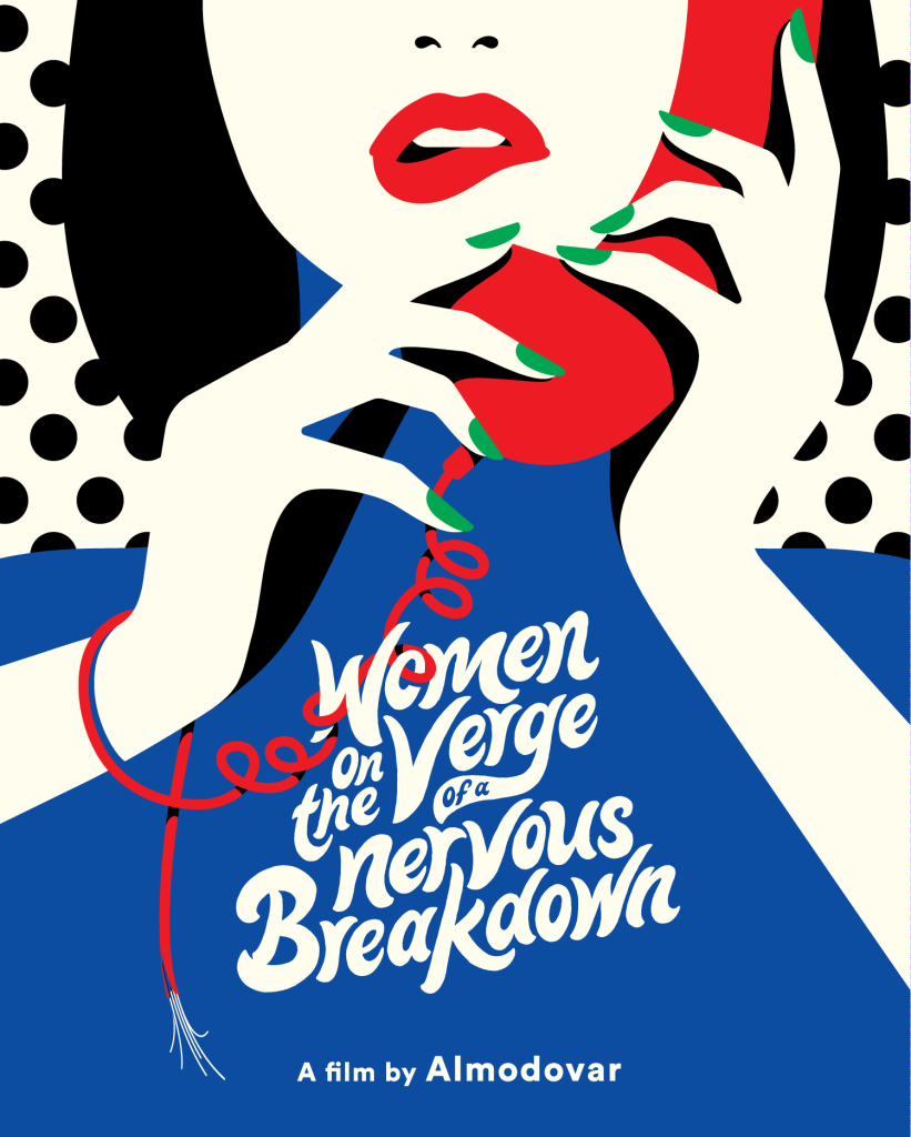
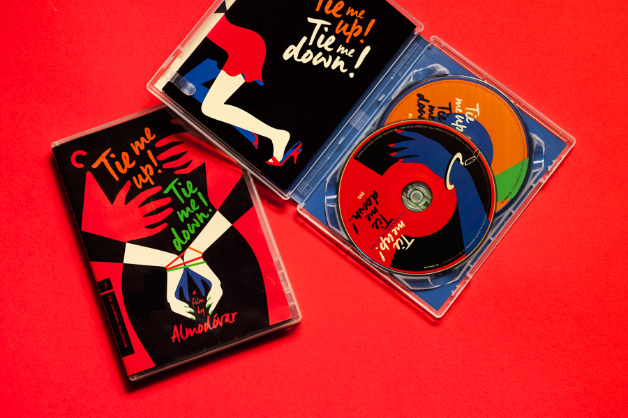
Below are DVD covers for reprints of the films Tie Me Up! Tie Me Down! and Women on the Verge of a Nervous Breakdown, Favre’s covers were made in 2015, and 2017, respectively.

For those who are already fans of Pedro Almodóvar’s films, I can see the appeal in owning these reissues with Favre’s slick cover and disk designs, but I feel that the illustrations would surely draw in new viewers, too.

airline label
Tie Me Up! Tie Me Down! DVD case, insert, and disks

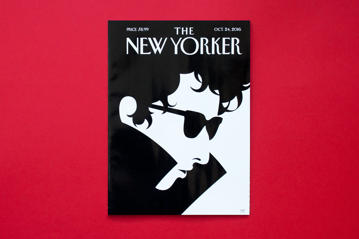
Favre’s also illustrated many covers for The New Yorker, and illustrated editorials for the same publication. Given the demographic of the magazine, the sophisticated and informed fiction, poetry, and articles are a good match for Favre’s sleek and precise artworks. The illustrations are not going to steal the readers’ attention away from the body copy, and instead elevate the overall presentation.

airline label
The New Yorker cover illustration, 2016
airline label
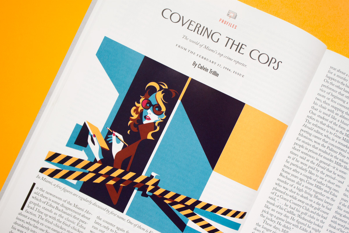
Editorial illustration for Covering the Cops, The New Yorker

Favre’s distinct style and work suits very much print media; magazine and book covers, editorial illustration, poster design, etc. Because the feel of these works aren’t chasing a trend, I don’t see these illustrations losing their charm in future years. As with any particular style, it’s worth noting that they work best with particular demographics and themes.

I am very much impressed with Favre’s use of colour – all of it is flat, leading to ease of reading the optical illusions. What characteristics within Favre’s work stand out to you, dear reader?

Lunar New Year – Tiger!

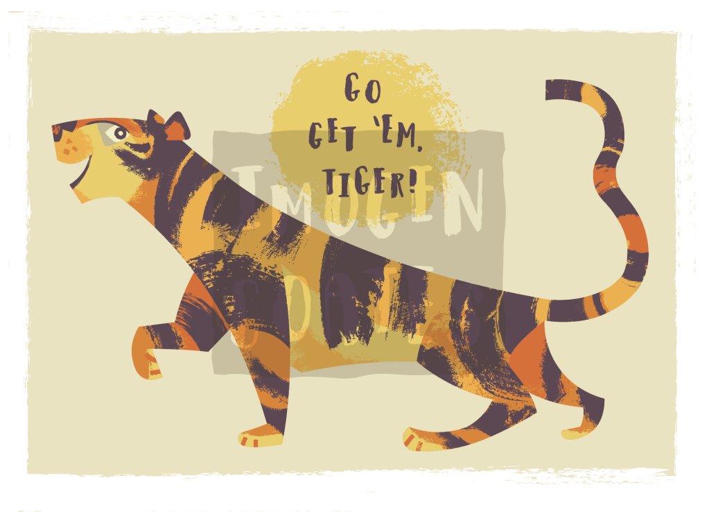
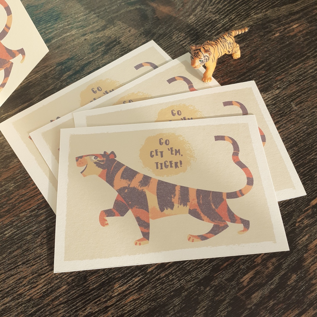
I’ve been test printing work at home to see how my digital illustrations look in full-colour. I made a new tiger illustration, which just so happens to be the Lunar New Year animal of 2022.

As I want to experiment with digital painting, this may be the last vectored illustration I make for some time unless I invest in the programs for it. I’m exited to learn digital painting, however. I’ll have more freedom in regards to texture and line.

Some of my work has been saved as pdfs for future printing as postcards or greeting cards; I’m very happy with these motivational tiger! I also made a birthday tiger graphic (with alternate text).

I still have a lot to learn in regards to typography, but it’s fun to experiment with different typefaces, and learn as I go. I suppose when I make future greeting cards, I’ll be revising my understanding.

So.. until next time… go get ’em tiger!!

Illustration – Musical Bear

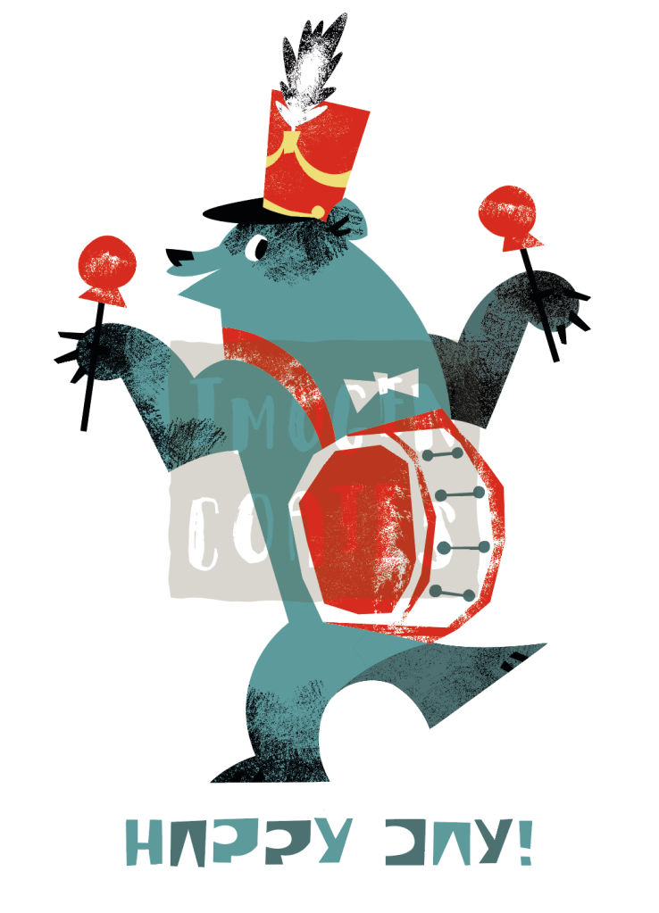
First post of the New Year. A little mid-century bear illustration. He’s having a grand old time jamming out the tunes!

I made this with the intentional limit of colours thinking I’ll try to print it as a Risograph at a later date. I’ll be happy if it turns out well, but most digital pieces will end up in a portfolio regardless.

I didn’t make any New Year’s resolutions or promises to myself – I never do. It’s not directly related to creativity, but just being honest with myself, and being kinder to myself is something that I am woking on. Always. I do, however, have goals to reach. It helps to set those.