It’s been a while sine I had written about a designer or illustrator. Today, let’s look at the artist Malika Favre. Favre creates artworks that incorporate the sensilbilies of op art (optical art manipulating the viewer’s perception of colour and form that often result in illusion) and pop art.
Favre has worked for many magazines as a cover illustrator, including, Vogue, Metropolitan Magazine, and The New Yorker. She has designed book covers for Penguin Press, too.
Personal Works
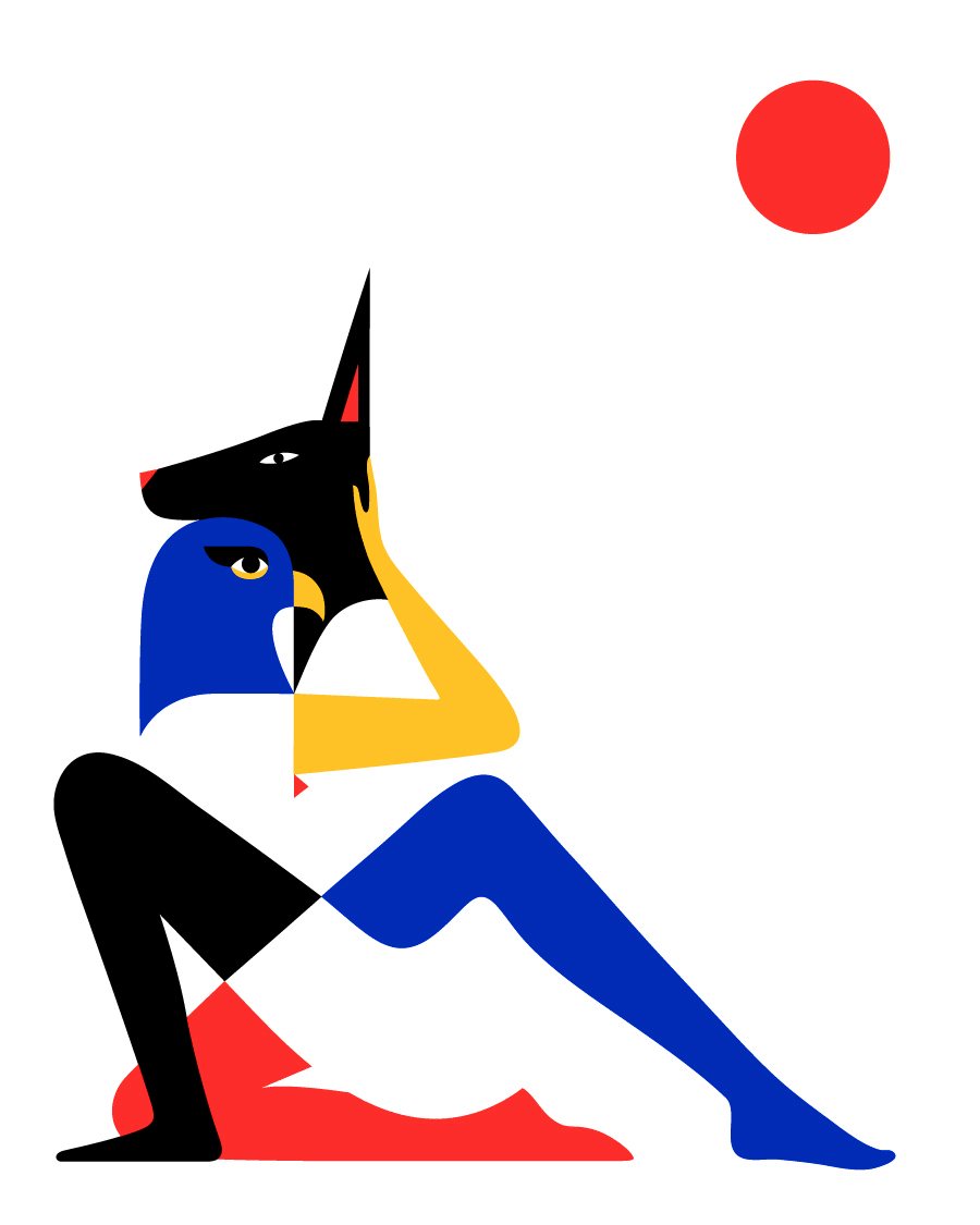
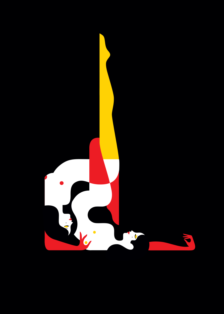
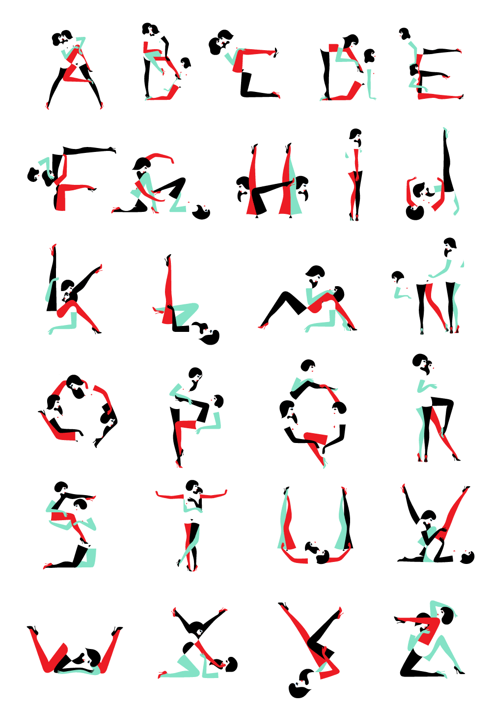
The few personal works that Favre offers as prints, are sensual and evocative. The confidence in line work, the vivid and emotive feel are sensibilities that are felt throughout her works. With the very limited colour palette, here you can see Favre pushing negative space.
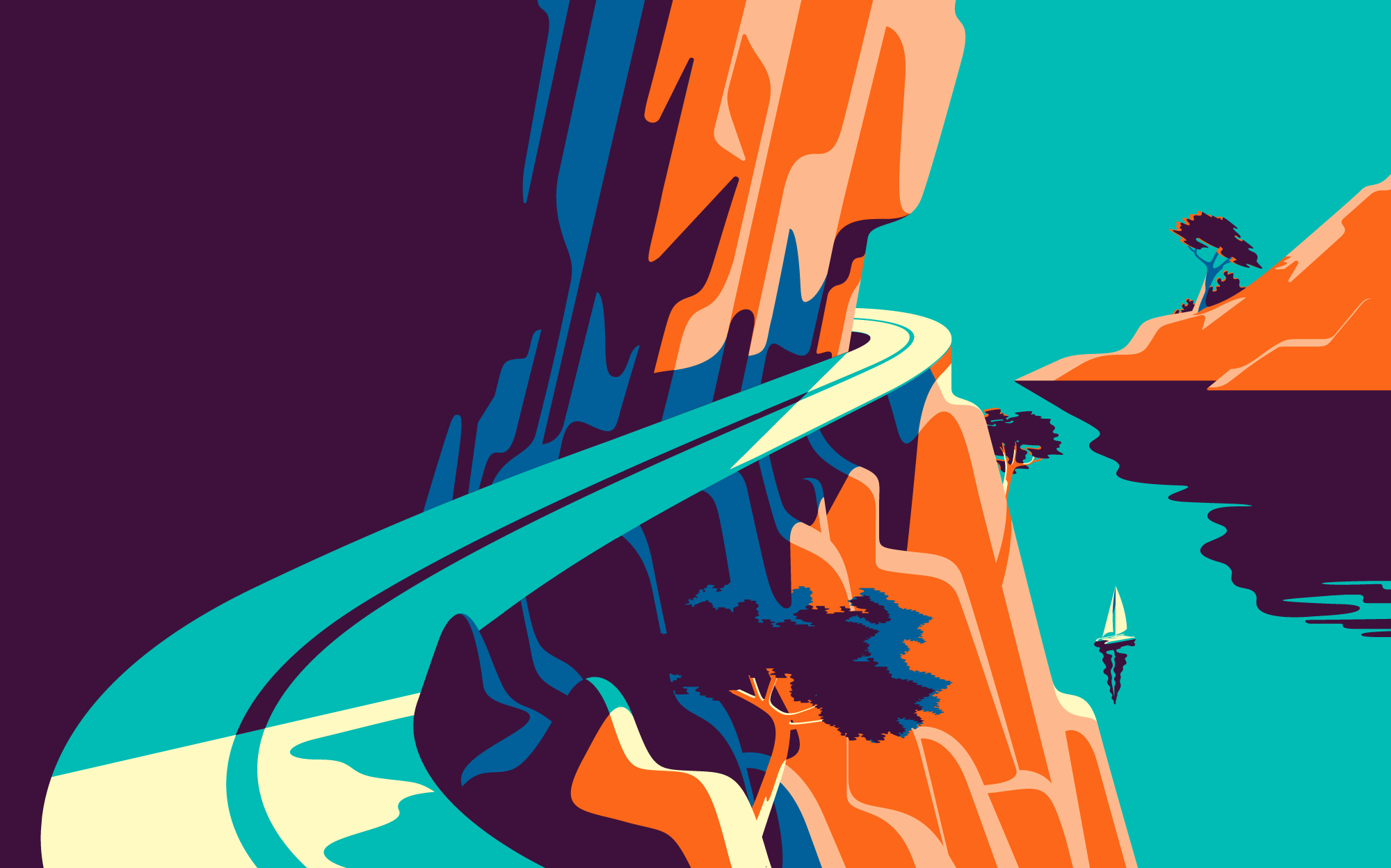
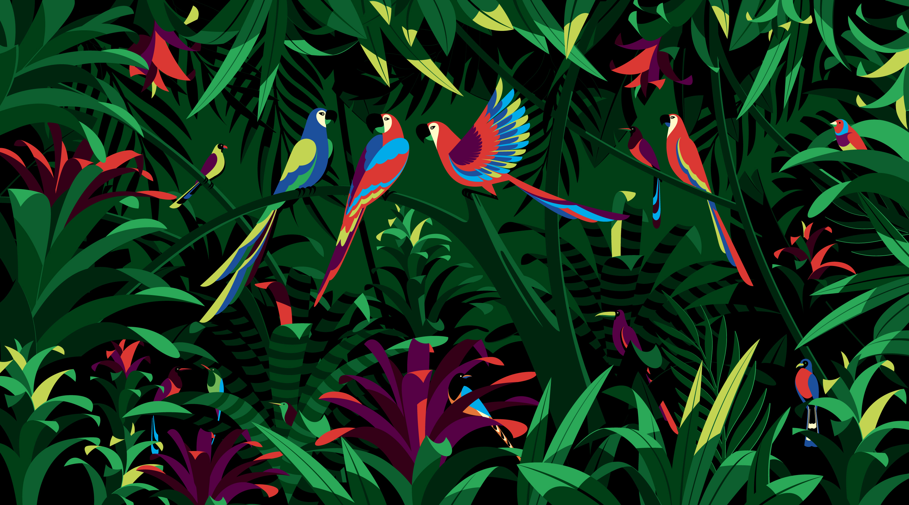
Object Design
Let’s have a look at Farve’s design choices applied to physical media.
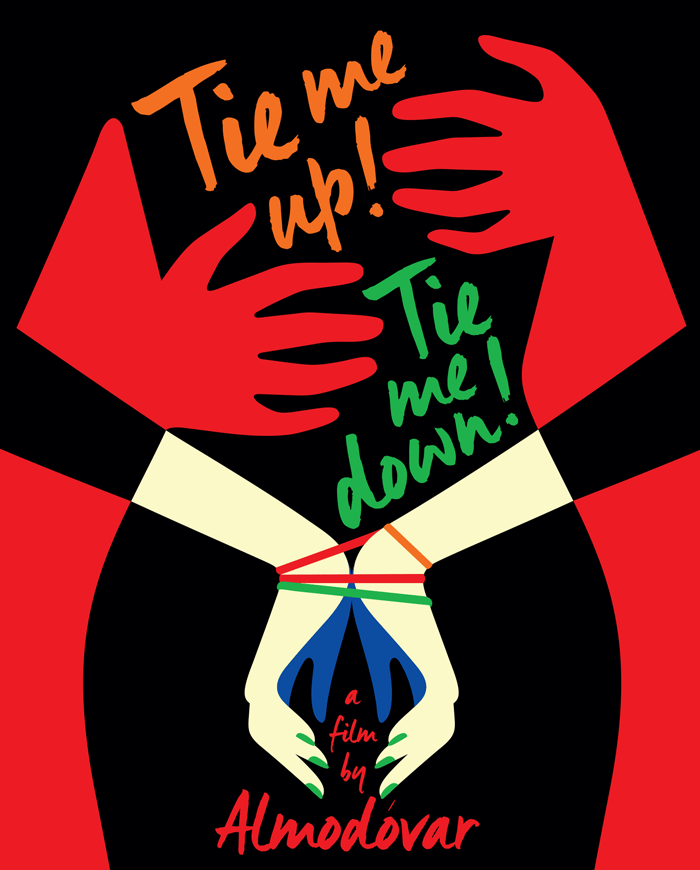
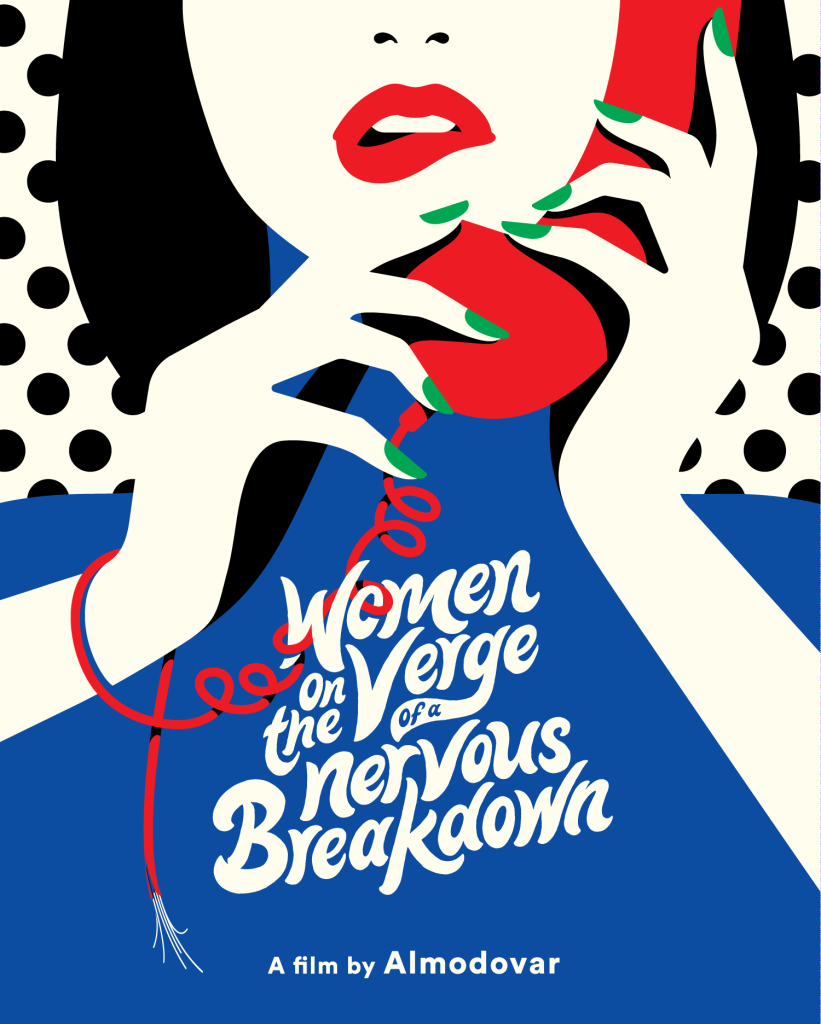
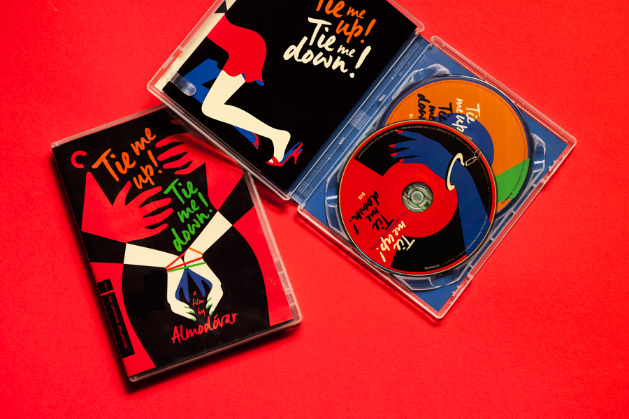
Below are DVD covers for reprints of the films Tie Me Up! Tie Me Down! and Women on the Verge of a Nervous Breakdown, Favre’s covers were made in 2015, and 2017, respectively.
For those who are already fans of Pedro Almodóvar’s films, I can see the appeal in owning these reissues with Favre’s slick cover and disk designs, but I feel that the illustrations would surely draw in new viewers, too.
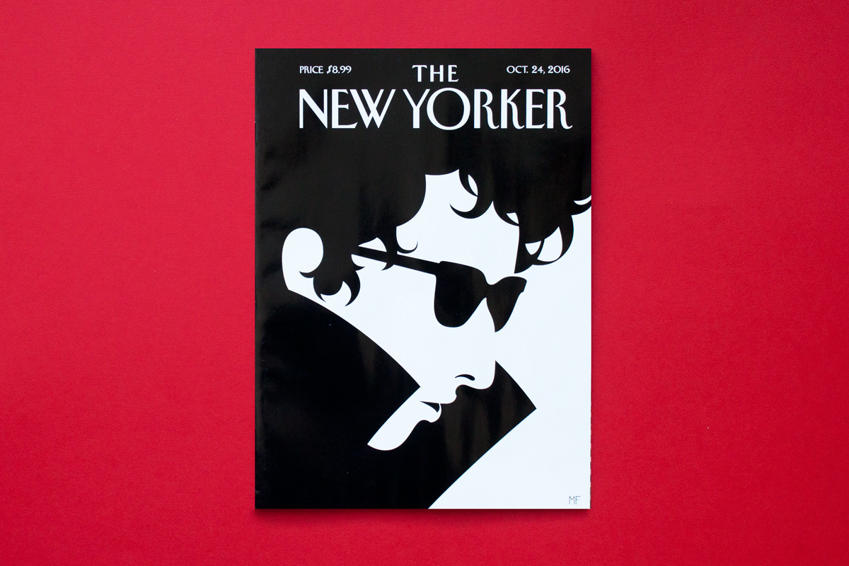
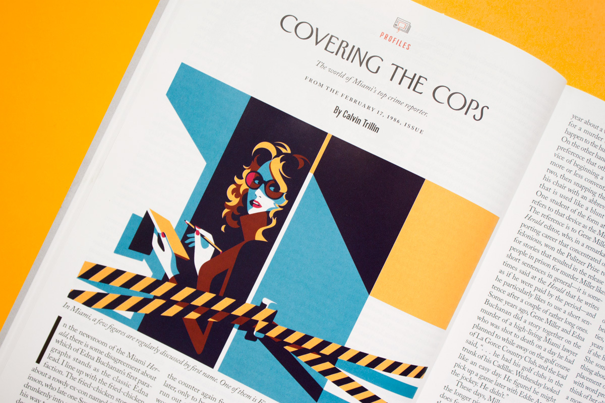
Favre’s also illustrated many covers for The New Yorker, and illustrated editorials for the same publication. Given the demographic of the magazine, the sophisticated and informed fiction, poetry, and articles are a good match for Favre’s sleek and precise artworks. The illustrations are not going to steal the readers’ attention away from the body copy, and instead elevate the overall presentation.
Favre’s distinct style and work suits very much print media; magazine and book covers, editorial illustration, poster design, etc. Because the feel of these works aren’t chasing a trend, I don’t see these illustrations losing their charm in future years. As with any particular style, it’s worth noting that they work best with particular demographics and themes.
I am very much impressed with Favre’s use of colour – all of it is flat, leading to ease of reading the optical illusions. What characteristics within Favre’s work stand out to you, dear reader?
