At the tail end of last year I had the idea of making downloadable stationery. I wanted to refine some of my skills in Adobe programs and learn some new ones. I had the idea of making weekly planners and letter paper sets – the latter being something not everyone uses nowadays. Still being on a mid-century illustration high, the designs I worked on have that feel about them. I’m sharing a some of them here.
Organisation is key to getting tasks done, so I wanted to make practical stationery to aid those who want to get organised, and benefit from writing tasks down physically. The compositions of the weekly planners are simple enough. I chose to divide a page into seven blocks – for seven days of the week – focusing on a countryside illustration. I made two sheets.
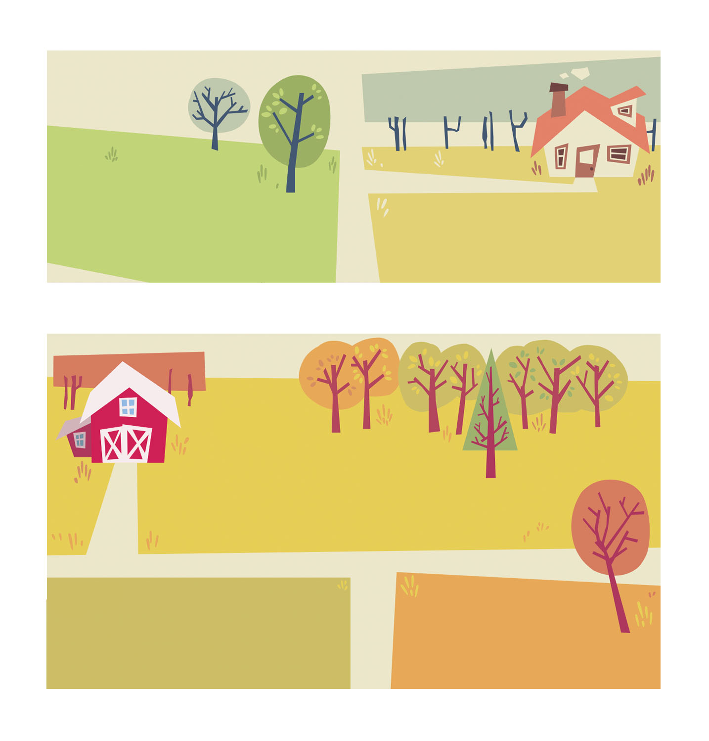
I think the weekly planner illustrations turned out very friendly. If I remove the text, they look like background assets ready to be part of a fuller, livelier illustration. I enjoyed filling them out with just enough details for interest, but balancing the empty spaces for the use of writing.
I think the composition of letter paper is much more straightforward. I made a lot of pages that were detailed around the corners or edges of the page, while leaving the centre free of distractions.

I don’t think I’ll be using the above template as a writing paper as the stylisation isn’t as playful as the other ideas I had for compositions and subject matter. The target audience for such a niche item is more likely wanting to use designs that are much more stylised and fun. But it’s worth keeping in mind if I want to revisit the composition itself.
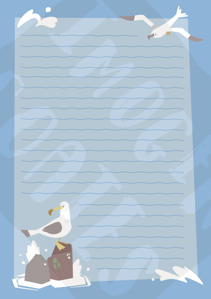
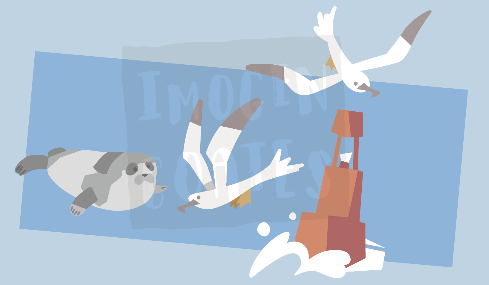
One set of letter paper I wanted to make was nautical – anything to do with ocean life or perhaps boats – so I made a few pages to go together as a set. I think having the nautical paper lined works well to reinforce the ocean waves feeling, but I can of course remove them. I do want to give the option to users to choose unlined paper to write upon.
In making a lot of similar assets for themed writing paper sets I have the choice to recycle some of the assets towards sticker sheets etc.
There are aspects of the digital stationary project that aren’t finished at all – I have some designs that need to be touched up, or pieces that I’m unhappy with. I have yet to decide on where to host or sell PDFs of the stationary. I really enjoyed making these even though I did find it trying at times. I’d say I learned a lot. While writing this up, I realised that I can even make colouring in and activity sheets if I think I can contribute something that isn’t already being provided by other services.
If for some reason I can’t move forward with the idea of downloadable stationary, I can add the designs I made to my portfolio for now. This year, I want to make a lot of things for personal growth and portfolio needs!
