I picked up a new book as I want to add to the small pool of design reference books I have. The book is called A dictionary of Color Combinations, and is published by SEIGENSHA. The small amount of text within the book is primarily written in the Japanese language, but the practical nature of the book means it is accessible to those who can not read the Japanese text.
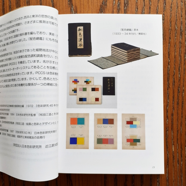
The contents of the book are sourced from the work of Sanzo Wada (和田 三造). Sanzo Wada created 6-volumes of colour studies (Haishoku Soukan) between 1933 to 1934 (in the pre-war Shōwa era). Sanzo Wada studied western style painting at the Tokyo School of Fine Arts and later worked as an instructor at the school. This book’s dust jacket states that he was a working artist of many disciplines; while he was a costume designer for theatre and movies, he was best-known for his woodblock artworks.
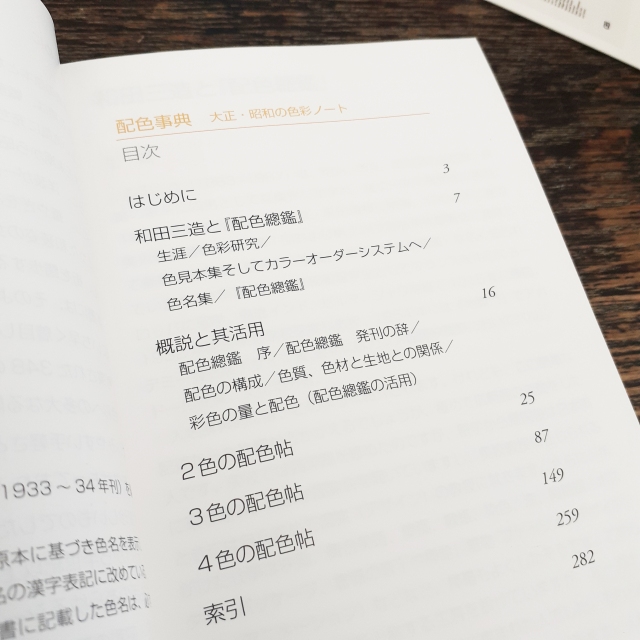
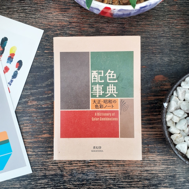
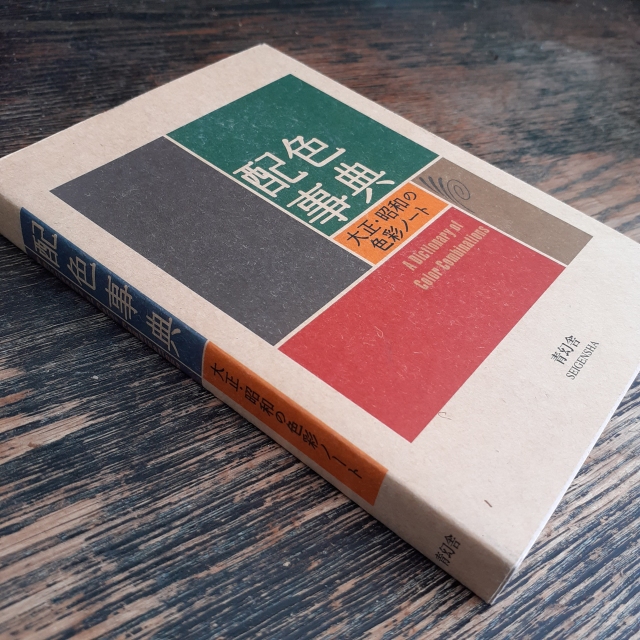
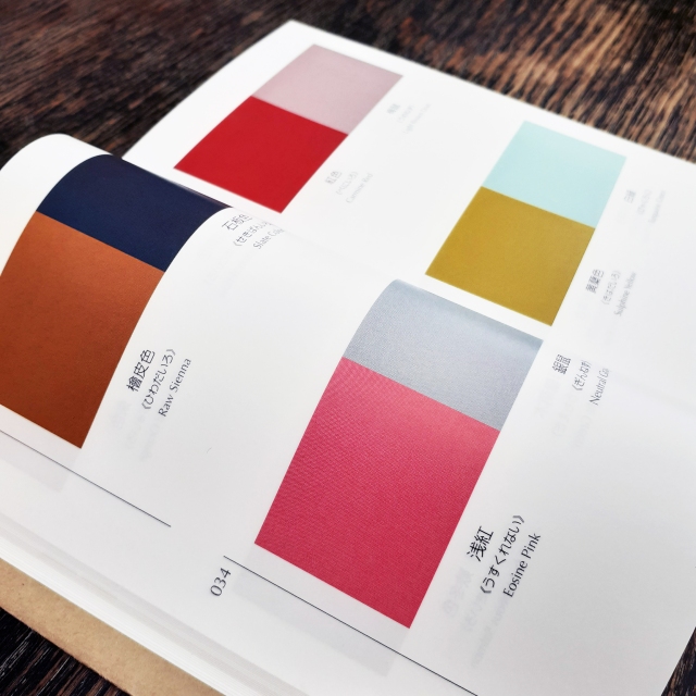
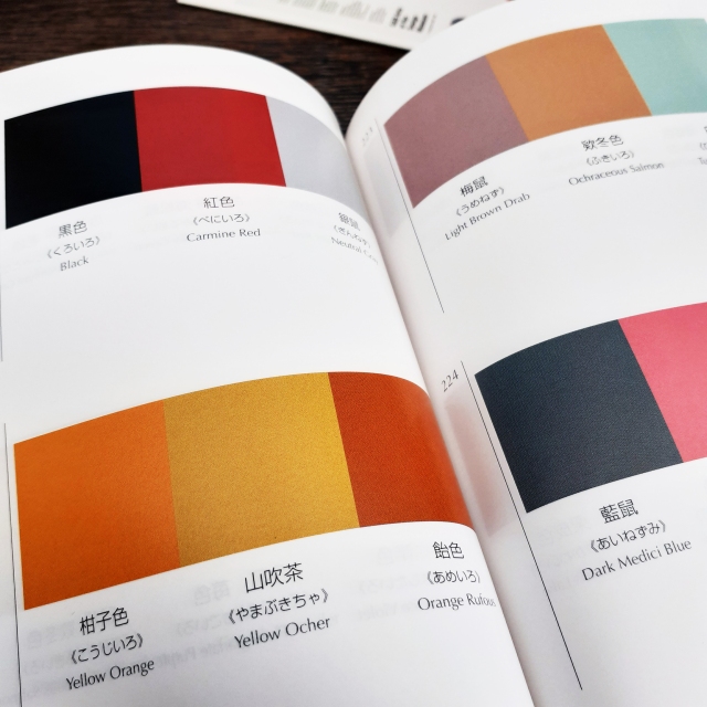
The book sports a thin brown paper dust jacket, and is rather small being A6 (so you could say it’s a ‘pocket-sized’ reference book). It’s very dense, and there are more than 300 thin, but glossy pages. Over 200 of the pages are dedicated to colour combinations (348 unique combinations in all). There is a section for colour pairings, and then three and four colour combinations. Each colour is given its Japanese name first, and then an English name.
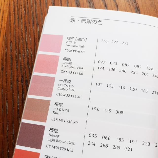
Even though the contents are from back in the 1930s, it’s clear that Sanzo Wada was progressive in colour theory studies, and the colours grouped together here will work to suit contemporary western sensibilities. I can imagine looking to this book when stuck on illustrative projects with mature audiences and certain demographics in mind. The books gives the CMYK (the cyan, magenta, yellow, and key/black) code of each colour towards the back. (The CMYK colour range is used for any design intended for print.) This is very friendly feature for those working digitally.
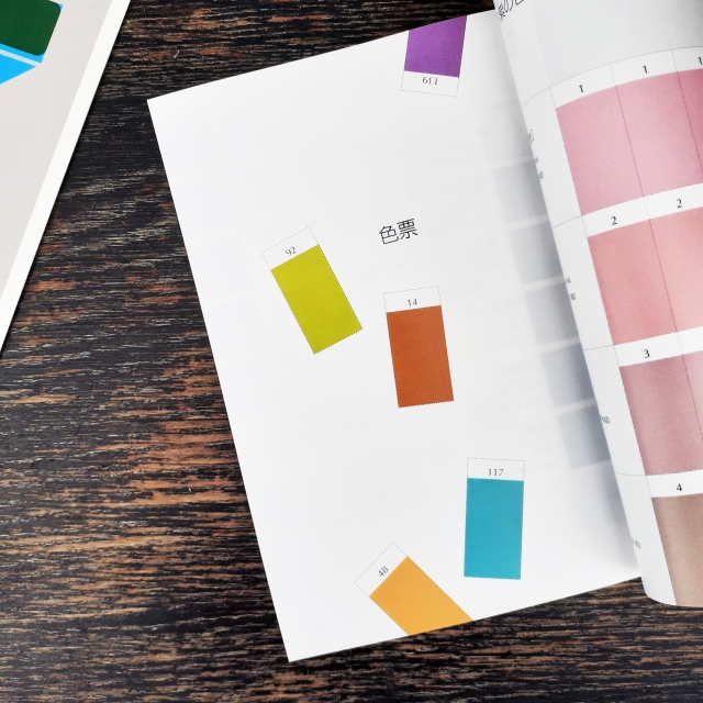
At the tail-end of the book are plenty of colour swatches in which one can cut out and make one’s own colour combinations. (I personally can’t bring myself to cut such a book up… but the practicality is a nice thought.)
The insides and usefulness of a design book is more important than its image, but this book happens to look and feel nice. (It’s actually a difficult book to photograph given how tight the binding is, but I hope the pictures I took showcase the contents and overall look well enough.)
If this looks like a useful book to you – for use in interior design, fashion, graphic design – then it’s good to know that the book has been in continuous print since 2010 and is not difficult to come by.
