Alongside the desired phone calls or video chats to keep up distance relationships, I’ve found myself both sending and receiving more postcards or letters to keep in contact with loved ones. A few weeks ago I ran out of envelopes to send letters to friends and family, so I decided to up-cycle some paper from around the house to make envelopes. I used an old copy of Creative Review – a commercial creativity and graphic design magazine.
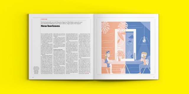
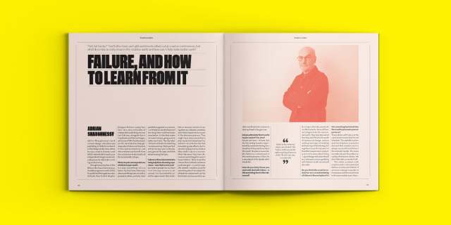
The insides of Creative Review are varied. The magazine covers the current visual trends, notable student graduate work, interviews from designers or creative directors, art exhibitions, the news on the latest popular media (films, video games, etc.).
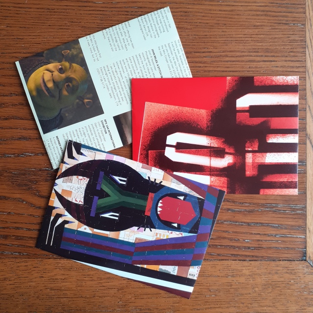
I was familiar enough with basic envelope nets to bash out some C5 envelopes in a short time. I used a popular culture review page, an art exhibition review, and a printing service advertisement to make radically different envelopes.
As I have already cut up my 2001 copy of Creative Review, here are a few images of the magazine’s insides of another issue (taken from their website). These are page spreads of of a 2018 issue, showing the magazine’s variation of editorial design.

A single page of Creative Review is large enough to make a single C5 envelope, with room to arrange the placement of the net. Part of the fun is figuring what imagery or text would look most exiting on the envelope. Even the advertisements can hold some interesting photos and design!
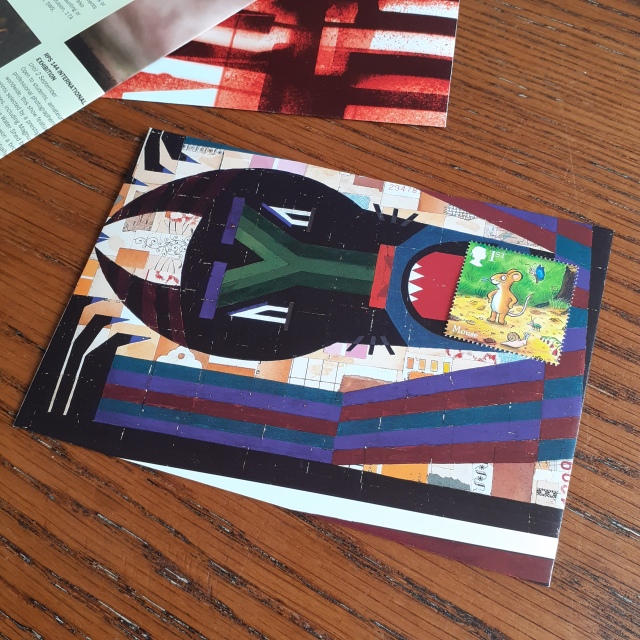
This envelope is my favourite of the three shown here. The placement of the stamp looks as though the ‘design’ is interacting with it. It sparks ideas for illustrated envelopes.
I’ve mentioned my affinity for stationery design (particularly illustration) in the past, and that at some point I’d like to try my hand at designing some letter writing sets. There’s definitely something to be gained from experimenting with the materials (and imagery) that make up mundane objects to generate new excitement in them. I received a positive response to these envelopes when I sent them out to others in the post!
