In January, the company Siemens approached graphic design students for logo work. Presumably because the belief that students face less creative constraints due to their freelance status. (But boundaries are set by briefs, regardless!) The brief presented was a challenge for me, with highs and lows.
As with all clients that approach you, it’s important to understand where they are coming from. I needed to do a lot of reading up on the company, as I knew next to nothing about the history of Siemens or the specific line of work that the logos were requested for; their off shore wind farms.
I did end up researching what the daily routine of an engineer is, what environment they are working in, the clothes they wear, and the equipment they use etc. But the brief strained the importance of the place the work was at. The brief also made it clear that the The logos were not for the farms themselves, but rather the people who work on the farms. The workers were keen to wear emblems that reflected themselves as a ‘team’.
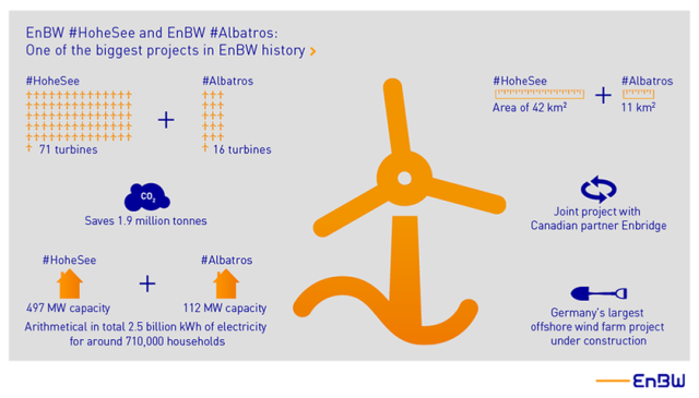
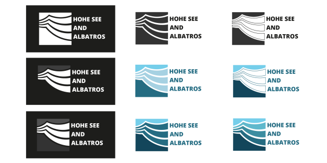
The specific farms that required logos were Hohe See and Albatros and Horn Sea Two. The most important of the key desirables was to create a symbol that represented the men at work and their ‘team spirit’. The workers were very interested in emblems such as the ones created by Bands FC (Football league and Album cover crossovers). This element of the brief was not received too well by a number of students (for being restrictive from the get-go) and many approached the brief in other directions initially.
I even approached the brief by attempting to create logos that shared visual elements (shapes or pattern) to keep some consistent identity across the two teams. The decision to explore this was made concrete after looking at logo work by Pentagram for MIT Media Lab. This approach was not well understood by the client, and I understood that they disliked it.
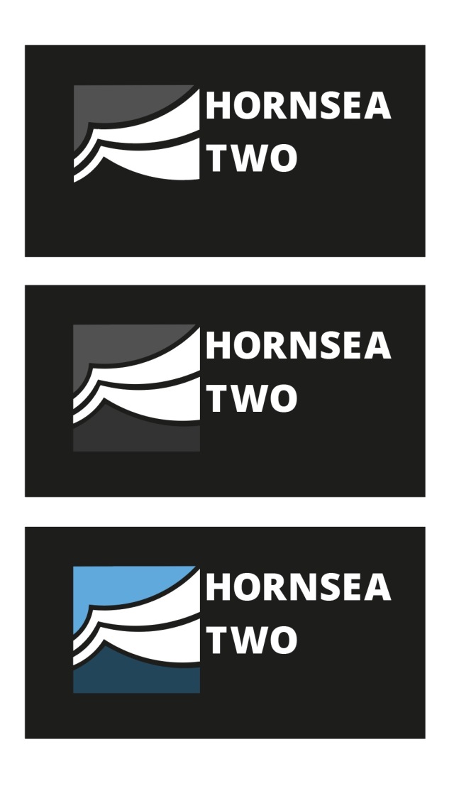
When I presented pencil scamps to the client, it was very much a case of straying too far from the client’s wishes, and my scamps were not meeting the goals. I had in mind a more conservative and corporate logos – ones that work great in monochrome, and on any scale – ones that could be easily replicated on clothing, letter heads, stationary etc.
Versatility of the logo was something that actually wan’t a necessity. It wasn’t stated in the brief that the logo would be for anything more than ‘personal use’. But it also wasn’t stated that the workers would be the only ones to sport the logo either. I had drafted and crafted a number of logos thinking they’d have to adhere to the general rules of logo design.
I experimented a lot with the pen tool and manipulating the lines ever so slightly to get very smooth curves in some of the logo concepts. I was really happy with the vague images of the logos above – I thought that because the viewer could interpret the lines as they wanted the logo could represent what they want. Is it the wind, is it turbulent waves? It’s what you make it.
The abstract angle is the wrong road to travel for this particular client tough. They were less enthusiastic with examples from students that were a less direct answer to the brief. What was demand was something ‘simple’, something ‘obvious’. And I can admit that it was deflating. It took a lot of potential avenues out (experimentation, and fun). But it just means I had to attack the problem from another angle. I did find it difficult to get exited over the sports logo direction, and don’t feel that my best strengths are able show through.
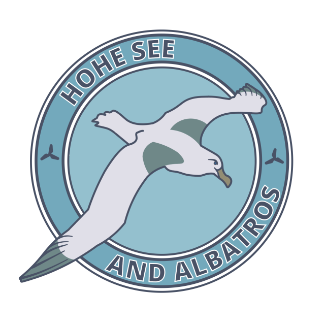
I returned to looking at the issue of providing the client with a crest-like logo. I drew many new scamps focussing on the albatross and the wind turbines. The sort of logo work I ended up vectorising became more of an illustration. (It also wound up looking a lot like a pre-existing Football emblem, I later realised.) Arriving at this conclusion, I feel that the brief really wanted a illustration from the start; not a logo.
I was given pointers by a tutor to help ‘modernise’ the feel of my first digital attempt of a ‘sports-inspired logo’. Varying the line width of the rings and removing the lines around the type gives the image a more contemporary look. It was desirable to remove the lines from the bird itself. I added a SOV vessel and wind turbines into the sea.
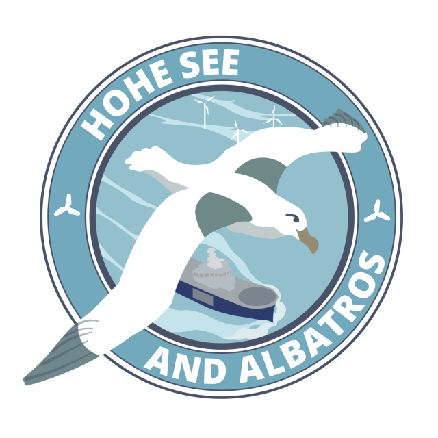
The logo as above does not function (or read) well in monochrome, however. This is because this logo was not initially conceptualised as a black-on-white mark, and is relying on a lot of colours and lines to communicate to the viewer. Without colour, it suffers a lot. (Believe me.)
I had wanted to work on this logo more and refine it with the aforementioned details before presenting digital logos to the client, but I was occupied overseas and busy with a work placement before I realised the time to pitch had arrived, and I hadn’t the program to do so. Since I wasn’t present for the presentation of student works, I do not know the outcome of the project. I would have liked to have heard some feedback on the vectors of my scamps that were dismissed beforehand, and the opinion of the emblem-like logo that was made closer to the client’s wishes.
Looking back on this project, I feel proud of the progress I have made recently using Adobe Illustrator, and how fast I can move when I need to. I feel happy with my more abstract symbolic designs even if they are not going to be utilised – they were genuinely enjoyable to craft.

An interesting journey, i am sure the clients didn’t understand what they genuinely wanted, had a hashed together idea, but not appreciation of the necessary detail they didn’t provide in the brief? I rather liked your final design, very easy to look at and yet sufficiently self explanitory without being over detailed. Take no notice of me though, I’m even worse than the client at expressing myself.
LikeLike
Thanks for your comment.
I wish the client who visited was clearer from the start that only the staff on the farms would wear the logo on their shirts and that it wasn’t necessary for the graphics to function on letterheads, or to be printed on hard hats and hi-vis jackets etc. as a monochrome logo would. I had wanted to hear from the men at work who were sent the students’ logos last month to know what they thought, but now I’m not so bothered (and there are more pressing matters). I have a better understanding of how to use this tool and that tool and so on in Adobe from just chipping away at these pieces, and I can still keep the finished logos in my portfolio.
LikeLike
Pingback: WKL200 – Reflection (02) – Imogen's Student Blog