Visiting the campus library for hands-on research on print – on magazines – I borrowed a couple of the journals that interested me due to the contents, the materials used, and editorial layouts, and I will share photos of those journals, too.
(Just bear In mind that the old phone I’m using to take pictures… is on its way out.)
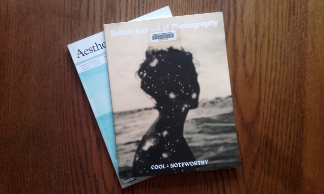
The two magazines borrowed are a copy of British Journal of Photography, and a copy of Aesthetica.
The following photographs are of the December 2019 edition of British Journal of Photography, titled Cool + Noteworthy.
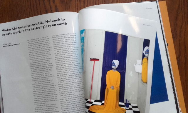
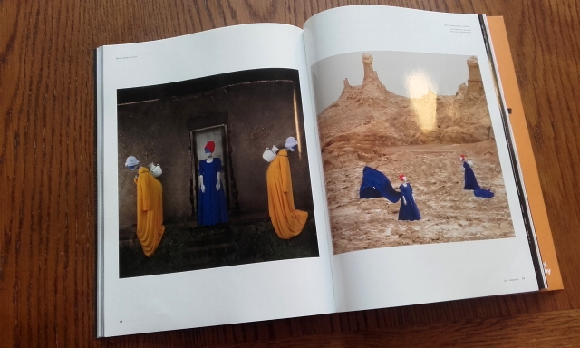
The heavy, glossy paper used in the centre of the British Journal of Photography adds value to the object; I can tilt the book and enjoy the light’s changing reflection, I can run my fingers over the soft surface, I can listen to the sounds the glassy pages make as I turn them.
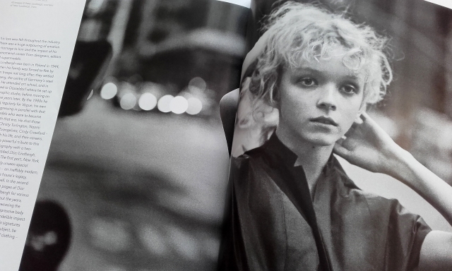
The articles are all laid out in grids with the text aligned left. The general layout is restrained, or reserved.
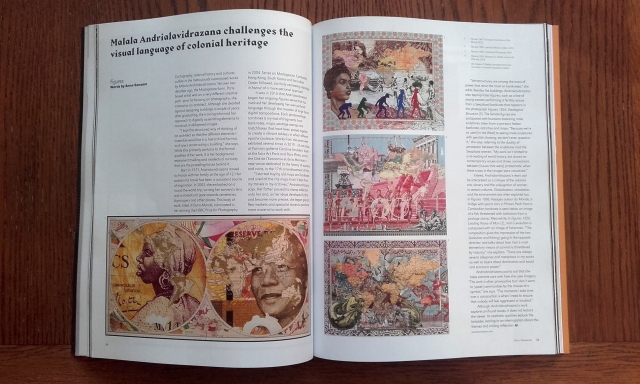
The following photographs are taken of Aesthetica’s June/July 2019 edition.
The two-page image spreads are numerous in Aesthetica, and I’m trying to imagine how they’d display on-screen. There’d be a lack of fold in the centre of the page, of course, and I feel that the small loss of image in the centre of the page in print is a characteristic specific to print that would be somewhat missed in a digital format.
Looking at pages with such large images makes holding the physical book so rewarding. I am reminded that the copyright of an image is different than copyright of text. Many copyrighted images can not be printed freely without consent.
There are no excessively glossy pages in this Aesthetica issue; but the pages are a decent thickness. This magazine is much denser than British Journal of Photography, being 162 pages long, than the Journal’s 98 pages.
The dimension and weight of the physical magazine is something that a digital edition can’t recreate. All sorts of material read on the same hand-held device will feel the same size and weight. A reader is removed somewhat from an on-screen book as there is less touching involved.
Next, I want to research some magazines that are exclusively published online and see how they show off their strengths (and weaknesses) through specific characteristics that are bound to the screen. It’s only just to look at the counterpart to print and give credit when due.

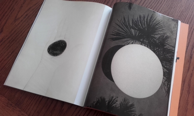
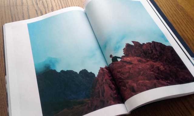
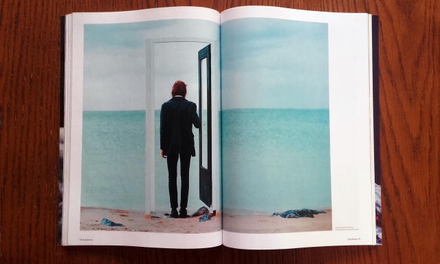
More artwork by Sanja Maruśić, from Flowers in December, 2016, the photograph is mesmerising, and reminds me of Salvador Dahli, there is one print he made of a window, through which can be seen the sea, it feels almost as it the sea is about to pour into the room through the window. This photograph evokes a similar sensation of apprehension in myself. Its fascinating.
LikeLike
Girl At A Window, from 1925, this is the painting by Salvador Dali, that i referred to in my comment before.
LikeLike
Thank you for your comments Alison. I had a look at the Salvador Dali painting… The other artwork by Sanja Maruśić shown here reminds me of Caspar David Friederich’s painting, “Wanderer above the Sea of Fog” (1818)… except the mountains shown in Sanja Maruśić’s work seem to envelope the figure than yield to them. The double pages that the pictures are printed on really help sell the scale of the pieces. It feels good to hold the journals and pour over the images.
LikeLike