Although I have already written in detail about the poster brief, sticker making, and risograph prints that I made elsewhere on this blog, I want to write up my thoughts on the Practice Enrichment module as a whole now that I have been given feedback.
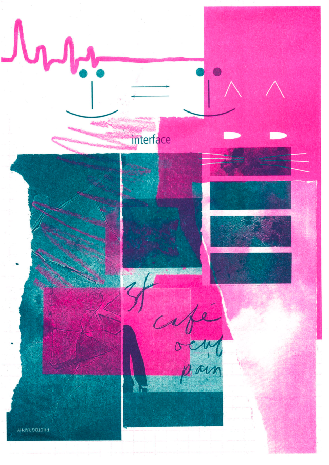
I’d admitted previously that I had difficulty with the risograph session – getting a composition together – but in the end I sourced my images from magazines and made a pleasing enough image.
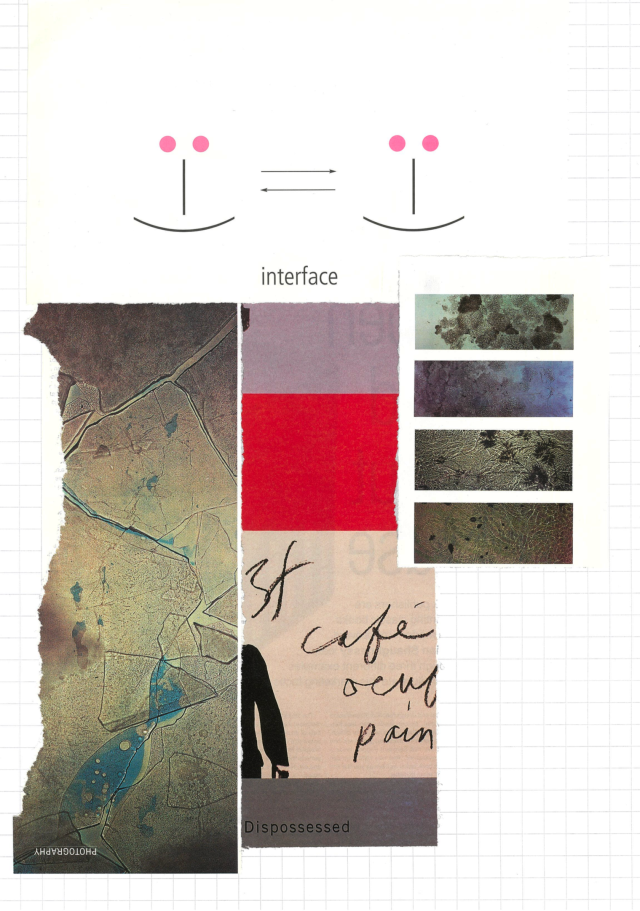
Only 7 final images out of the run of 10 were of a good, consistent quality. But I think that’s a good number and I’m eager to try my hand again at risograph printing. With enough trial and error, I imagine that I could create some very pleasing work.
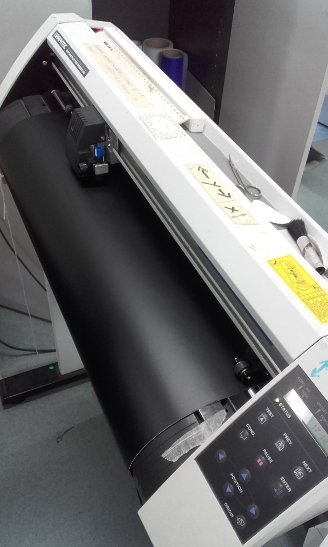
I think I need guidance to go though the method of creating decals again. The workshop was s quick; but through practice, the task should become easier. Creating a crisp and solid graphic that performs as you want is the hardest part; printing it is a technical process.
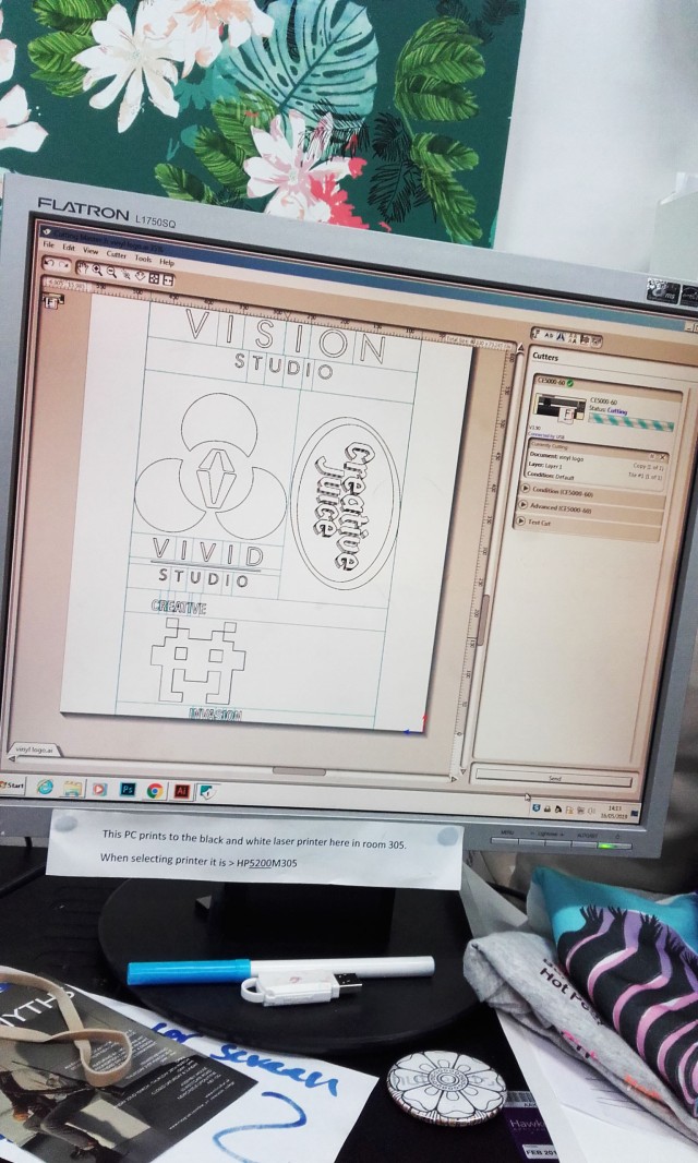
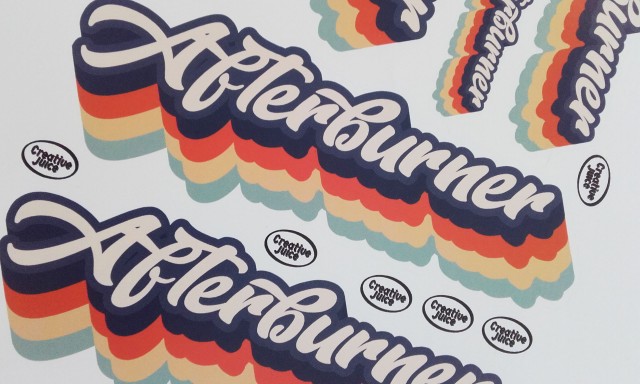
The vinyl graphic needs to be in monotone; although a finished multiple colour vinyl is possible, if the work is made of different, individually printed layers. My Creative Juice logo was simply black. The work has got to be a vector in order to work with the Cutmaster 3 program, which sends the data to the vinyl cutting machine.
Sticker-making felt a lot simpler a process. As long as the graphic is sharp enough to print as the desired dimensions, it doesn’t need to be a vector. I used programs and technology exclusive to the creative industries’ department. The most important specific to remember is the cut-contours’ line with of 0.25.
With the feedback that I have received, I am happy with the results. I am encouraged to push on and keep up the momentum and drive to better myself, to continue learning at my own pace to become a solid graphic designer.
Reflecting on this past academic year, I have achieved a lot, learned much more than I had thought I would (or could), and I intend to keep it up. And there’s so much more to learn when I return in the autumn.

Okay, my second attempt🙂: I find myself drawn to all designs in advertising, be they products, buses with cinema adverts, posters on billboards, book covers or album covers; indeed the height of the 70’s album covers for long play records was probably something many including myself cared about from a collectible perspective as much as the discs (lp’s) they contained and protected. There was a tactile magic felt upon holding such albums, and the artwork and design was widely remarked upon by people of that era. Now I’ve learned so much through your blogs about your experiences in using different methods, or machines, tools, to produce this cornucopia of printing; creating, graphic art and designs, and I begin to appreciate how cleverly constructed the designs over the decades have impacted on the beholder. Our emotions, or psyches are responding to those combinations, uses of colour, structure, and balance or deliberate placing of hard or soft images, in fact here I struggle to express myself, whereas you so articulately convey these details to us. So, thank you Imogen for sharing it all on your blog. I believe we are each either attracted or repelled by what we see, or worse, we are indifferent, unresponsive. The aim/responsibility of the creator of such pieces of art, is surely to achieve the desired response in the beholder, it’s that person’s skill level that may elicit such response, a
unless the beholder is without the ability to “feel” a response, for whatever reason. We also may react individually to what we see according to our own life situations.. Perhaps not all beholders of art can feel the same response, but understanding what we see versus how that understanding triggers an emotional response will be different from person to person. Okay, enough of my ramblings. Thank you for sharing the various thoughts you do. It’s always interesting and informative.
LikeLiked by 1 person
Thank you for sharing your thoughts with me, Alison! Always appreciated! …I have heard about how collectable long play records and their covers were. The size of a record cover is far bigger than a CD cover and thus one can appreciate the cover art better. I have never collected a CD for its cover. I have not bought any physical music in some time (thanks to online streaming).
“I believe we are each either attracted or repelled by what we see, or worse, we are indifferent, unresponsive.” is a very astute observation. The audience also needs to have the capacity to engage with the work, wether it be emotional or intellectual. A nonplussed audience will kill a creation. Advertisement is tailored to the target audience to counter the chances of “falling flat”.
You can argue that someone with more life experience will surely be moved by an image or piece of music than someone yet to live though many experiences. Returning to certain media from childhood, sometimes, I feel more of an impact by some imagery and scenarios that I didn’t think much of as a child (because I couldn’t fully understand them – sometimes because I hadn’t experienced a particular situation). …But entertainment is a different beast than advertisement (not that the two don’t have connections)!
LikeLiked by 1 person