Another 1-day brief delivered by our tutors. Students were asked to create a two-colour (A3) Risograph printed poster. Blank Poster’s word prompts would define the content, and we could later submit our work to the website (for exposure) if we wished to do so.
The process of Risograph printing is a technical ordeal. Risograph printing is an environmentally friendly, unique printing method which uses a special Japanese printer. It could be compared to the largely obsolete technology of a Mimeograph; ink is pushed though a stencil.
A Riso printer uses soy based inks and masters (which are essentially stencils) to produce a unique set of prints. A master is copied from whatever’s placed under the printer’s glass.
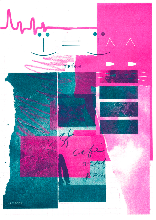
While only a single coloured image can be printed at one time, more colours can be layered onto dried prints (overprinting), and will produce new colours from overlapping ink. As can be seen in the image above, I overprinted and ended up with nice, muddied pinks. It’s actually very difficult to capture the brightness of the fluorescent pink in a digitised image!!
If I wanted to avoid creating new colours, I would have had to ensure that no patches from either layer overlapped; the knockout technique.

I was unsure of making a digital illustration, and thought to pursue an analogue composition. I had great trouble with this brief.
Though I struggled with the drive to create a composition, in the end, I did make an analogue piece of art. I scoured the magazines that we had in the studio for source material to make two collages.
My inspiration or influence here? … fine textures and close-up photography. Interaction; intimacy. Although I much prefer an artwork to speak for itself, and like the viewer to interpret the piece however they wish to.

I really liked that the fine textures within the images I had used were emphasised in the photocopies. The machine’s glass was a little dirty and left extra marks on my collages, but in this case, I think they add to the overall aesthetic.
I really appreciate that the Risograph print has similar visual feel to a conventional silkscreen print – each print is unique – though the process is quicker, cheaper, and results in less mess.

One of the most exiting elements of Risograph printing is that you’re essentially “working blind” and the final outcome might not match your expectation exactly. The finished work could be an unexpected result. It could be better than your expectation!
Not all of the details from the photocopy carried over to the colour prints. I lost some cool detail in my collages, along with most of the background paper’s grid. It’s good to spot these happenings now, and remember them in the future.

You can see from the above image (left) that each print is unique in how the ink is pushed through the master and how it takes to the paper. My work did not suffer any print marks (uneven printings of heavily-inked areas) or marring from the machine’s “pick off needle” which can leave scratches (needle marks) it does have some light track marks (yes, marks not dissimilar to the marks of an automobile’s tyre tracks) at the top of the page on the pink layer.
Upon reflection, I very much enjoyed the exercise and I am pleased with the outcome. I want to take advantage of the Risograph printer we have in the design department. I want to make personal illustrations and experiment with digital image making in my spare time, too. If I ever get very well acquainted with the Risograph printer, I feel that I can make ace analogue illustrations with a bite I can’t otherwise produce traditionally.

Pingback: NCI404 Feedback – “Through perseverance than strength.” – Imogen's Student Blog
Pingback: Zine Pickup – INFERNAL – Imogen's Student Blog
Pingback: Personal Project Work – Test Printing – DESIGN WORKS