I have decided to spend more of my free time working on building up digital artworking skills. When it comes to using Adobe Photoshop and Illustrator, I’m but still a tyro. I spent a short time manipulating text in Illustrator, to create a weathered, retro graphic, following a tutorial found on Spoongraphics. The tutorial was very accessible; both convenient and reassuring.
I’m recording the process and outcome here to log my personal progress.
While Abobe Illustrator can appear daunting at first, especially as it uses vectors (mathematic equations) it’s easy enough to rectify errors. I have used Illustrator to render graphics from scratch in the past, and patience (a lot of it) is needed to get illustrative art to flow as naturally as analogue drawings. And while I had at first perceived Illustrator as a “stiff” program with a lack of “freedom”, the benefit of vectors is that it allows for work to scale to large sizes without degrading the quality of the image.

I downloaded a thick, script-type of font to use. DaFont is a good, free resource. Of course, Google Fonts‘ live text allows one to see if a font will serve – before downloading – saving one time. There are other free font resources around the internet, too. (N.B. Nothing in life is truly for free.)
I typed out a word, and I found the characters a little cluttered. It was no big deal, and was easily rectified.

I don’t claim to be an ace at typography, so I tentatively adjusted the kerning to aid legibility. Here, I also had the opportunity to manipulate each character to personal preference; for example, to sharpen or to soften them, but I left them alone.

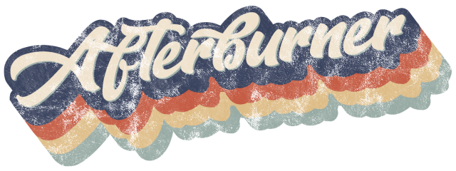
I sheered the text to add dynamism. (Object > Transform > Shear.) I then applied colour to the text and added a nice, thick outline via Object > Path > Offset Path (offset by 10px).

Now, making a copy of the blue outline and pasting it (behind and) offset, I created depth. After blending the blue layers together, I duplicated the action, adding other colours (behind). It’s a somewhat repetitive and tedious process.

After copying the top layer (the text) and pasting it behind the original, recoloured green, the most tedious (copy and pasting) tasks are done. …now we’re talkin’! Here’s where the image finally becomes solid. Very clean and sharp-looking.
Upon reflection, I’m seeing aspects of the text that I’d change if I took another shot at this. I feel it’s a little clumsy. I undoubtedly will try this method again – repetition being the most successful way that I learn.
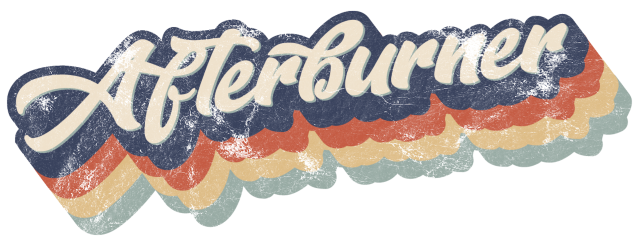
The fun yet easy process of adding a worn texture to the image is as simple as applying a Mask (through the Transparency panel). The tutorial came with (free) access to appropriate textures, so I tried out a number of them. The textures really add bite and finish to the graphic, with such little effort.
Even though this 1970s retro feel is quite specific, the core skills used here can be applied to modify text to reflect other aesthetics. I already want to adapt the technique to use on other fonts. I encourage other newbie graphic design students to seek out free tutorials and experiment. It’s rewarding.

Wow, it is very effective and reminiscent of the liberated designs in the 70’s that I remember being drawn to in my teen years. I am also thinking of Refreshers sweets although a different font. Recently I noticed HandDryers in restrooms using a blue and white font that evoked “Snickers” font, see what you are doing to me Imogen, heightening my awareness in the use of font, and aesthetic of advertisements, and so much more. Inarticulate as I remain within the realm of commentary, you have ignited a spark of intrigue to understand and appreciate all that confronts or presents itself from the wrapper on a chocolate box to the logo on Airlines and all in between.
LikeLike
Thank you, Alison! As always, I like to hear your thoughts and input, and I am glad to hear that you feel that you can appreciate more your encounters with design. I rather like looking at design from the decades that I’m a stranger to; and when a past design still appeals now, it is a testimony of a solid construct! And appropriating others’ designs isn’t as naughty or thoughtless as schools might teach; it can aid a new design in evoking nostalgic feelings, for example.
LikeLike
Pingback: Workshop – Stickers!! – Imogen's Student Blog