100 years on, and the teachings of the Bauhaus school of art are still examples of a solid design process. That is to say, that today’s graphic designers owe a lot to the teachings and theories of Bauhaus; it was the most important influence on graphic design in the twentieth century, with its presence felt throughout contemporary typography, architecture, website layout, furniture design, and art theory.
The Bauhaus school was founded in the year 1919 in Weimar, Germany, by architect Walter Gropius. Bauhaus essentially means “house of building”. The school existed in three German cities; in weimar from 1919-1025, in Dessau from 1925-1932 and in Berlin from 1932-1933, with a combination of tree different directors; Walter Gropius, Hannes Mayer and Ludwig Mies van der Rohe.
It was a school that strived to combine beauty with usefulness through architecture, sculpture, painting, crafts, and engineering. Under Bauhaus’ teachings, weavers, painters, architects, and so on were all understood to be of equal importance.
Much like the Arts and Crafts movement of Britain, Bauhaus’ teachings were in part, a reaction to soulless mass-production. Though unlike the Arts and Crafts movement, Bauhaus supported the idea that both mass-production and the individual artistic spirit were compatible. Another key difference is Bauhaus’ focus on practicality; for art to survive in a turbulent society, art had to show its functionality and purpose.
In future posts, I’d like to examine specific artists from the school of Bauhaus, and how their works still influences design to this day. As Bauhaus is such a broad topic, this entry focusses only on the Bauhaus typeface and some popular usage that it sees.
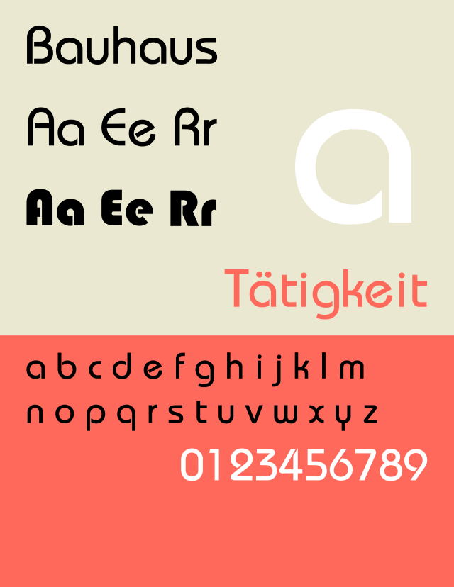
Student of Bauhaus and later teacher, Herbert Bayer, built the experimental Universal typeface in 1925, and while never truly finished, it lay the groundwork for the Bauhaus typeface Blippo, designed in 1969 by Joe Taylor.
For the Bauhaus typefaces, serifs (often seen as, or used as reading aids) have been left out in favour of a more definite, crisp finish; meanings it’s a sans-serif font. The font Blippo and the variant, Bauhaus 93 (first used in Microsoft Office in 1993) see ever-popular usage on brands looking to be easy-going and friendly.
Nintendo has used Bauhaus 93 for their amiibo logo. They also used Blippo back in 1985 in the title screen of the Nintendo Entertainment System’s Super Mario Bros. and its sequel. Nintendo generally pushes their accessibility, their wholesome content, and the fun and excitement of learning and exploring, so appropriating the font to communicate “playfulness” is no surprise.
Playmobil uses the Bauhaus font to look both approachable and fun, yet the typeface also holds a sturdy and durable quality to it, mirroring the endurance of a product that is designed for everyday play and wear.
In media, the 1981 British stop-motion television program Postman Pat uses Blippo in the logo and end credits, while Bauhaus 93 is used extensively in the American, flash-animated surreal comedy web series Homestar Runner.
There are other well-known uses of the Bauhaus fonts, though they’re either used for children’s entertainment, or family-oriented products or services. I think there is much opportunity for Blippo and Bauhaus 93 to be applied to services and products aimed at other target markets, especially when paired with complimentary fonts. The bauhaus typeface family is most suitable (that is, highly legible) for use on print media such as posters and book covers.

What a nice typo, will use it next projects. Thanks
LikeLike