Hey, now that I’ve got more time, how about a real introduction to the Graphic Design Festival Scotland, then? This creative festival has been around since 2014. It’s held in Scotland’s National Centre for Design & Architecture, The Lighthouse, and each year, GDSF hold events, including one to two day workshops that anyone can take part in – if you book in advance. The workshops can include anything from making your own animations and typeface to printmaking sessions and learning to code websites. I picked a risograph printing and book making workshop to try out something new.
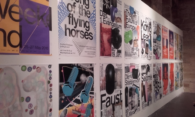
The main attraction of GDFS would be the poster design competitions and galleries. There are two divisions; a national campaign for youths across Scotland (aged 8-26 ) called Young and Powerful, and the International Poster Exhibition, which is open to everyone the world over to submit their poster entries. Now, these posters can cover a wide range of subjects, be it a comment or critique on the state of the world, an advertisement, or a just personal thought. Regardless of the content, they’re exhibited in a celebration of contemporary design. Below are a handful of the International Poster Competition entries that were originally created to promote various creative arts events.

“Nacht van de Beeldende Kunst” (Night of the Visual Arts) is a temporary, public celebration of contemporary art, and the exhibitions are open until the early hours of the morning, so it’s pretty fitting for such an ad to be dominated by deep black. The initials are skilfully pushed to near-abstraction, while still retaining legibility.

This advertisement for the music festival “Minuit avant la Nuit” (Midnight before the Night) is the type of imagery that rewards the viewer the more time spent with it; I hadn’t noticed the eyes within the shadow of the moon the first time I saw the ad. Besides the screen-printed aesthetic, I feel that the most attractive quality is the hand written text.

When surround by many brightly coloured posters, the pastel palette in this piece feels refreshing! This is a theatre poster for a comedy about “esoteric therapies”. All the information needed is presented to us, but to read it all, the viewer is eased into a visual rhythm.

If the mix of hot and cool colours don’t catch your eyes, then the light that catches the metallic text will! There is a lot going on in Super Terrain’s posters that are better appreciated in person, the colour gradients, the textures, and the typefaces. This is a fun, loud, and energetic composition, perfectly tailored to sell the creative events of dance performances, choreography workshops, and film screenings.
Seeing all of the posters at the event, and looking a little a closer at a select few has been rewarding. All these posters are so different in goal and execution, but all are successful in informing their respective target audiences the necessary information in order to perform as poster advertisements. This is because each graphic designer has a clear understanding of their audience, and how to market to their audience’s interests and sensibilities through the medium of posters.
As long as the target audience’s tastes are put first when creating an advertisement, the message should reach them with ease, create excitement, and even lead to an audience reaction.

This is all so absorbing, and I think helps me to understand how so often shopping is often about the packaging rather than the product, the art and design triggers sensory responses in my head before I have even noticed.. Its exciting, empathic seductive etc, much more feeding my artistic appetite, than so often I realise, and so quick..
One mistake with the date for the book.. From 1950’s to 1970’s,but the typo is the extra 1 between the 9&7…if you want to edit it?
Learning so much, loved your riso print too.
Alison
LikeLike
Whoops…! Thanks for catching the typo; I’ve corrected the date of the images from the book!
Yes, I believe that everything can be marketed – you just need to know your target. Looking at packaging is fun!! I like to see foreign packaging design too, from import food stores, and when on vacation.
Thanks for your thoughts.
LikeLike